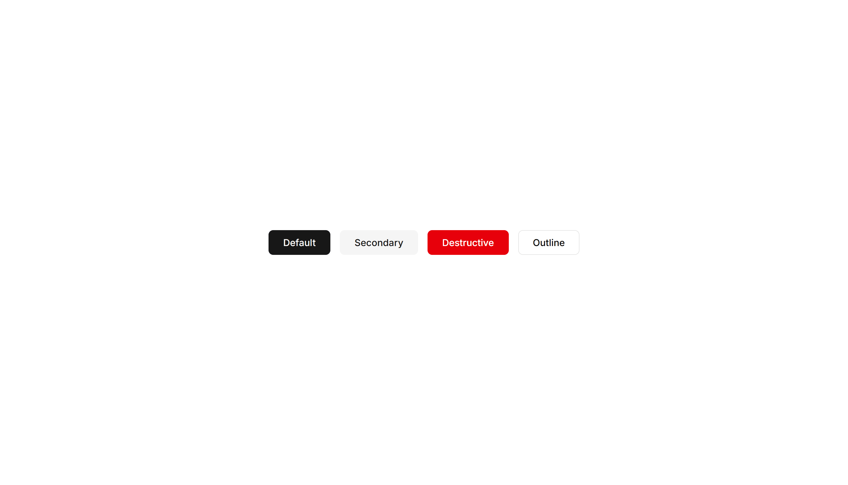
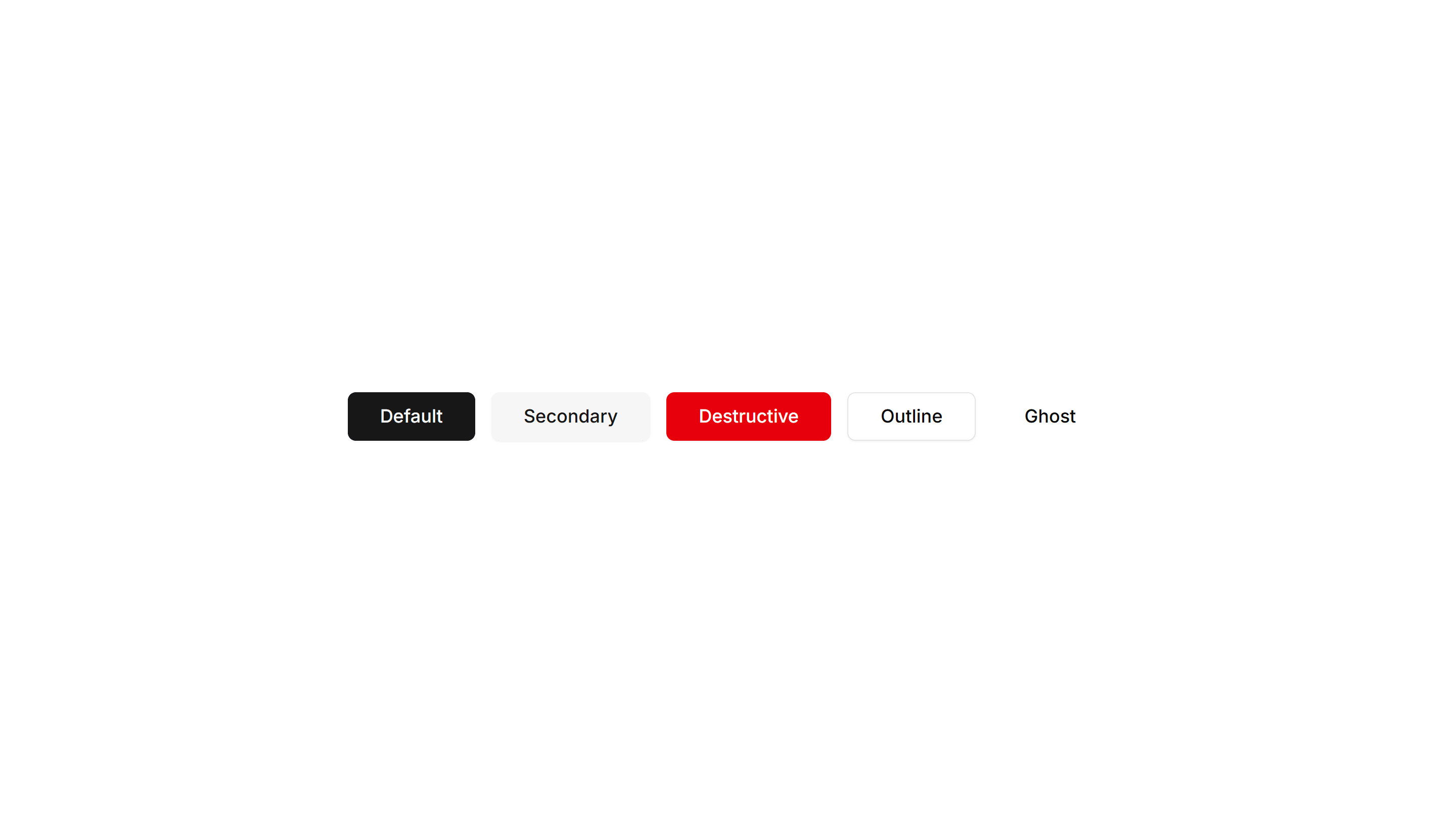
Shadcn Component Blocks
Use 124 free Components for shadcn/ui. Buttons, cards, alerts, accordions, badges, breadcrumbs, tabs, and pagination, all responsive and easy to customize.
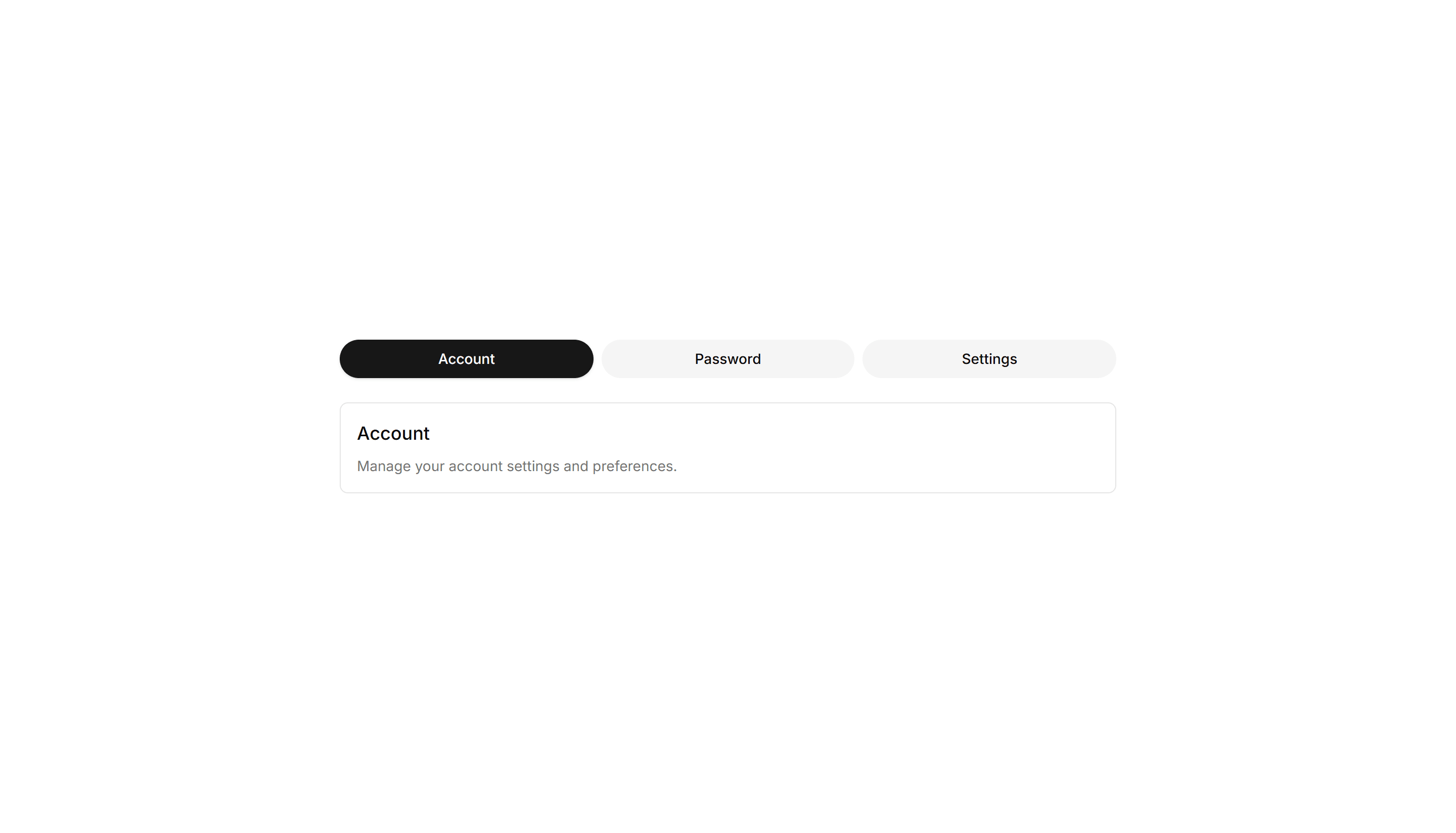
Components Tab: Pill Tabs
Tabs shaped as rounded pills with a filled background on the active one. Ideal for filter bars and segmented controls that toggle between a few short views.
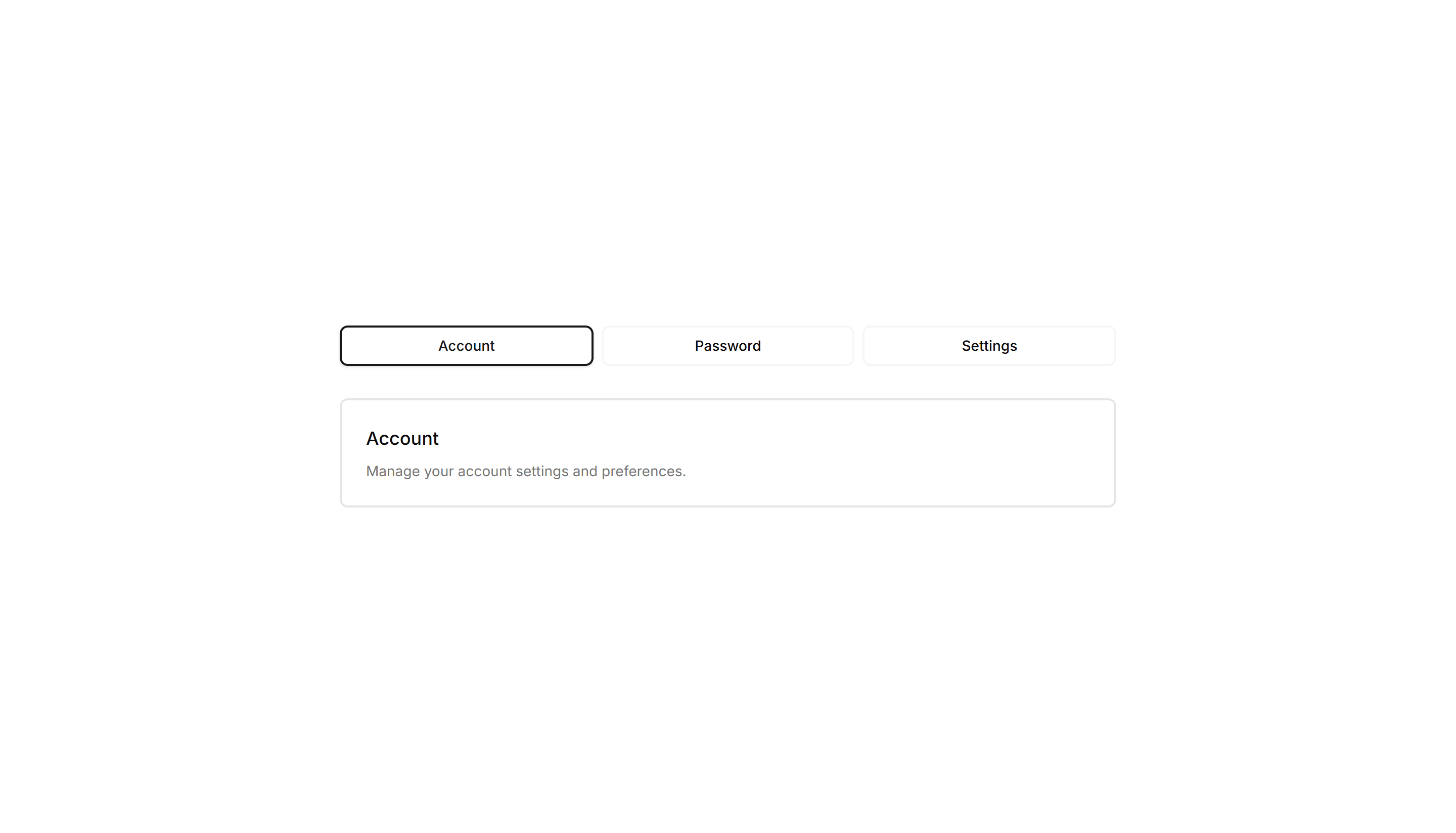
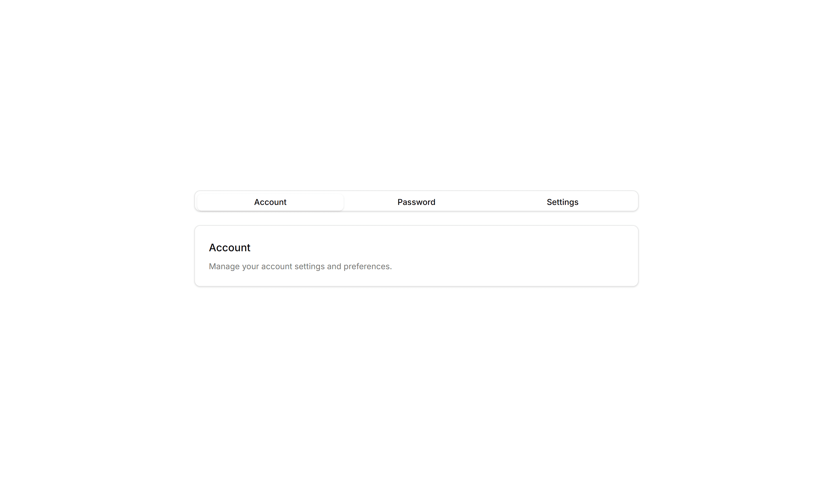
Components Tab: Outline Tabs
Tabs wrapped in a light border that frames each trigger and the active panel. Suits forms or profile screens that need clear structure between grouped fields.
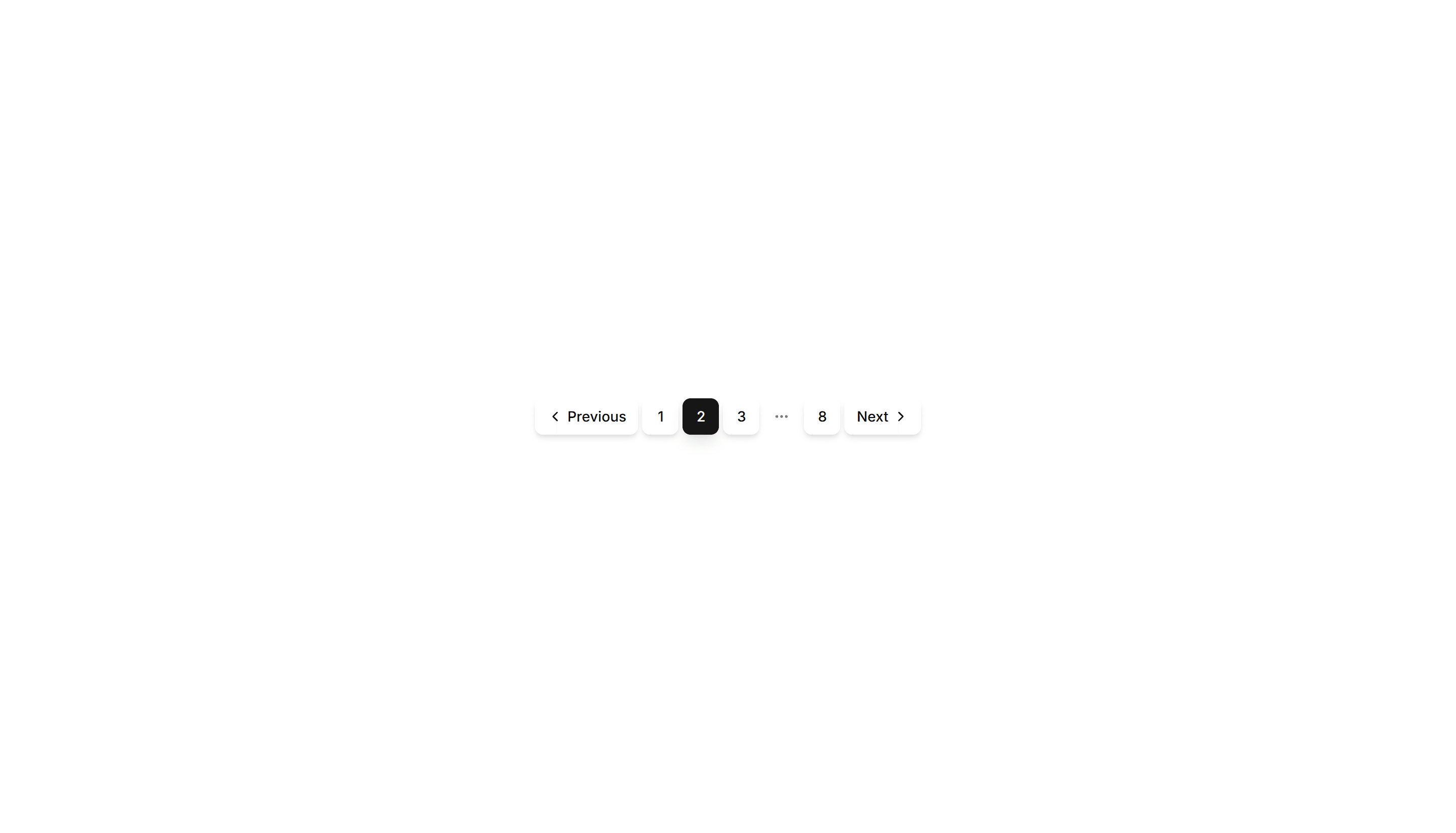
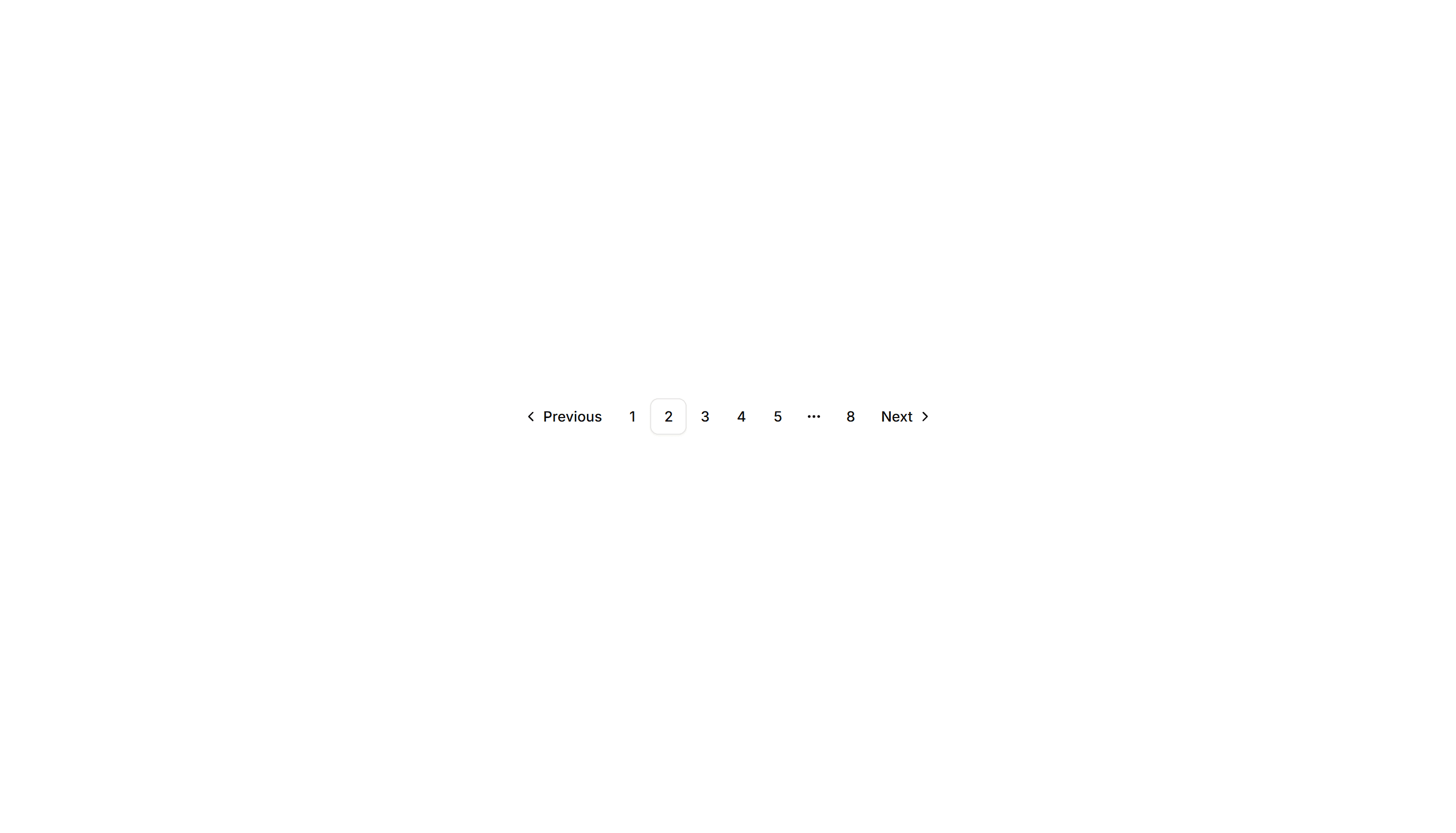
Components Pagination: Shadow Pagination
Pagination with subtle drop shadows on each button for depth. The lifted look helps the controls stand out over busy backgrounds and image grids.
Components Tab: Gradient Tabs
Tabs with a soft color gradient on the active trigger for a vivid accent. Use them on landing pages or feature views where the switcher should draw the eye.

Components Pagination: Mini Pagination
A very small pagination control showing the current page and arrows to step through results. Fits inline next to filters, counts, or table footers.
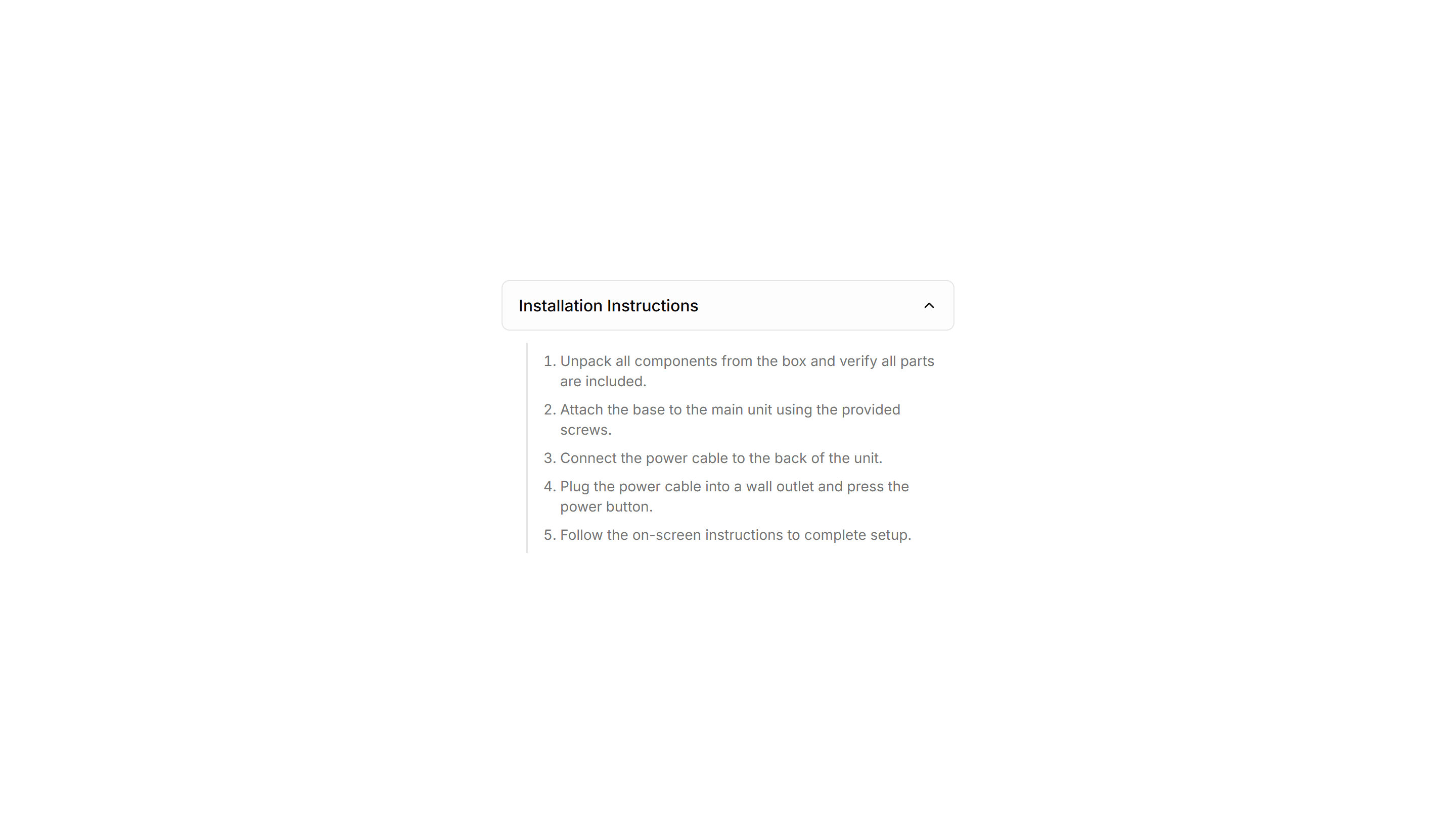
Components Collapsible: Stepped Collapsible
Numbered collapsible steps that reveal instructions one at a time. Use it for onboarding or setup guides where readers work through tasks in order.

Components Pagination: Compact Pagination
A tight pagination row that fits page numbers, prev, and next into a small footprint. Good for sidebars, panels, and dense admin tables with limited space.

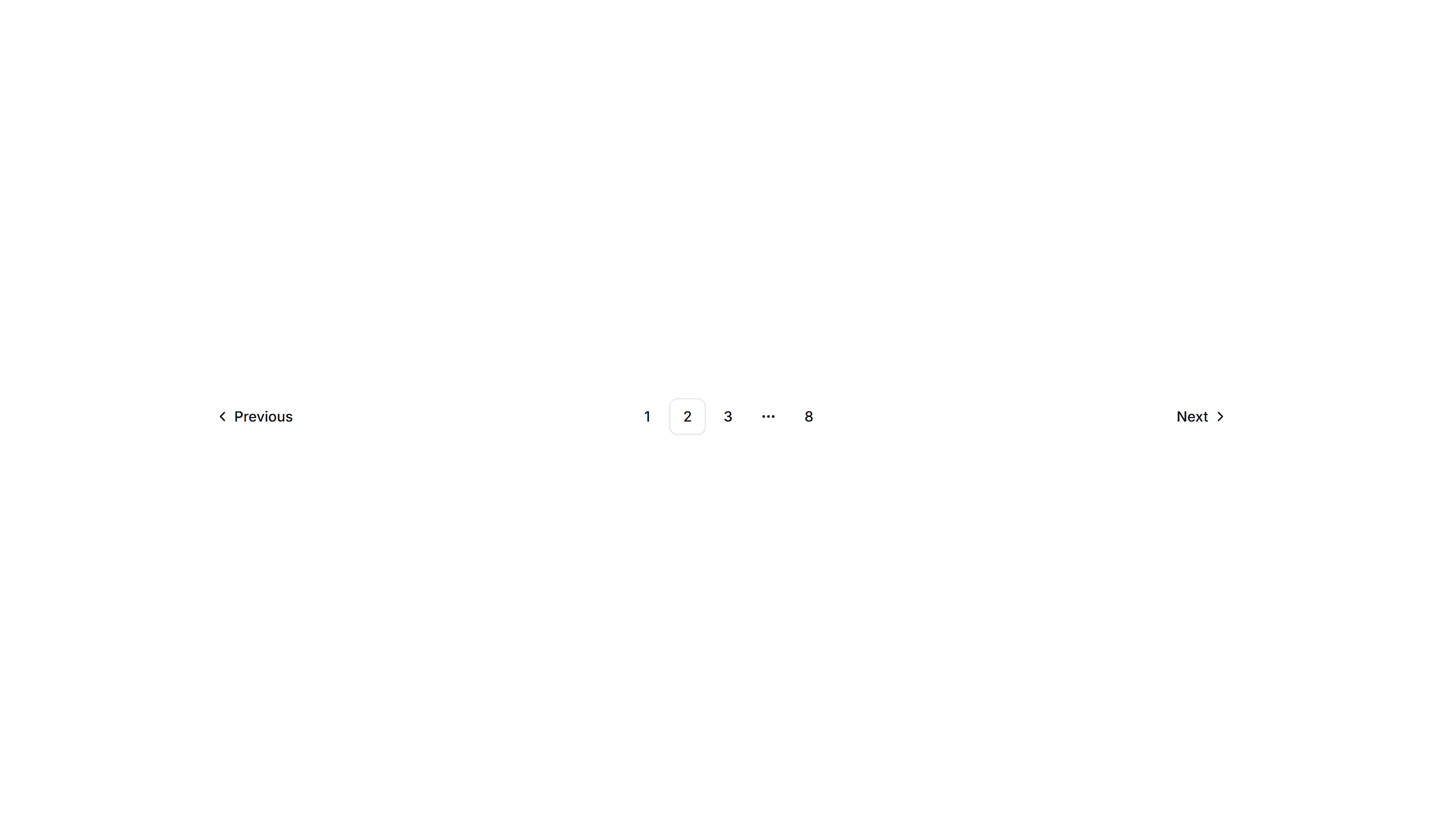
Components Pagination: Icon Only Pagination
Pagination built from chevron icons for previous and next, with no page numbers. Keeps mobile toolbars and image viewers clean when only direction matters.
Components Card: Stacked Card
A card layered over offset copies to suggest a deck behind it. Use it for collections, albums, or grouped items where many sit under one cover here.
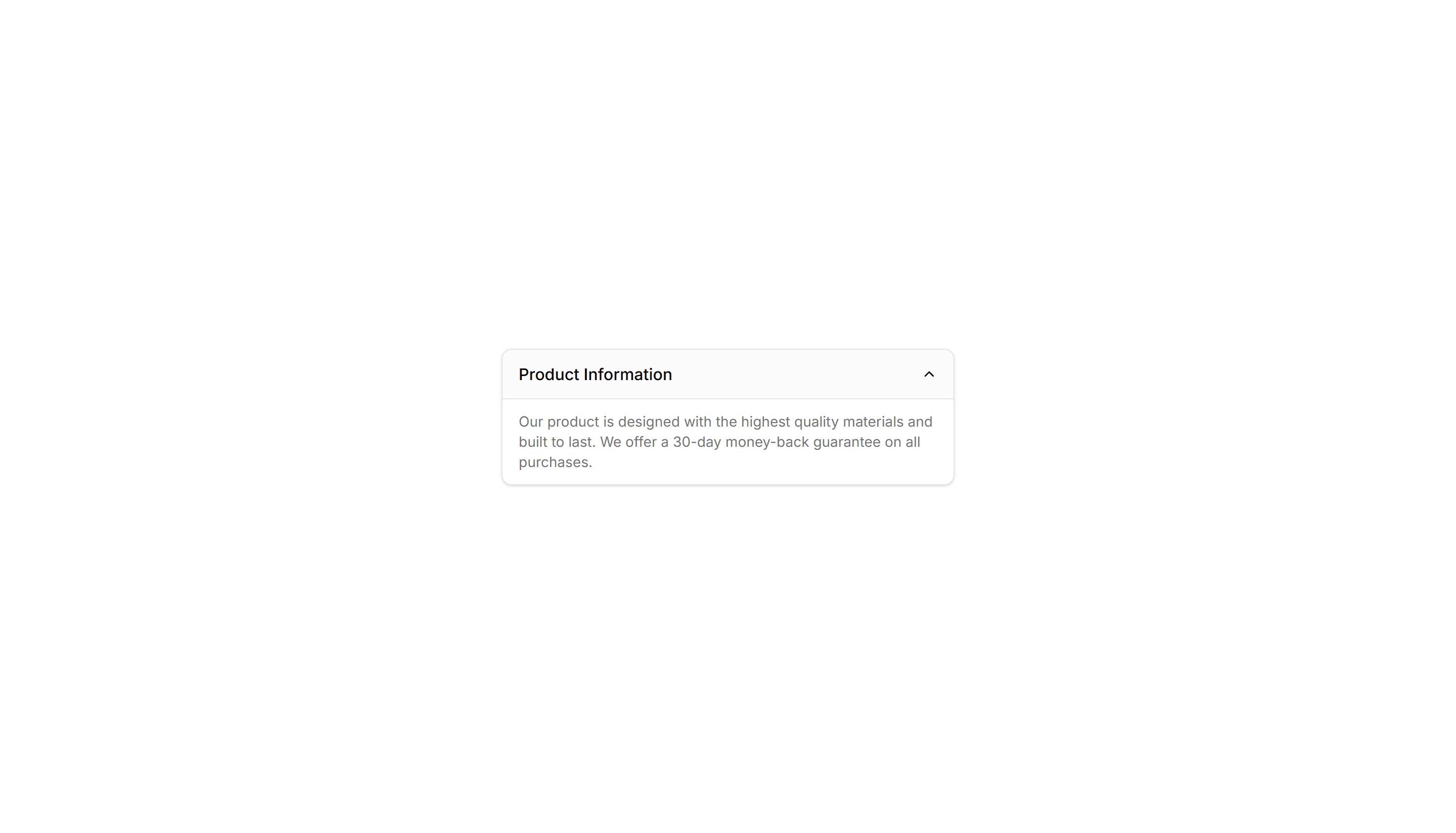
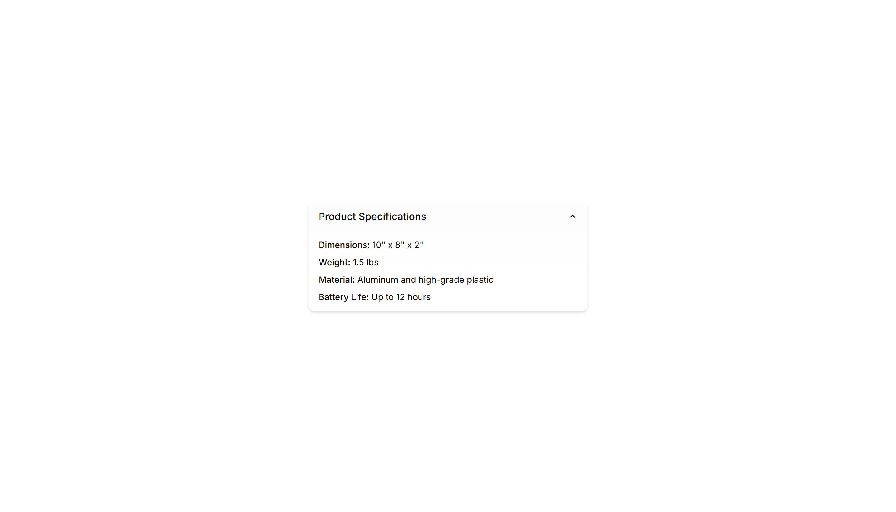
Components Collapsible: Card Collapsible
A card that expands to reveal extra detail when clicked, keeping the summary visible. Use it on dashboards to tuck away long notes inside a tidy tile.
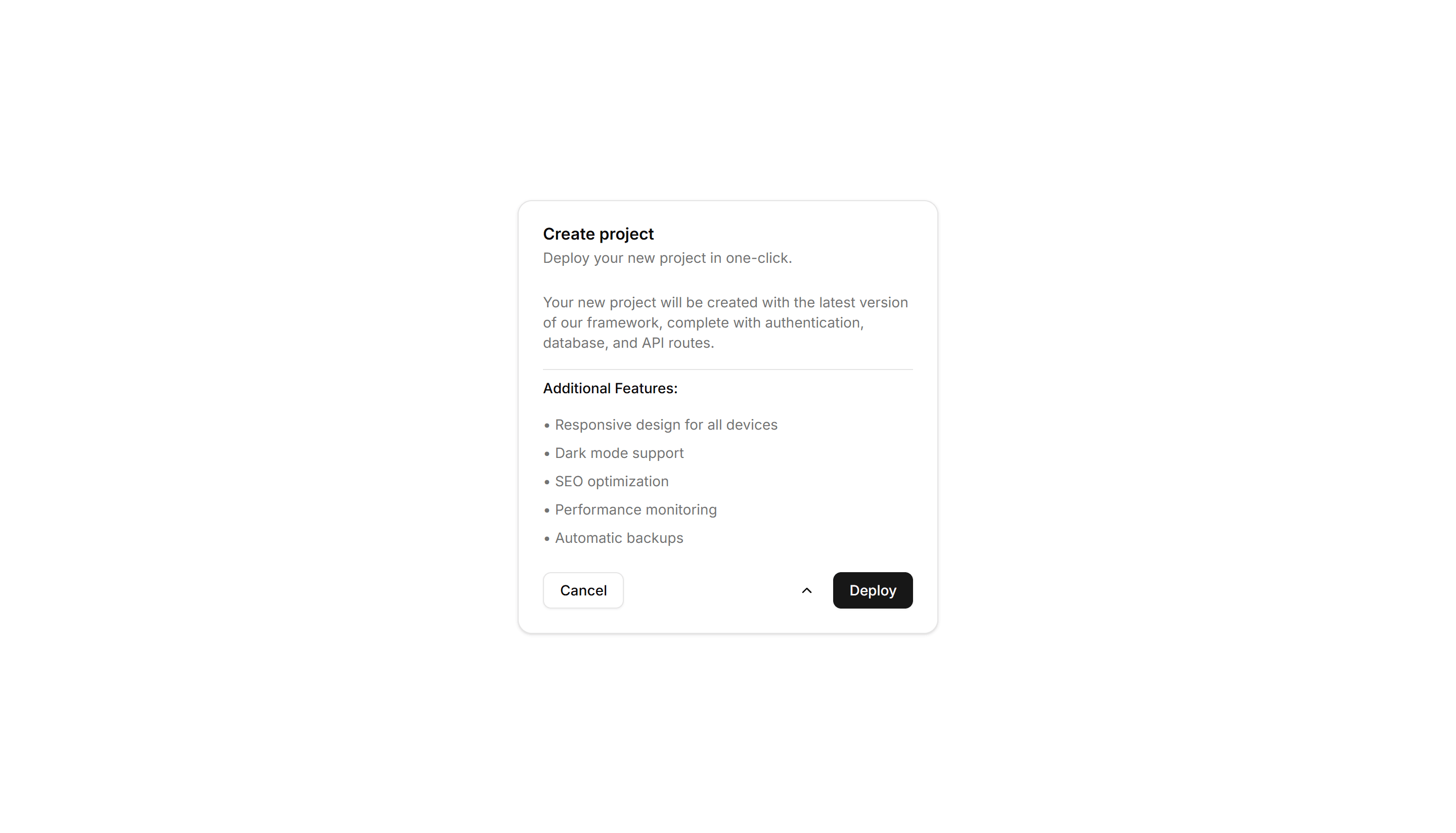
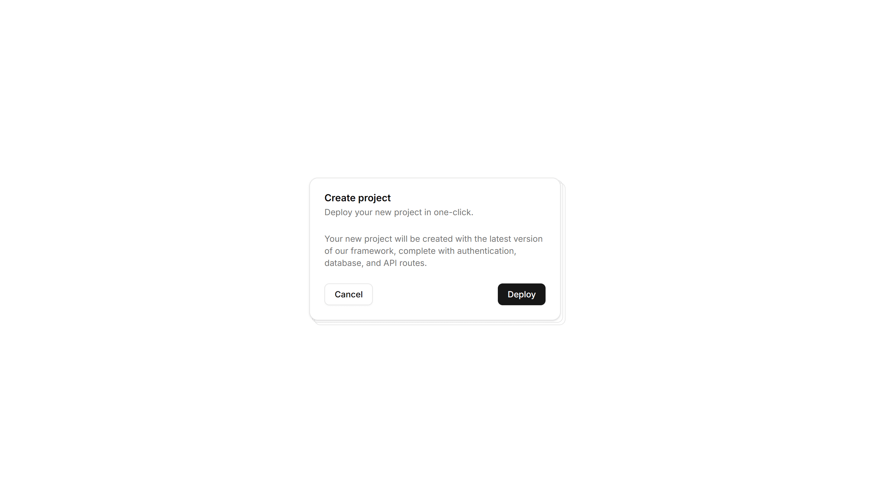
Components Card: Expandable Card
A card that grows to reveal more text or controls when opened. Use it for FAQs, settings, or summaries that hide detail until the reader wants it.
Components Card: Hover Reveal Card
A card that hides extra text or actions until hover uncovers them. Use it for portfolio tiles or features where the cover stays clean until needed.
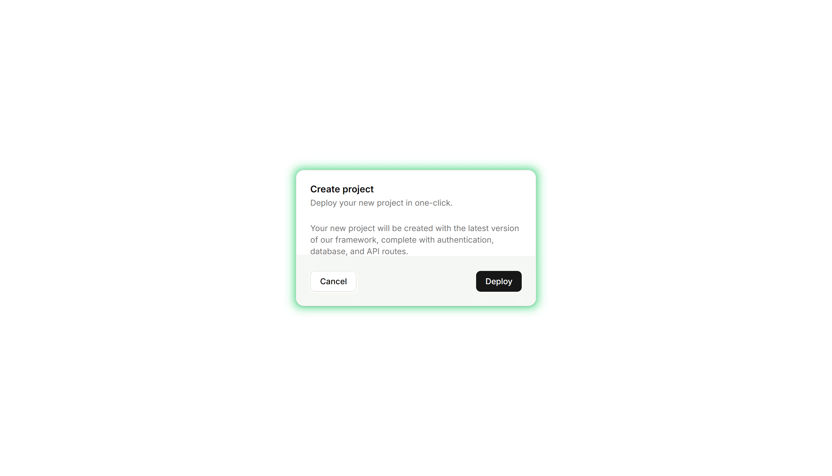
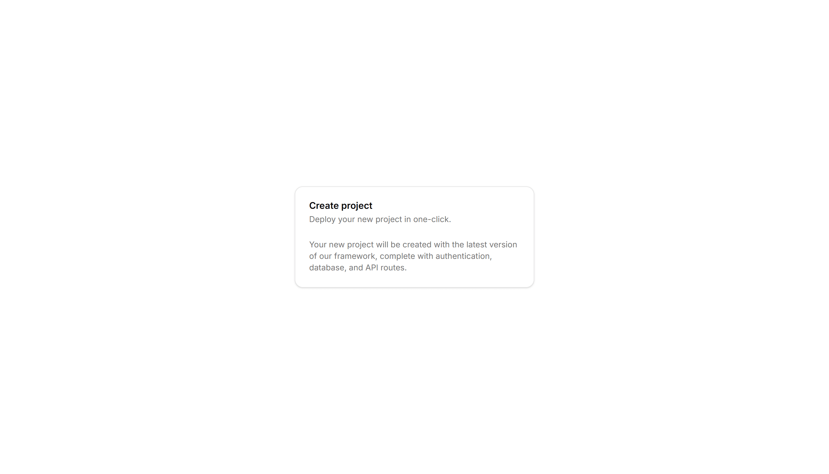
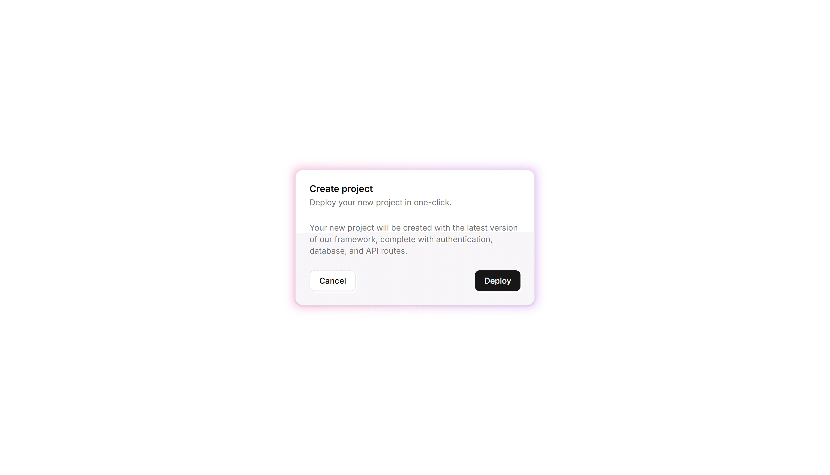
Components Card: Neon Border Card
A card ringed by a glowing neon outline that pops on dark backgrounds. Use it for gaming, music, or tech pages where a bright frame fits the mood.
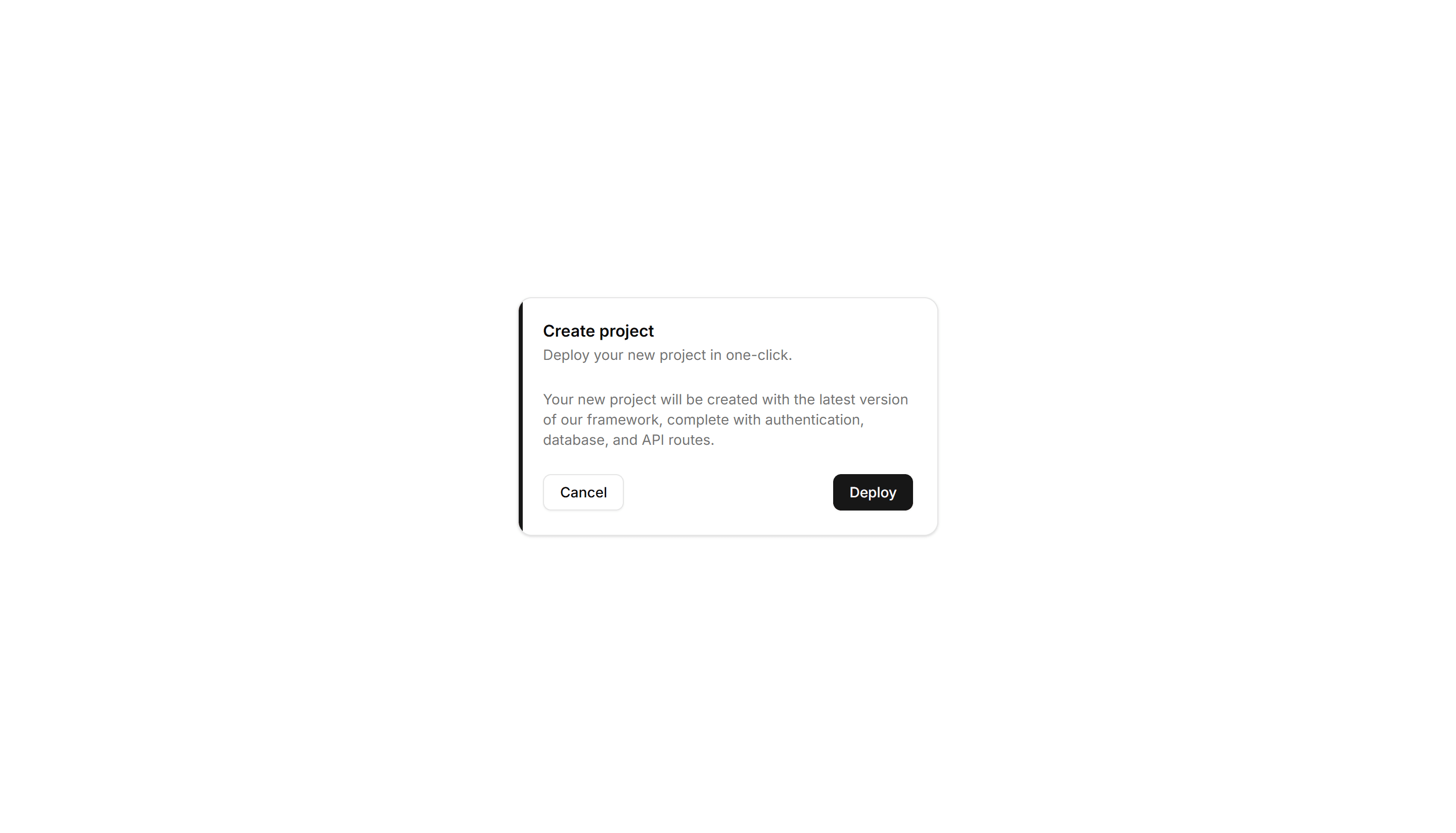
Components Card: Border Accent Card
A card with a colored accent line along one edge that draws the eye. Use it to group related text and labels while signaling category or status.
Components Card: Border Highlight Card
A card that brightens its border when focused or hovered. Use it to mark the recommended choice in a pricing grid or a selected option in a form.

Components Card: Dashed Border Card
A card outlined with a dashed border for a light, sketch feel. Use it for empty states, upload zones, or placeholders that invite the user to add content.
Components Button: Morphing Buttons
Buttons that morph their shape, size, or label between states. Use for loading, success, and submit flows that confirm progress to the user.

Components Button: Rotate Buttons
Buttons that rotate an icon or the whole label on hover. Add subtle motion to refresh, settings, and other action icons across your app today.
Components Button: Slide Buttons
Buttons with a color or label that slides in on hover. Reveal a second state to guide users toward the next step in a clear and simple flow.
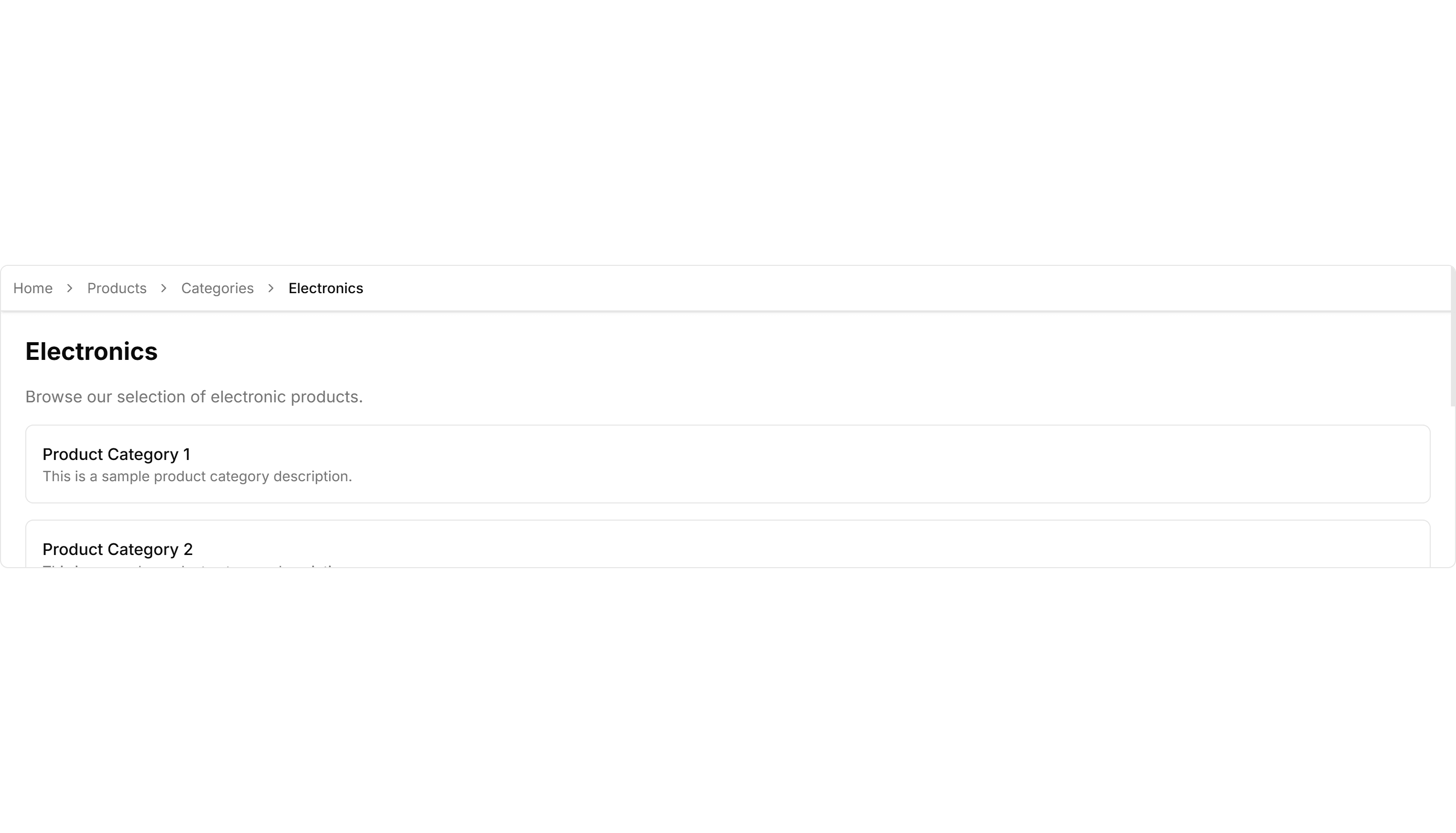
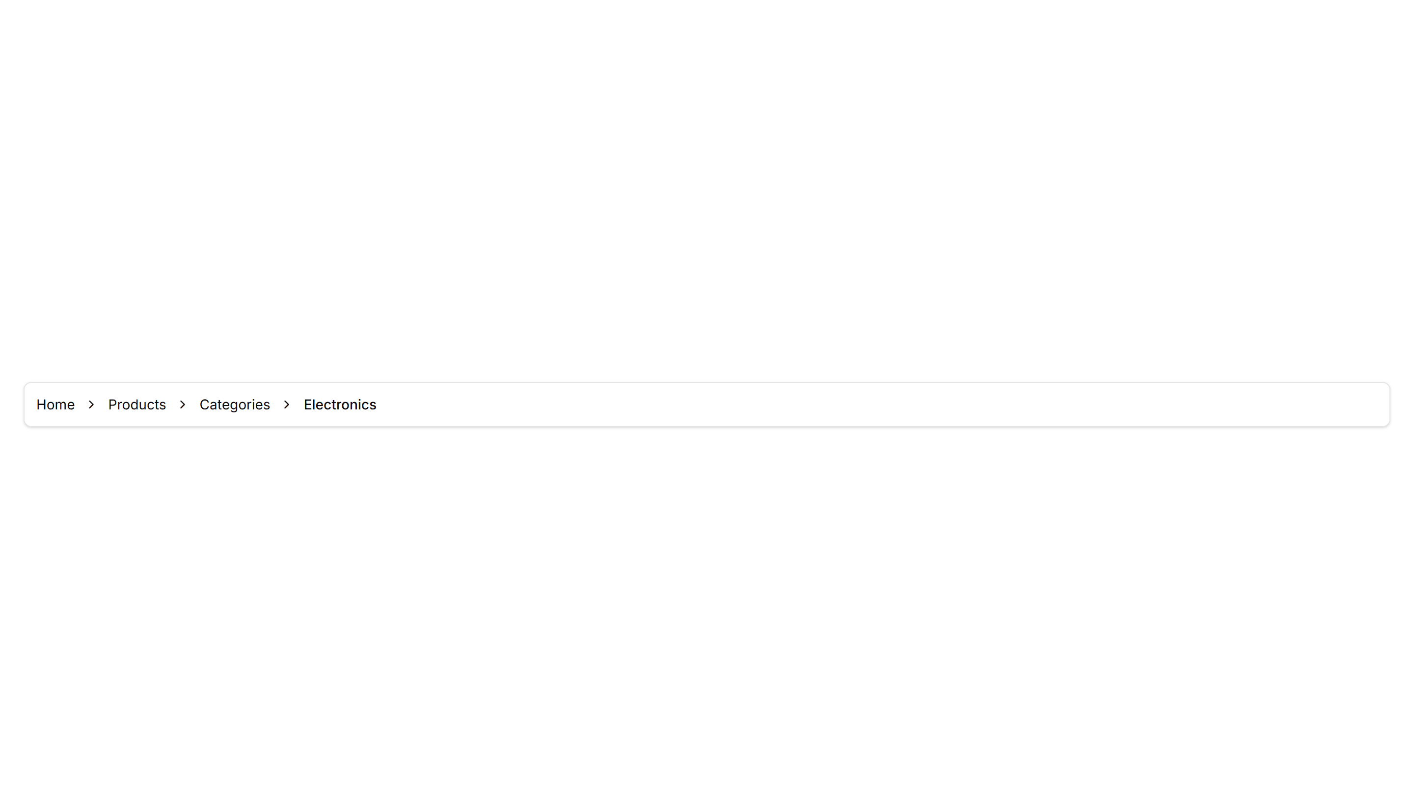
Components Breadcrumb: Sticky Breadcrumb
A breadcrumb that pins to the top of the view as the page scrolls. Keeps the current location visible on long articles and deep settings pages.
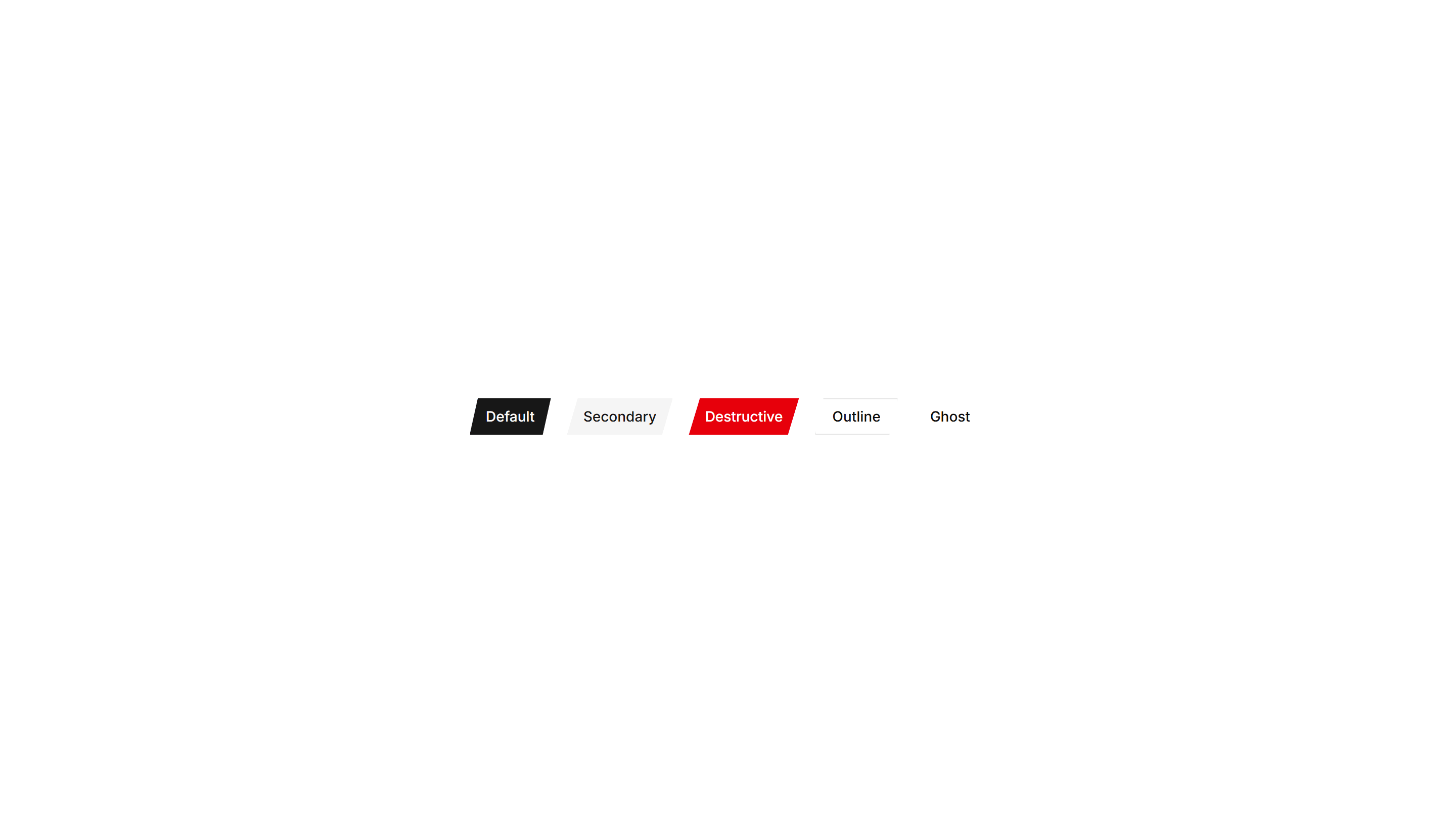
Components Button: Cut Corners Buttons
Buttons with angled, clipped corners for a sharp geometric look. Fits gaming, tech, or editorial interfaces that want an edgy call to action.

Components Button: Grow Buttons
Buttons that scale up smoothly on hover to feel responsive. Add a touch of motion feedback to cards, pricing tiers, and primary form actions.

Components Breadcrumb: Bordered Breadcrumb
A breadcrumb sitting inside a thin outlined container. Frames the navigation path cleanly on a dashboard header or any content section toolbar.

Components Breadcrumb: Dot Breadcrumb
A breadcrumb that separates each link with a small round dot. Offers a quiet, minimal path indicator for clean app layouts and page headers.

Components Breadcrumb: Pill Breadcrumb
A breadcrumb where each link sits inside a rounded pill shape. Adds a friendly, tappable feel to navigation on dashboards and profile pages.
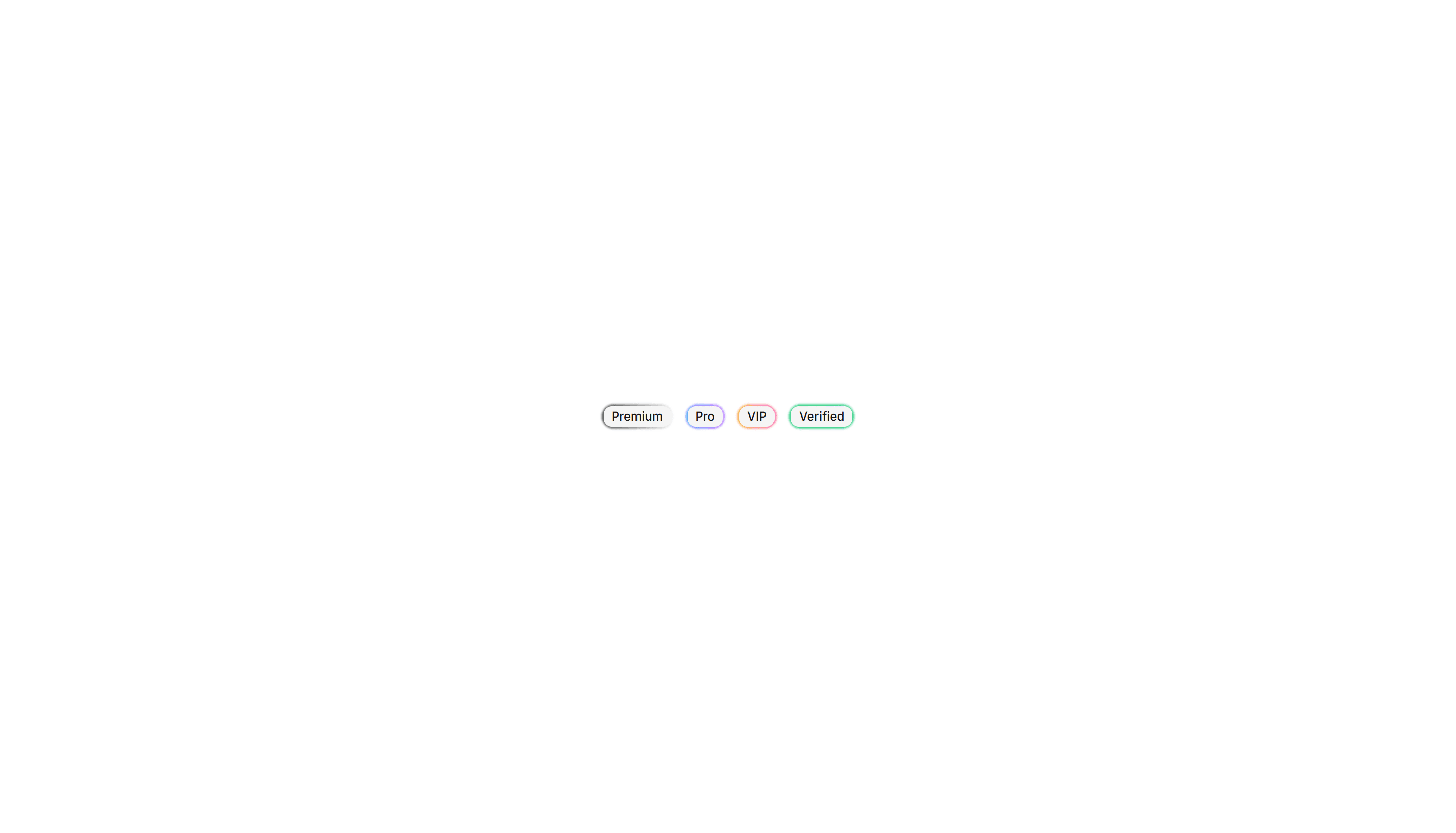
Components Badge: Extra Large Badge
An oversized badge with generous padding and bold text for high visibility. Use it on hero areas or banners where a tag must read from a distance.
Components Badge: Icon Badge
A badge that pairs a small icon with a label for instant meaning. Use it to tag categories, statuses, or actions where text alone reads slowly.
Components Badge: Ribbon Badge
A badge styled as a corner ribbon that drapes over a card edge. Use it to flag sale, new, or sold out states across product and gallery tiles.
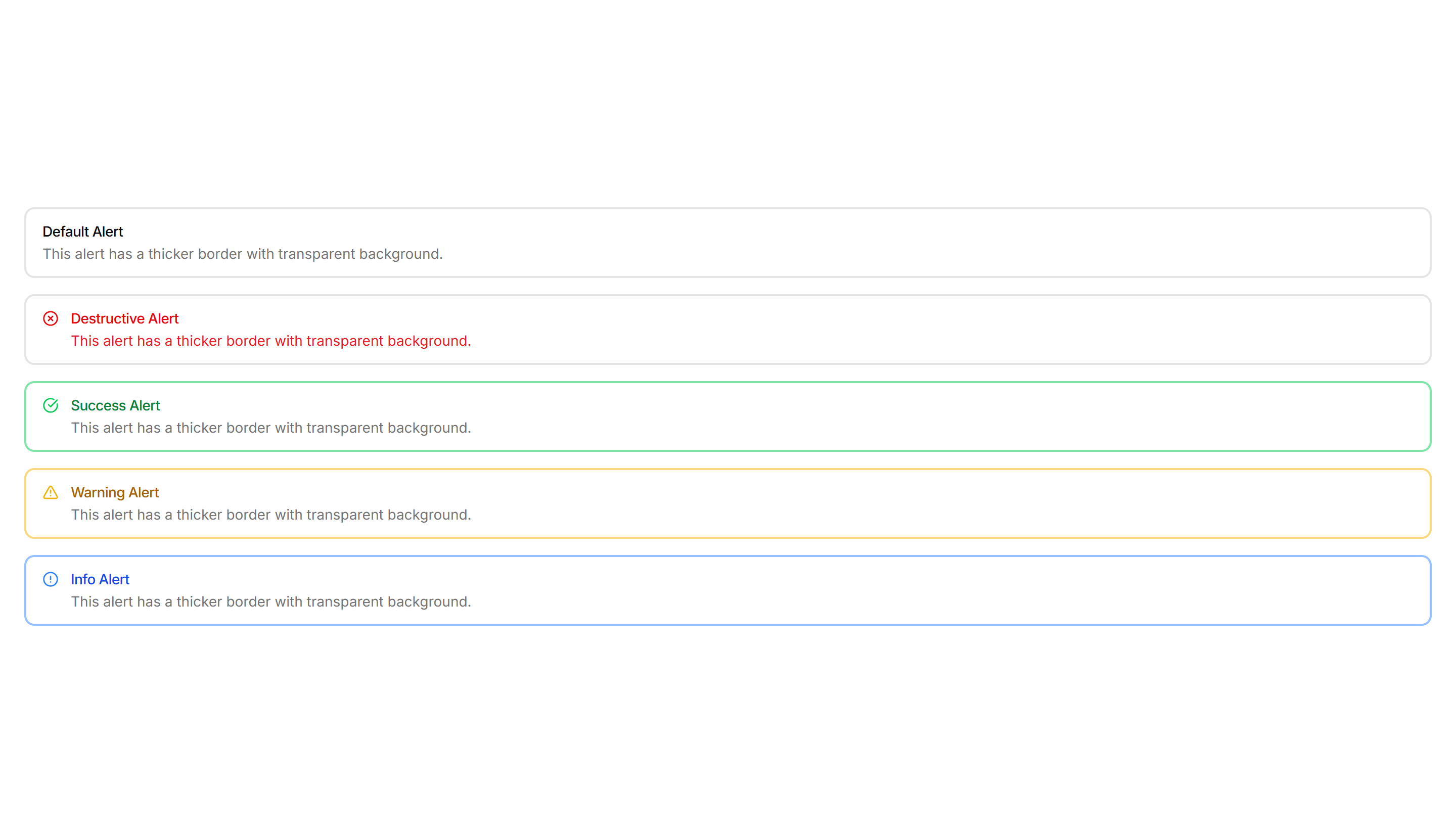
Components Alert: Outlined Alerts
Alerts defined only by a clean border with no fill behind the text. Use on colored or busy backgrounds where a solid panel would feel heavy.
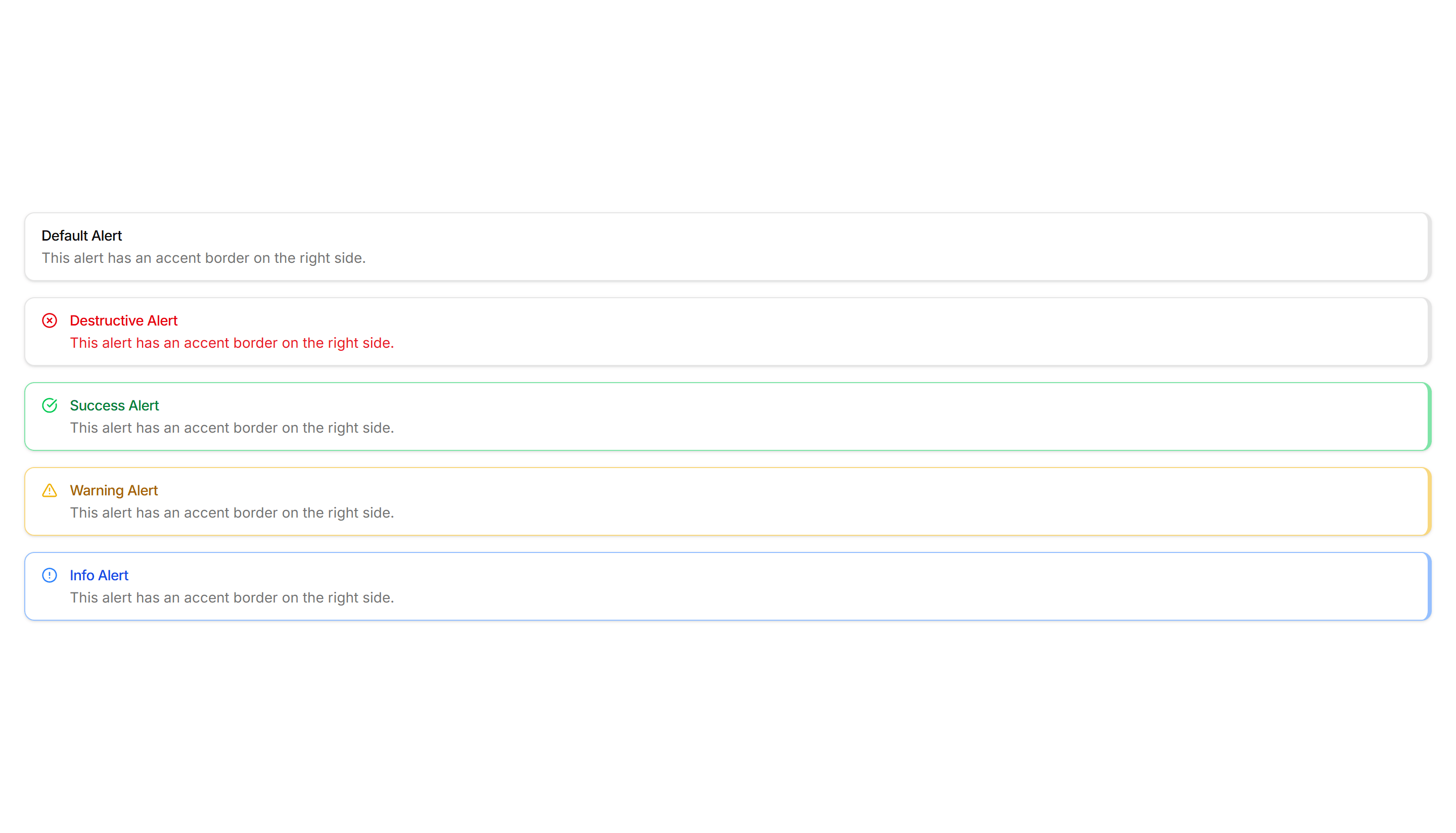
Components Alert: Right Accent Alerts
Alerts with a colored bar on the right edge for a mirrored accent. Use in right aligned layouts or when the left side already holds an icon.
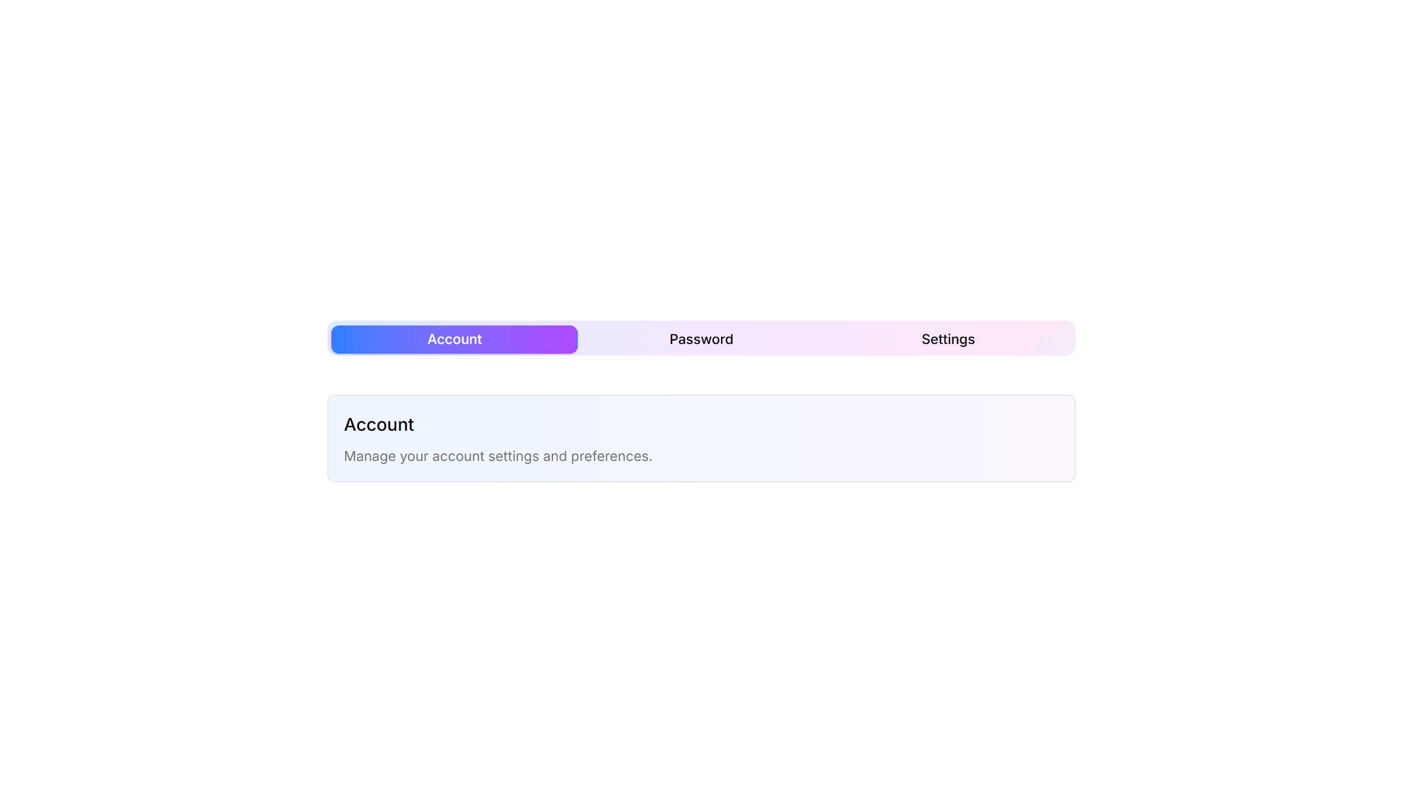
Components Tab: Shadow Tabs
Tabs where the selected trigger gains a subtle drop shadow for depth and focus. Works well on cards and panels that need a tactile, layered feel to the switch.
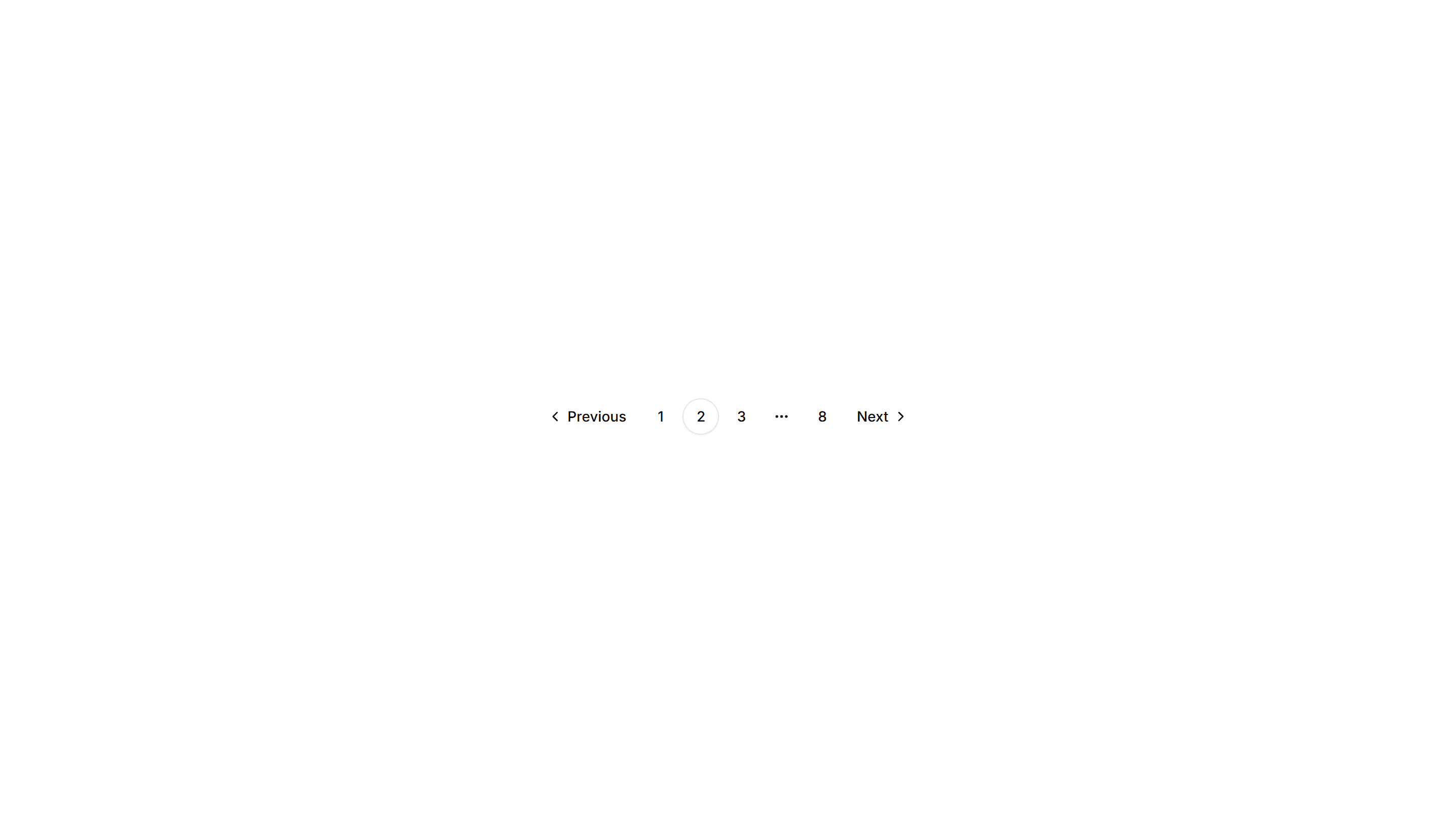
Components Pagination: Responsive Pagination
Pagination that shows full page numbers on desktop and collapses to arrows on mobile. Keeps navigation usable across phones, tablets, and wide screens.
Components Pagination: Split Pagination
Pagination with prev and next pushed to opposite edges and page numbers centered. Spreads controls across wide footers and full width content areas.

Components Tab: Icon Tabs
Tabs that pair a small icon with each label so options read at a glance. Good for navigation menus and toolbars where space is tight and clarity matters.
Components Collapsible: Shadowed Collapsible
A collapsible panel with a soft shadow that lifts it off the page. Use it to highlight an expandable block of content inside a busy layout or feed.
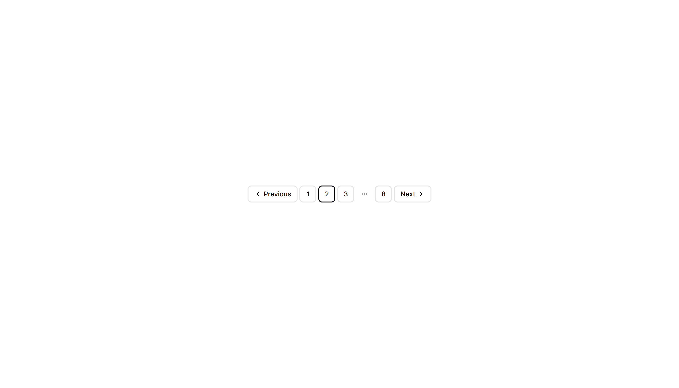
Components Pagination: Bordered Pagination
A pagination row where each page number sits inside its own outlined button. The clear borders separate pages cleanly across data tables and search results.

Components Pagination: Dot Indicator Pagination
Pagination shown as a row of dots, with the active page filled. Ideal for image carousels, onboarding steps, and short sequences where numbers feel heavy.
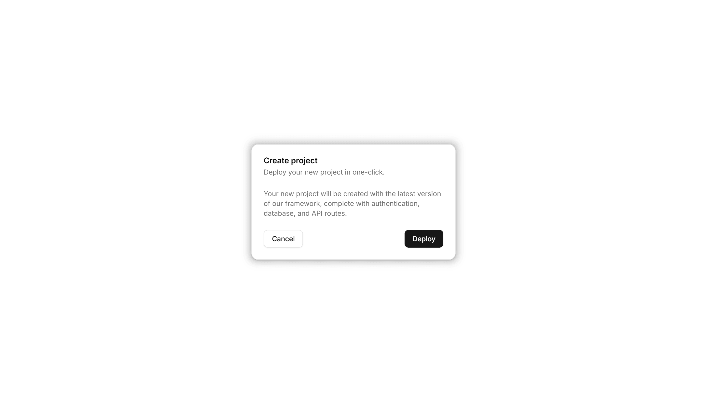
Components Card: Pulse Border Card
A card with a border that pulses softly to draw a glance over. Use it for live alerts, fresh items, or a call to action that should feel active now.
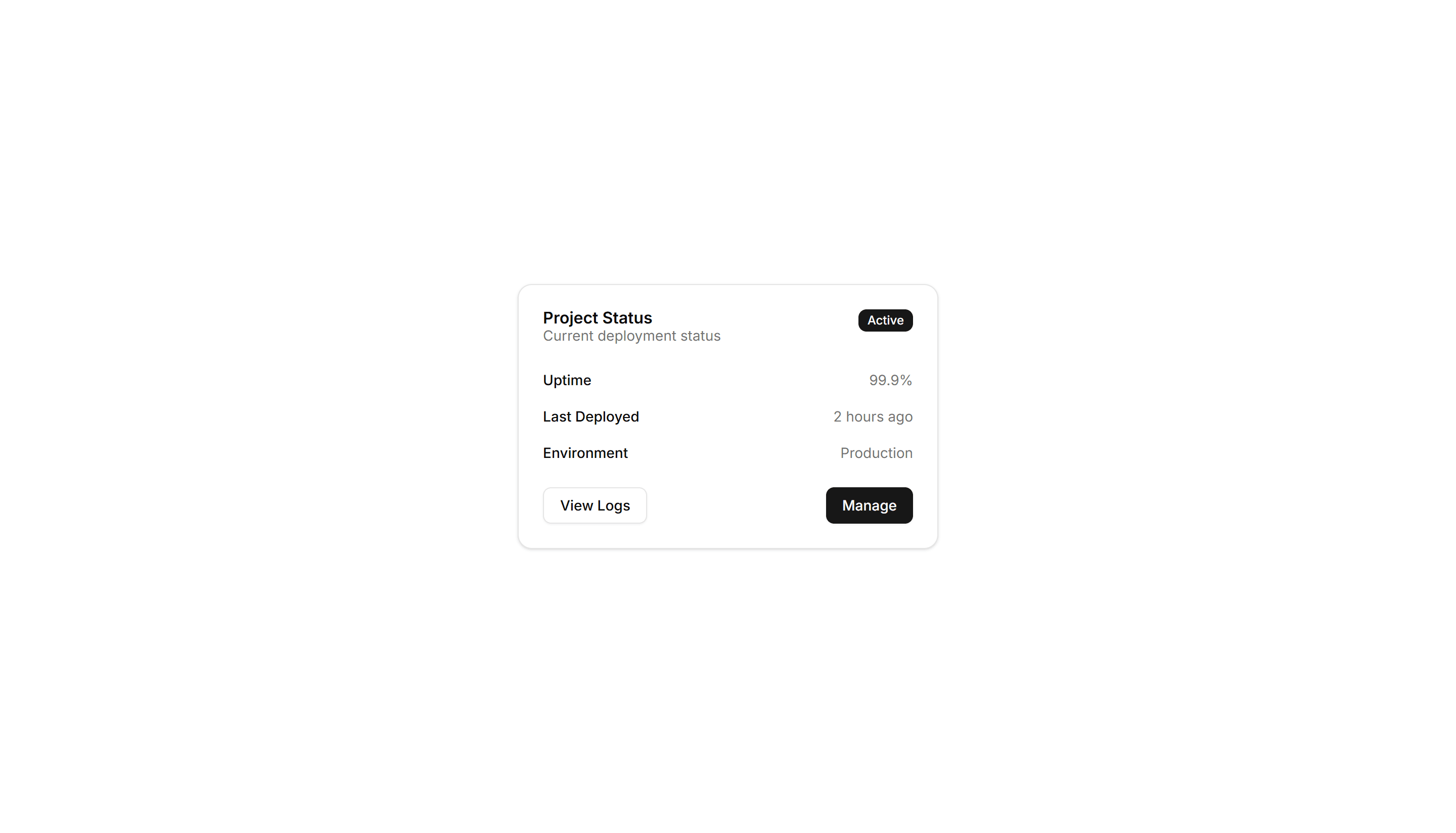
Components Card: Status Card
A card showing a state badge, label, and short note together. Use it on dashboards to surface health, order, or system status at a quick glance.
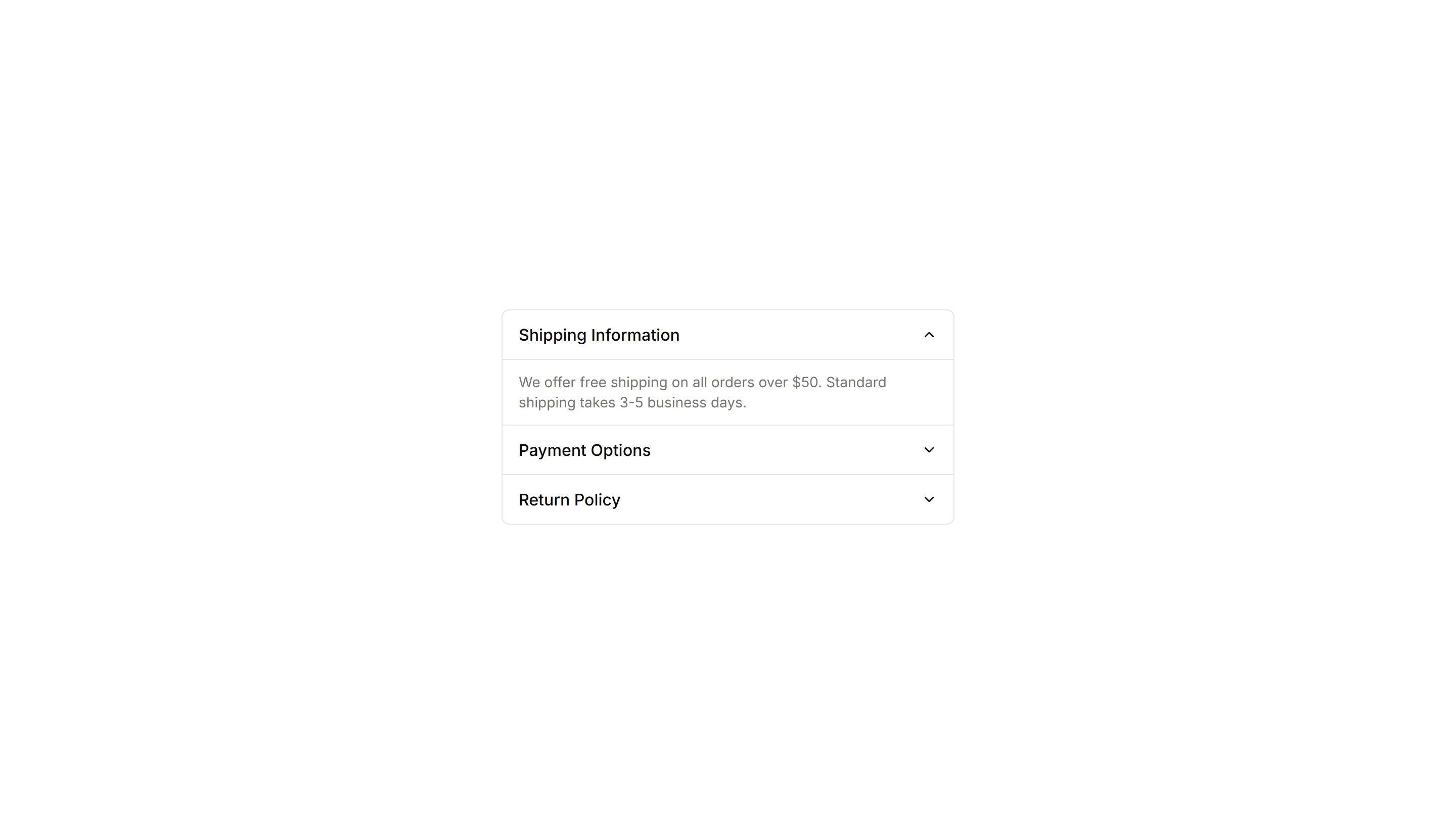
Components Collapsible: Grouped Collapsible
Several collapsible panels stacked together so readers open one section at a time. Good for settings pages where related options sit in separate groups.
Components Card: Gradient Border Card
A card edged with a static gradient outline that adds color without noise. Use it to set apart a key offer or profile in an otherwise plain grid.

Components Card: Icon Card
A card led by a single icon above a short title and blurb. Use it for feature grids, service lists, or steps where a glyph anchors each point made.
Components Card: Perspective Hover Card
A card that rotates in 3D space as the pointer crosses it for depth. Use it for hero items or showcases where motion makes a tile feel tactile.

Components Card: Border Animation Card
A card whose border traces a moving outline around the edges. Use it to spotlight a featured plan, offer, or item that needs attention on the page.
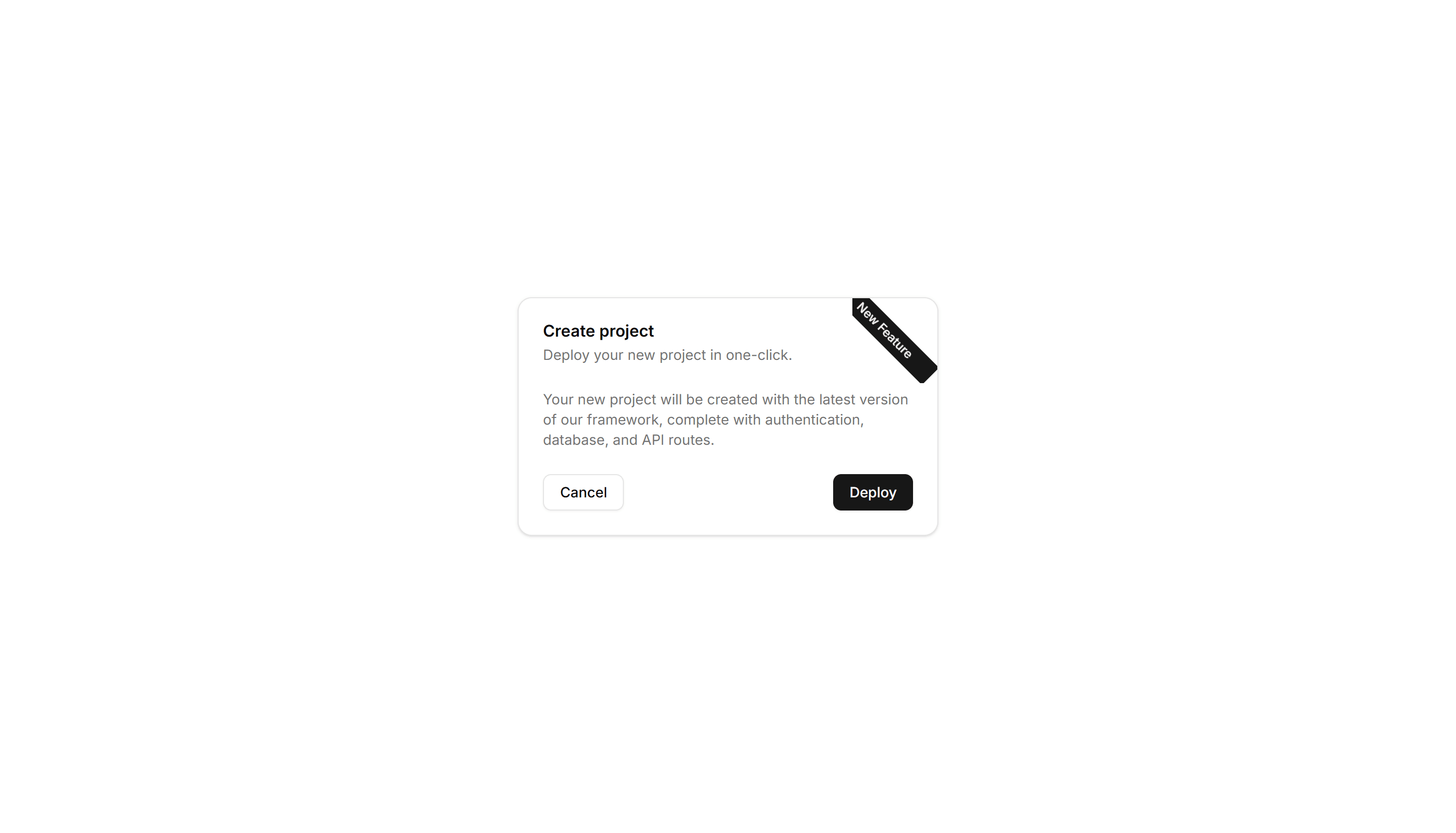
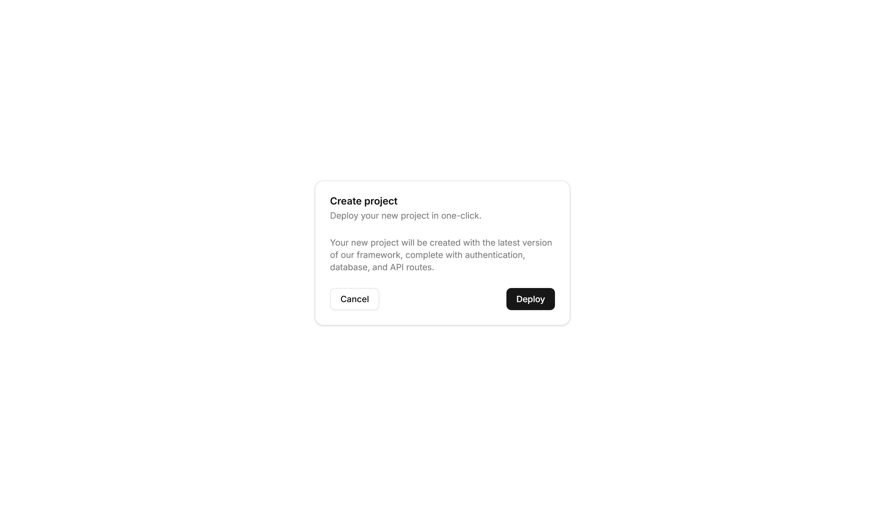
Components Card: Corner Ribbon Card
A card with a diagonal ribbon pinned to one corner for a short label. Use it to flag New, Sale, or Featured items in a product or listing grid.

Components Card: Double Border Card
A card wrapped in two stacked outlines for a framed, formal look. Use it for certificates, awards, or quotes that deserve emphasis on the page.

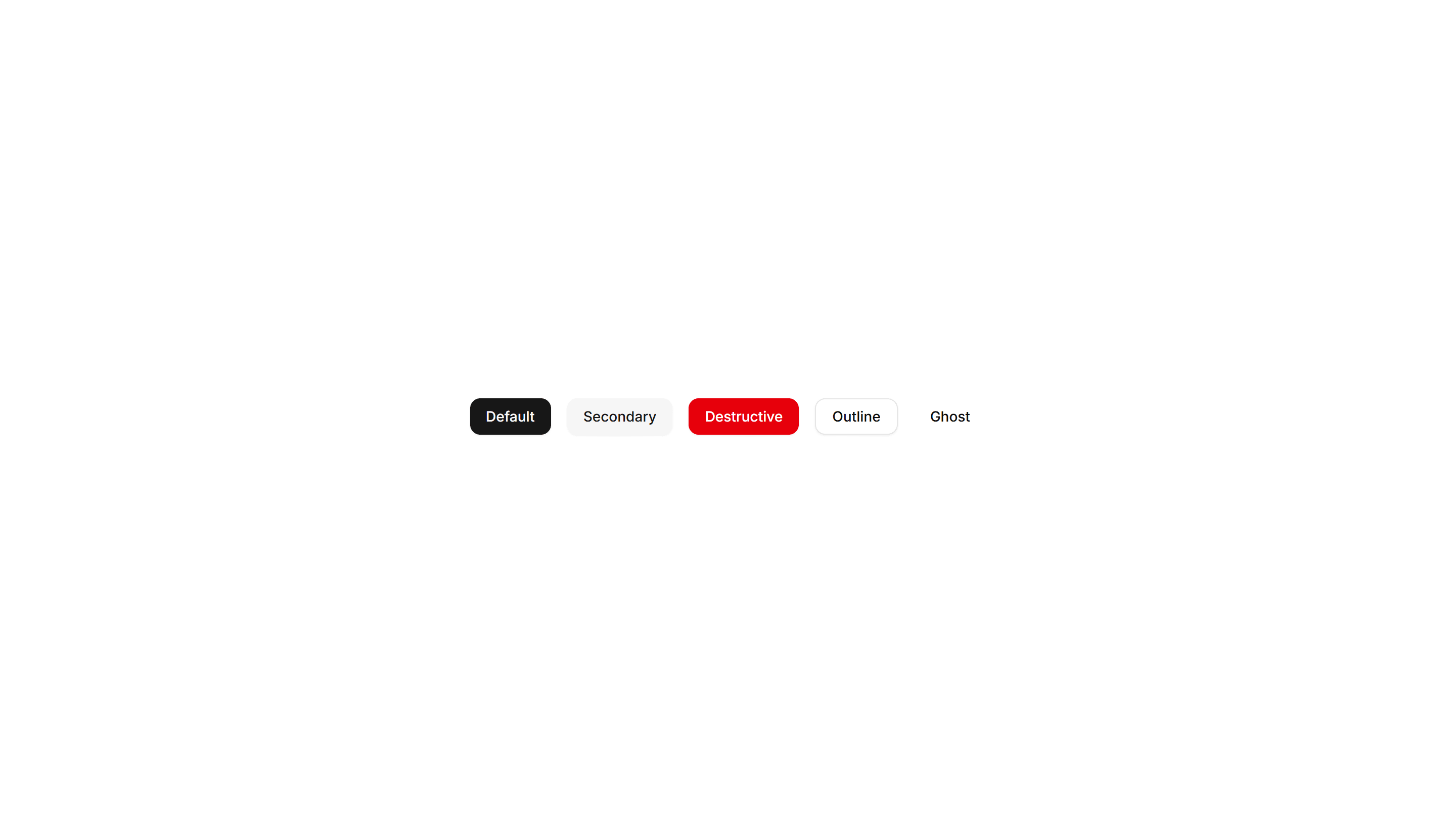
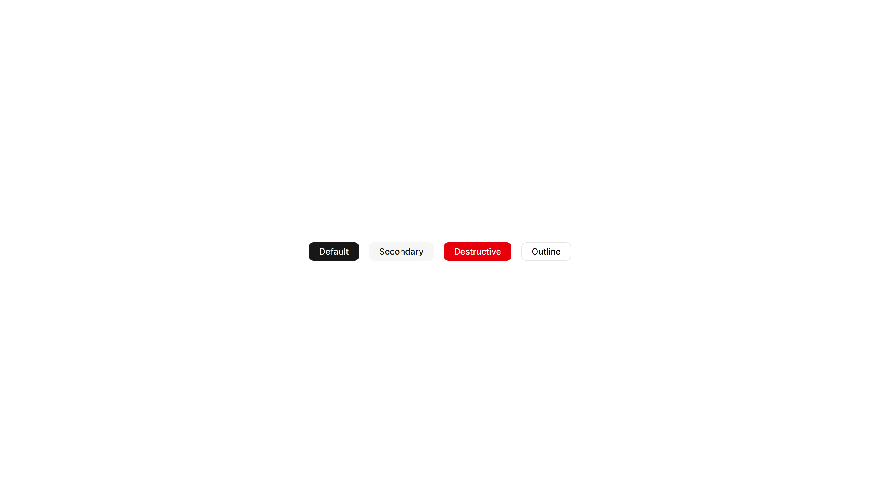
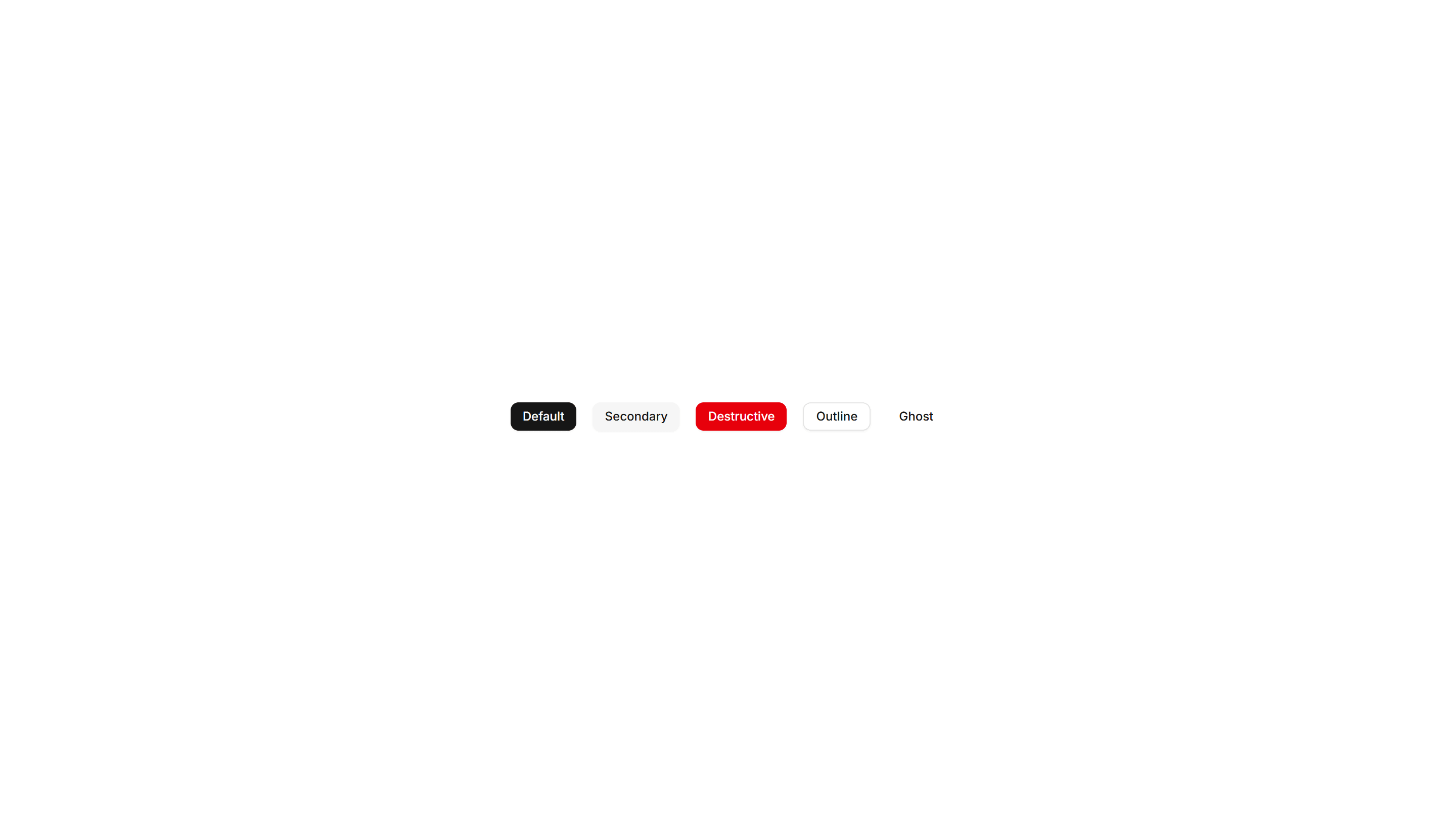
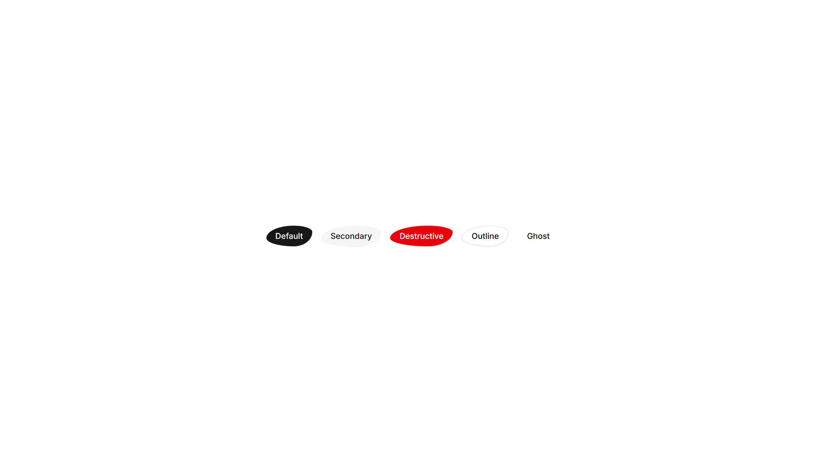
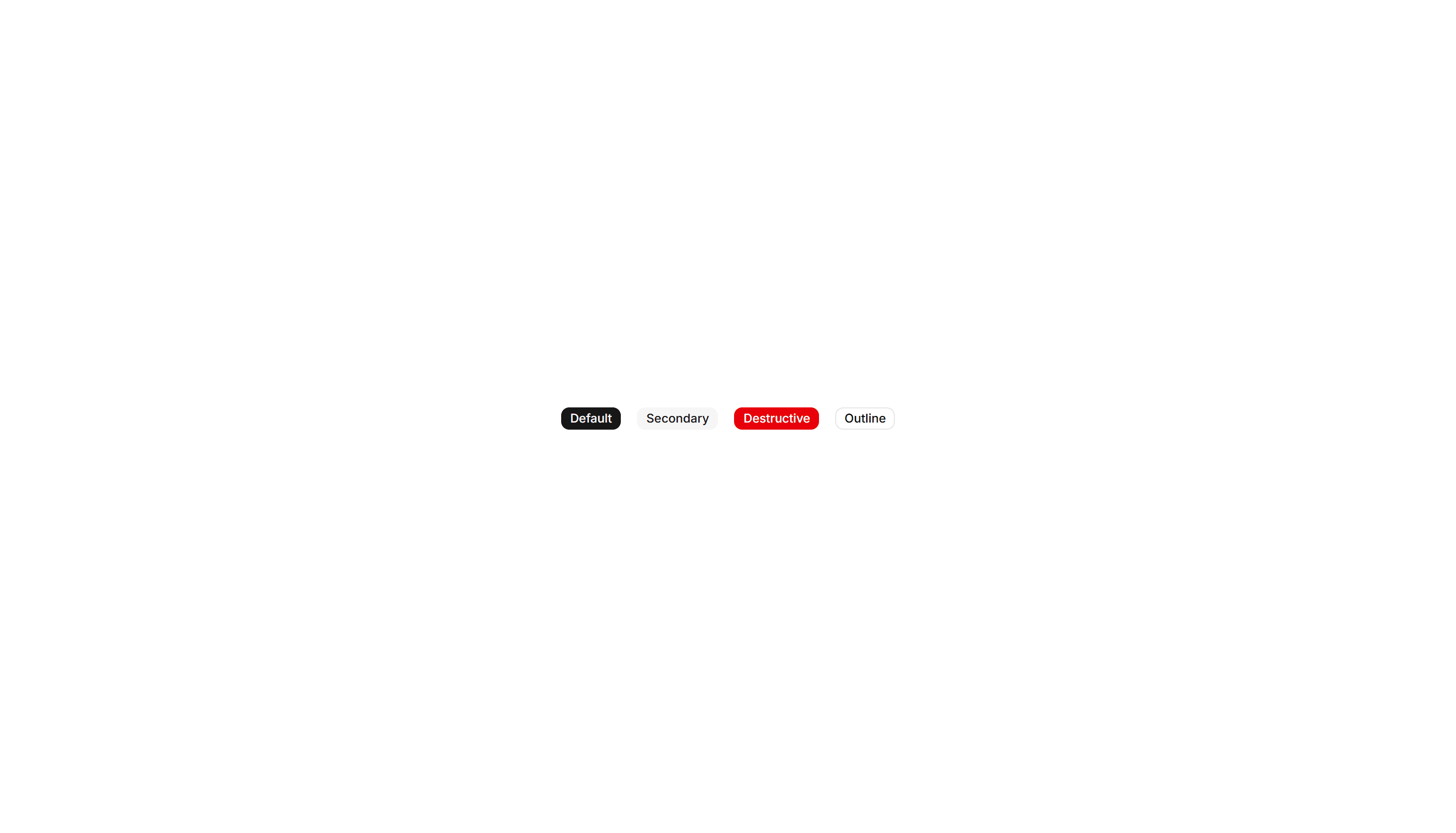
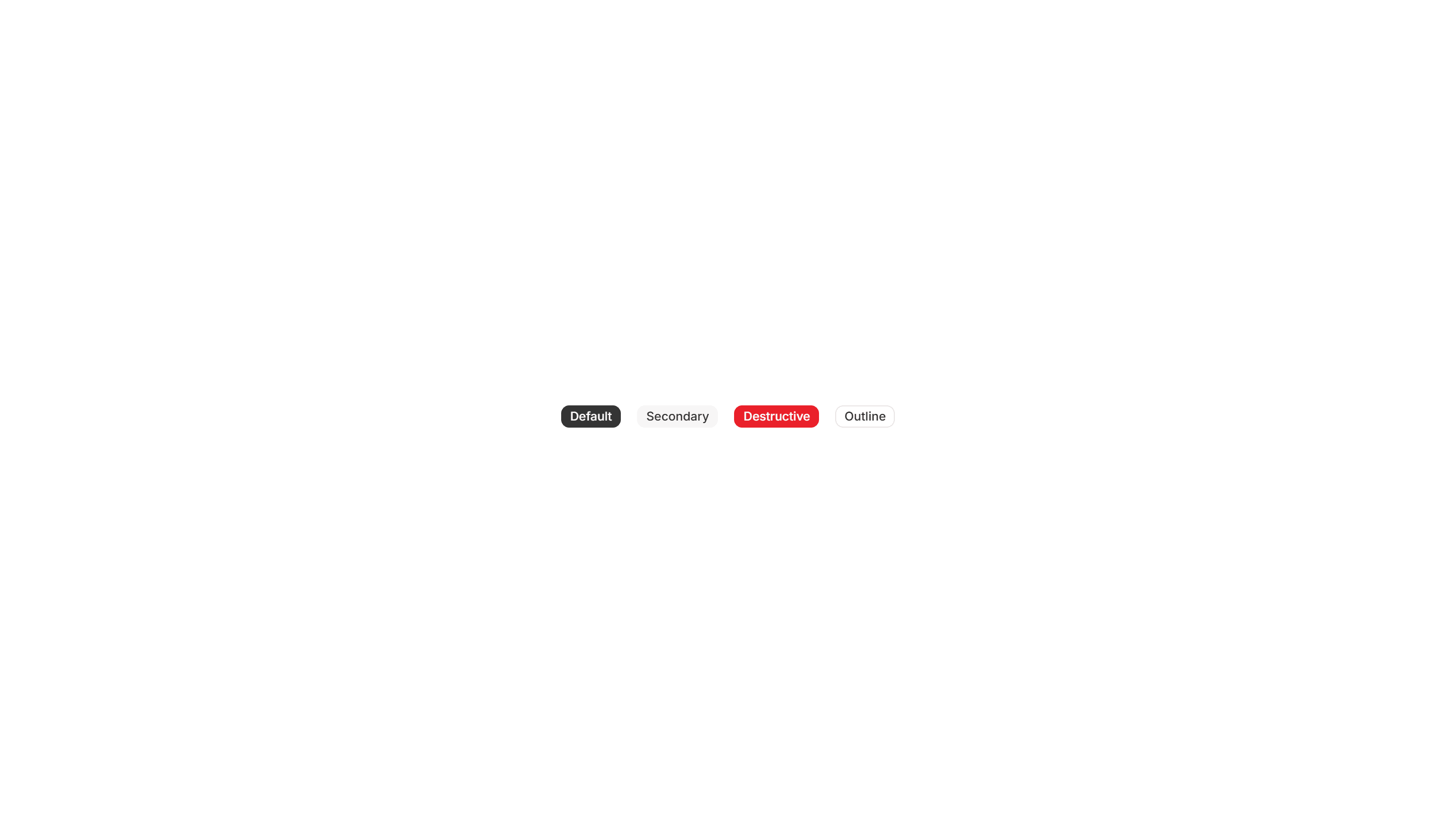
Components Button: Pixel Buttons
Buttons with a blocky pixel art finish and retro styling. Perfect for games, indie projects, and brands that lean on a nostalgic visual theme.
Components Button: Shadow Buttons
Buttons with layered shadows that lift or shift on hover. Give actions a tactile, raised feel across cards, forms, and toolbars in any layout.
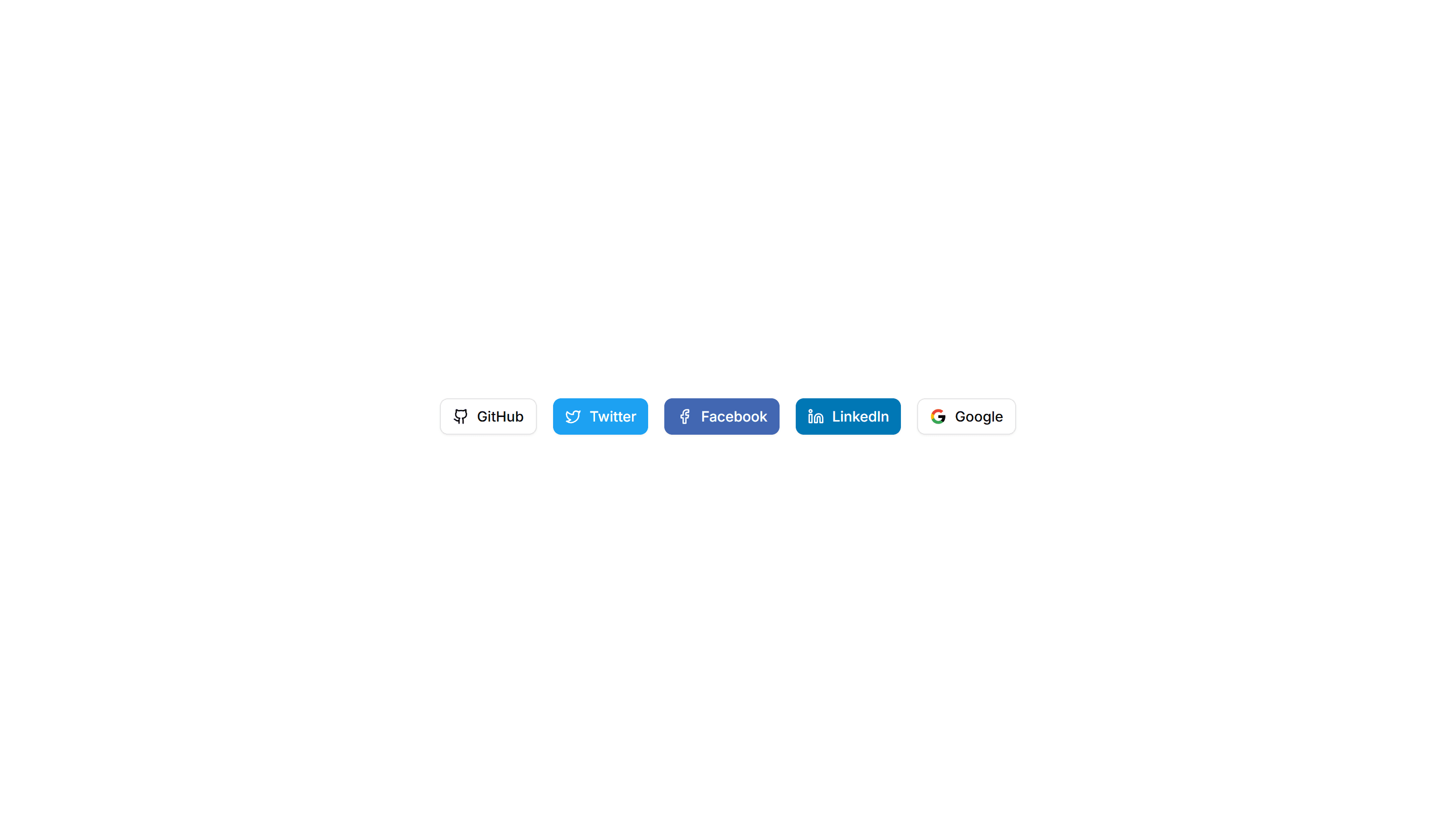
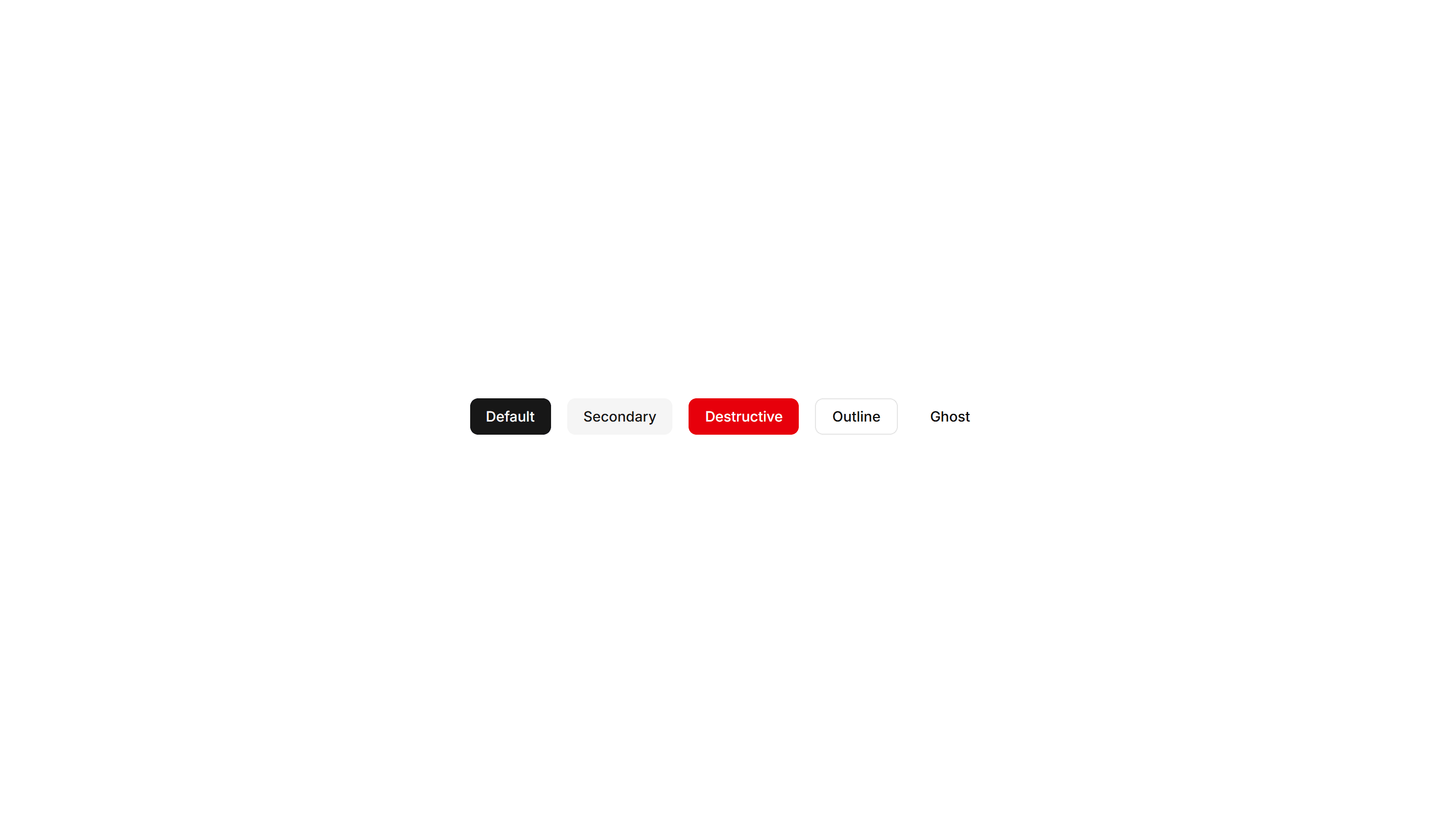
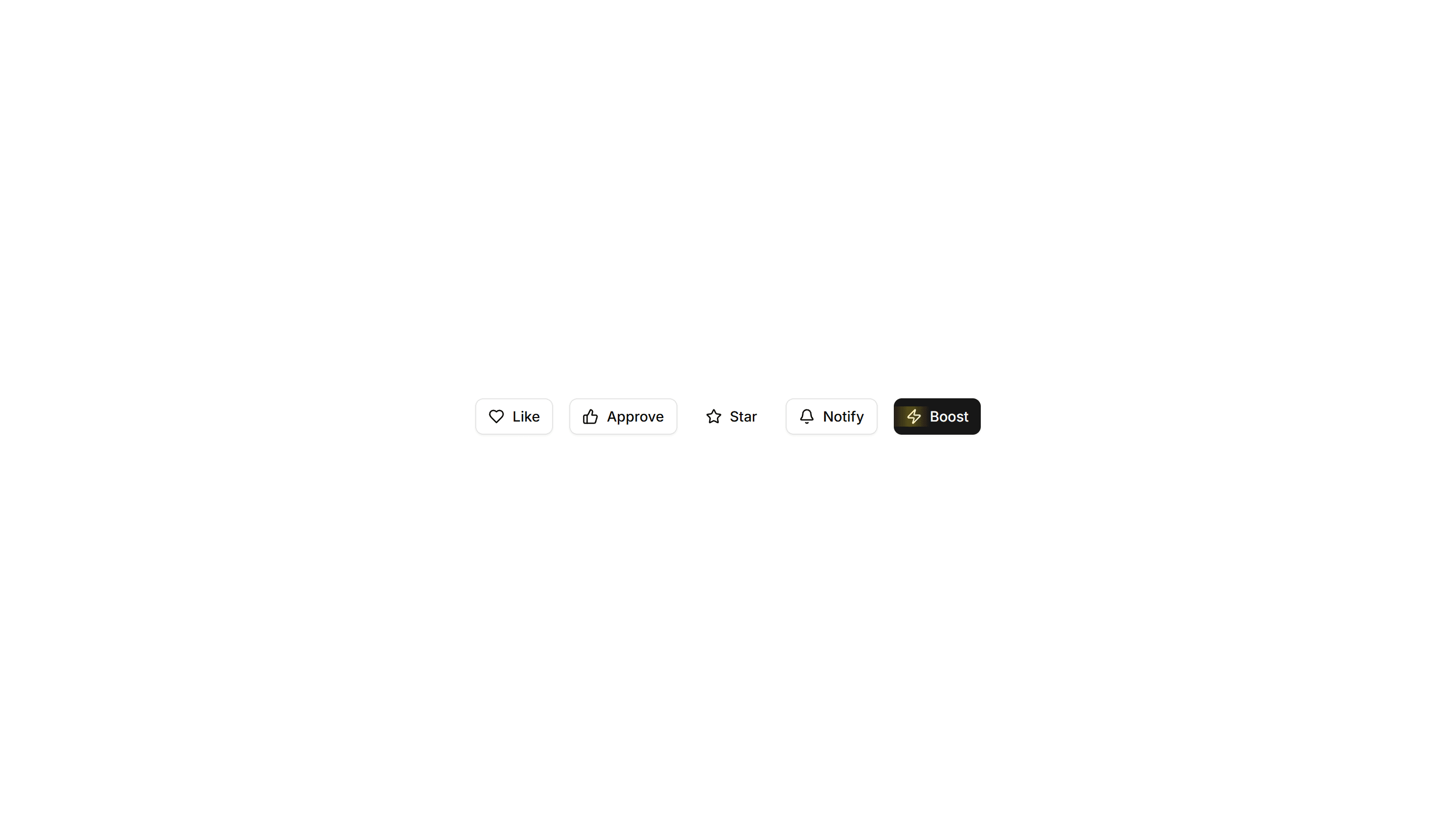
Components Button: Social Buttons
Buttons branded for Google, GitHub, Apple, and more providers. Drop them into sign in and sign up screens for fast one click authentication.
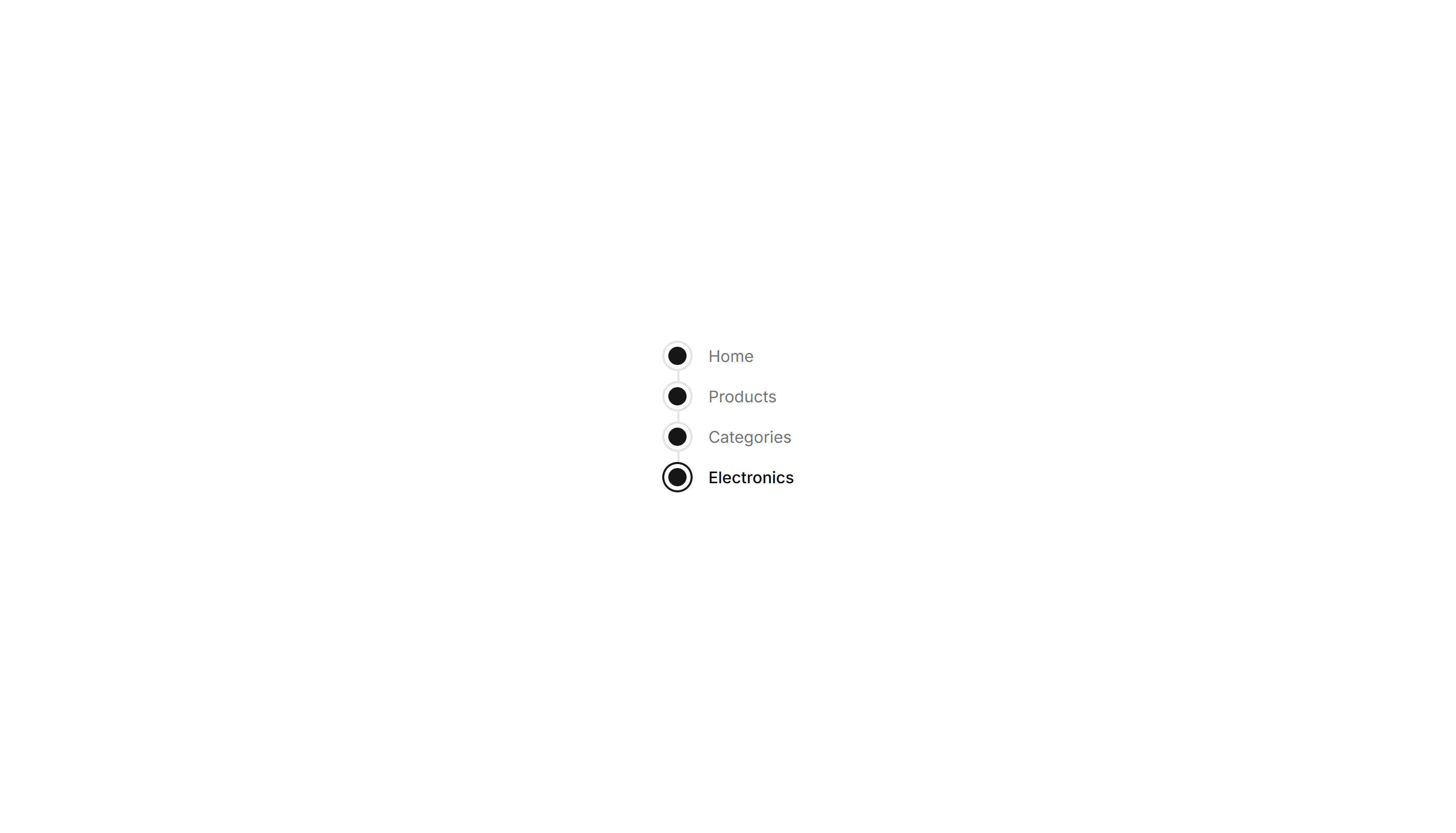
Components Breadcrumb: Timeline Breadcrumb
A breadcrumb laid out as a connected timeline of steps. Maps a journey through stages, ideal for order tracking and live project status views.
Components Button: Extra Large Buttons
Oversized buttons with generous padding and large type. Use them as the main hero call to action where one tap should be impossible to miss.
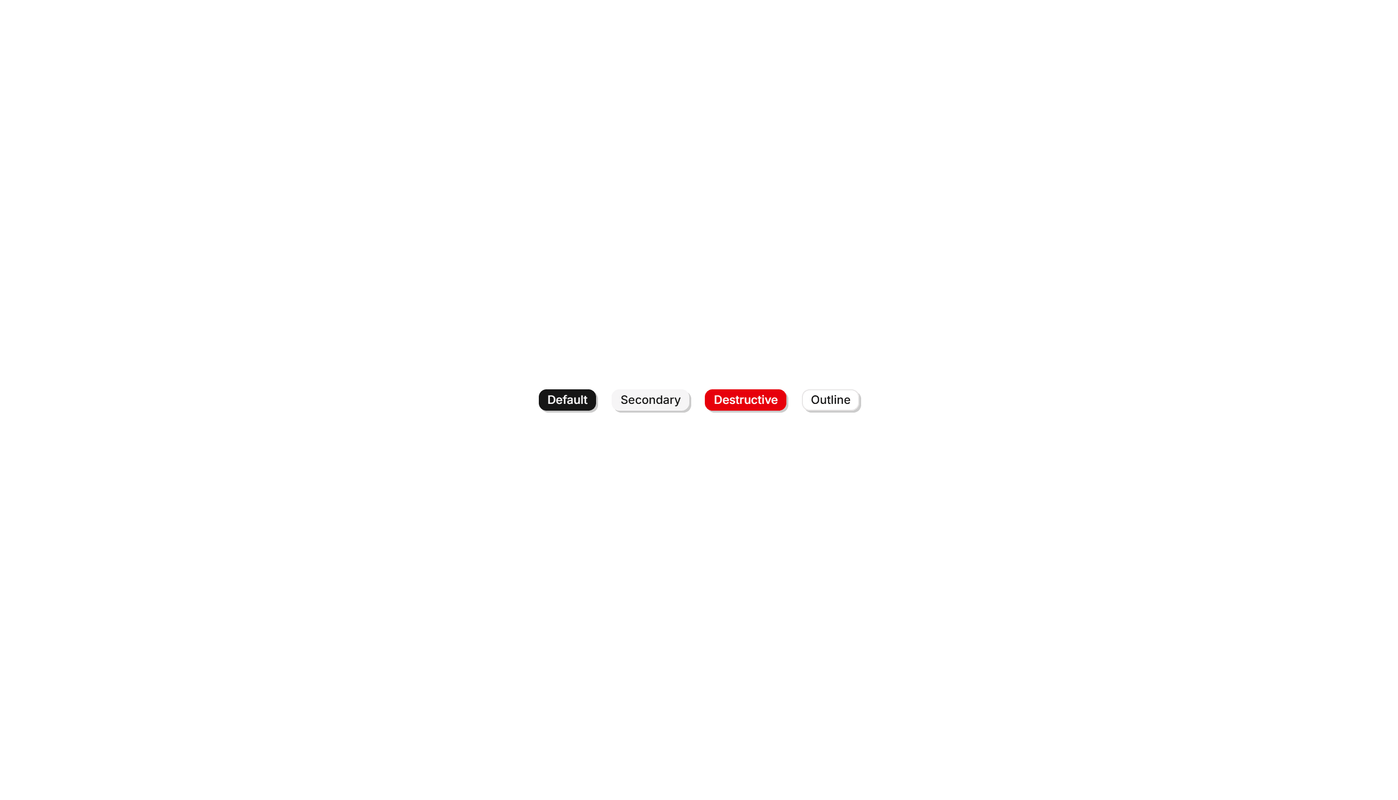
Components Button: Interactive Buttons
Buttons that react to hover and click with motion and state changes. Make signups, downloads, and key actions feel alive and worth clicking.
Components Breadcrumb: Card Breadcrumb
A breadcrumb housed in a rounded card with a subtle shadow. Lifts the navigation path off the page for detail views and account settings screens.

Components Breadcrumb: Icon Breadcrumb
A breadcrumb pairing each link with a leading icon. Helps users scan the path at a glance across sections like home, docs, billing, and settings.
Components Breadcrumb: Progress Breadcrumb
A breadcrumb with a fill that tracks how far a user has moved. Shows completion across multi step forms, checkout, and guided account onboarding.
Components Badge: Gradient Border Badge
A badge wrapped in a colorful gradient outline around plain fill. Use it to mark beta, pro, or featured labels that need a vivid accent edge.
Components Badge: Large Badge
A roomy badge with extra padding and larger text for clear reading. Use it to highlight a plan tier, count, or status across busy interfaces.
Components Badge: Square Badge
A badge with sharp square corners and a compact footprint. Use it for crisp version tags, counts, or labels that suit a structured grid layout.
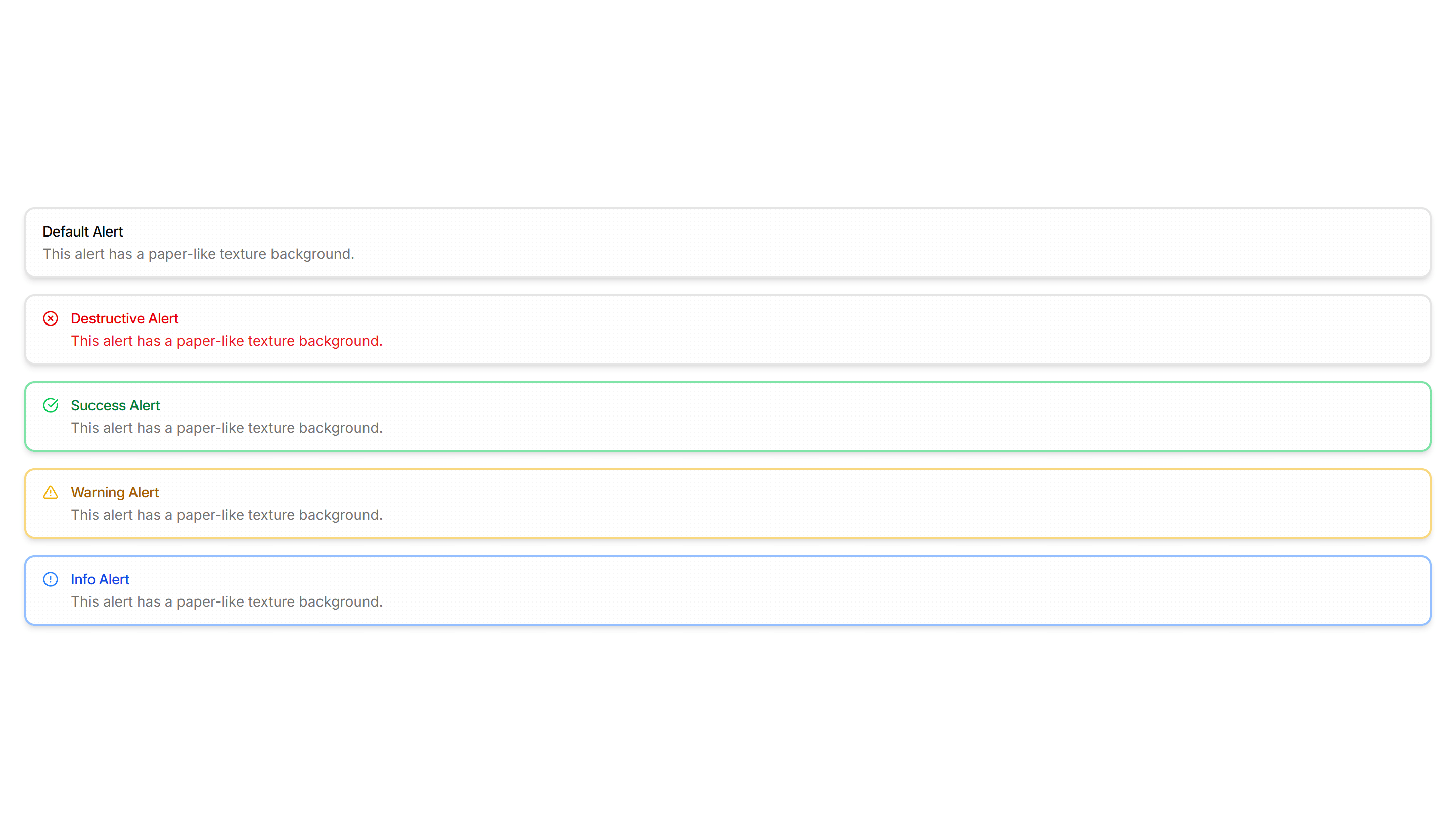
Components Alert: Paper Alerts
Alerts styled like a paper card with subtle texture and soft edges. Use for printed style notices, receipts, or warm document driven layouts.
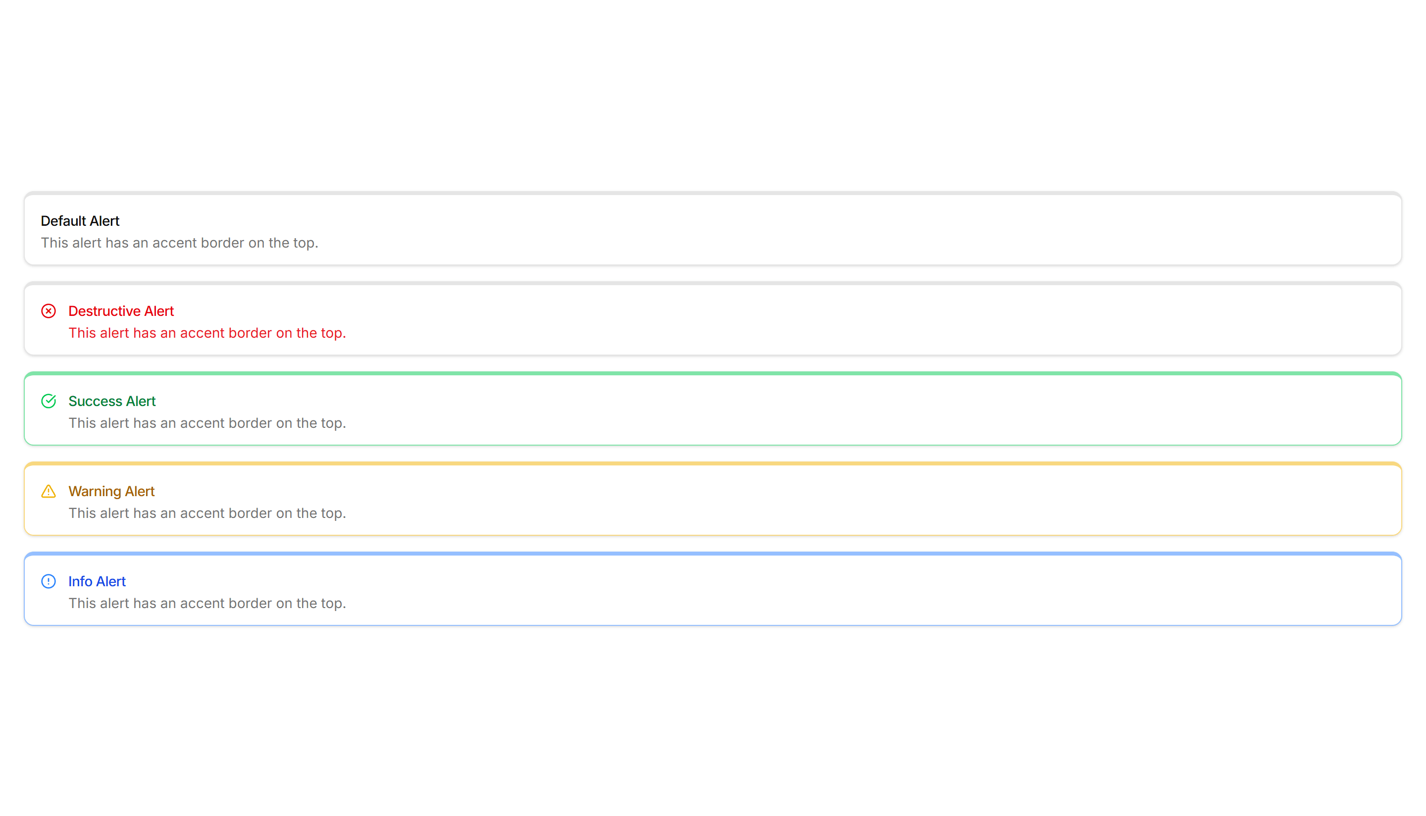
Components Alert: Top Accent Alerts
Alerts topped with a colored bar across the upper edge for a header cue. Use for grouped notices where the accent reads like a small banner.
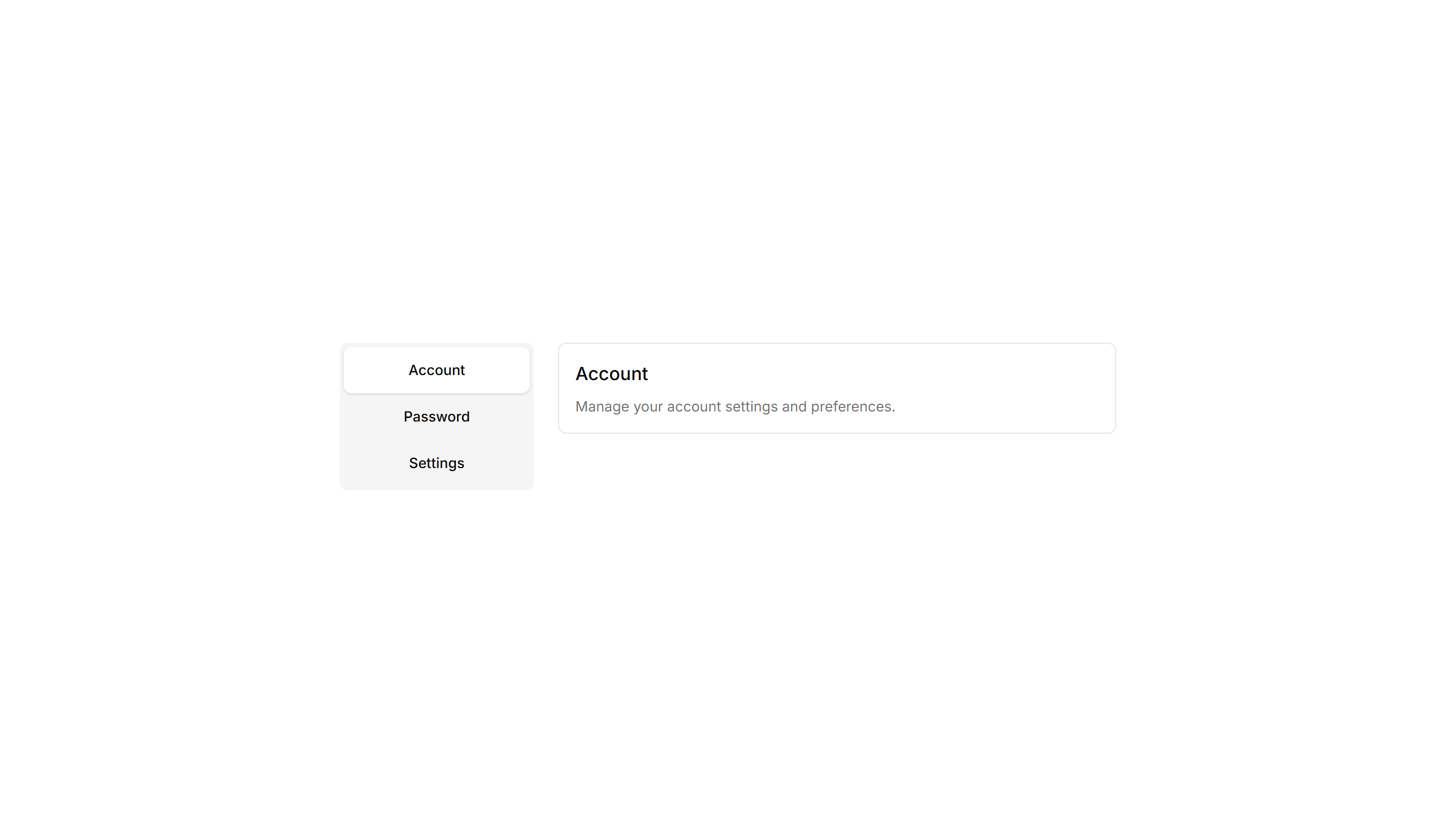
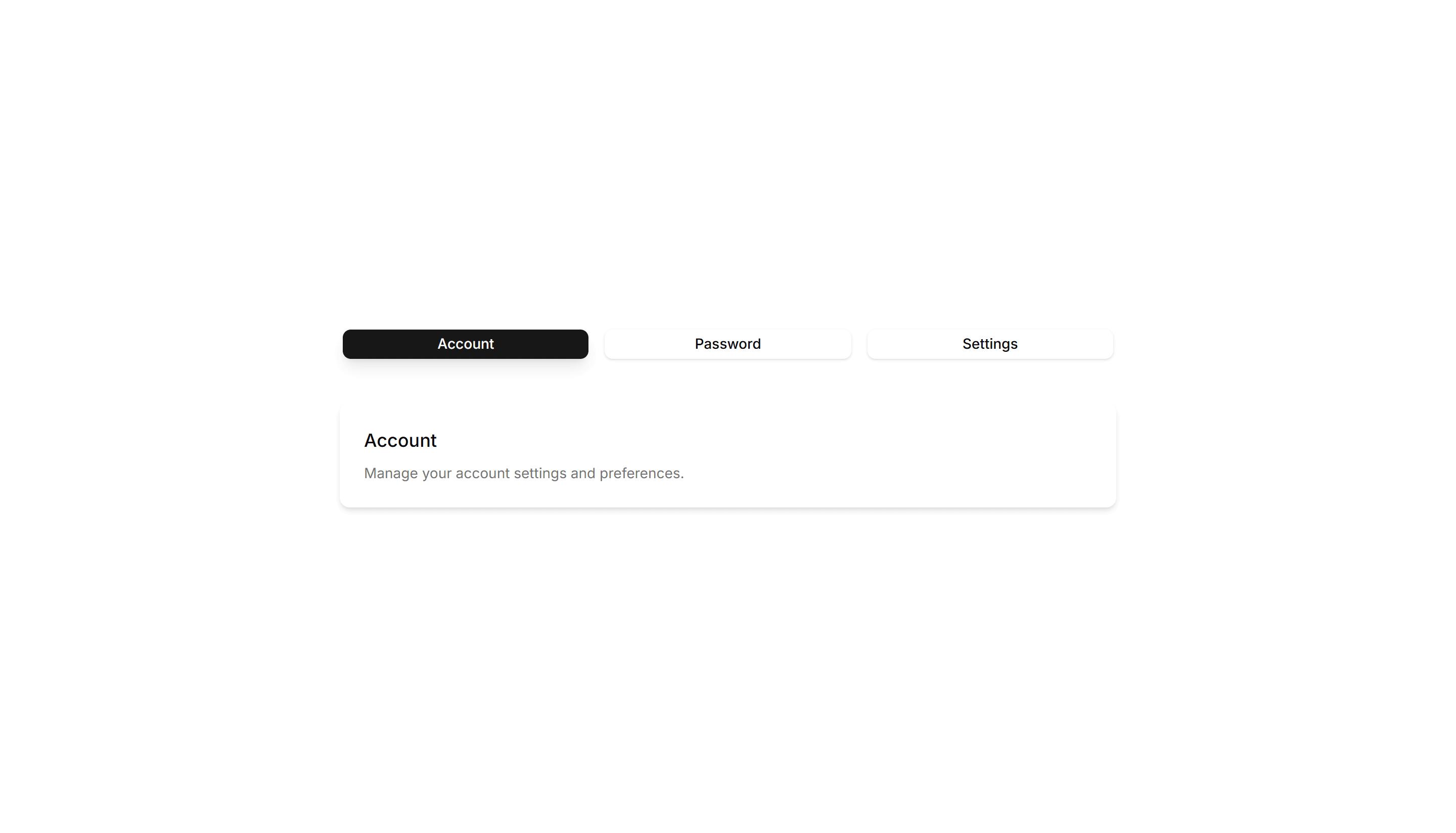
Components Tab: Vertical Tabs
Tabs stacked in a sidebar column with panels rendered to the right. Built for settings, account, and documentation pages with many sections to navigate.
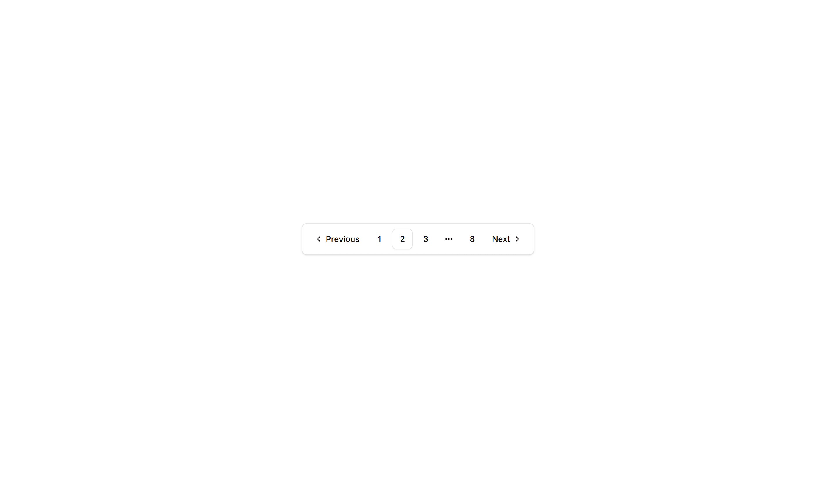
Components Pagination: Rounded Pagination
A pagination row with fully rounded pill buttons for each page. The soft circular shape suits friendly product pages, blogs, and modern marketing layouts.
Components Tab: Card Tabs
Tabs styled as raised cards, where the active panel lifts above the rest. Great for settings pages or dashboards that group related content into sections.
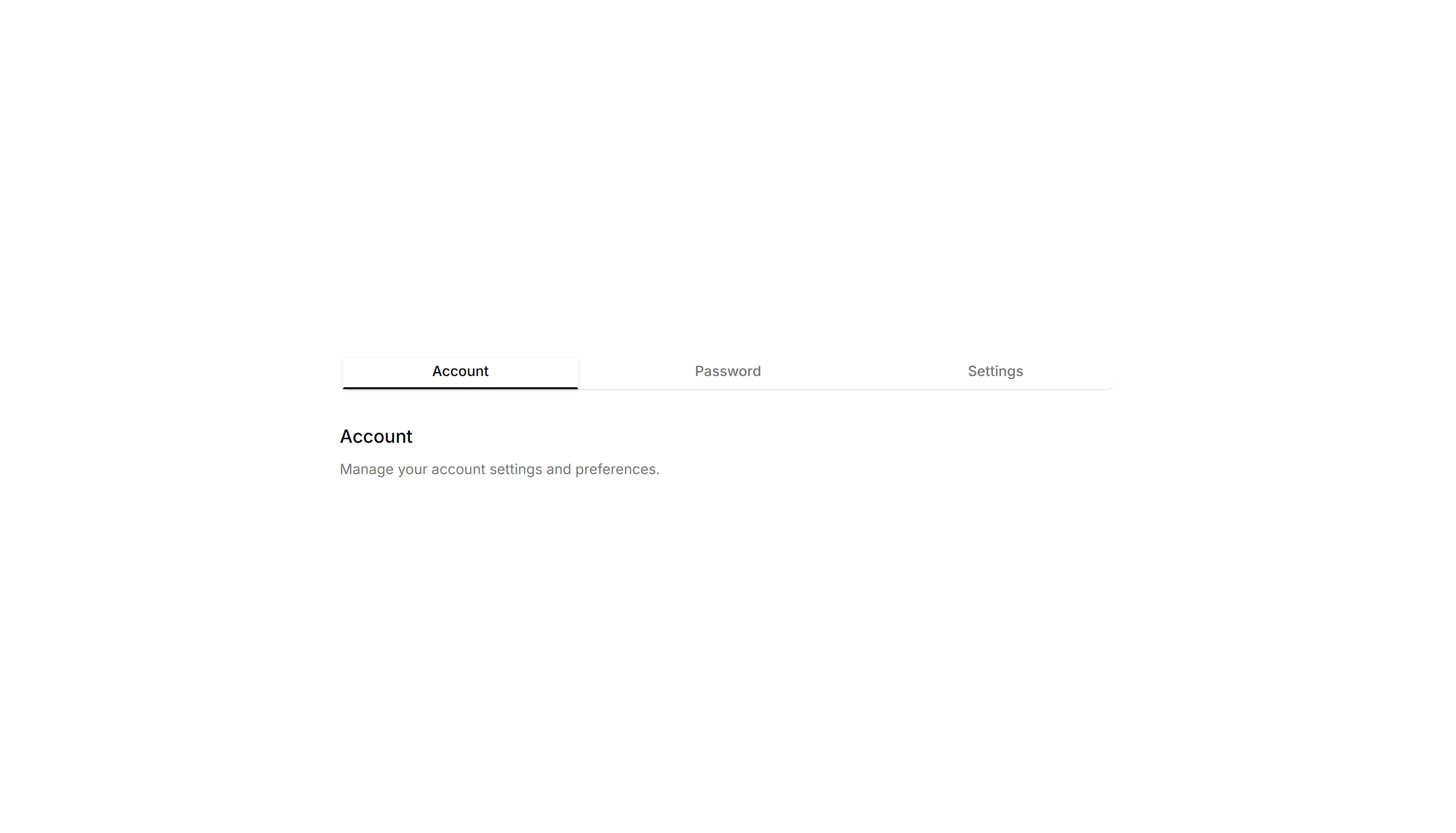
Components Tab: Minimal Tabs
Clean tabs with a thin underline marking the active item and no extra borders. Fits content heavy pages where the switcher should stay quiet and unobtrusive.
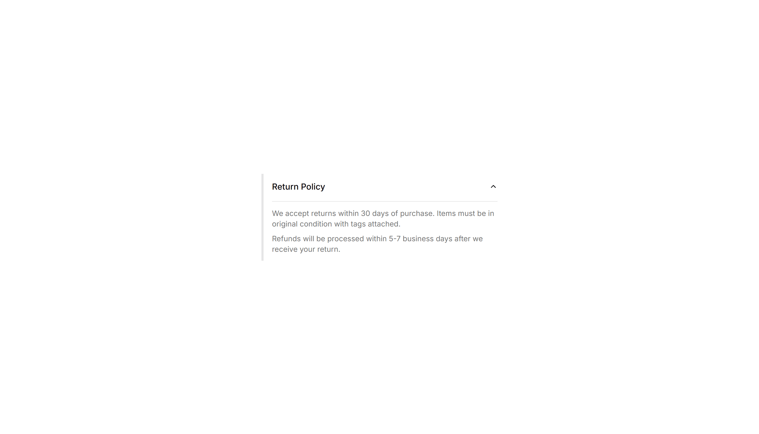
Components Collapsible: Side Bordered Collapsible
A collapsible panel with a colored bar down one side to mark its state. Use it for alerts or notes whose details readers can show or hide on demand.
Components Pagination: Card Pagination
Pagination wrapped in a raised card surface with page numbers and prev next controls. Groups navigation neatly below a list or grid of cards.
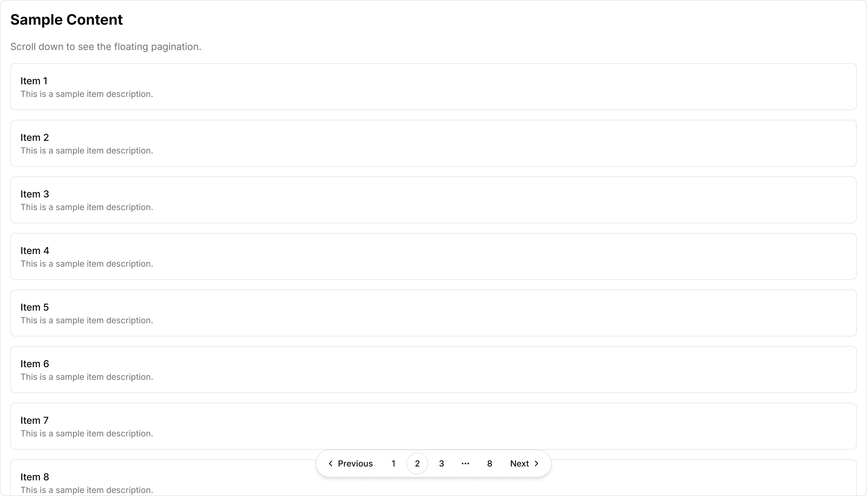
Components Pagination: Floating Pagination
A pagination bar that hovers above the content with soft elevation. Stays visible while readers scroll through long articles, feeds, or paginated galleries.
Components Card: Shimmer Effect Card
A card with a light sweep that glides across its surface. Use it as a loading skeleton or to add gentle motion to a featured tile in a busy grid.

Components Card: Tilt Effect Card
A card that tilts under the cursor to follow its position closely. Use it for interactive feature tiles or showcases where slight motion adds polish.

Components Collapsible: Icon Collapsible
A collapsible row with a chevron icon that rotates as the panel opens and closes. Use it in menus where a clear visual cue tells readers it expands.

Components Card: Hover Effect Card
A card that lifts, scales, or shades when the pointer moves over it. Use it for clickable tiles in a gallery, menu, or dashboard to signal they react.

Components Card: Magnetic Card
A card that drifts toward the cursor as it nears, with a subtle pull. Use it for playful landing pages or feature tiles that reward a hovering pointer.
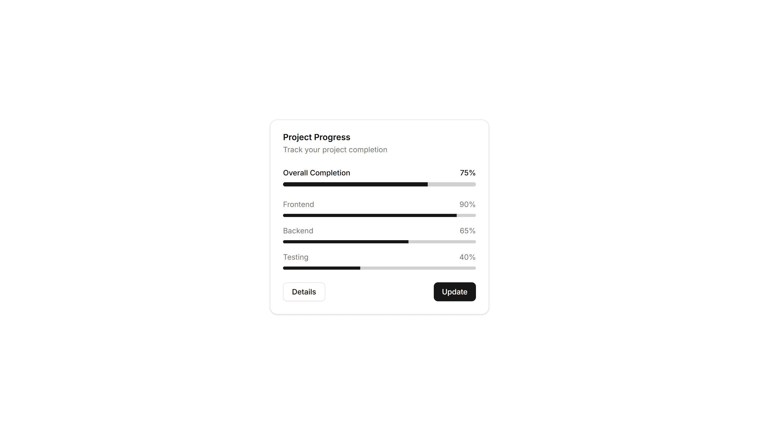
Components Card: Progress Card
A card pairing a progress bar with a label and value reading. Use it to show task completion, goals, or usage limits inside a dashboard or account view.

Components Card: Border Gradient Animation Card
A card framed by a shifting gradient border that flows around the edges. Use it to highlight a premium tier or hero item in a grid of options.

Components Card: Cutout Border Card
A card with a notched border that carves out shape along its edge. Use it for tickets, coupons, or passes where a distinct outline reads as a stub.

Components Button: Underline Buttons
Buttons styled with an animated underline that grows in on hover. A clean, minimal accent for text links and quiet secondary actions in any UI.
Components Button: Pulse Buttons
Buttons with a soft pulsing glow that draws the eye over time. Highlight a single primary action like start trial or buy now on a busy page.

Components Button: Skew Buttons
Buttons with a skewed, slanted shape for a sense of dynamic energy. Suits sports, fitness, and bold marketing pages that want forward momentum.

Components Button: Squeeze Buttons
Buttons that squeeze inward on press for satisfying tactile feedback. Use on mobile flows and forms where every tap should feel confirmed fast.

Components Button: Border Animation Buttons
Buttons with borders that animate and trace around the edge on hover. Draw attention to a primary action without changing the button fill at rest.
Components Button: Extra Small Buttons
Compact, low height buttons with tight padding and small type. Ideal for dense toolbars, table rows, and inline controls where space is limited.
Components Button: Liquid Buttons
Buttons with a flowing liquid fill that sweeps across the surface on hover. A playful accent for landing pages and creative product sites today.

Components Breadcrumb: Compact Breadcrumb
A tight breadcrumb with reduced spacing between its links. Fits crowded toolbars and mobile headers where horizontal room is in short supply.

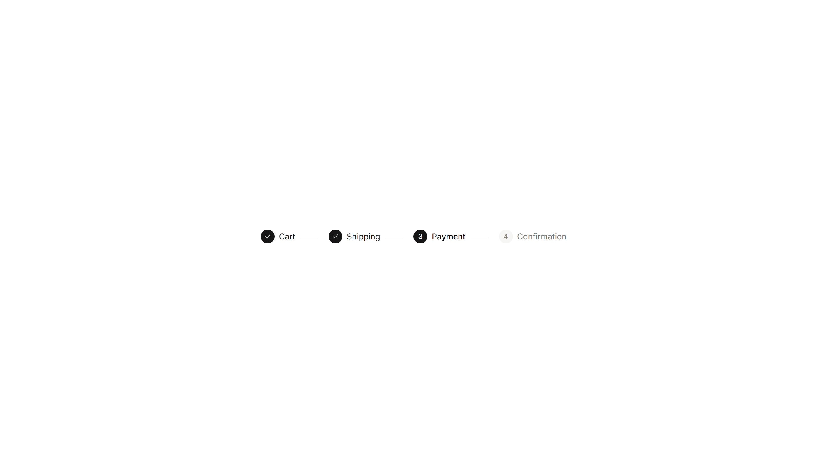
Components Breadcrumb: Numbered Breadcrumb
A breadcrumb that numbers each step in the path. Clarifies order for sequential flows such as checkout, onboarding, or a multi step setup wizard.

Components Breadcrumb: Slash Breadcrumb
A breadcrumb that divides its links with a forward slash. Mirrors a file path style for code tools, documentation, and folder browsing screens.
Components Badge: Hover Scale Badge
A badge that grows slightly when the pointer rests on it. Use it for interactive tags or filters where a touch of feedback invites a quick click.
Components Badge: Pulse Badge
A badge with a soft pulsing ring that radiates outward on a loop. Use it to signal live activity, unread items, or a recording session in progress.
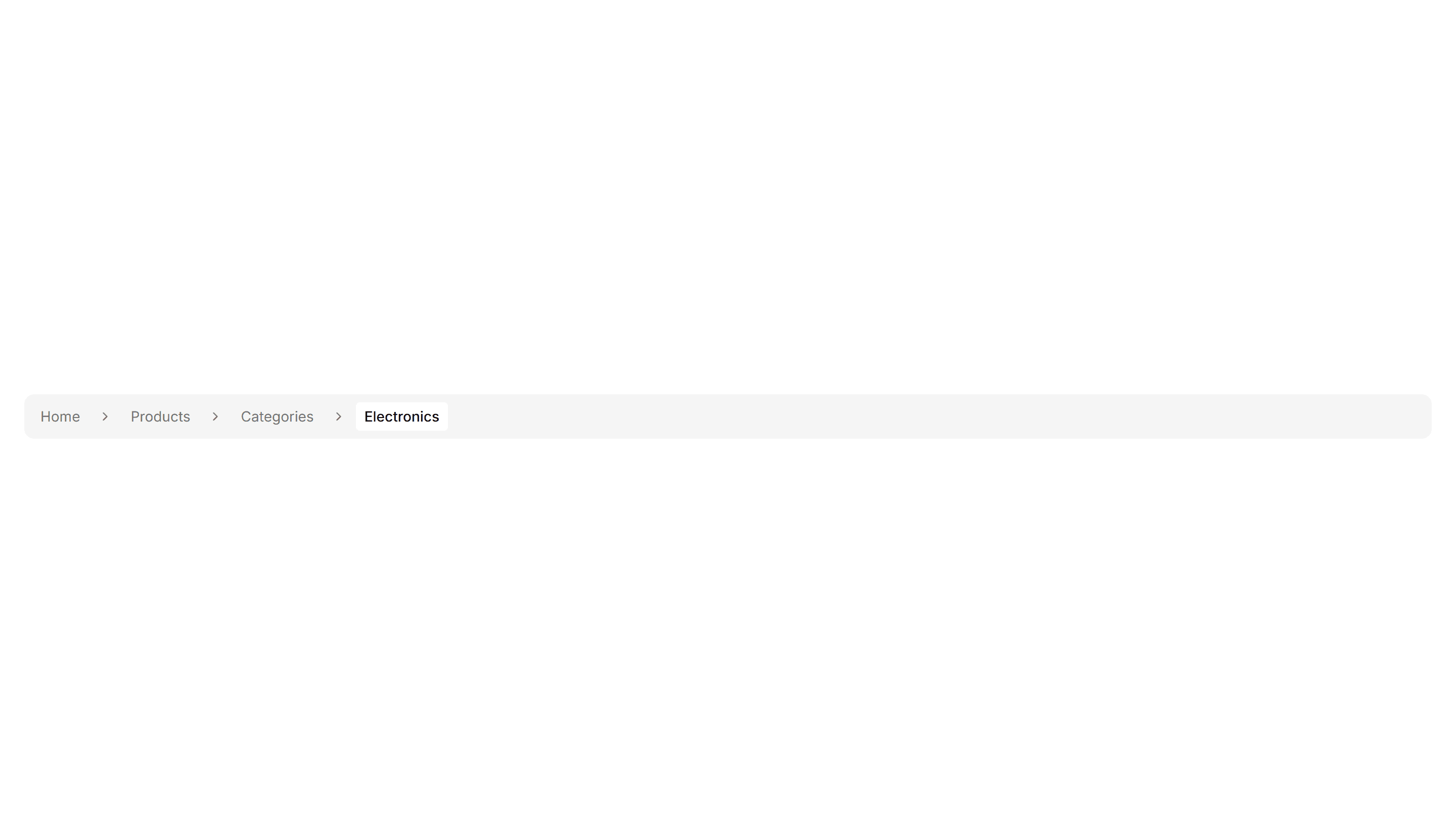
Components Breadcrumb: Background Breadcrumb
A breadcrumb trail wrapped in a soft tinted background bar. Anchors the top of a page and keeps navigation links readable above busy content.
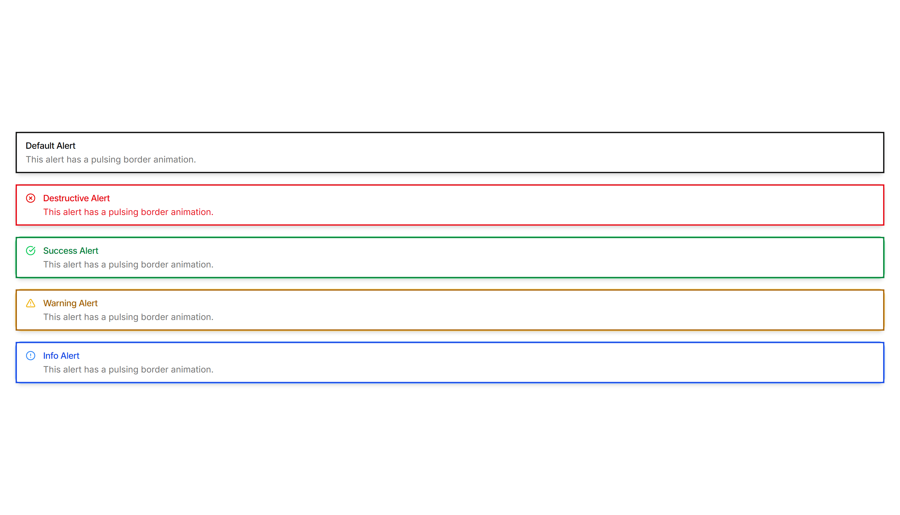
Components Alert: Pulse Border Alerts
Alerts with a border that gently pulses to catch attention over time. Use for live updates, countdowns, or urgent notices that should not be missed.
Components Badge: 3D Badge
A badge with layered shadows and depth that lifts off the surface. Use it to spotlight a featured tag or premium label that needs to stand out.