Shadcn Alert Blocks
Browse 20 alert blocks for shadcn/ui. Border accents, dismissible banners, icons, and styled variants to flag status, errors, warnings, and tips.
Components Alert: Outlined Alerts
Alerts defined only by a clean border with no fill behind the text. Use on colored or busy backgrounds where a solid panel would feel heavy.
Components Alert: Right Accent Alerts
Alerts with a colored bar on the right edge for a mirrored accent. Use in right aligned layouts or when the left side already holds an icon.
Components Alert: Dotted Border Alerts
Alerts wrapped in a dotted border for a soft, playful outline. Use for casual reminders, tips, or low priority notes in friendly interfaces.
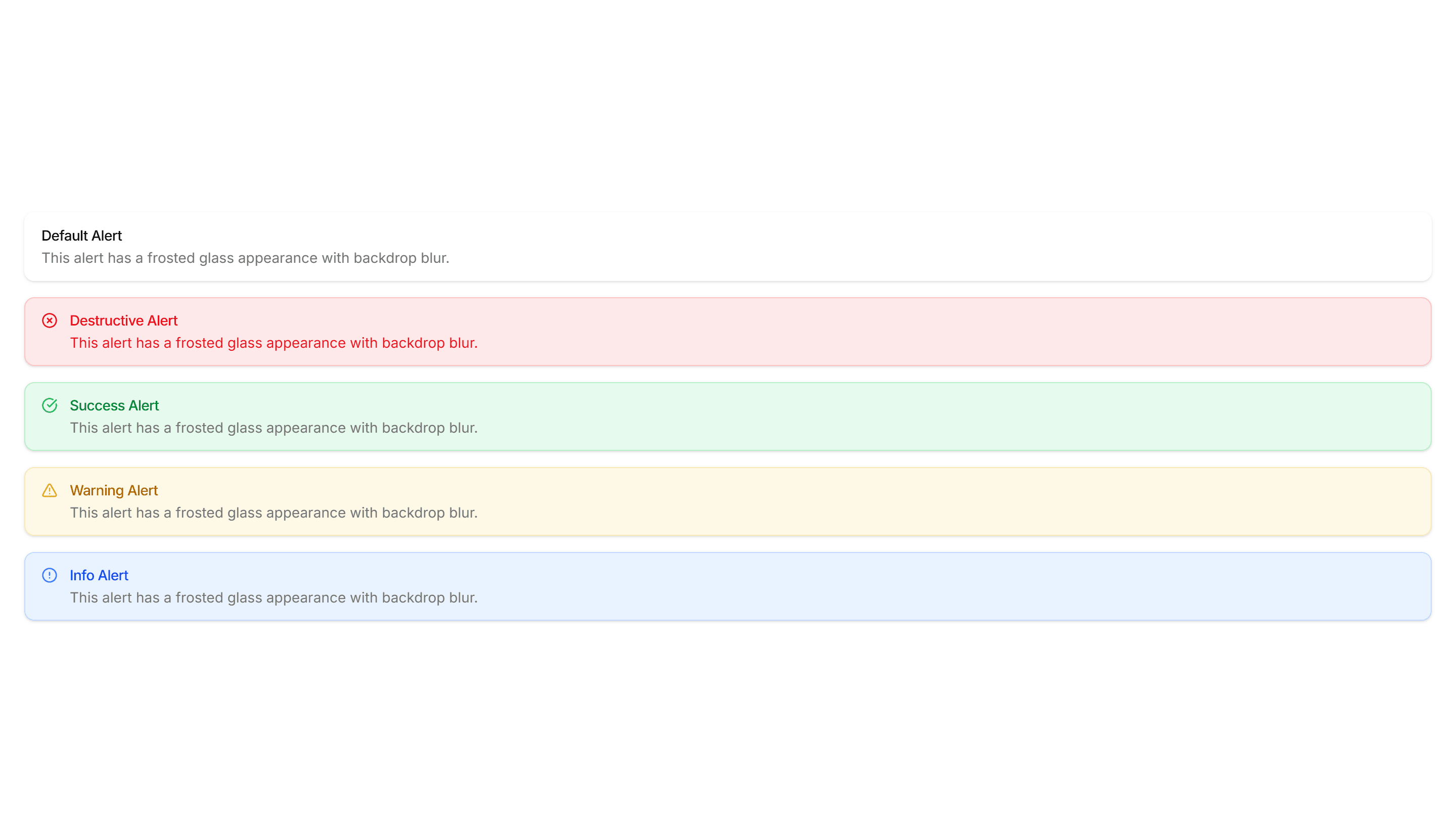
Components Alert: Frosted Glass Alerts
Alerts with a blurred, translucent backdrop that reveals content behind. Use over images or hero sections where a glassy notice fits the design.
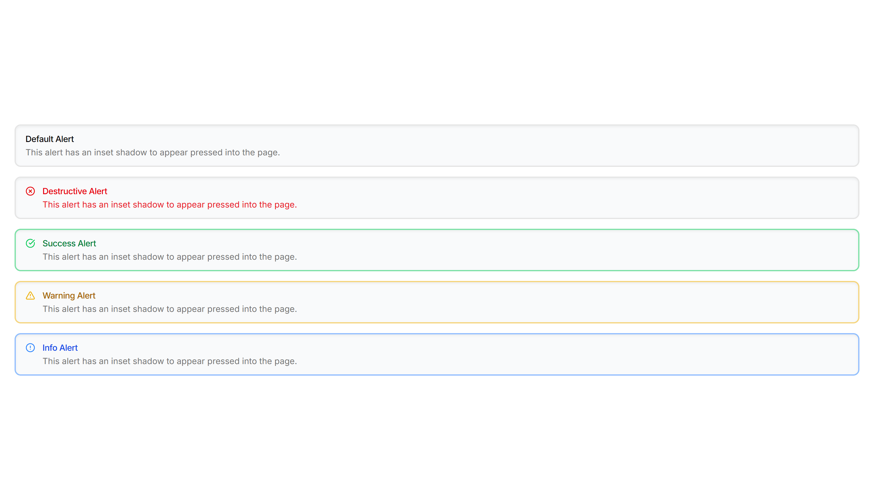
Components Alert: Inset Alerts
Alerts with an inset shadow that sinks slightly into the surface. Use for grouped notices inside cards or panels that feel part of the layout.
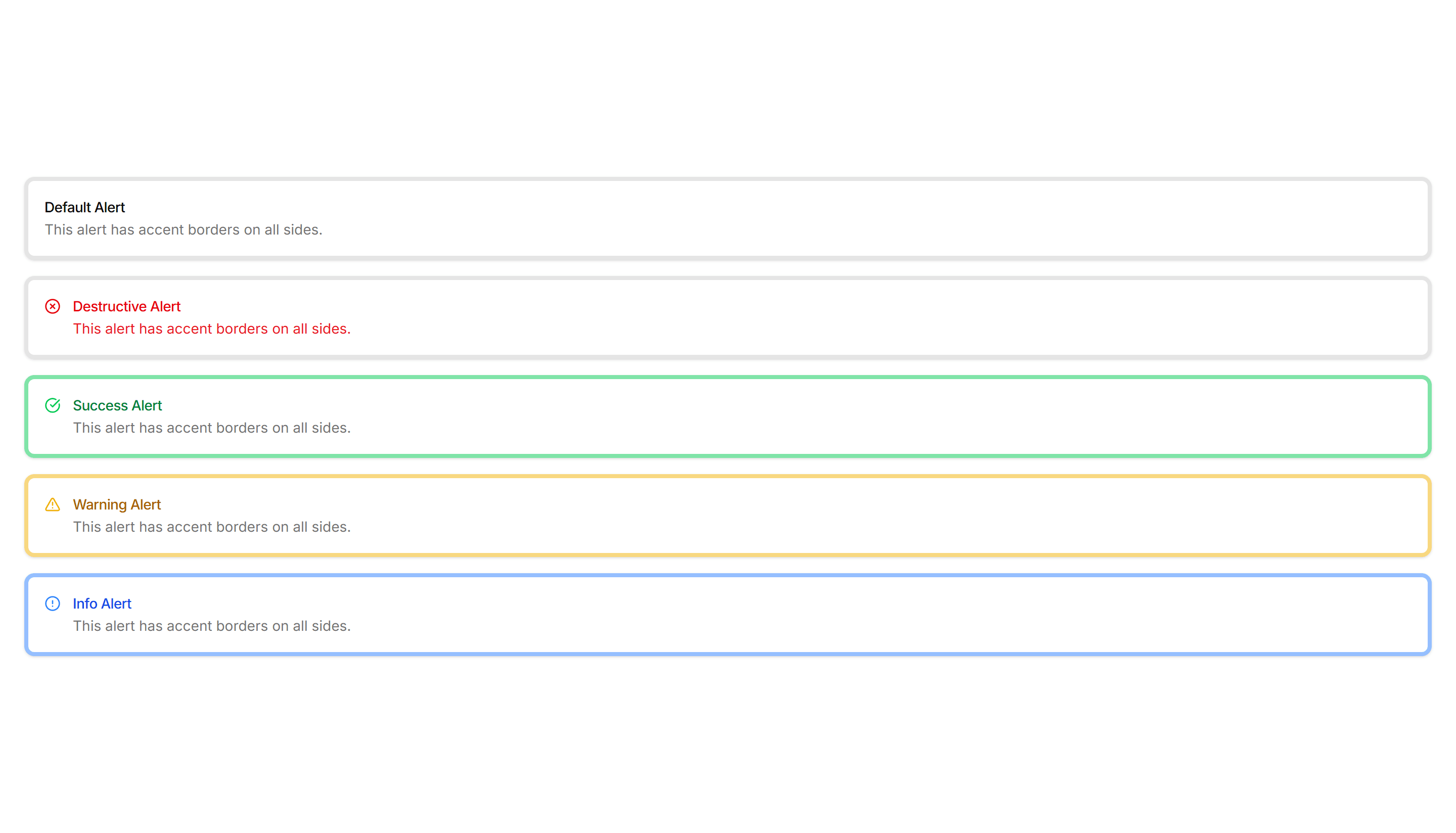
Components Alert: All Sides Accent Alerts
Alerts framed by a colored border on every side for strong emphasis. Use when a notice must stand out clearly against a busy page or dashboard.
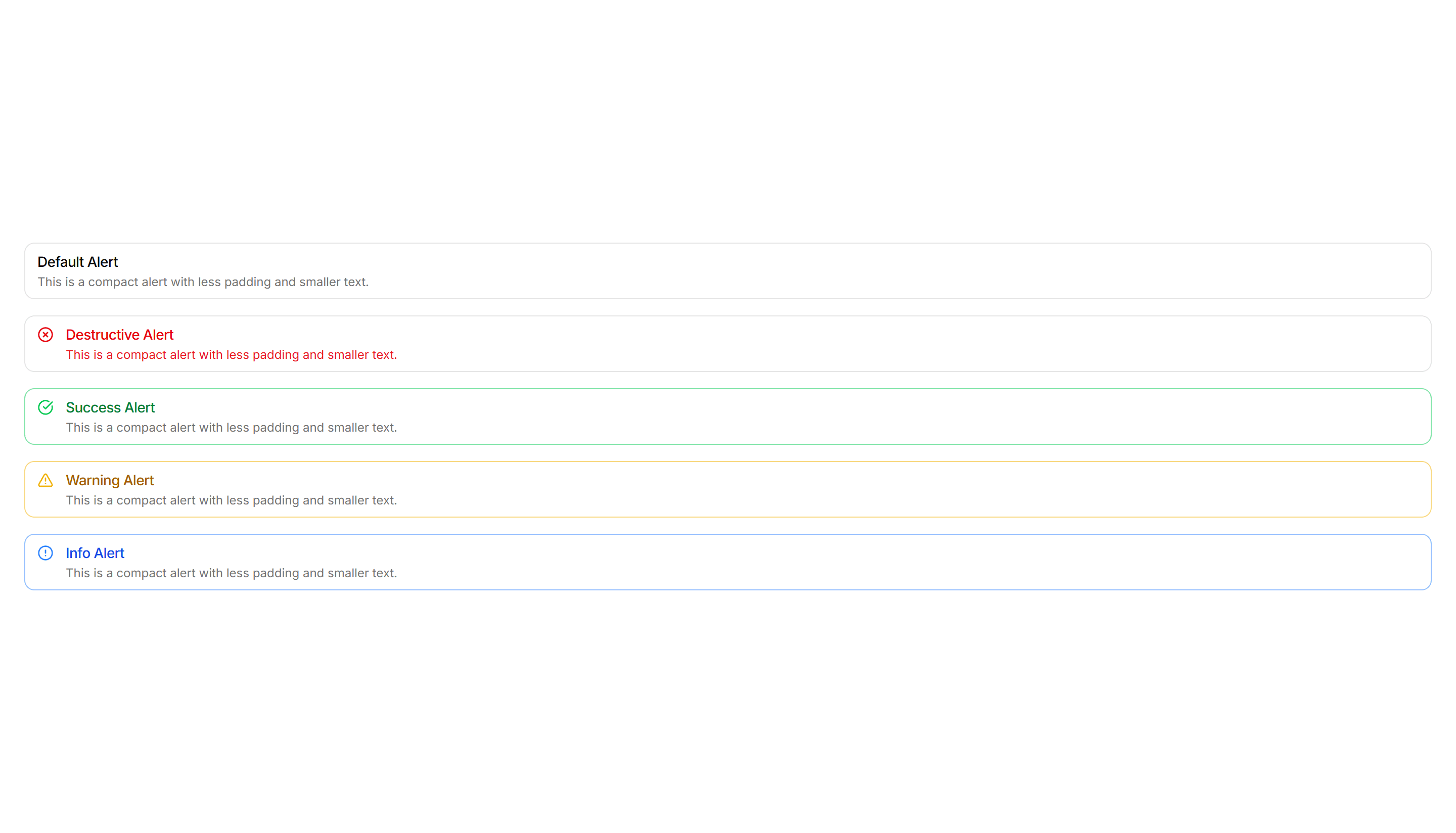
Components Alert: Compact Alerts
Slim alerts with tight padding and a single line of text inside. Use in dense layouts, tables, or sidebars where vertical space stays limited.
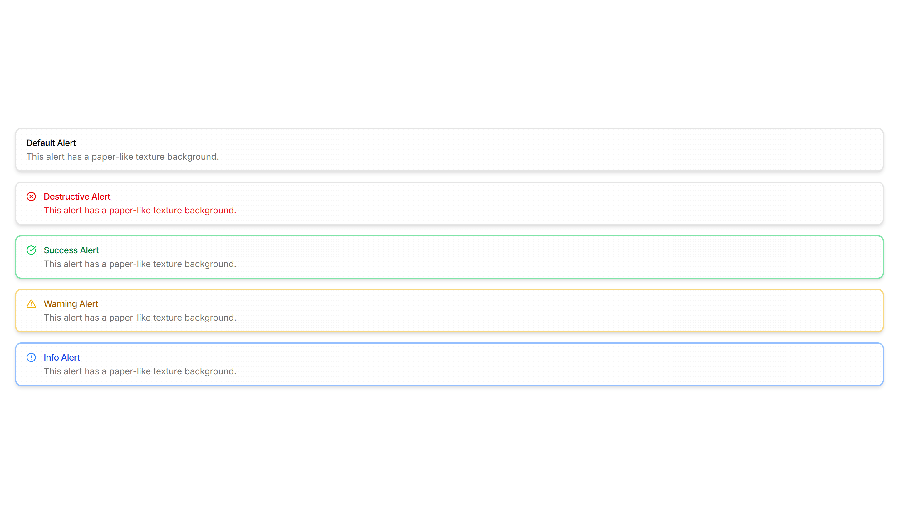
Components Alert: Paper Alerts
Alerts styled like a paper card with subtle texture and soft edges. Use for printed style notices, receipts, or warm document driven layouts.
Components Alert: Top Accent Alerts
Alerts topped with a colored bar across the upper edge for a header cue. Use for grouped notices where the accent reads like a small banner.

Components Alert: Double Border Alerts
Alerts with a layered double border for a refined, framed look. Use to highlight important notices that deserve extra visual weight on a page.

Components Alert: Glow Border Alerts
Alerts ringed by a soft glowing border that draws the eye gently. Use for promotions or new feature notices that need a warm, inviting accent.
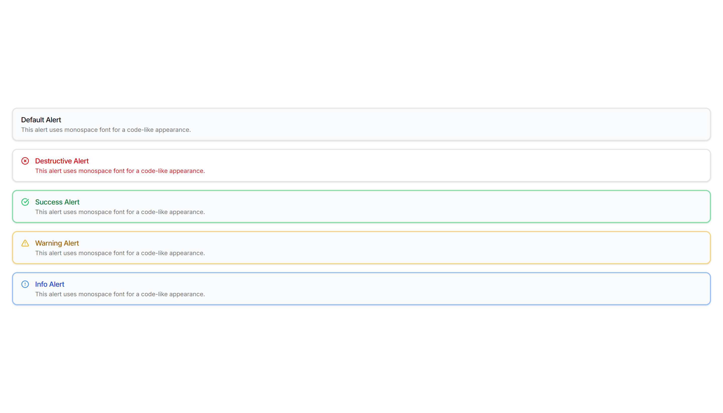
Components Alert: Monospace Alerts
Alerts set in a monospace typeface for a technical, code style tone. Use for build output, terminal messages, or warnings aimed at developers.
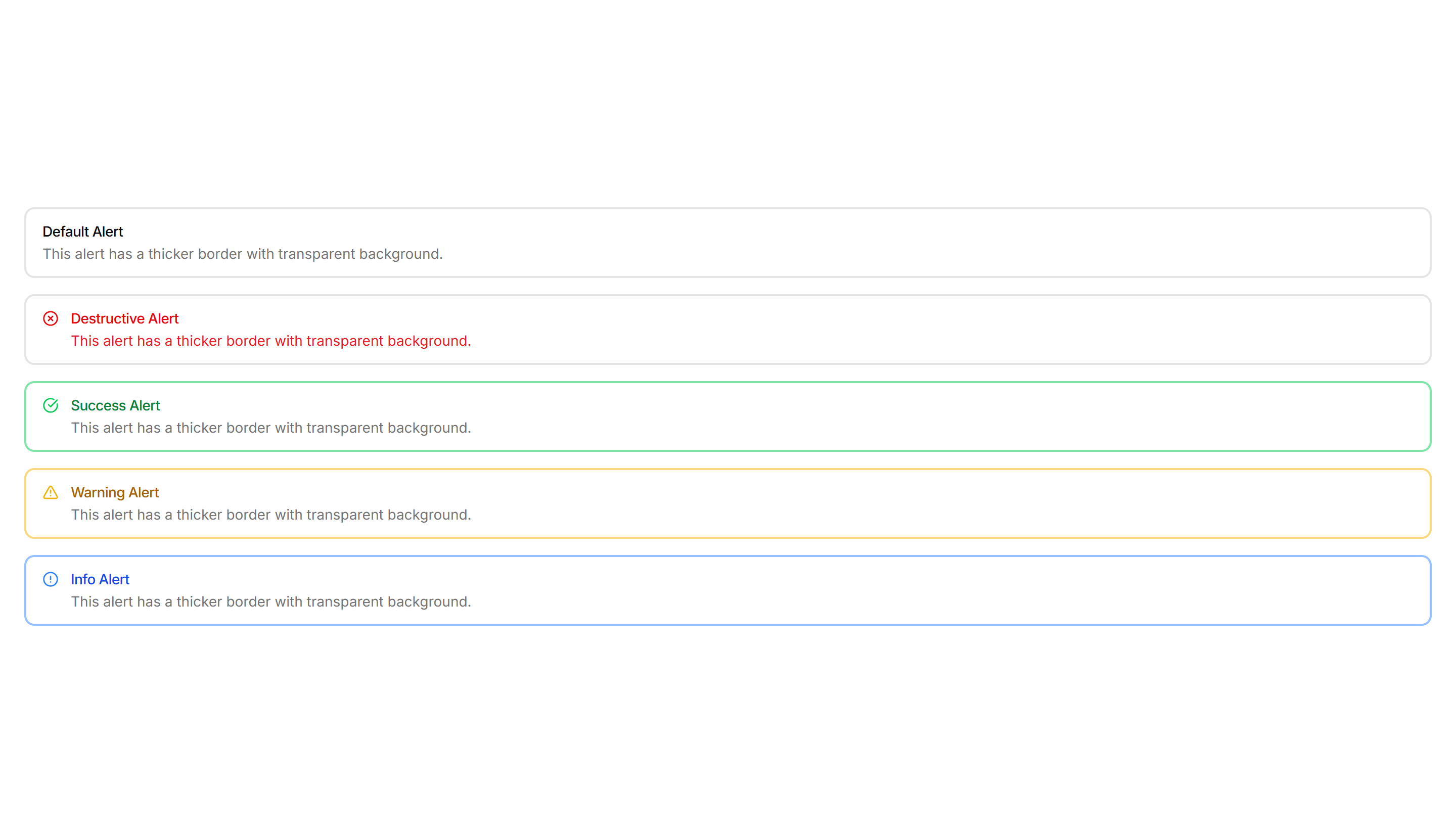
Components Alert: Basic Alerts
Plain alerts with an icon, title, and message in a soft container. Use for everyday notices like saved changes, confirmations, and short tips.

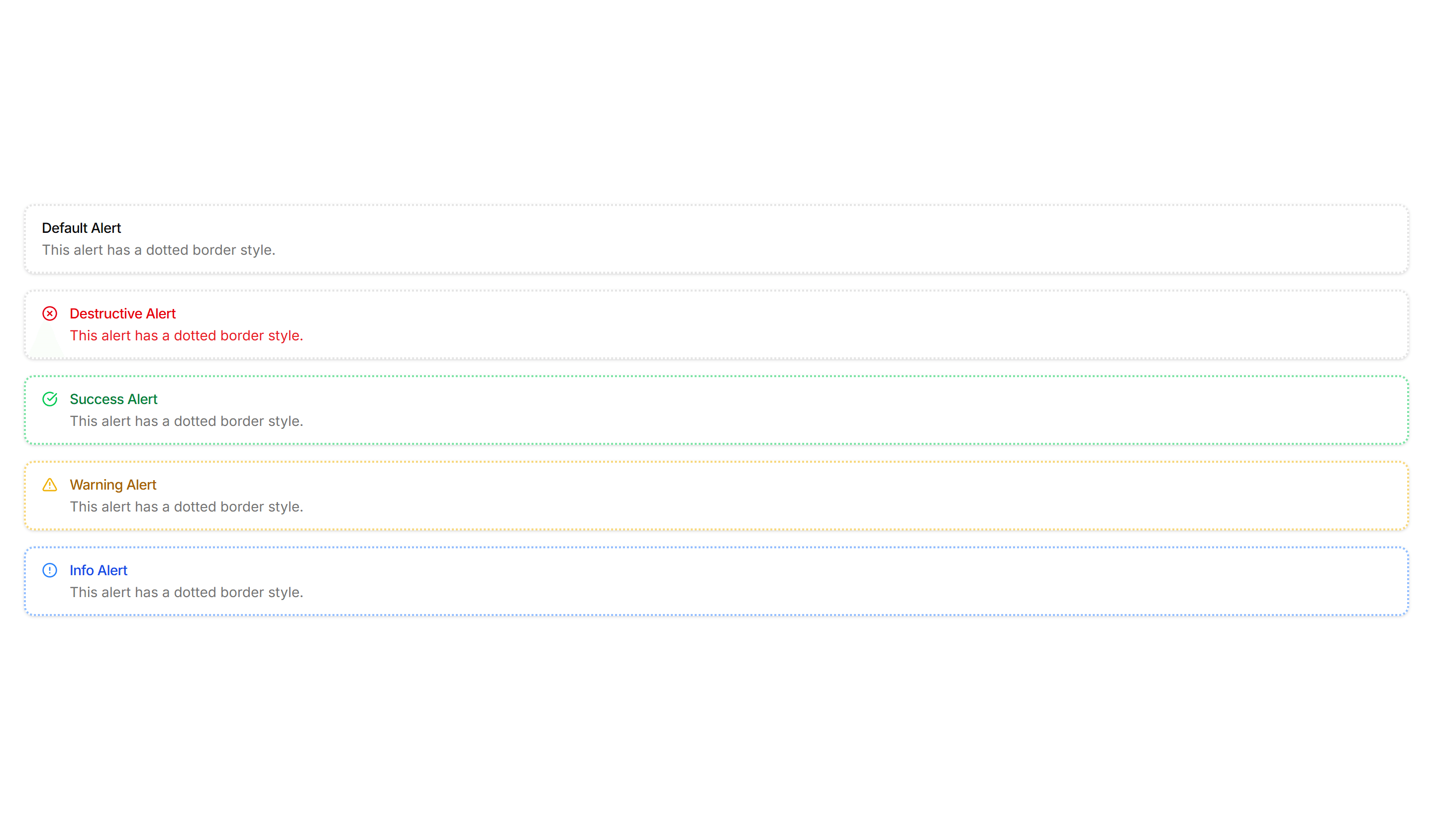
Components Alert: Dashed Border Alerts
Alerts outlined with a dashed border for a lighter, sketch like feel. Use for draft notices, placeholders, or optional tips in a quiet tone.
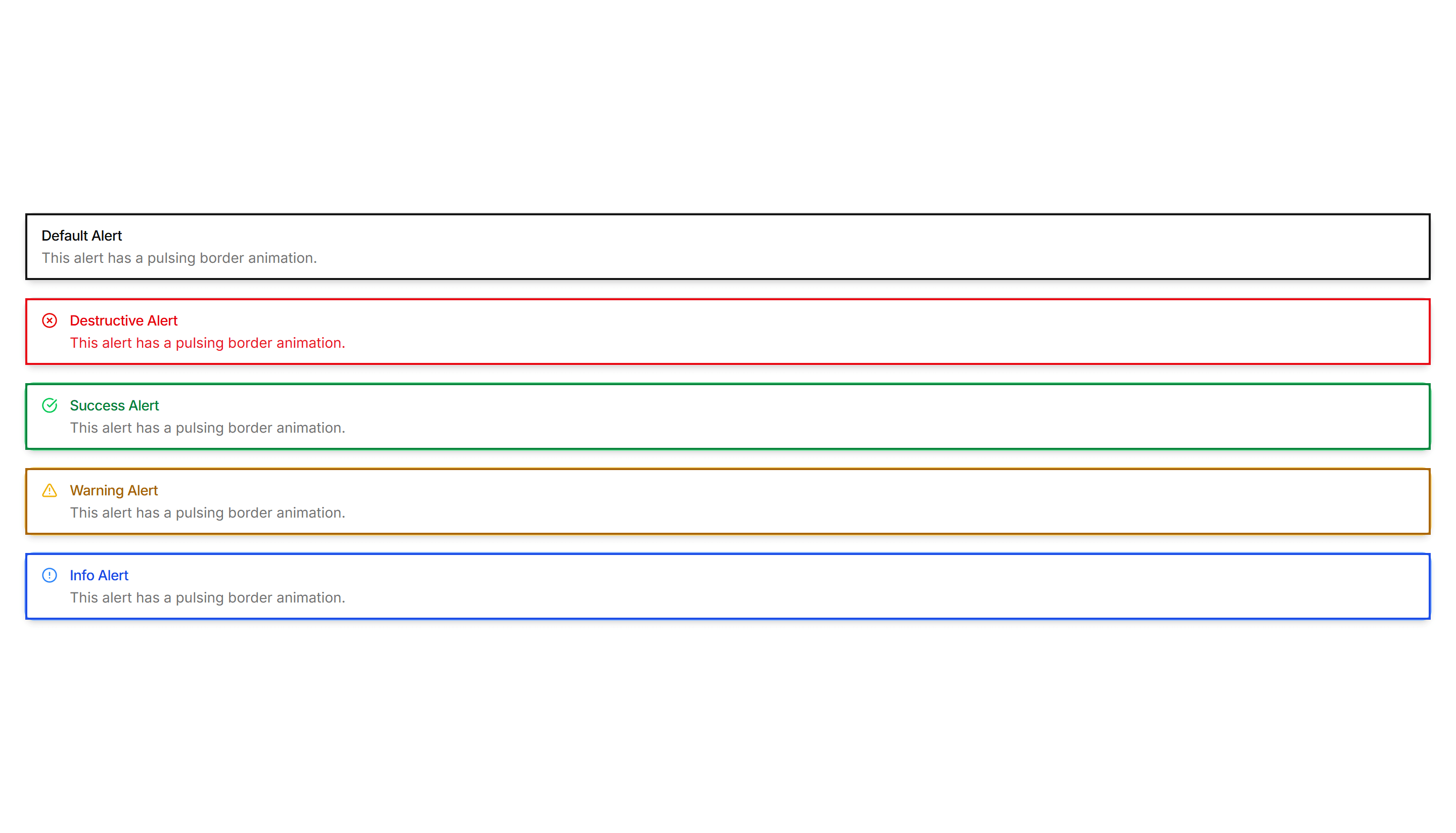
Components Alert: Pulse Border Alerts
Alerts with a border that gently pulses to catch attention over time. Use for live updates, countdowns, or urgent notices that should not be missed.
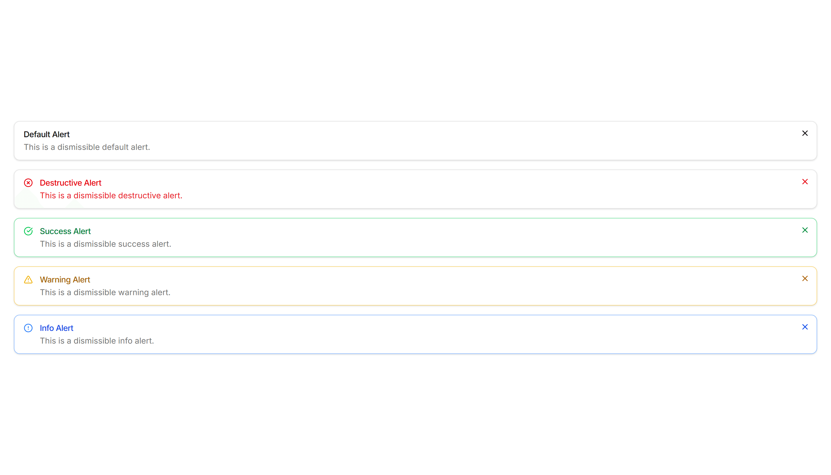
Components Alert: Dismissible Alerts
Alerts with a close button so users can clear a notice once read. Use for cookie banners, promotions, and warnings that should not stay forever.
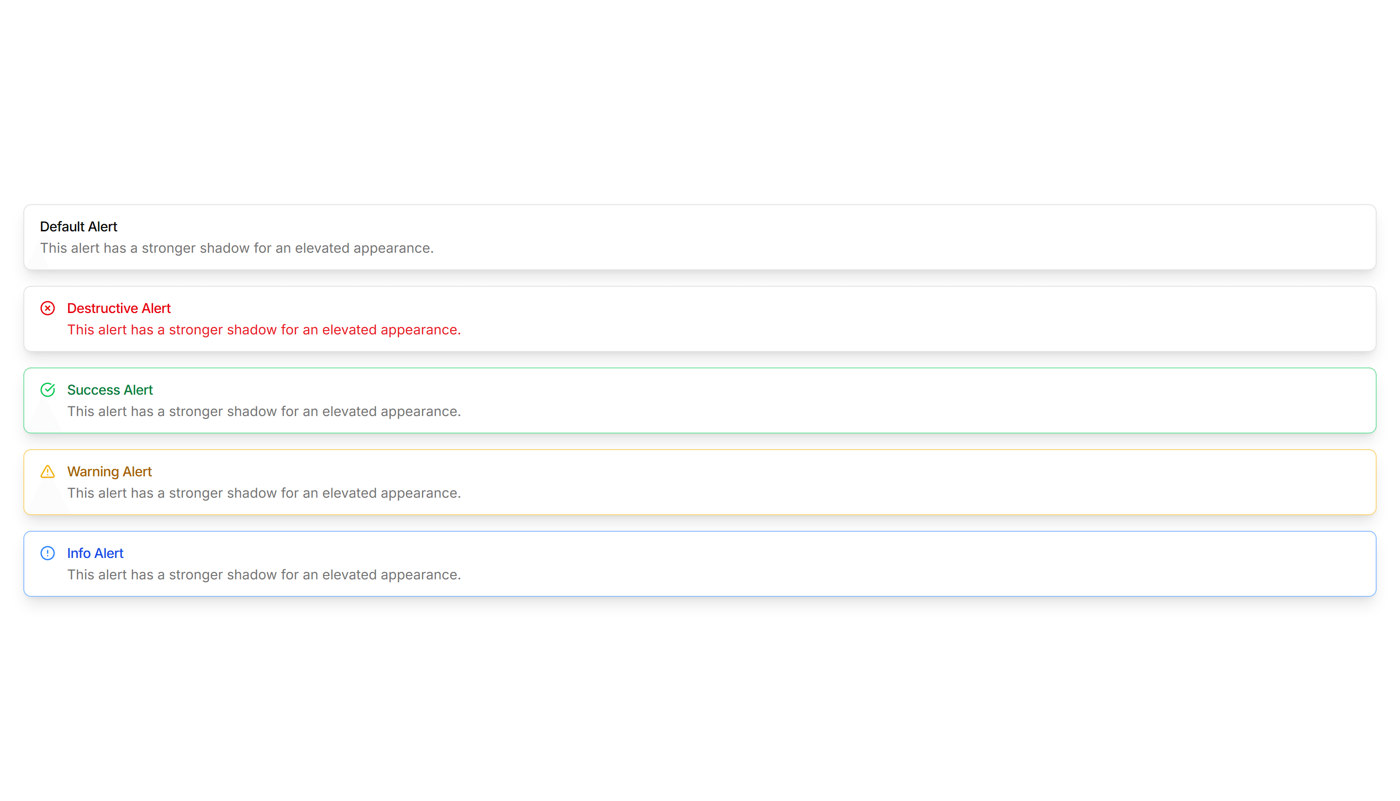
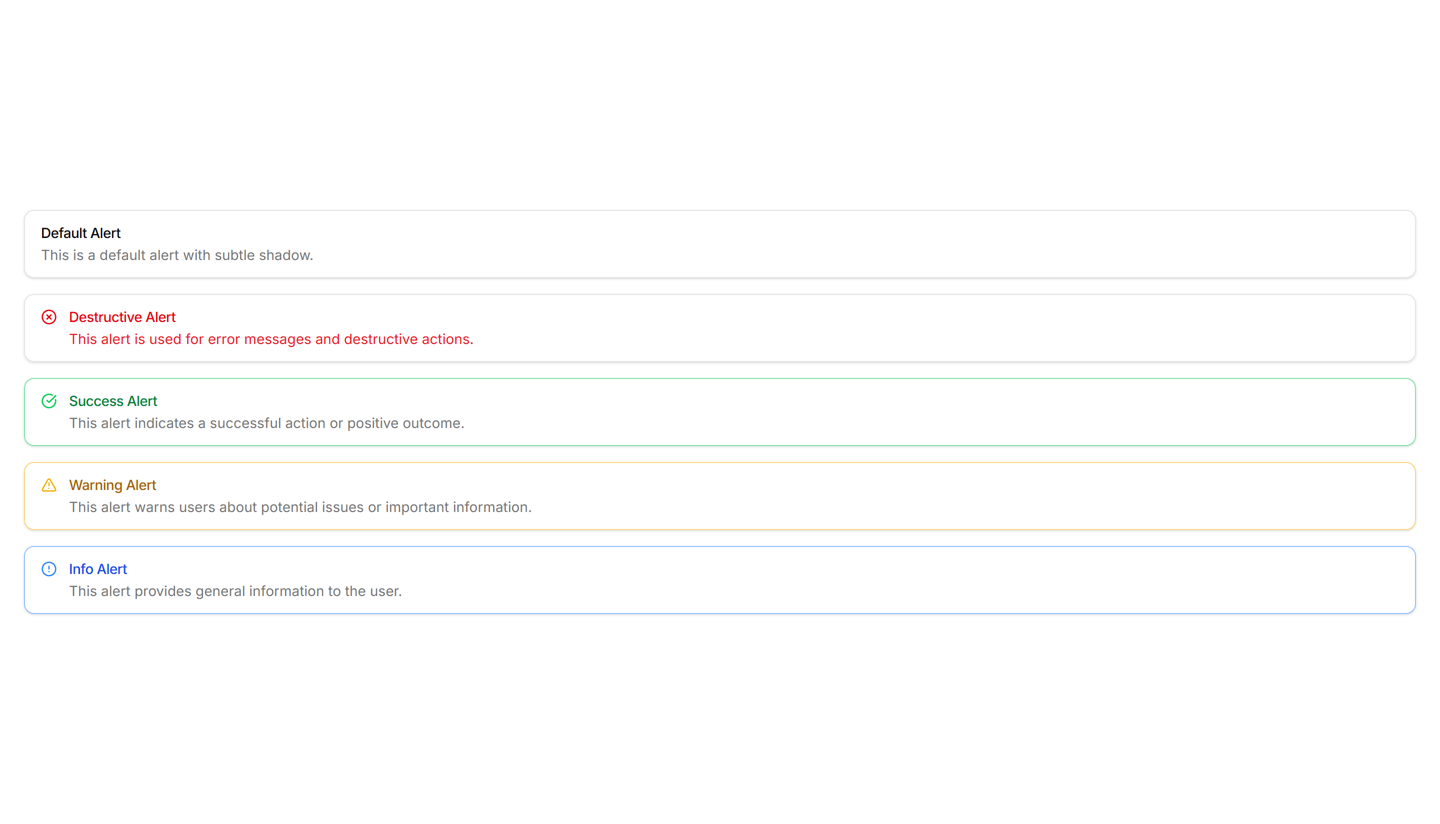
Components Alert: Elevated Alerts
Alerts raised with a soft shadow so they lift off the surface. Use for floating notifications or messages that should feel above the content.

Components Alert: Icon Only Alerts
Compact alerts that pair a status icon with a short message and no title. Use for quick inline feedback where space is tight and tone is clear.
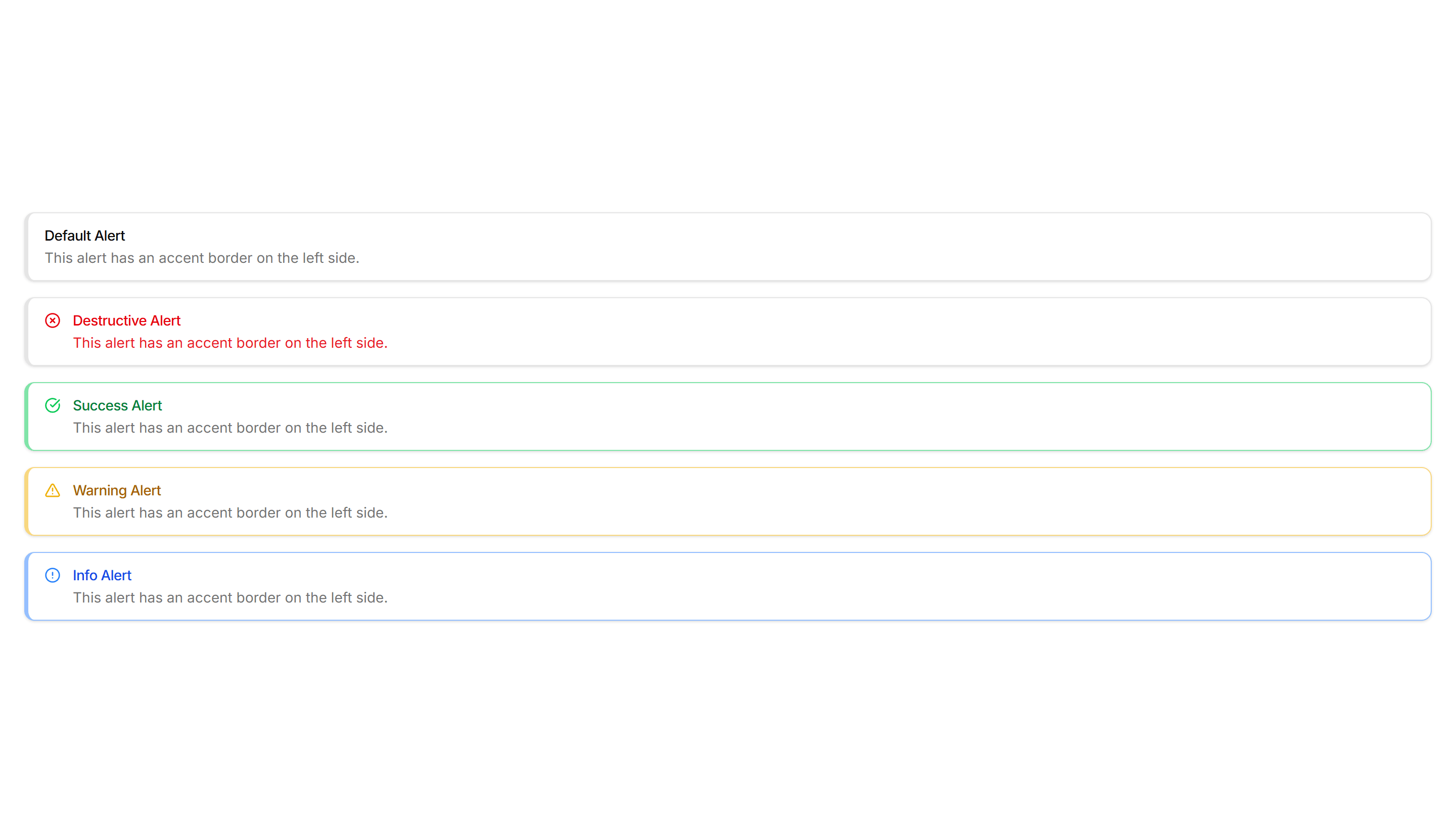
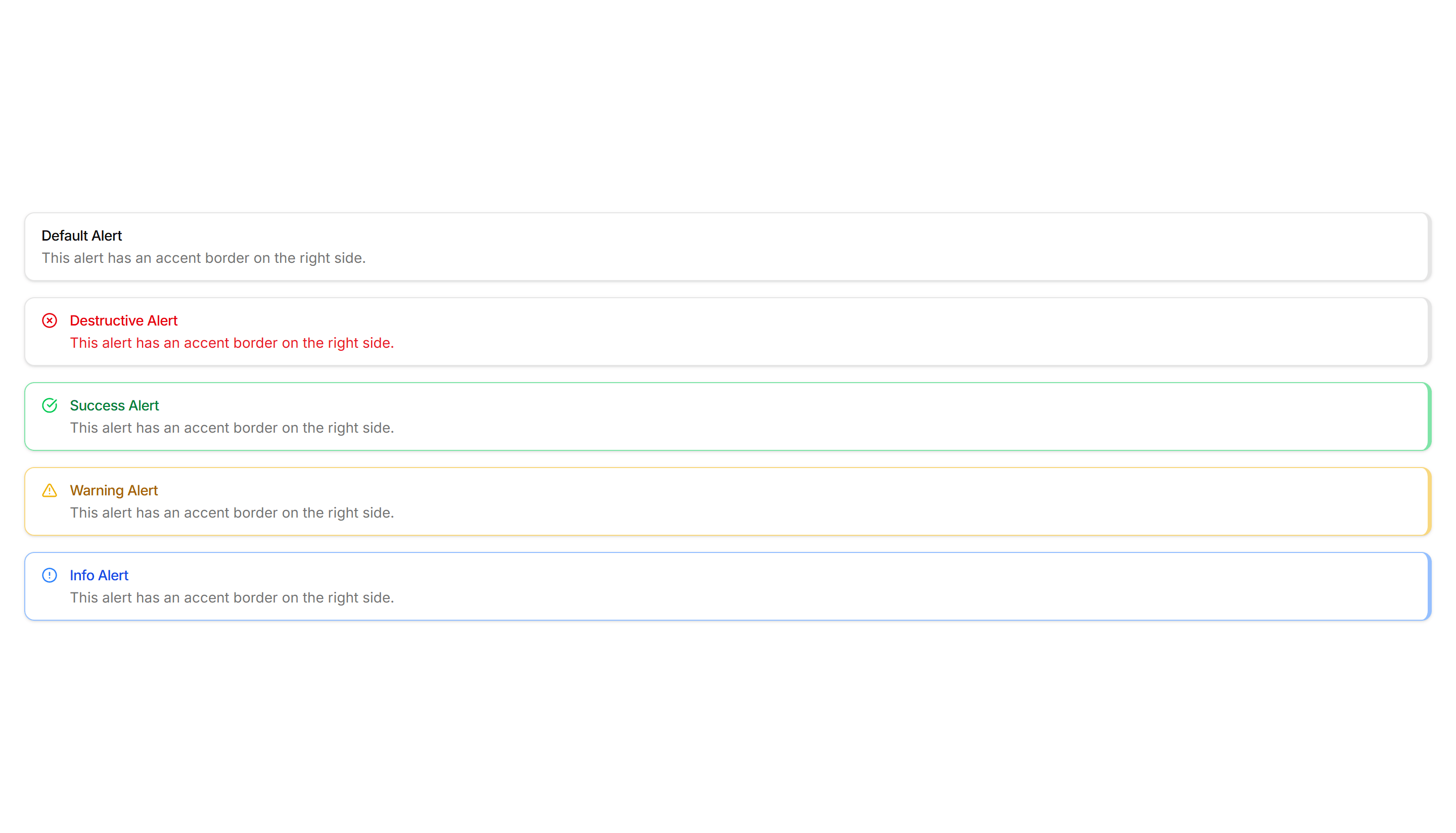
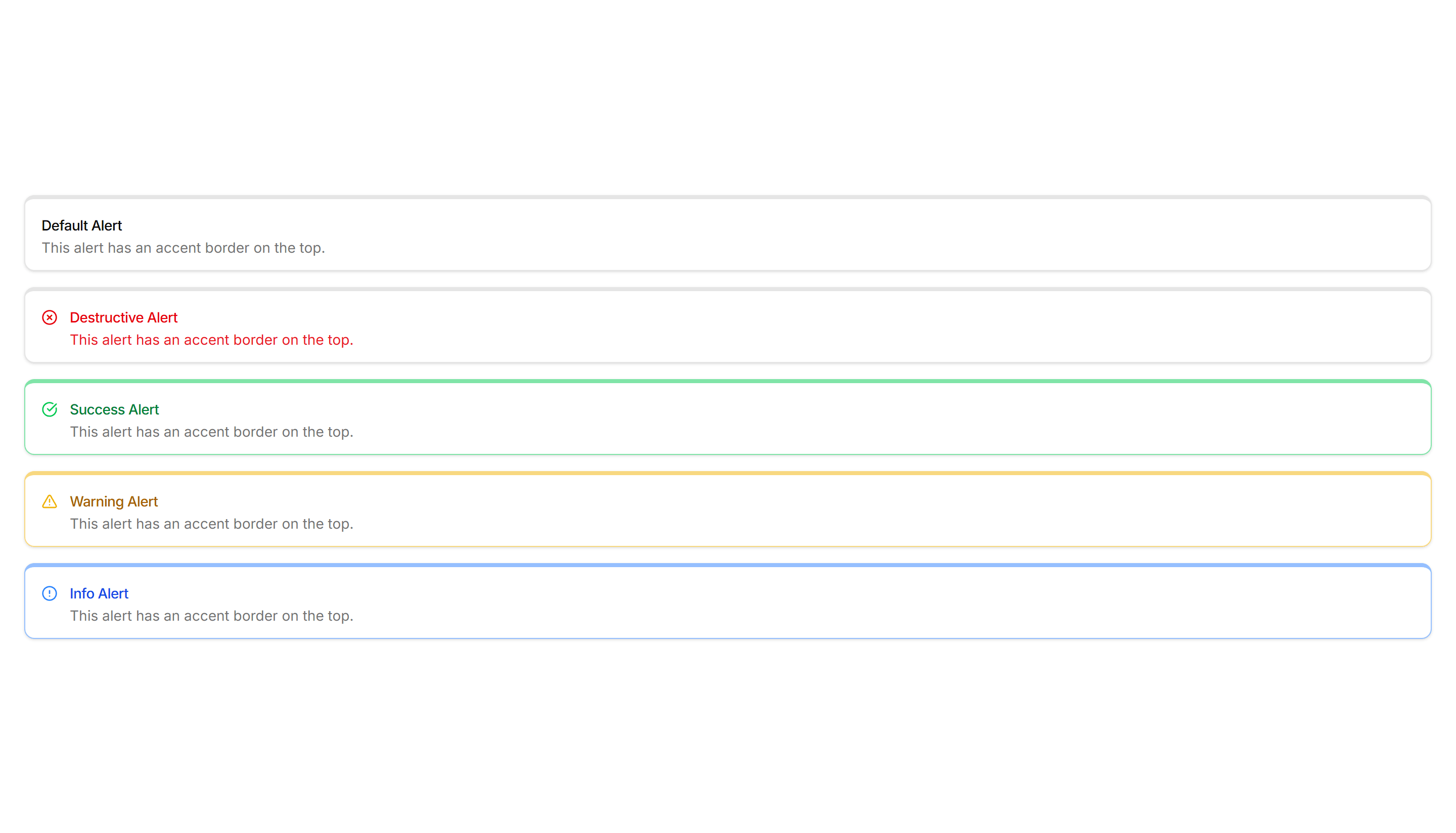
Components Alert: Accent Border Alerts
Alerts with a colored bar on the left edge that signals tone at a glance. Use for status messages where the color cue matters more than the icon.
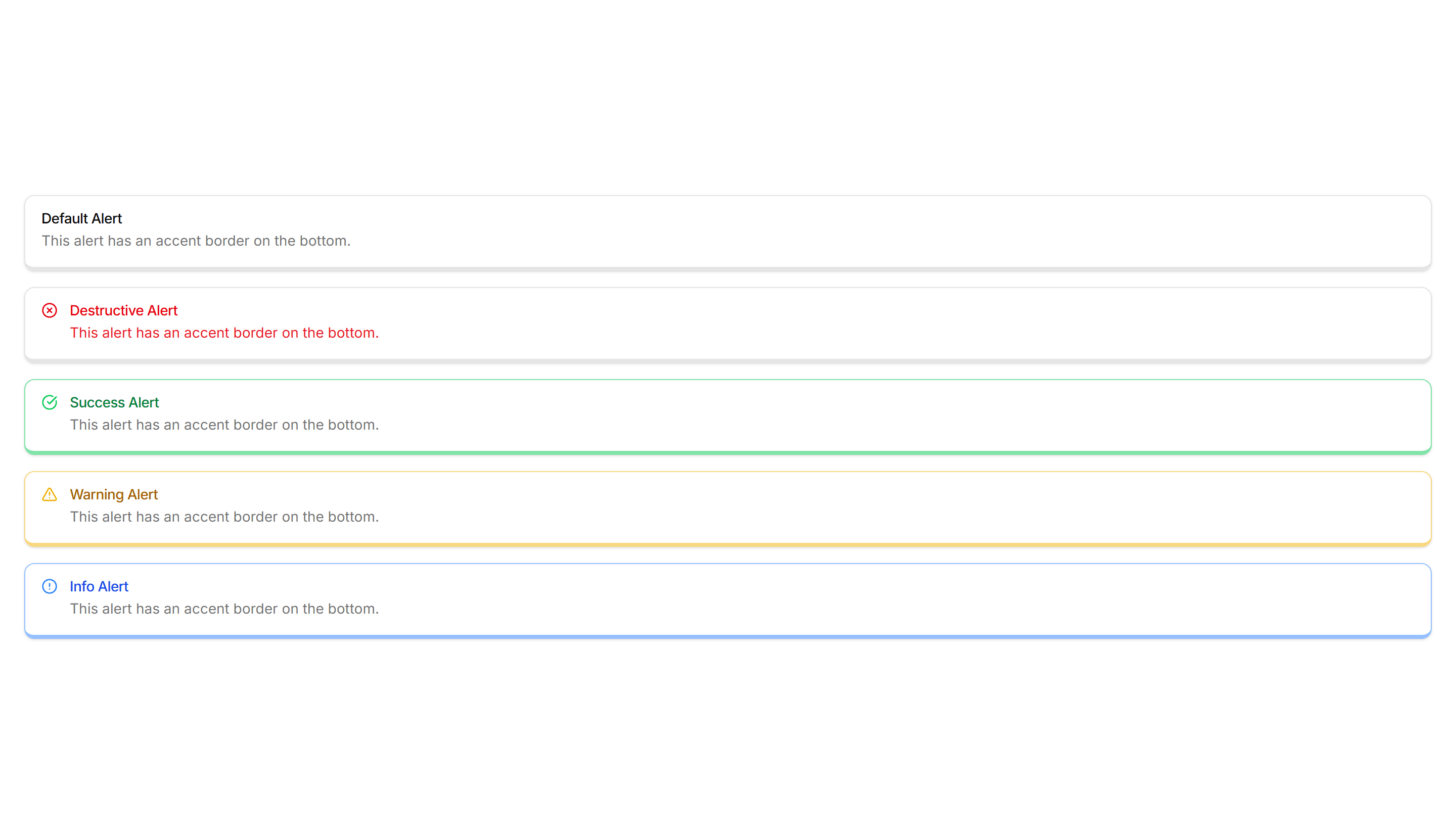
Components Alert: Bottom Accent Alerts
Alerts with a colored underline along the bottom edge for a subtle cue. Use for inline messages in forms or cards that need only light emphasis.