Shadcn Marketing Blocks
Browse 279 free Marketing blocks for shadcn/ui. Heroes, features, pricing, testimonials, FAQs, blogs, and CTAs you can copy, paste, and ship.
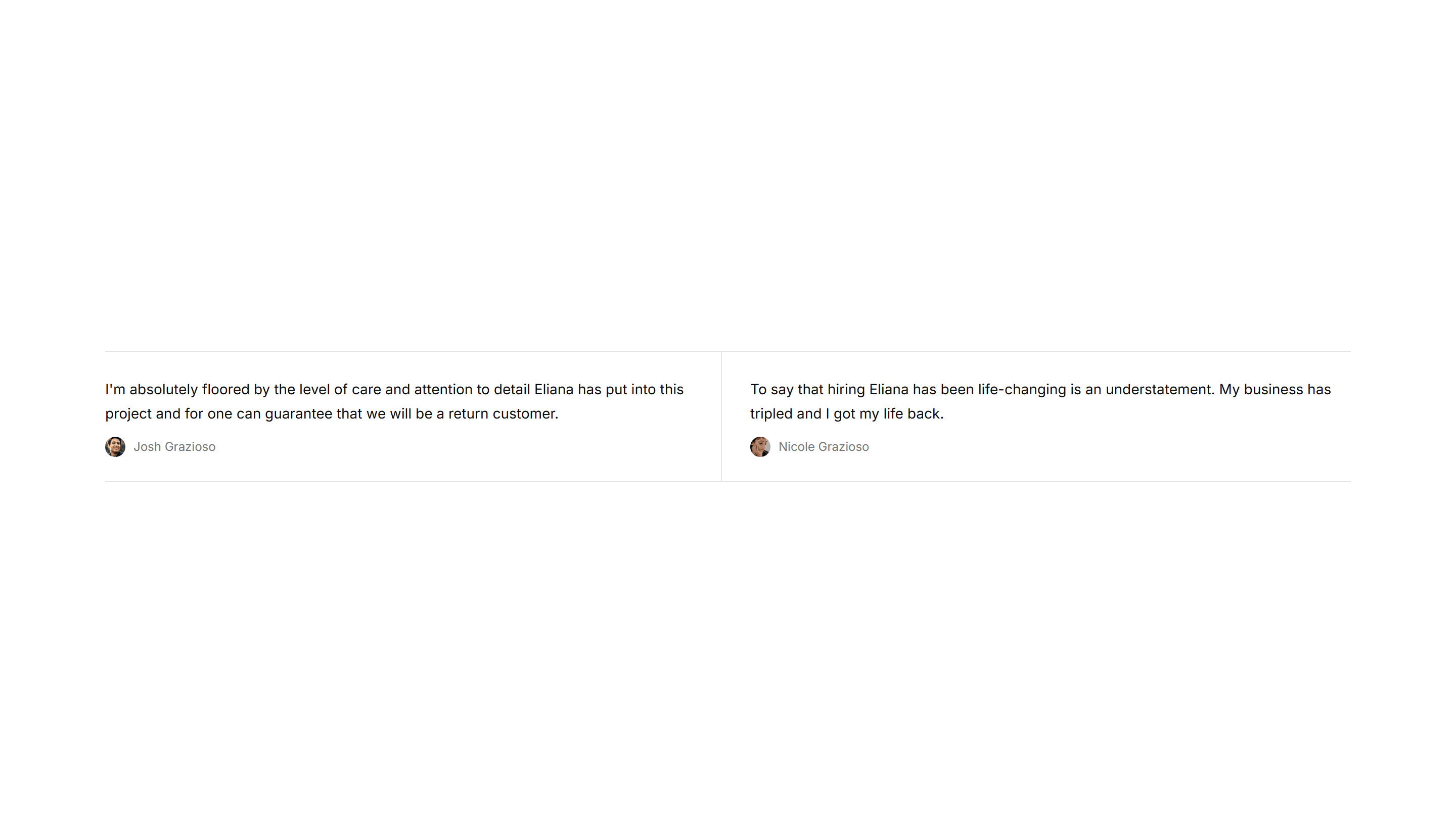
Marketing Testimonial: Mini With Dividers In Grid
Compact testimonials arranged in a grid with thin dividers between them. Fit many short quotes into a tidy space without crowding the layout.
Marketing Testimonial: Small Image
A testimonial with a small rounded avatar set beside a concise quote and name. A friendly, lightweight option for sidebars or quieter page spots.
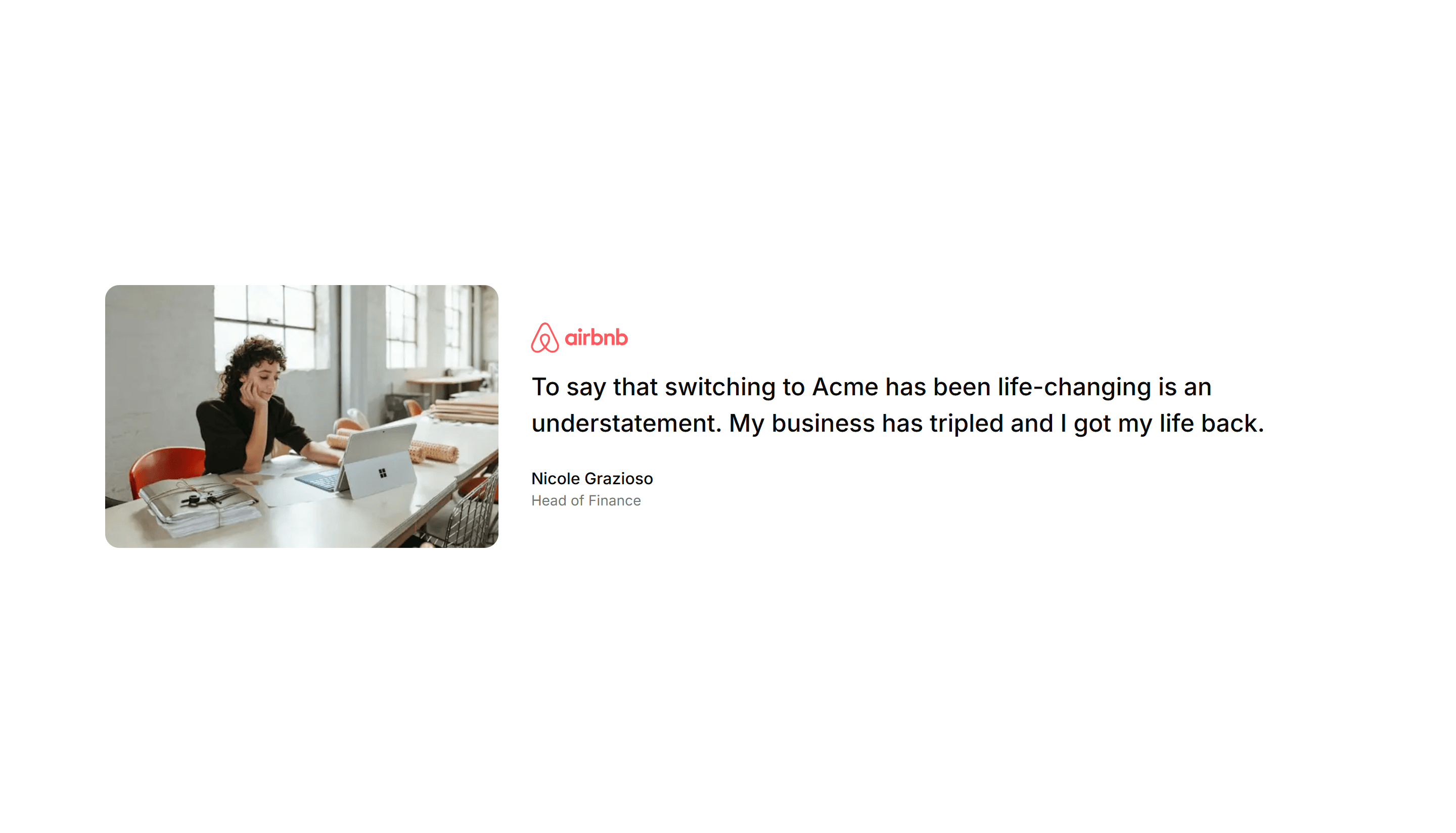
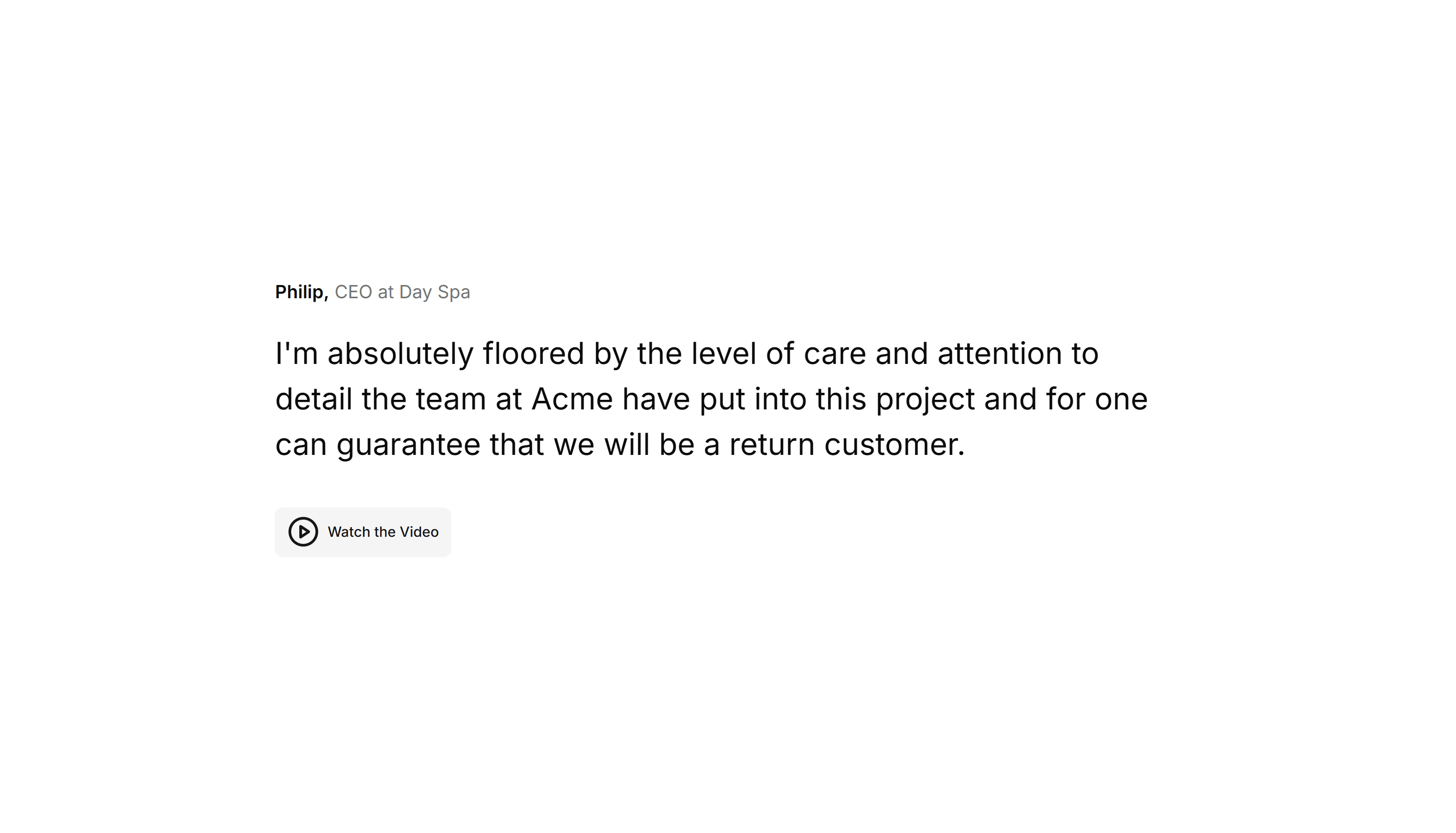
Marketing Testimonial: Big Image
A testimonial paired with a large customer photo beside the quote. Use it when you want a single voice to carry weight and feel personal and real.
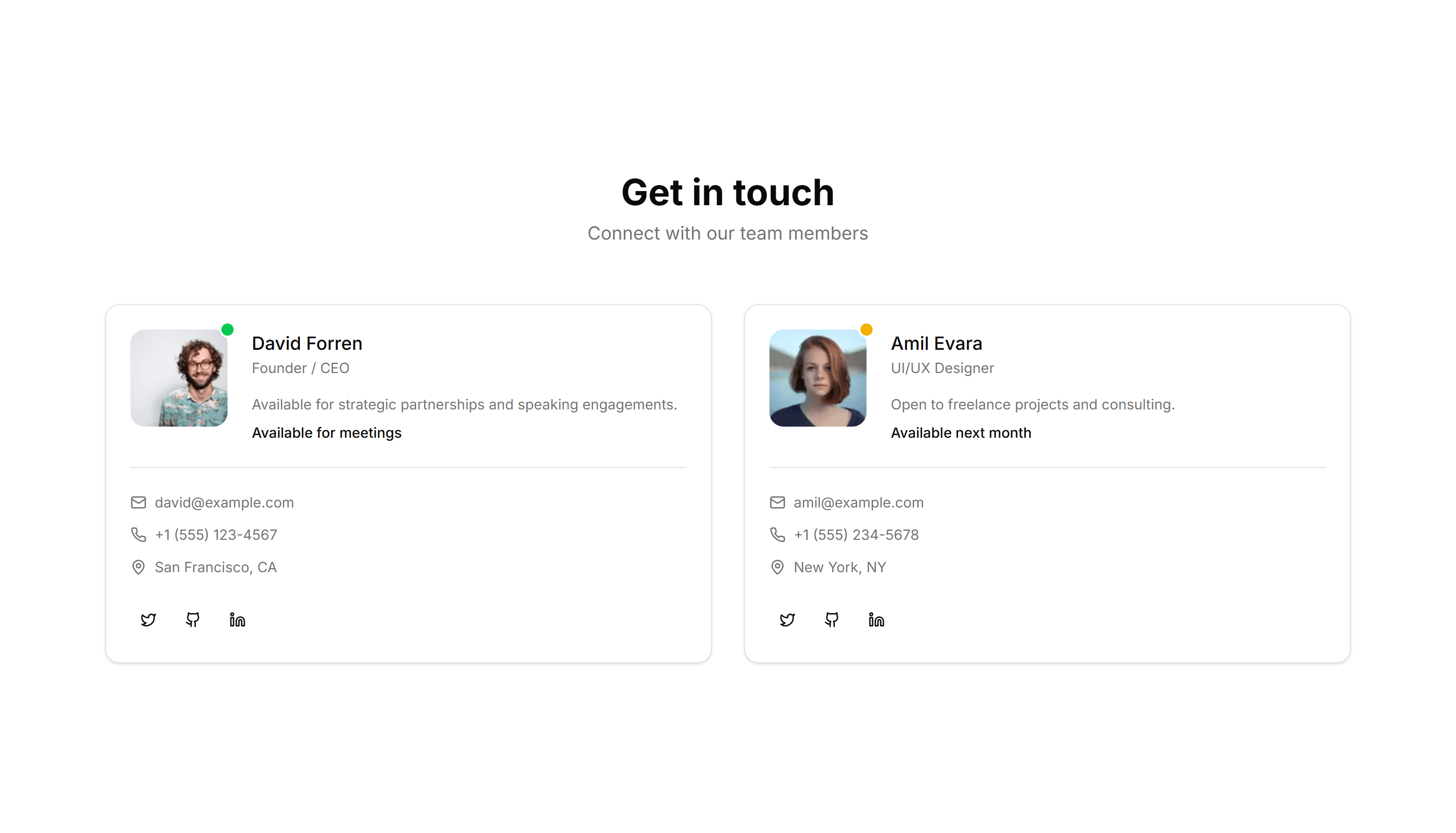
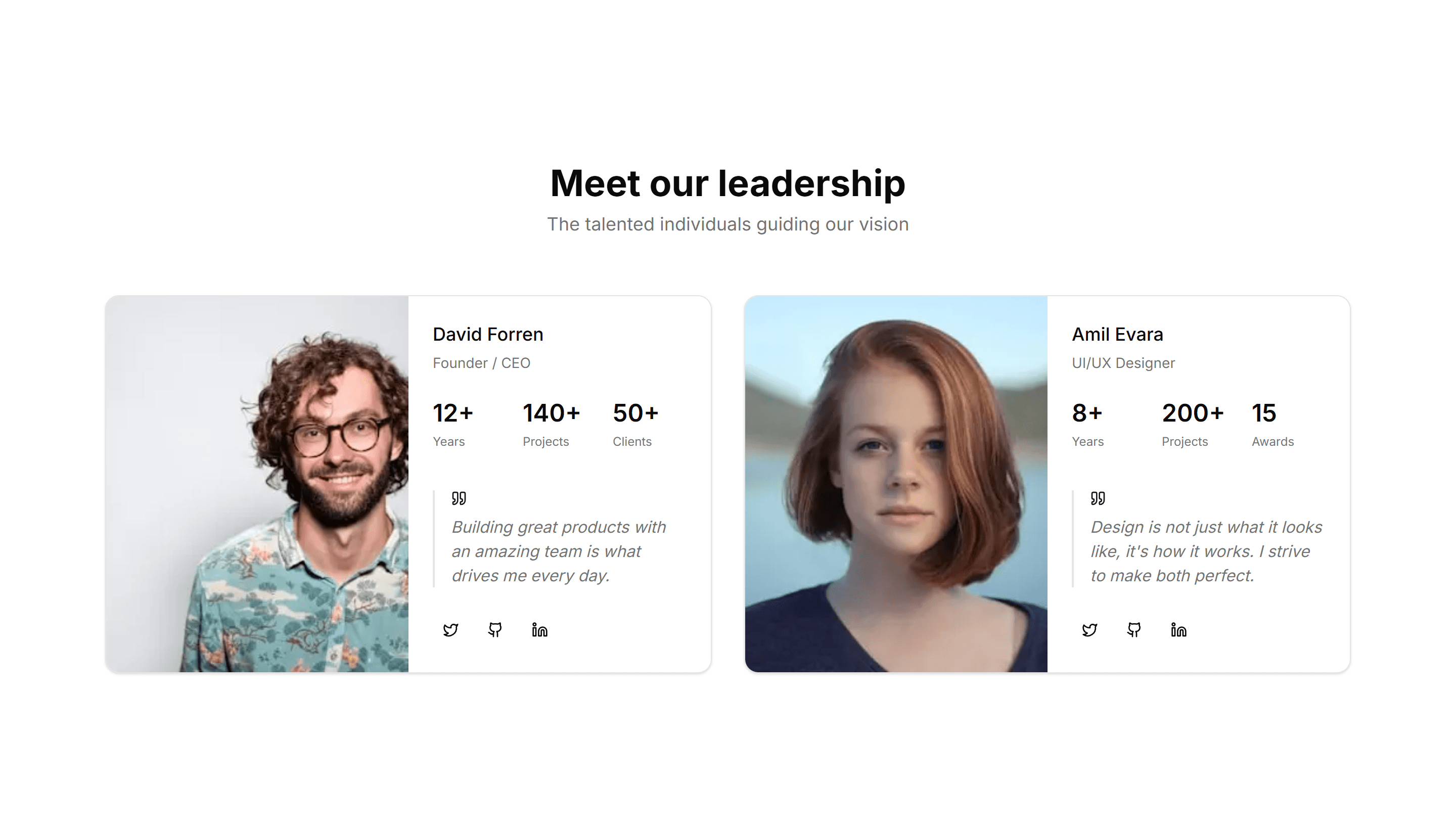
Marketing Team Section: With Contact
Team cards that pair each photo and role with an email or phone link. Lets visitors reach the right person directly from your about or contact page.

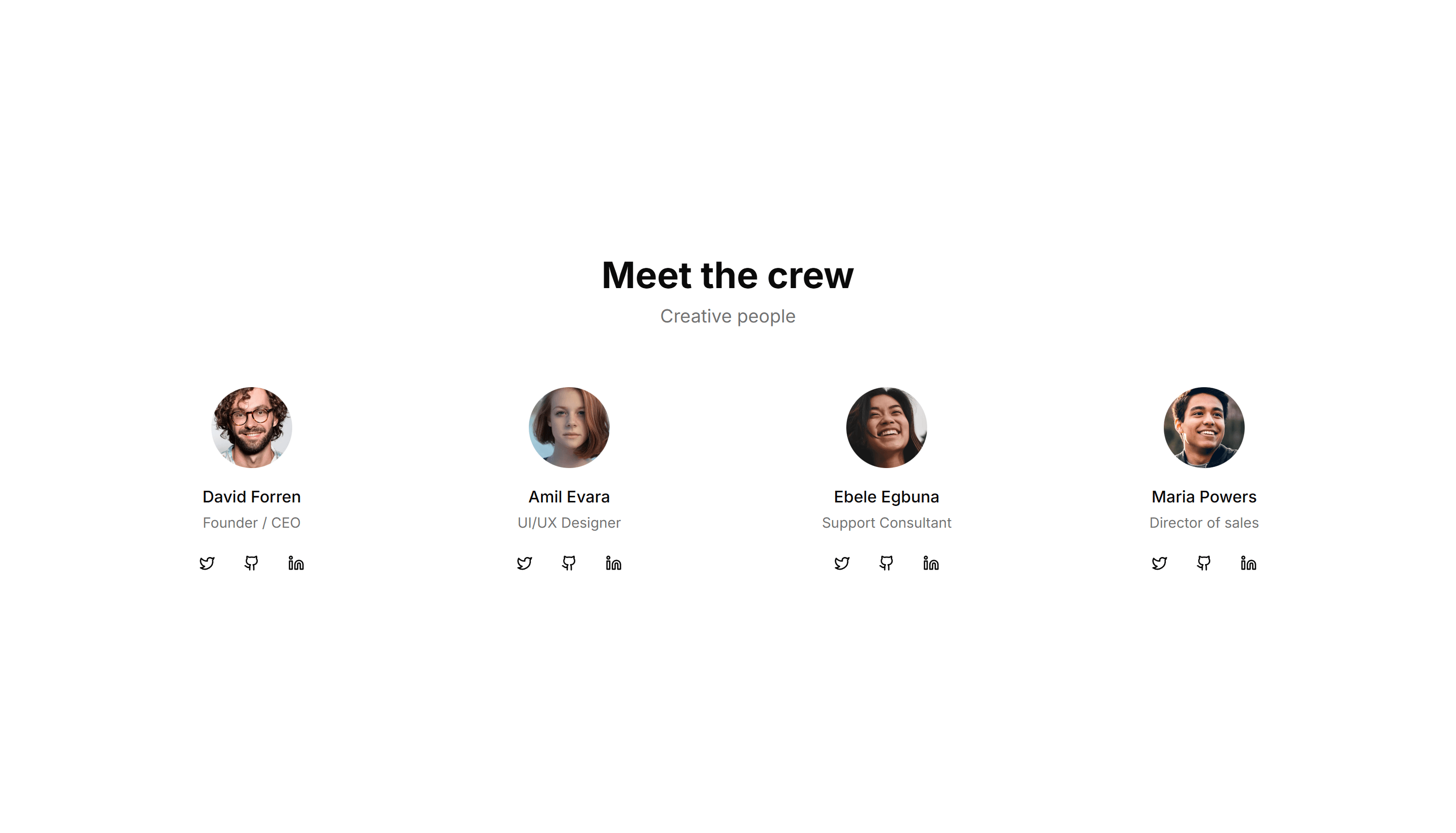
Marketing Team Section: With Large Images
Team profiles built around big, full bleed portraits with name and role. Puts faces front and center for a bold, personal about page that feels human.
Marketing Testimonial: Base
A clean testimonial section with a customer quote, name, role, and avatar. Drop it onto any landing page to add a trusted voice with little effort.
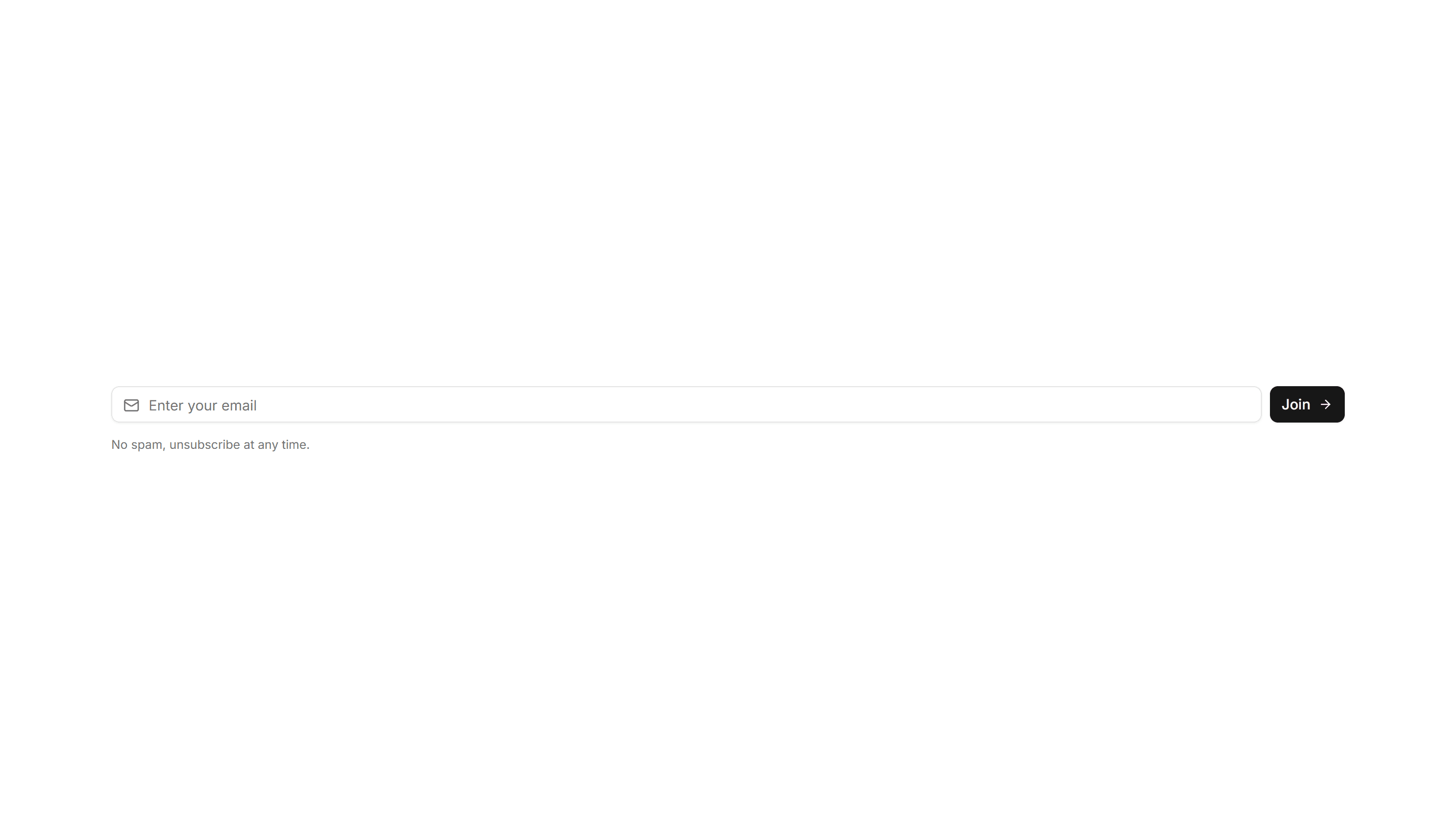
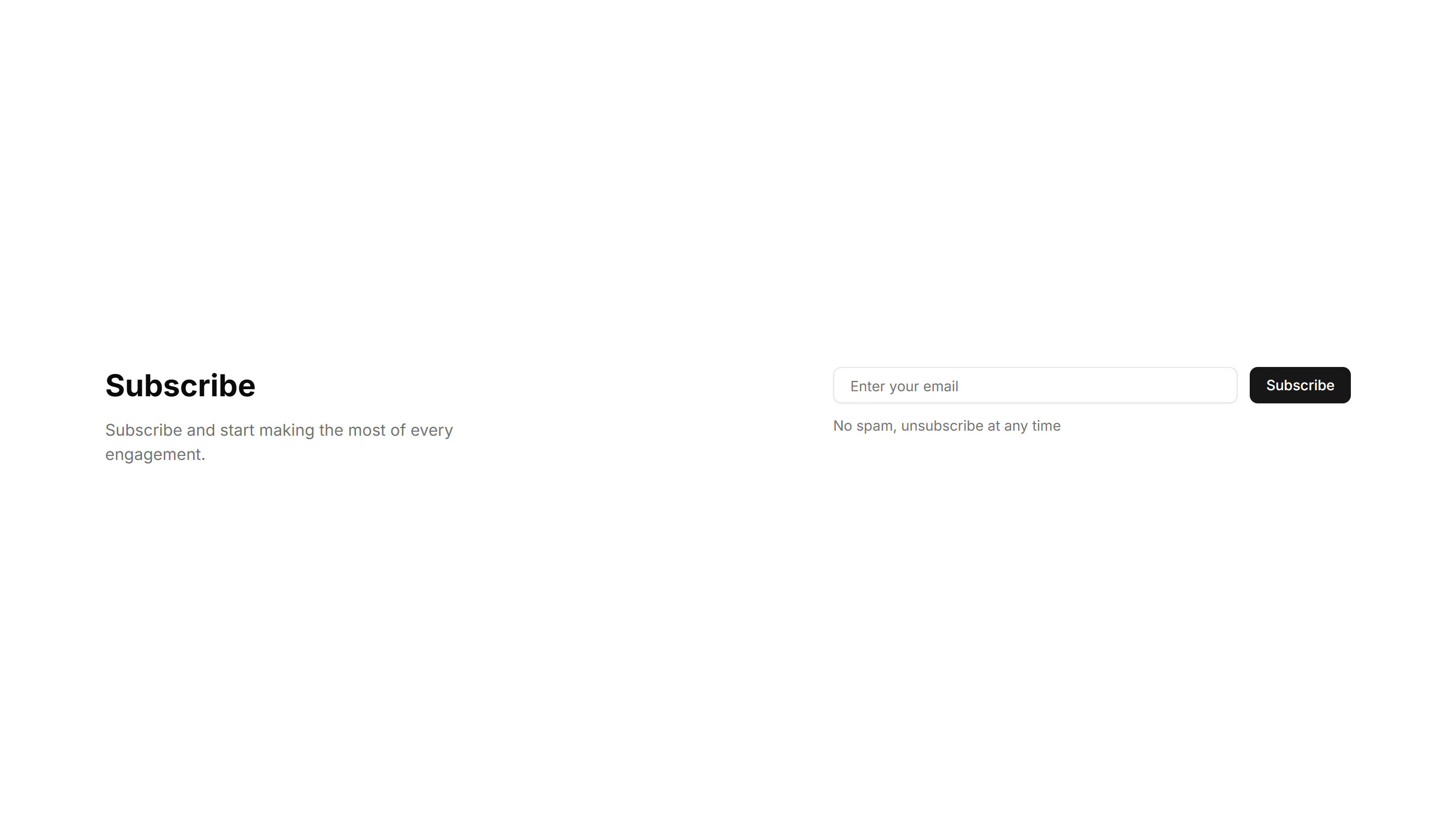
Marketing Subscribe: Input Style
A compact email input with an inline submit button on one row. Drop it into a footer or banner where space is tight but you still want signups.

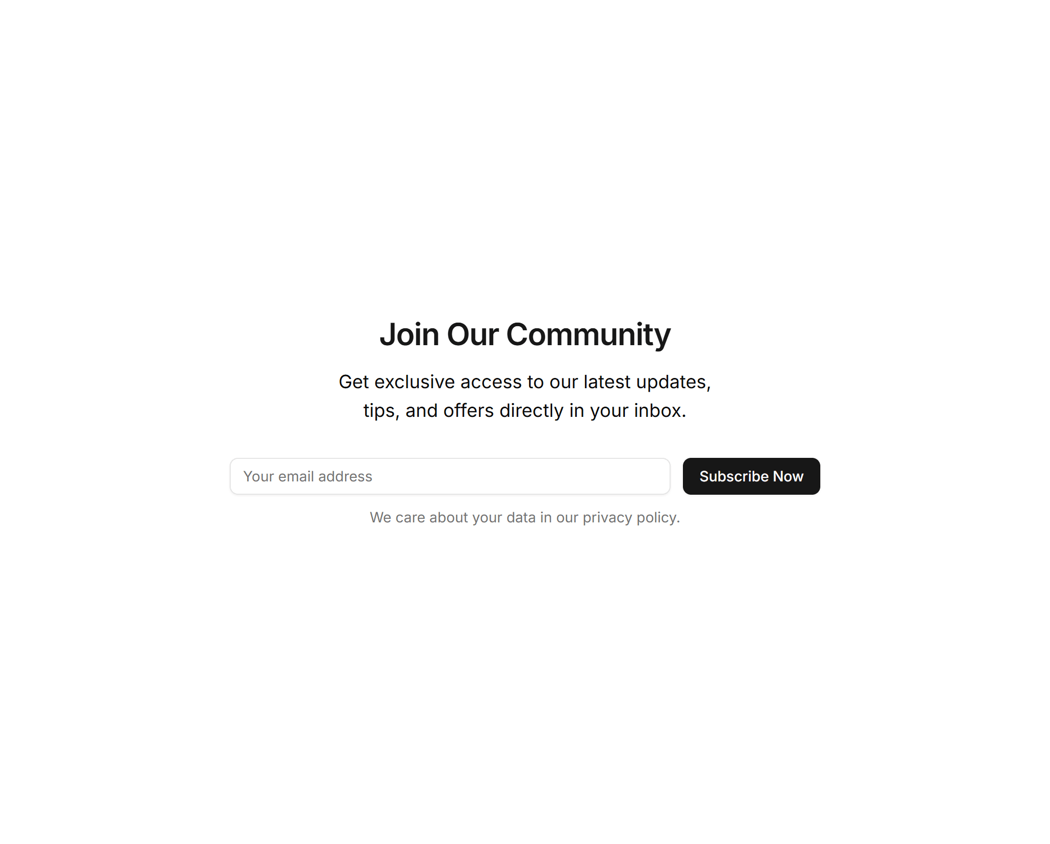
Marketing Subscribe: Simple Center Aligned
A clean centered newsletter signup with a heading, short text, and email field. The reliable default for landing pages and blog footers here.
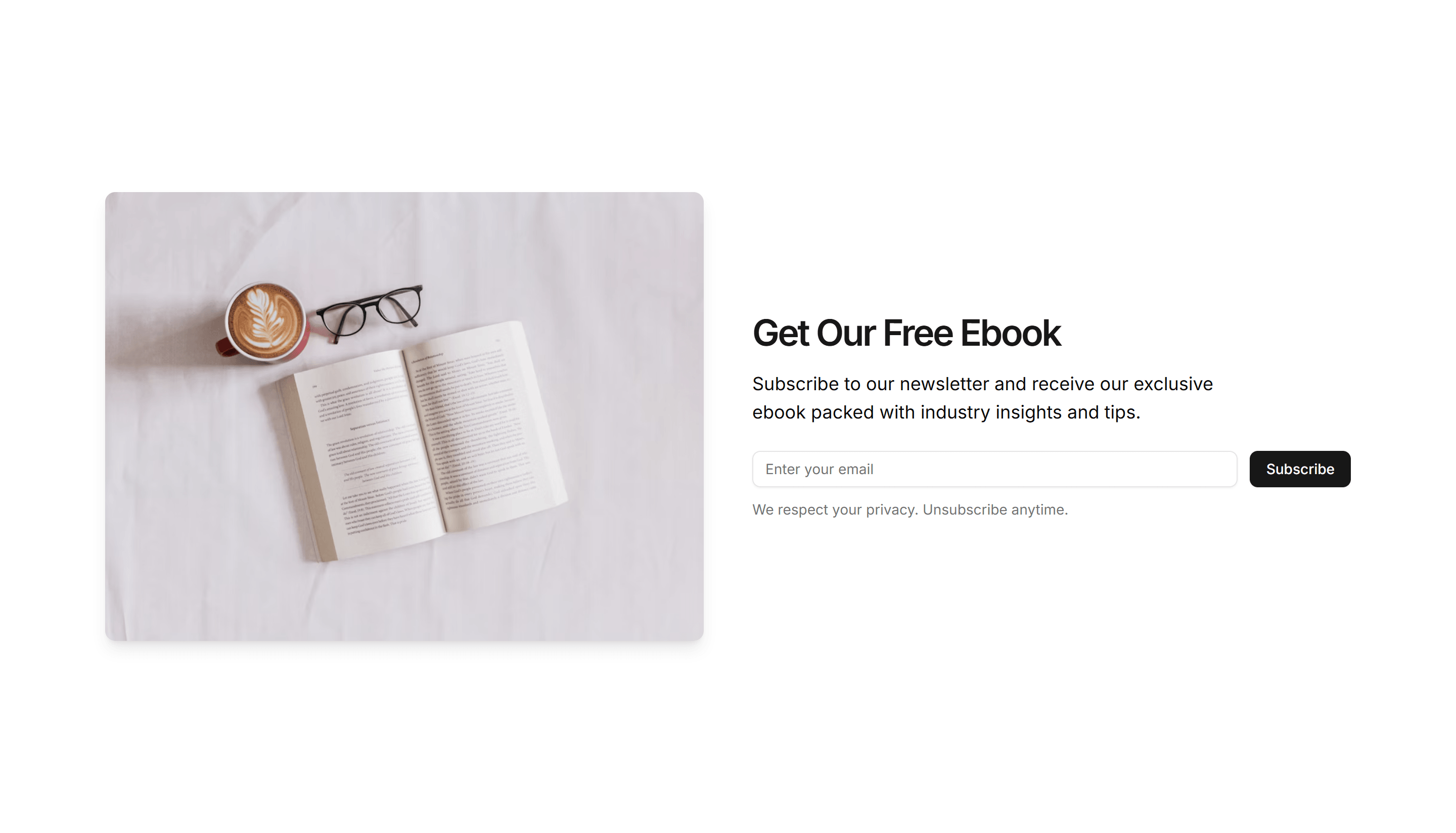
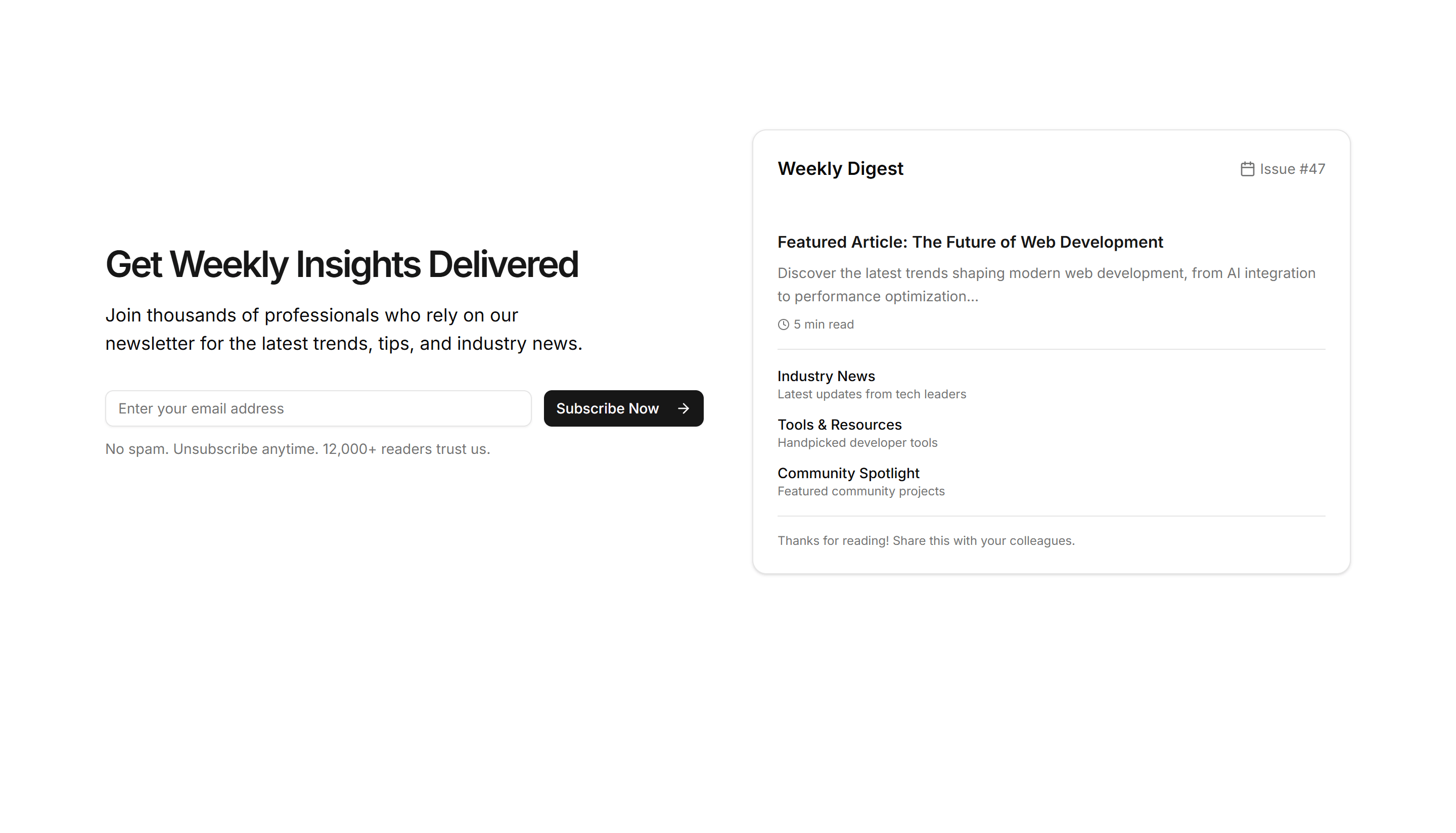
Marketing Subscribe: Split Layout
A two column subscribe block pairing an image or copy on one side with the email form on the other. Adds visual interest to a signup section.
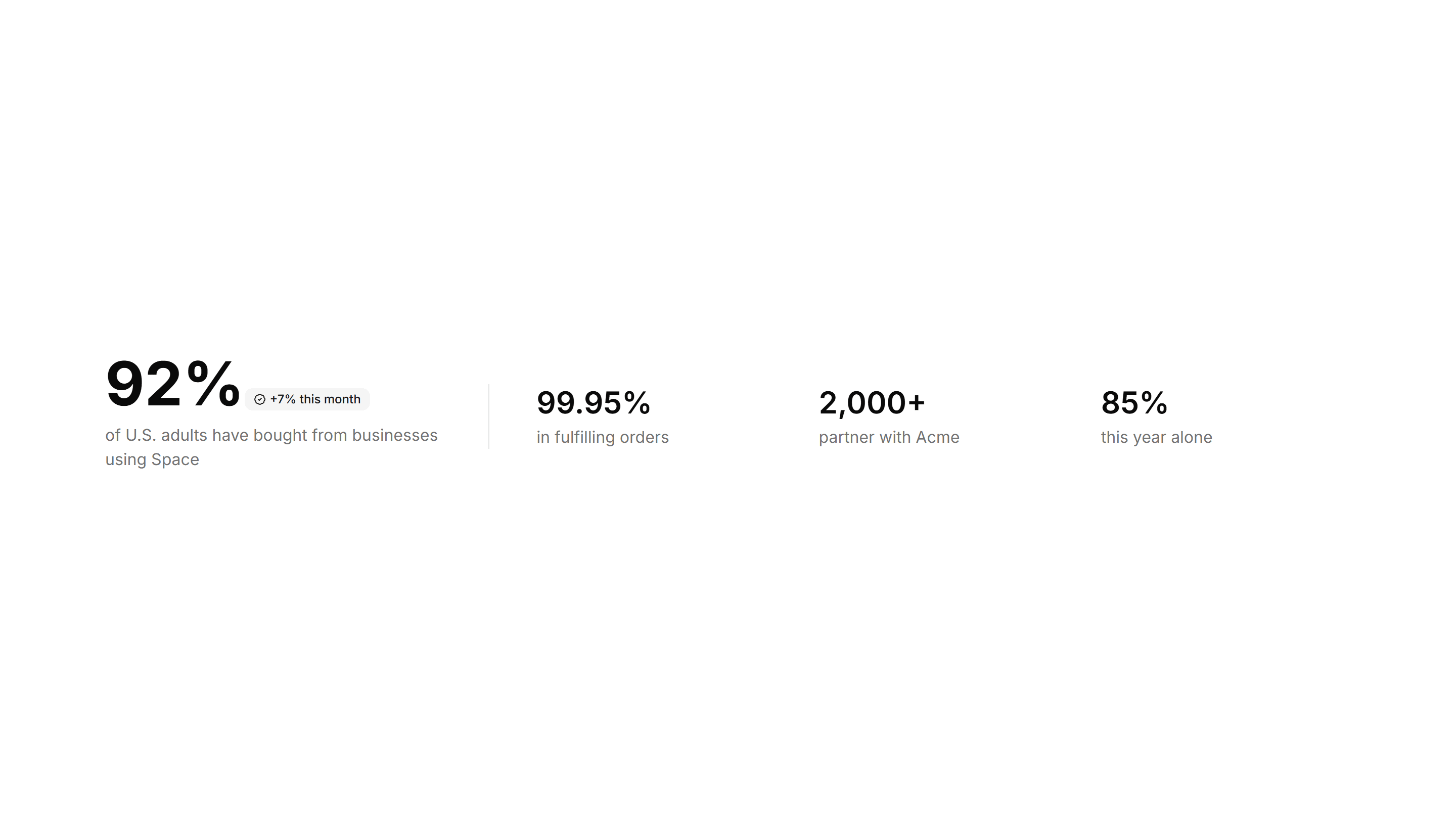
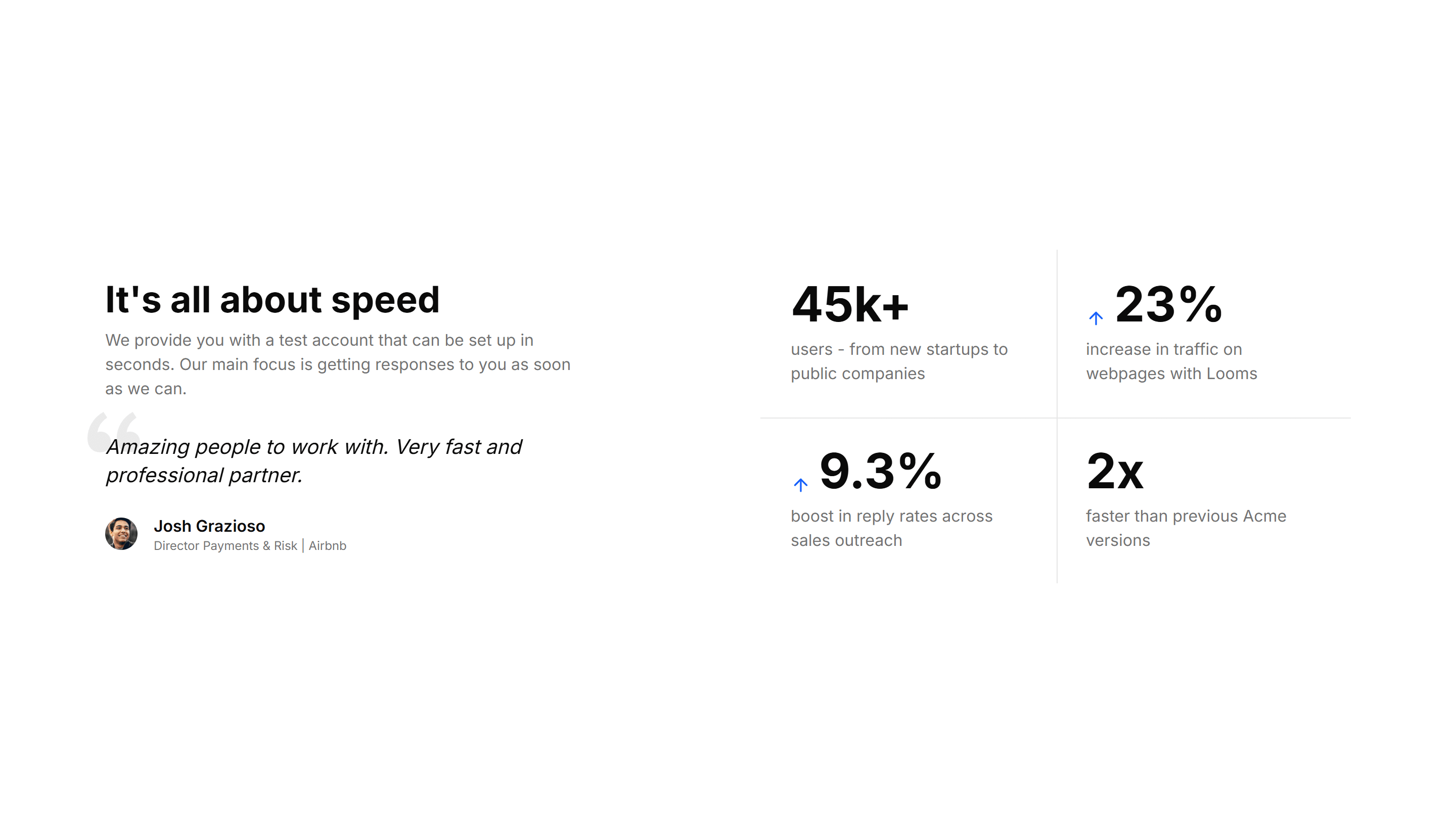
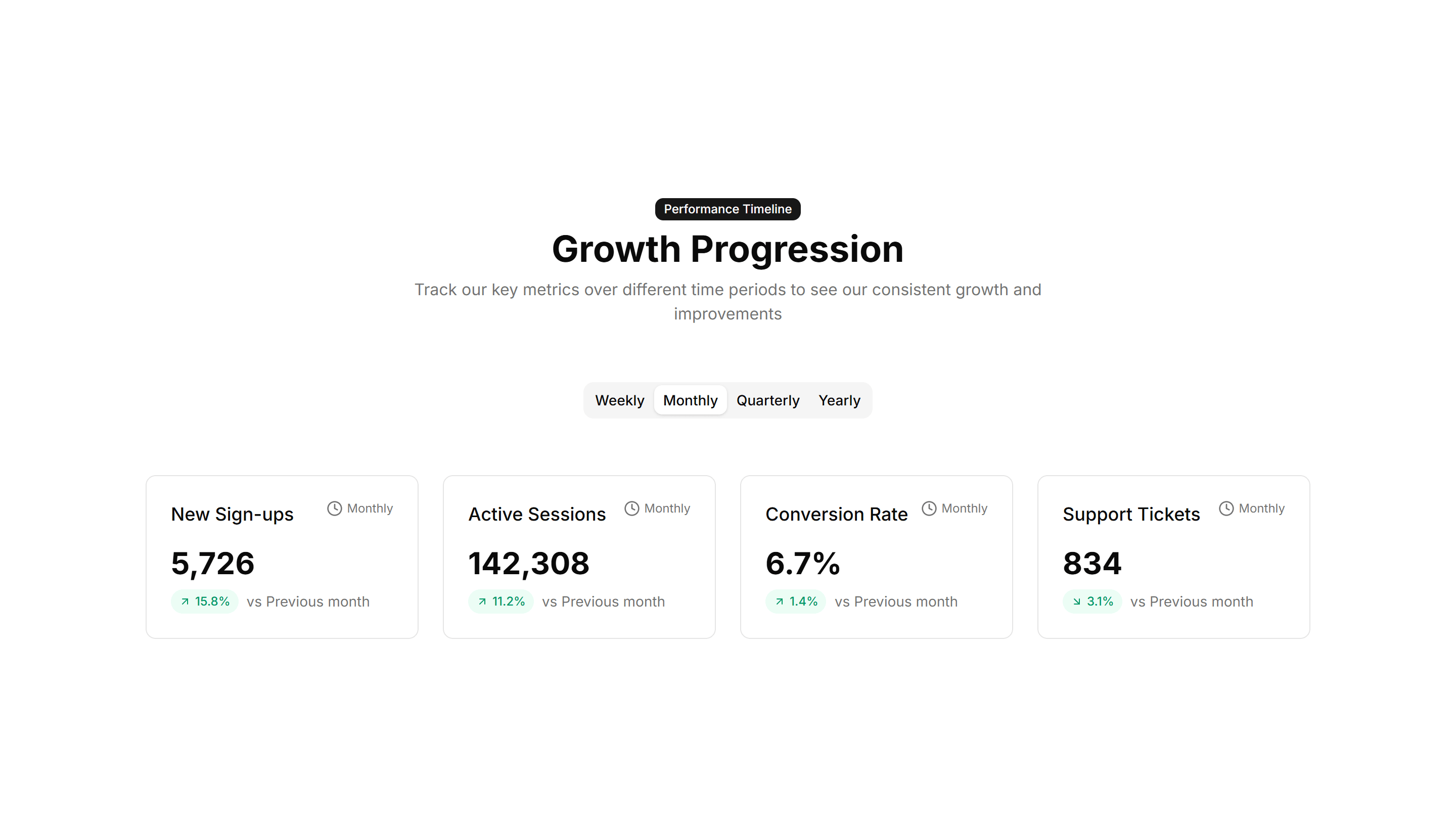
Marketing Stat: One Main With Three Follow Ups
One large headline number anchored by three smaller supporting stats. Use it to lead with your strongest figure and back it with related proof.
Marketing Stat: Sparkline Stats
Stat cards that pair a current value with a tiny inline trend chart. Use it to show a number and its recent direction together on a dashboard view.
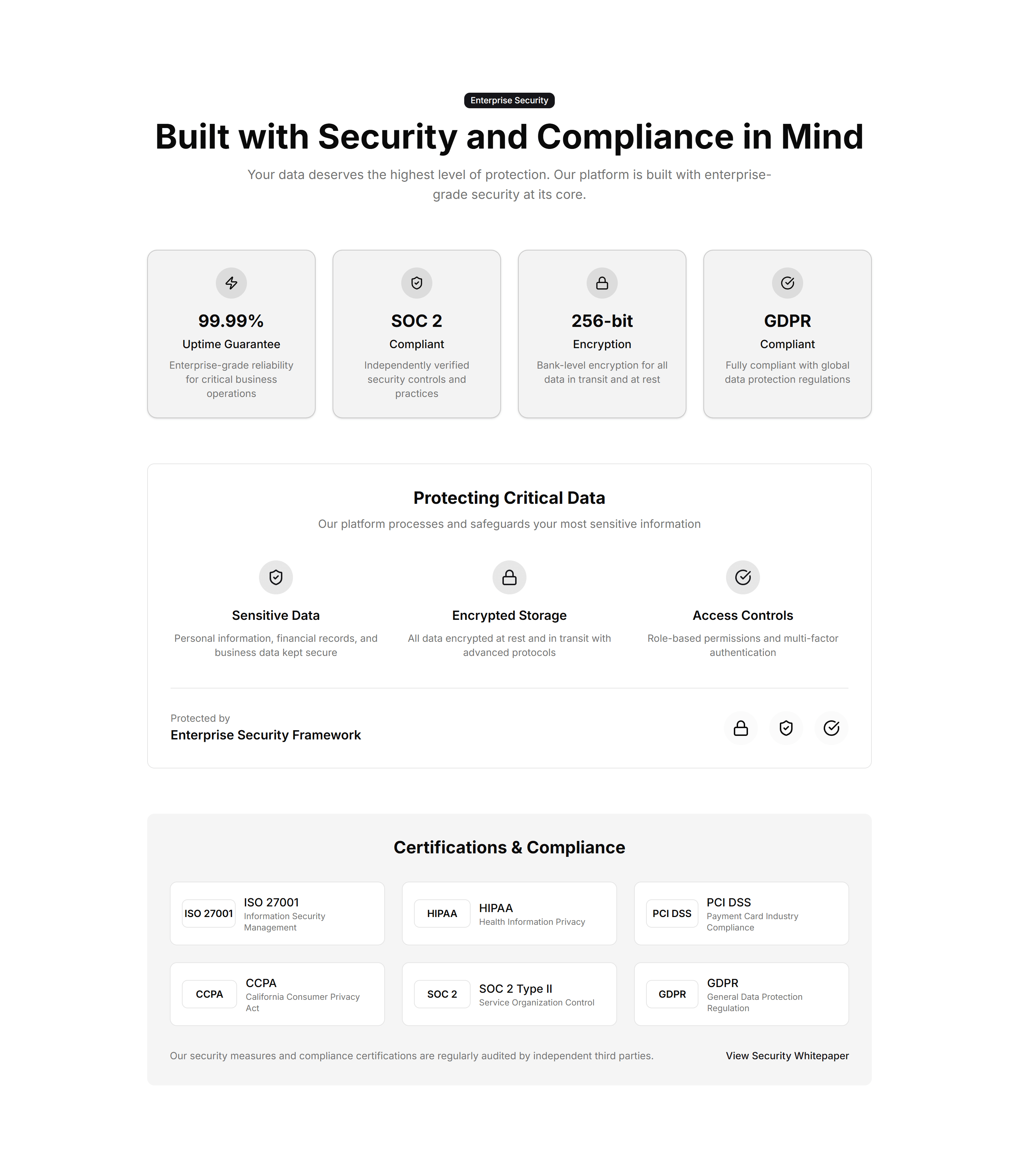
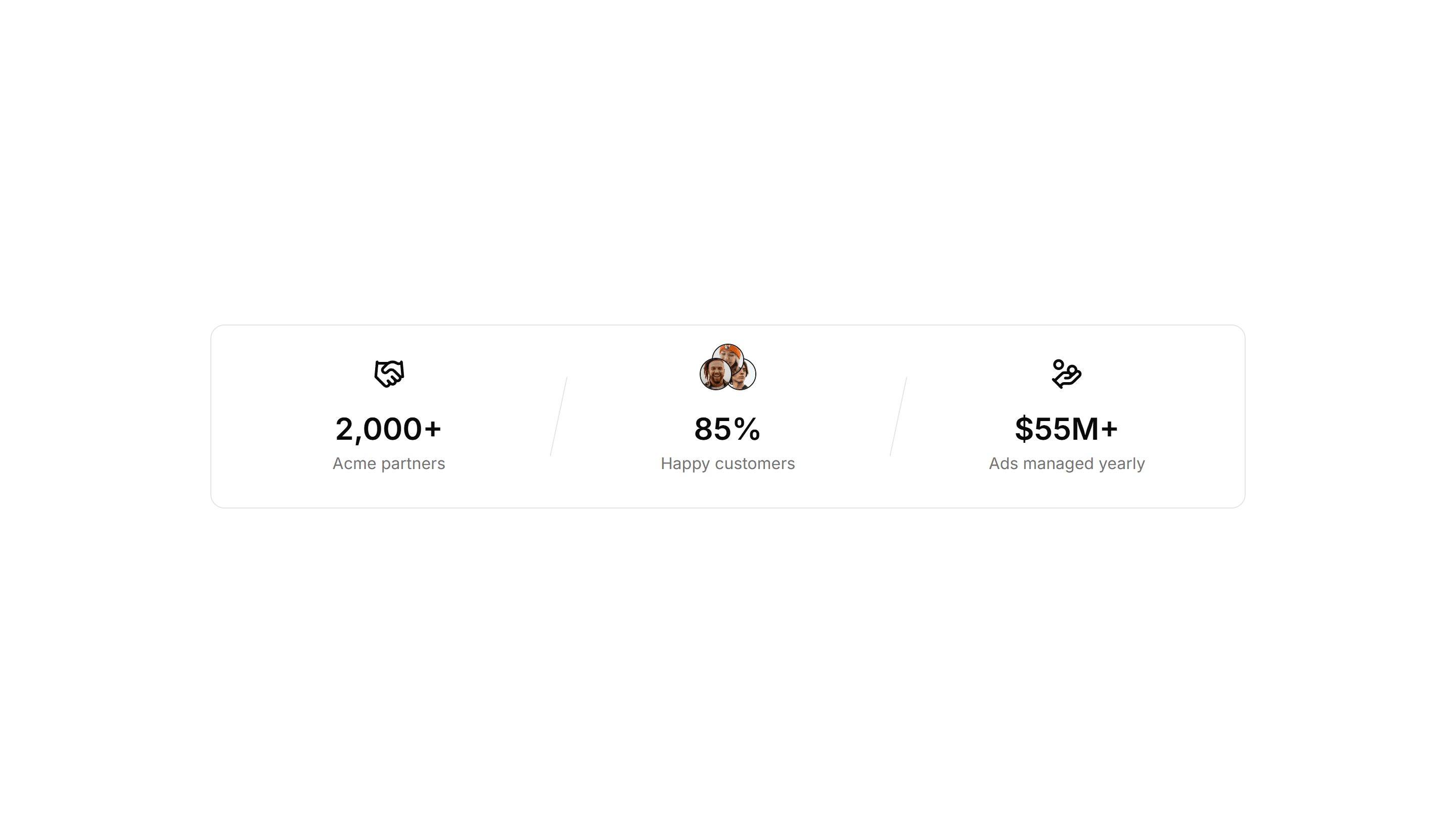
Marketing Stat: Trust Indicators
A band of proof points like uptime, customers, and ratings in one row. Use it near a signup form to reassure visitors and lift their confidence.
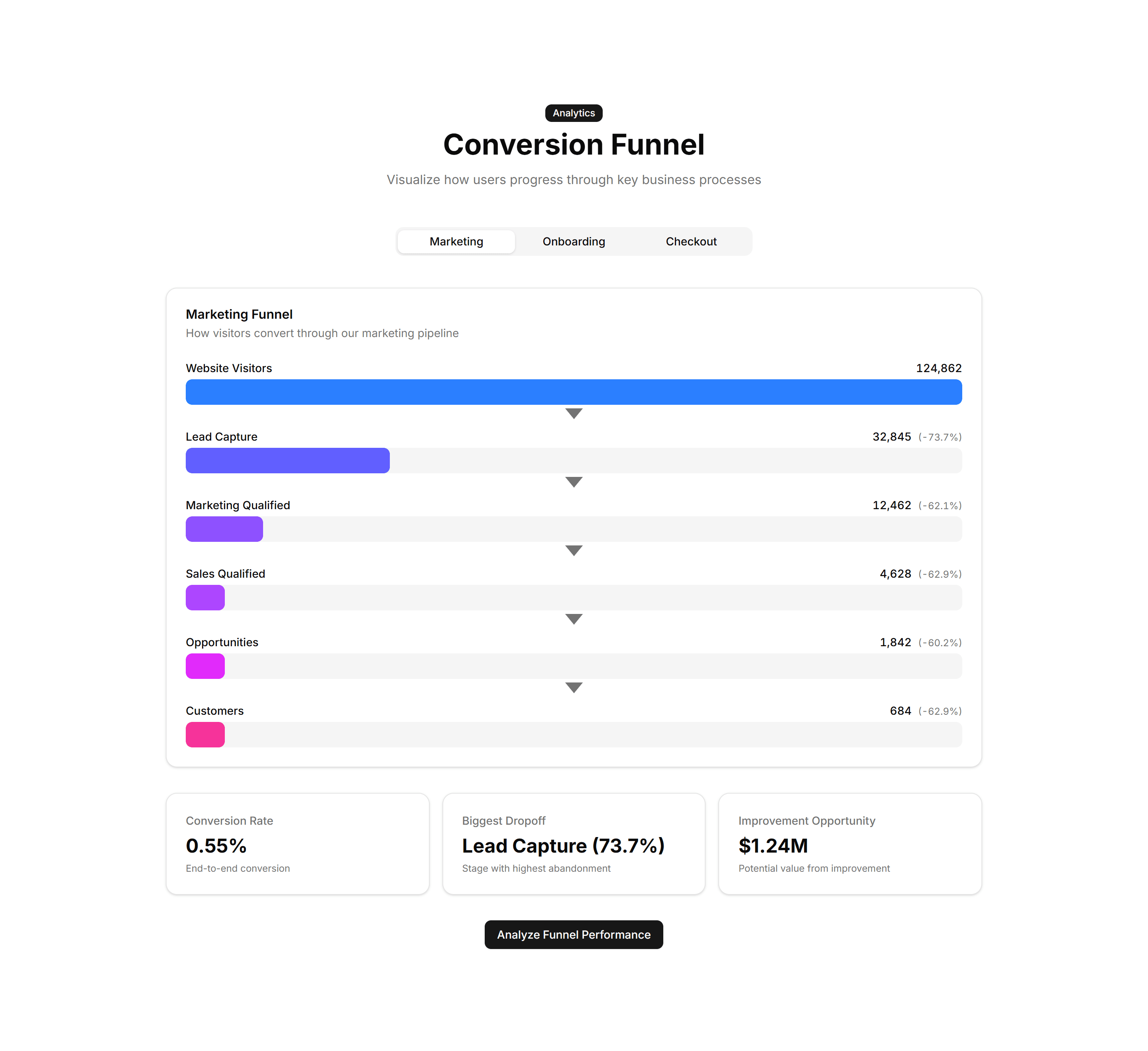
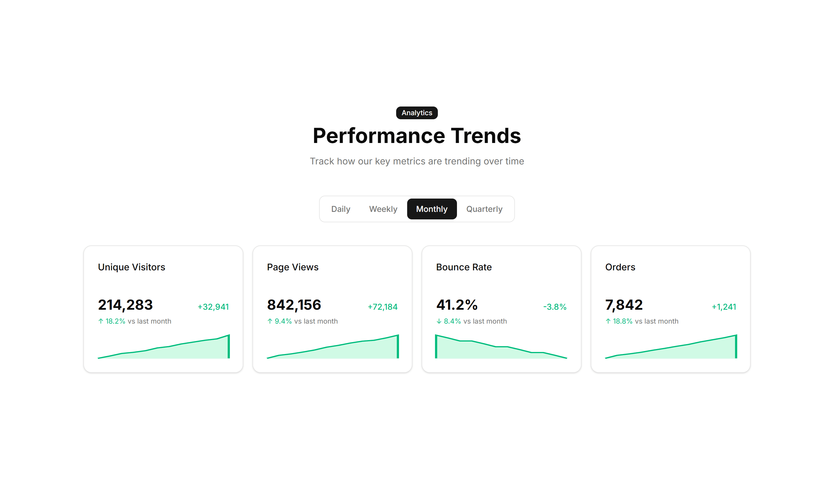
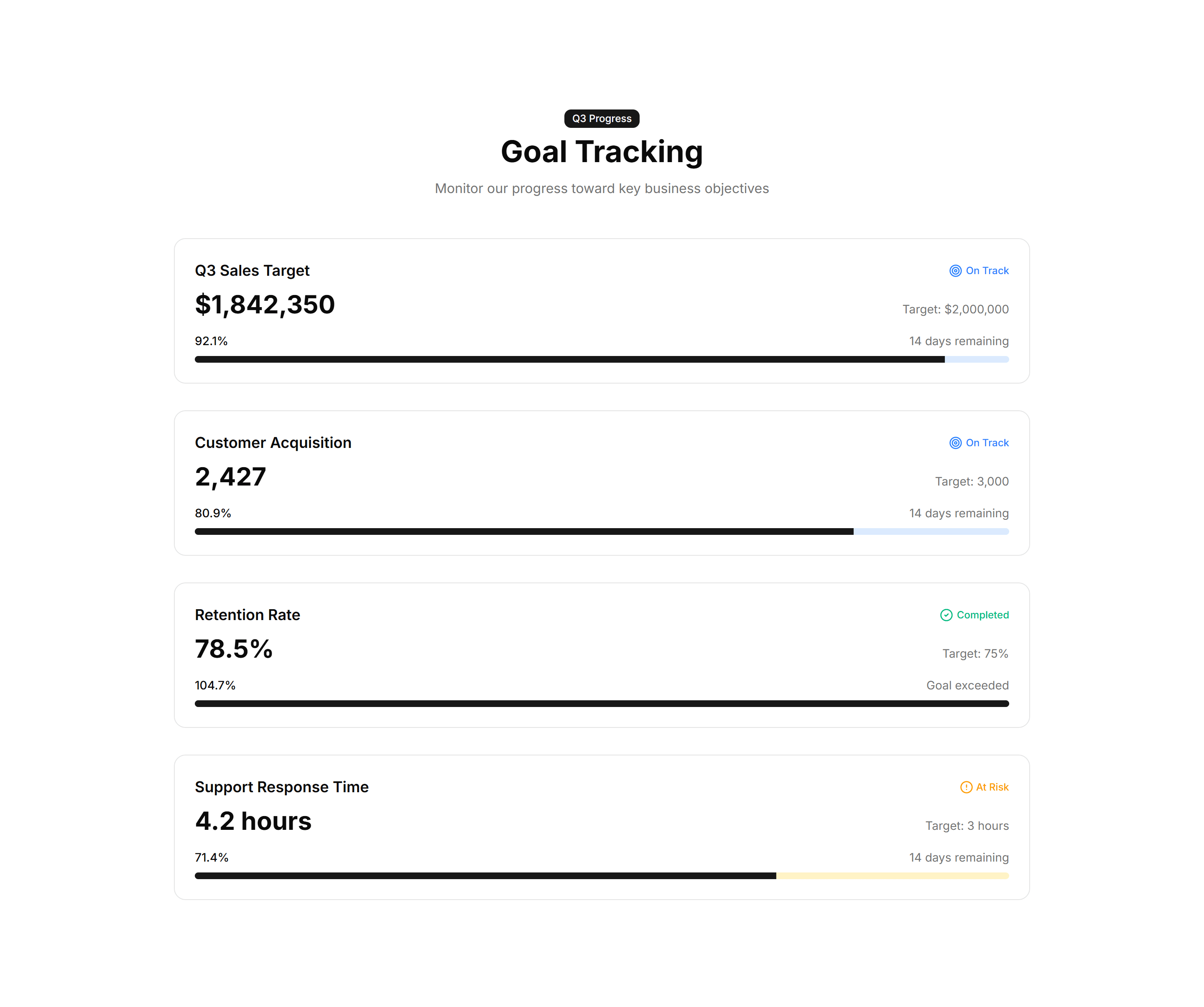
Marketing Stat: Funnel Stats
A stepped funnel showing how many visitors move from view to signup to paid. Use it to explain conversion and where users drop off in your flow.
Marketing Stat: Impact Numbers
Oversized counters that animate upward as the section scrolls into view. Use it to make reach, users, or revenue feel bold and immediate to readers.
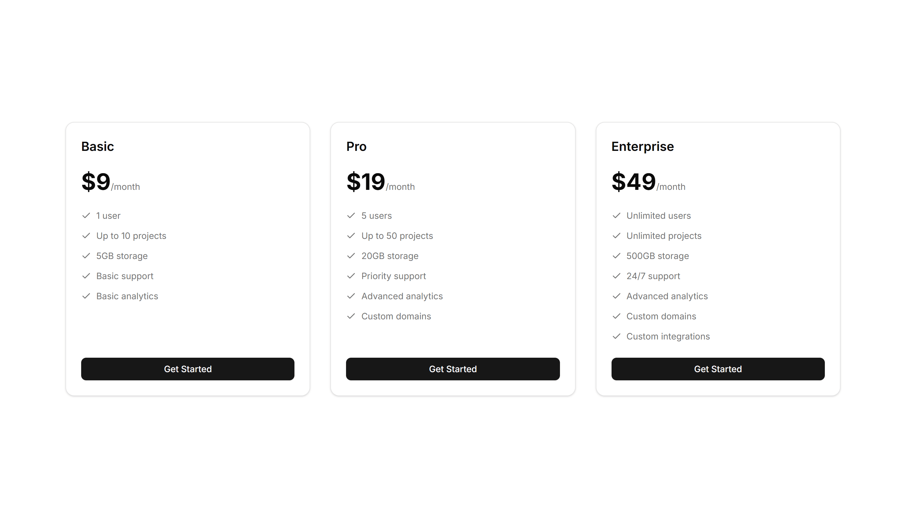
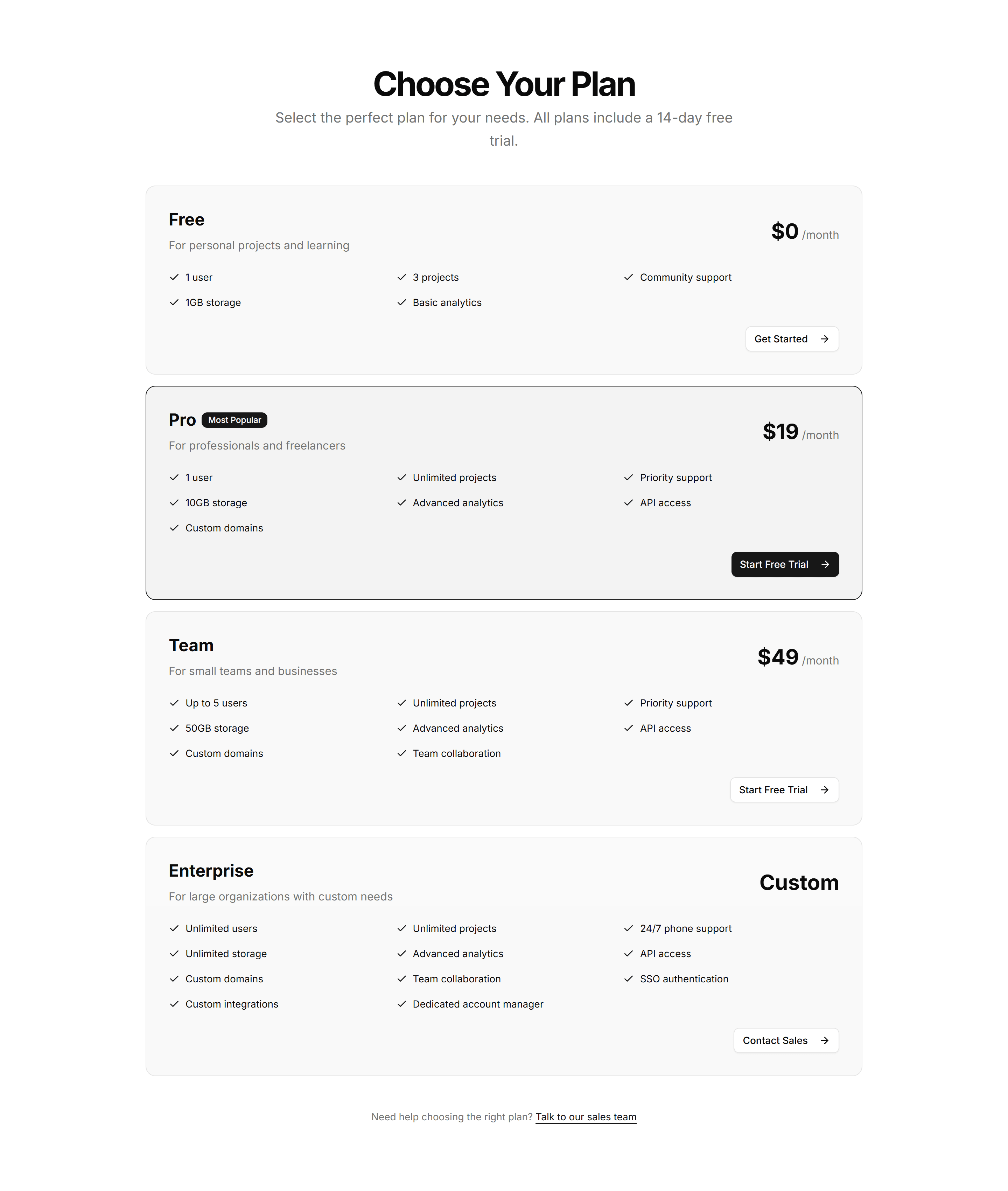
Marketing Pricing Section: Simple
A clean pricing section showing a few plans with price, features, and a button each. Use it when you want fast comprehension without extra decoration.
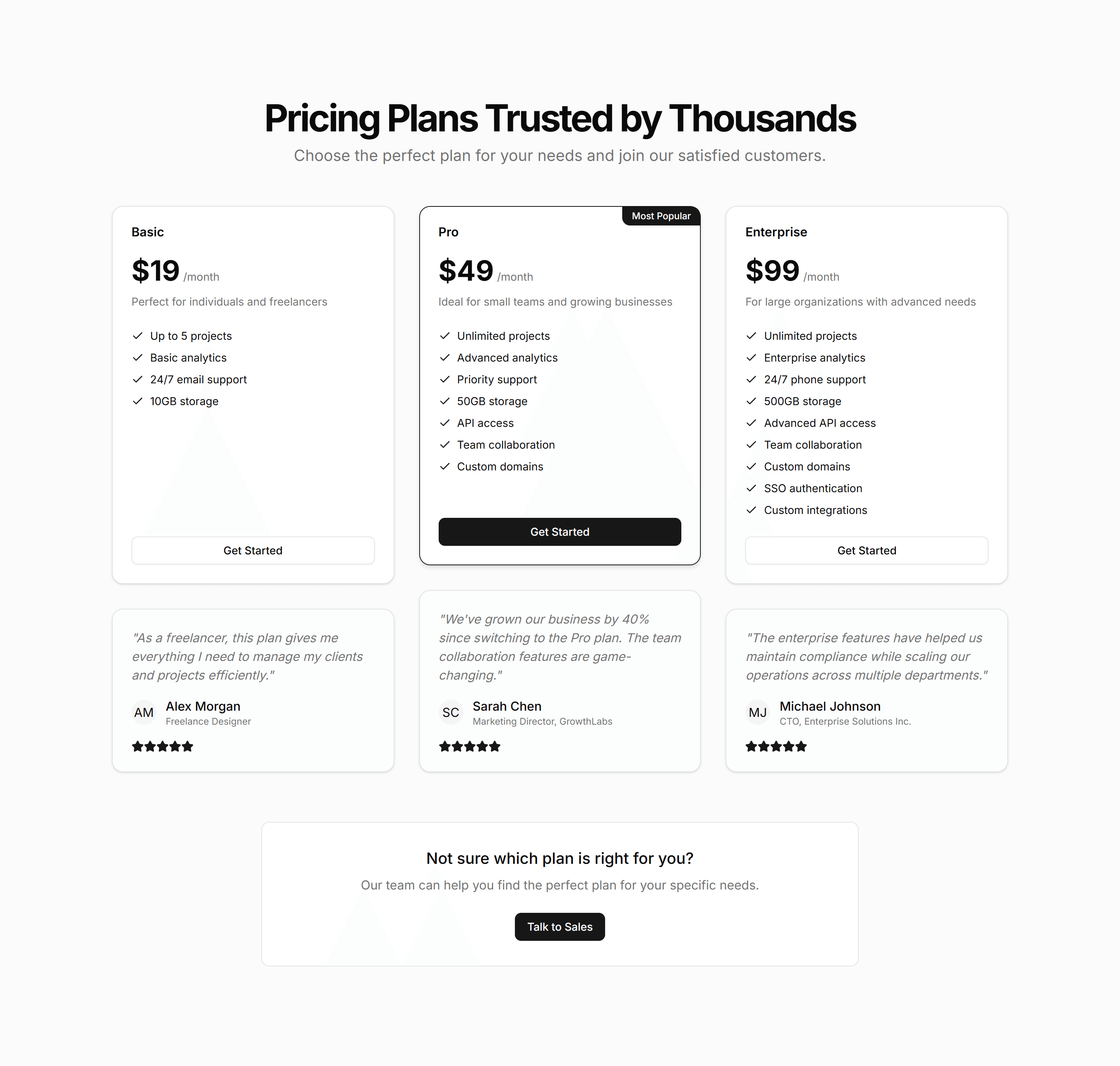
Marketing Pricing Section: Testimonial
A pricing section that pairs plan cards with customer quotes and logos. Use it to add social proof right where buyers weigh price and decide to commit.
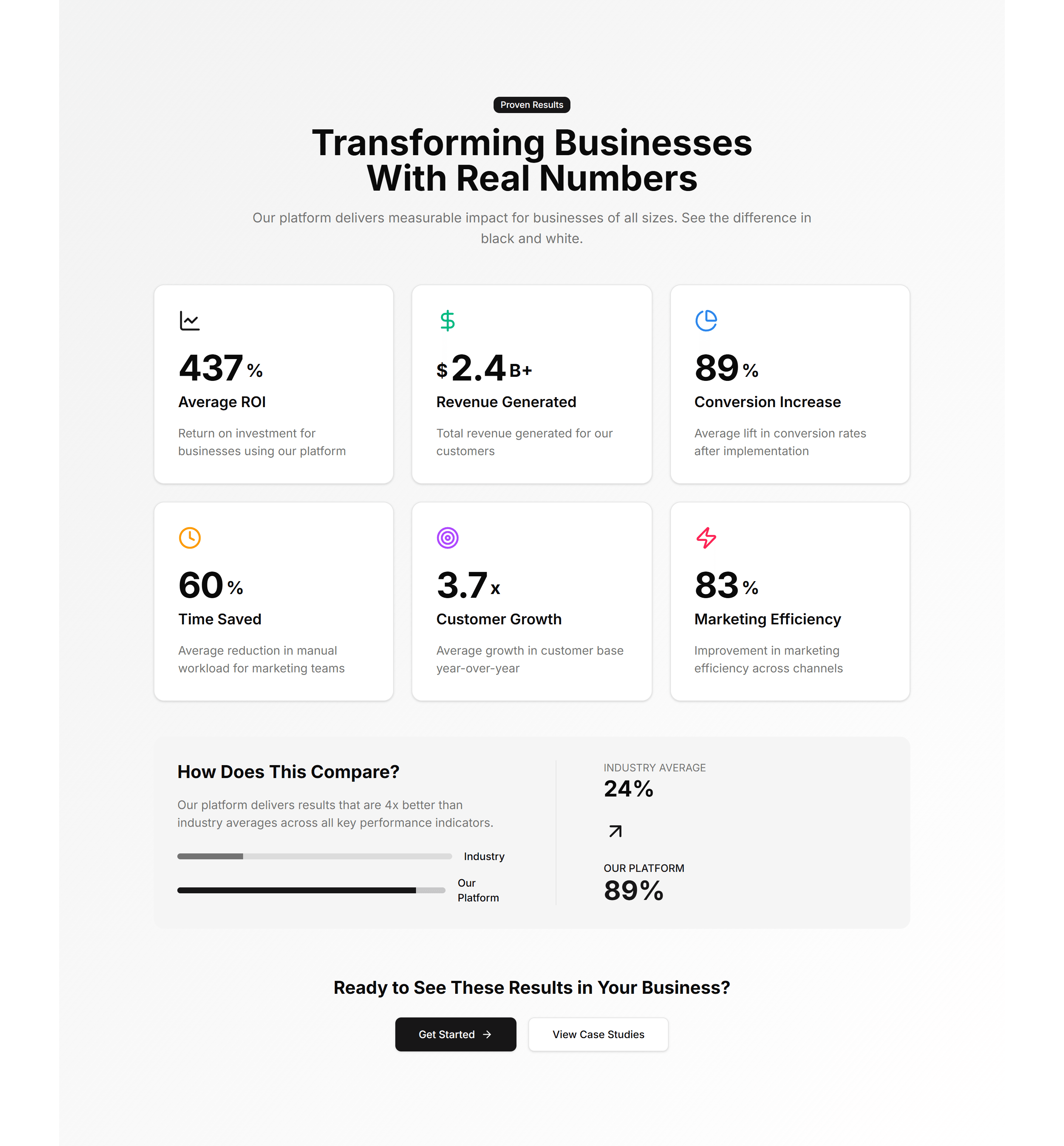
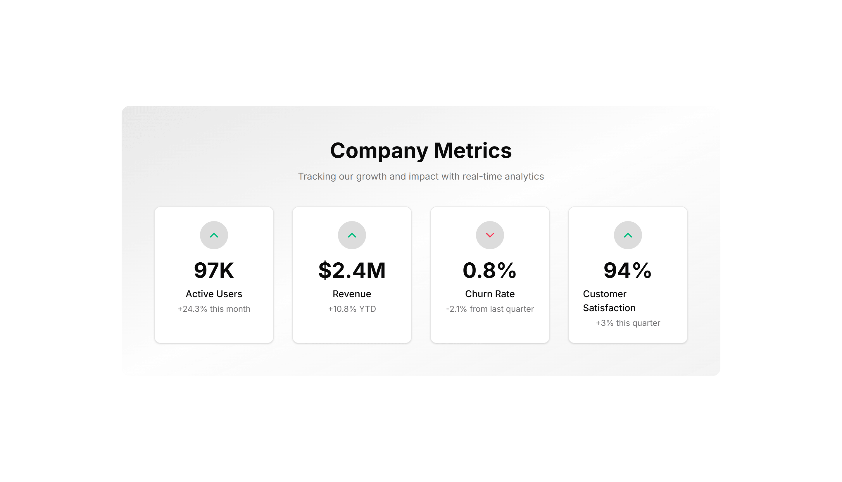
Marketing Stat: Card Group
A cluster of stat cards with a big number, label, and short caption in each. Use it to spotlight key metrics across a landing page in a clean grid.
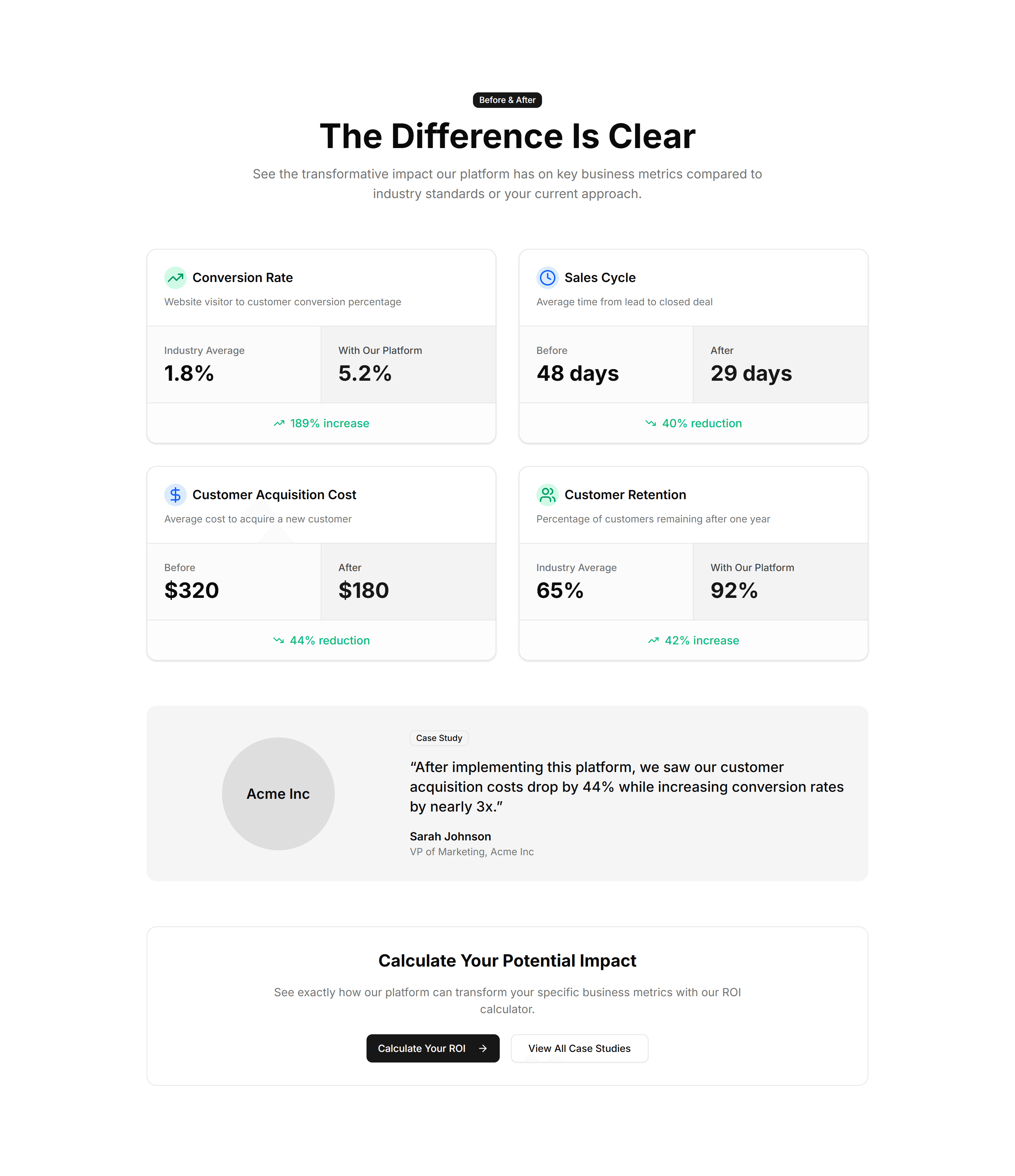
Marketing Stat: Comparison Metrics
Two columns of numbers placed side by side to contrast before and after results. Use it to show the lift your product delivers over the old way.
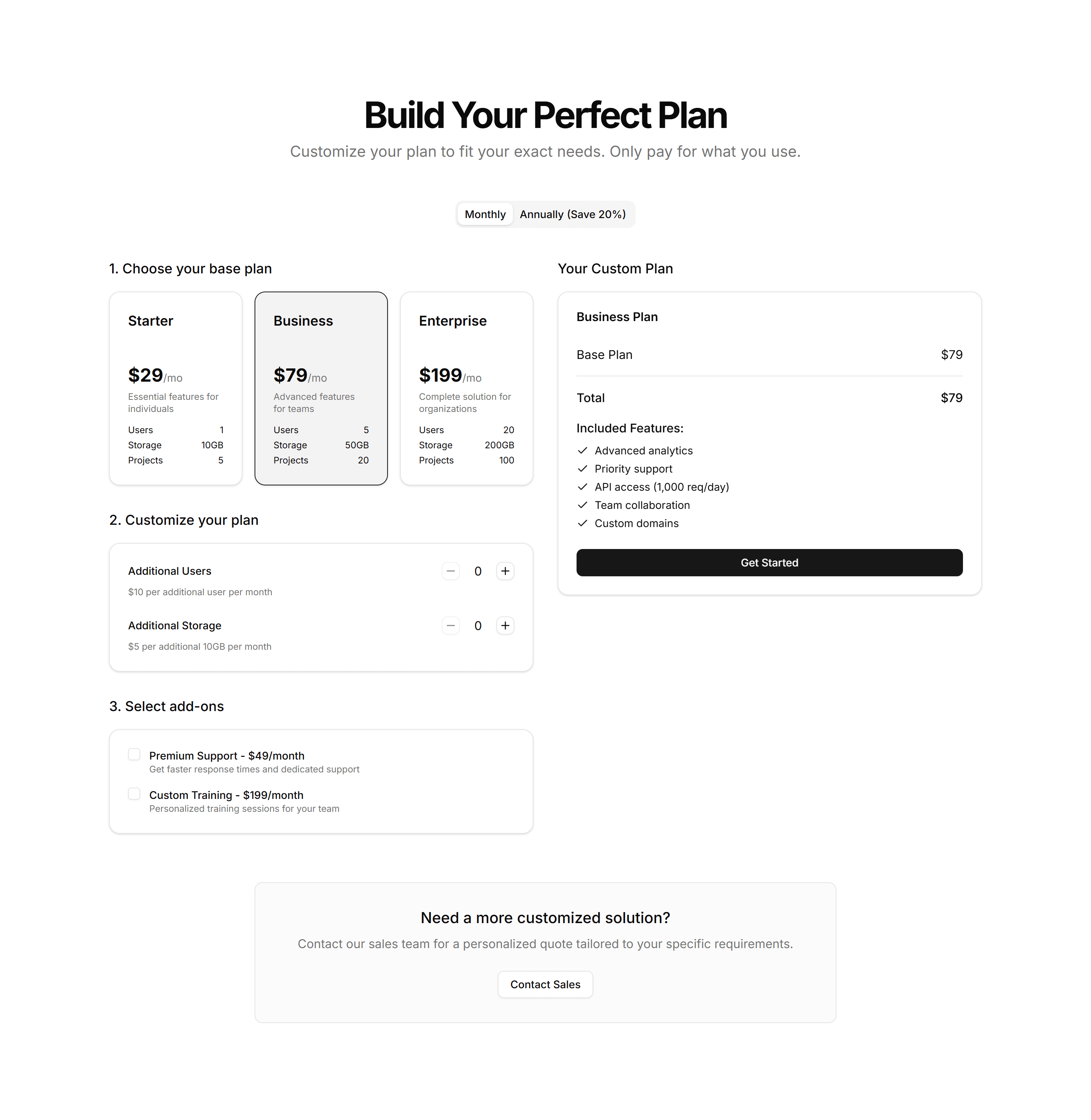
Marketing Pricing Section: Custom Builder
A plan builder where buyers pick features and quantities to assemble a quote. Use it for modular products where every customer needs a different mix.
Marketing Pricing Section: Horizontal
A wide pricing row that lays plans side by side in a single band. Fits narrow page slots and pages where you want plans visible without much scrolling.
Marketing Pricing Section: Minimalist
A pared back pricing layout with generous spacing, plain type, and one clear price. Use it when a single plan or clean brand needs no visual clutter.

Marketing Icon Section: Stacked Cards
Vertically stacked icon cards, each with a title and short blurb. Reads top to bottom on any screen and keeps a long feature list easy to follow.
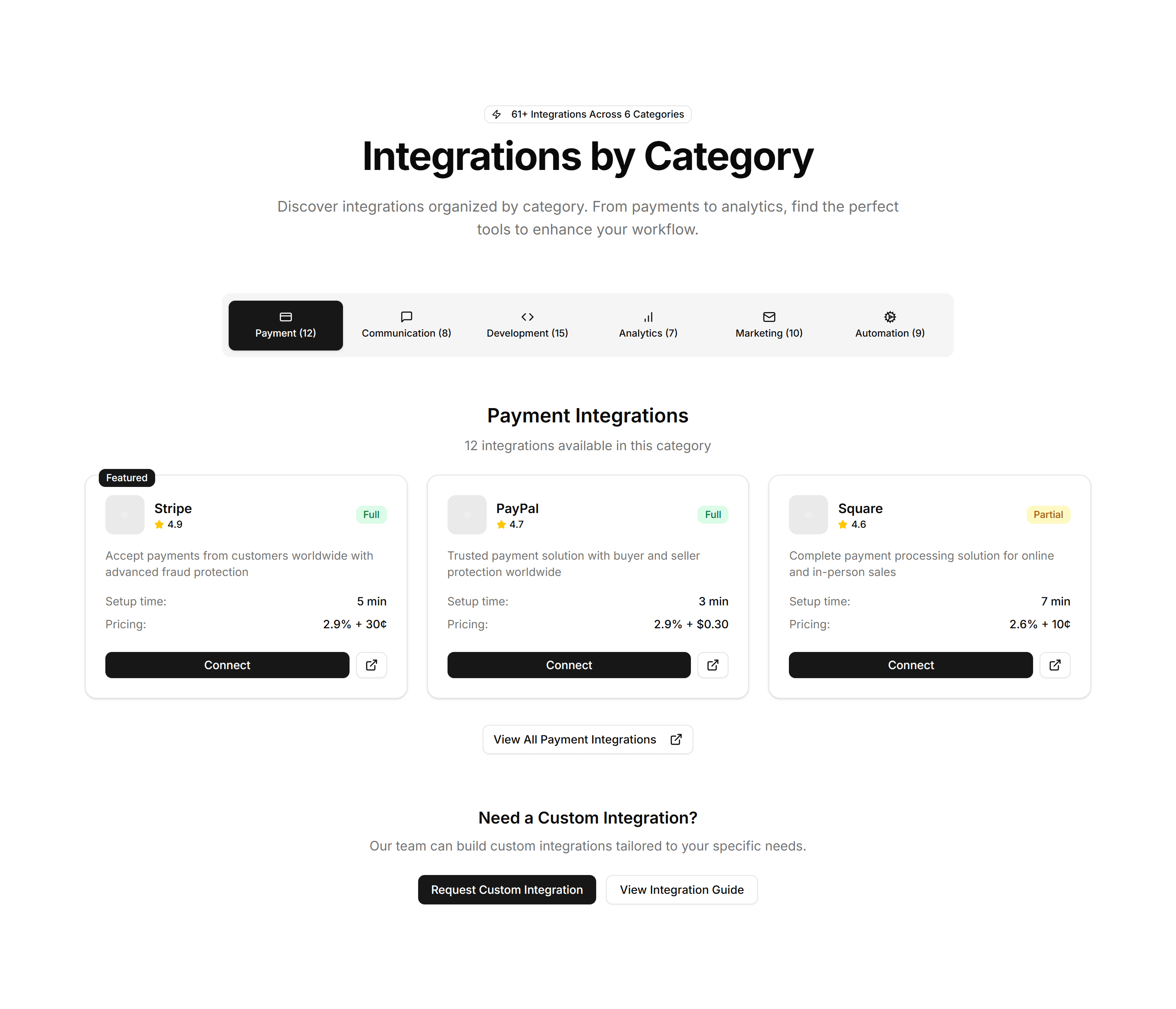
Marketing Integration: Category Tabs
Tabs that sort connected apps by type, so visitors filter integrations to find the one they use. Ideal for a busy marketplace or directory page.
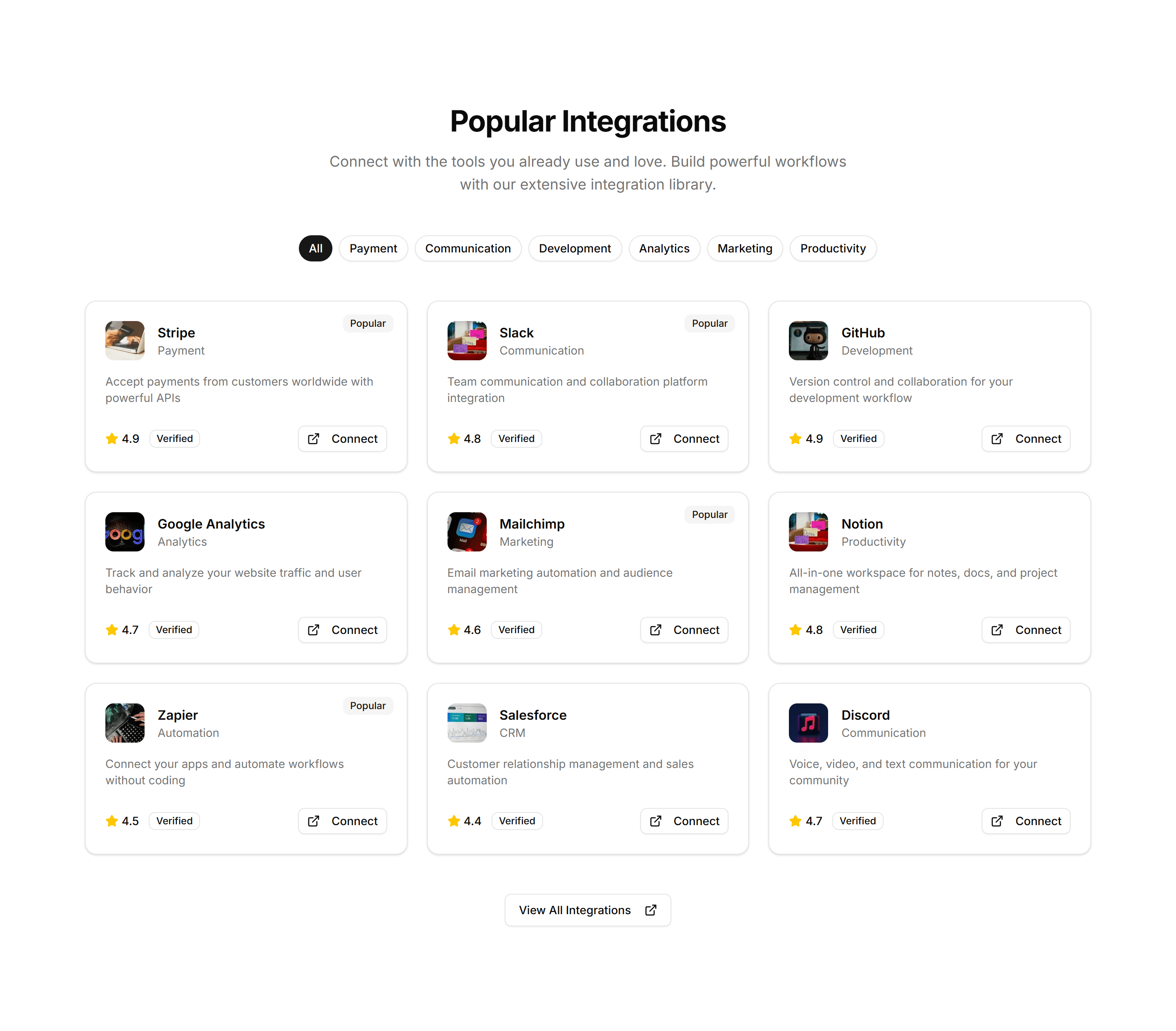
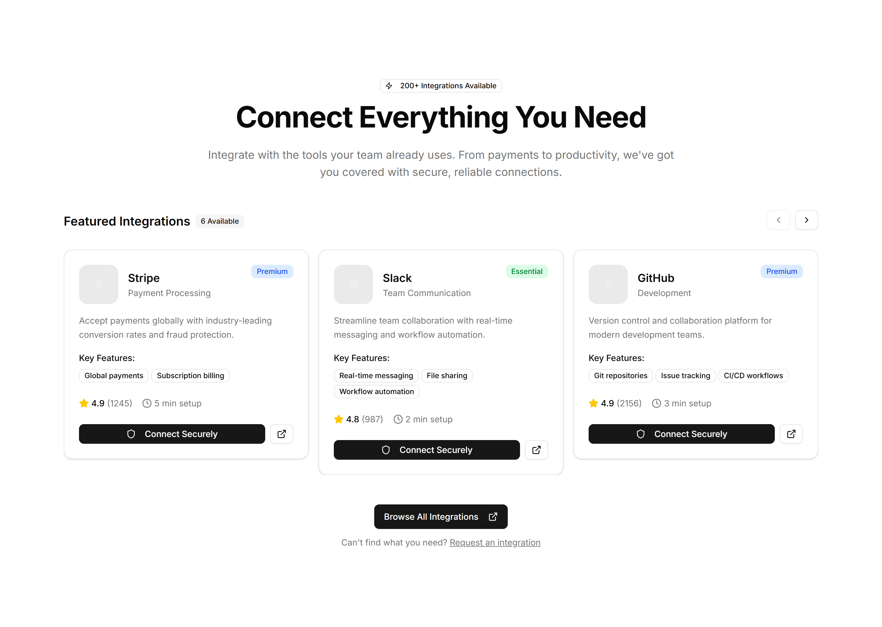
Marketing Integration: Simple Grid
A clean grid of integration logos in even rows and columns. Use it on a connections page to display the apps and services your product supports.

Marketing Icon Section: Icon Tabs Categories
Category tabs marked with icons that filter the features shown below. Helps visitors jump straight to the feature set that matches their needs.
Marketing Icon Section: Interactive Icon Showcase
An interactive panel where hovering an icon updates the description beside it. Invites visitors to explore features at their own pace and stay engaged.

Marketing Icon Section: Minimal Stats Tiles
Clean tiles showing an icon, a number, and a short label. A spare way to display a few key stats without distracting from the surrounding copy.

Marketing Icon Section: Icon Stats Grid
A grid of stat cards pairing an icon with a bold number and label. Surfaces growth figures and key results to build trust on a marketing page.
Marketing Icon Section: Description On Left Icon Blocks On Right
A split layout with a section heading and copy on the left and stacked icon blocks on the right. Pairs a narrative pitch with scannable feature points.
Marketing Icon Section: Feature Icon Tabs
Icon tabs that switch between feature panels in place. Lets visitors explore several capabilities without scrolling, one focused view at a time.
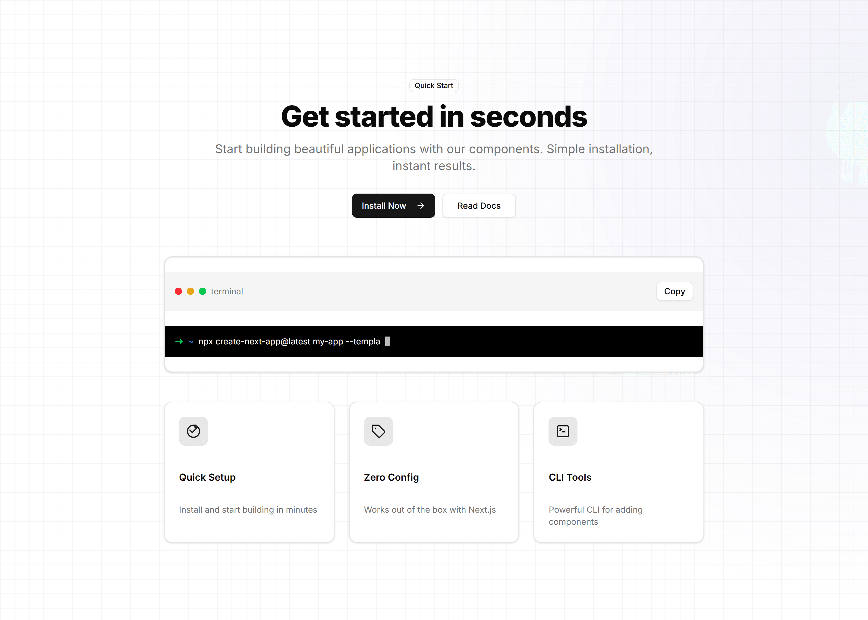
Marketing Hero Section: With Terminal
A hero pairing a headline and CTA with an animated terminal window. Speaks to developers and shows install or usage commands on a tool landing page.
Marketing Testimonial: Short Review With Logo And Stars
A brief review with a star rating and a company logo for instant credibility. Place it near a pricing table to reassure buyers before they commit.
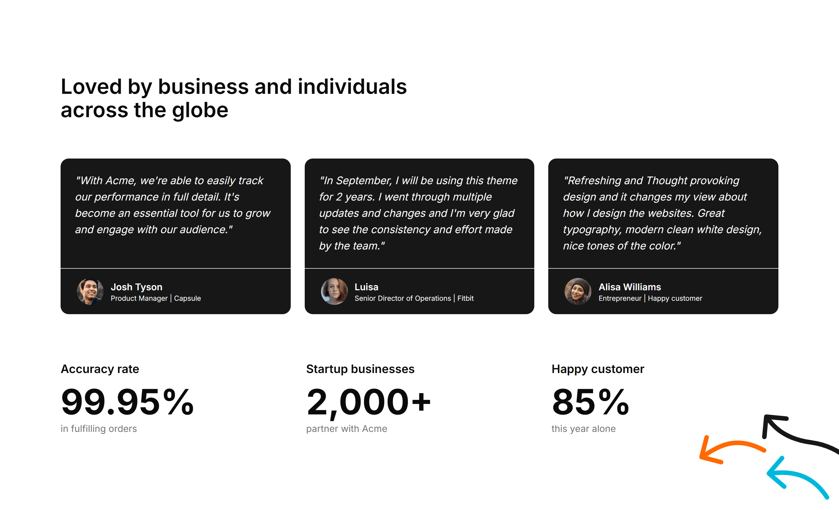
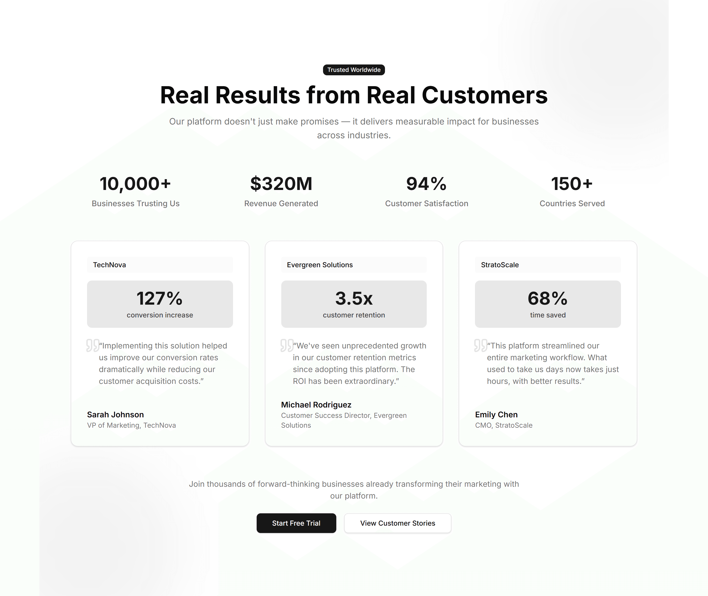
Marketing Testimonial: With Stats
A testimonial section blended with key metrics such as customers served and ratings. Combine a quote with proof points to back your claims with data.
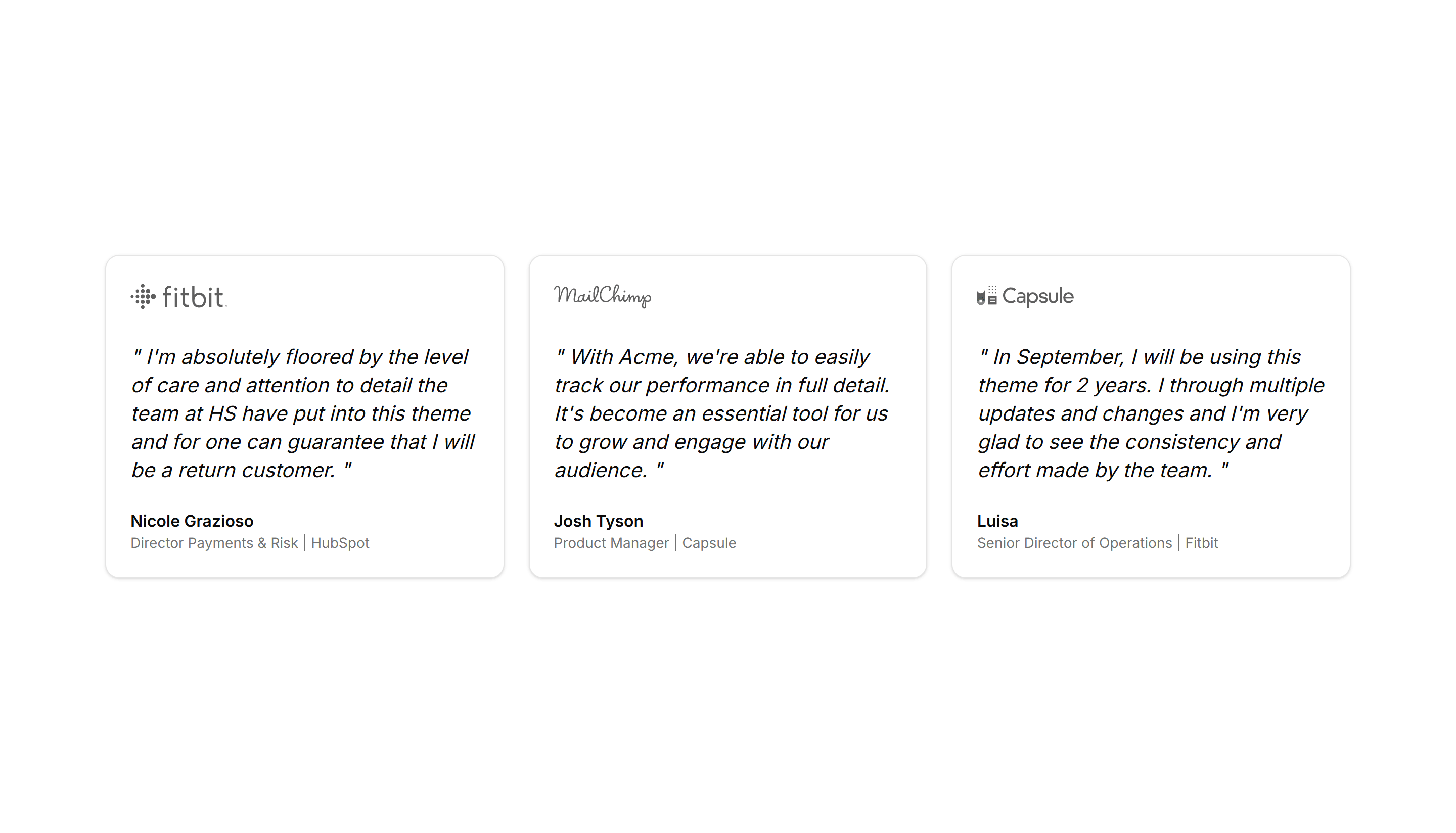
Marketing Testimonial: Cards
A grid of testimonial cards, each holding a quote, avatar, name, and title. Show several happy customers at once to build trust across your page.
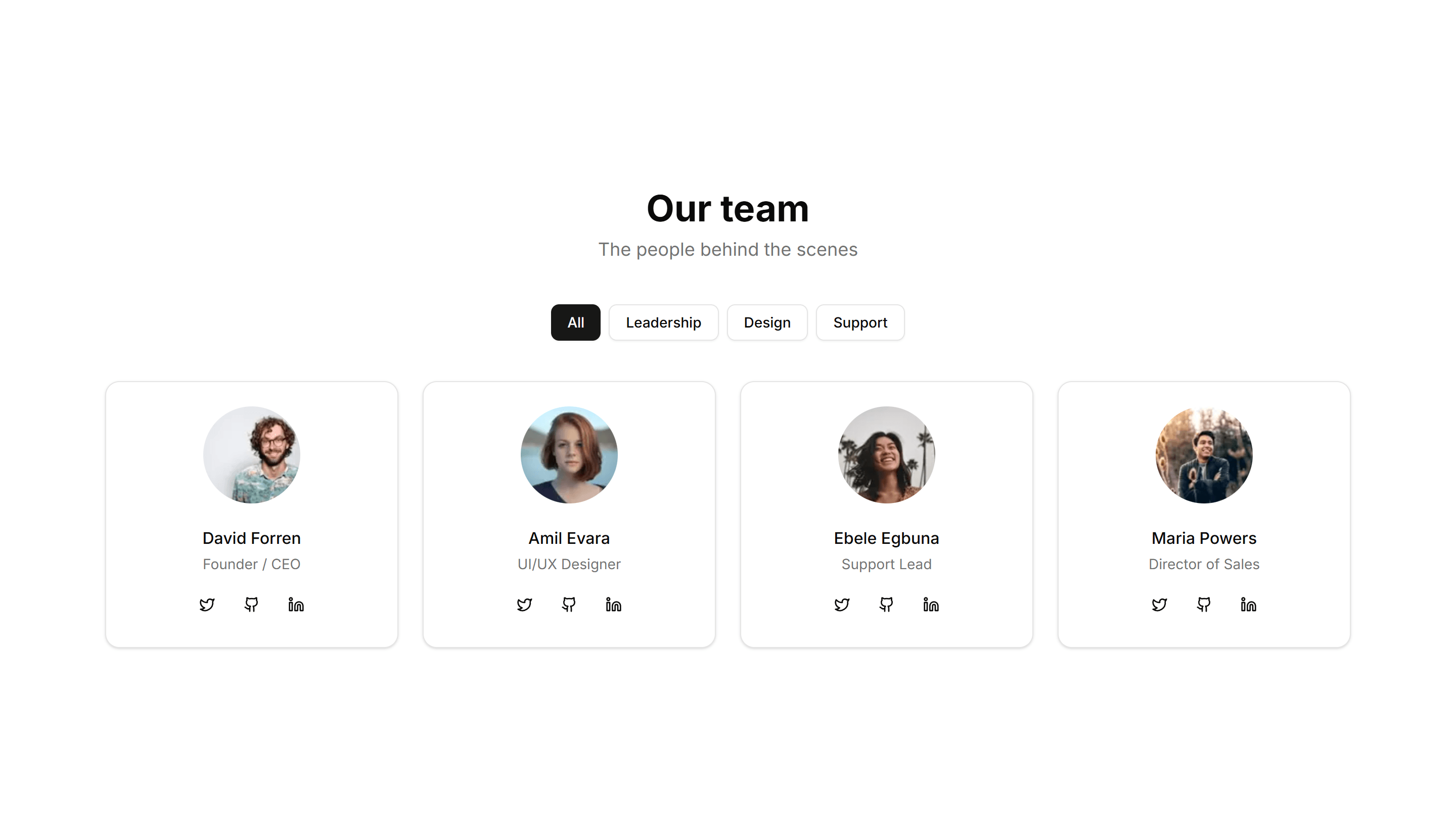
Marketing Team Section: Simple Cards
A clean grid of team member cards, each with a photo, name, and role. The fast, tidy way to introduce a small team on an about or company page.

Marketing Team Section: With Hover Cards
A team grid where each photo reveals a short bio and social links on hover. Keeps the layout clean while extra detail stays one mouse move away.
Marketing Team Section: With Testimonials
Team profiles paired with short quotes from each member or their clients. Adds a human voice and social proof to the about page of any company.
Marketing Subscribe: Incentive Center Aligned
A centered signup block that offers a clear incentive above the email field. Use it to reward visitors who join your list with a discount or guide.
Marketing Subscribe: Simple Right Aligned
A signup block with text on the left and the email field aligned right. Fits wide sections where you want the form to balance the supporting copy.

Marketing Team Section: Alternating Sections
A team layout that alternates photos and bios from left to right down the page. Adds rhythm and gives room for longer profiles on an about page.
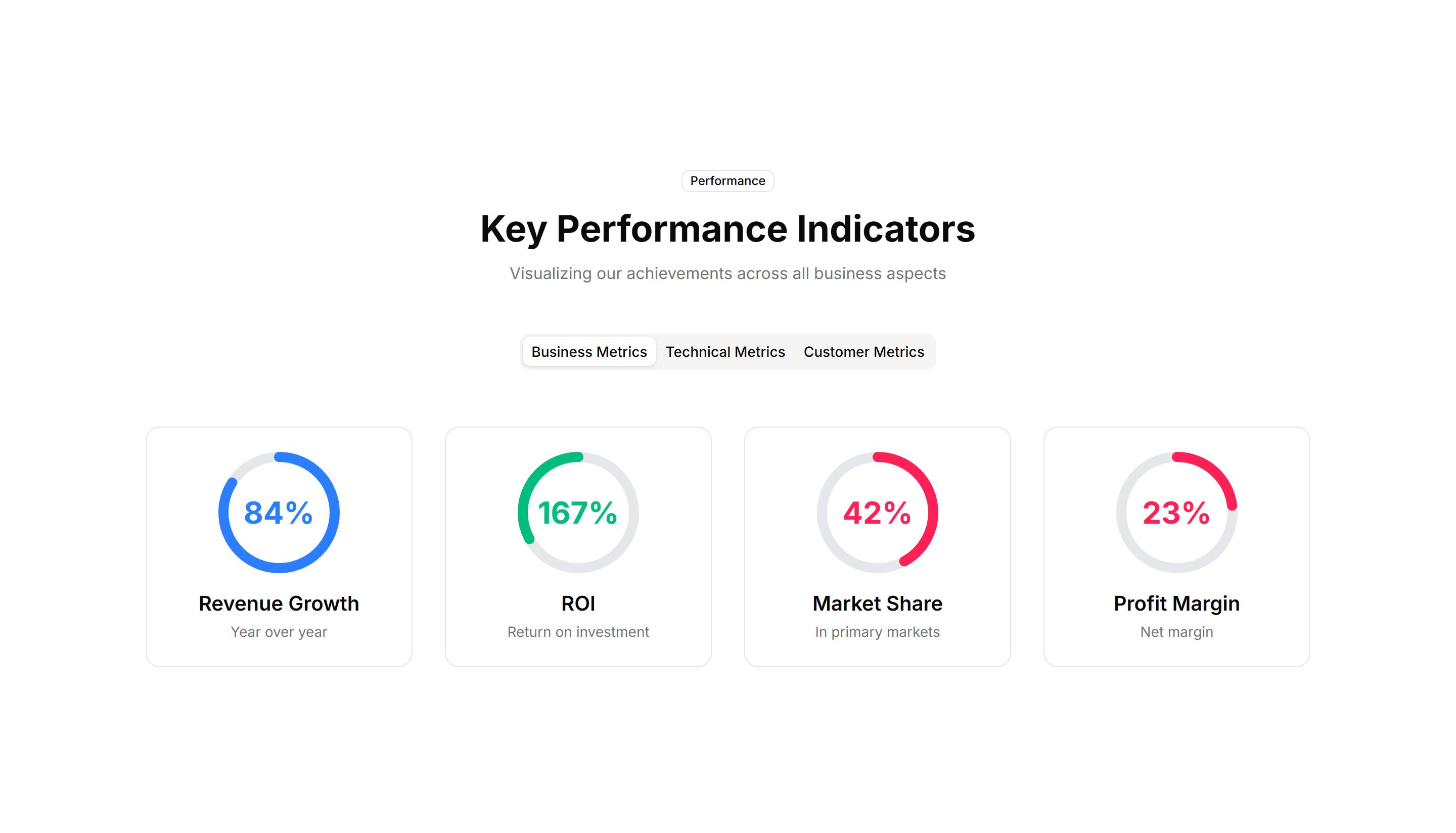
Marketing Stat: Simple 3 Cols
Three evenly spaced columns each with a number and a short label below. Use it for a clean, balanced stats strip on any marketing or about page.
Marketing Stat: Timeline Stats
Key numbers plotted along a horizontal timeline of moments and dates. Use it to tell a growth story across quarters on an about or press page.
Marketing Stat: Comparison Stats
Paired figures with labels that weigh your offering against a baseline. Great for sales pages that need to make the gain feel concrete and credible.
Marketing Stat: Gradient Grid
A grid of stat tiles washed in soft gradients for a vivid, modern look. Use it to display headline metrics when you want the section to feel premium.
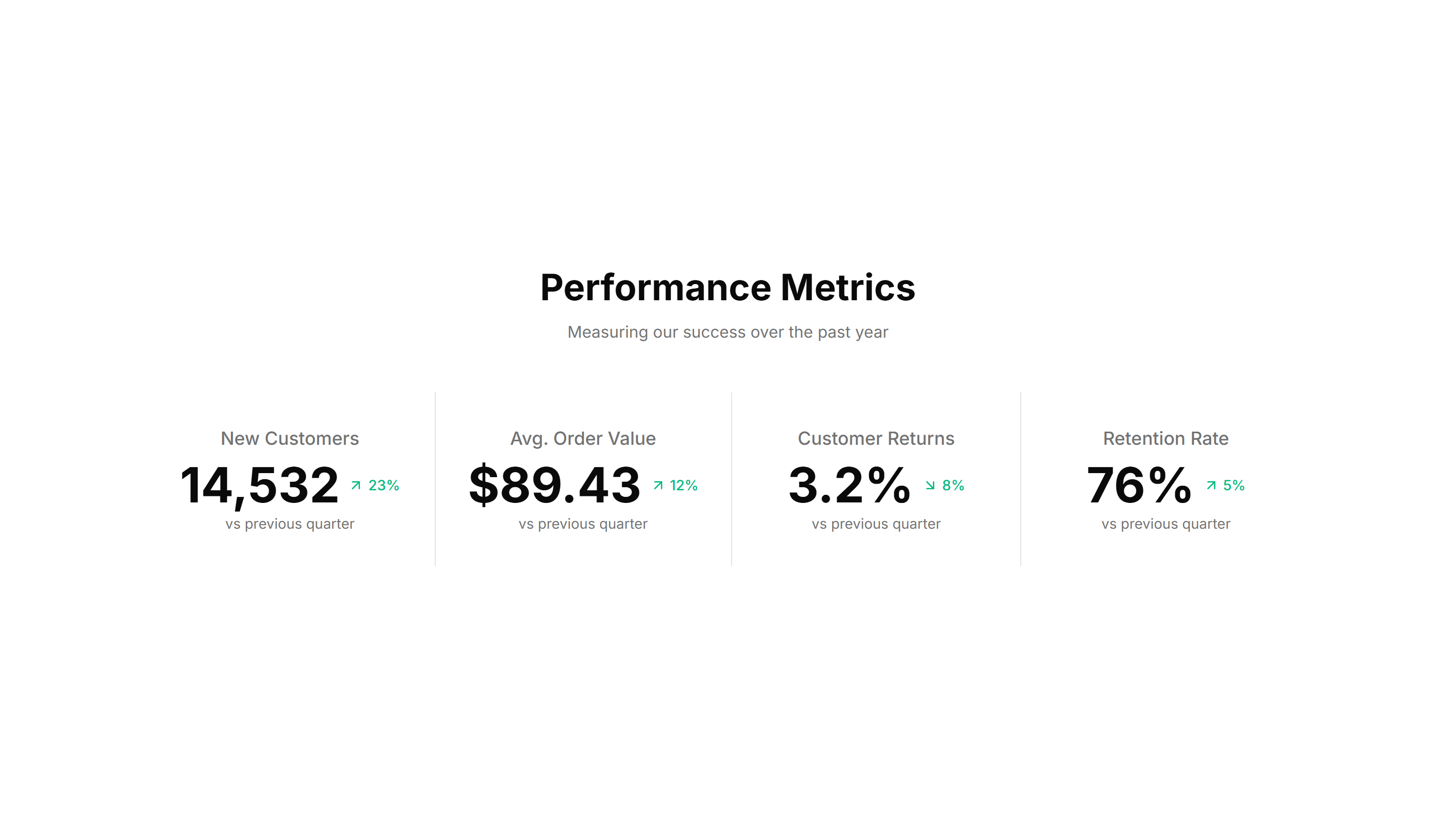
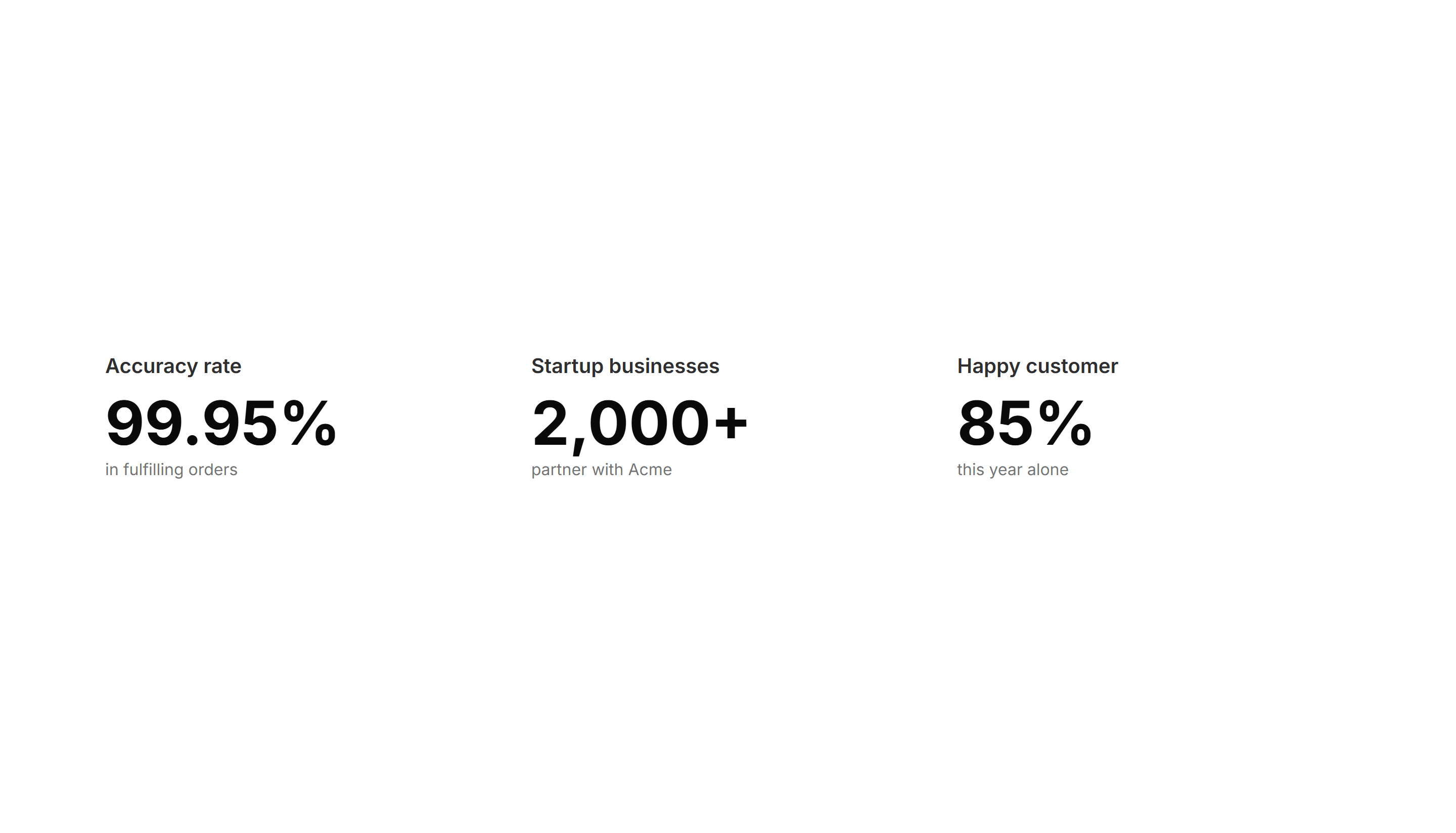
Marketing Stat: Horizontal With Dividers
A single row of figures split by thin vertical dividers for a tidy summary. Use it under a hero to surface three or four headline numbers fast.
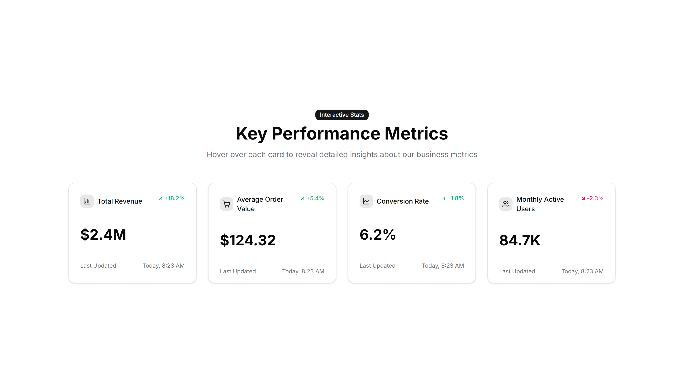
Marketing Stat: Interactive Hover
Stat cards that reveal extra detail or a chart when you hover over them. Use it when you want a number to expand into context on a feature page.
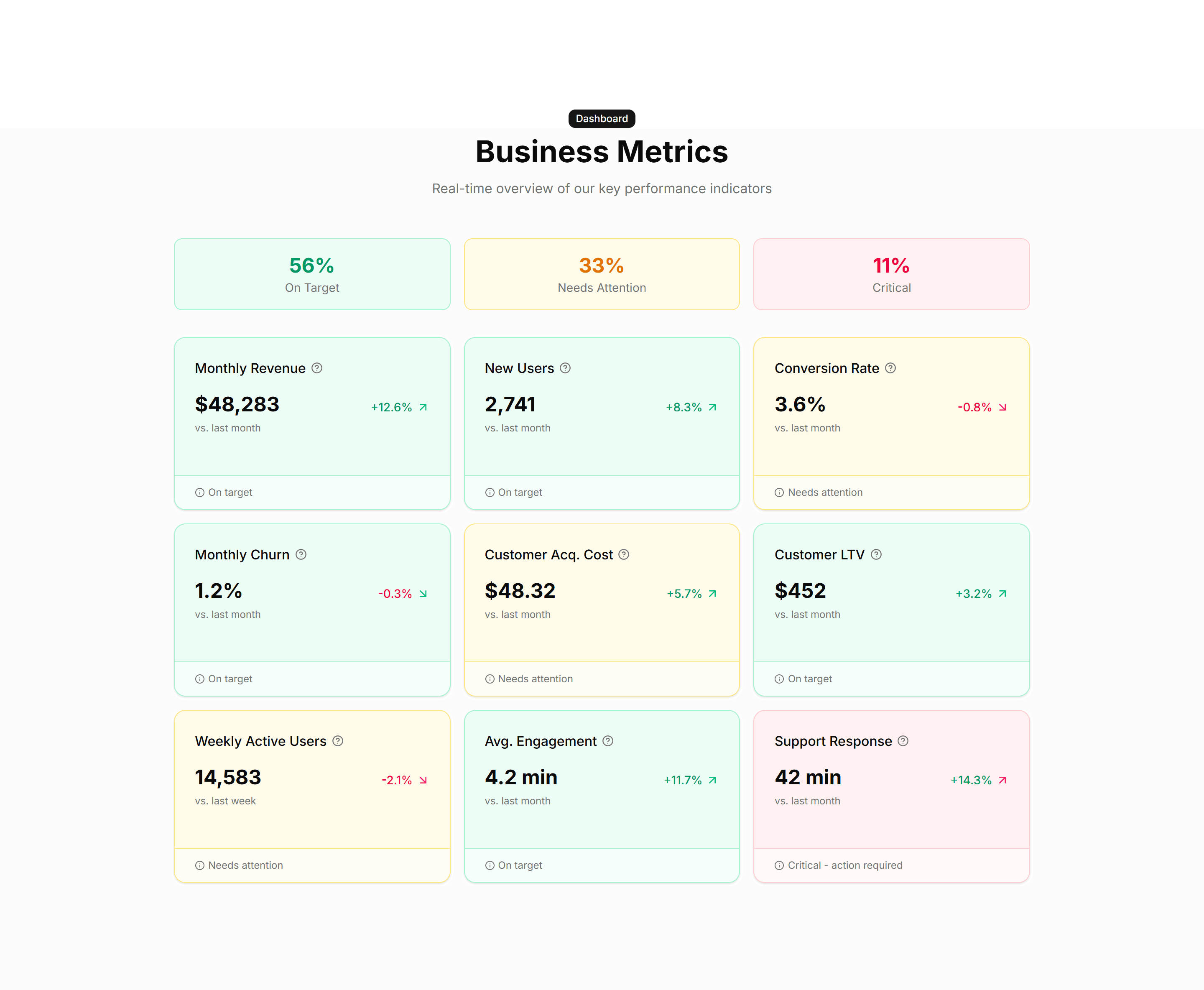
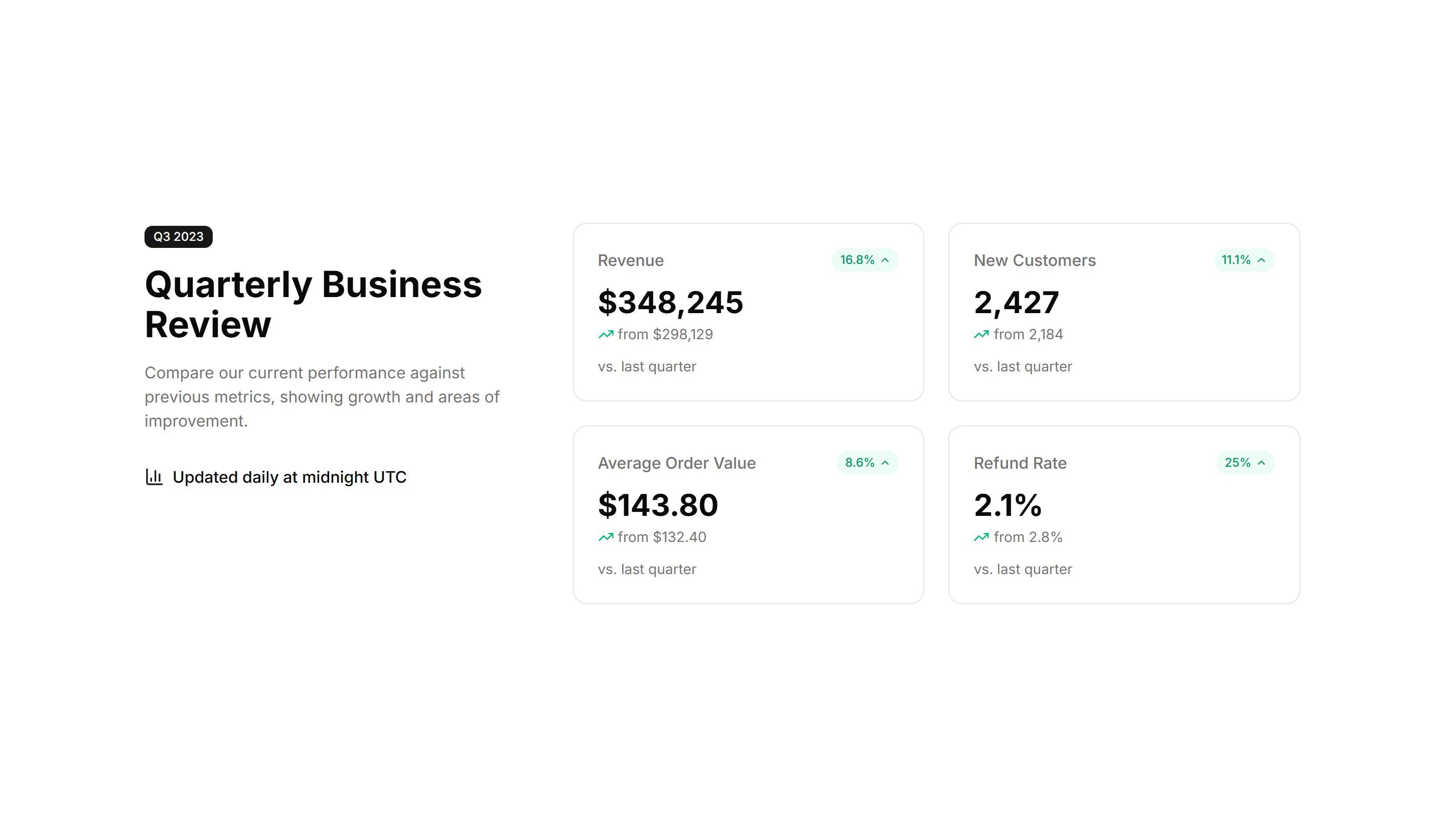
Marketing Stat: Metric Cards
Bordered cards each holding one metric, a label, and a trend note. Use it to report KPIs in a structured layout on a homepage or product page.
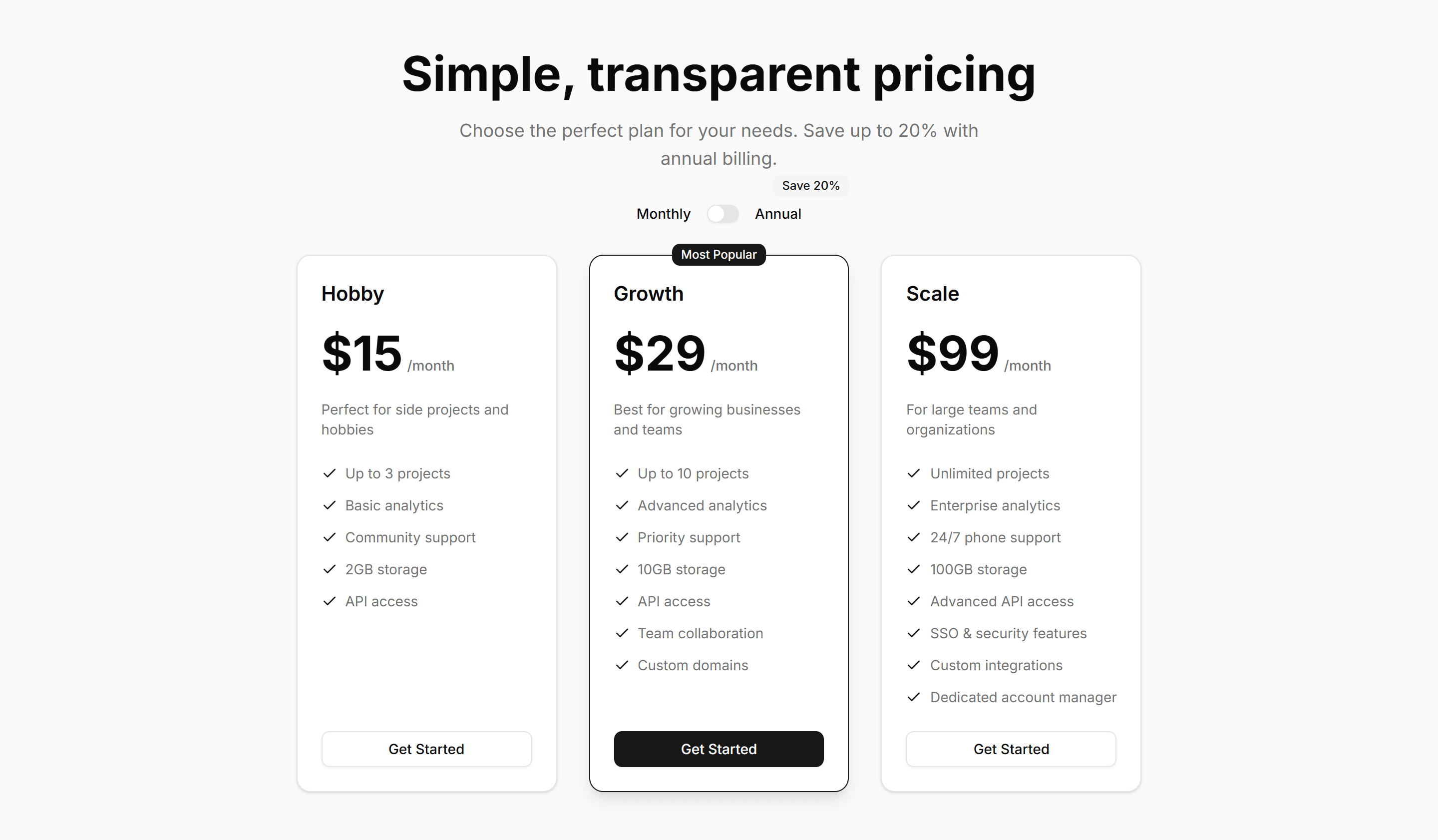
Marketing Pricing Section: Toggle
A pricing section with a monthly and yearly switch that updates every plan price. Use it to show annual savings and let buyers pick a billing cycle fast.
Marketing Stat: Achievement Bars
Horizontal bars that fill to show milestones reached against a target. Drop it on a results page to visualize goals hit and progress toward each one.
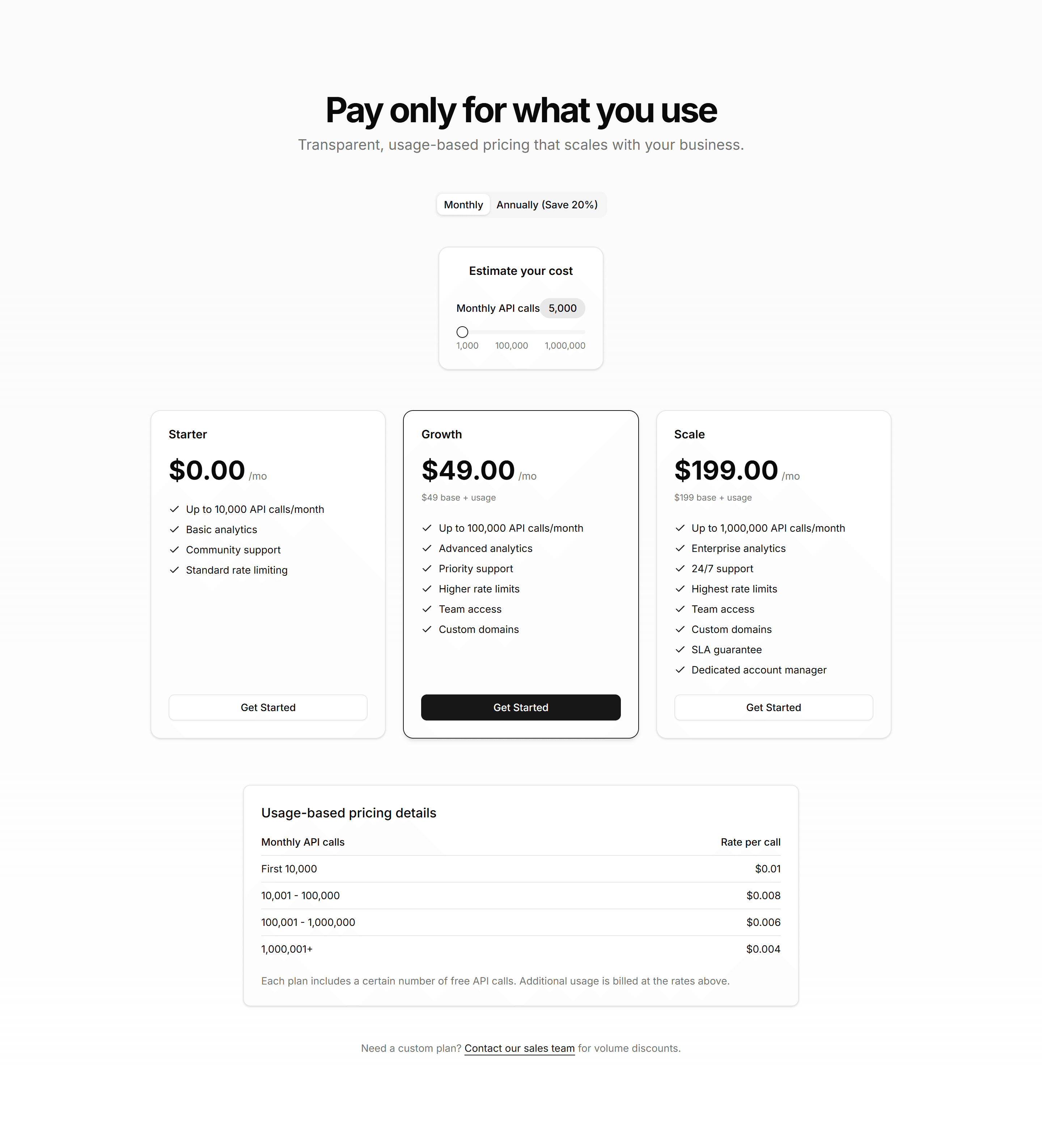
Marketing Pricing Section: Calculator
A pricing calculator with sliders and inputs that estimate cost from usage. Use it when plans scale by seats, requests, or volume so buyers see real numbers.
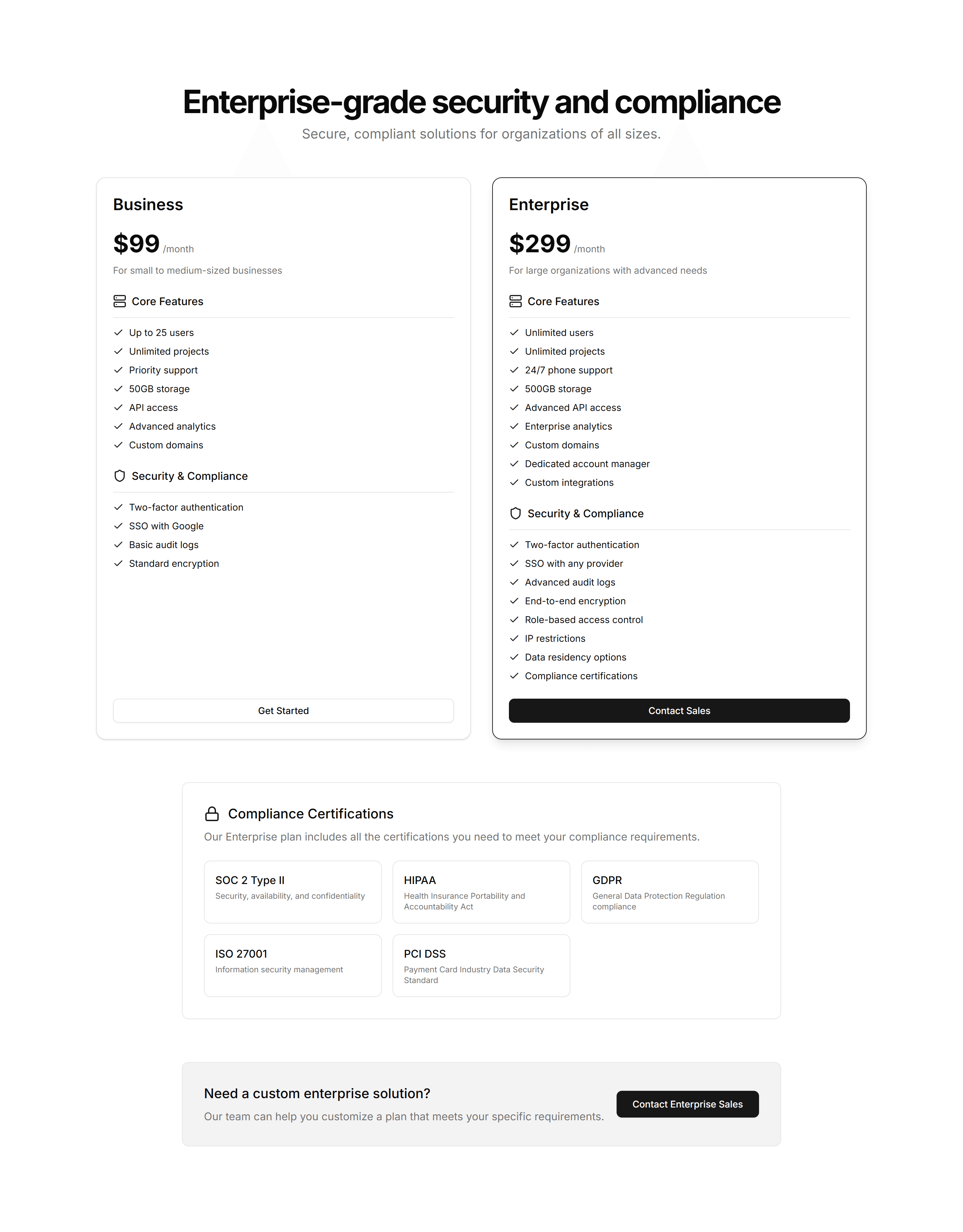
Marketing Pricing Section: Enterprise
A pricing layout pairing standard tiers with a contact sales panel for large accounts. Use it when bigger deals need custom quotes and a human conversation.
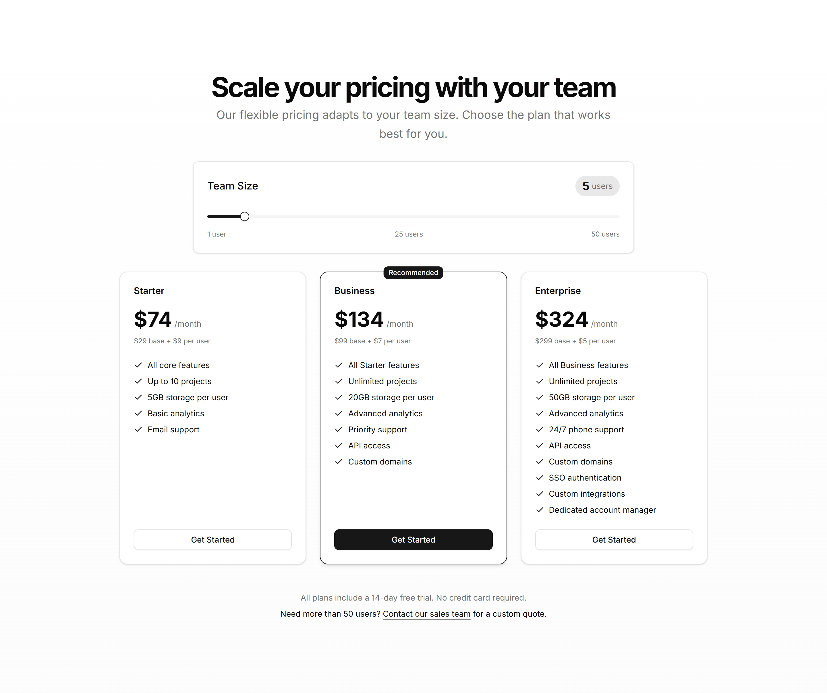
Marketing Pricing Section: Interactive
A pricing section that updates prices and highlights as buyers select options. Use it when choices like seats or add ons should reflect cost instantly.
Marketing Icon Section: Solid Icon With Hover Effect
Solid filled icons that shift colour or lift on hover. Adds tactile feedback to a feature grid so the section feels responsive as visitors browse.
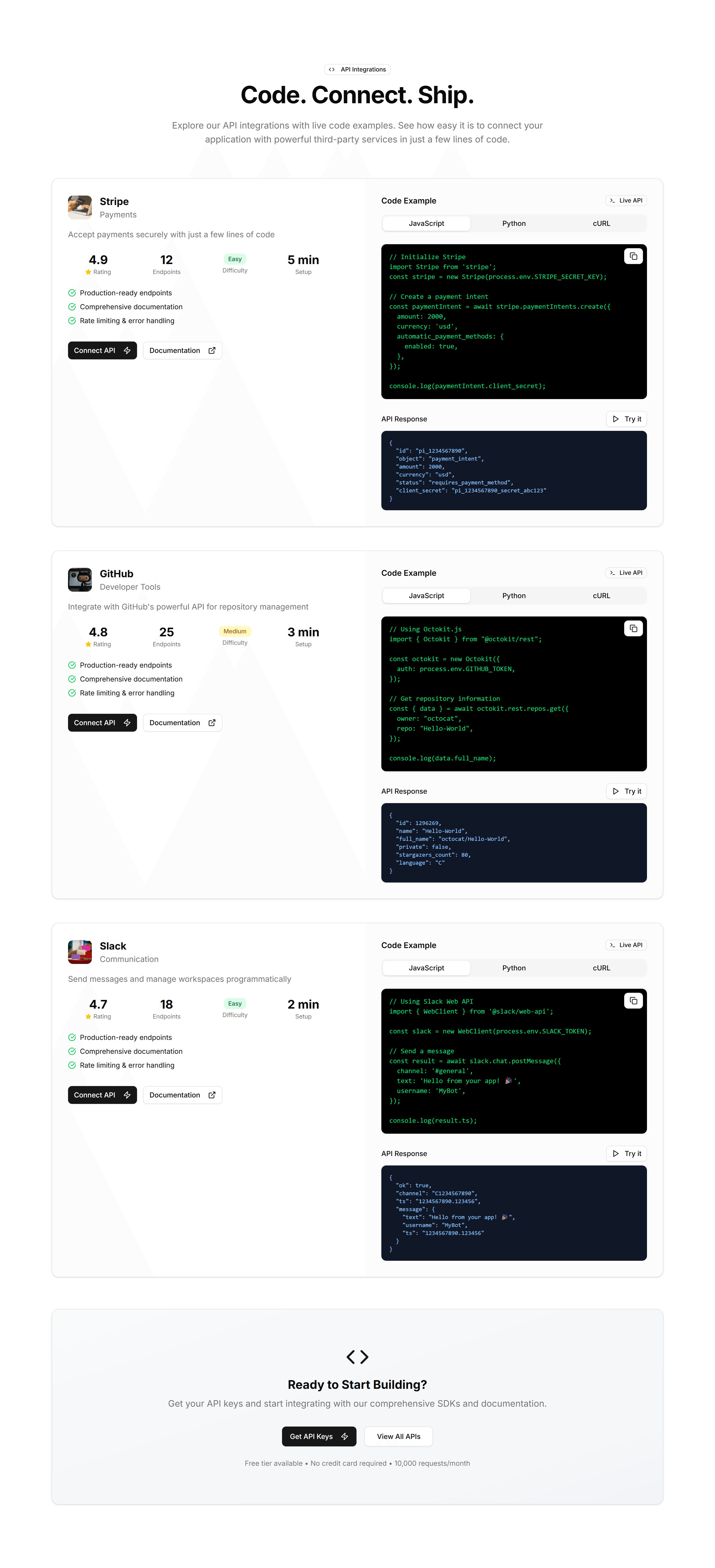
Marketing Integration: API Preview
A code sample panel beside copy that explains your API. Drop it on a developer page to show how integrations connect in only a few short lines.

Marketing Masonry Section: Cards On Images
A masonry grid of cards layered over images, each with a heading and short text. Showcases a gallery, portfolio, or product collection on a landing page.

Marketing Icon Section: Icons With Tooltips
A row of icons that reveal a short tooltip on hover. Packs many features into a small space while keeping extra detail one cursor away.

Marketing Icon Section: Metric Cards
A set of cards pairing an icon with a headline metric and caption. Presents results, usage, or savings in confident, easy to scan tiles.
Marketing Icon Section: Centred Description With Icon Blocks
A centred intro paragraph above a row of icon blocks. Frames a section theme, then lists supporting features in tidy, evenly spaced columns.

Marketing Icon Section: Compact Metric List
A tight vertical list pairing icons with numbers and labels. Shows key metrics in a small footprint, ideal for sidebars or dense feature pages.
Marketing Icon Section: Horizontal Scrolling Icons
A horizontal strip of icon cards users swipe or scroll through. Fits many features in limited height and reads naturally on mobile screens.
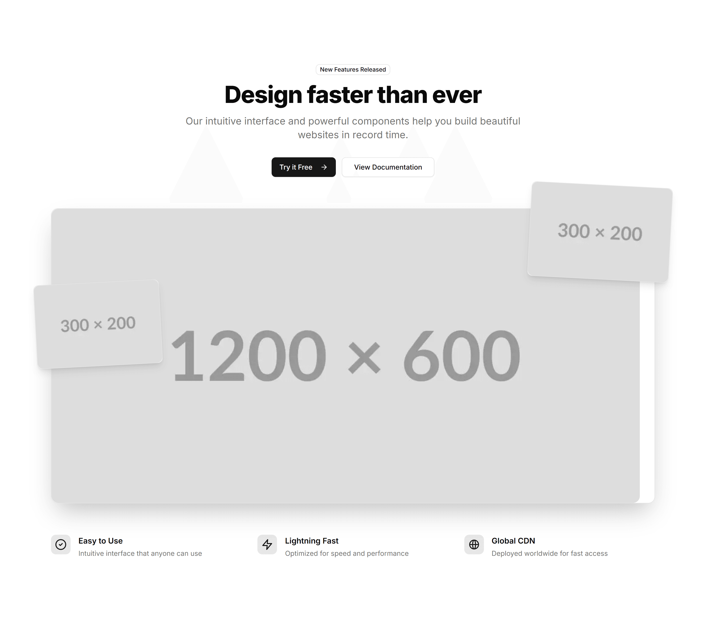
Marketing Hero Section: With Product Screenshots
A hero with framed product screenshots next to a headline and CTA. Shows the real interface at the top of a software or SaaS landing page.

Marketing Icon Section: 2 Cols Grid
A two column grid pairing each icon with a heading and short paragraph. Lays out a handful of product features in a clean, balanced reading layout.
Marketing Testimonial: Simple Center Aligned With Logo
A single centered quote topped with a company logo and the author below. Keep focus on one strong endorsement on a calm, uncluttered section.

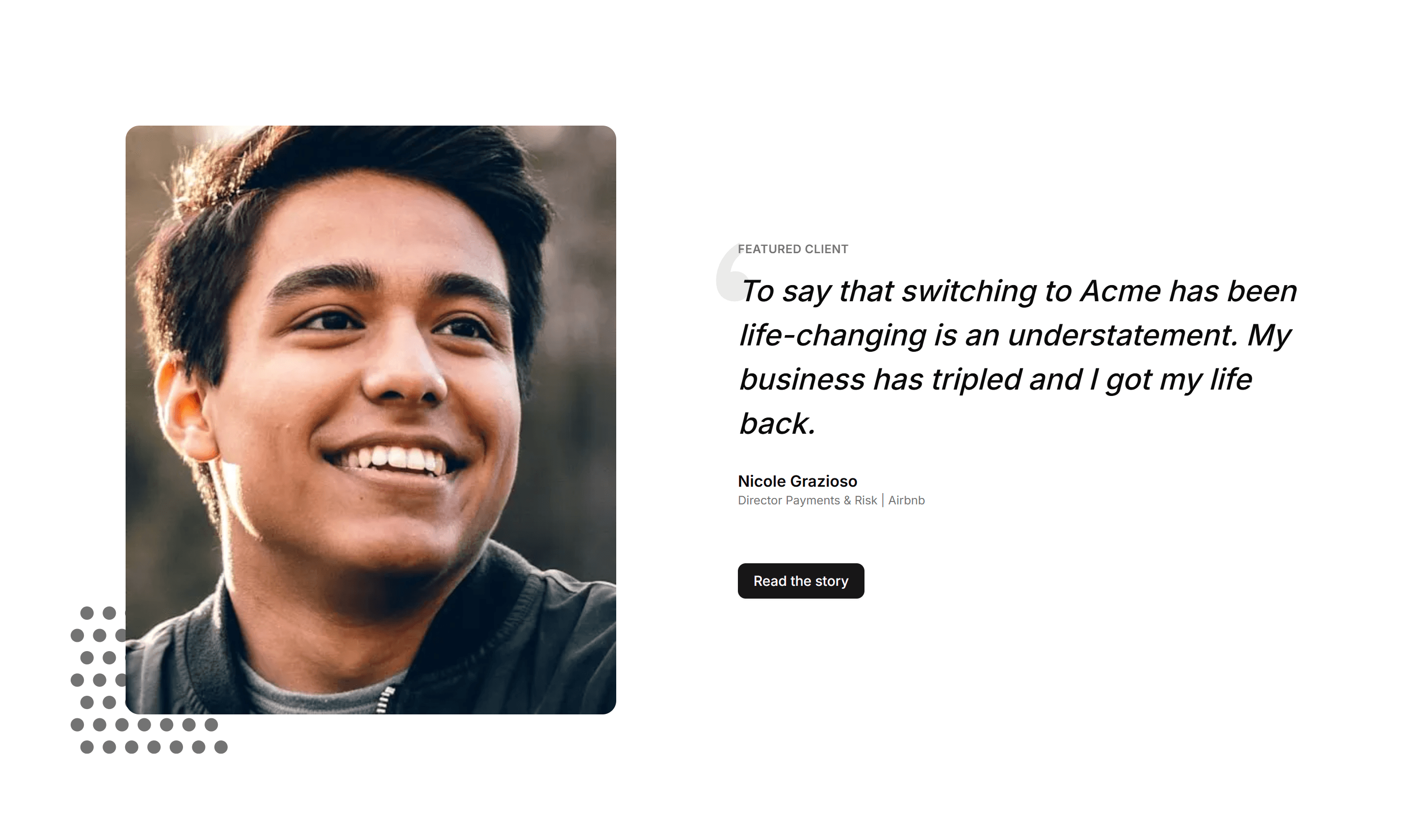
Marketing Testimonial: Customer Story Showcase
A featured customer story with a detailed quote, company logo, and result. Use it as social proof when one account speaks to your ideal buyer.
Marketing Testimonial: Cards With Stats
Testimonial cards joined by a row of headline metrics like users and revenue. Pair real quotes with hard numbers to prove your product delivers.
Marketing Team Section: With Filters
A team directory with category filters that sort members by department or location. Helps visitors find the right person inside a large company.

Marketing Team Section: With Skill Badges
Team cards that list each member with badges for their skills and tools. Great for agencies and studios that want to show real expertise at a glance.

Marketing Team Section: Masonry Grid
A team showcase in a staggered masonry grid where photos vary in height. Fills the space naturally and suits a large, photo rich company roster.
Marketing Subscribe: Newsletter Preview
A signup block showing a small preview of the newsletter content beside the email field. Sets reader expectations before they subscribe to it.

Marketing Subscribe: Social Proof Center
A centered subscribe form topped with subscriber counts or avatars as social proof. Use it when trust nudges visitors to join your mailing list.
Marketing Stat: Progress Bars
Labeled bars that fill to a percentage to track adoption or completion. Use it on a status page or report to show how far each goal has come.
Marketing Stat: Stats With Icons
Each figure sits beside an icon that signals what the number measures. Use it to make a stats row scannable and add visual cues to every metric.
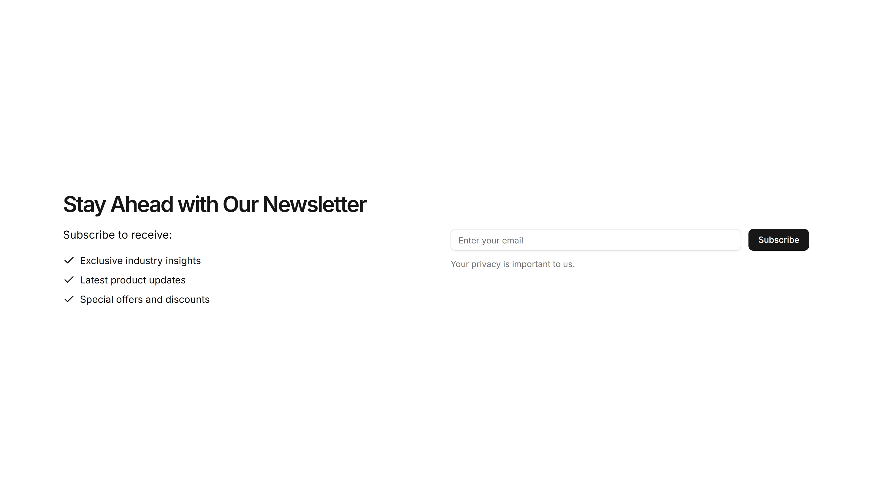
Marketing Subscribe: Benefits List
A subscribe form paired with a bulleted list of benefits and an email field. Tells visitors what they get before they sign up to your newsletter.
Marketing Stat: Customer Testimonial
A quote from a customer next to the numbers their team reached with you. Use it to pair social proof with hard results on a case study page.
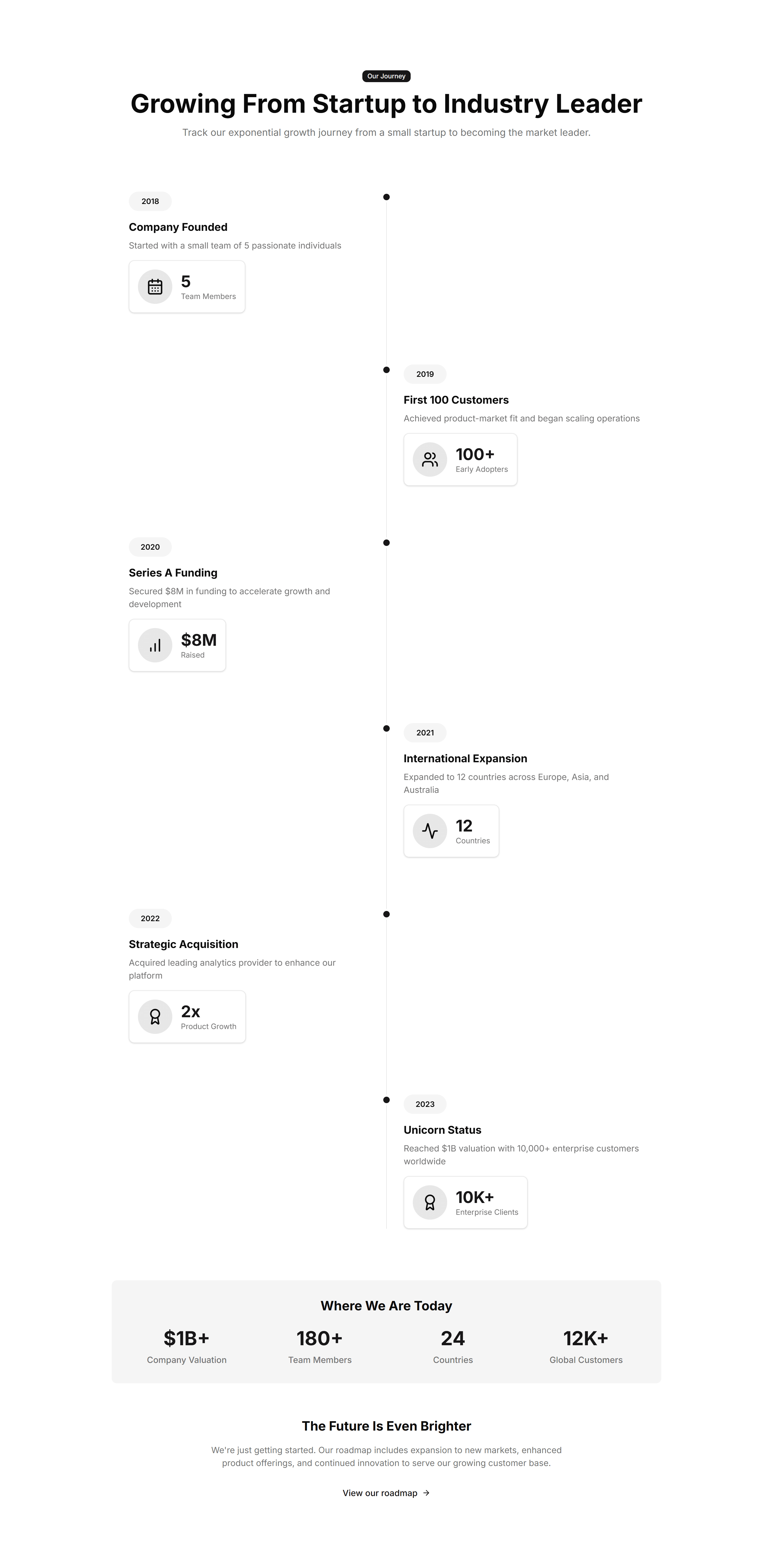
Marketing Stat: Growth Timeline
A vertical timeline pairing dates with the numbers you hit at each stage. Use it to chart company momentum on an about page or investor deck.
Marketing Pricing Section: Stacked
A pricing layout that stacks plan cards vertically for narrow columns and phones. Use it on mobile first pages or sidebars where width is limited.
Marketing Stat: Circular Progress
Ring shaped progress dials that animate to a percentage value. Good for dashboards or landing pages that report completion rates and capacity at a glance.
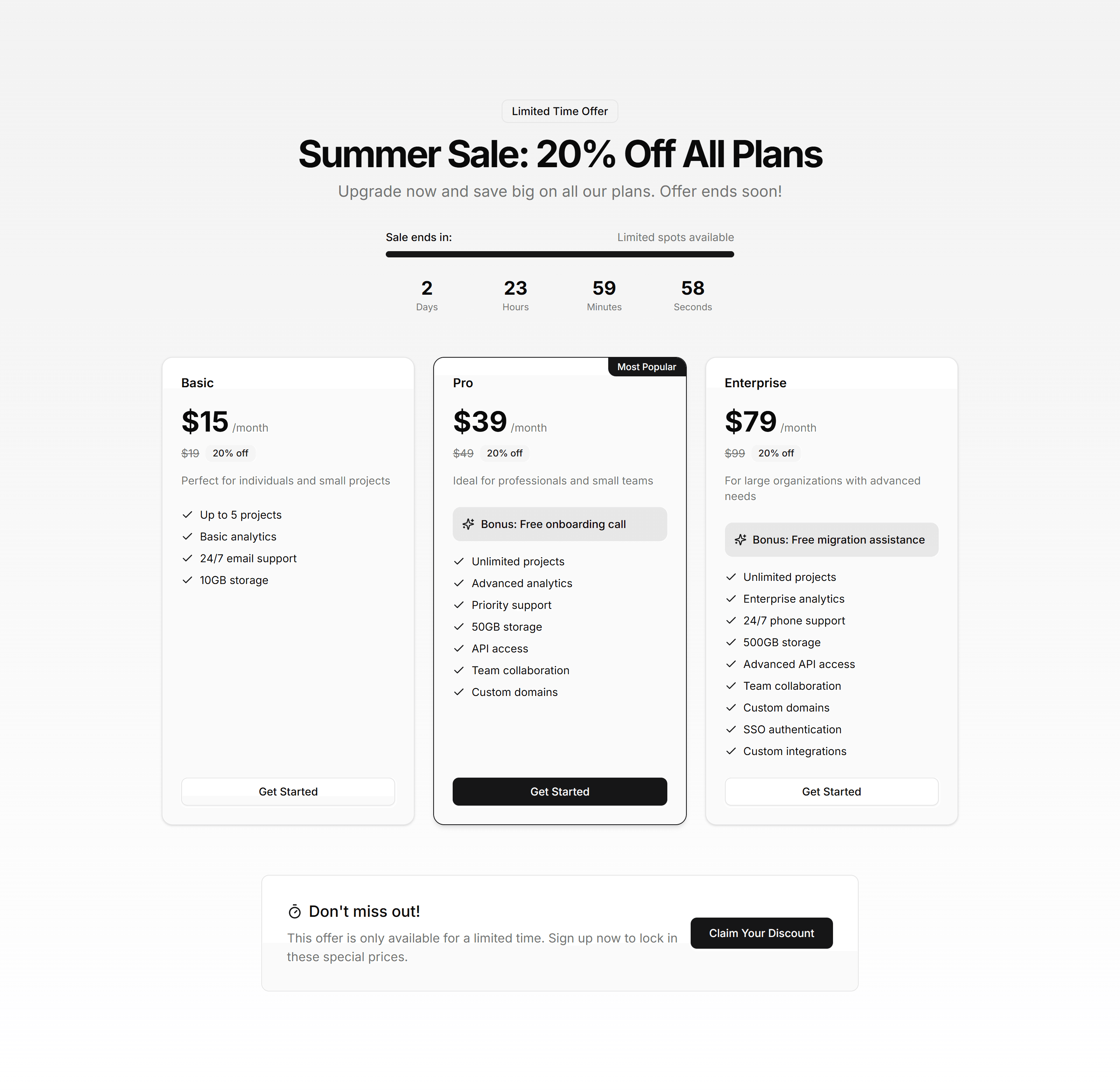
Marketing Pricing Section: Seasonal
A pricing section with promotional banners and limited time discounts on each plan. Use it for holiday sales, launches, and campaigns that push urgency.
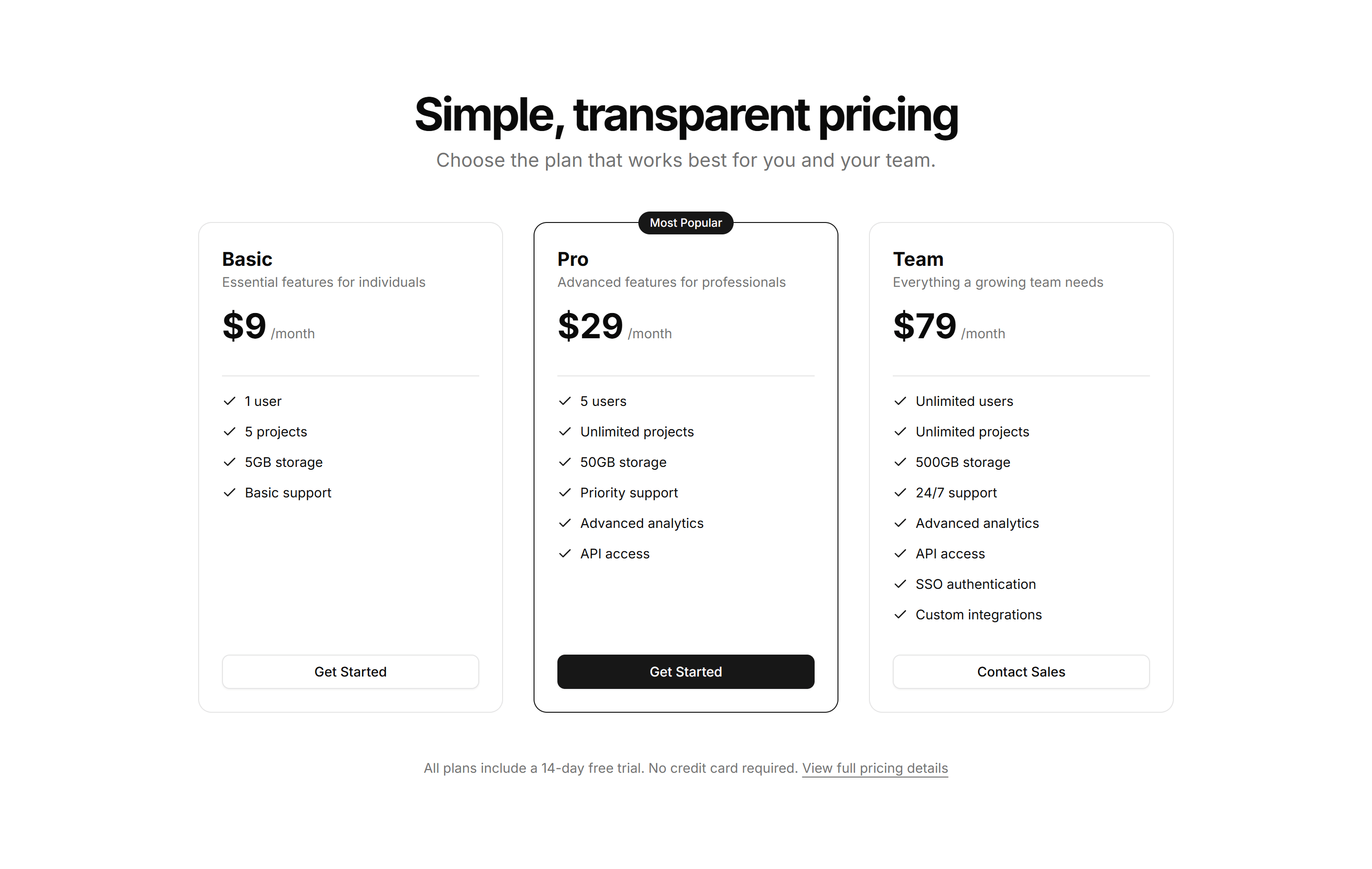
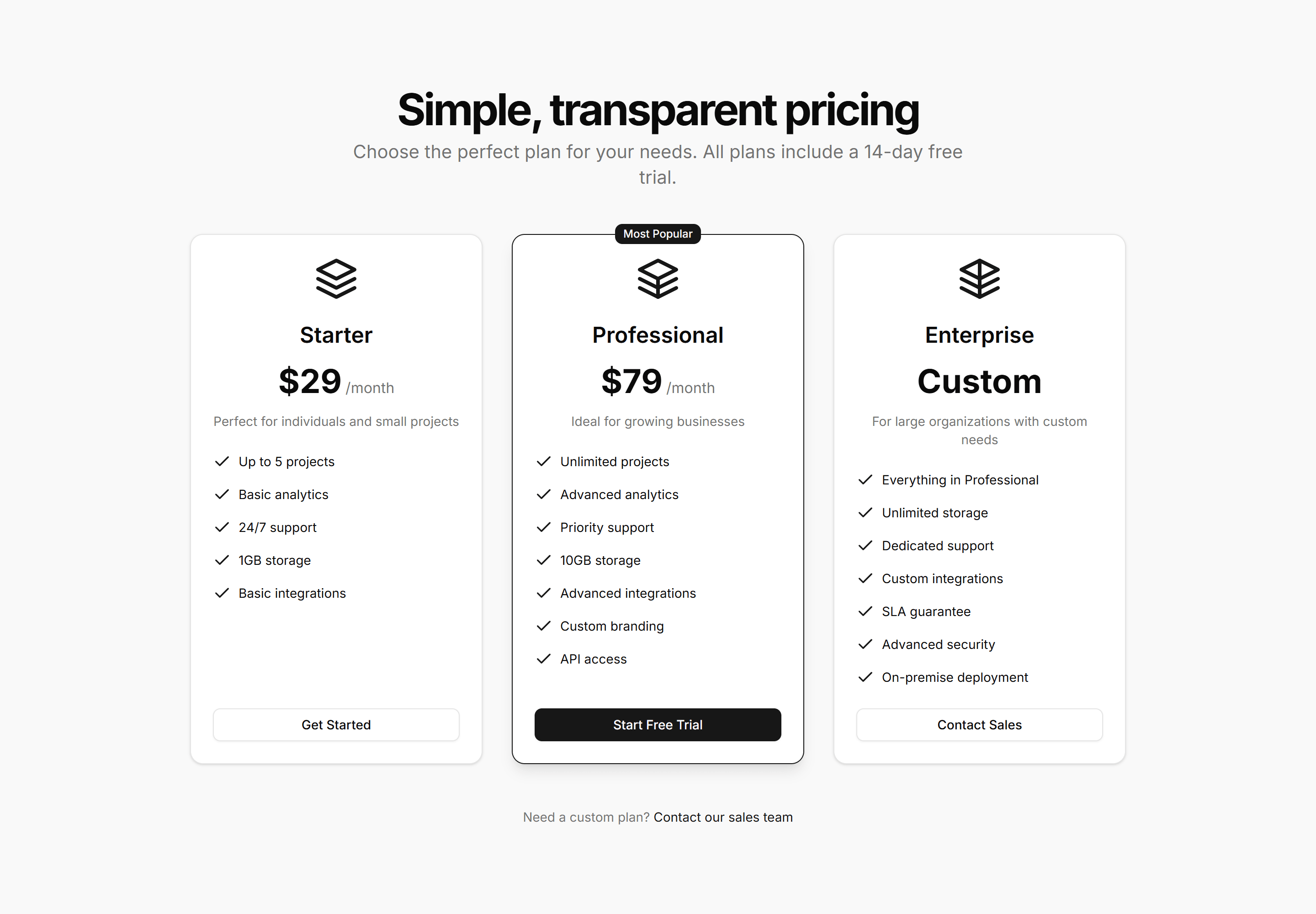
Marketing Pricing Section: Cards
A row of pricing cards listing plan names, prices, and features with a clear call to action. Drop it on a pricing page to compare tiers at a glance.
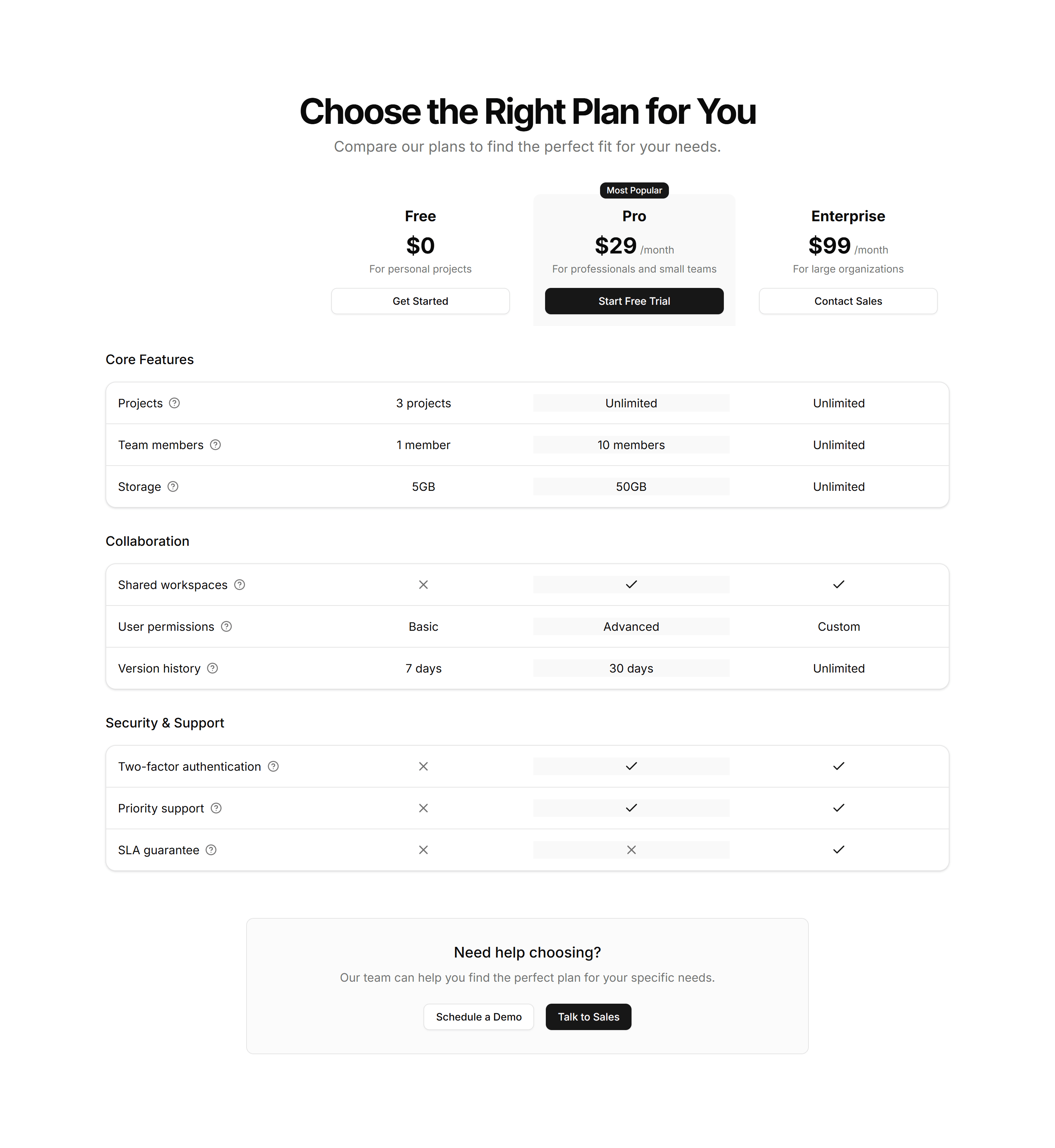
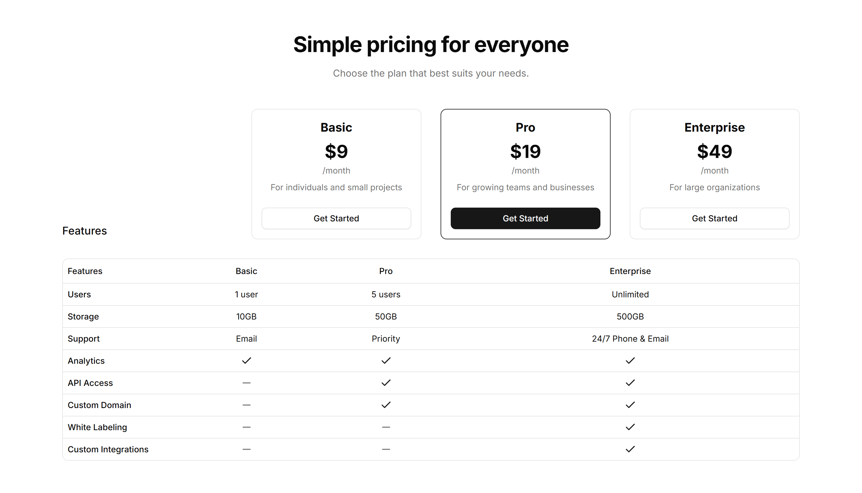
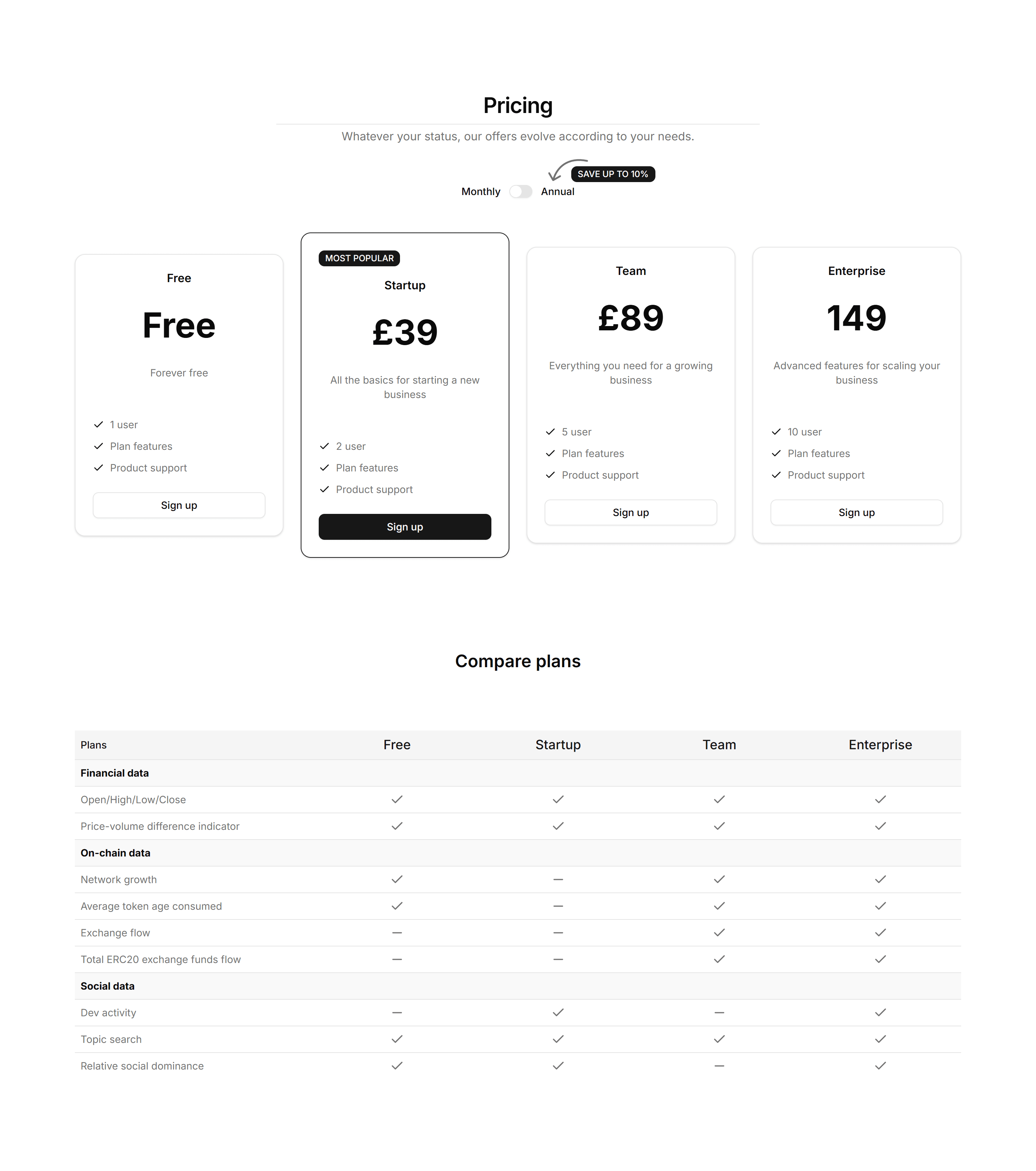
Marketing Pricing Section: Feature Grid
A pricing table mapping every feature to each plan across rows and columns. Use it when buyers want to confirm exactly what each tier includes before paying.
Marketing Pricing Section: Modern
A contemporary pricing section with bold cards, soft shadows, and accent gradients. Use it to give a polished, current feel to a product or SaaS page.
Marketing Integration: Carousel
A scrolling row of partner and app logos that loops as visitors watch. Place it under a hero to prove your product fits neatly into an existing stack.
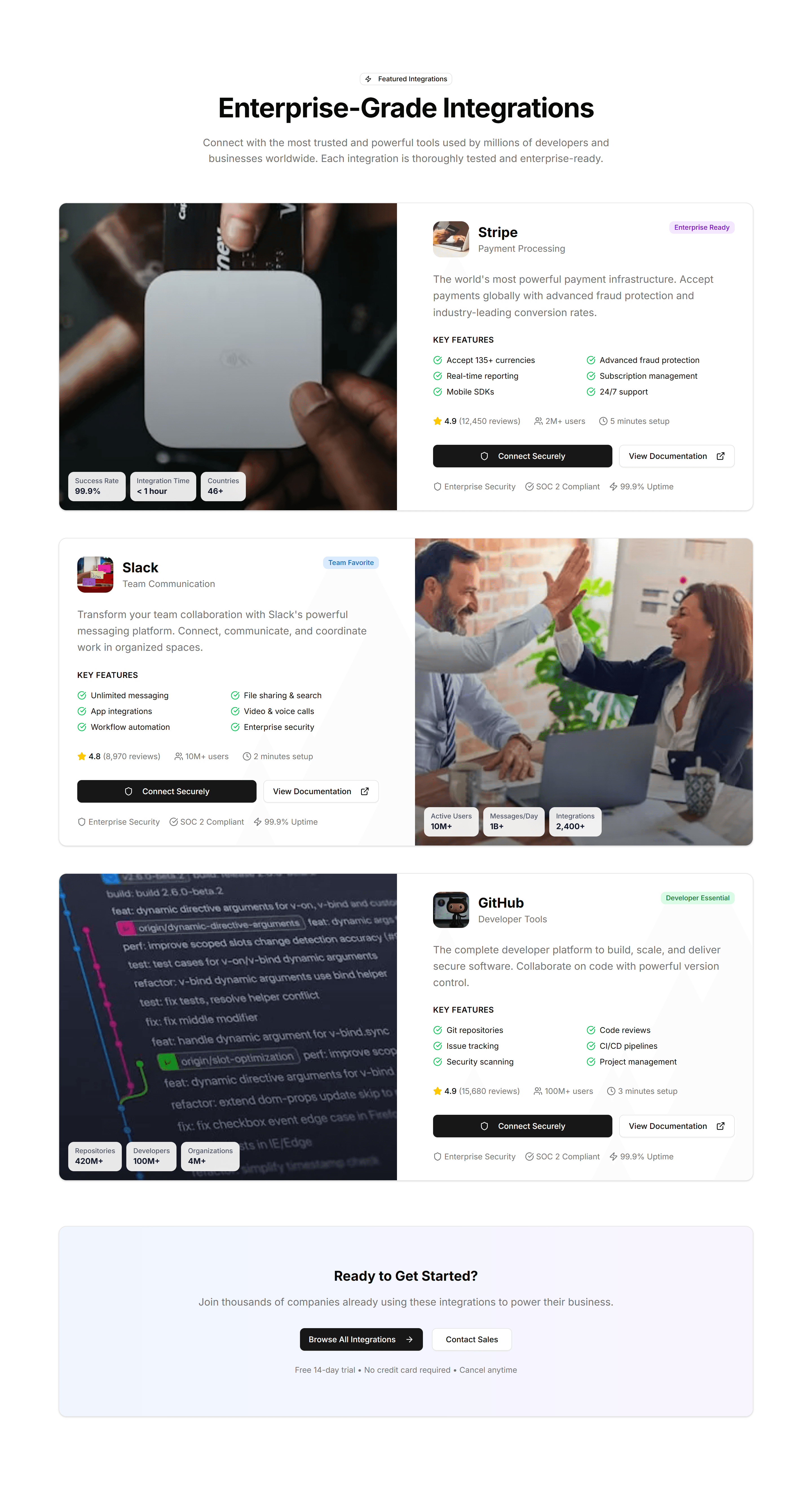
Marketing Integration: Featured Showcase
A large card spotlighting one key integration with its logo, summary, and a link. Use it to highlight a flagship partner above the full list.

Marketing Icon Section: Icon Timeline
A vertical timeline with an icon at each step. Walks visitors through a process or product journey in clear order, one milestone after another.
Marketing Icon Section: Radial Icon Layout
Icons arranged in a circular, radial pattern around a central label. A distinctive way to show how features connect to one core product idea.
Marketing Icon Section: Circle Icons Centre Aligned
Centre aligned icons set in soft circles, each with a title and caption. A friendly way to present three or four core benefits on a landing page.
Marketing Icon Section: Expandable Icon Cards
Icon cards that expand on click to reveal more detail. Keeps the section compact while letting curious visitors dig into any feature they choose.

Marketing Icon Section: Icon Feature Carousel
A carousel rotating through icon features one slide at a time. Highlights a long list of capabilities without crowding the page or overwhelming readers.
Marketing Hero Section: With Team Grid
A hero pairing a headline and CTA with a grid of team member photos. Adds a human face to about, agency, and company landing pages from the start.
Marketing Icon Section: Animated Icon Grid
A grid of feature icons that animate into view on scroll. Adds motion to a list of capabilities so each benefit catches the eye as users read down.