Shadcn Blocks
Browse all 3918 shadcn/ui blocks across Modern SaaS, Marketing, Application, Ecommerce, Portfolio, and Components. Search, filter, then copy, paste, and ship.
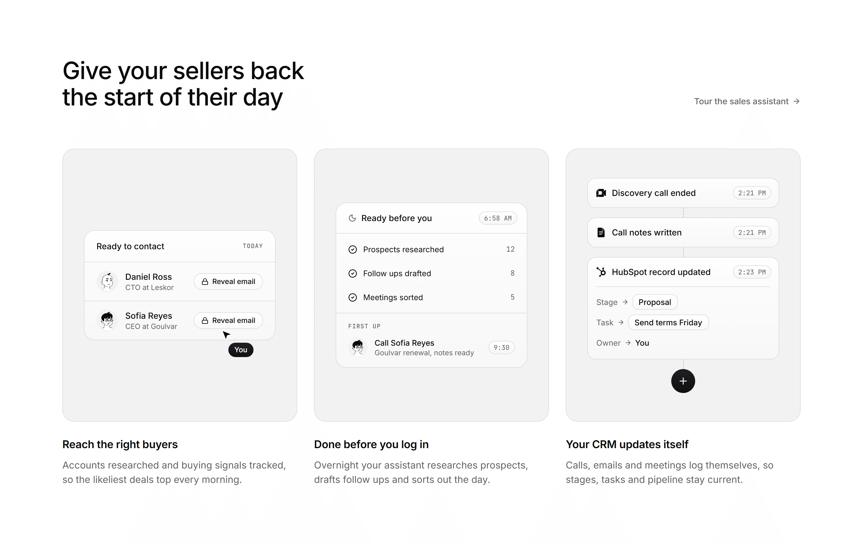
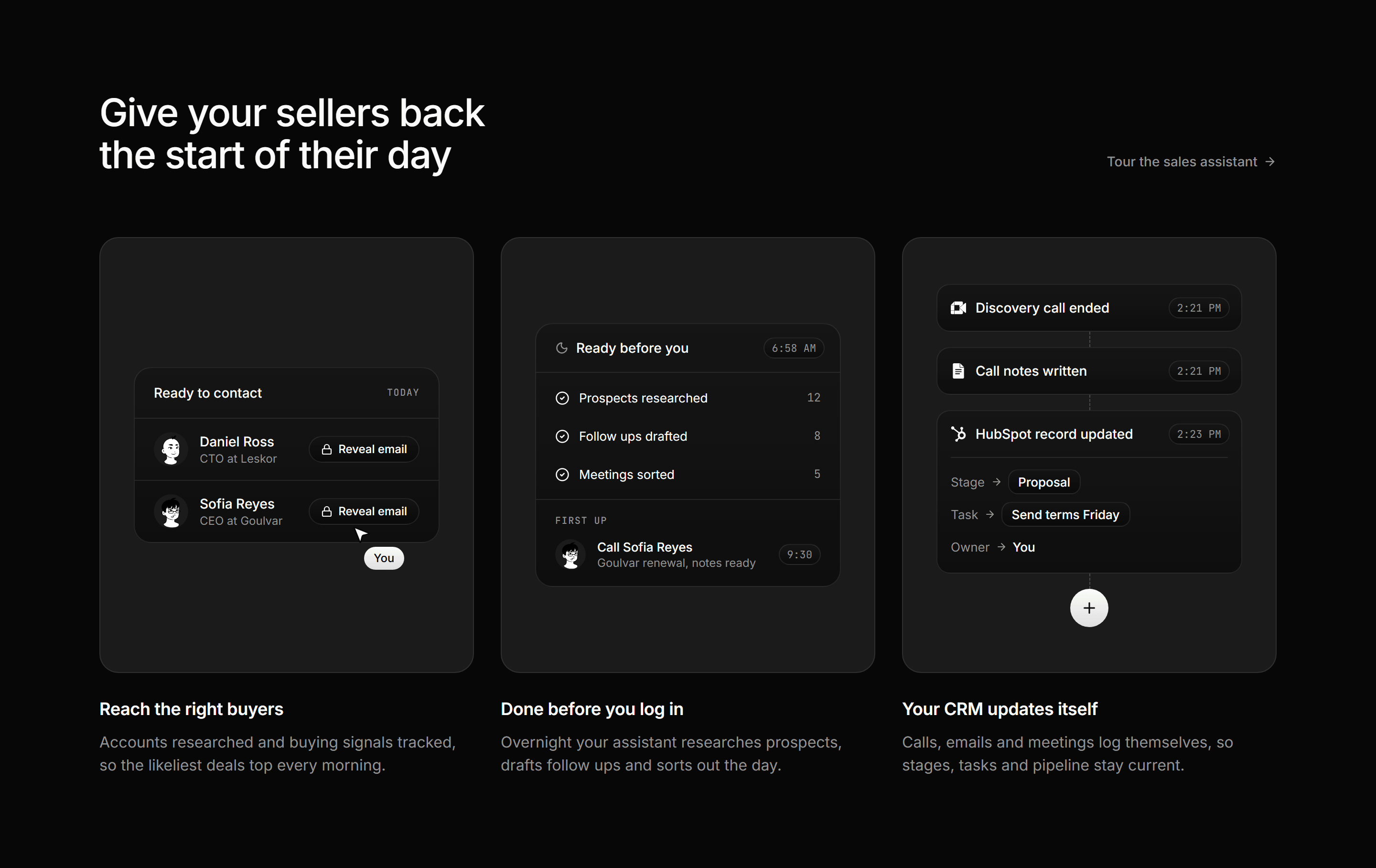
Modern SaaS Feature: Mockup Panel Trio
A heading row with a text link over three muted panels, each holding a small sales assistant mockup above a title and a two line blurb.
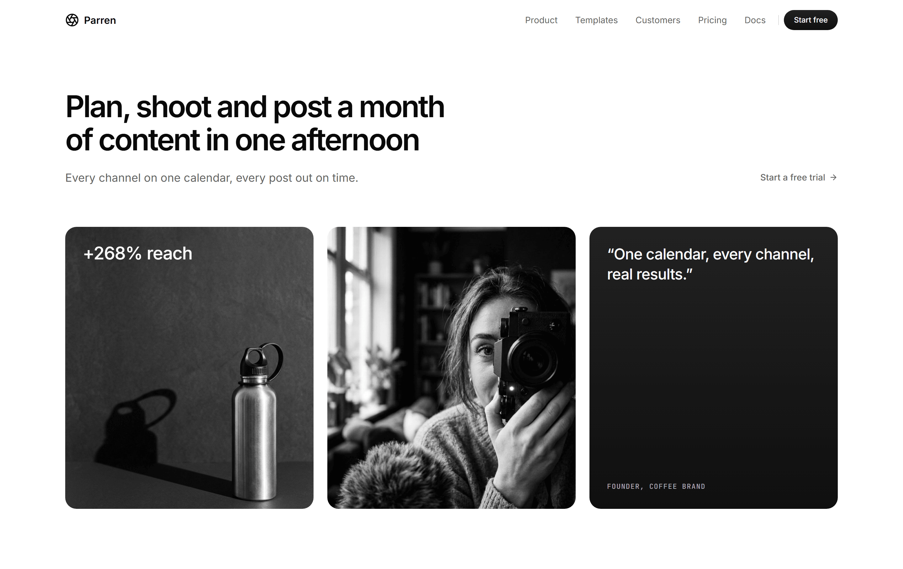

Modern SaaS Hero: Photo Quote Cards
A left aligned hero with a two line headline and a text link over three cards: a still life with a stat, a creator photo and a quote.


Modern SaaS Feature: Icon Card Grid with CTA
A heading row and a right aligned lede over a grid of five icon feature cards, closed by a call to action card on the primary surface.
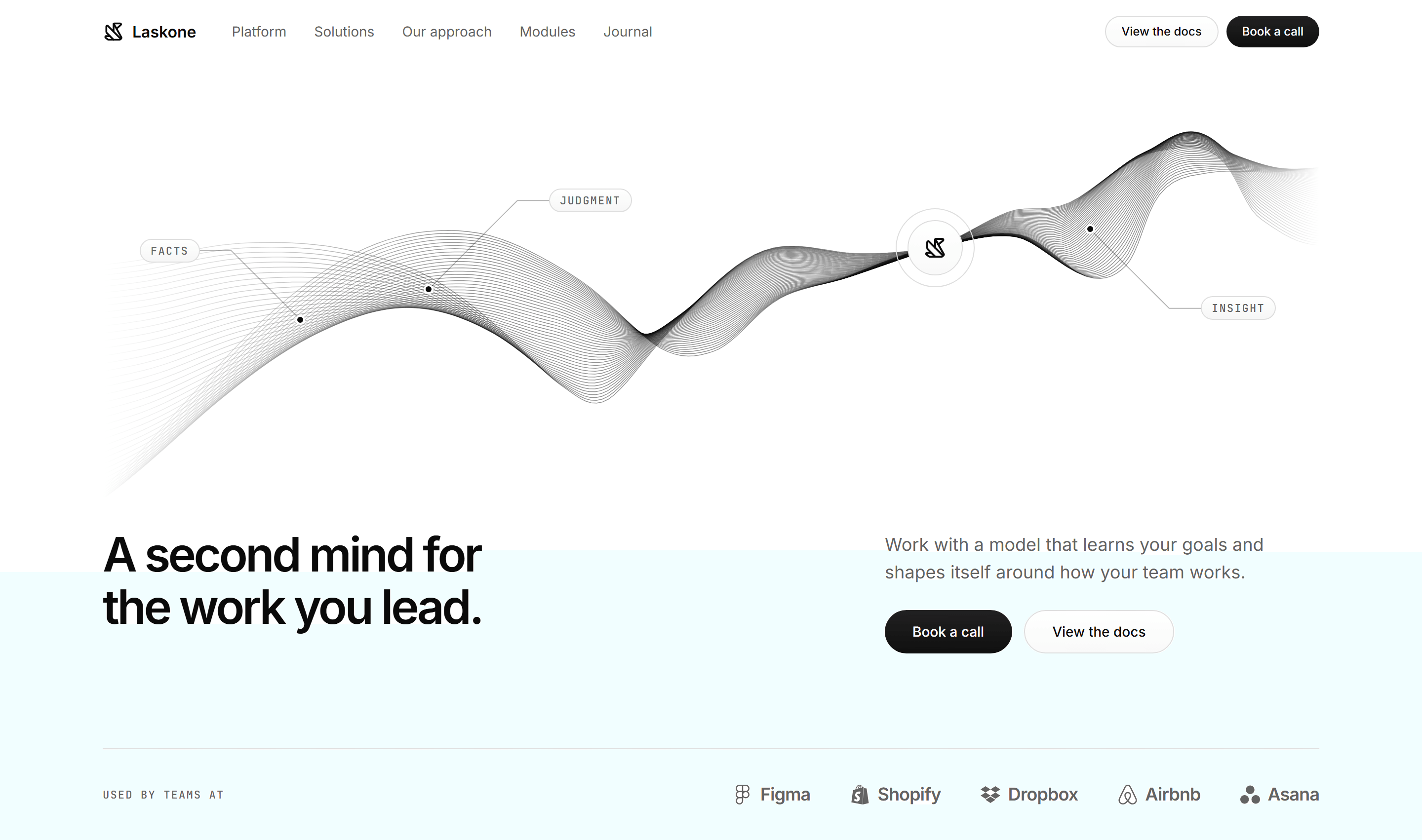
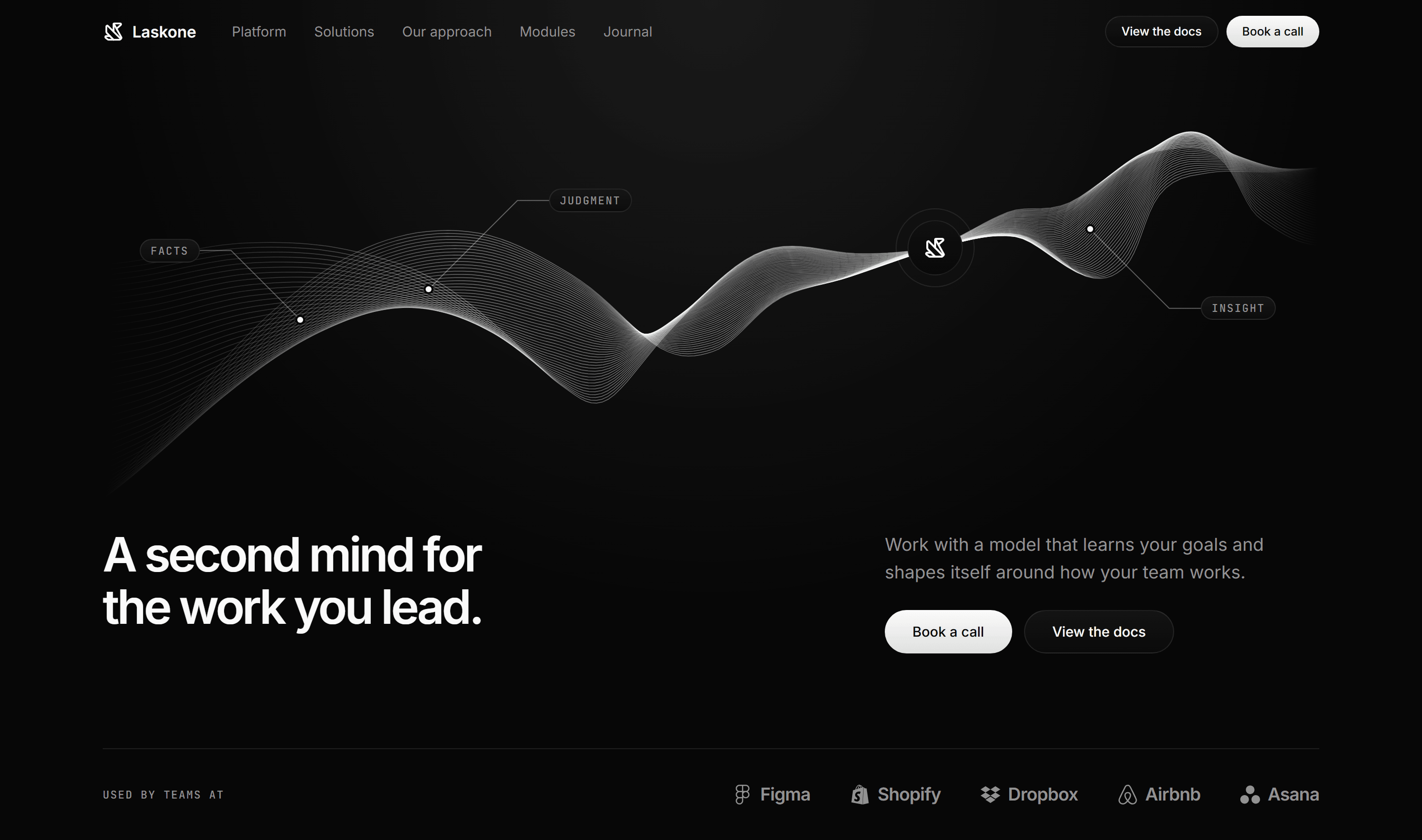
Modern SaaS Hero: Line Ribbon
A hero drawn around a twisting line ribbon with mono callouts and a brand node, a headline beside a lede and pills, and a logo strip.
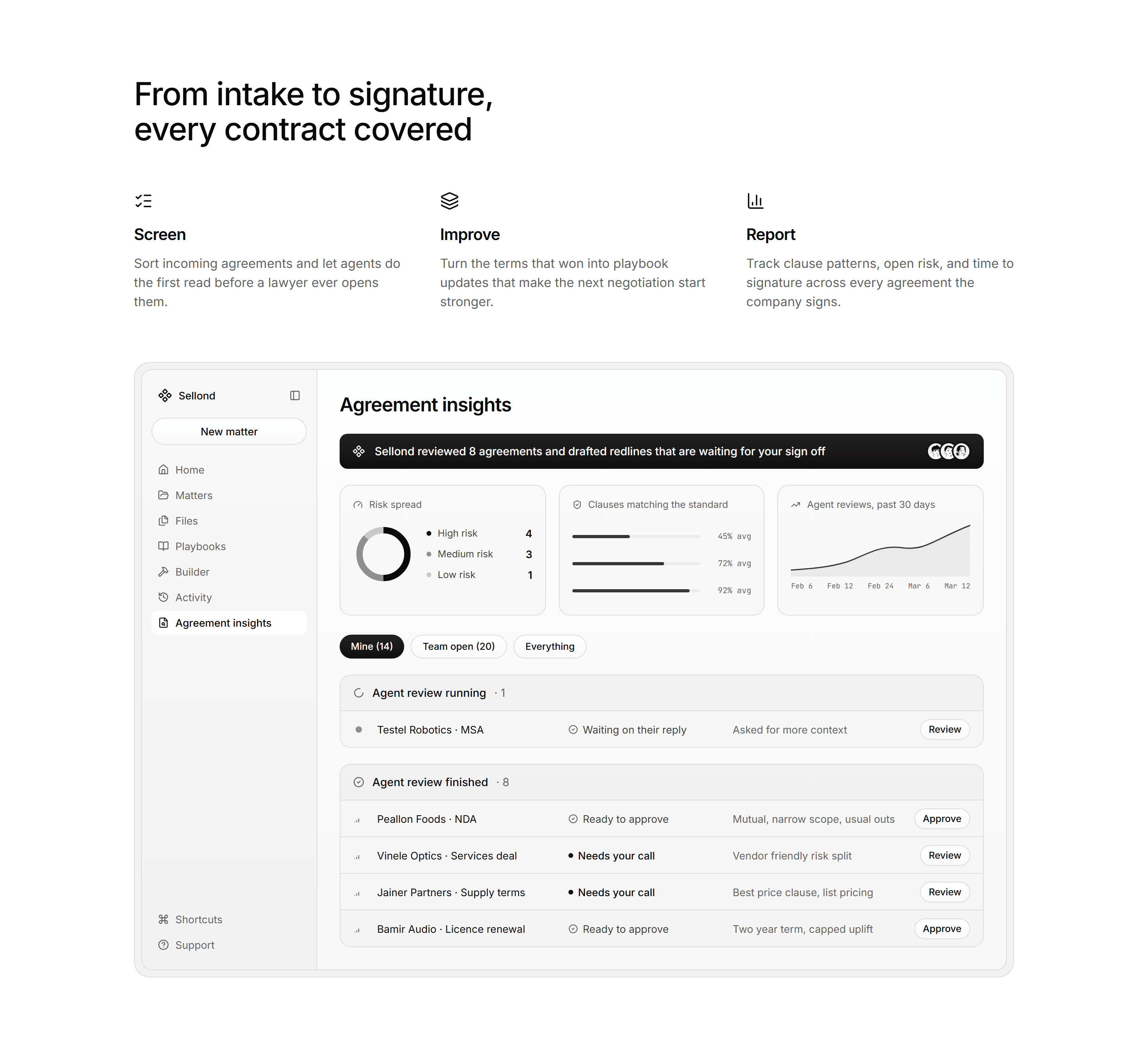
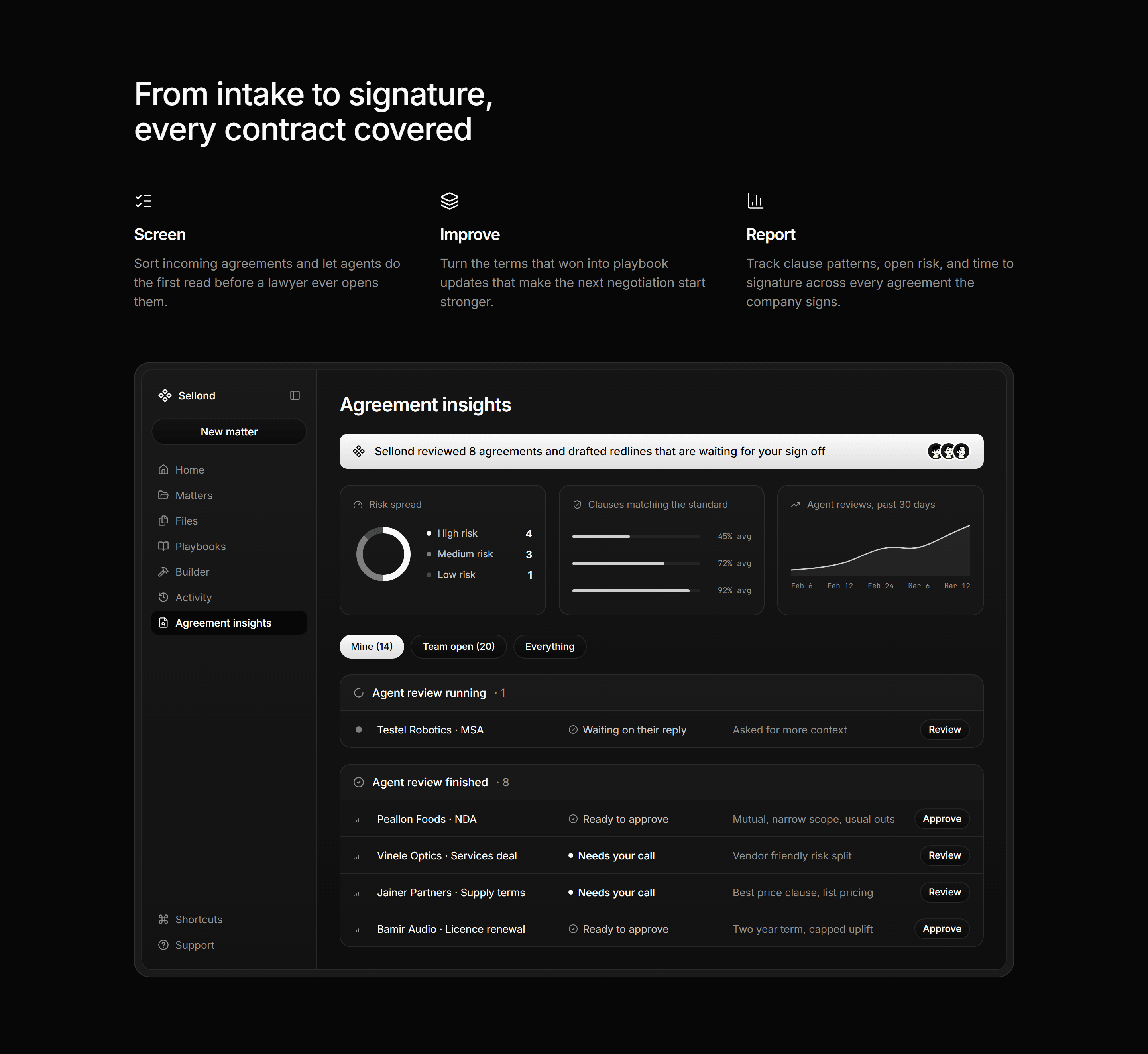
Modern SaaS Feature: Three Columns with App Mockup
A section heading over three icon columns, then a contract review app mockup with charts, filters and grouped lists in an inset tray.
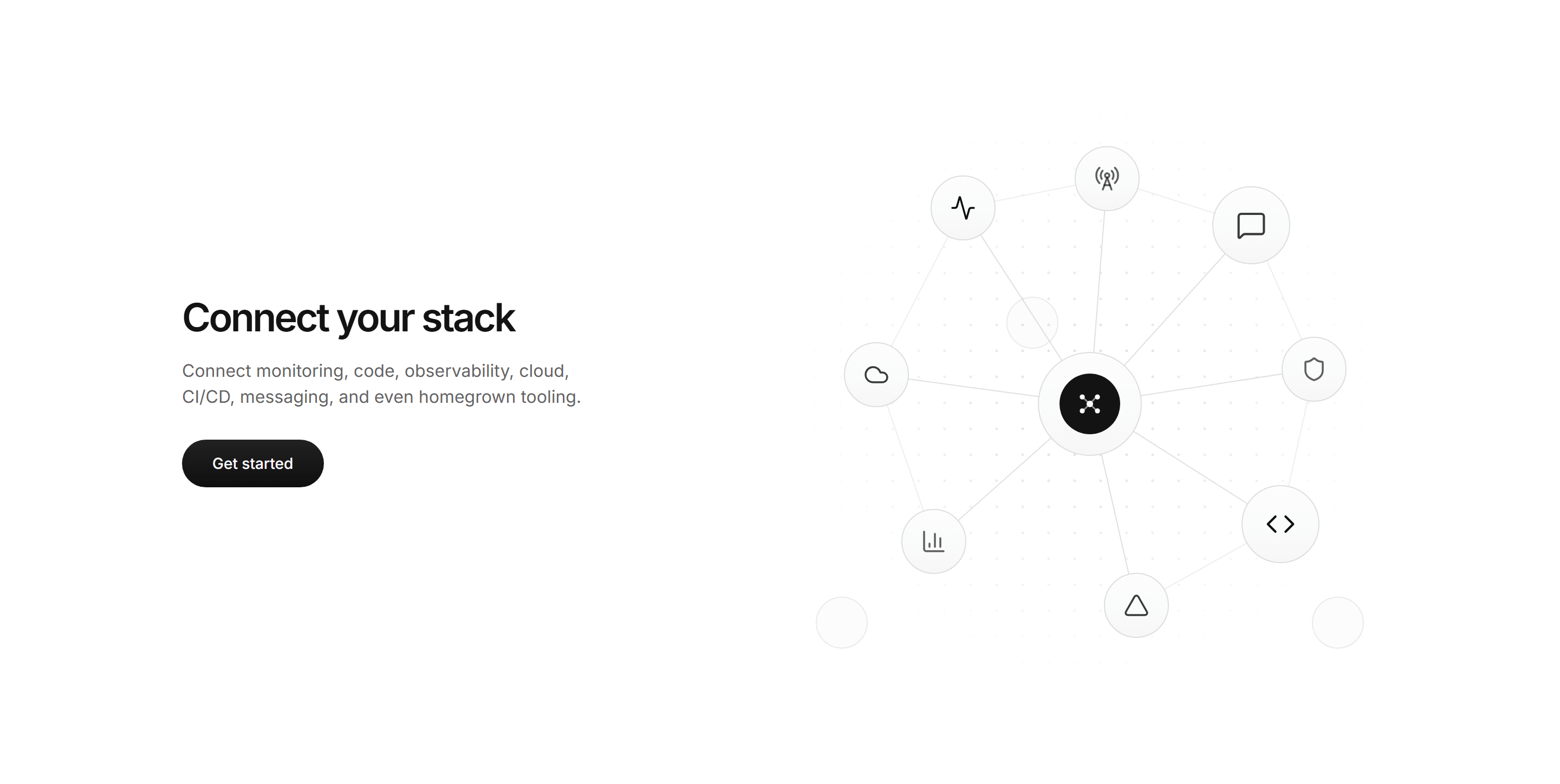
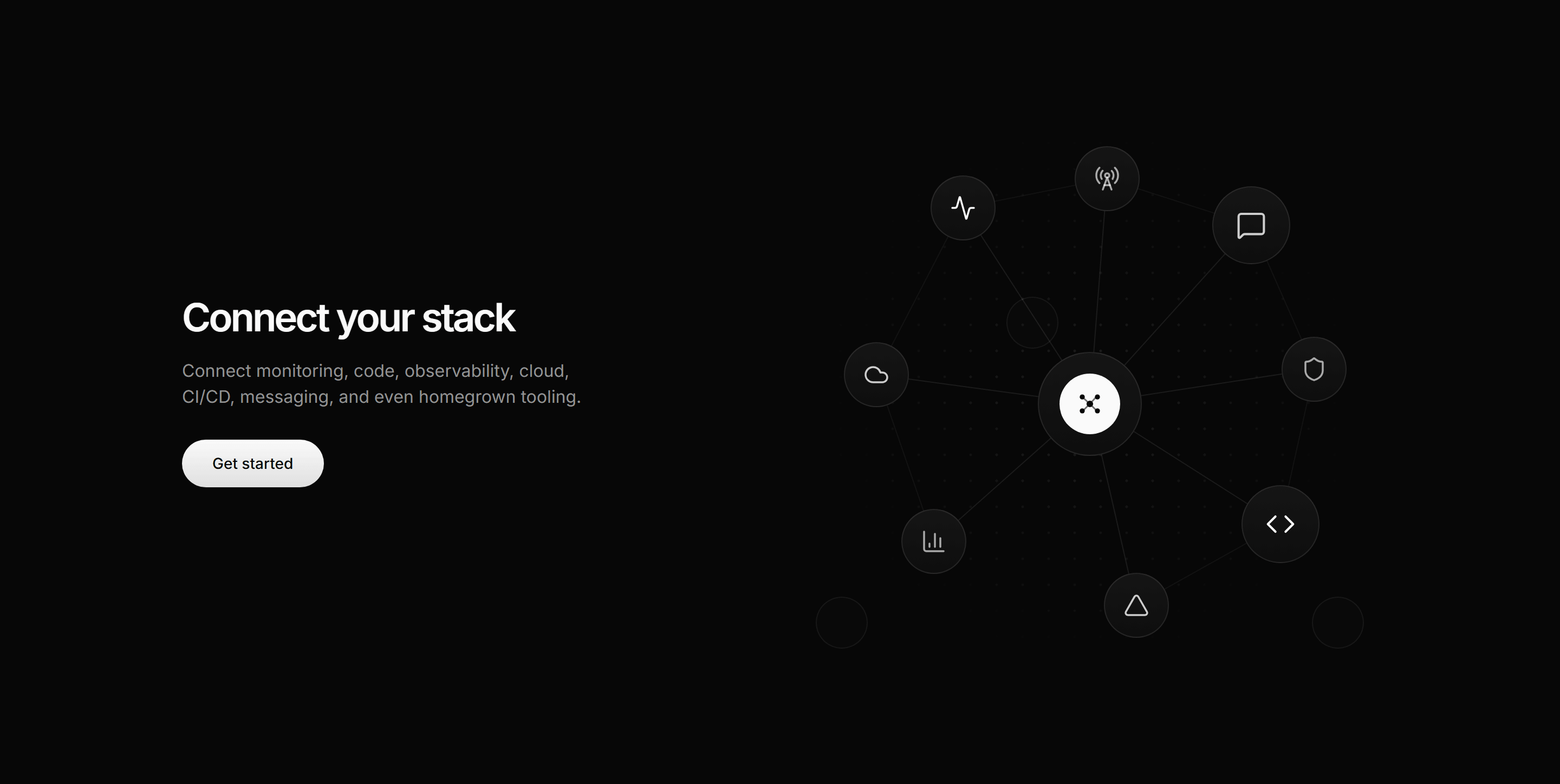
Modern SaaS Integration: Connect Your Stack
A copy rail beside a constellation graph that fans connector lines from a central product node out to a ring of integration nodes over a fading dotted grid.
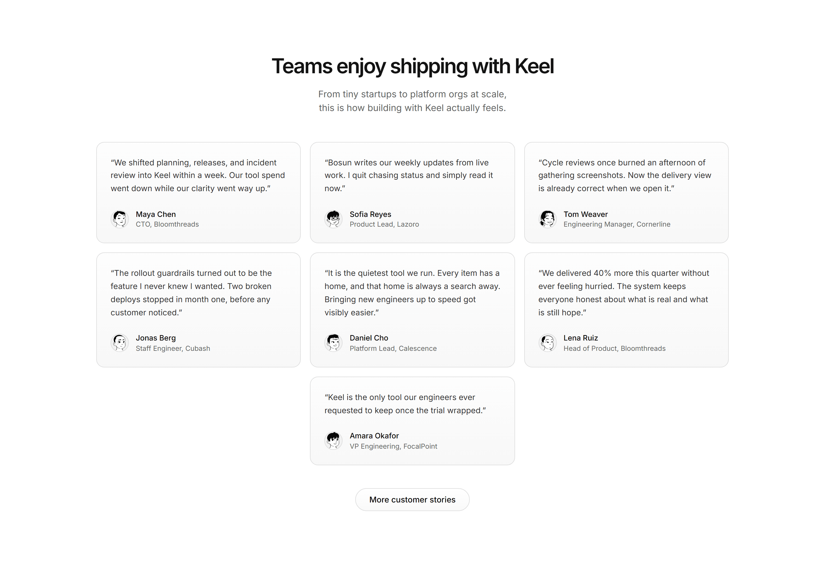
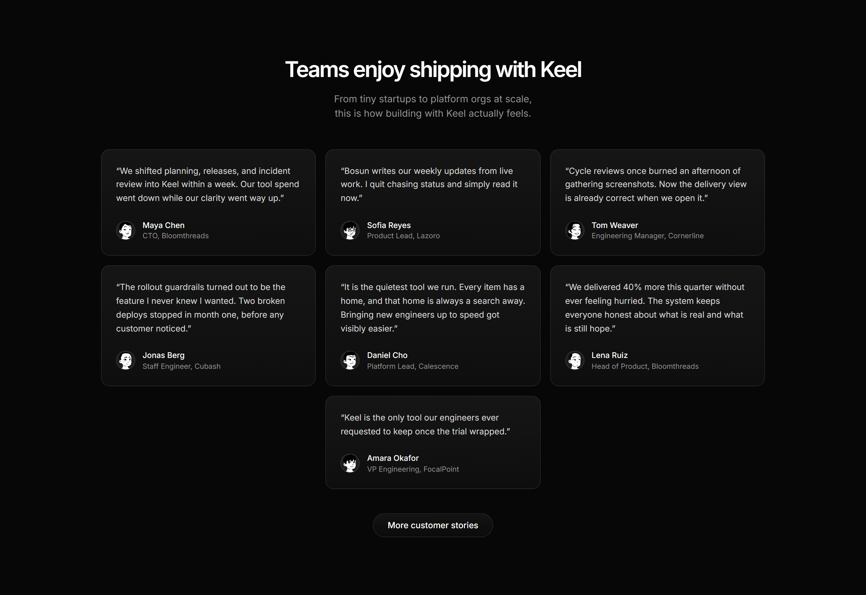
Modern SaaS Testimonial: Staggered Quote Masonry
A three column testimonial masonry of naturally staggered quote cards, each closed by an illustrated avatar byline.
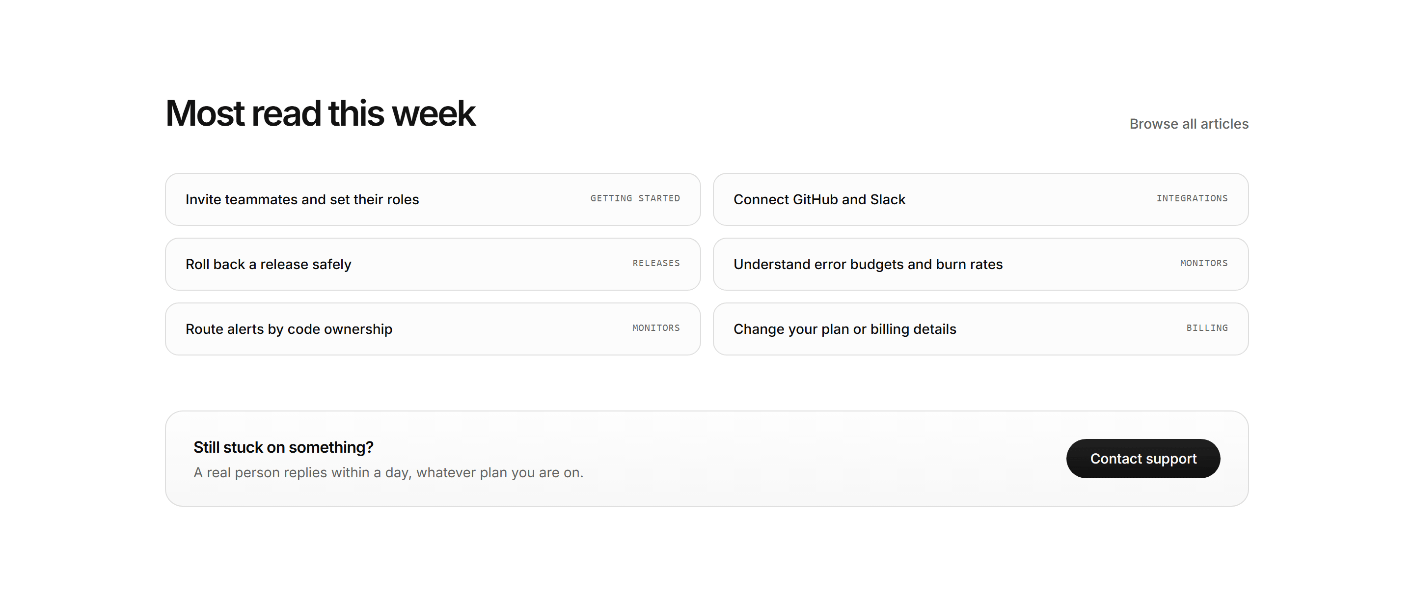
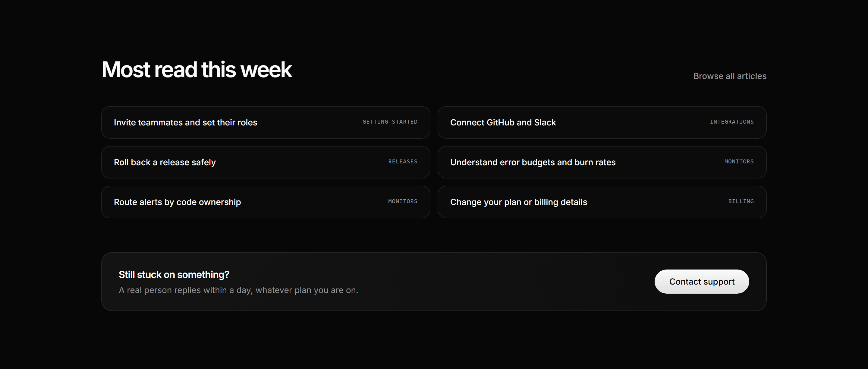
Modern SaaS Help Center: Popular Articles Support Strip
A help center closer: a most read header with browse all link, two columns of article rows with mono category tags, and a support strip with a depth CTA.
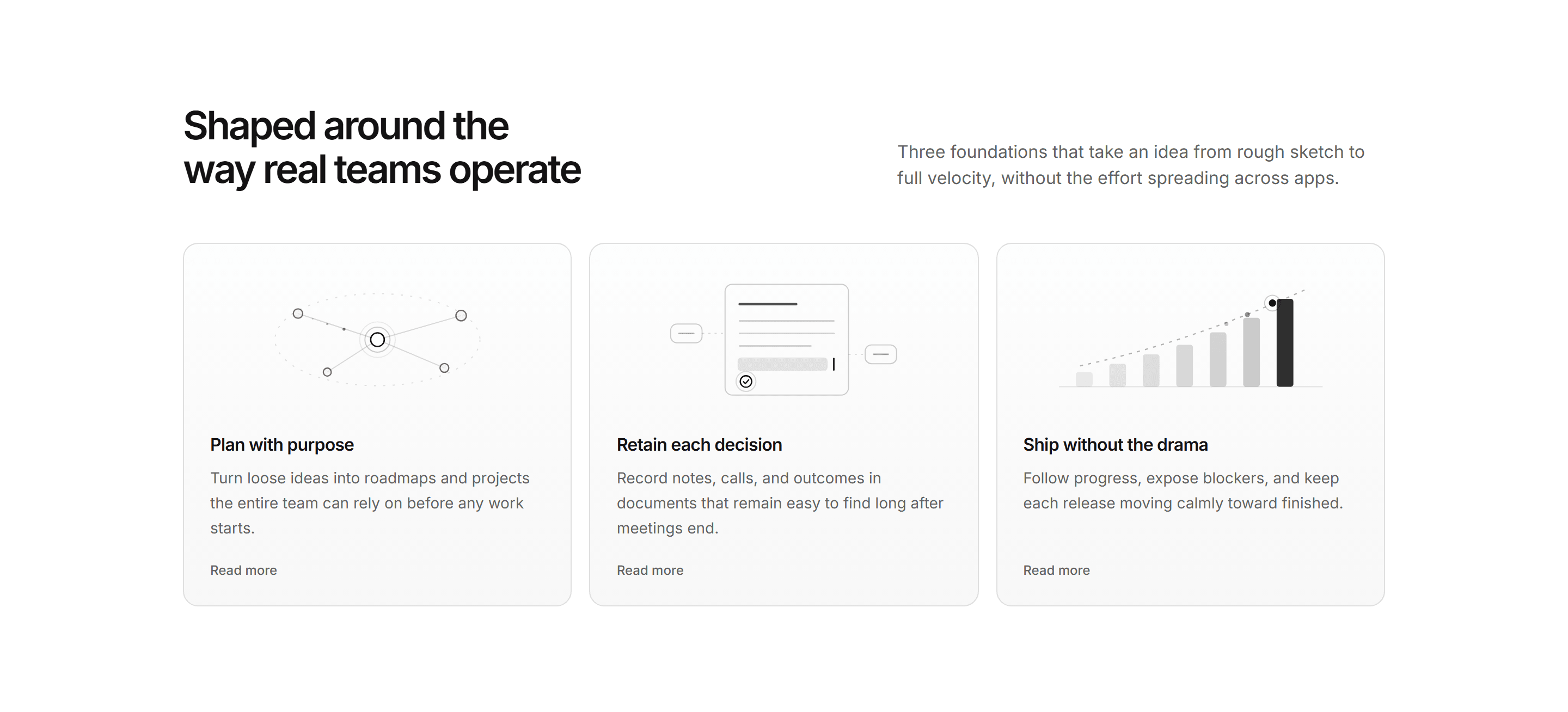
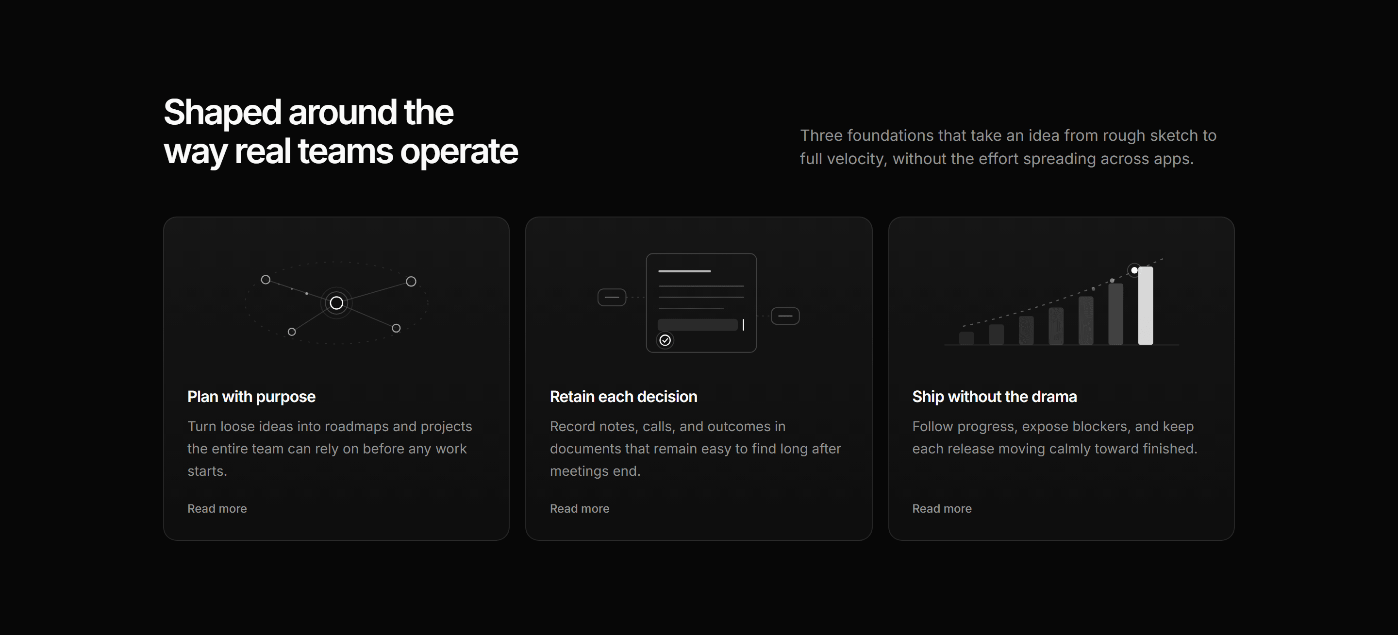
Modern SaaS Feature: Capability Diagram Cards
Three depth cards each led by an illustrative SVG diagram: node constellation, decision doc, and ascending bars.
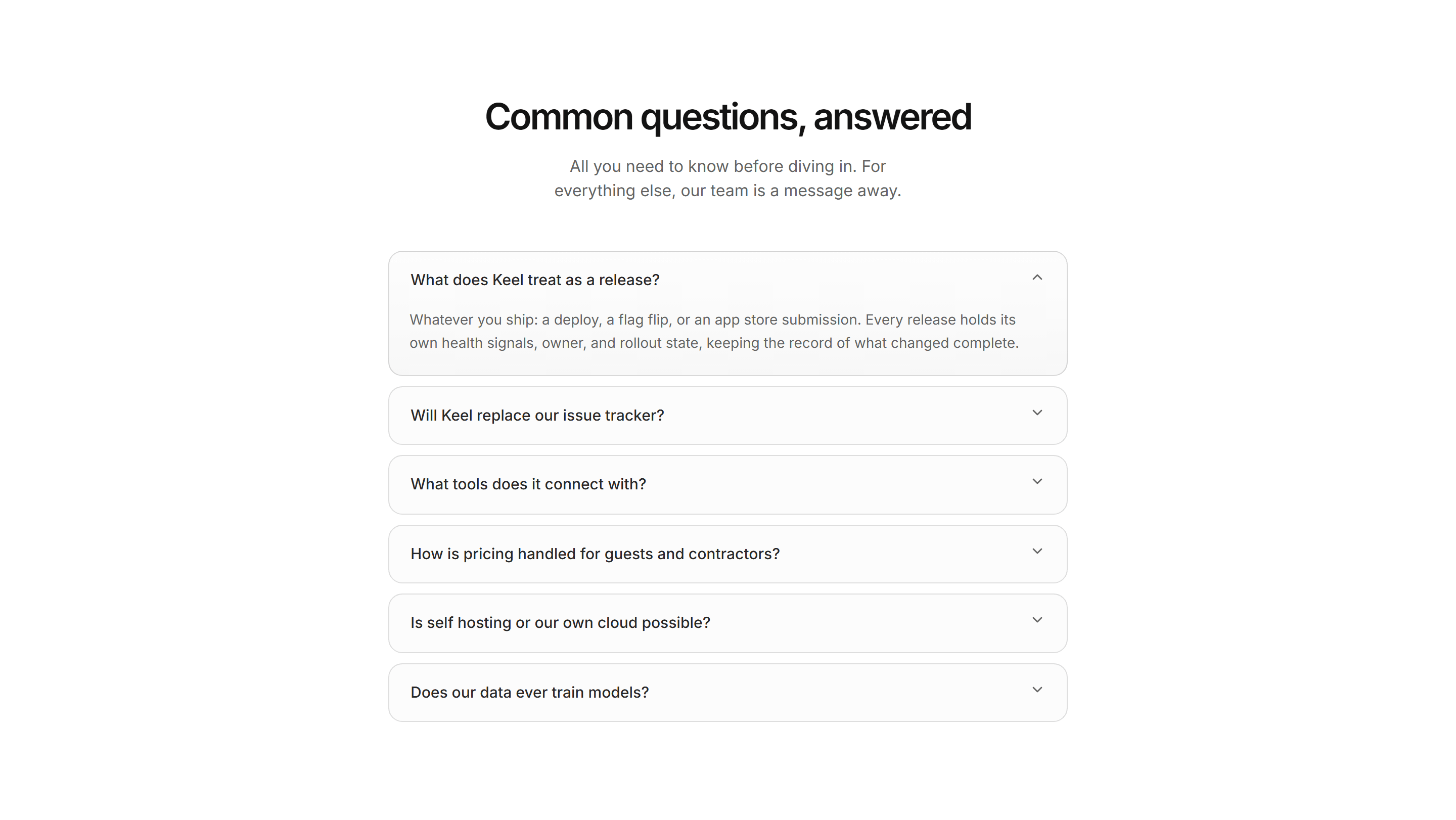
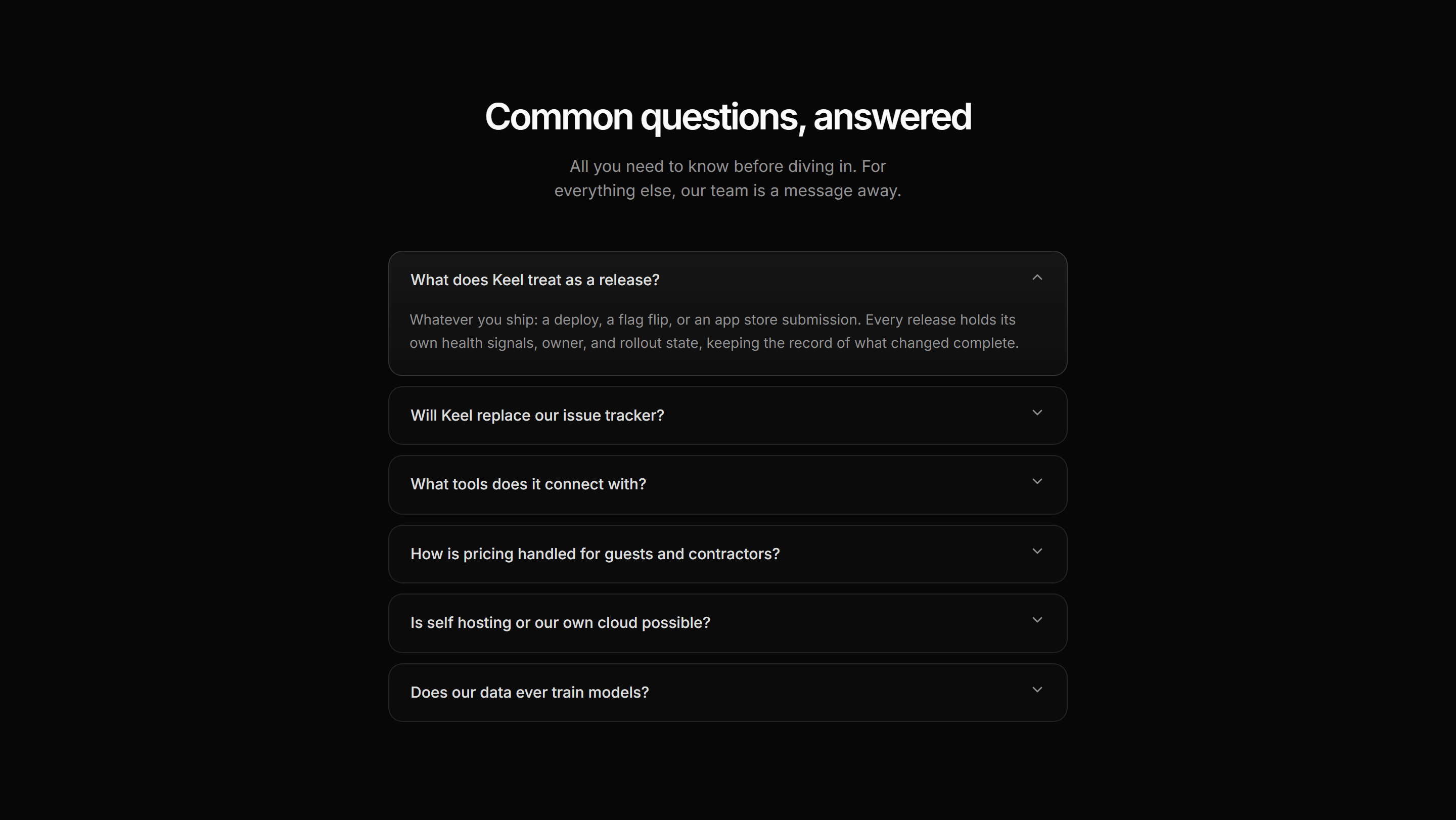
Modern SaaS FAQ: Single Open Accordion
A centered FAQ on the shadcn Accordion where the first item ships open and closed rows stay on quiet hairline tiles.
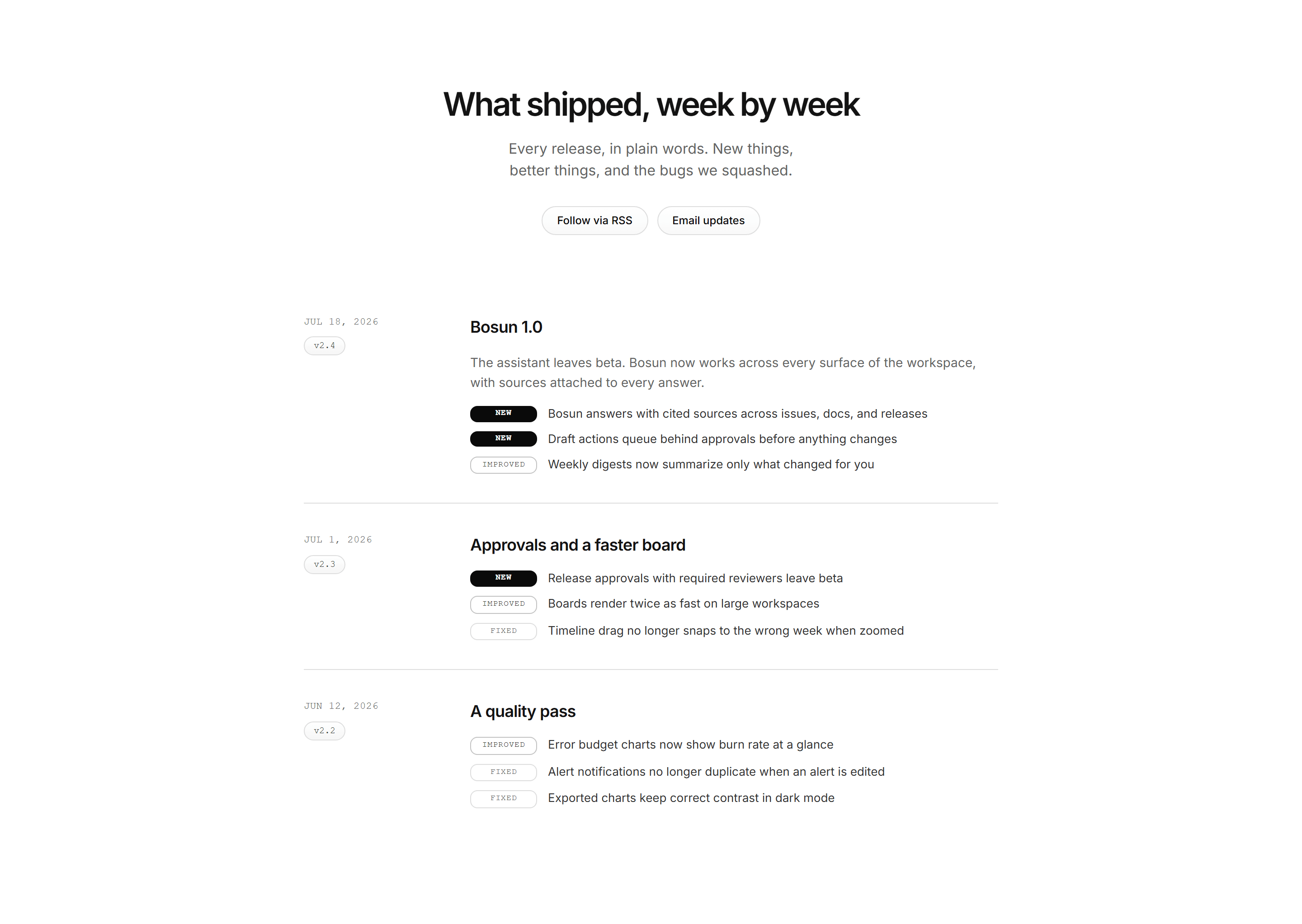
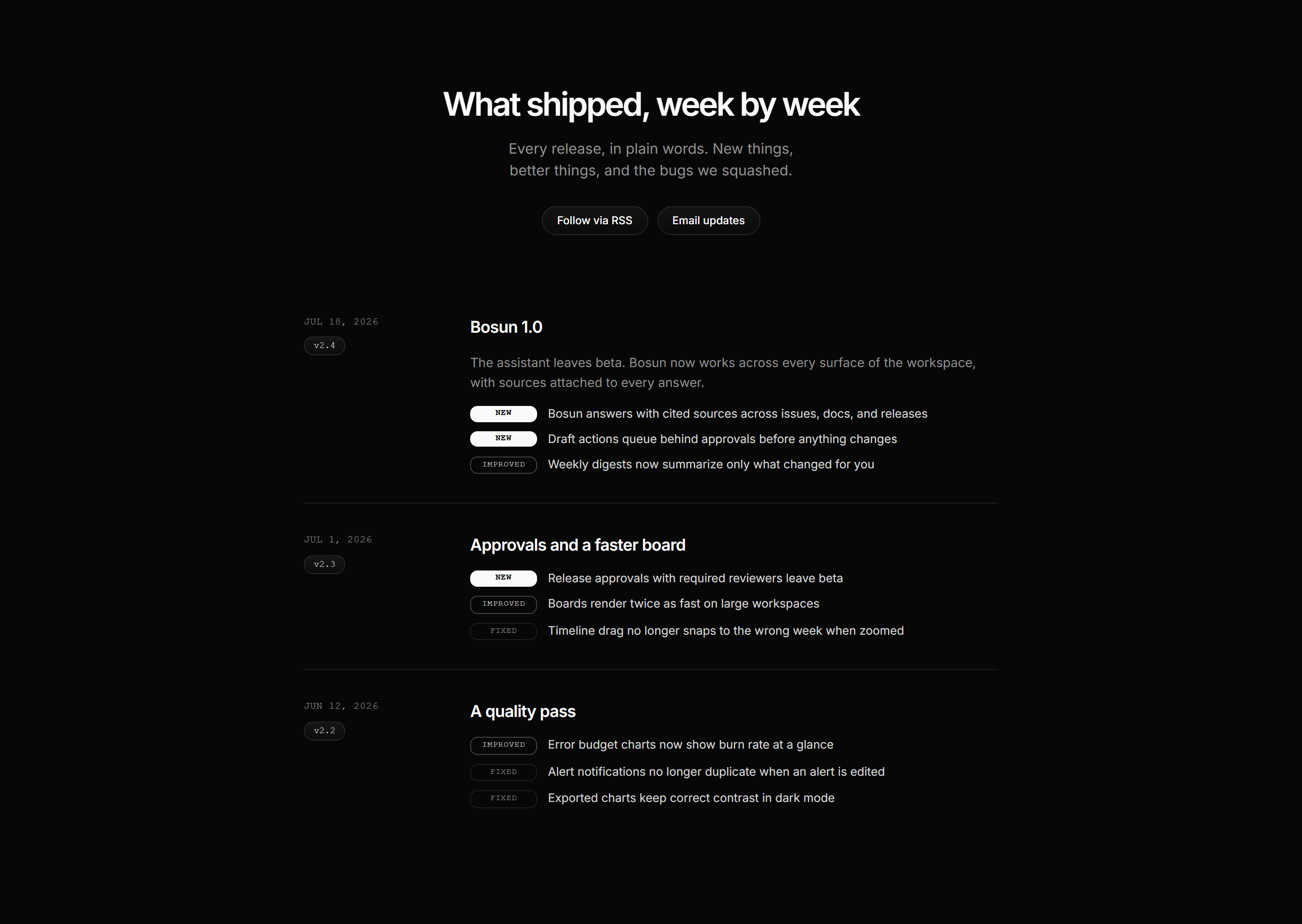
Modern SaaS Changelog: Versioned Entry List
A changelog with mono dates and version pills in a left lane and typed change chips stepping down in weight on the right.
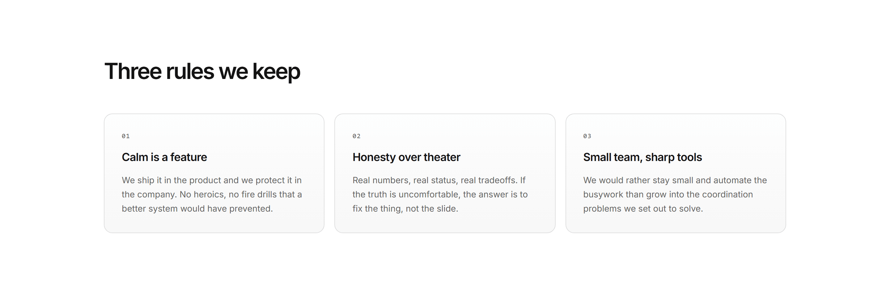
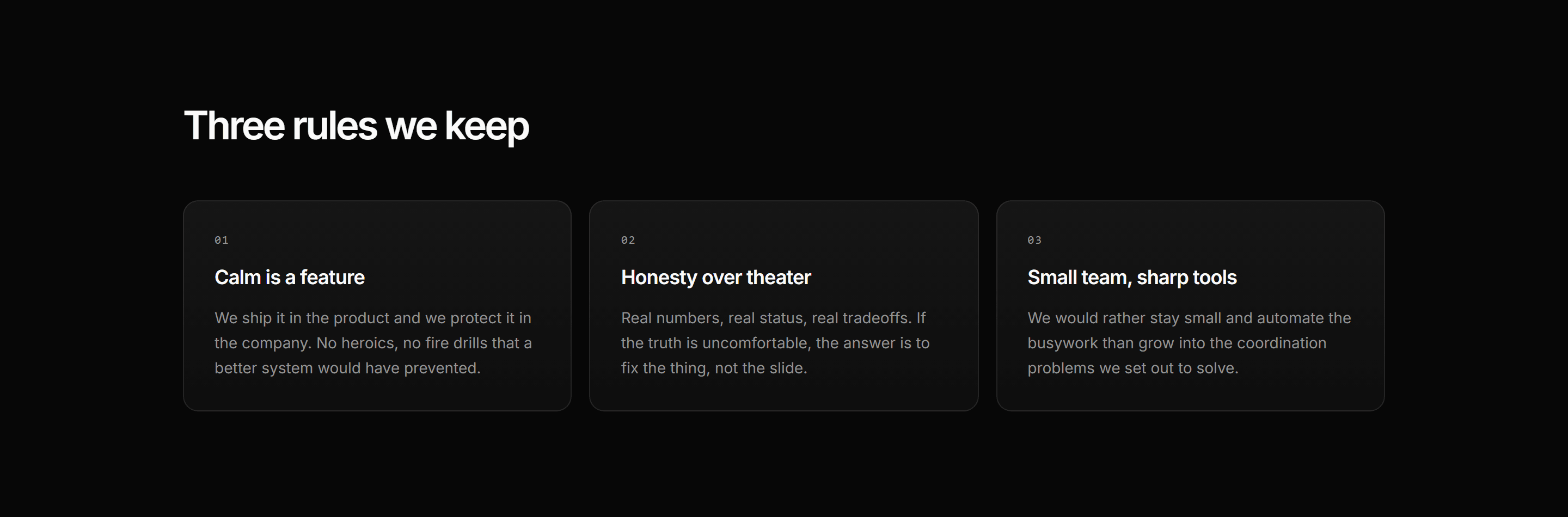
Modern SaaS About: Numbered Value Cards
Three numbered value cards: mono index, bold principle, and a two line explanation on gradient panels.


Modern SaaS About: Company Intro Hero
A centered about page opener: kicker pill, oversized headline, and a single plainspoken thesis line over a dark mode only ambient glow.
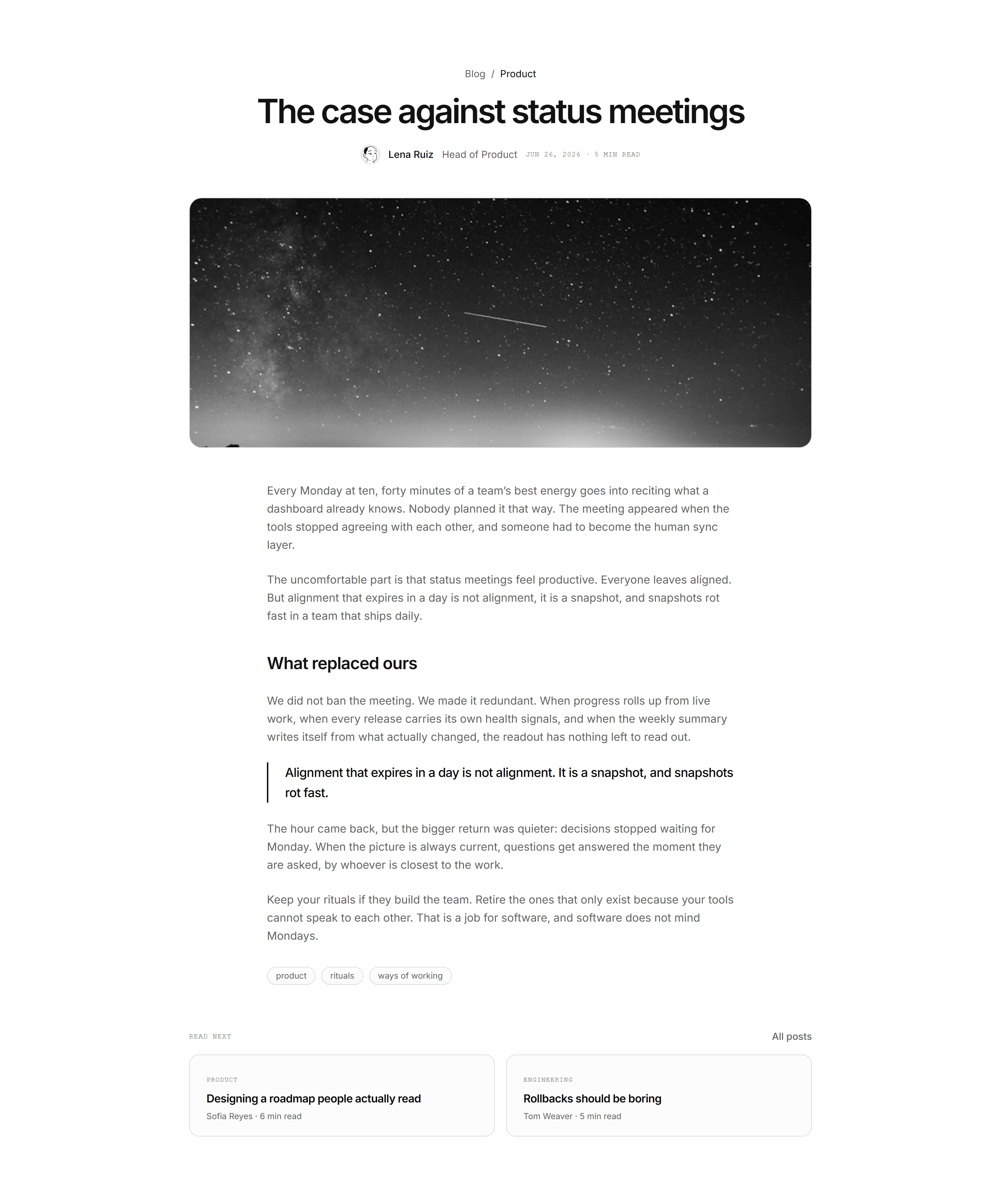
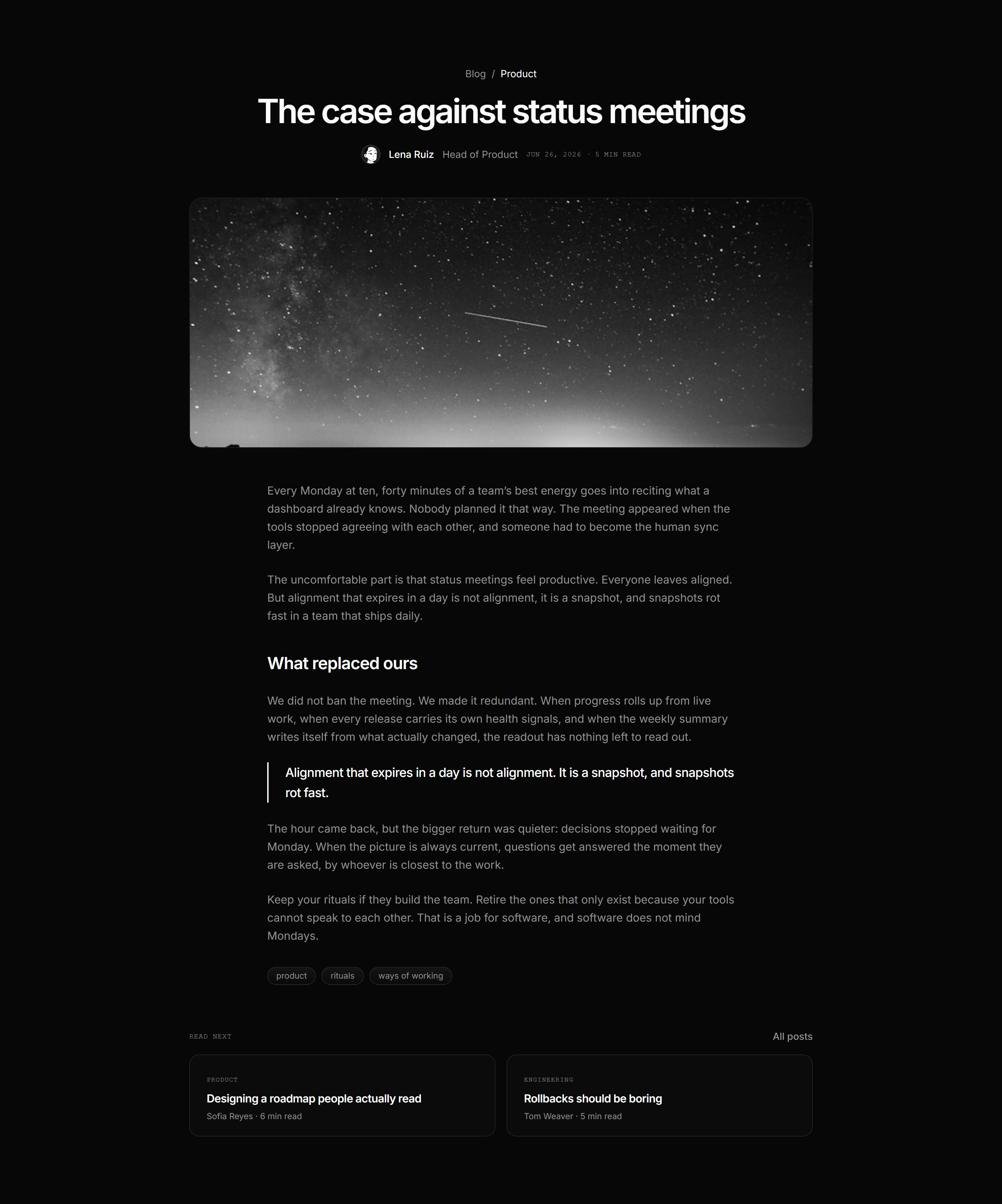
Modern SaaS Blog: Article Prose Page
A full blog article page: breadcrumb, oversized headline, avatar byline, wide photograph, measured prose with a pull quote, tag chips, and read next tiles.
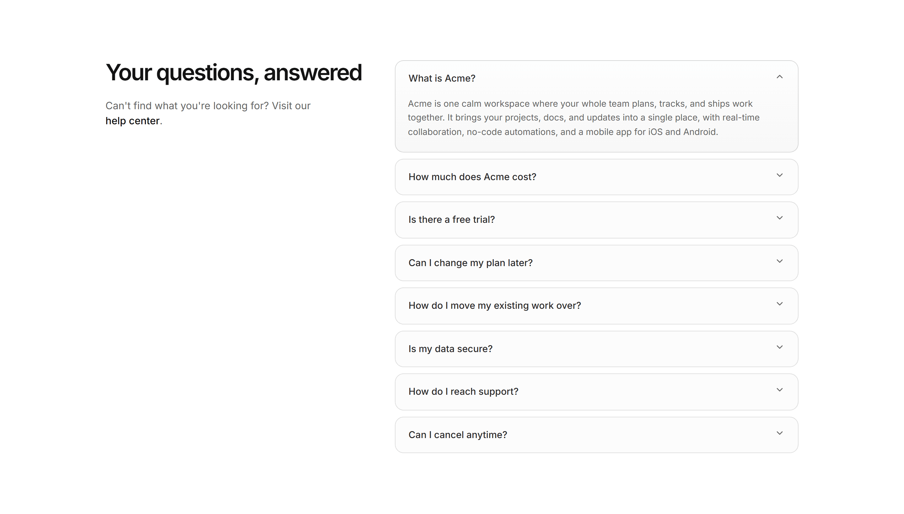
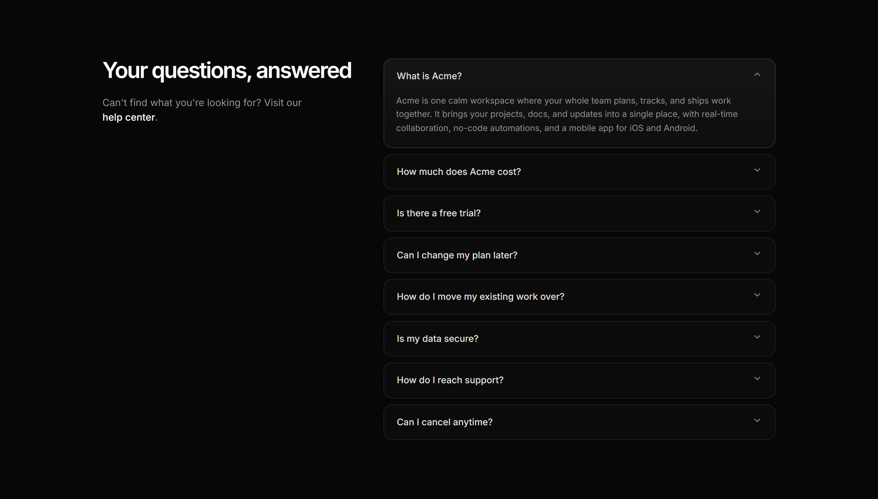
Modern SaaS FAQ: Split With Aside
A two-column FAQ: a sticky heading and help link beside a flat, single-open accordion of answers.
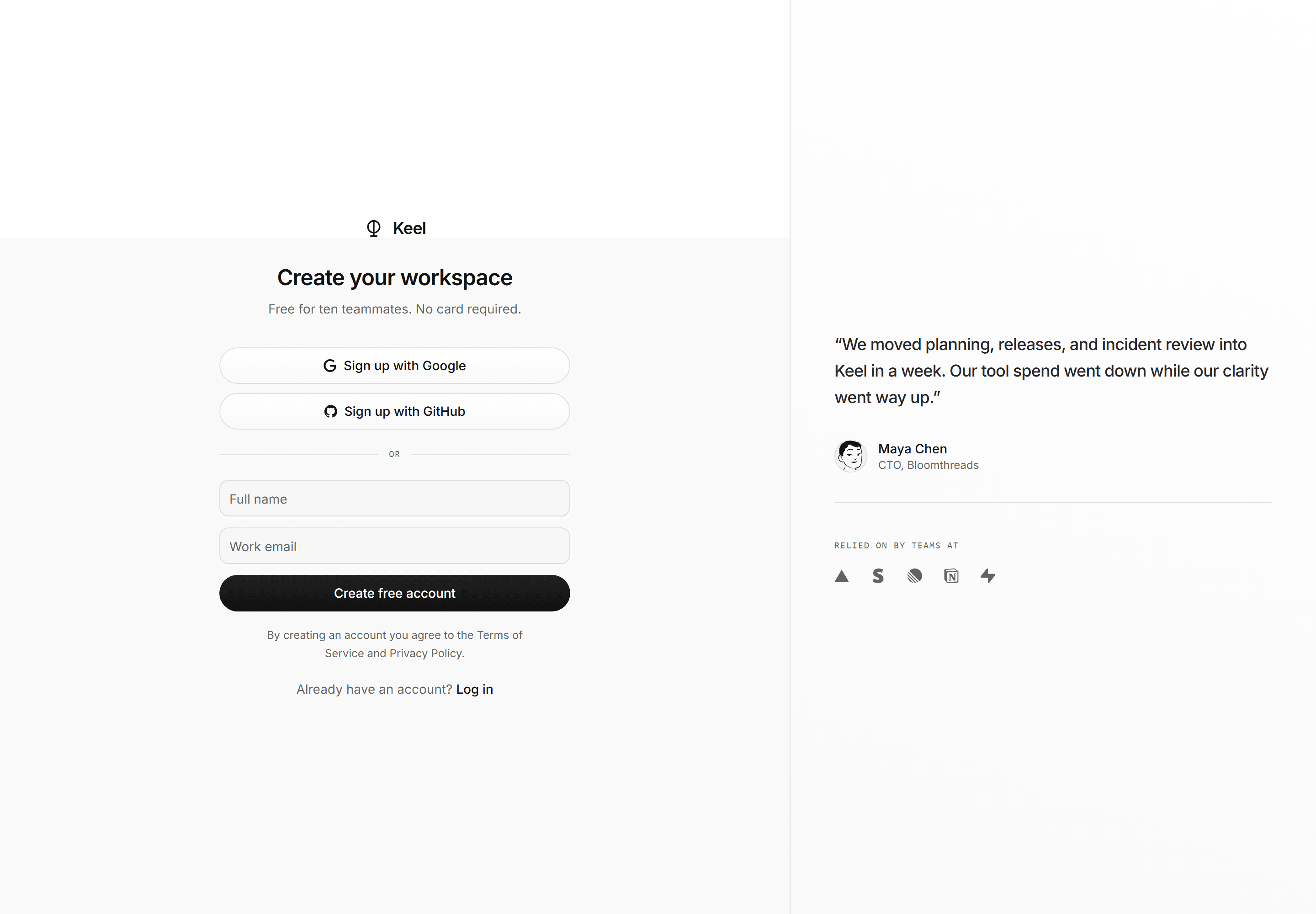
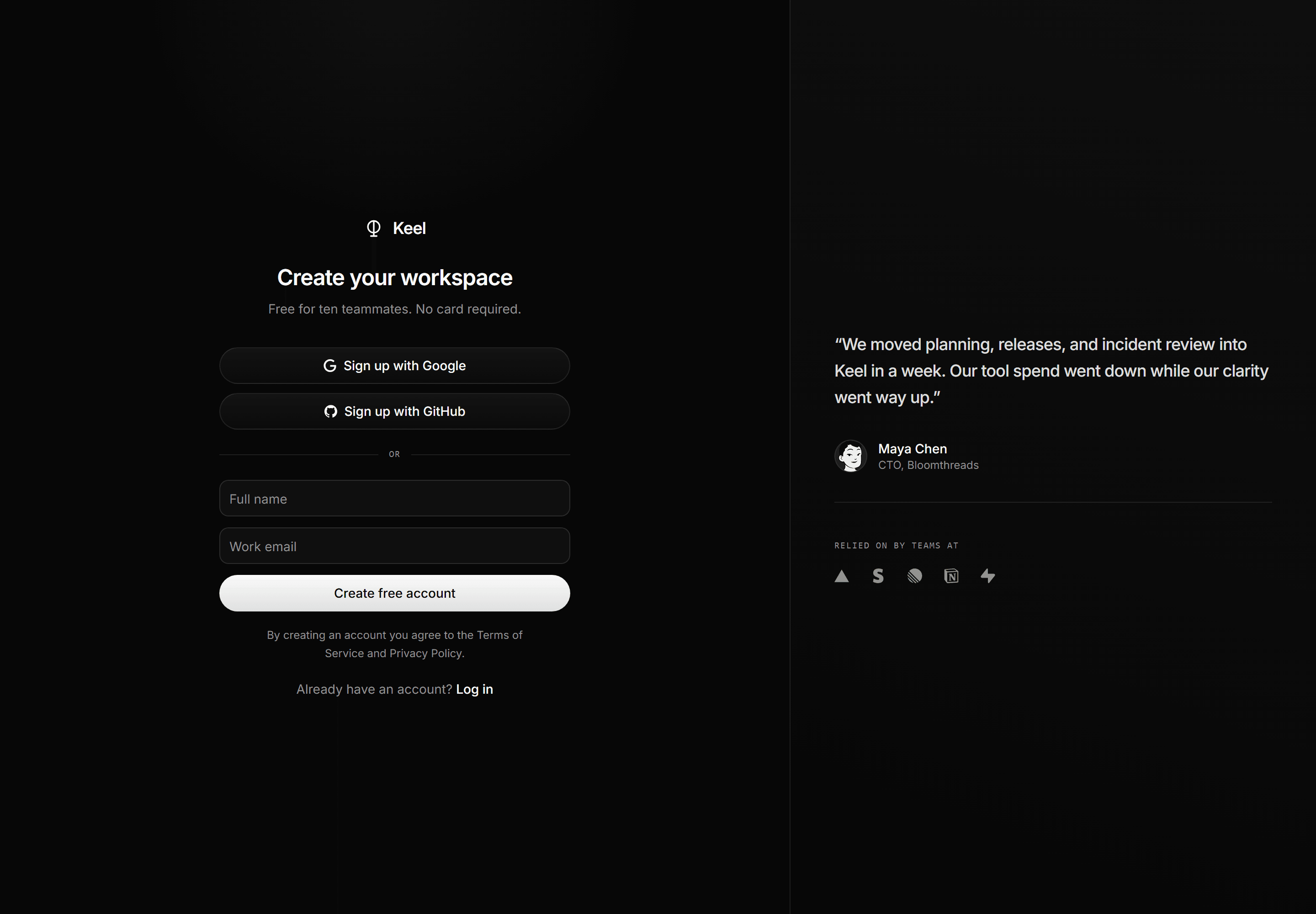
Modern SaaS Auth Page: Depth Signup
A split signup screen: form half with SSO pills and fields, proof half with a customer quote and social proof row.
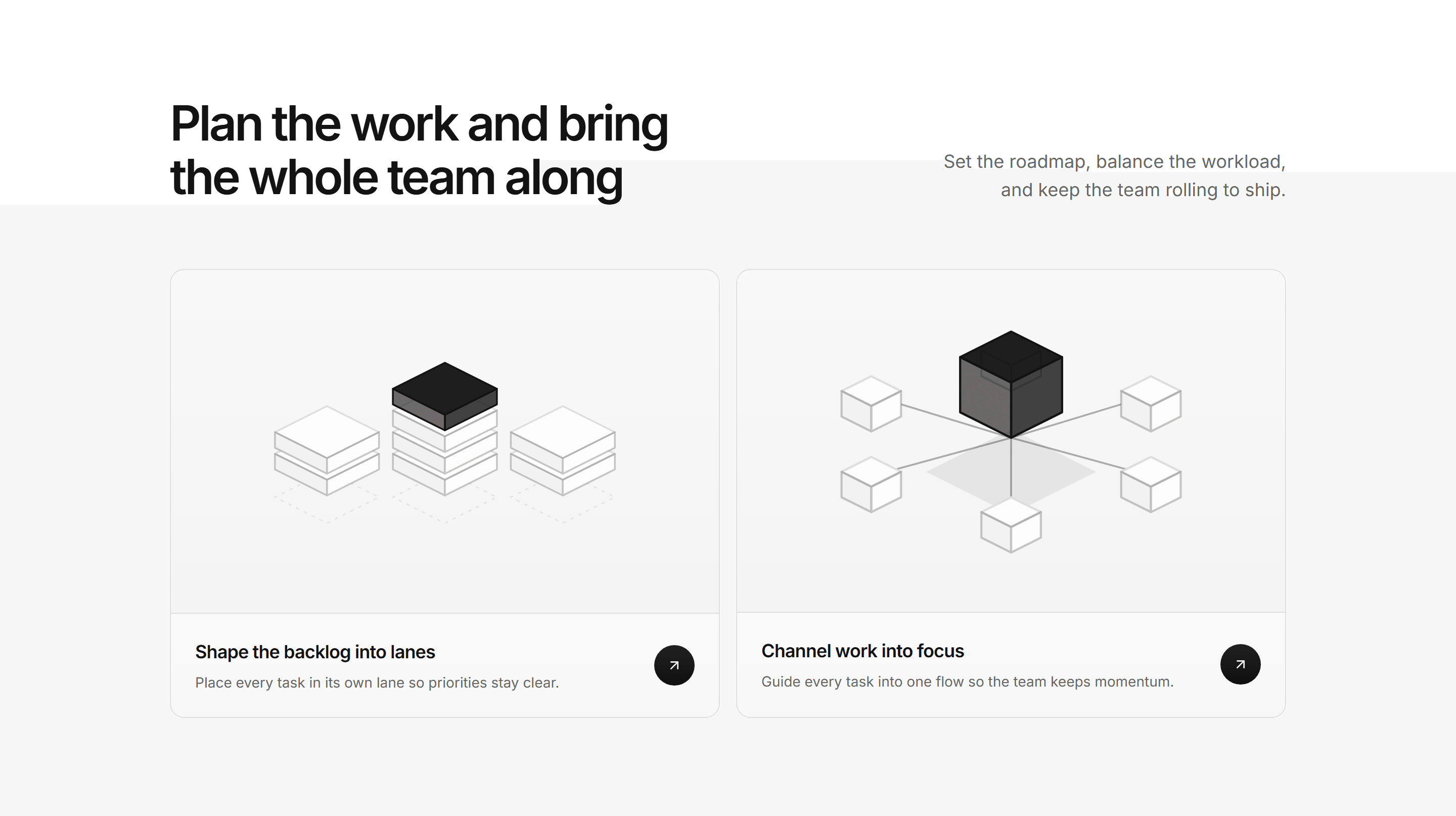
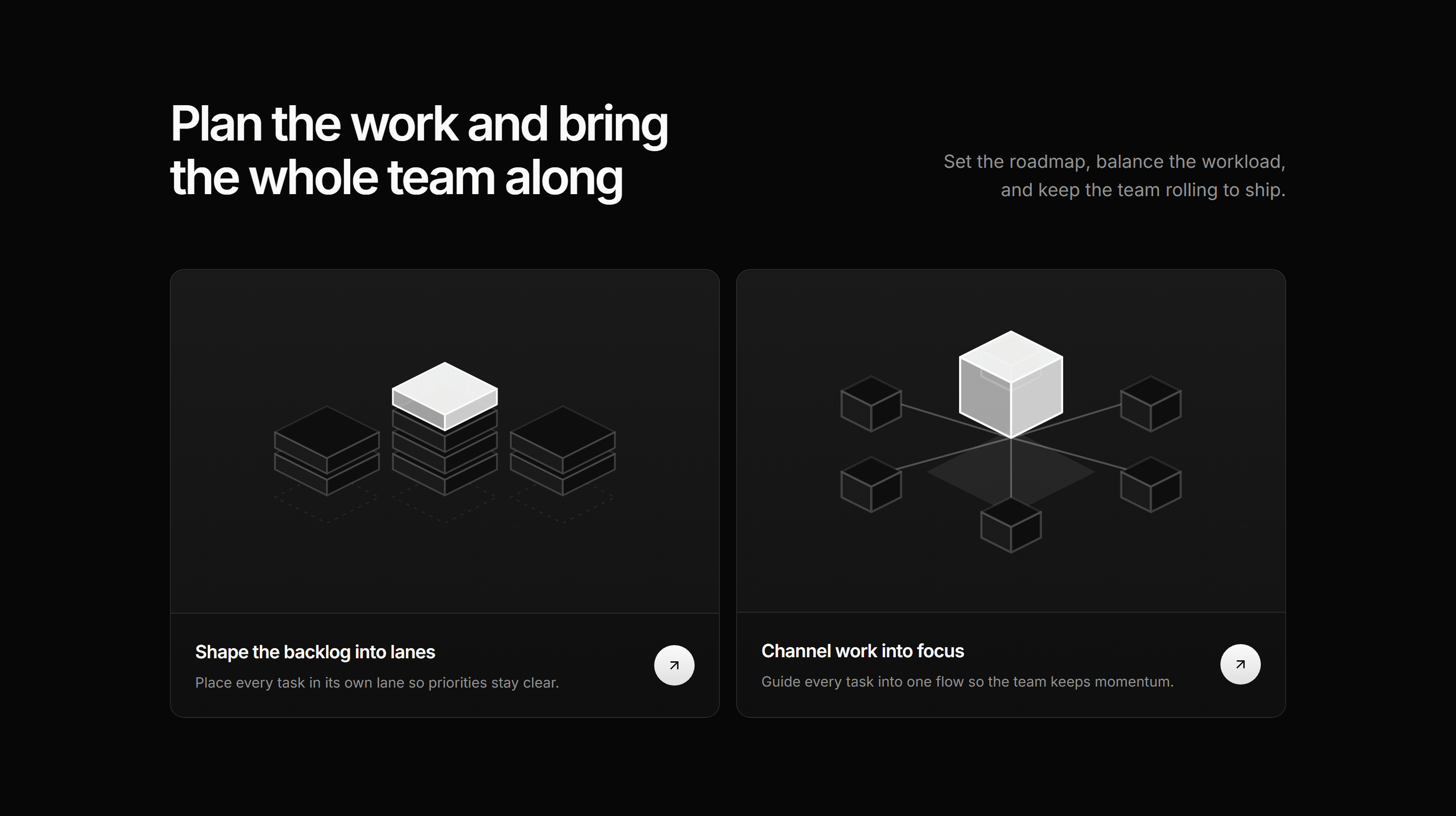
Modern SaaS Feature: Illustrated Cards
A gradient lead headline over two equal isometric cards: a backlog sorted into stacked lanes and cubes converging on one focused point.
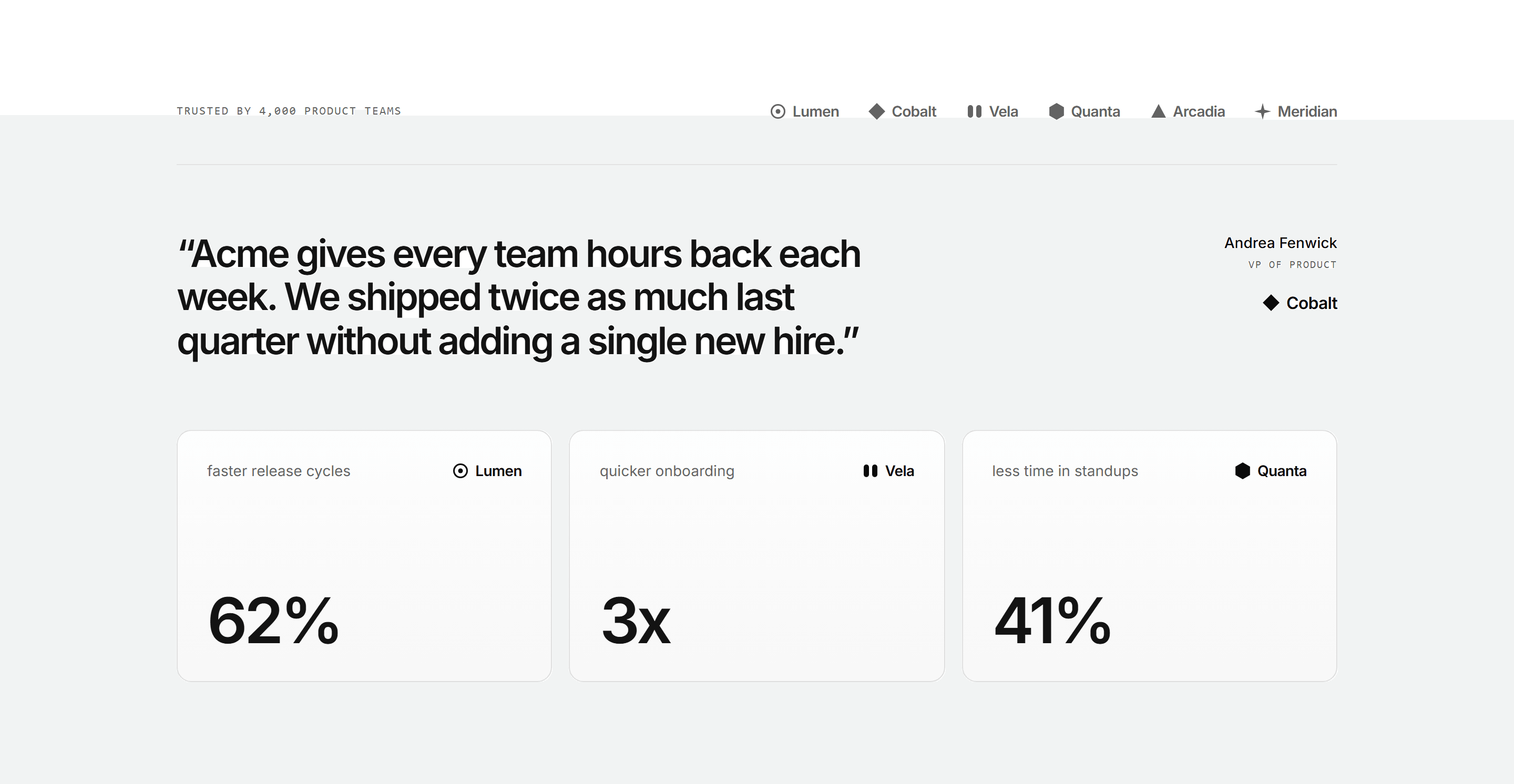
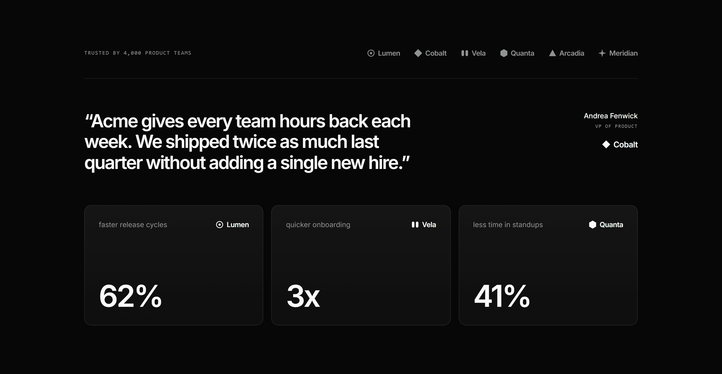
Modern SaaS Testimonial: Spotlight With Stats
A customer logo bar, one oversized pull quote with its attribution, and three metric cards that back the quote with hard numbers. A focused proof point for a landing page.
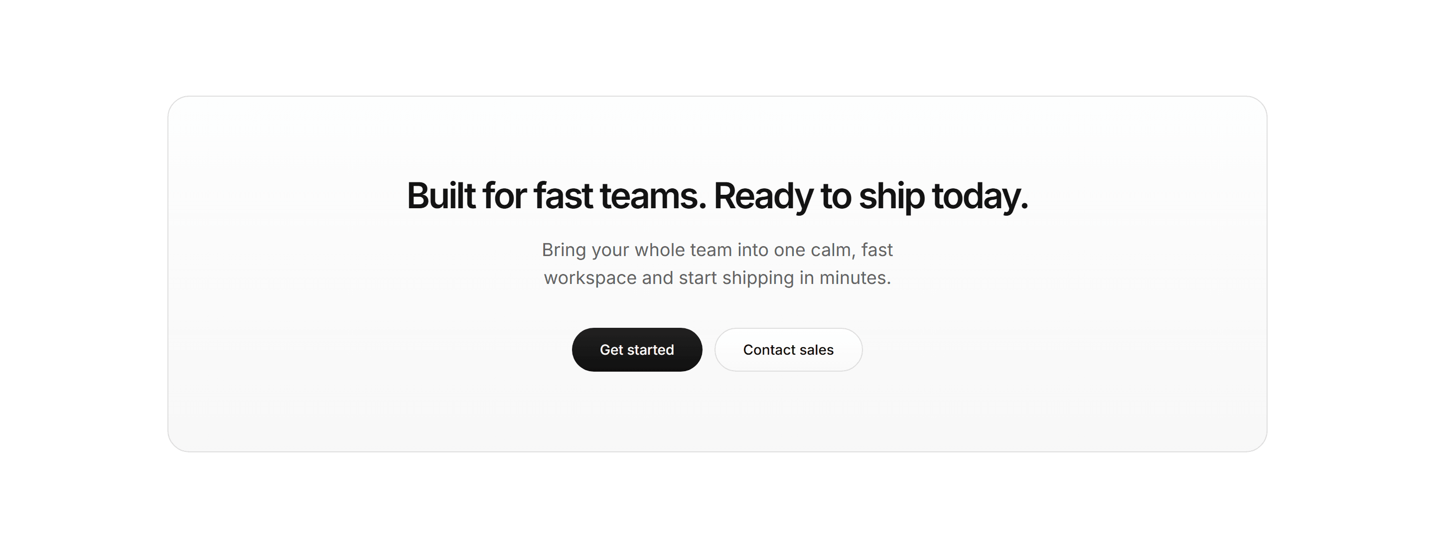

Modern SaaS CTA: Centered Callout
A simple, centered closing CTA on a soft bordered panel: a bold headline and short lede over two pill buttons.
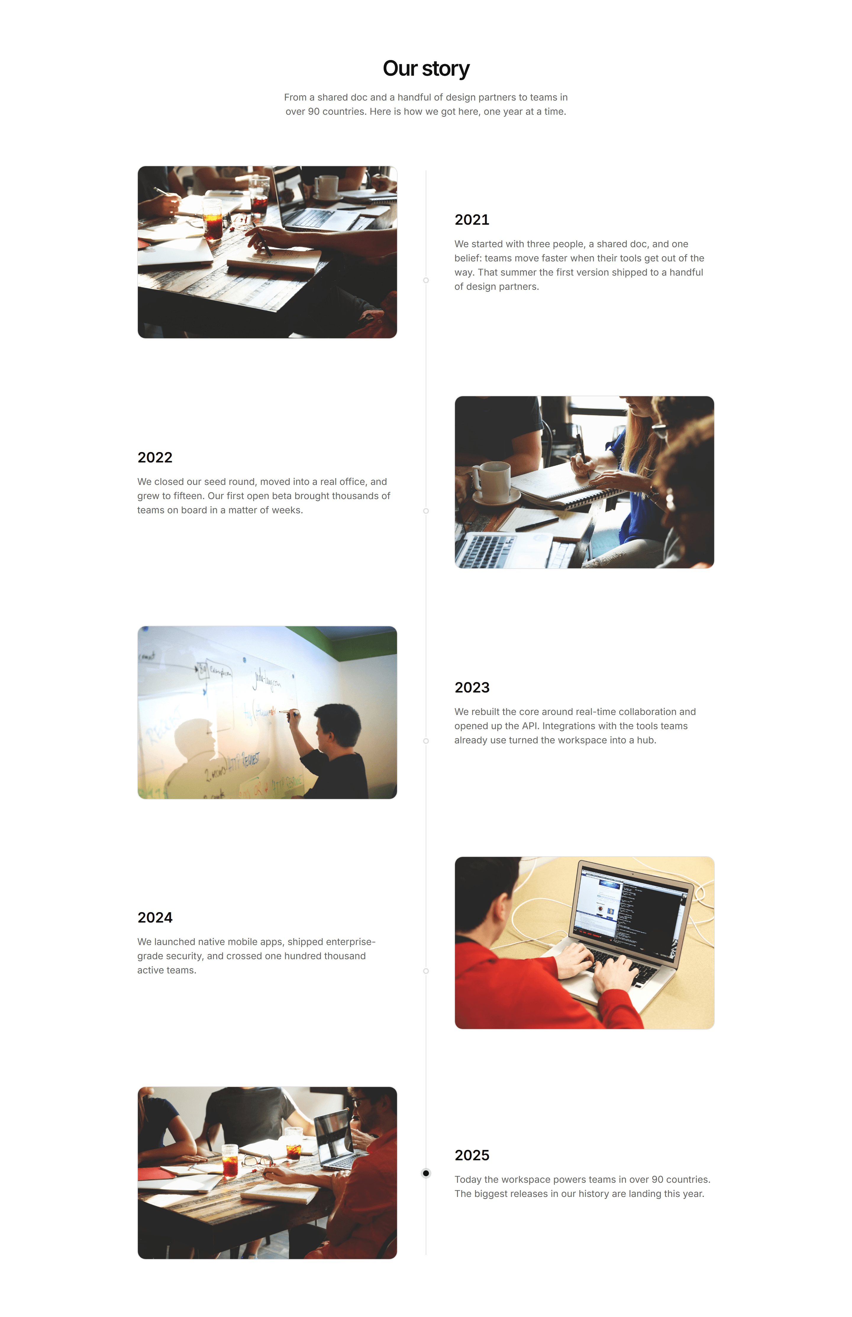
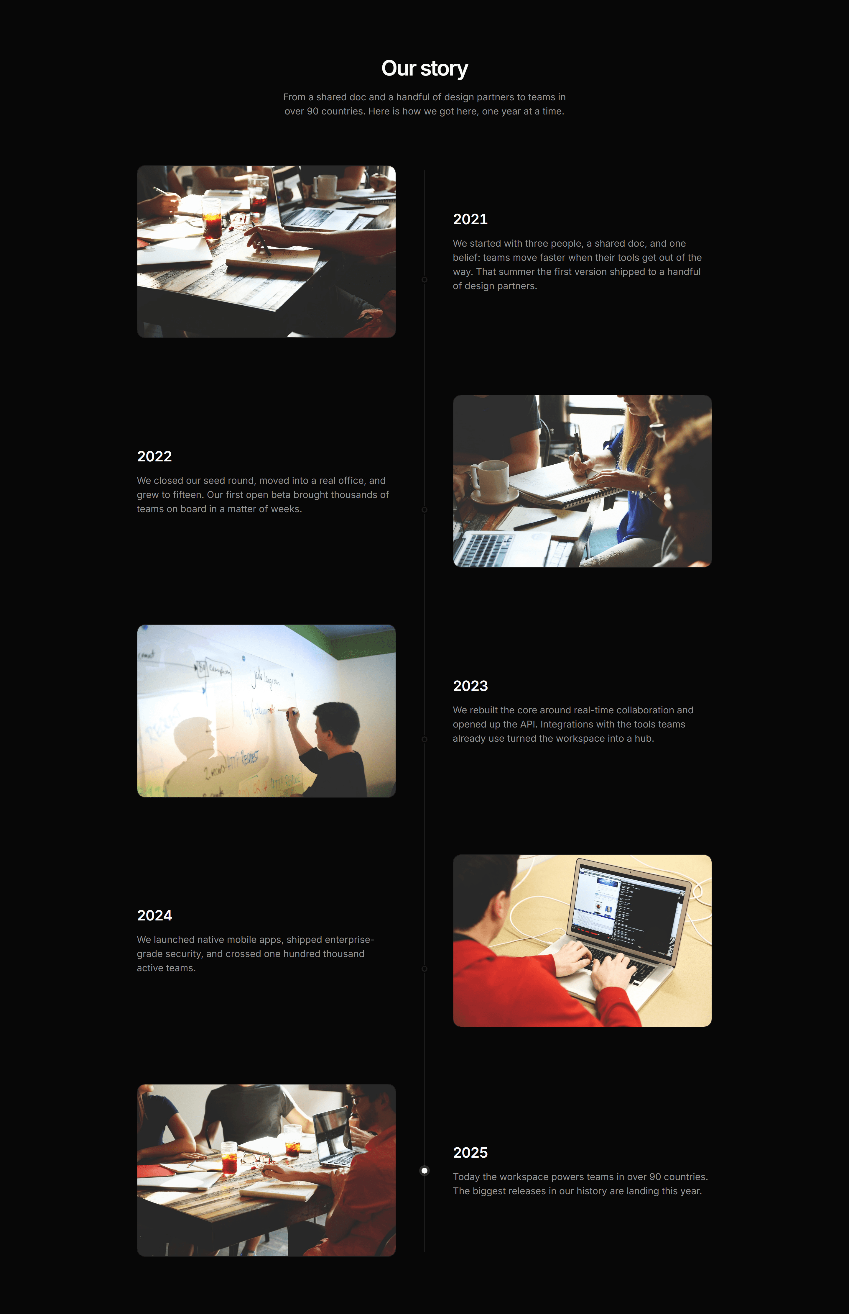
Modern SaaS About: Story Timeline
A vertical 'Our story' timeline of company milestones, alternating a photo with the year and a short paragraph beside a center rail, with the most recent year highlighted.
Modern SaaS Logo Cloud: Simple Grid
A simple, static logo cloud: an eyebrow line above a centered, wrapping row of customer logos. Clean, no motion social proof for a Modern SaaS landing page.
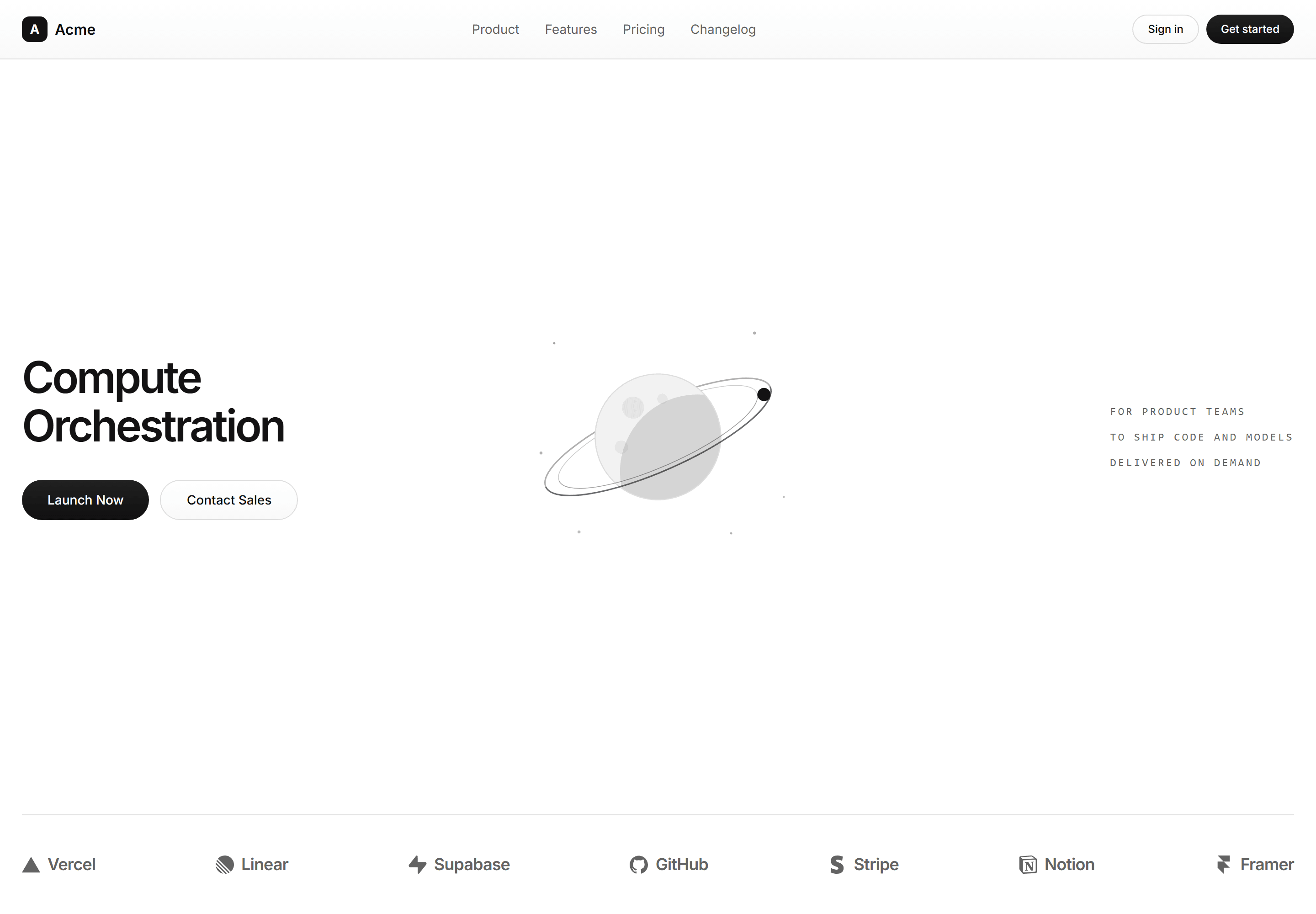
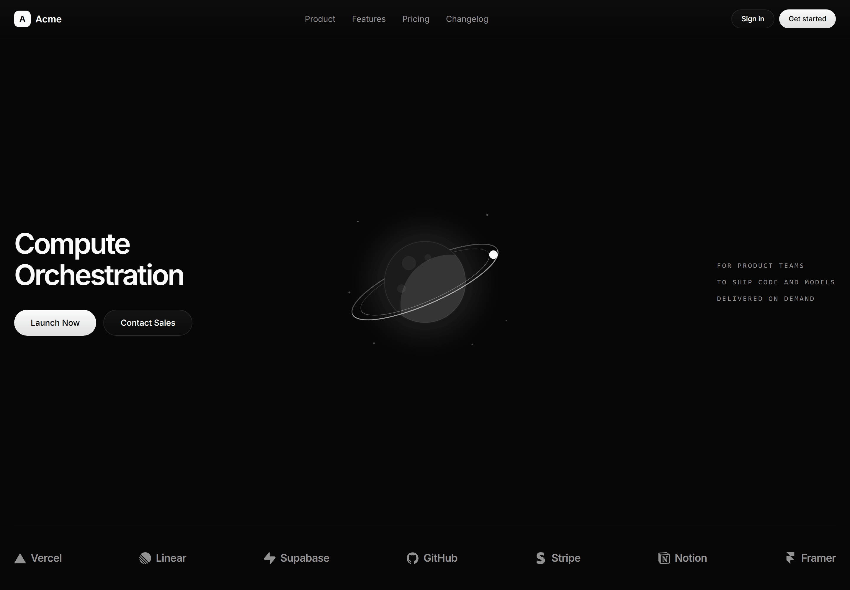
Modern SaaS Hero: Planet Centerpiece
A full-fold hero spread pairing a headline and CTAs with a token-built planet centerpiece and a monospace statement above a customer logo strip.
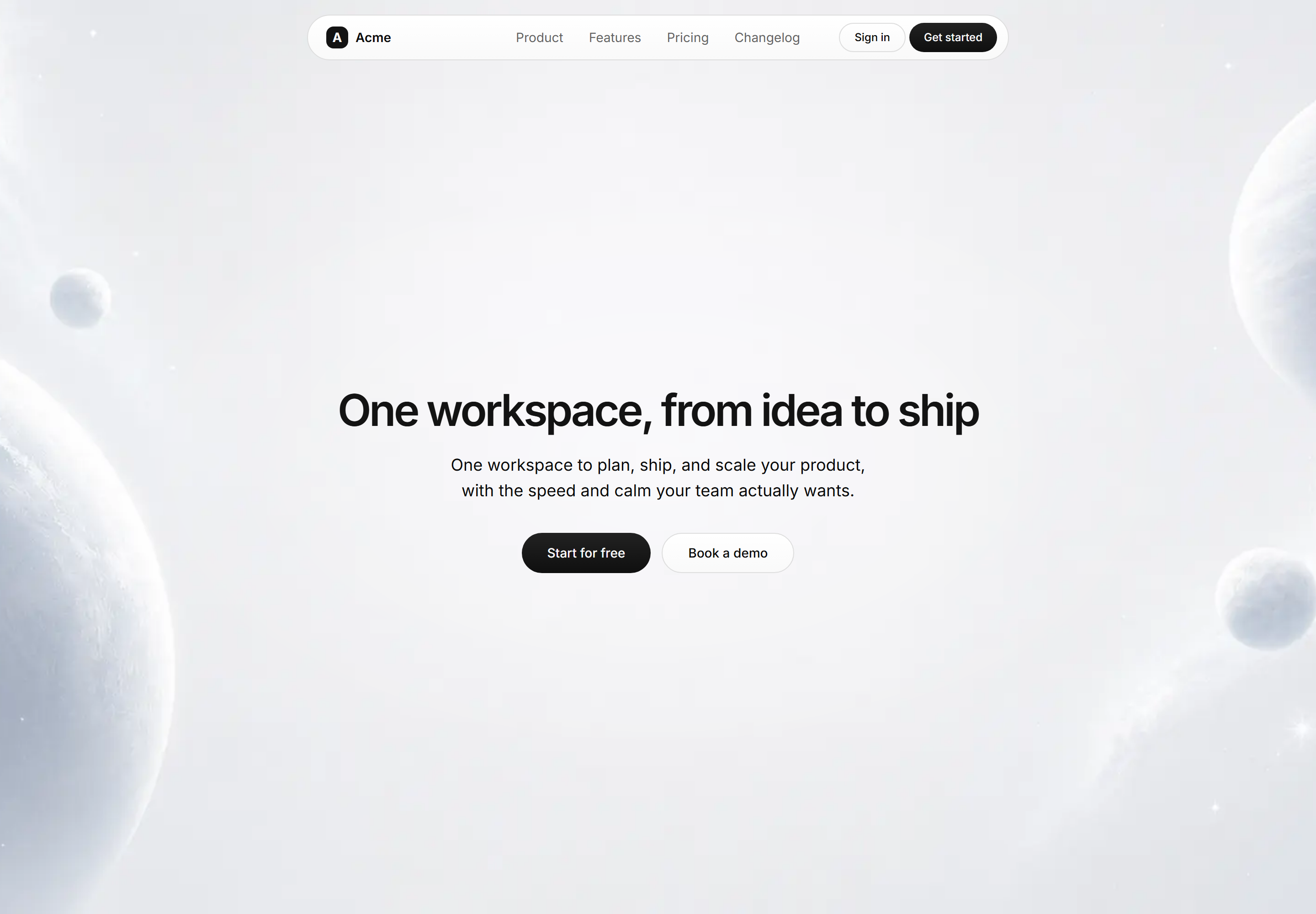
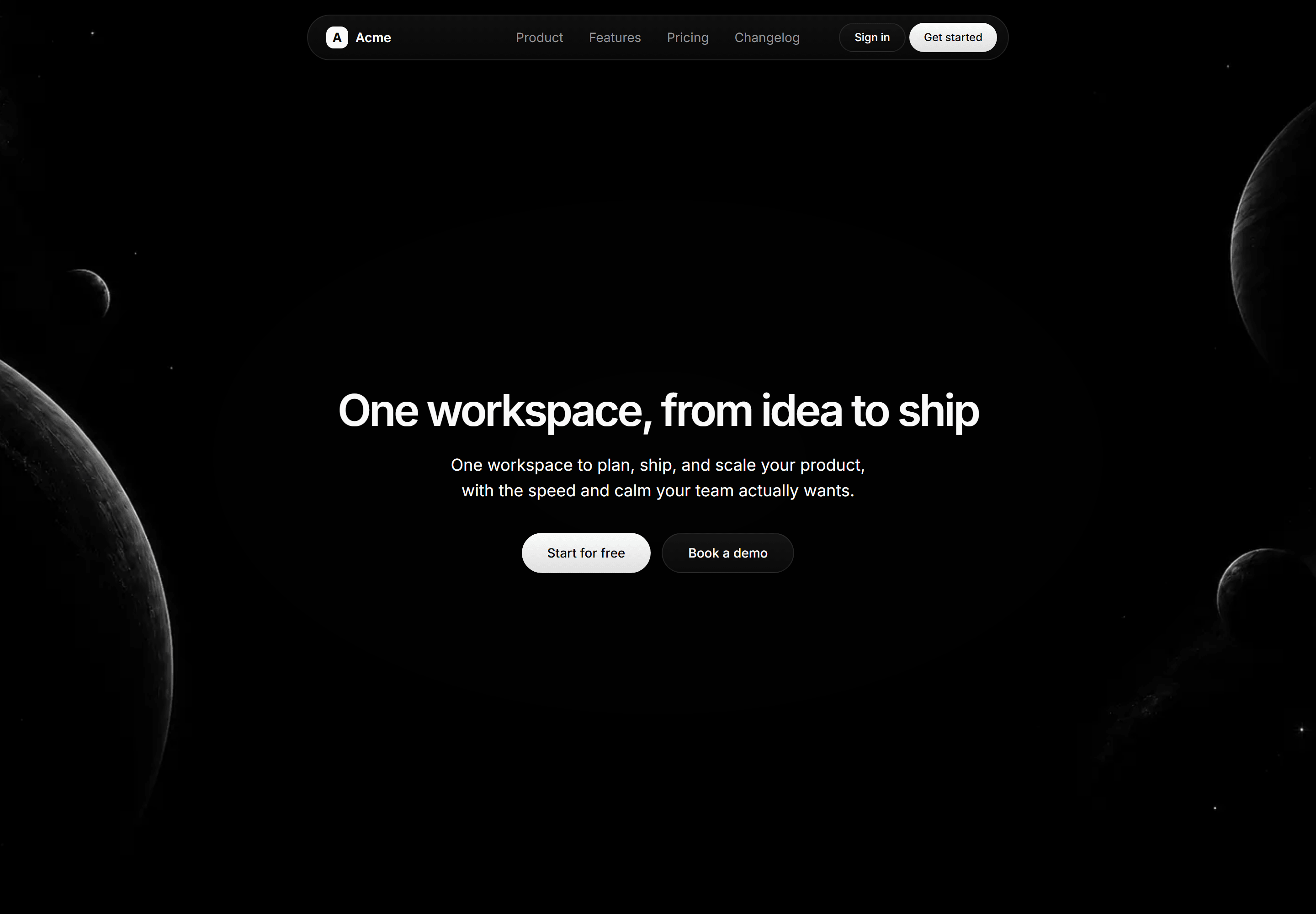
Modern SaaS Hero: Centered With Backdrop
A minimal centered hero, headline, lede, and two CTAs, set over a full bleed backdrop with matching light and dark images and a sticky oval navbar.
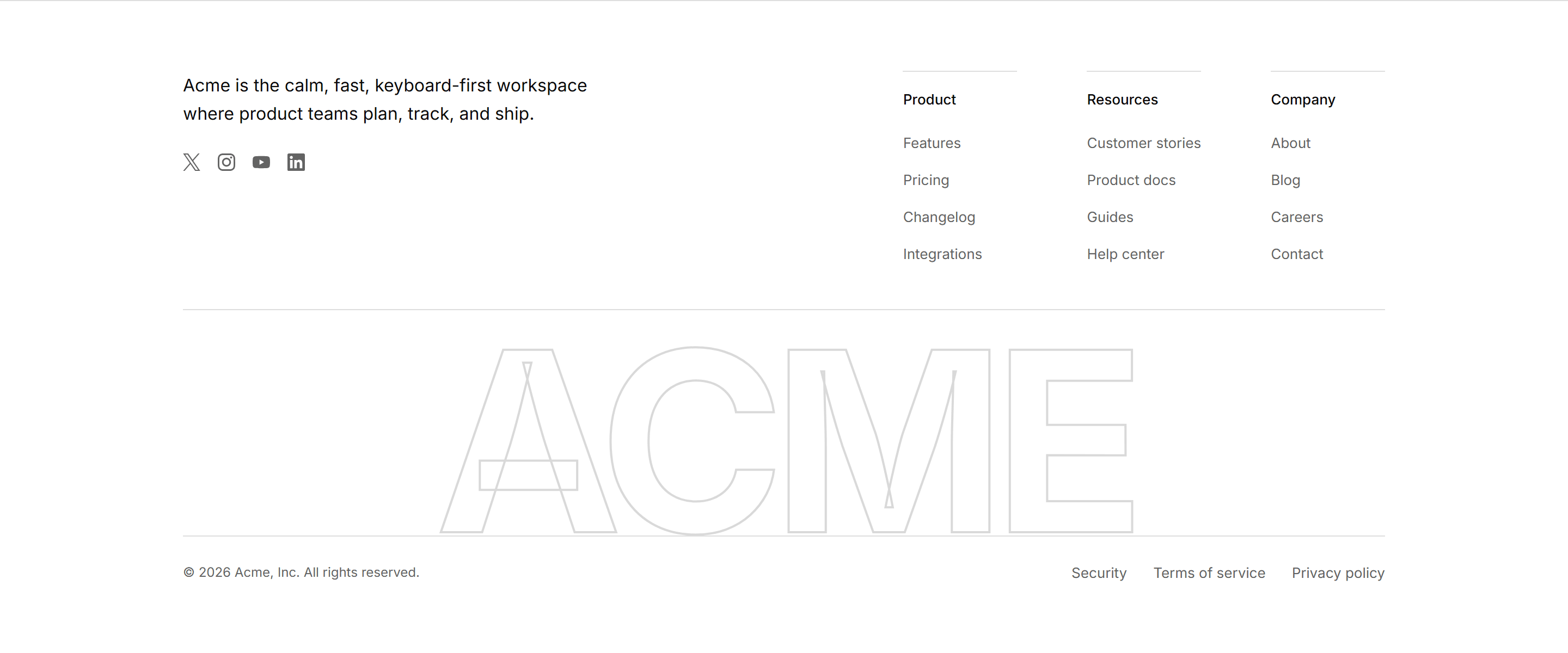
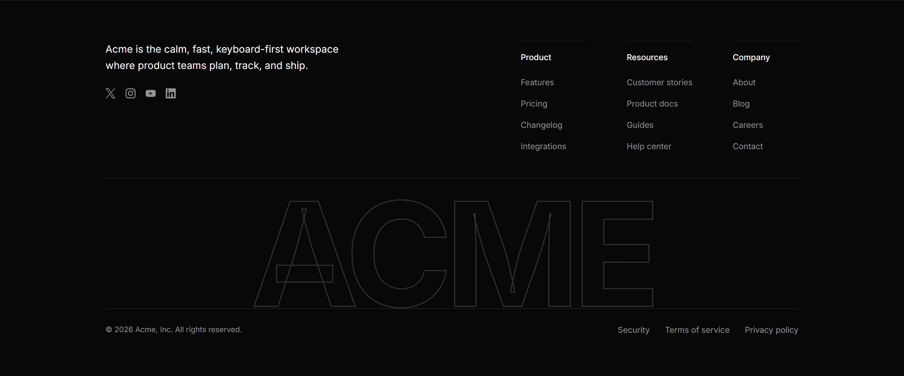
Modern SaaS Footer: Brand Watermark
A full width footer with a brand line, social buttons, and link columns, over a giant outlined brand wordmark above a legal bottom bar.
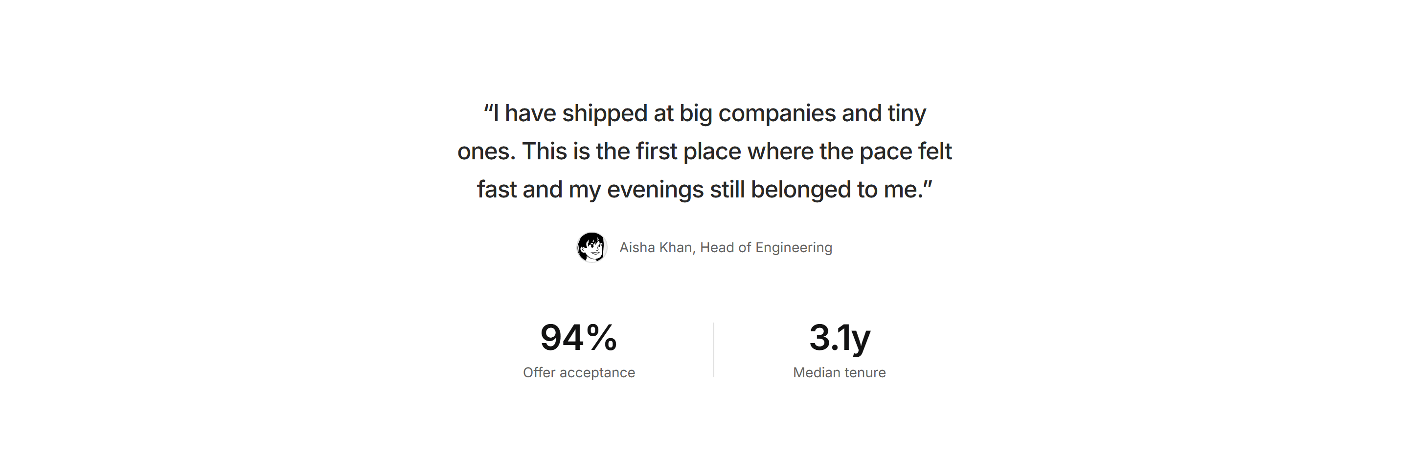

Modern SaaS Career: Team Quote Stats
A careers proof section: a centered teammate quote with an illustrated avatar attribution, followed by two hiring stats split by a hairline.


Modern SaaS CTA: Newsletter Signup Strip
A newsletter strip: an invitation line and a frequency promise beside a primary depth pill.


Modern SaaS CTA: Horizon Glow CTA
A closing CTA over a soft radial glow rising from the bottom edge, with a depth pill button pair.


Modern SaaS Integration: Icon Tile Spotlight
Two rows of gradient icon tiles above a centered heading, one line promise, and a ghost pill CTA.


Modern SaaS CTA: Inline Banner Strip
A slim banner strip: bold prompt and one line support on the left, a single ghost pill action on the right.


Modern SaaS Feature: Metric Interlude
A quiet pacing section: two large proof stats split by a hairline, followed by a single transitional statement line.
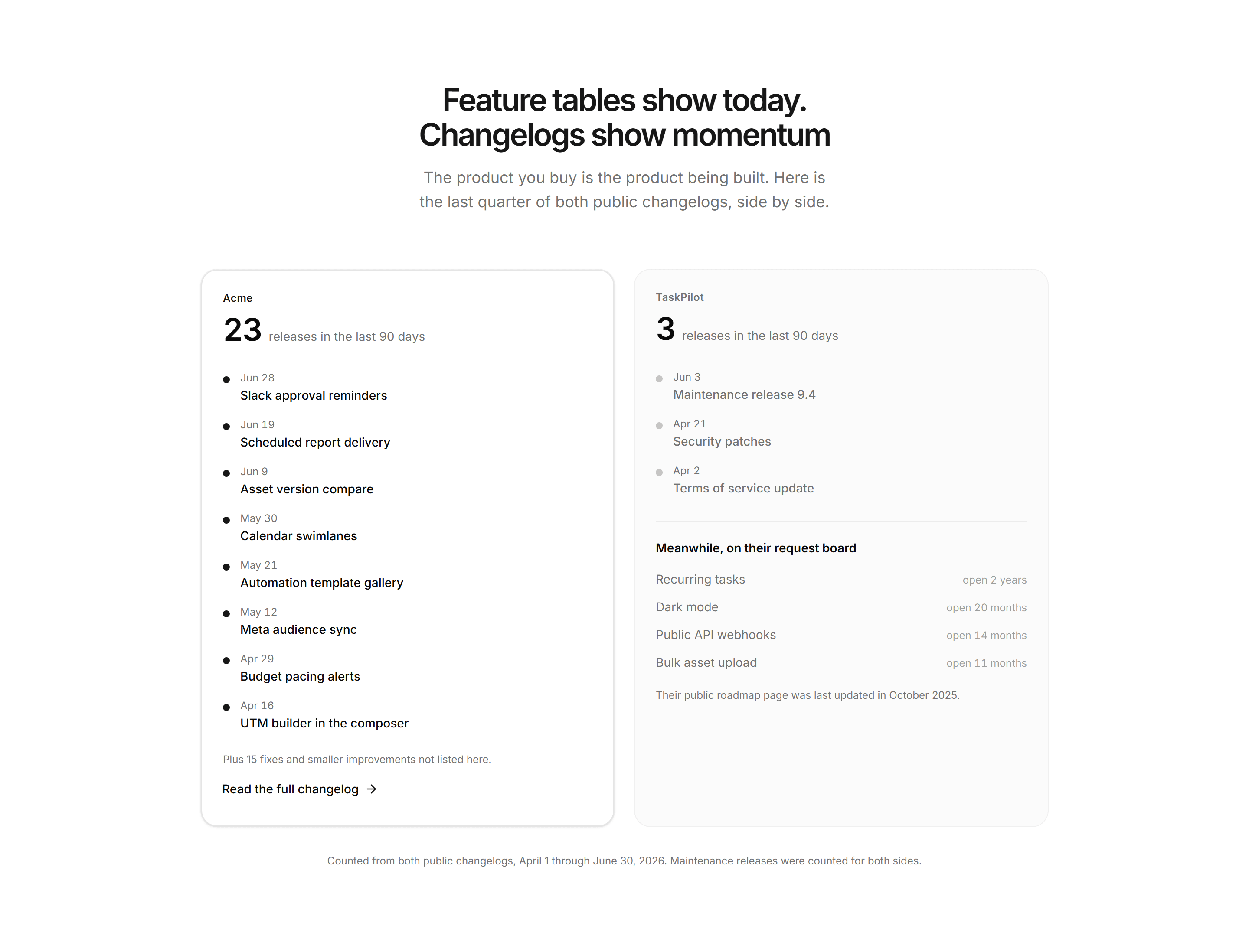
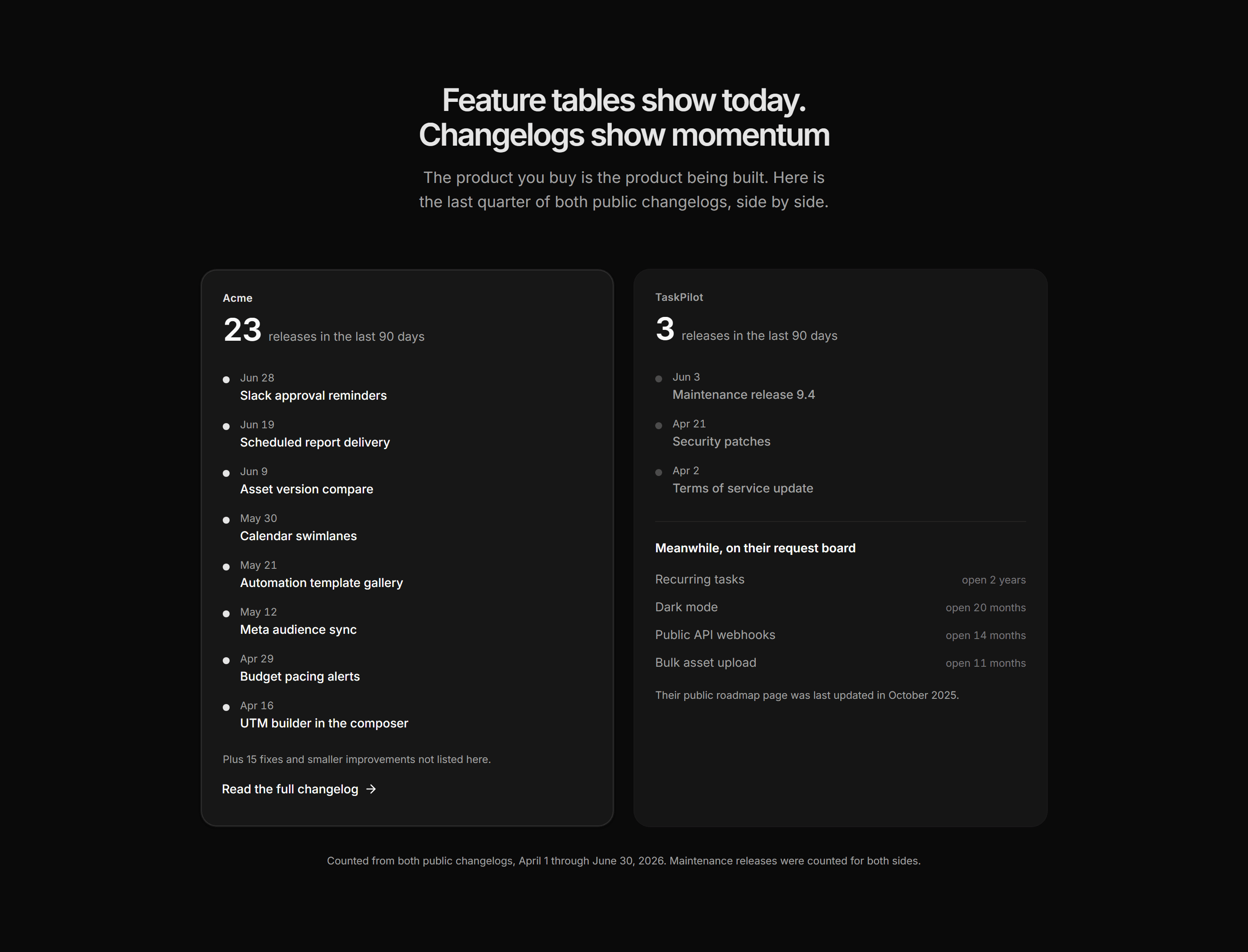
Marketing Comparison: Release Velocity
Two changelog columns side by side, each led by a release count over a dated feed, a busy product feed beside a sparse rival.
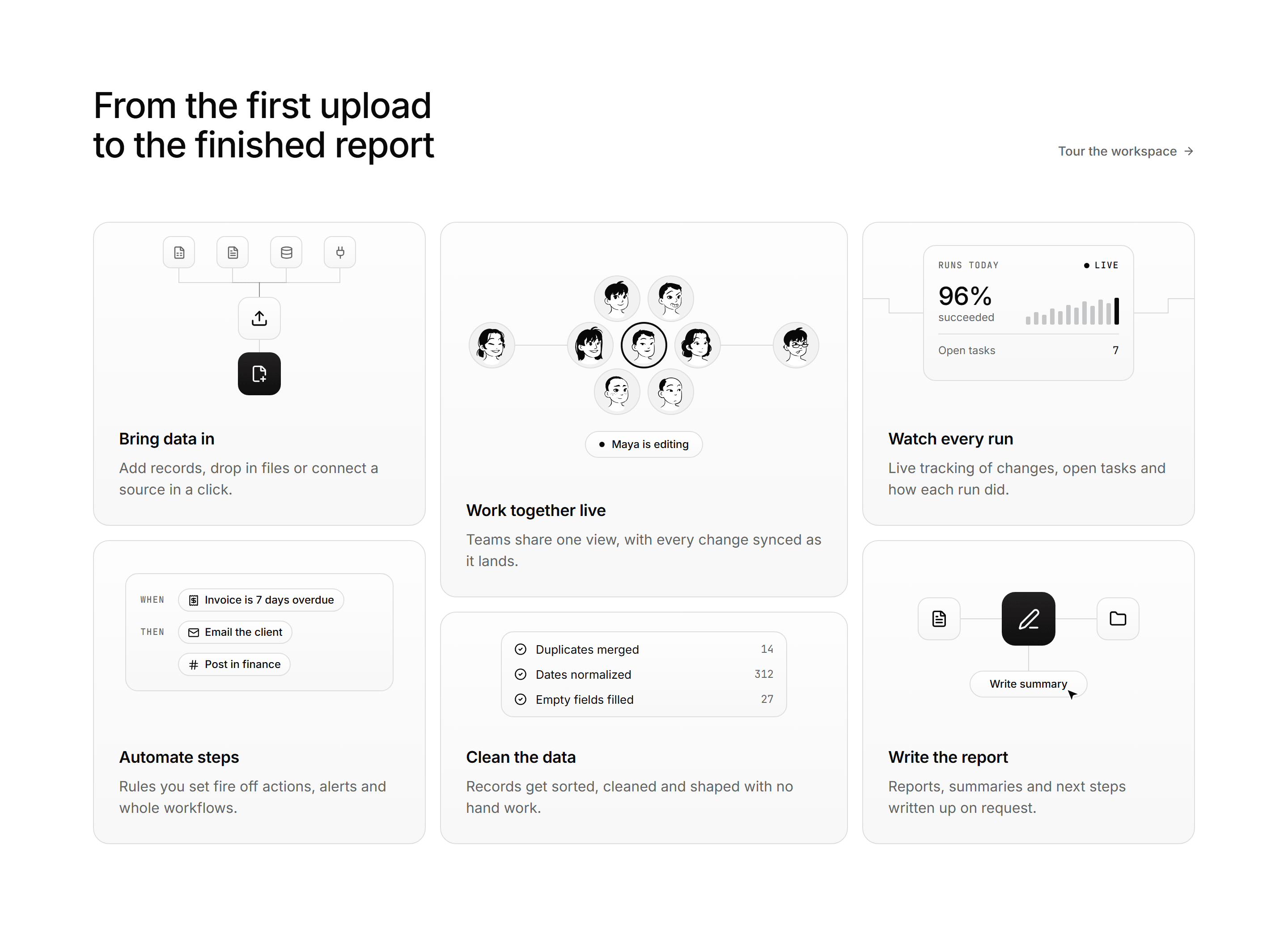
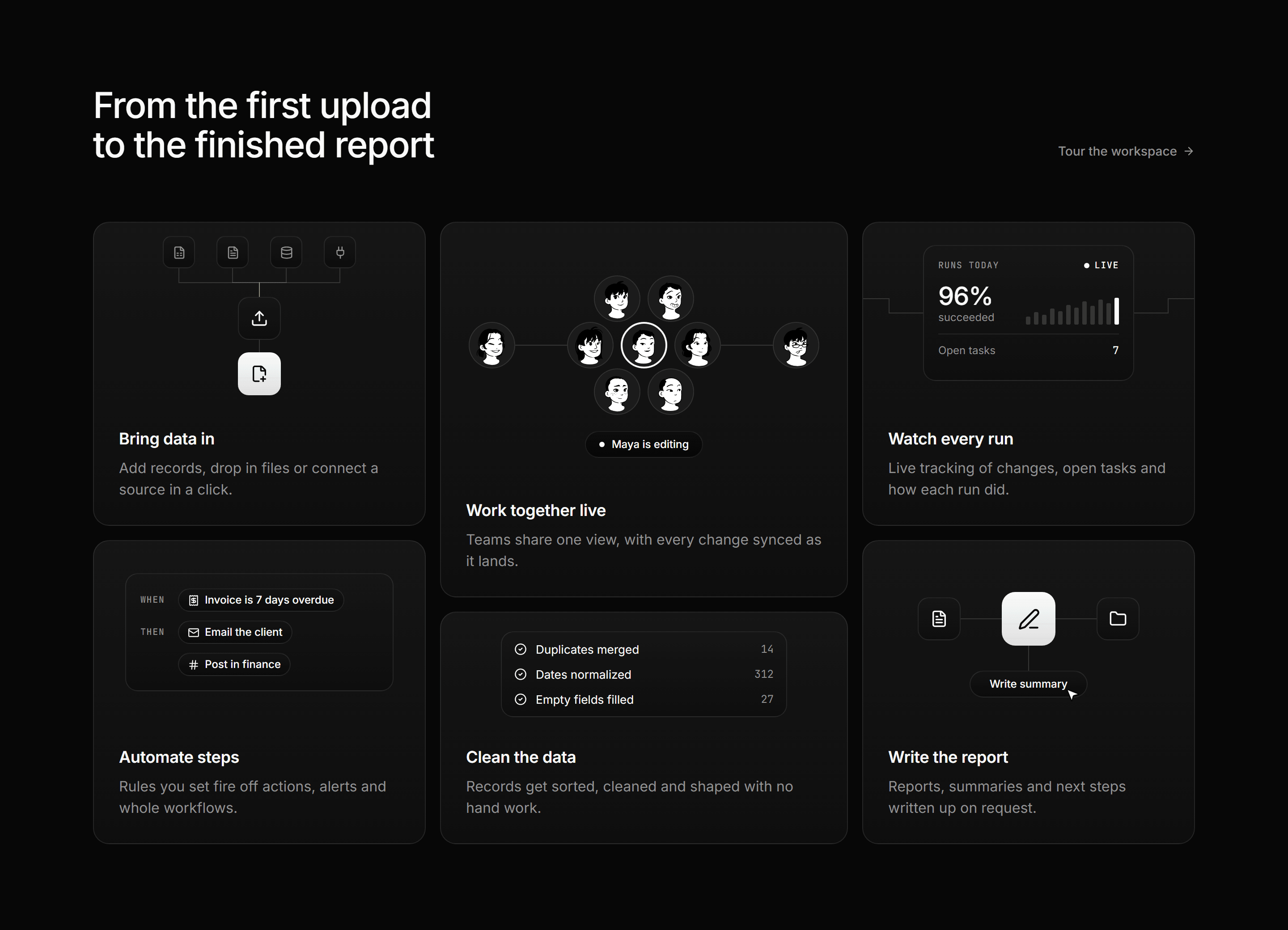
Modern SaaS Feature: Node Bento Grid
A heading row with a text link over a six tile bento, each tile a small product moment for its feature above a title and a two line blurb.
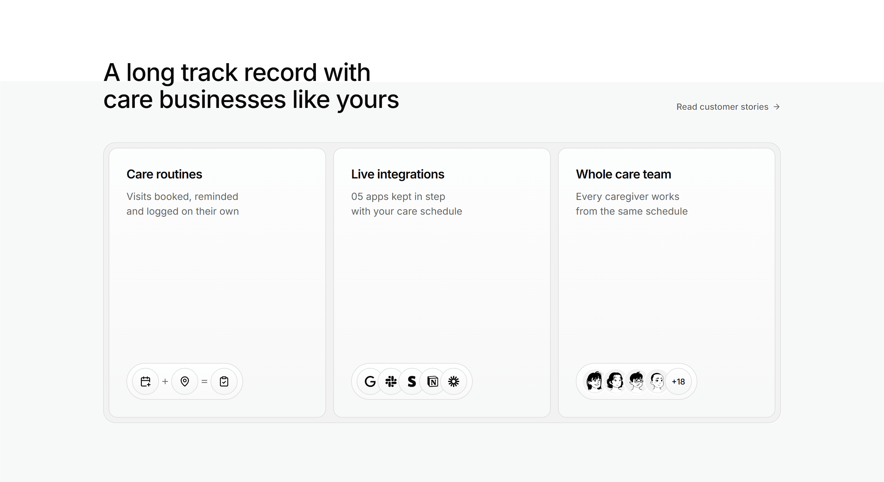
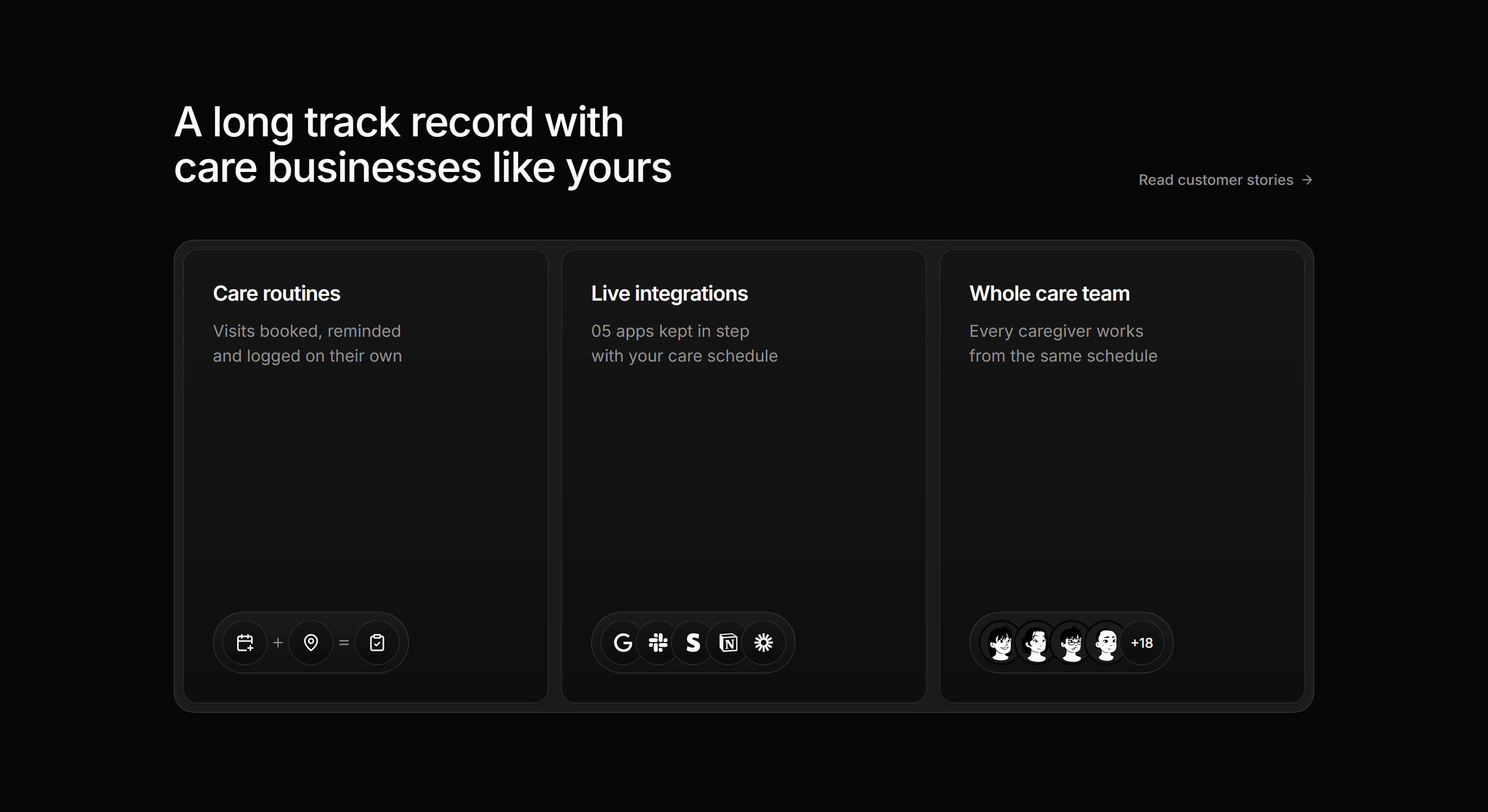
Modern SaaS Feature: Capsule Card Trio
A heading row with a text link over three tall cards in a muted inset tray, each closing on a capsule of icon, brand or avatar chips.
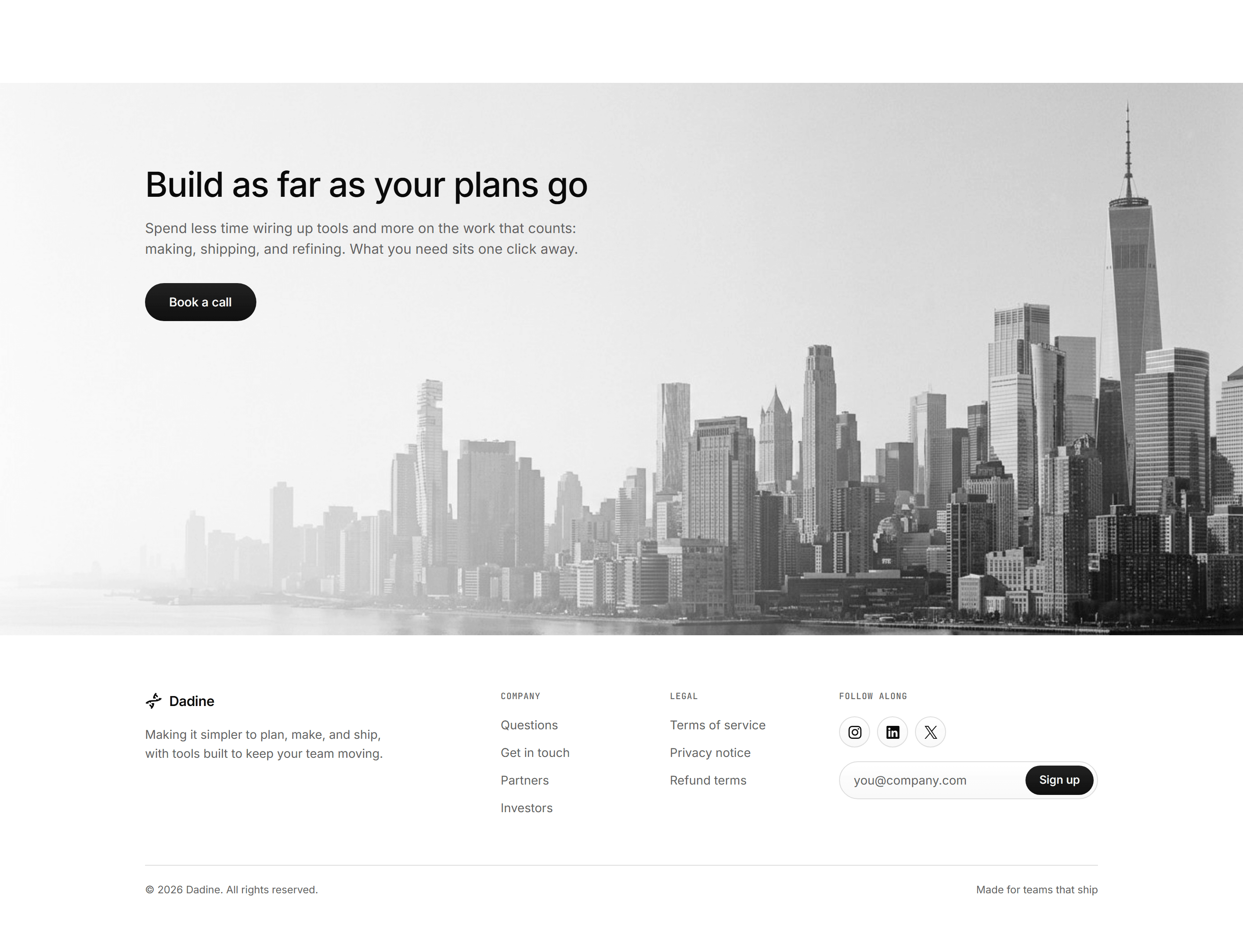

Modern SaaS Footer: Image CTA Footer
A full bleed skyline band carrying a heading, lede and pill, then a footer with link columns, social chips and a newsletter capsule.
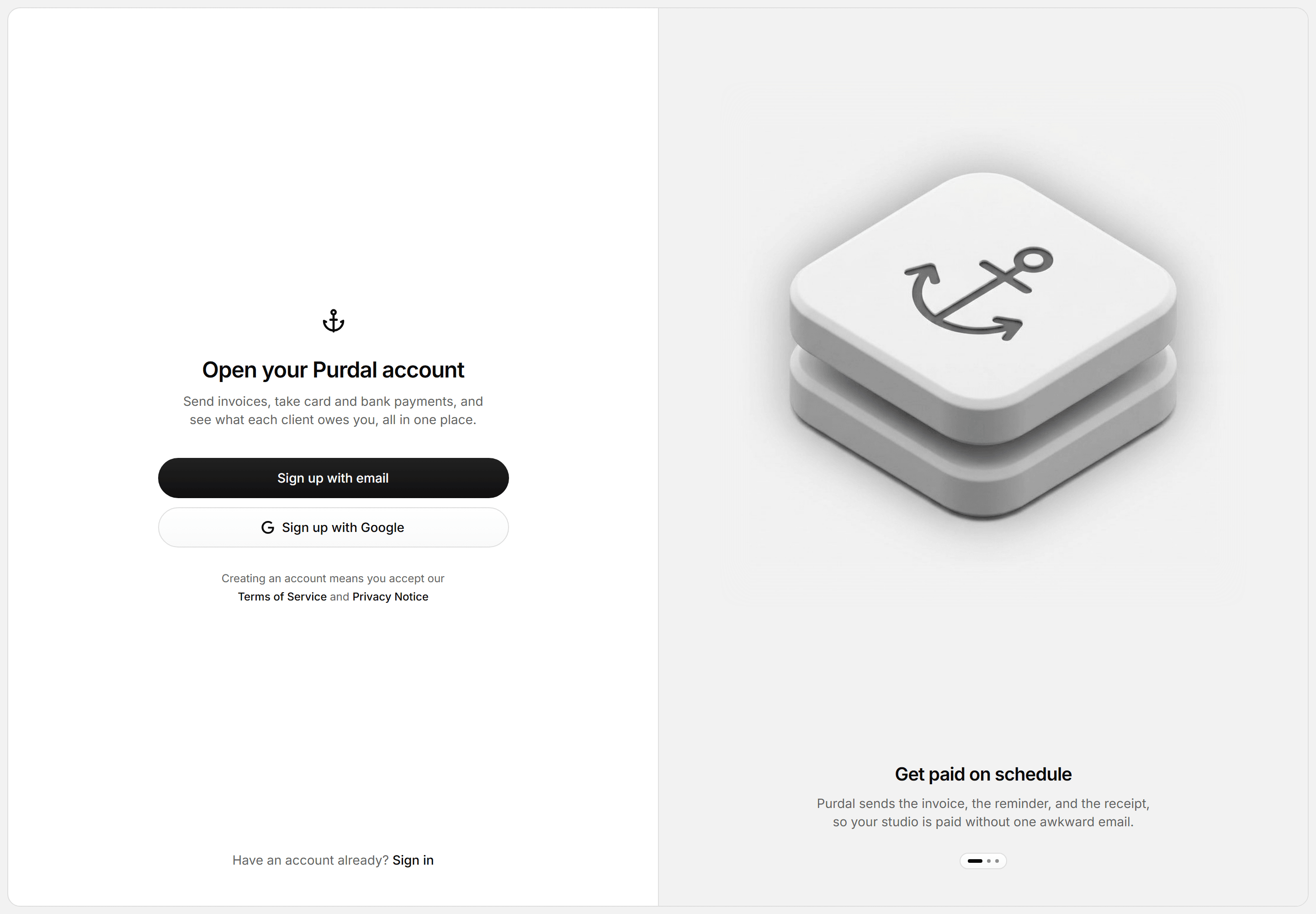
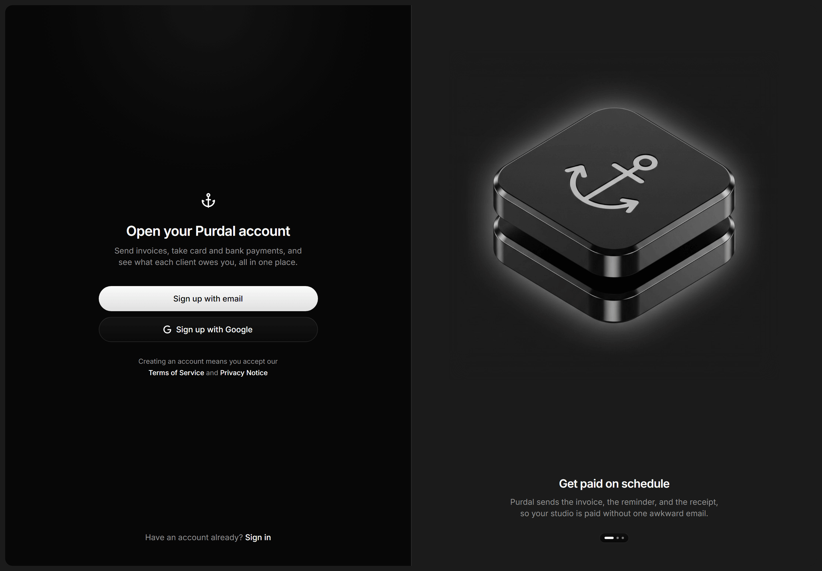
Modern SaaS Auth Page: Split Signup Showcase
A split signup screen in an inset tray: bare brand mark, email and Google pills, and a legal line beside a render over a caption carousel.
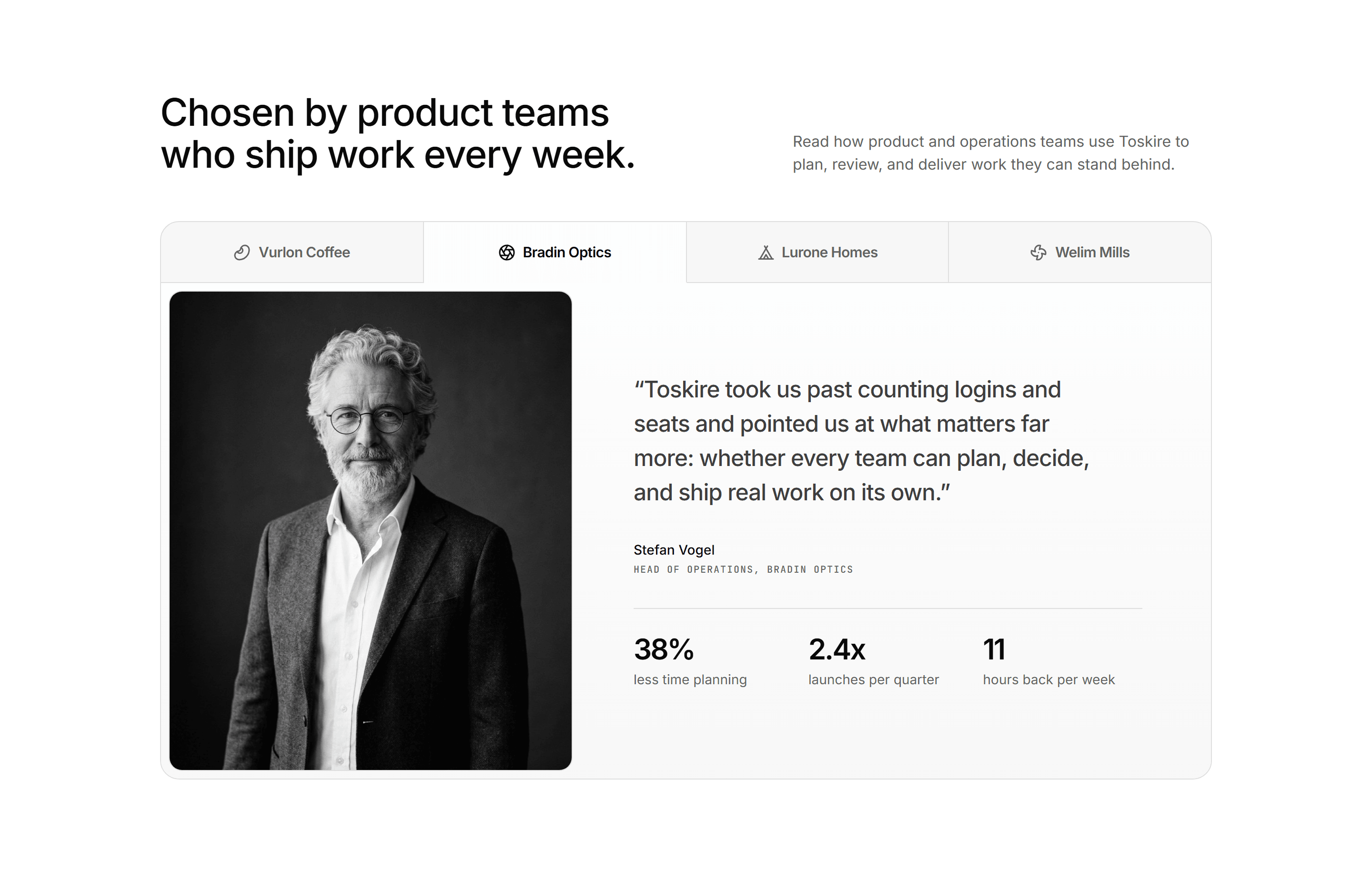
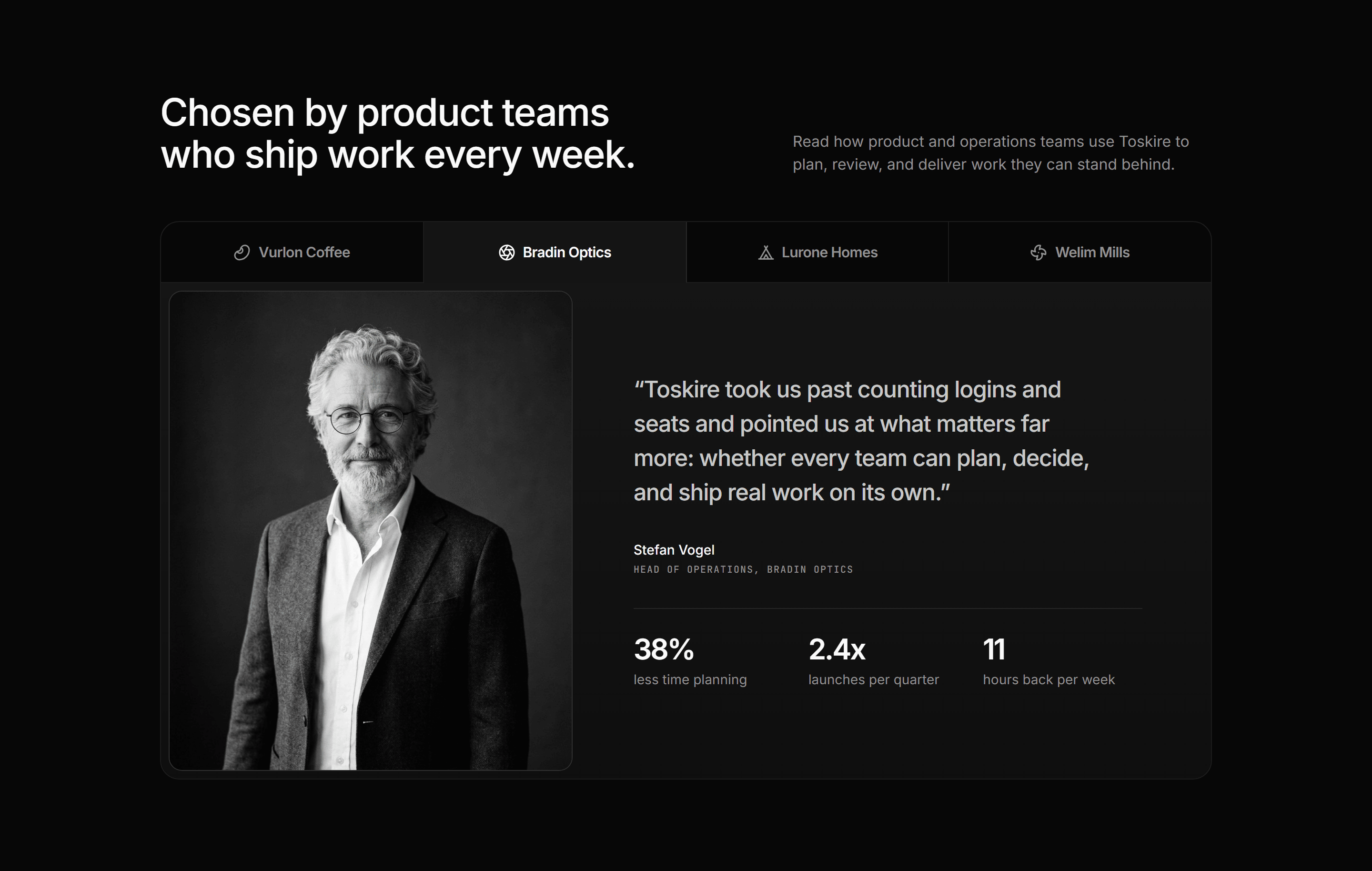
Modern SaaS Testimonial: Logo Tabs Spotlight
Customer logo tabs joined to a spotlight panel, each pairing a portrait with a pull quote, its attribution, and three result figures.
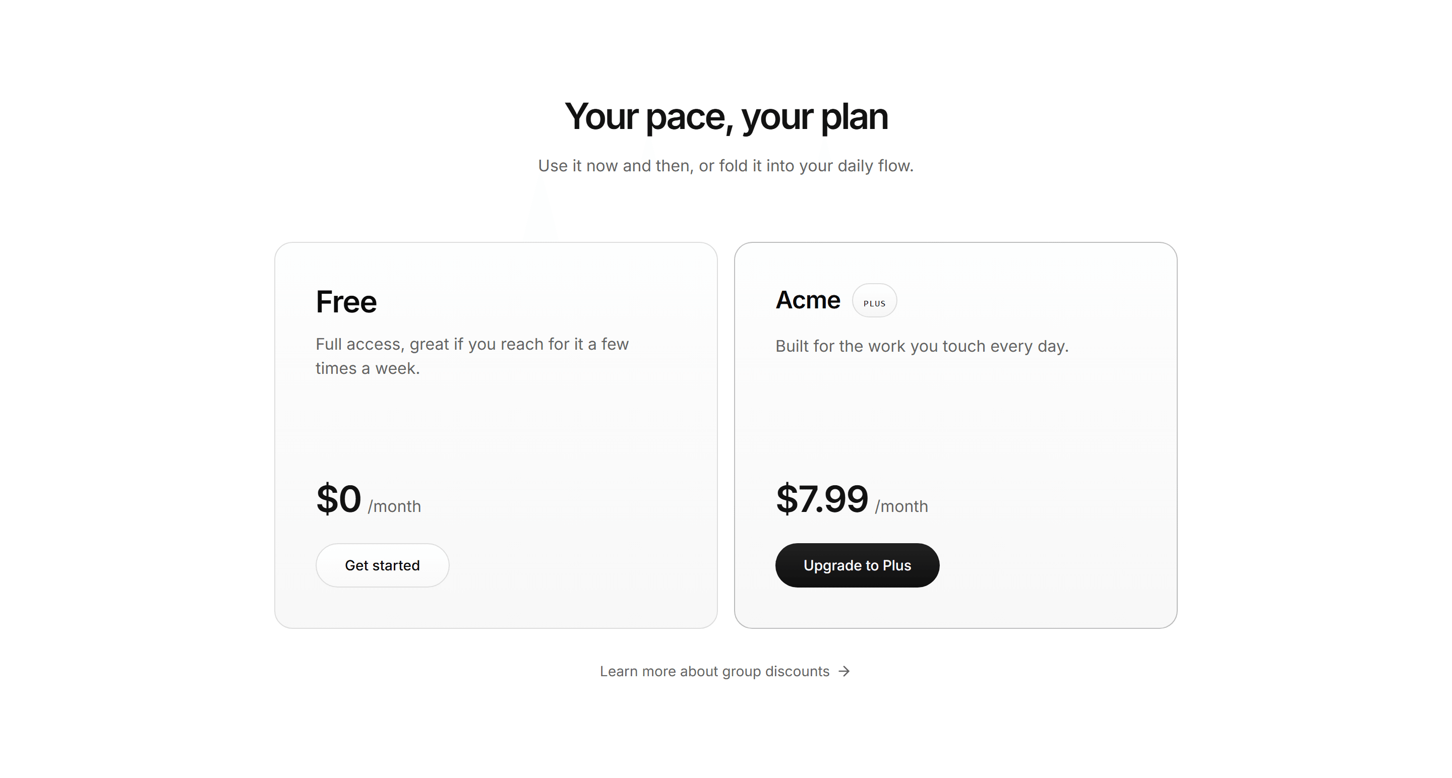

Modern SaaS Pricing: Two Plans
Two large plan cards side by side, a light free tier and an inverted paid tier, each with a price and CTA, over a group discounts link.
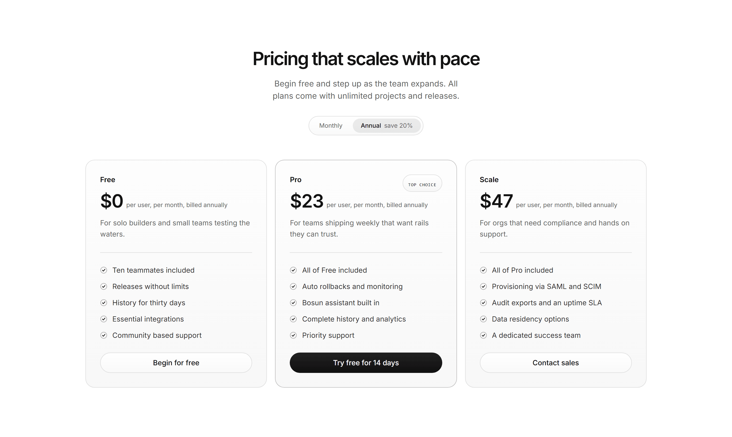

Modern SaaS Pricing: Depth Tier Cards
Three depth style pricing tiers with a billing toggle; the featured plan carries a brighter hairline and mono tag.
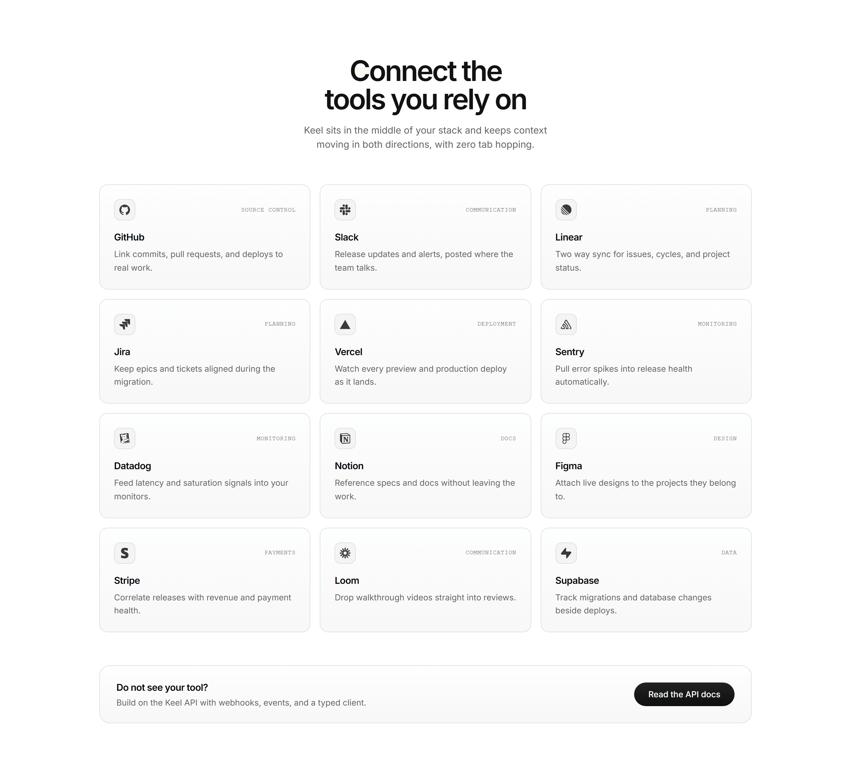
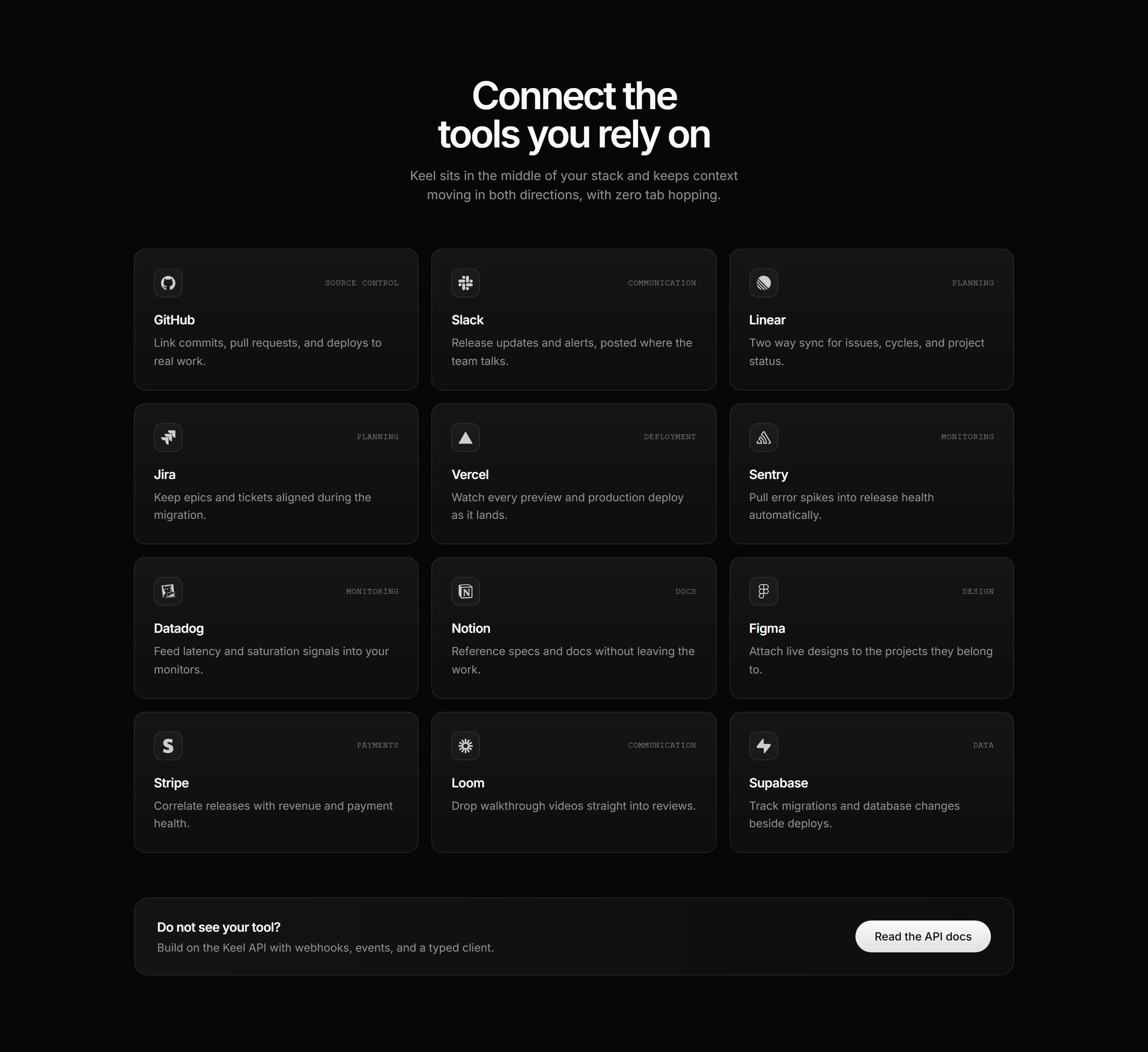
Modern SaaS Integration: Connector Directory
An integrations directory: centered heading over a responsive grid of connector cards pairing monochrome brand marks with one line descriptions and mono category tags, closed by an API strip.
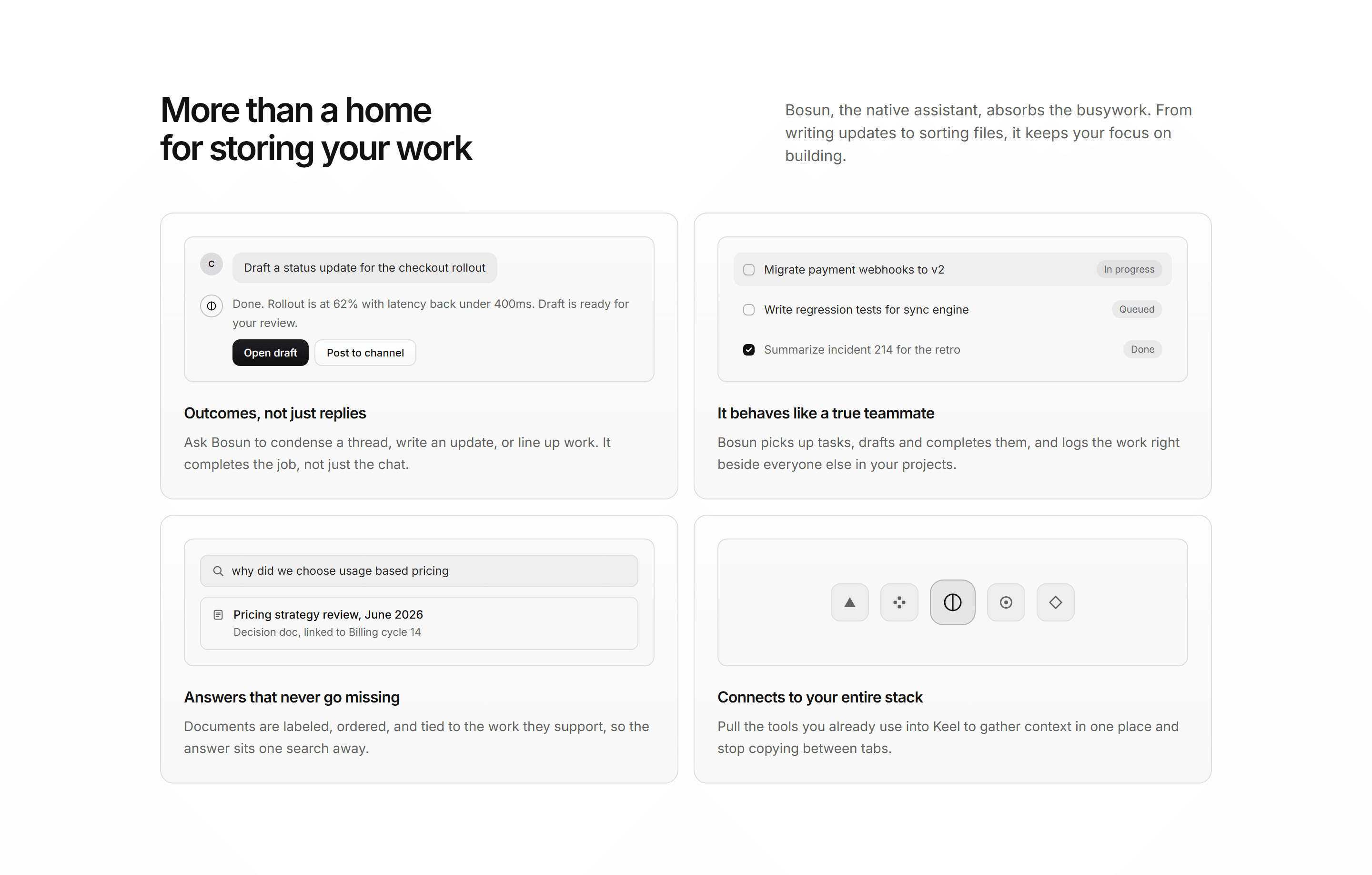
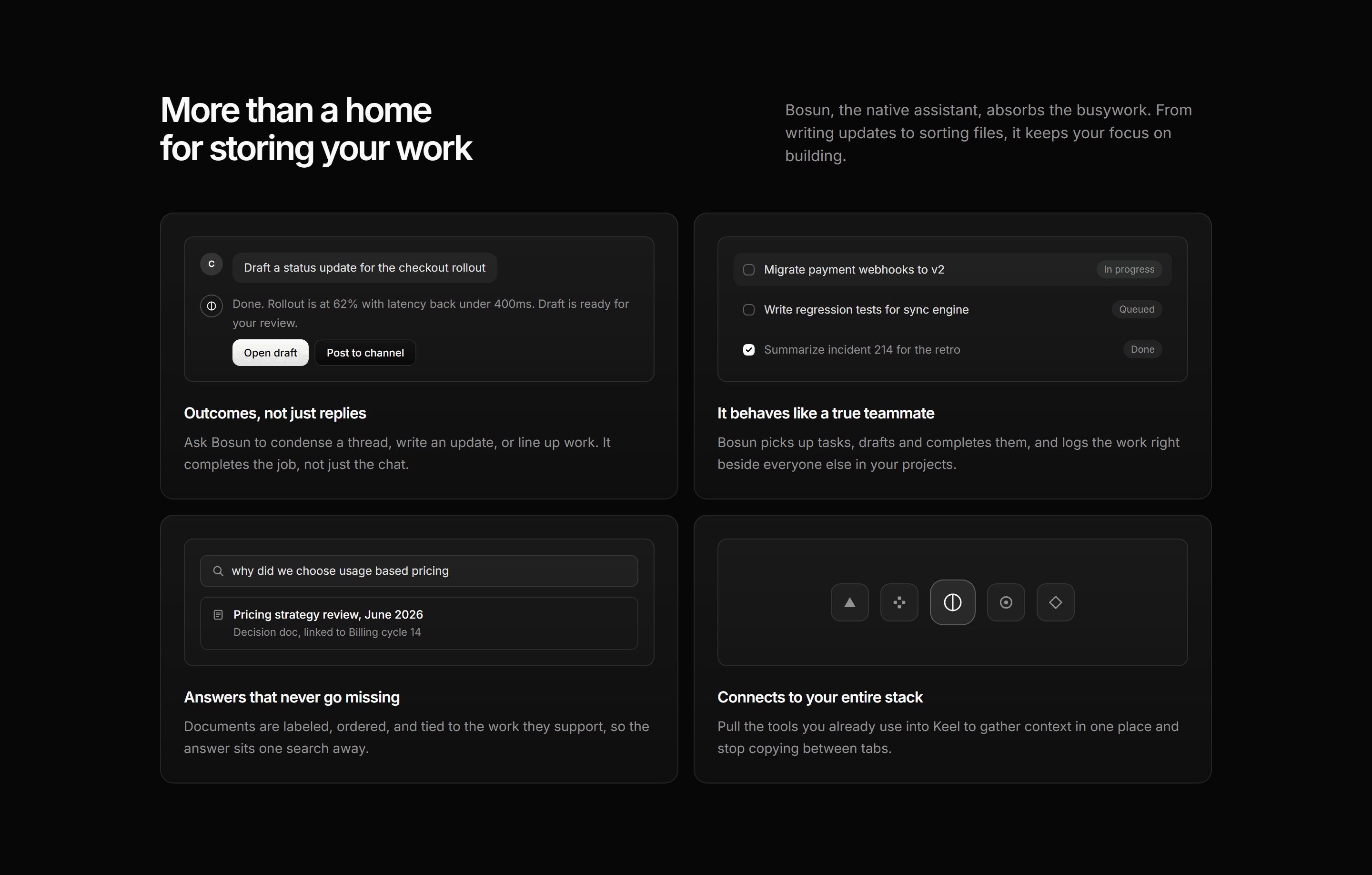
Modern SaaS Feature: Assistant Snippet Grid
A two by two grid of assistant feature cards, each led by a miniature UI snippet inside an inset tile.
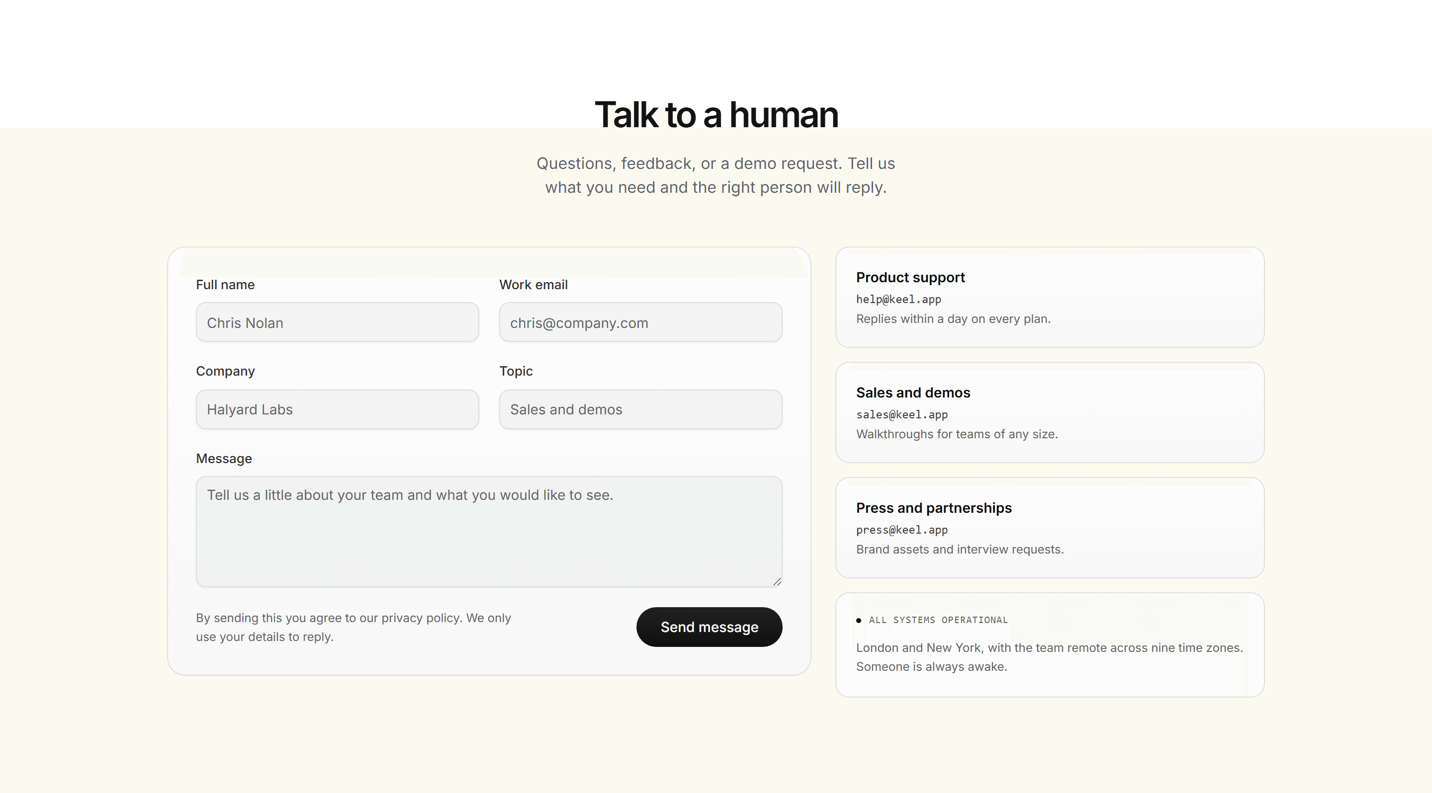
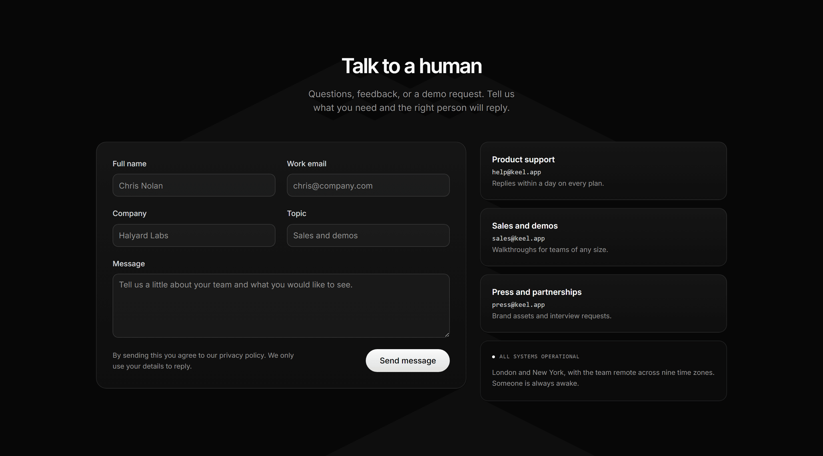
Modern SaaS Contact Section: Split Contact Form
A contact section splitting a form panel from a channel rail of direct line cards with mono emails and a status card.
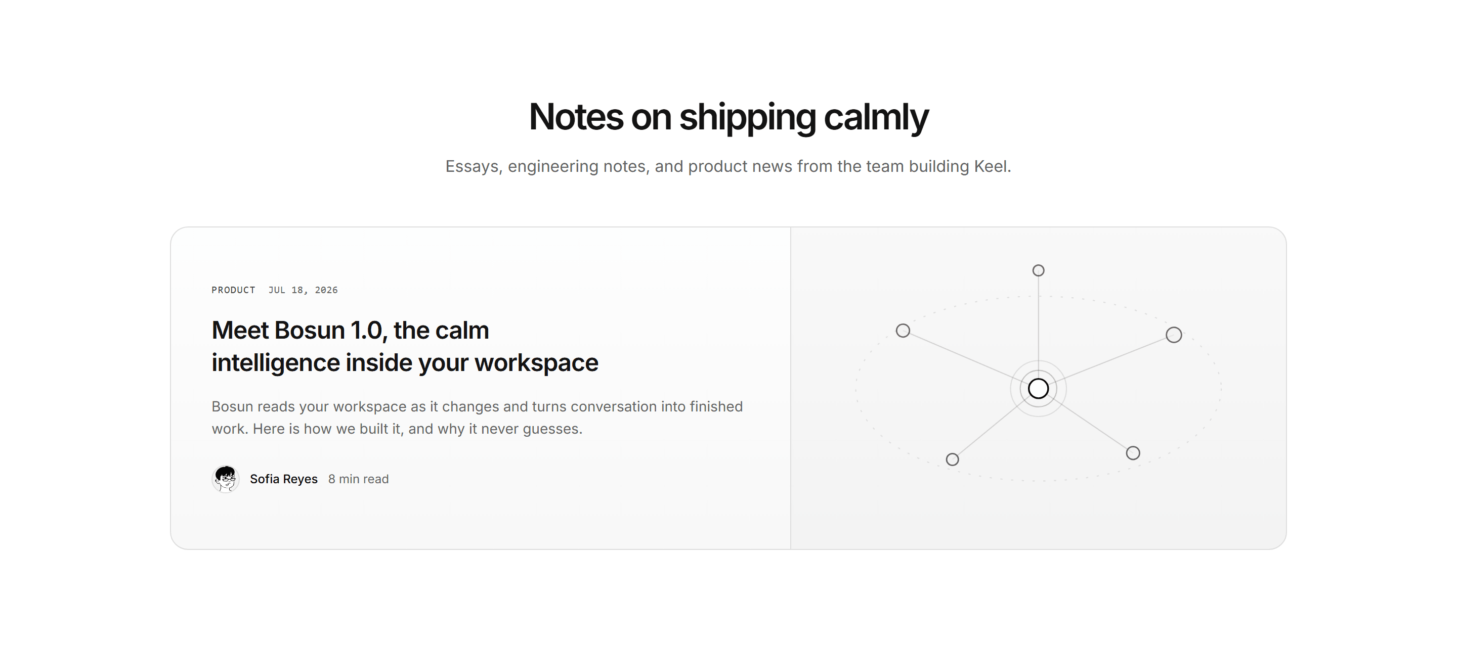
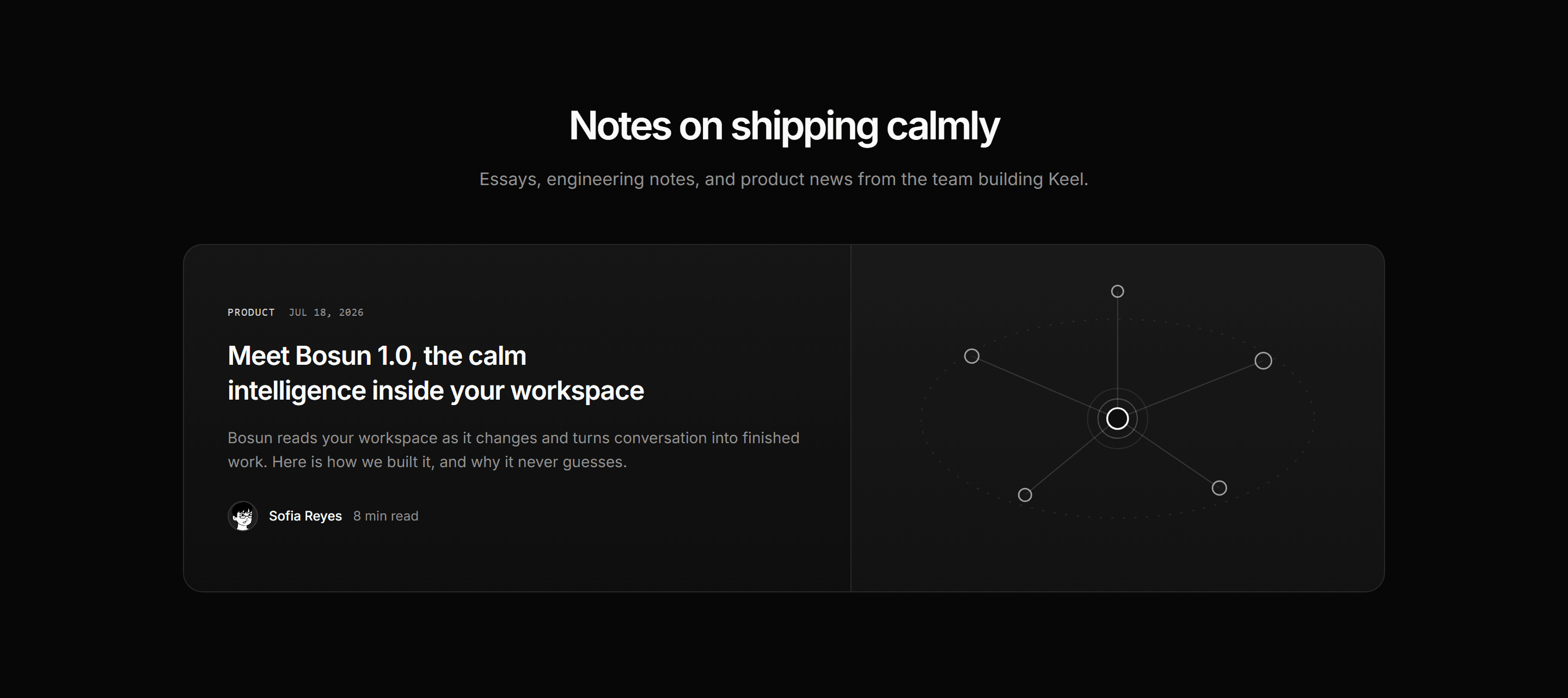
Modern SaaS Blog: Featured Post Grid
A blog landing opener: a centered kicker and heading over a wide featured post split card with an illustrative constellation panel and avatar byline.
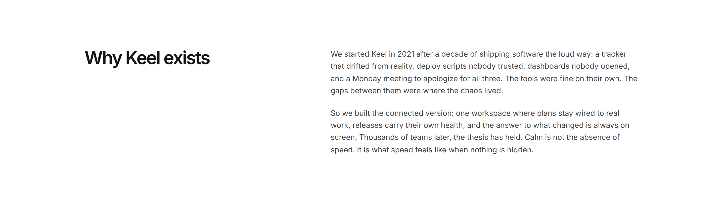

Modern SaaS About: Founding Story Split
A founding story split: mono tag and large heading on the left lane, two measured prose paragraphs on the right.
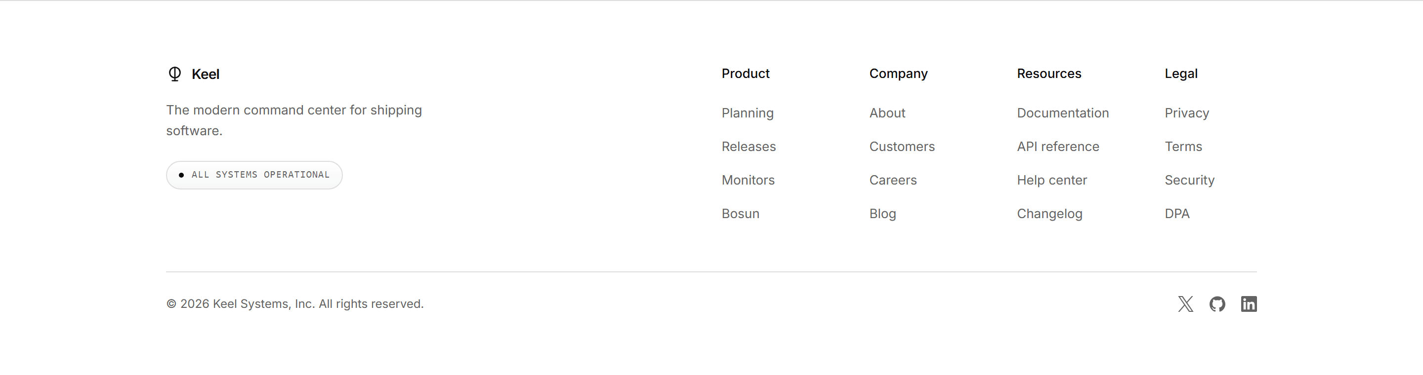
Modern SaaS Footer: Status Columns Footer
A multi column footer with brand tagline, live status pill, four link columns, and a hairline social bottom row.
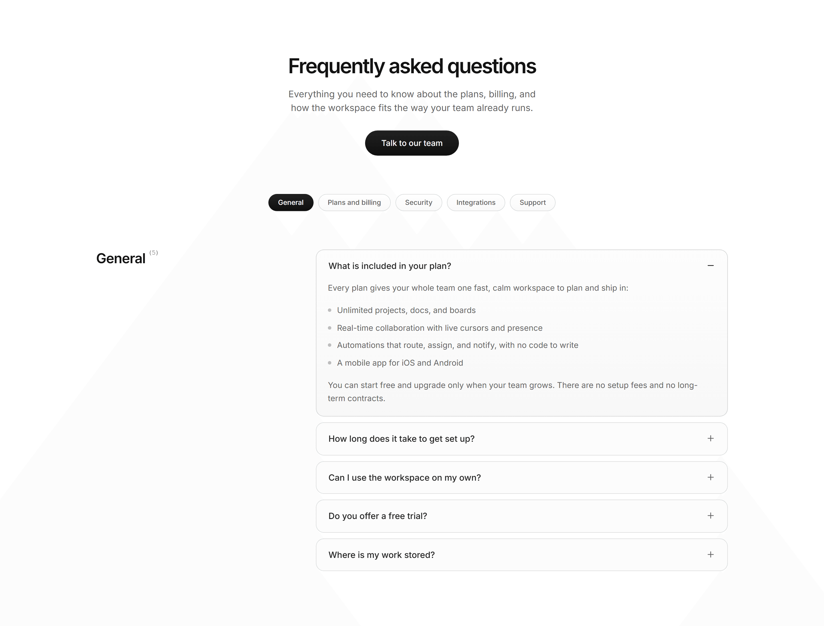
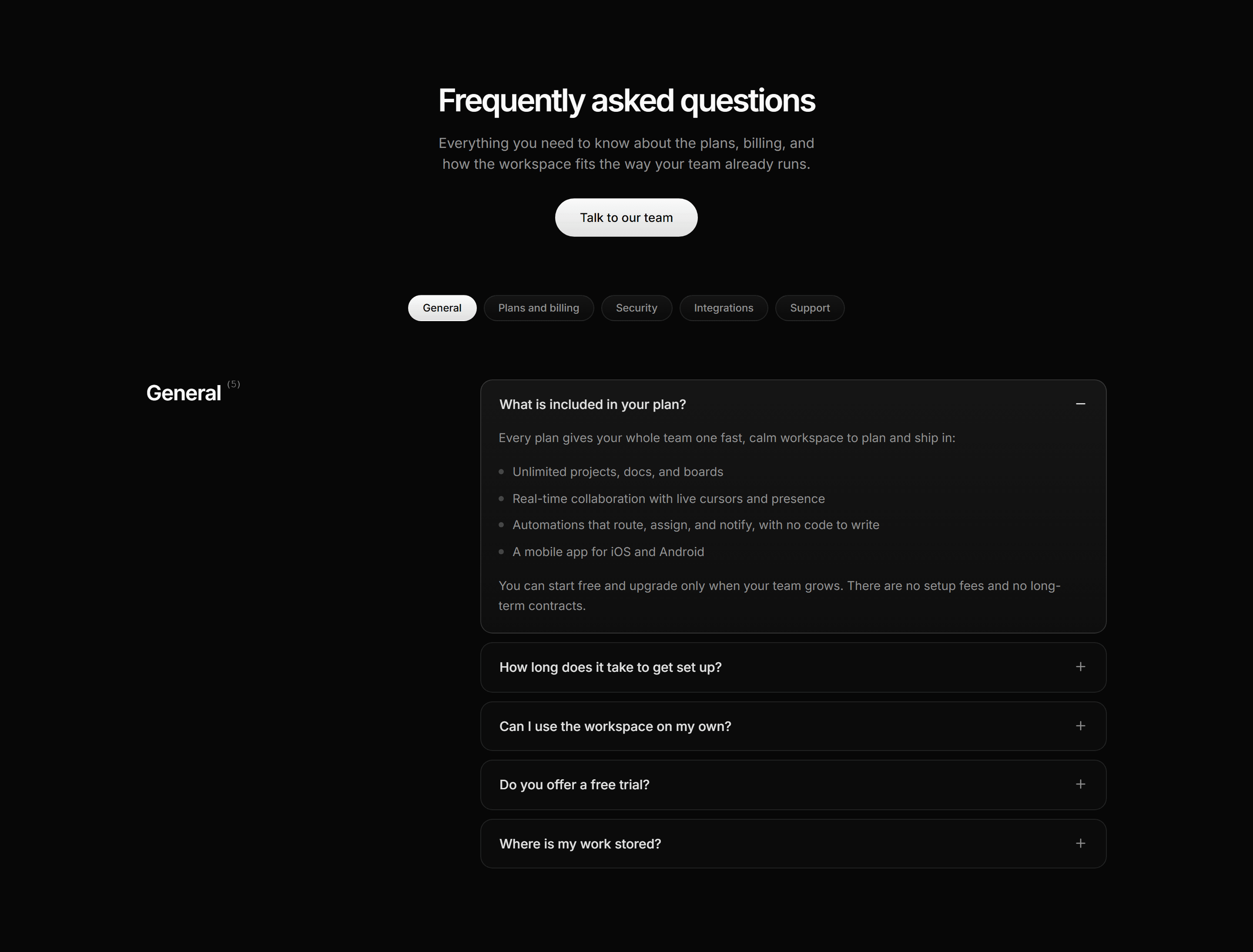
Modern SaaS FAQ: Tabbed Categories
A categorized FAQ: a centered headline and pill CTA above category tabs, then the active category and its count beside a single-open accordion of answers.
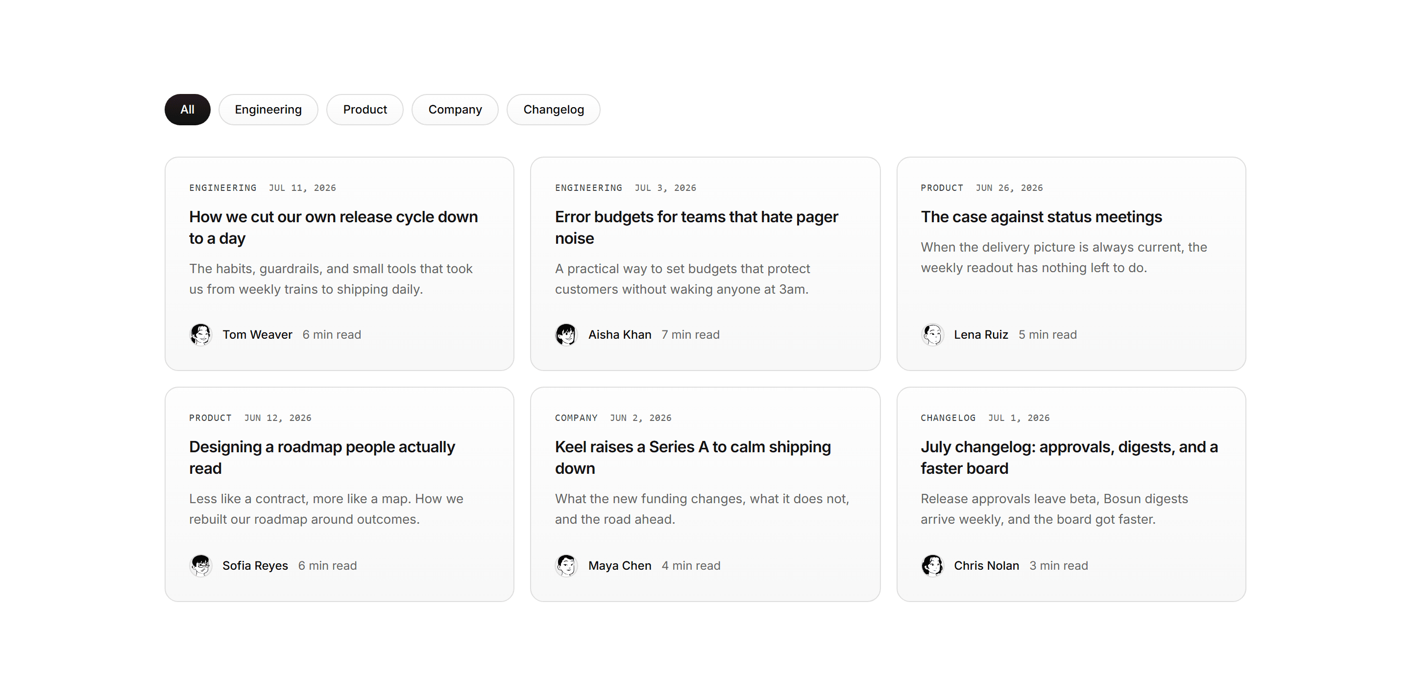
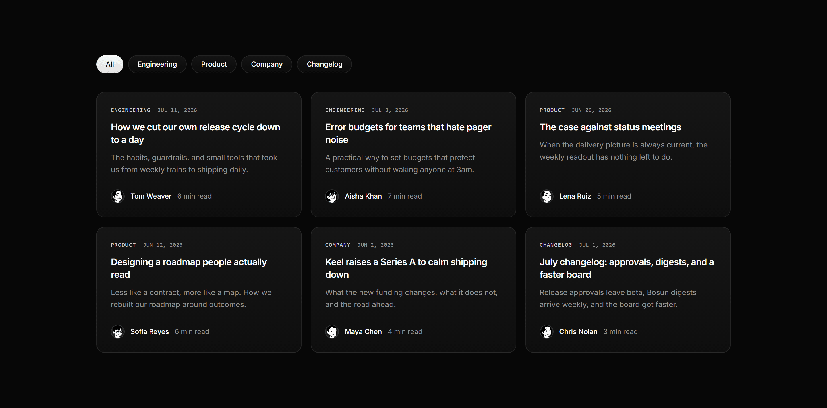
Modern SaaS Blog: Filterable Post Grid
A blog post grid with working category filter pills over two rows of text first post cards with mono meta lanes and illustrated avatar bylines.
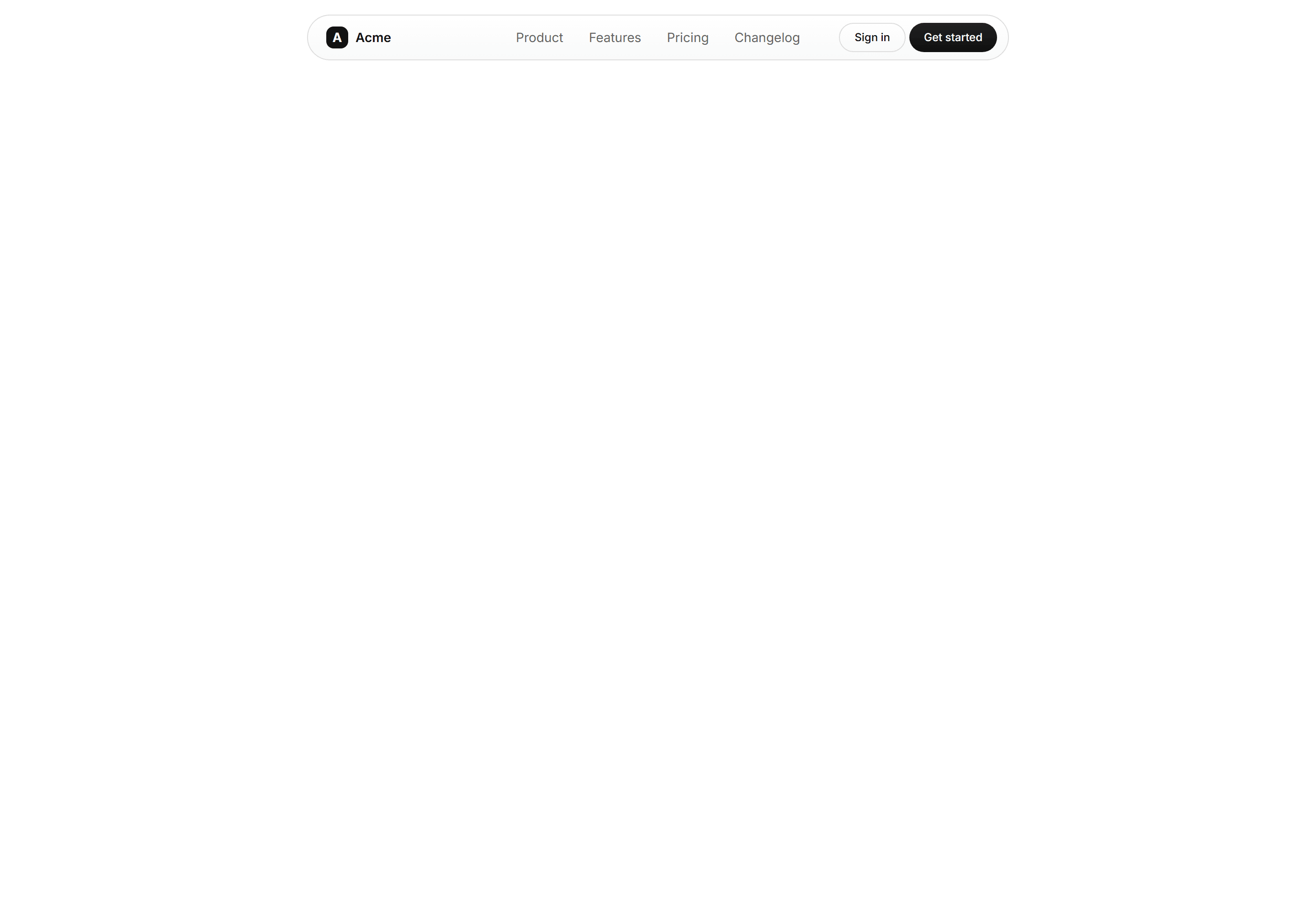

Modern SaaS Navbar: Centered Oval
A sticky, pill shaped glass navbar with a logo, optically centered links, and dual CTAs. A clean, modern header for a Modern SaaS landing page.
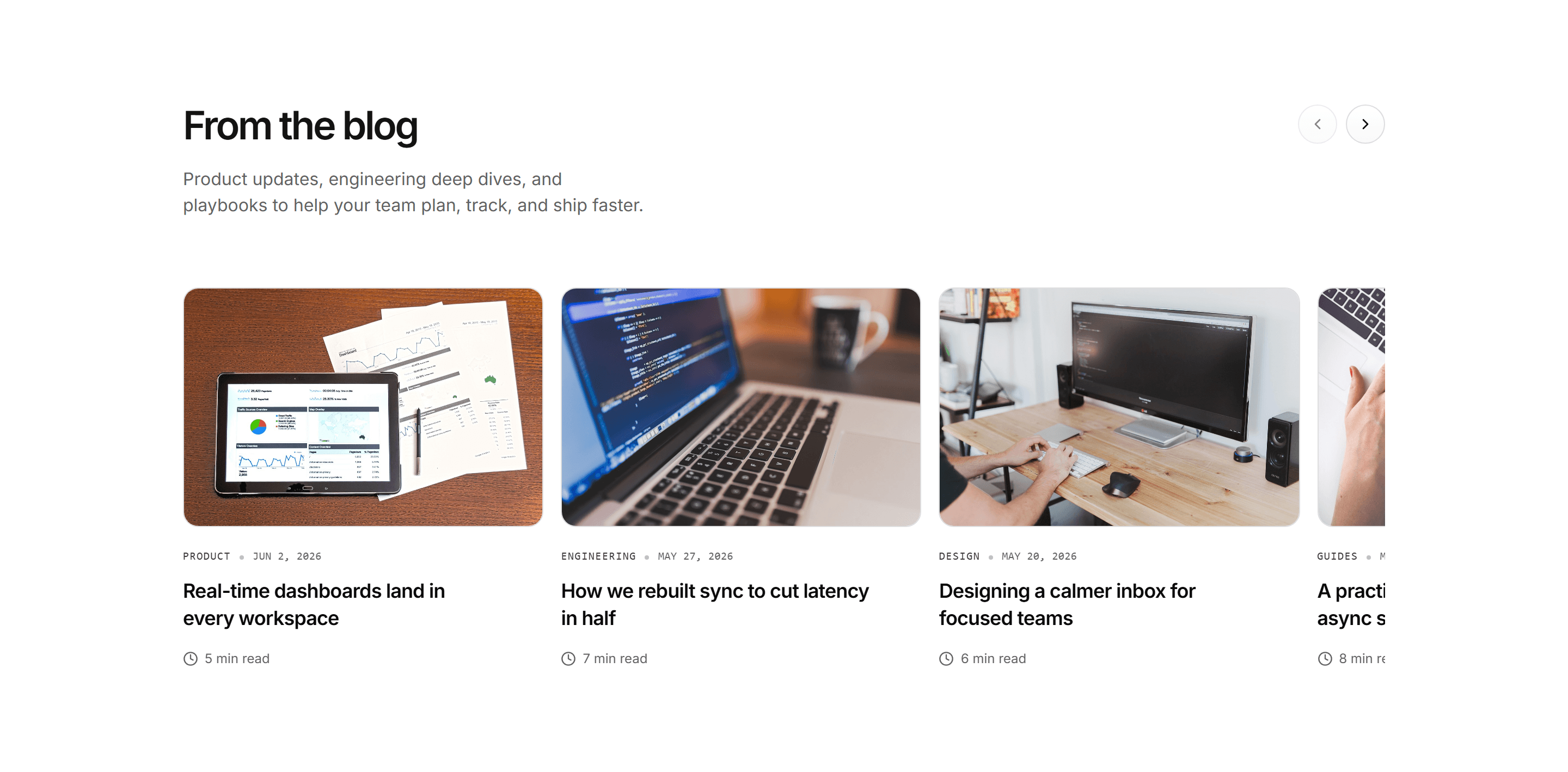
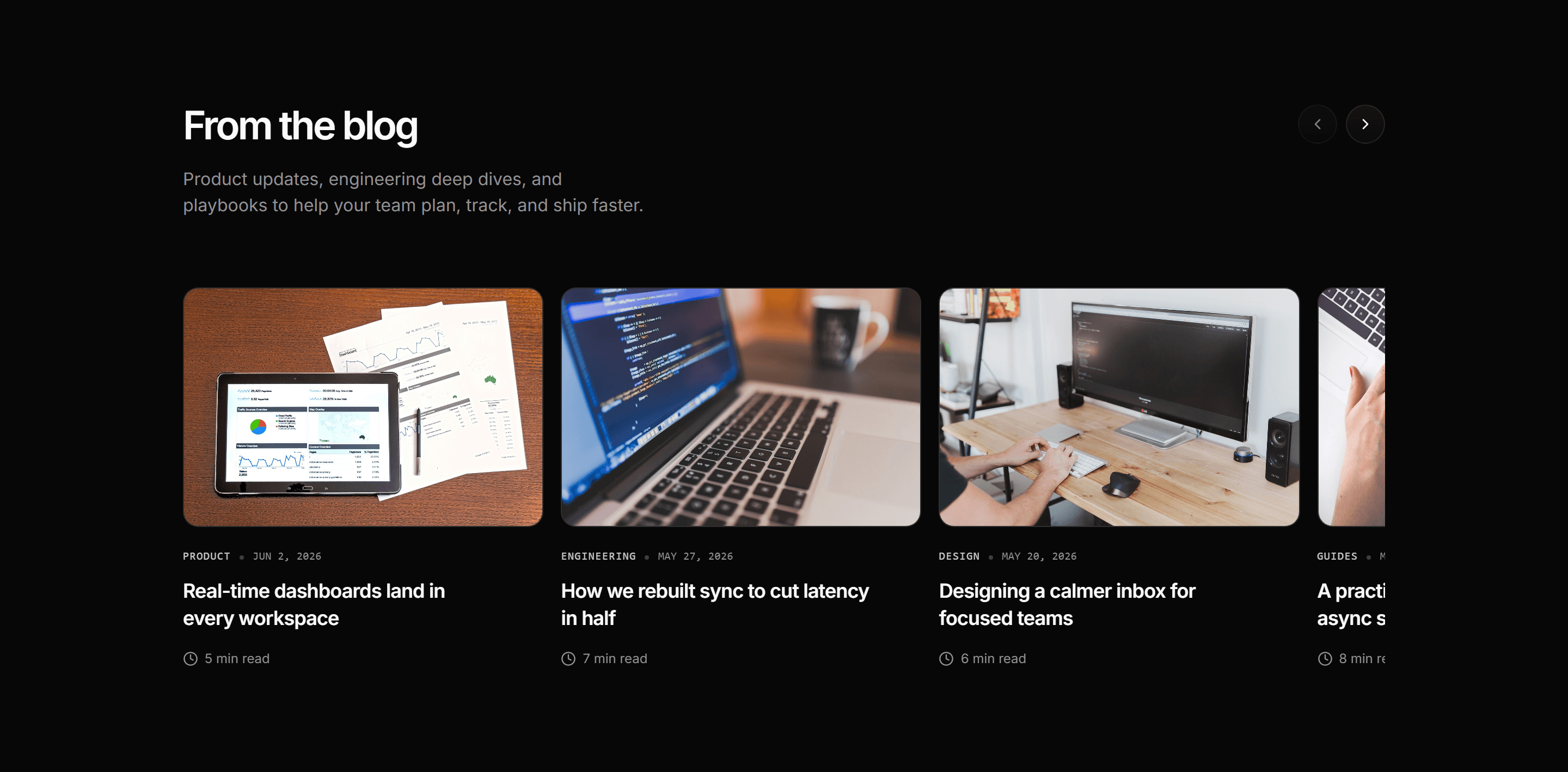
Modern SaaS Blog: Card Carousel
A swipeable carousel of blog post cards, each pairing a cover image with a category, date, two line title, and read time.
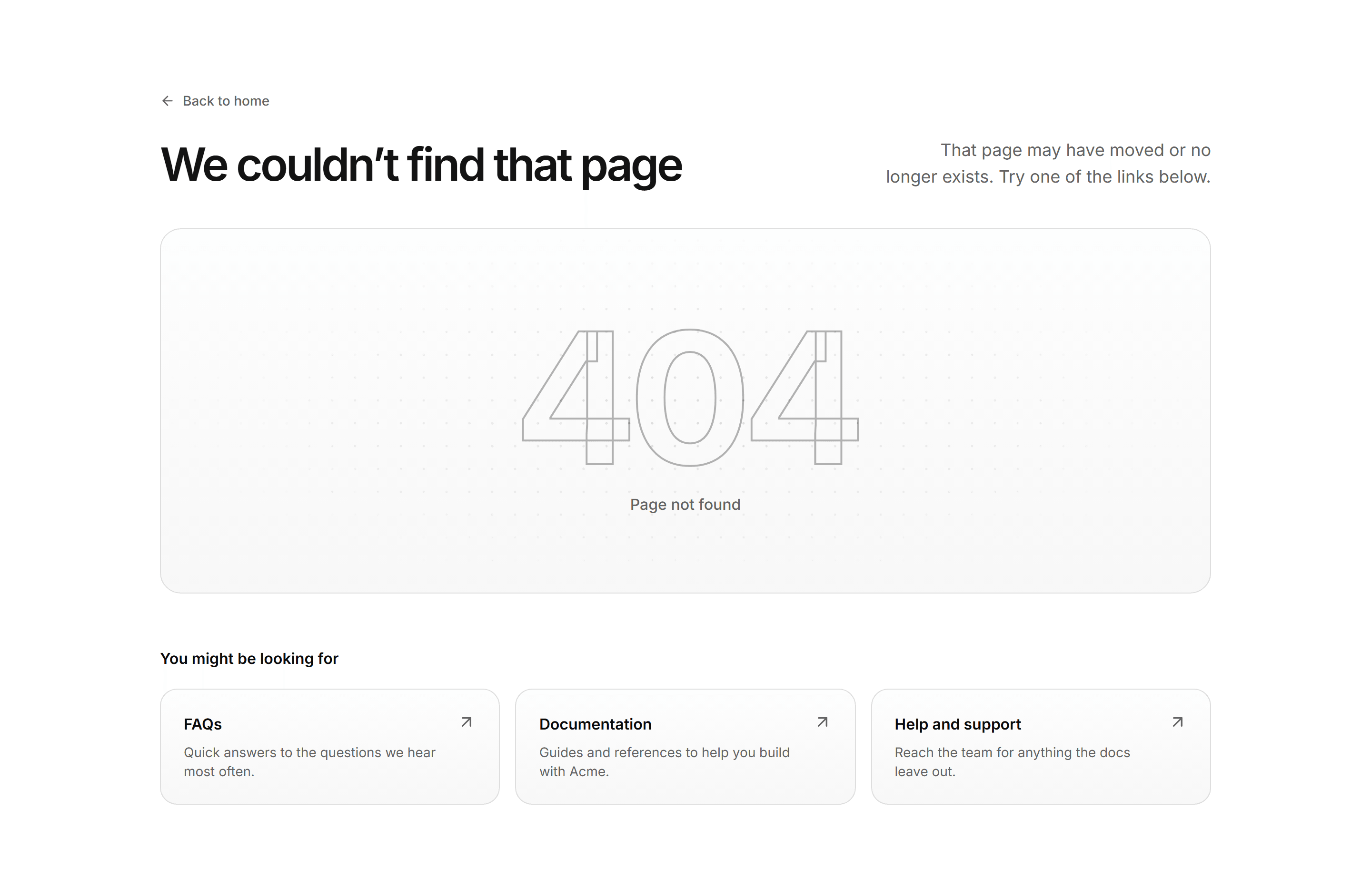
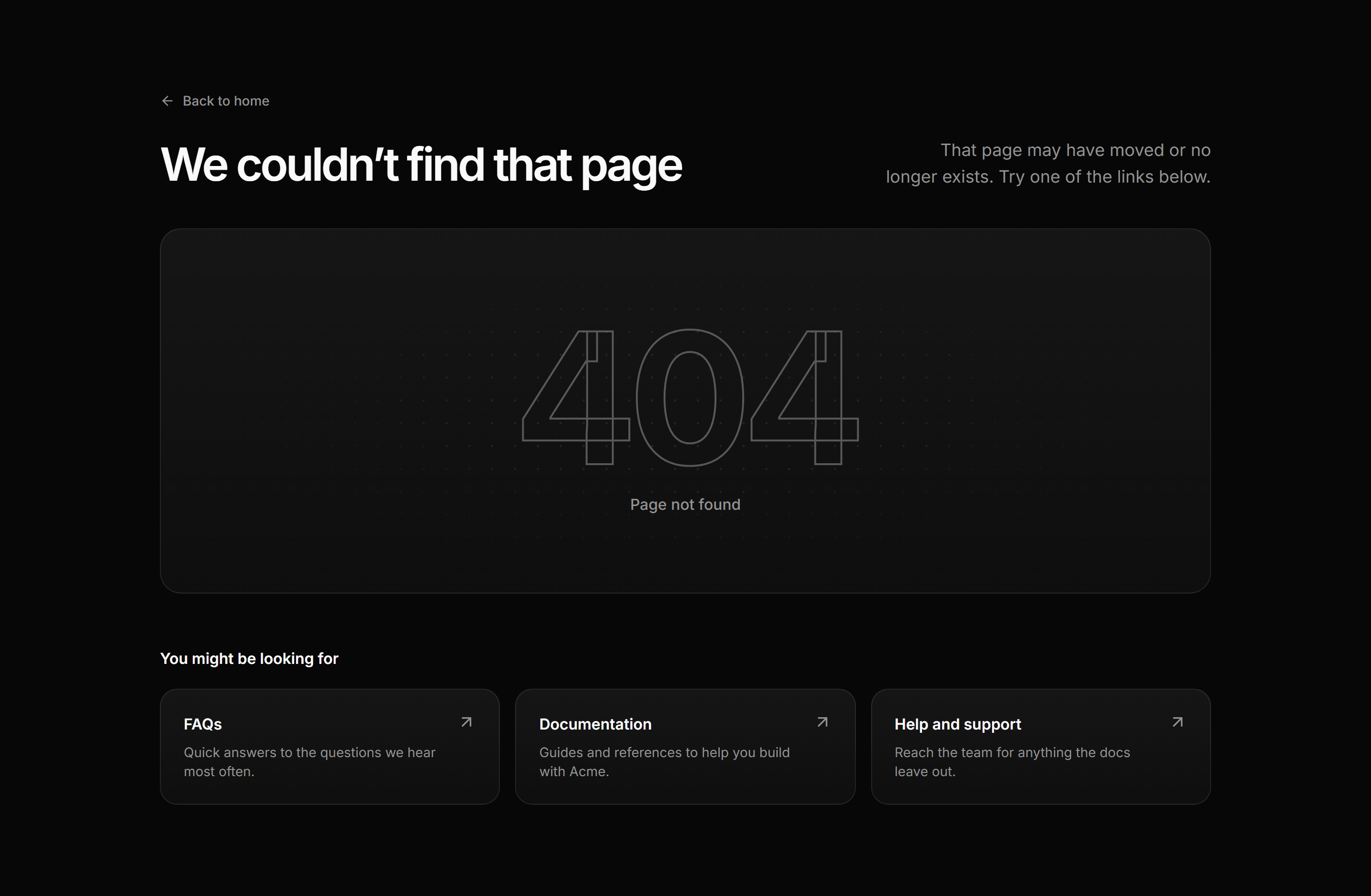
Modern SaaS Error Page: Split With Links
A 404 page with a split header, a giant outlined number over a dotted grid, and a row of helpful link cards to get visitors back on track.


Modern SaaS CTA: Split Signup
A split CTA on a soft bordered panel: a headline and pill button beside a newsletter signup with an email field, submit button, and privacy note.
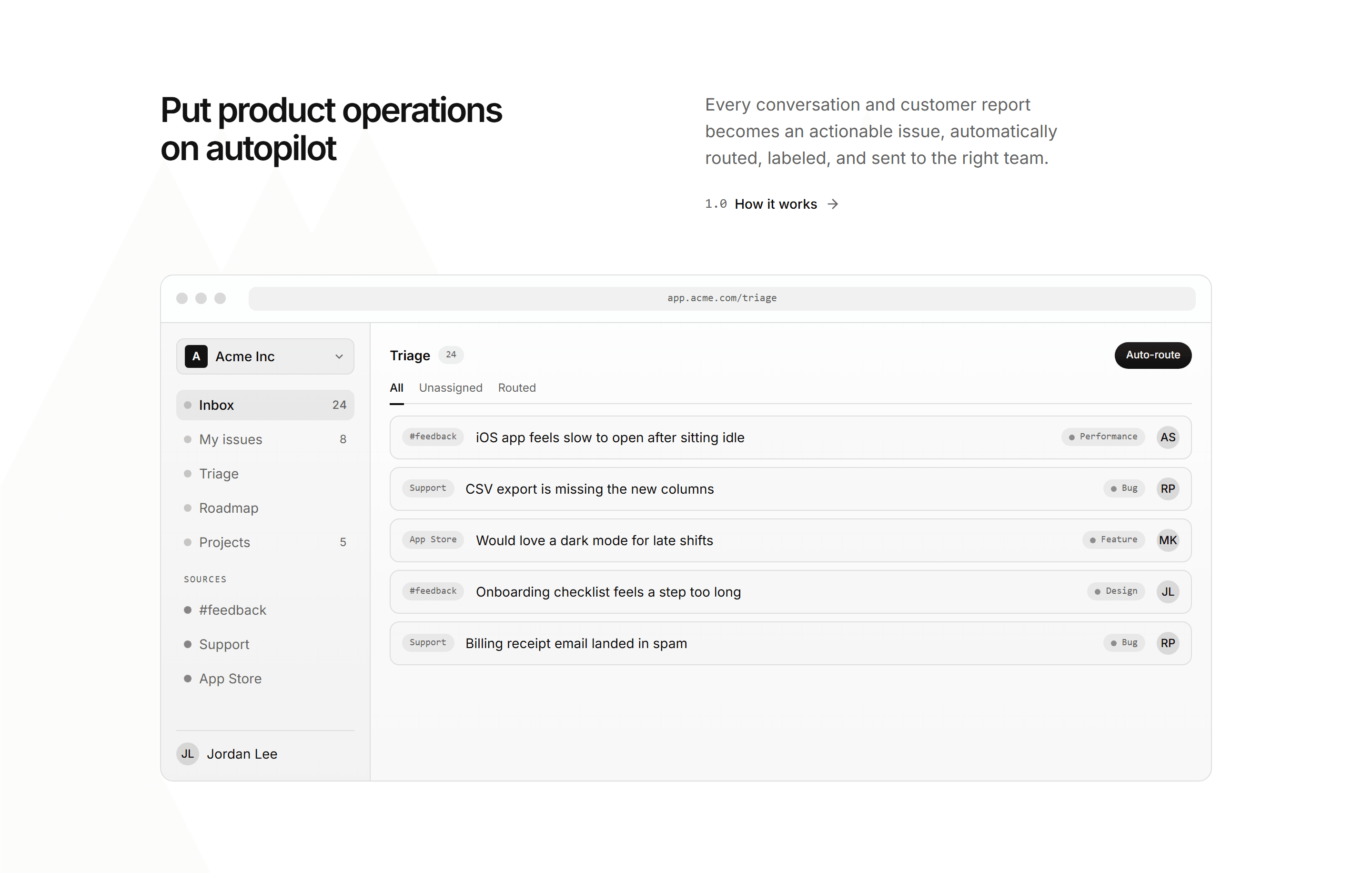
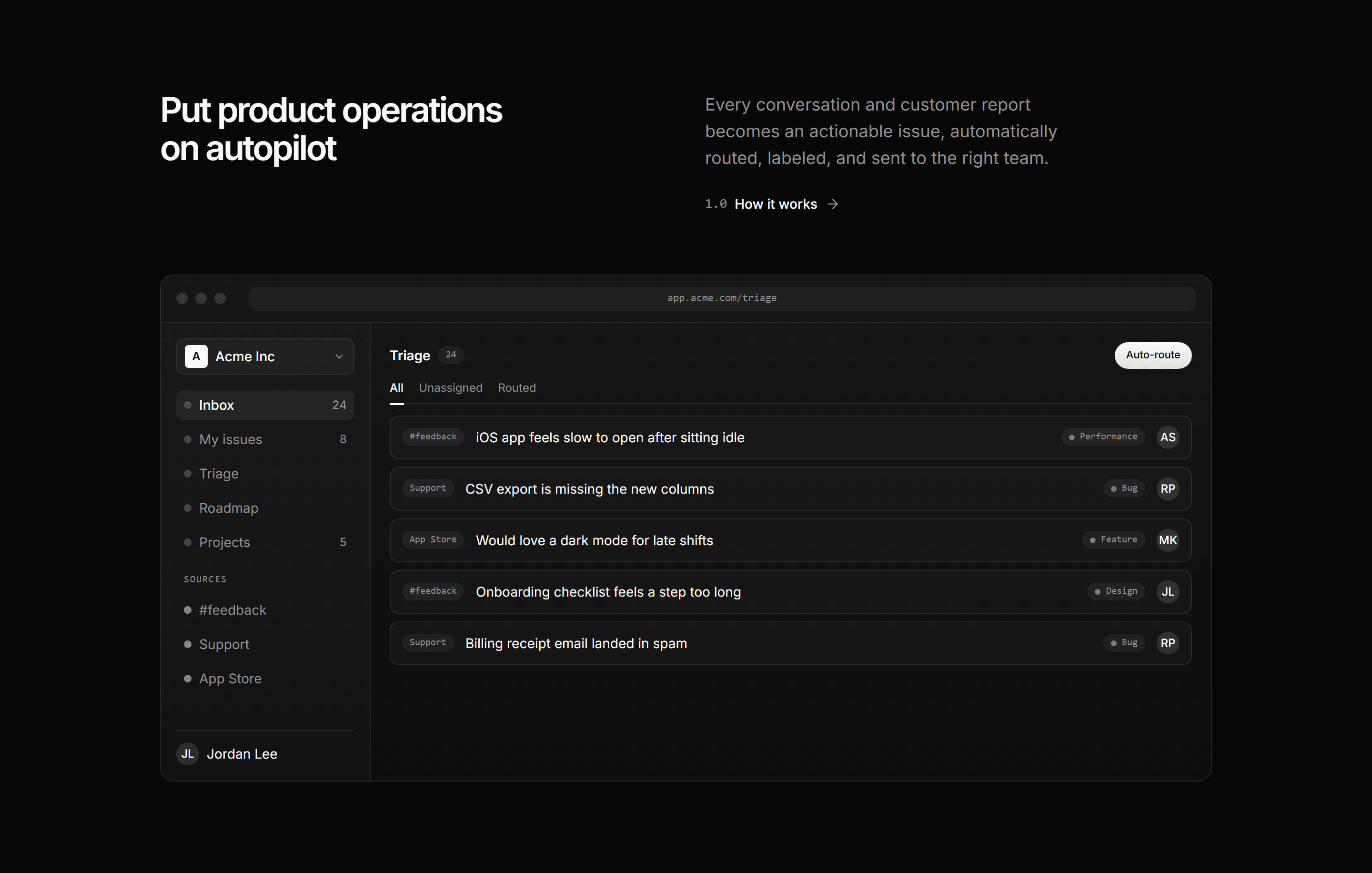
Modern SaaS Feature: Product Showcase
A split header over an app window mockup: a triage inbox where incoming feedback is auto-routed into labeled, assigned issues. Shows the product in action.
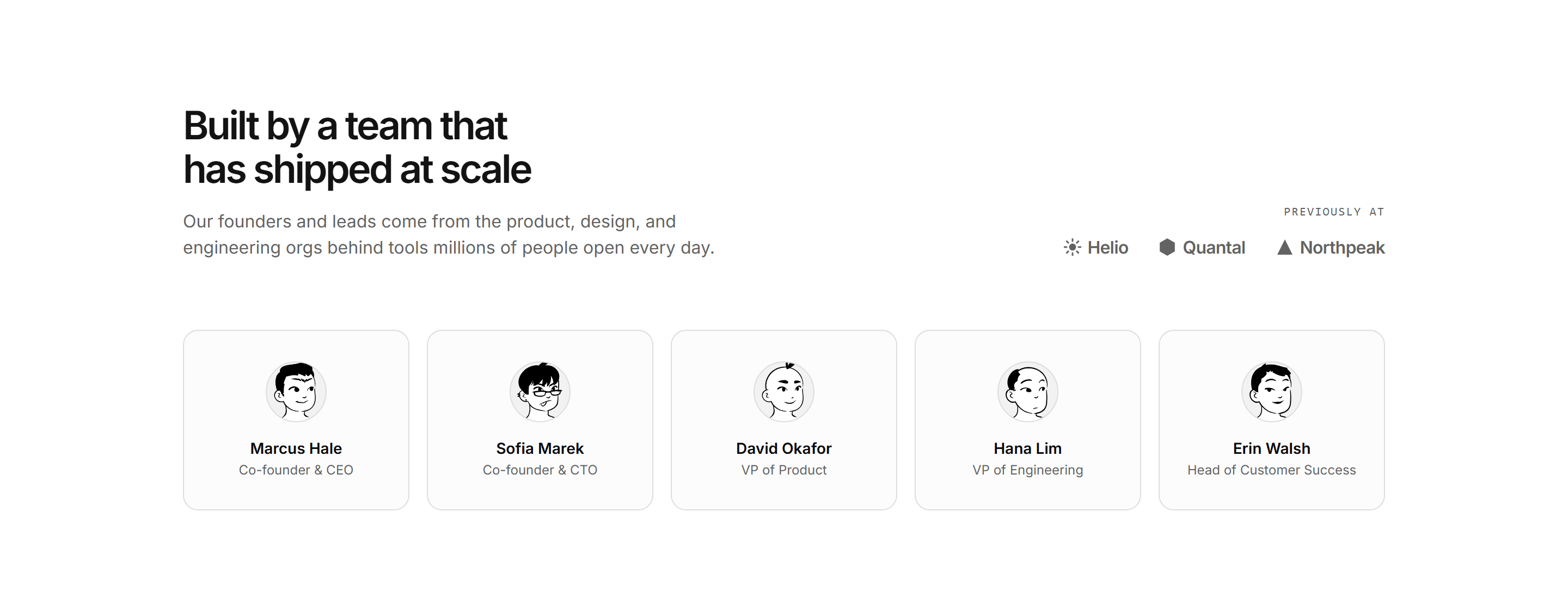
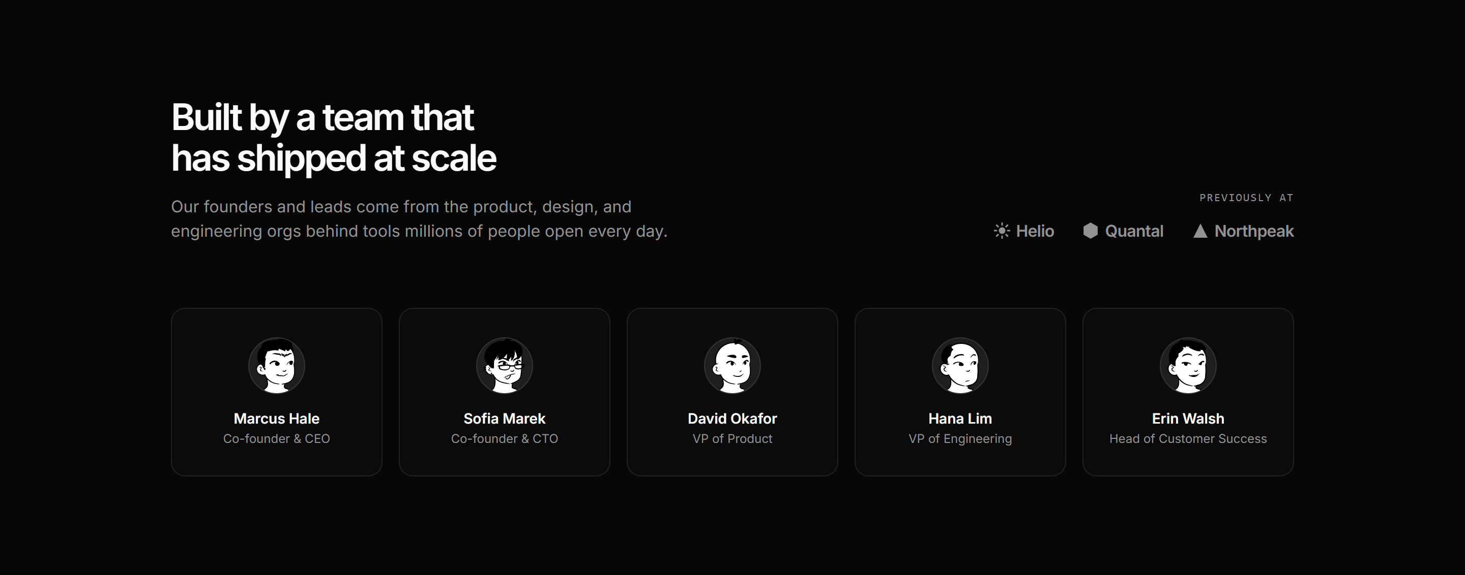
Modern SaaS About: Leadership Team
A two part header with a credibility wordmark strip above a five up row of leadership portraits, each with a name and role, to put real faces behind the product.
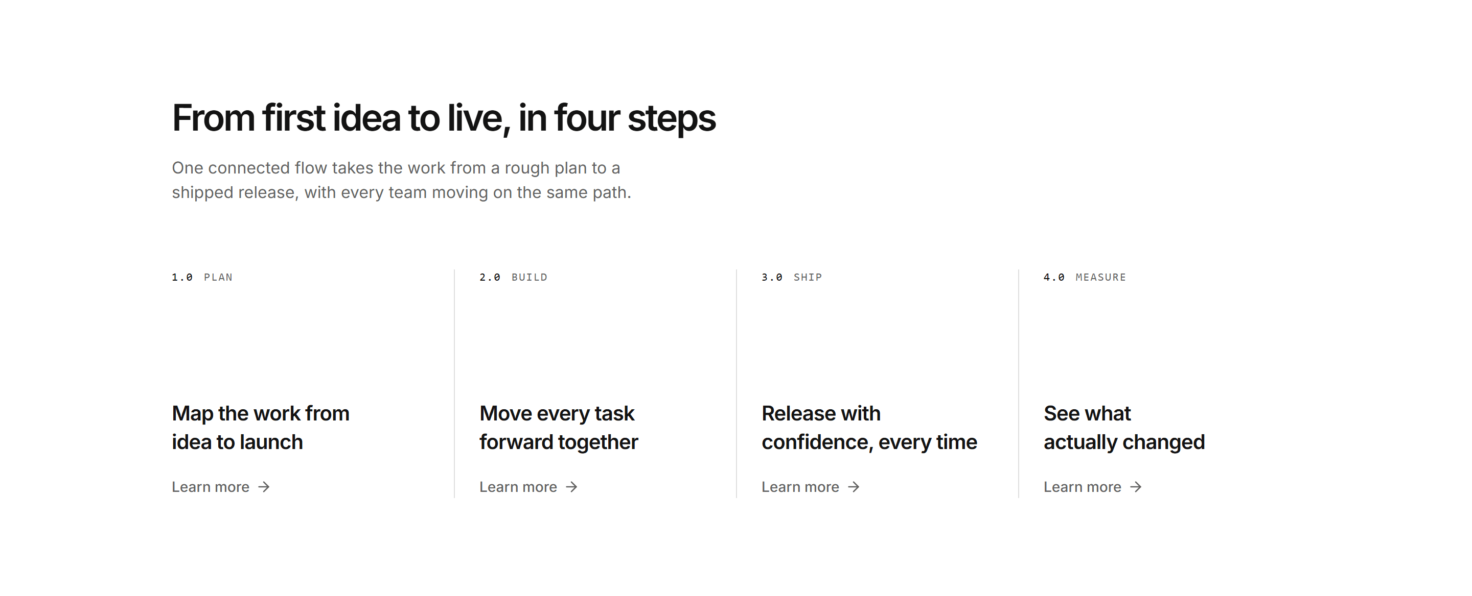
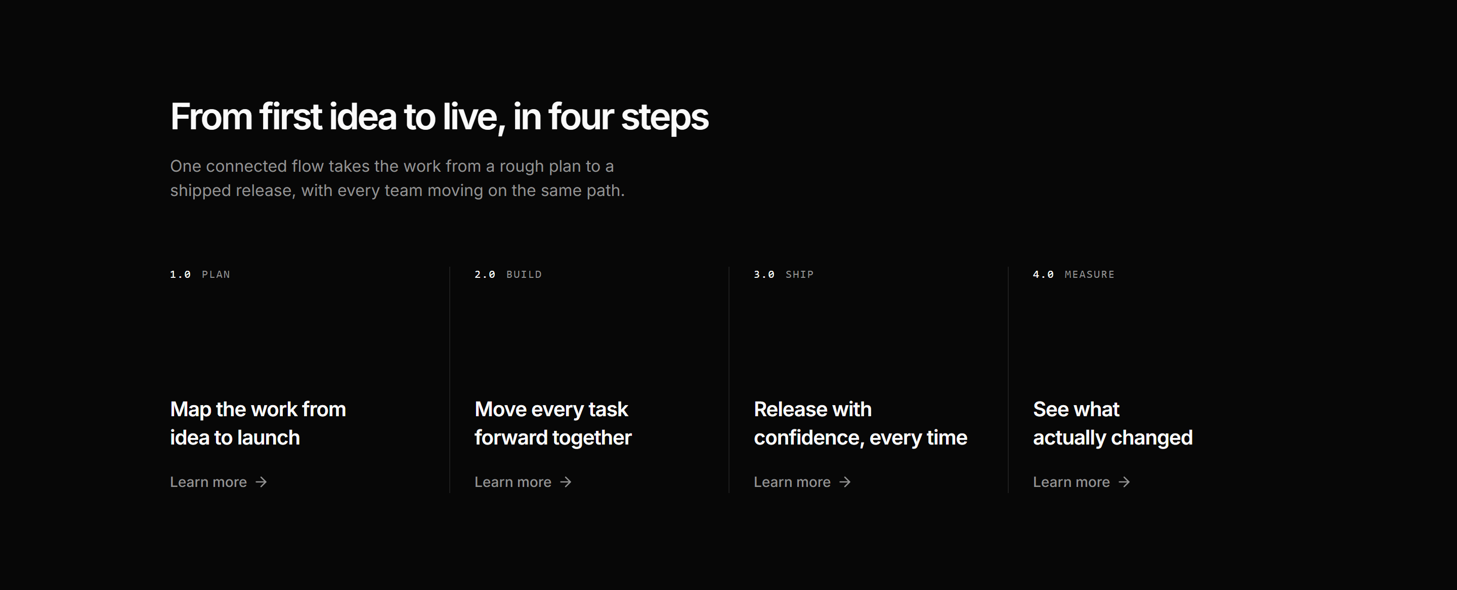
Modern SaaS Process Flow: Numbered Steps
A horizontal row of numbered steps, each pinning a label to the top and dropping a two line heading and a learn more link to the foot. A quiet, editorial flow.
Modern SaaS Logo Cloud: Dual Marquee
A logo cloud with two rows of customer logos scrolling in opposite directions. A seamless, pure CSS marquee for social proof on a landing page.
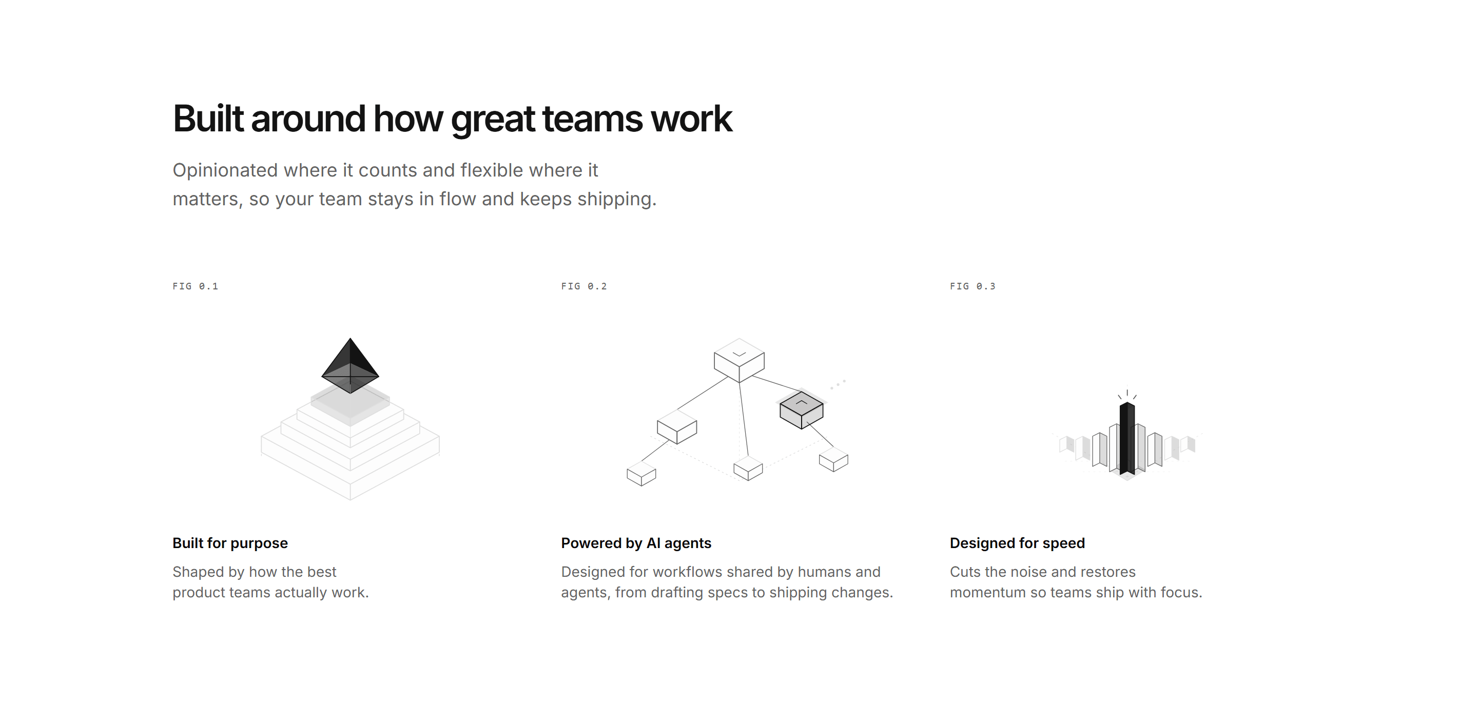
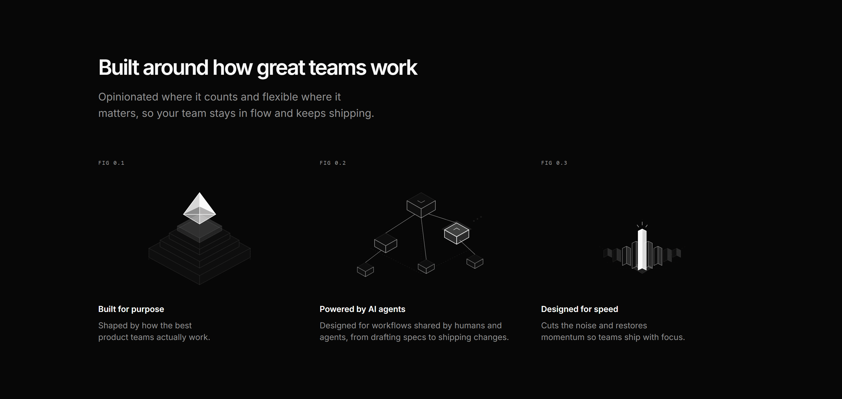
Modern SaaS Feature: Benefits Isometric
Three benefit columns, each with a centered isometric SVG illustration, a FIG tag, label, and short paragraph. A clean, minimal way to frame product principles.
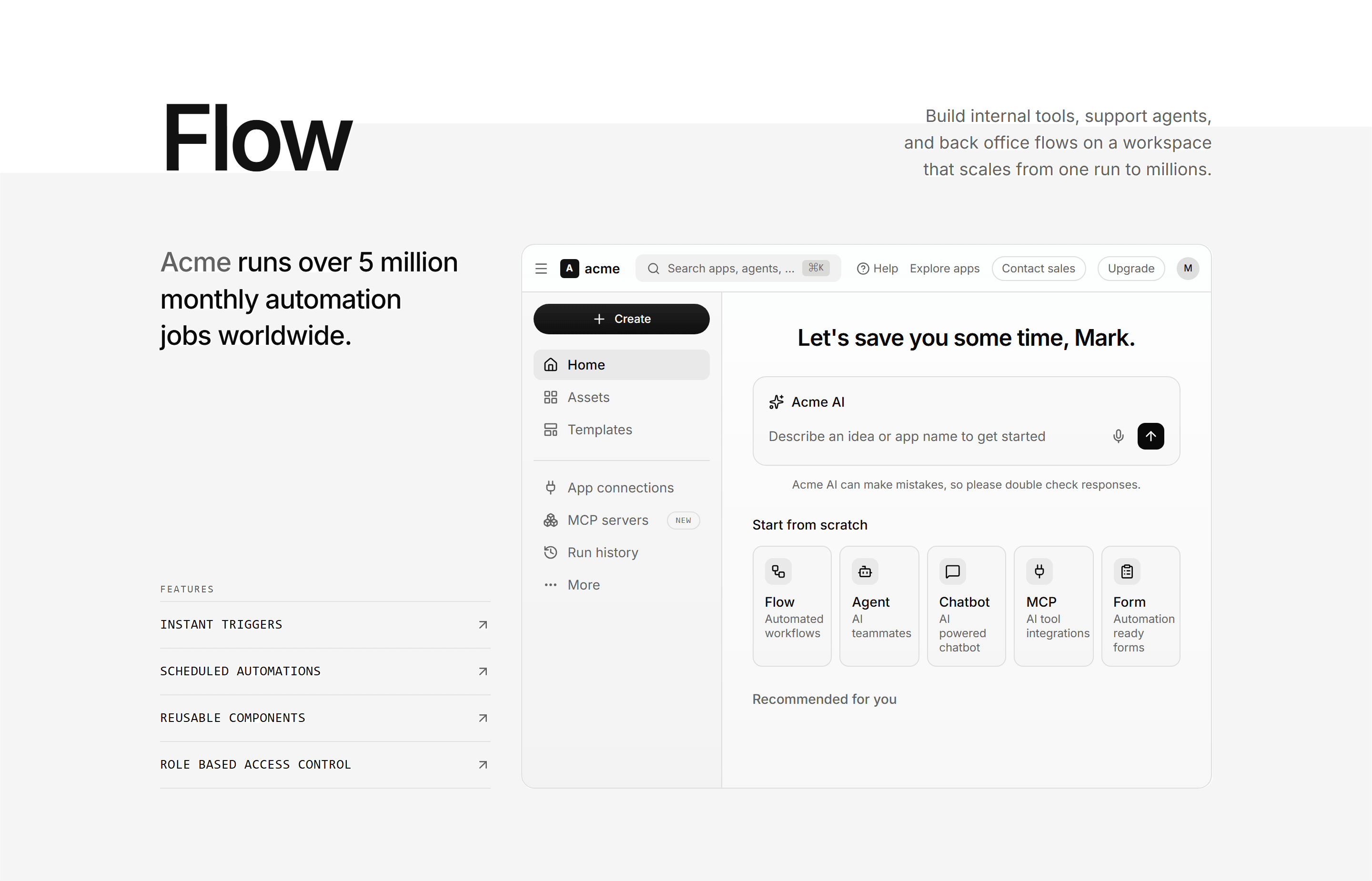
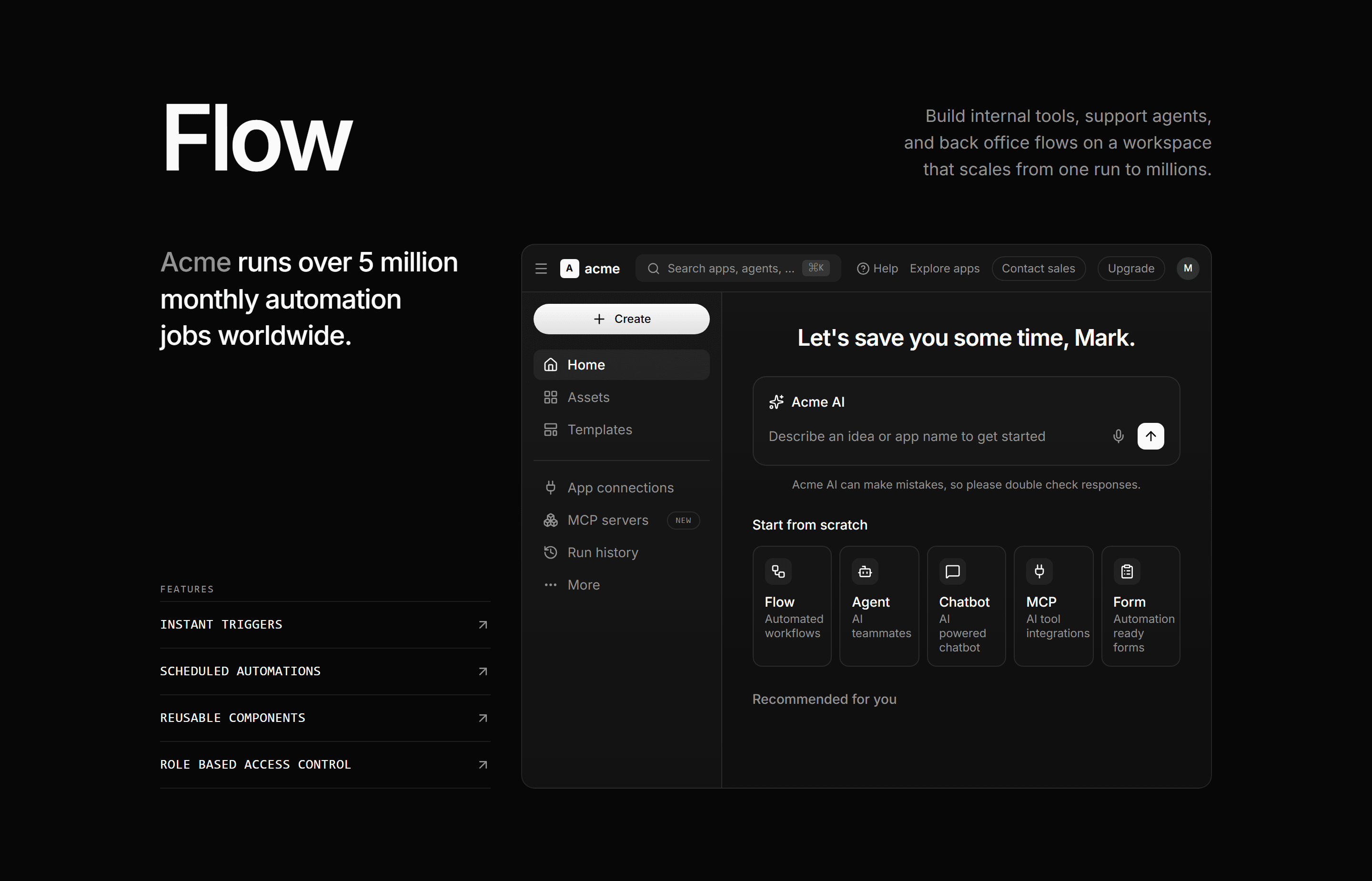
Modern SaaS Feature: App Workspace
An oversized display word over a stat-led feature rail beside a full automation workspace dashboard mockup built from theme tokens.
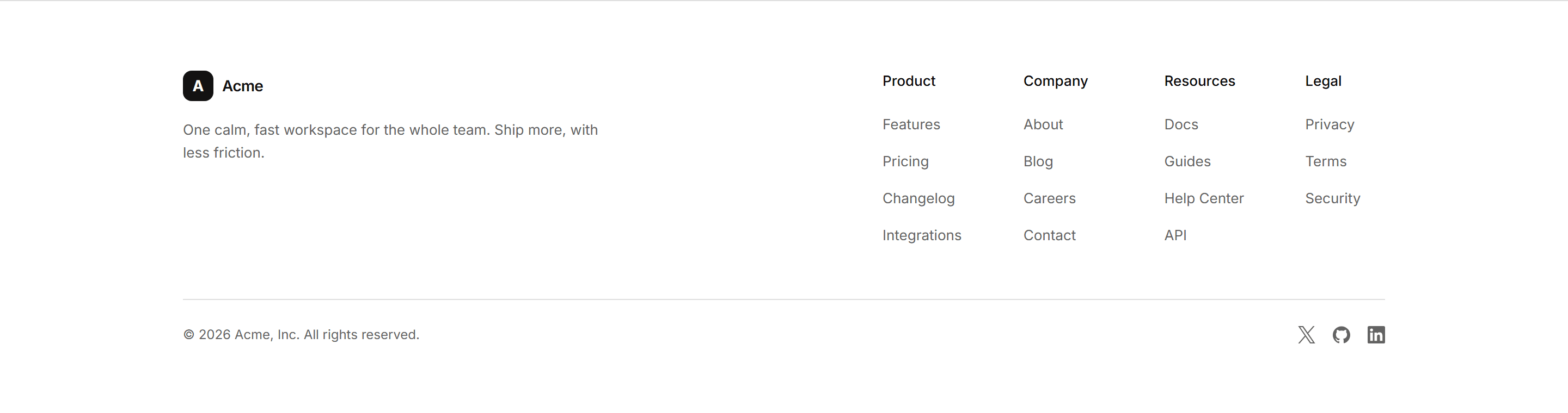
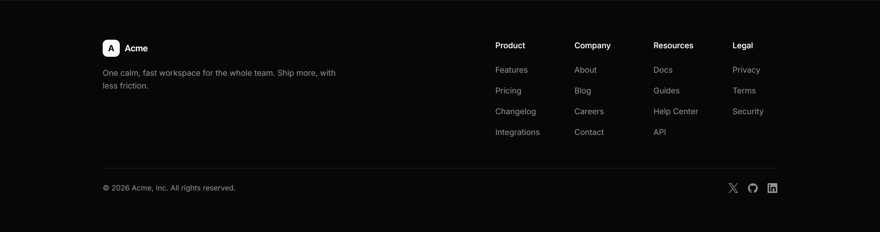
Modern SaaS Footer: Simple
A simple footer: a brand mark and tagline beside columns of navigation links, over a bottom bar with a copyright line and social icons.
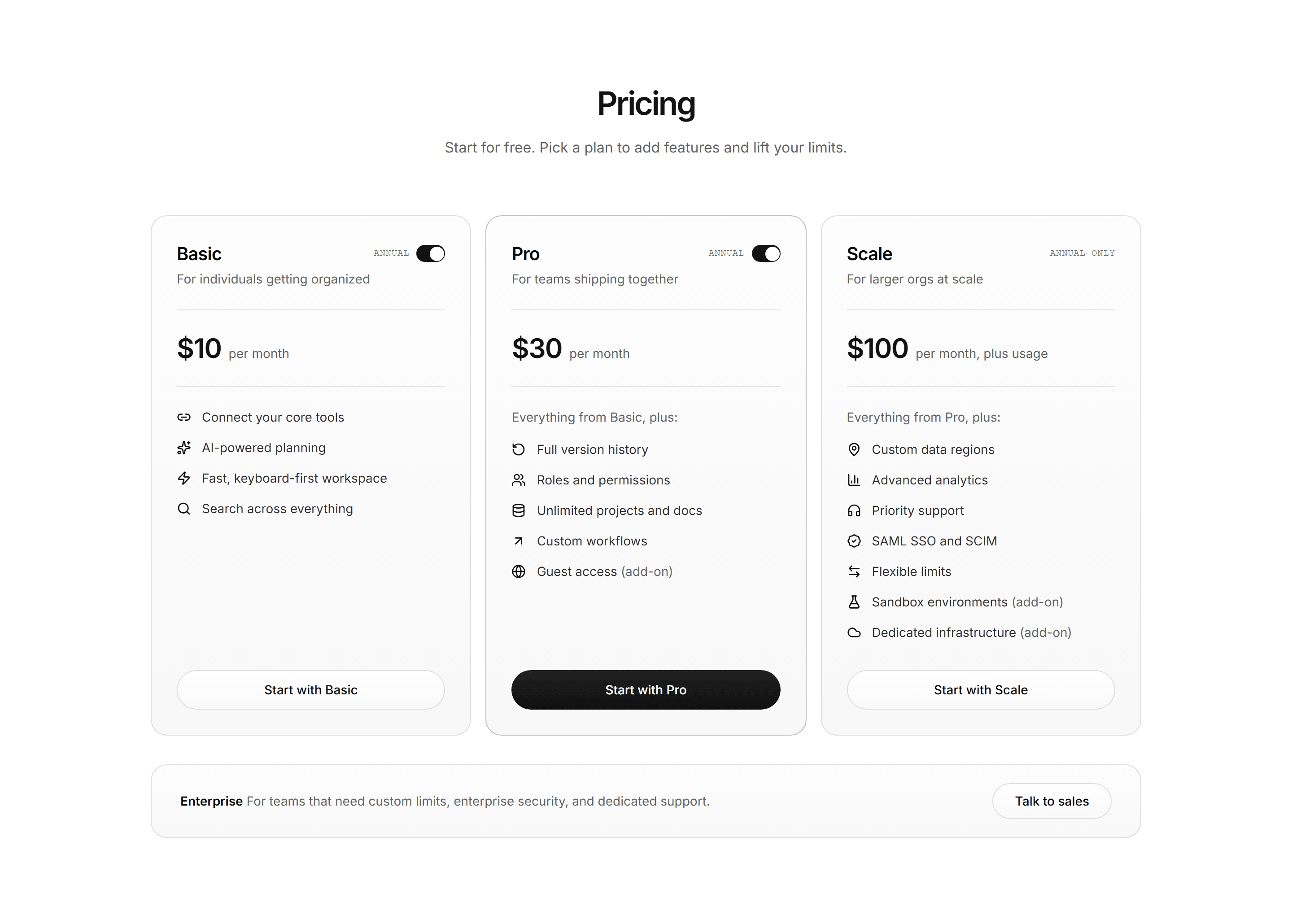
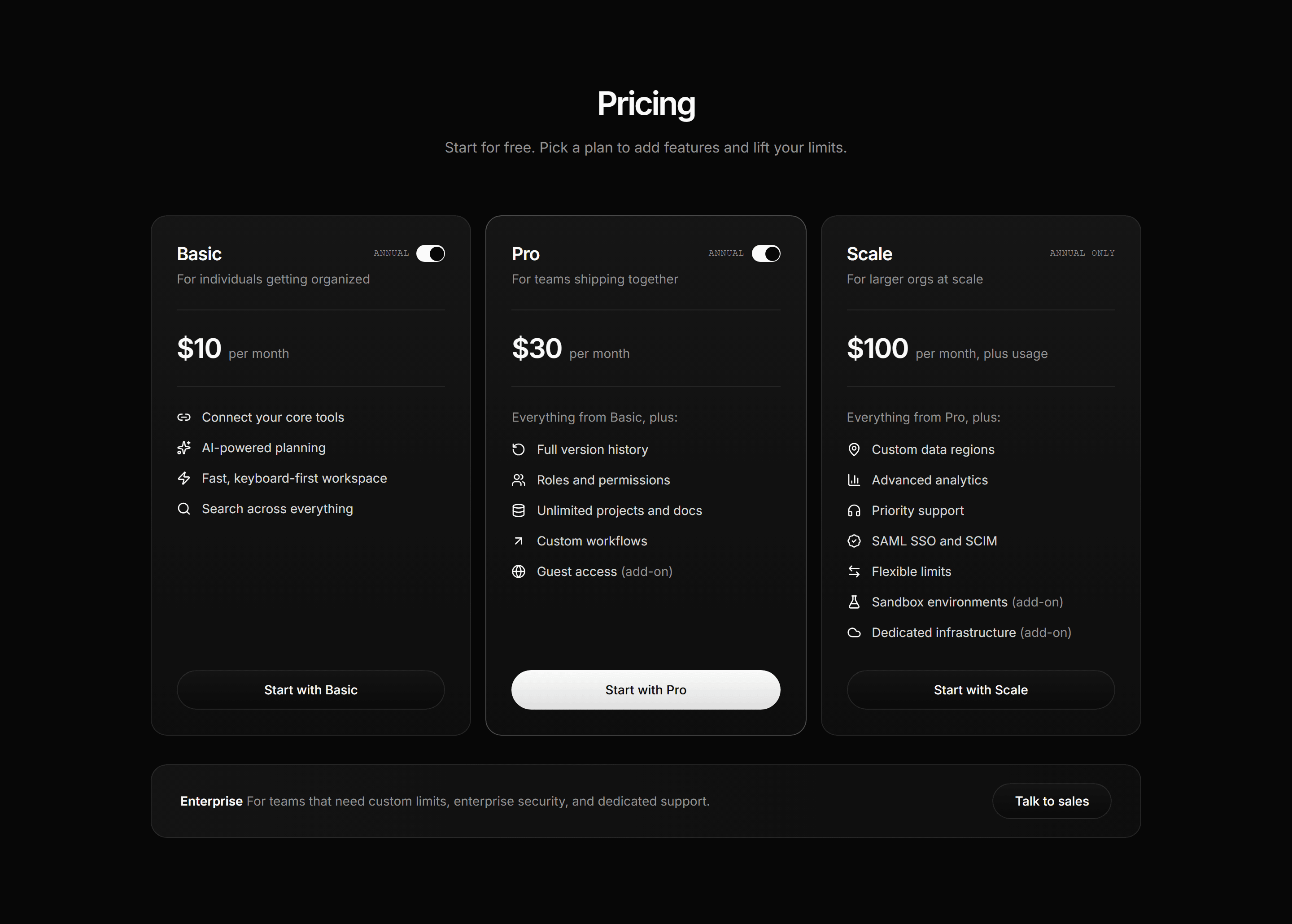
Modern SaaS Pricing: Three Tier
A three tier pricing section with a featured plan, per card annual billing toggles, icon feature lists, and an enterprise banner.


Modern SaaS About: Hiring Banner Strip
A hiring banner strip: an invitation line and a short teams list beside a primary depth pill pointing at open roles.
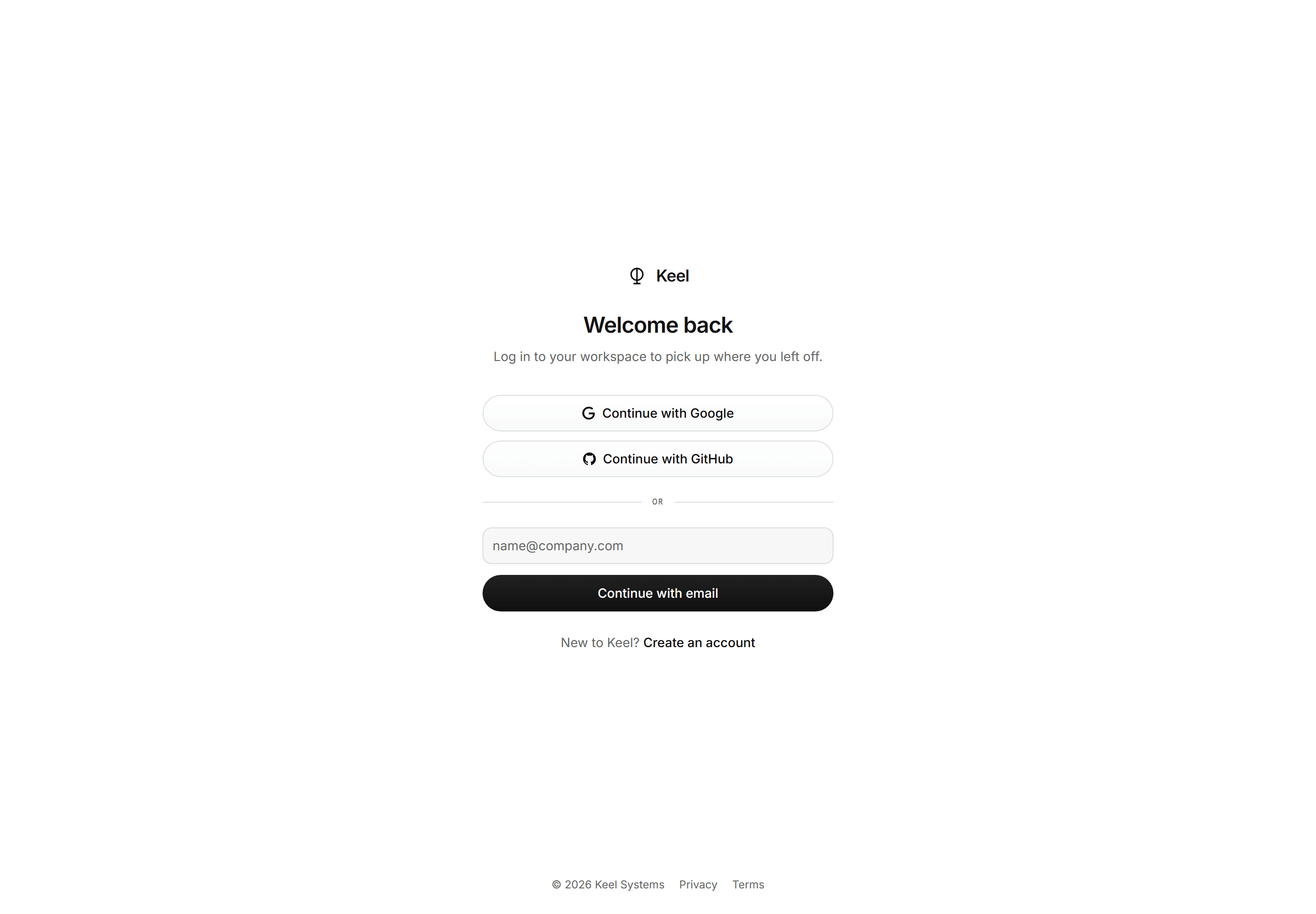
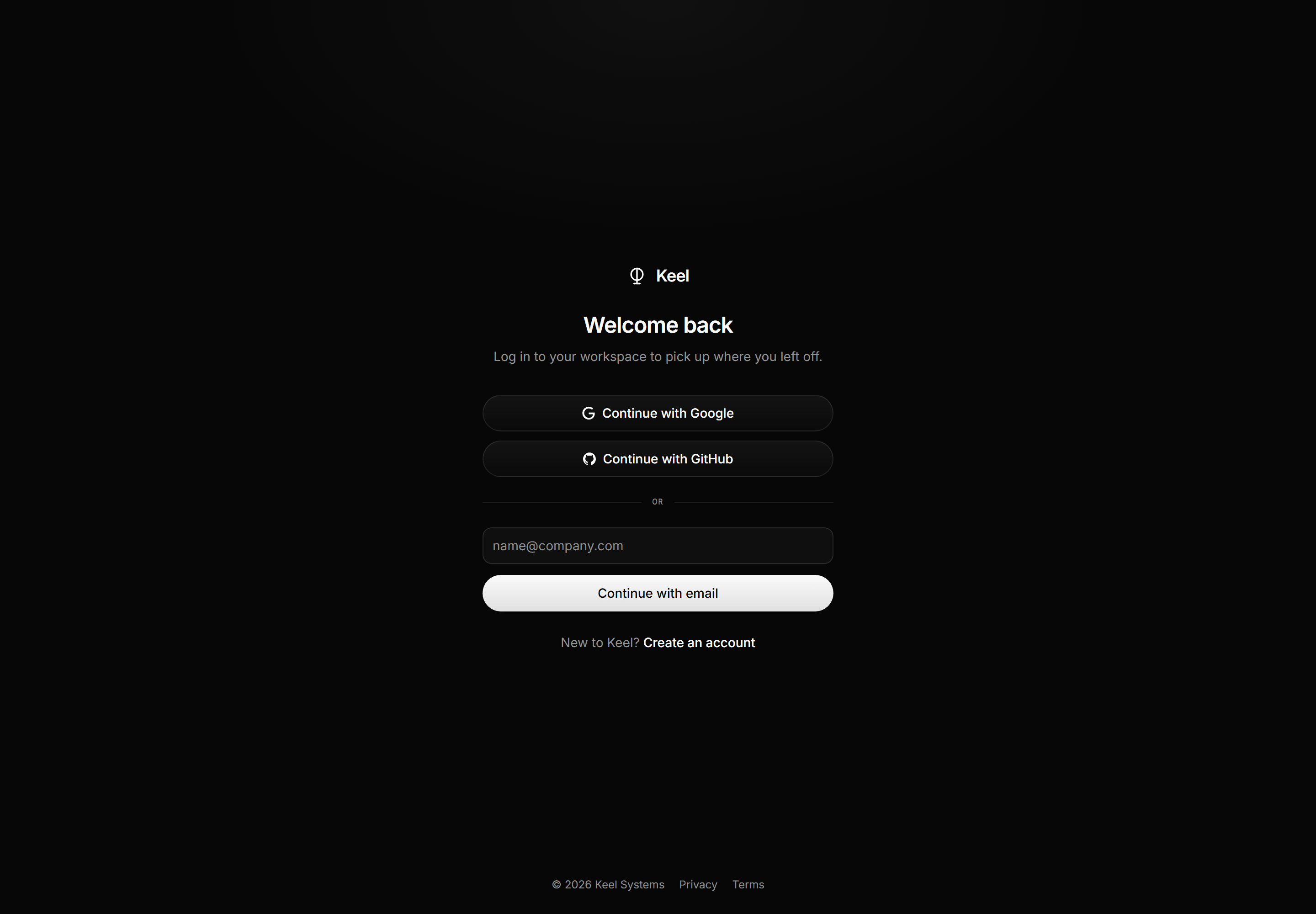
Modern SaaS Auth Page: Depth Login
A centered login screen with SSO pills, mono divider, email field, and primary depth pill over a soft radial glow.


Modern SaaS Logo Cloud: Inline Wordmark Strip
A quiet single row logo strip: a muted caption over one evenly justified line of glyph and wordmark pairs.
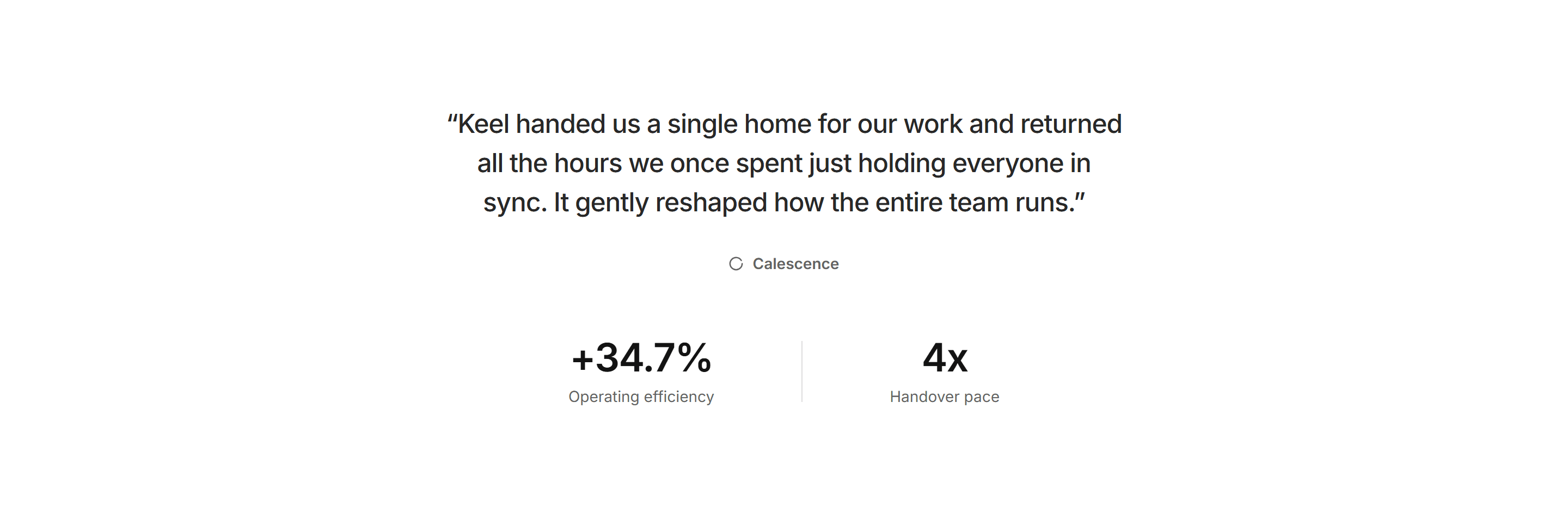
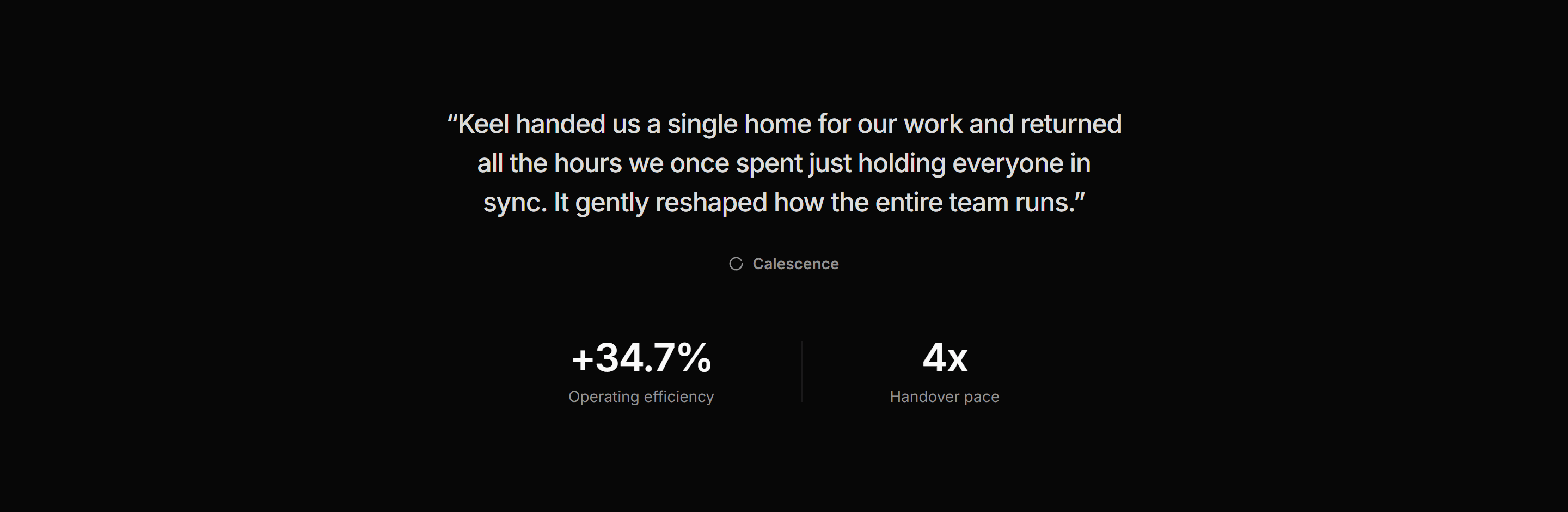
Modern SaaS Testimonial: Pull Quote with Proof Stats
A large centered pull quote with attribution mark and a pair of proof stats split by a hairline divider.


Modern SaaS Hero: Full Bleed Photo
A hero on a full bleed black and white sports photograph, its headline, lede and two pills over token scrims, then fading into the page.
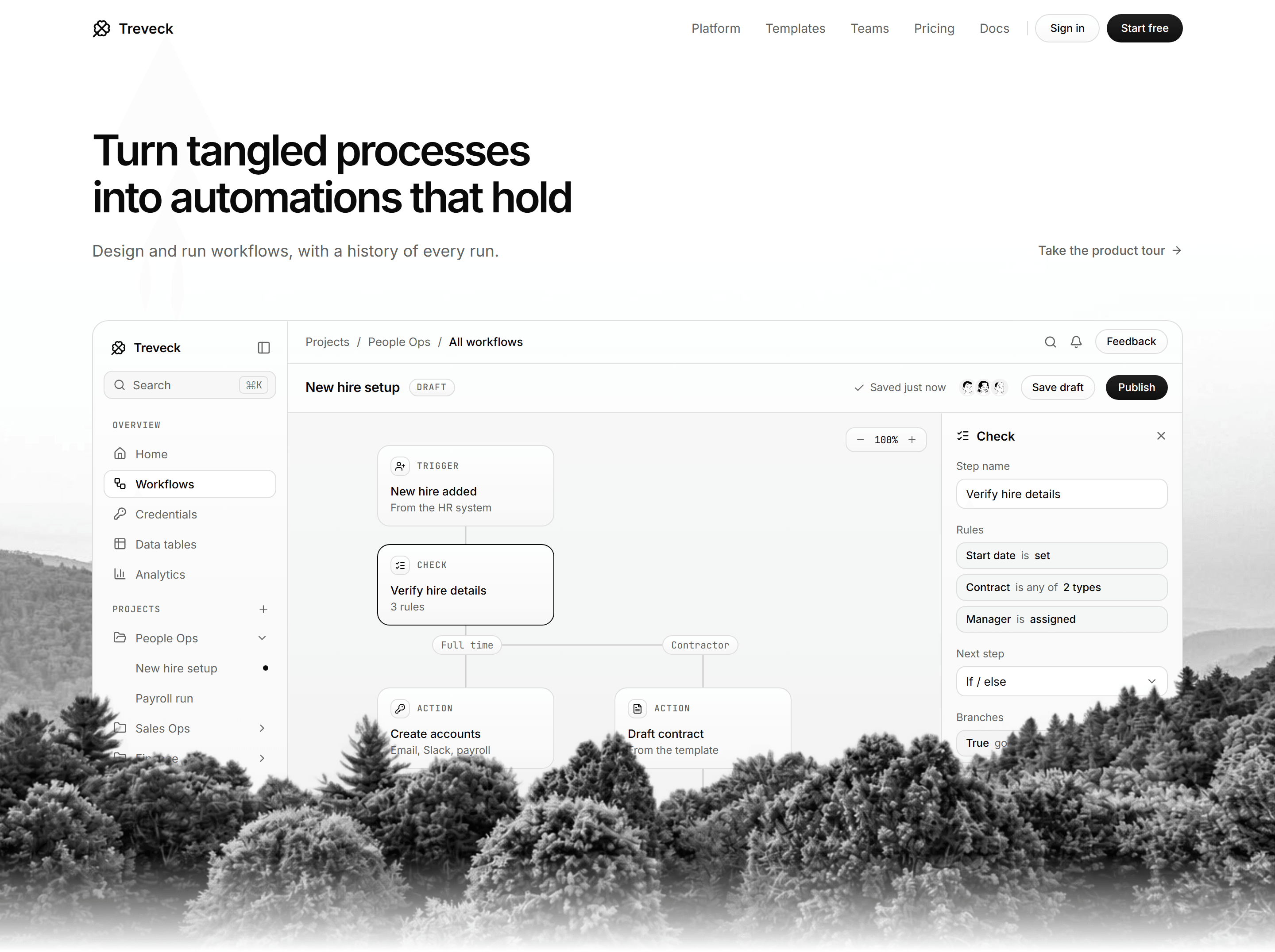
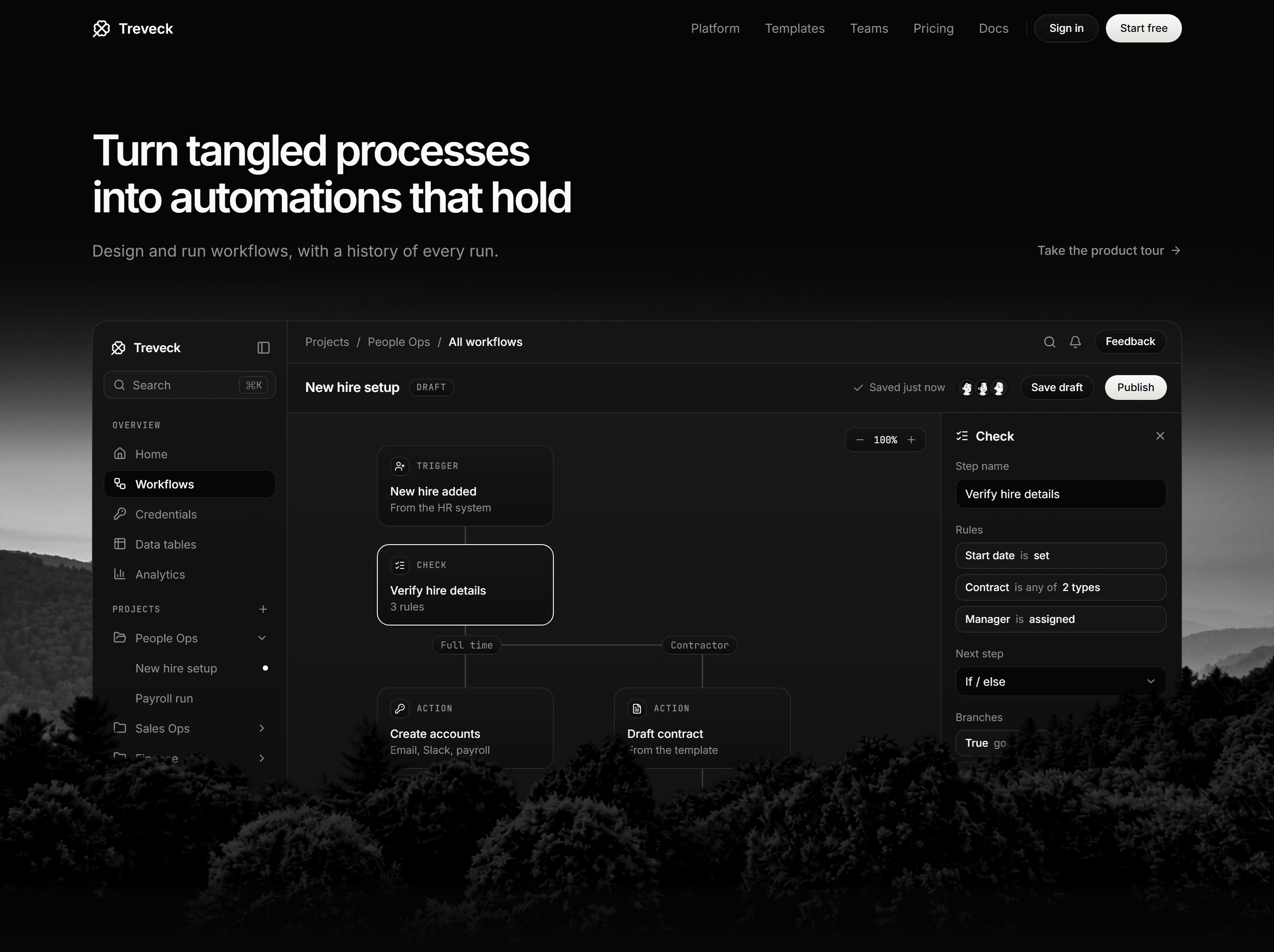
Modern SaaS Hero: Landscape App Window
A left aligned hero with a two line headline and a text link over a workflow builder window rising out of a forested valley photograph.
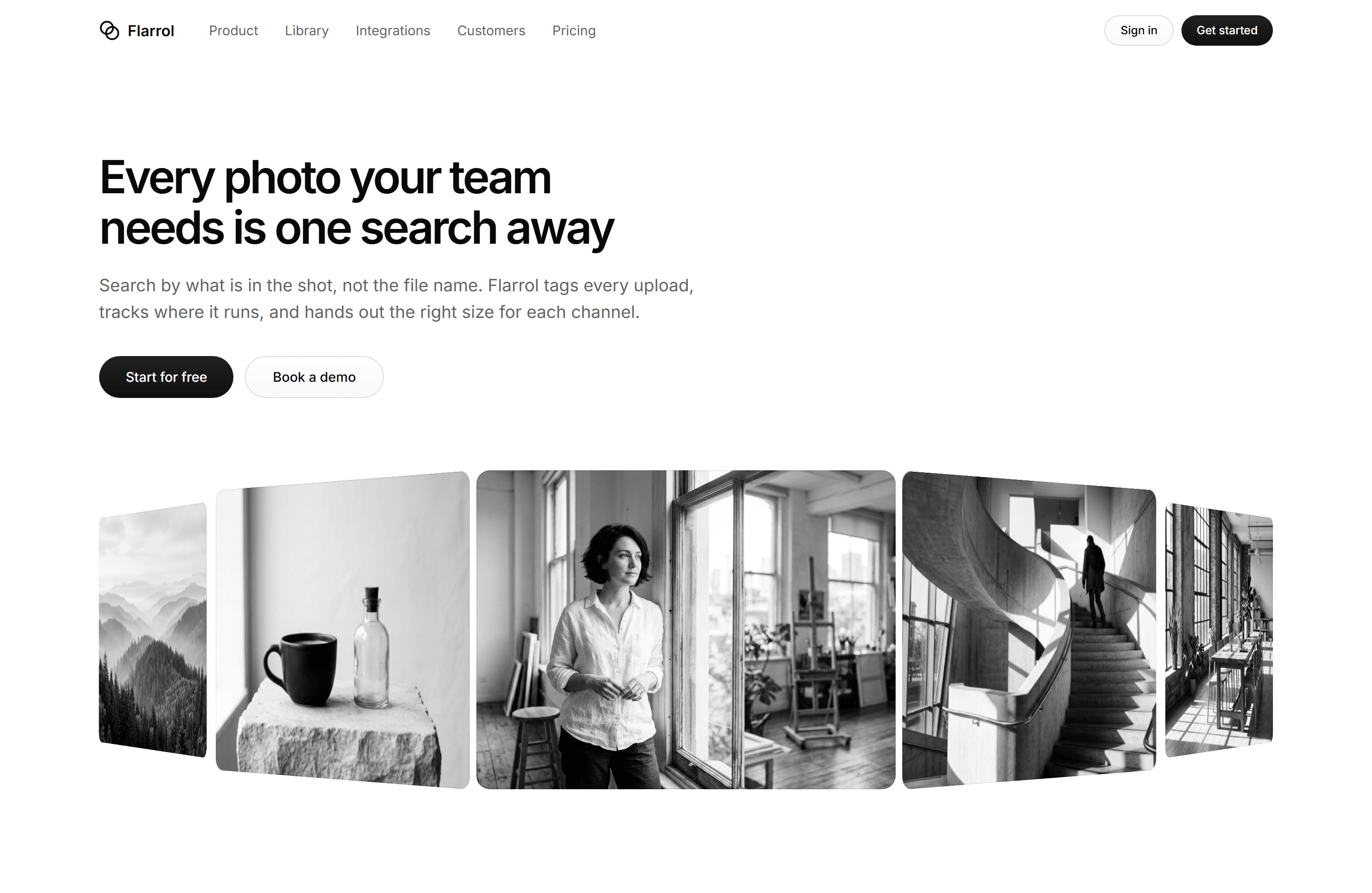

Modern SaaS Hero: Asset Carousel
A left aligned hero for an image library with a two line headline, a lede and two pills over a CSS 3D coverflow of five photographs.
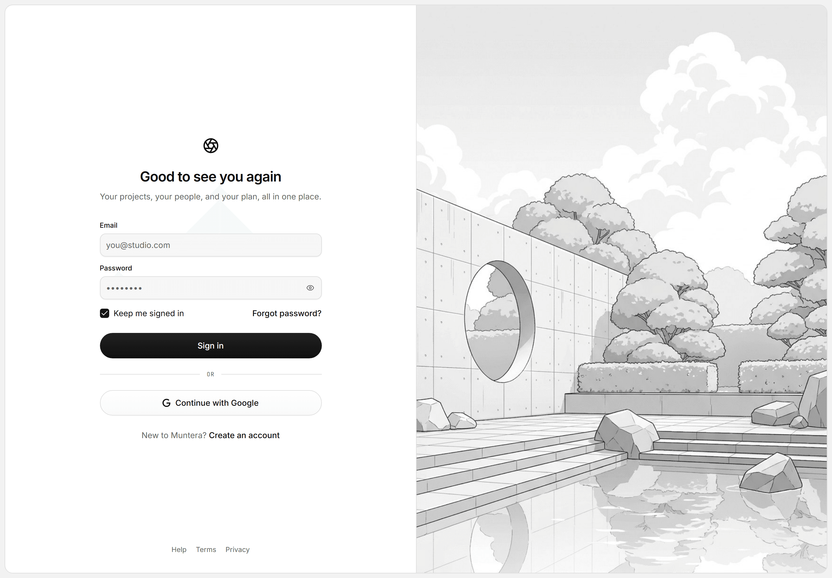
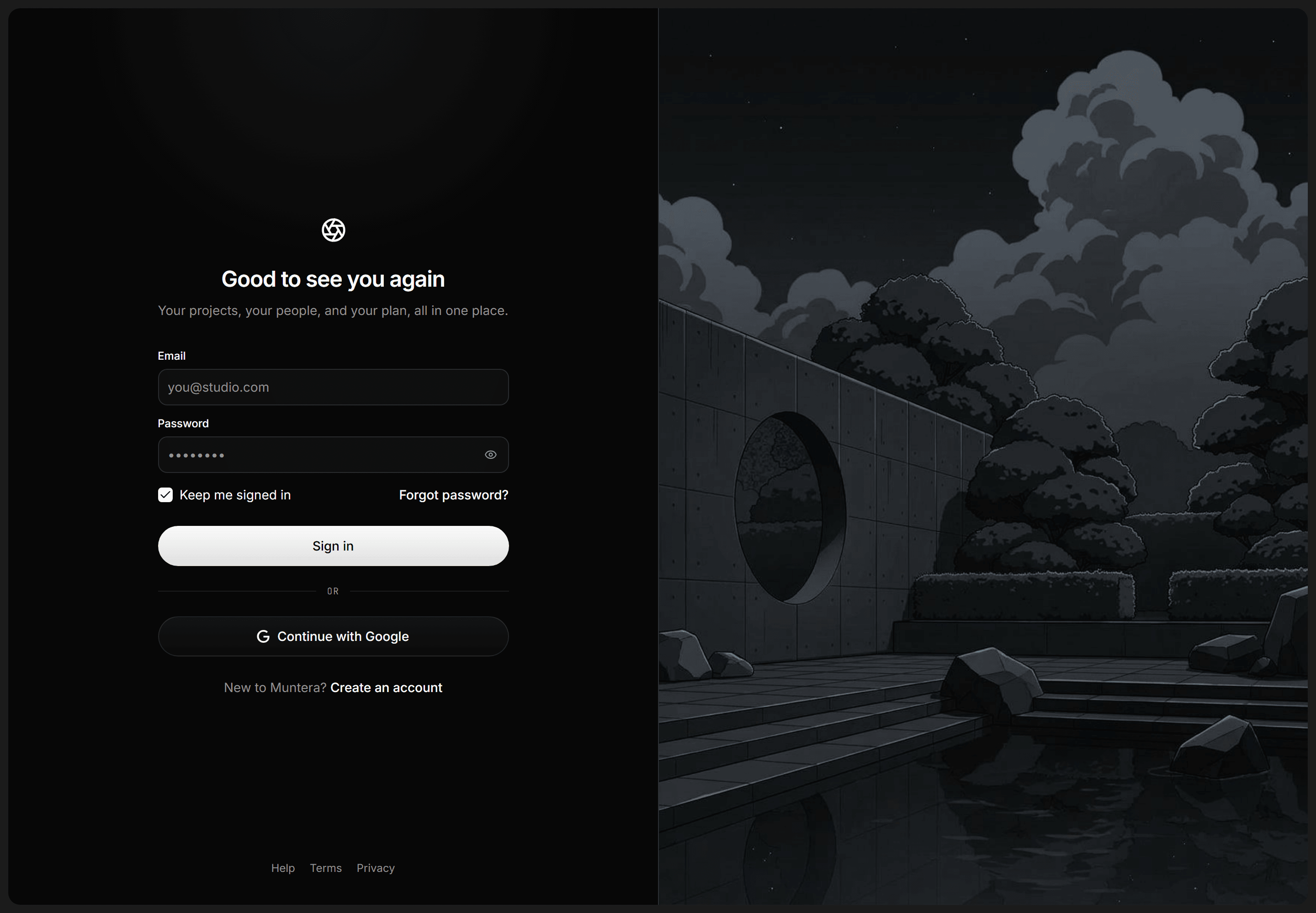
Modern SaaS Auth Page: Split Login Illustrated
A split login screen in an inset tray: labeled fields, remember me, and a Google pill beside a grayscale garden illustration edge to edge.
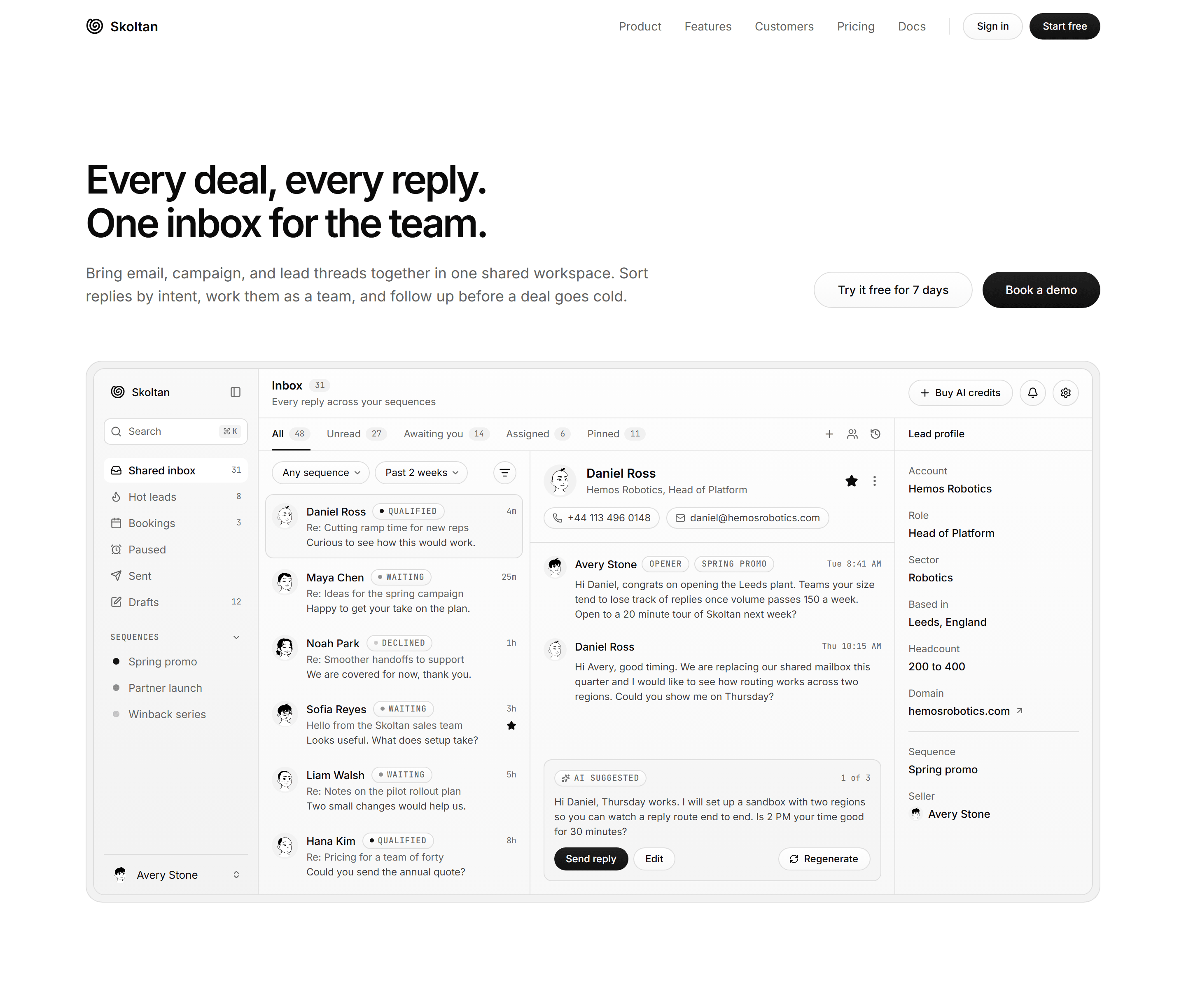
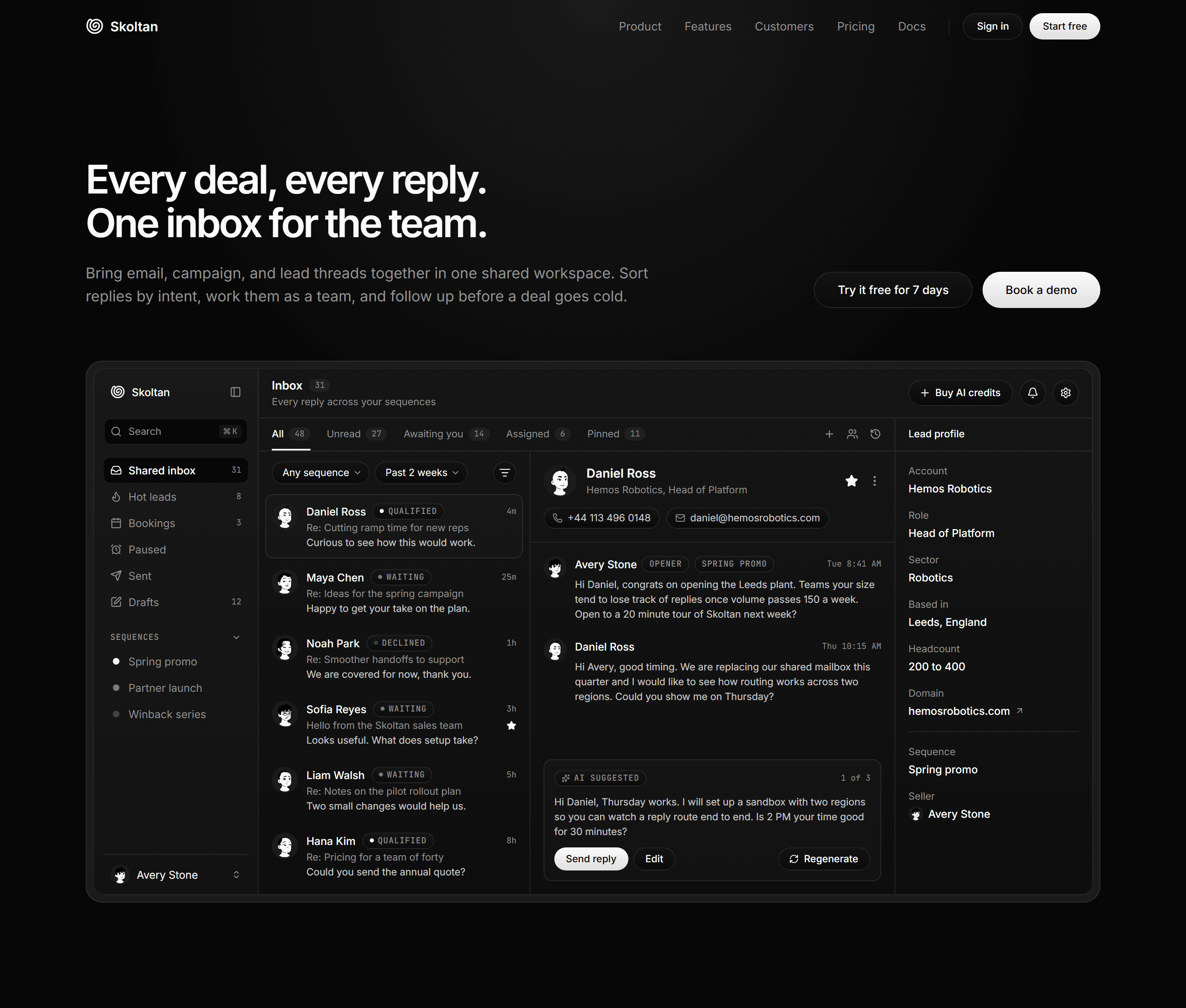
Modern SaaS Hero: Inbox Showcase
A left aligned hero with a two line headline, a lede sharing its row with two pills, and a shared sales inbox mockup in an inset tray.
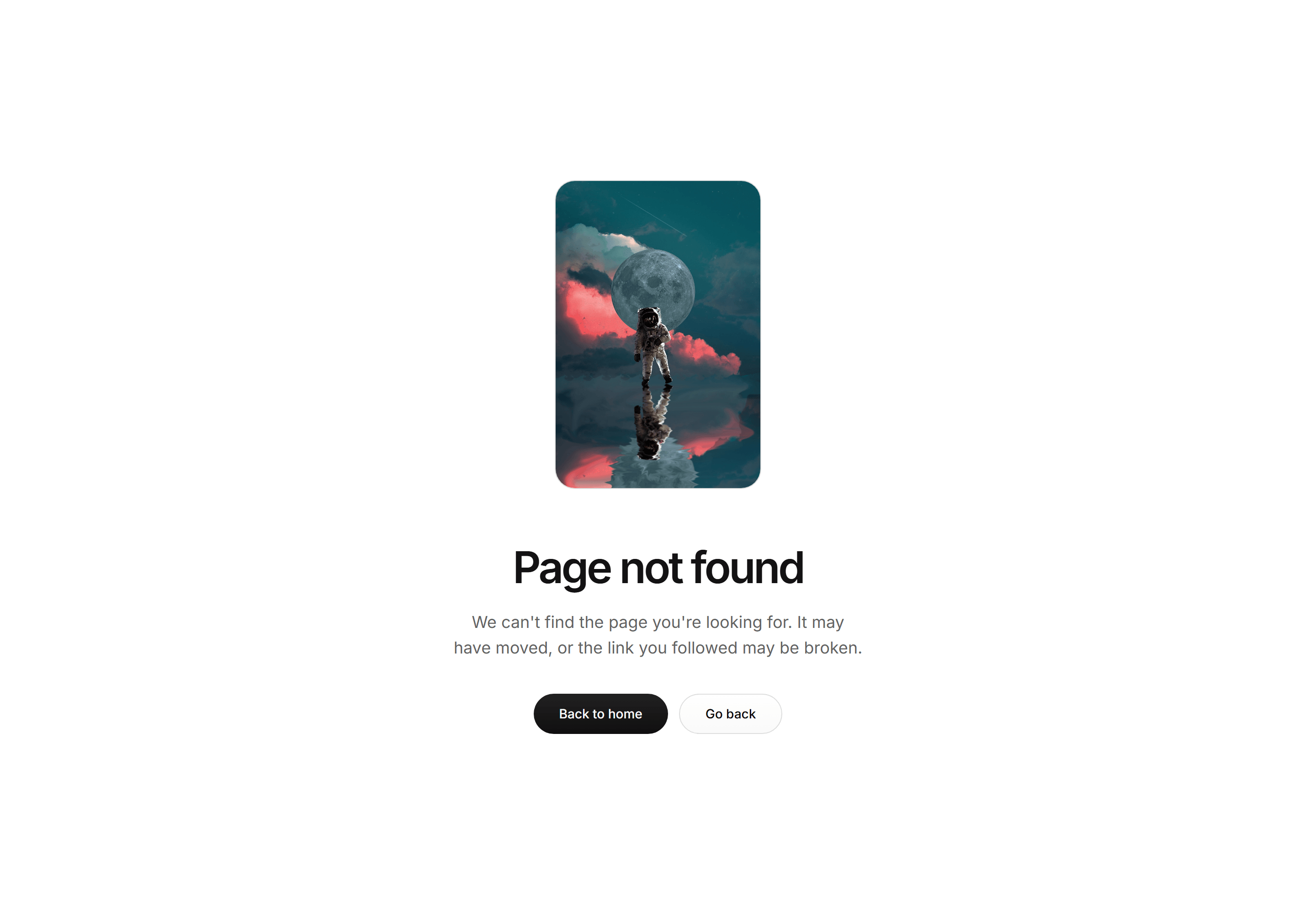

Modern SaaS Error Page: Centered Astronaut
A centered 404 screen: a framed astronaut adrift over a soft glow above a bold headline, a short lede, and pill CTAs to head home or go back.
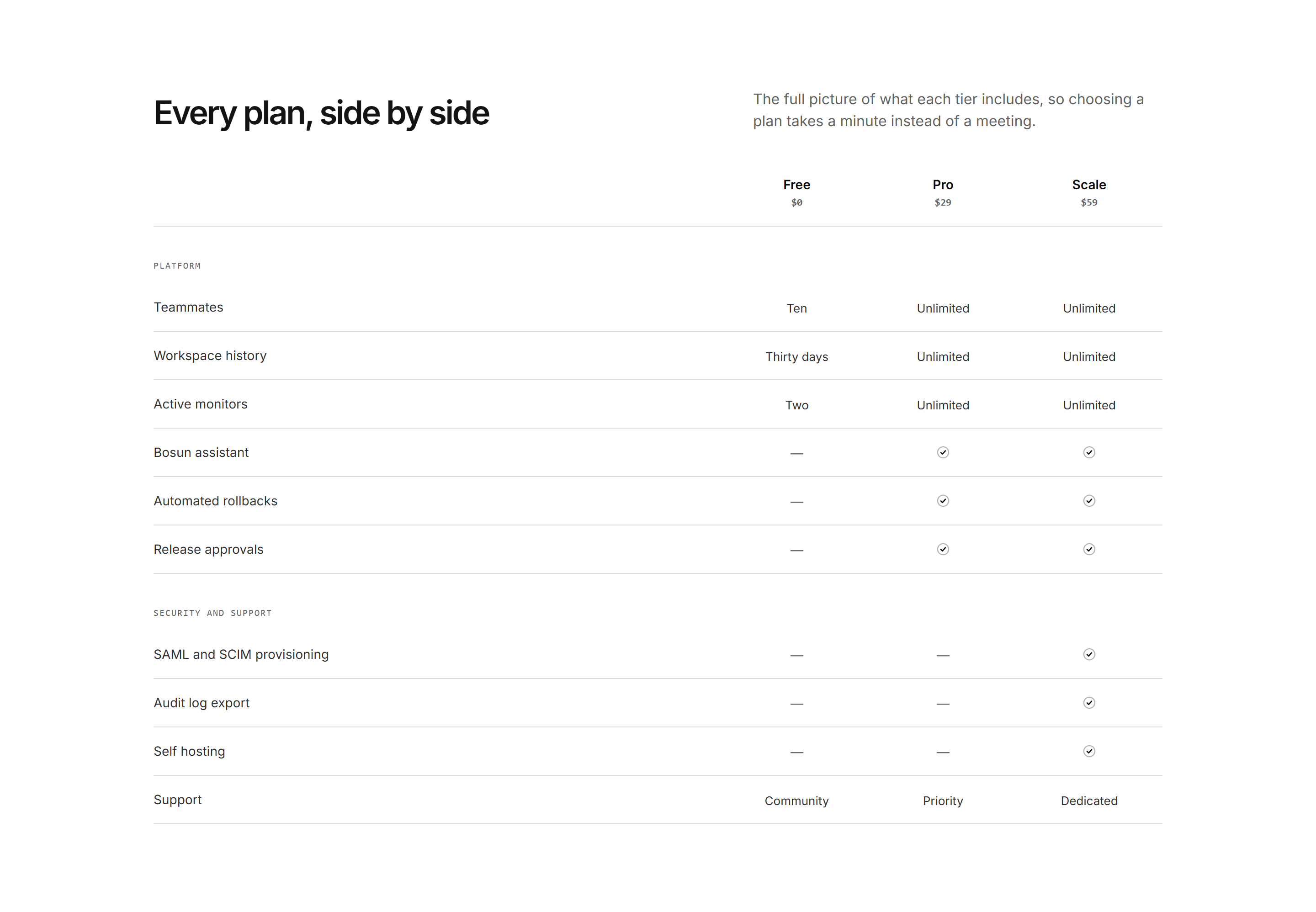
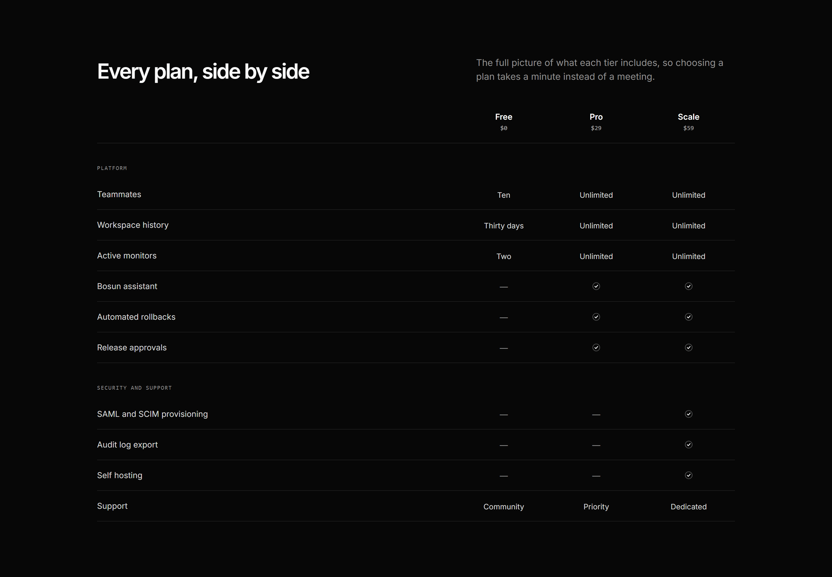
Modern SaaS Pricing: Plan Comparison Table
A plan comparison table with price column headers, mono feature groups, and checks aligned down fixed lanes.
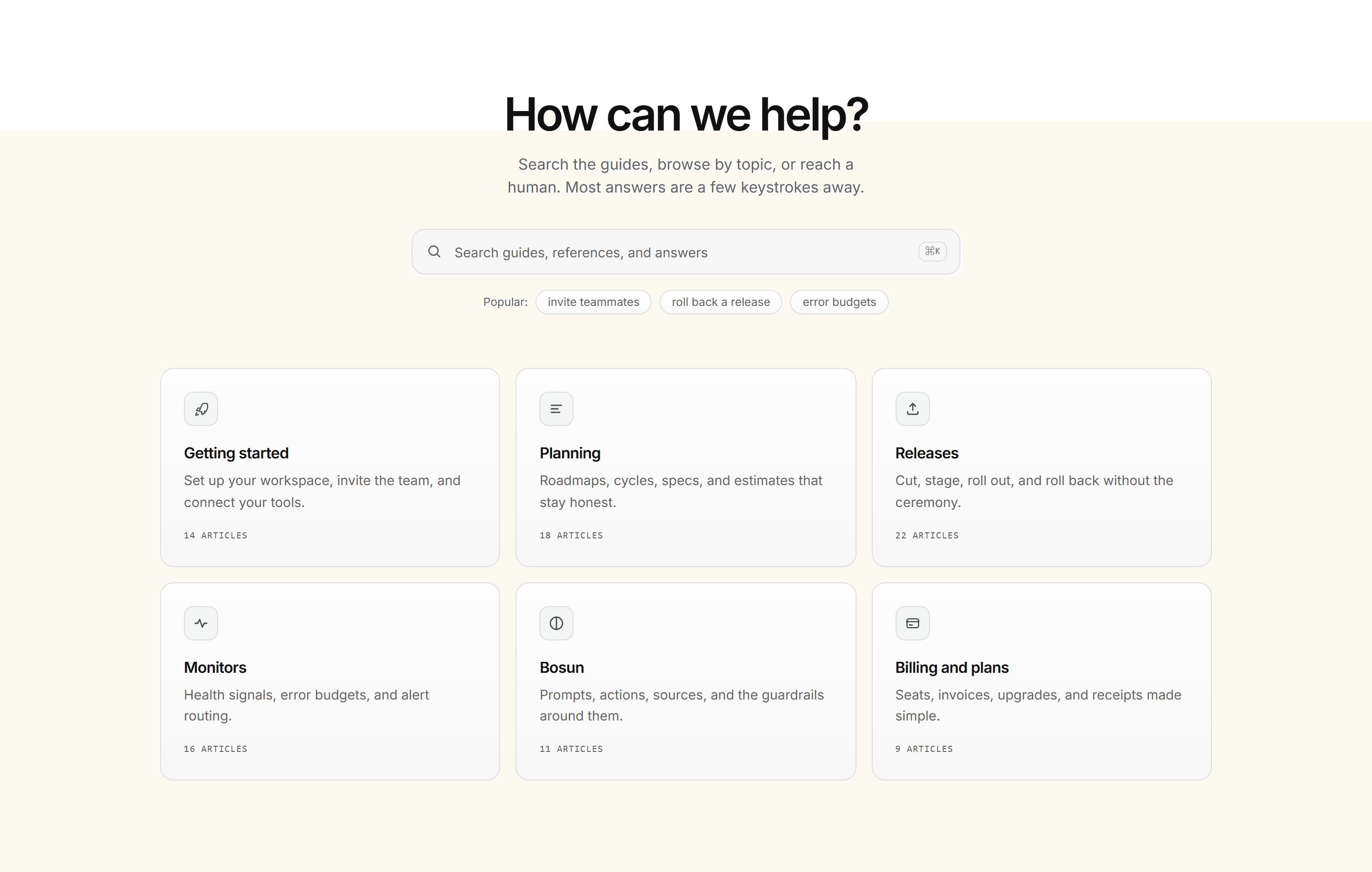
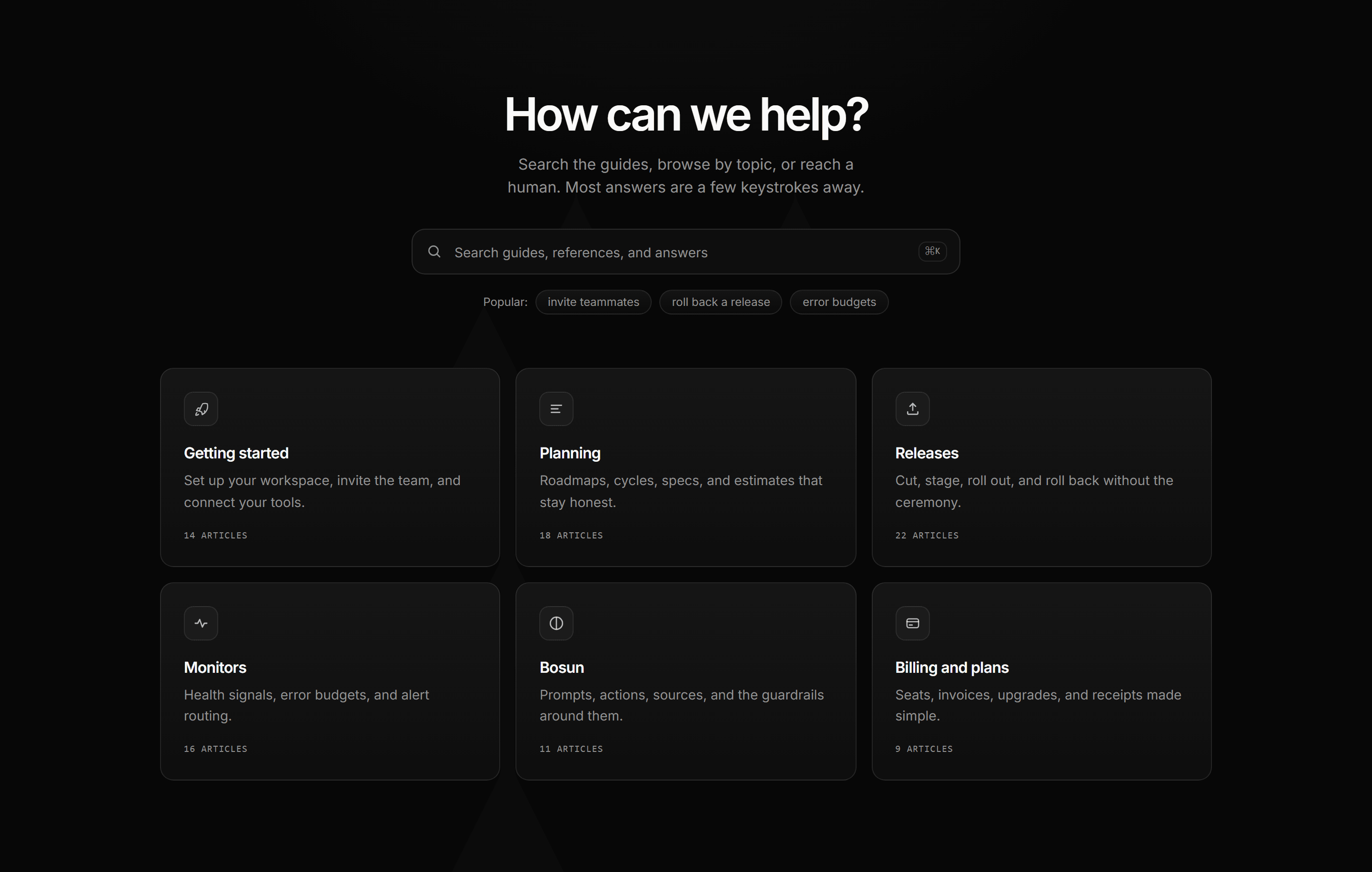
Modern SaaS Help Center: Search Hero Topic Grid
A help center opener: kicker, oversized heading, wide search field with shortcut hint and popular chips, then a grid of icon tile topic cards with mono article counts.
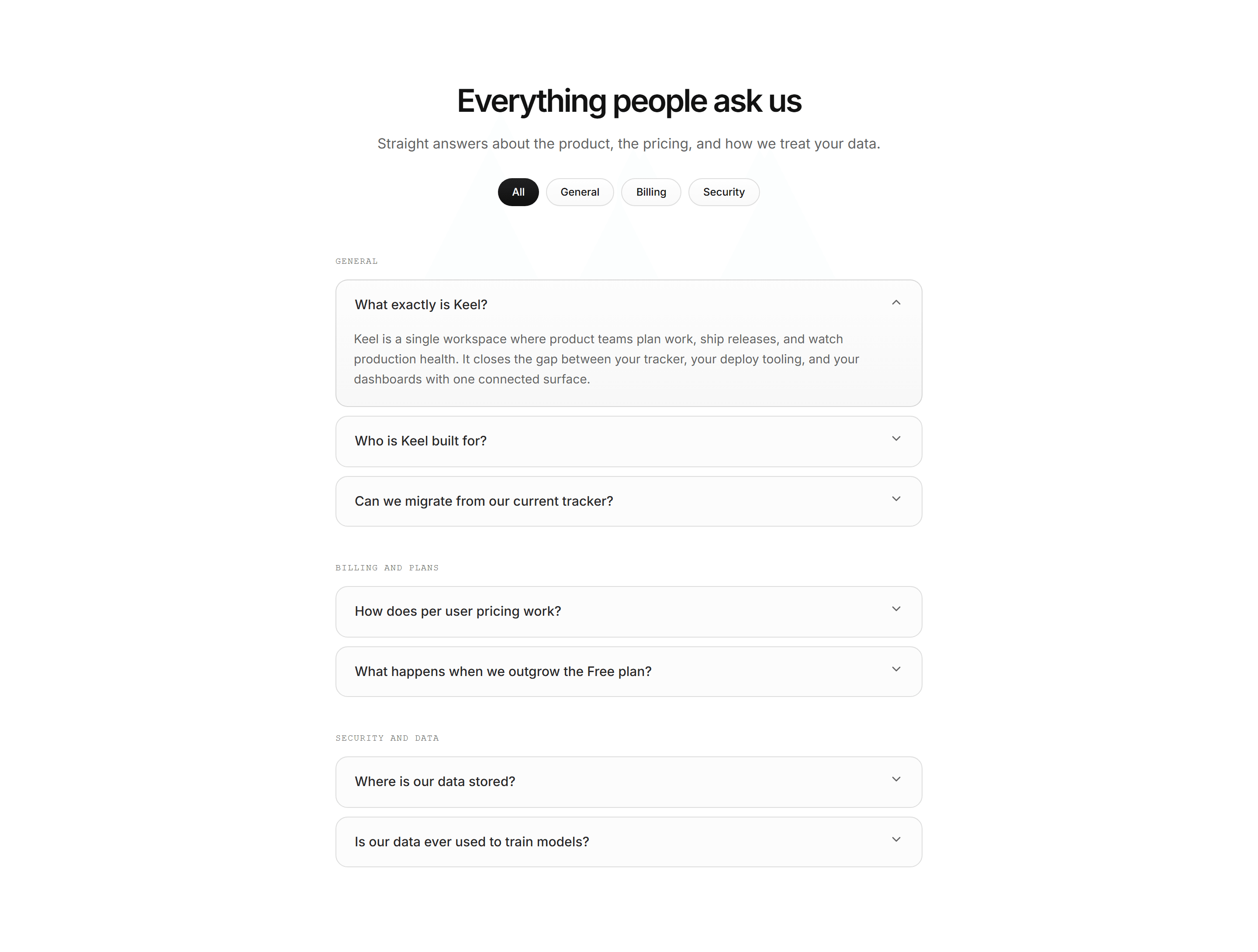
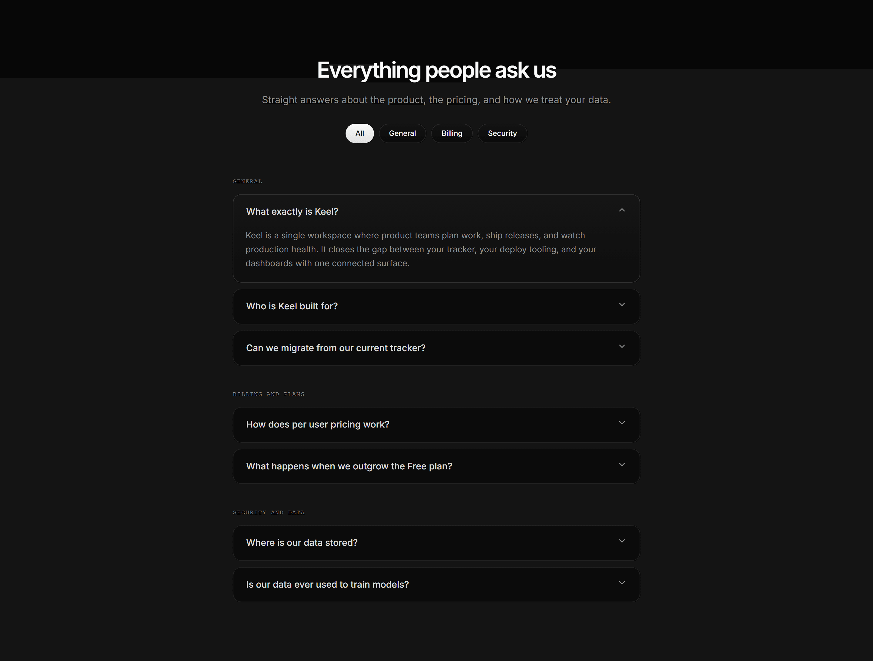
Modern SaaS FAQ: Category Pill Accordions
A full FAQ section with a category pill row and mono labeled question groups as quiet accordion tiles.
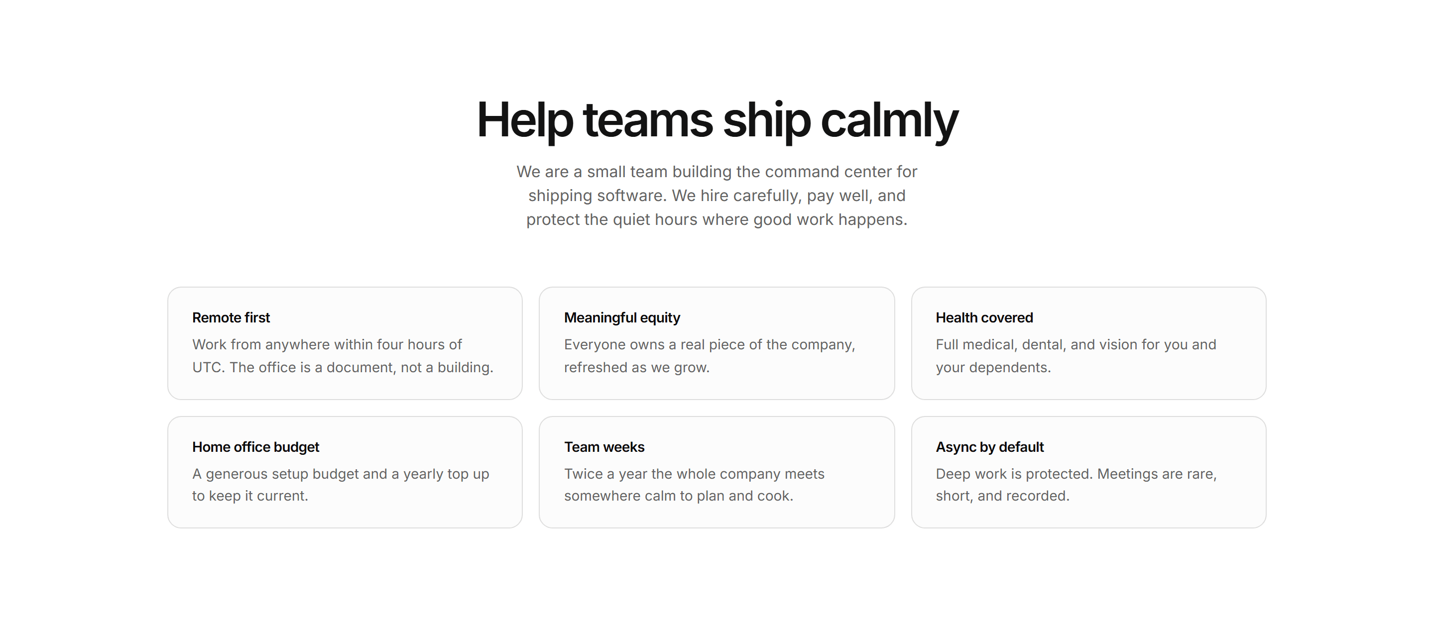
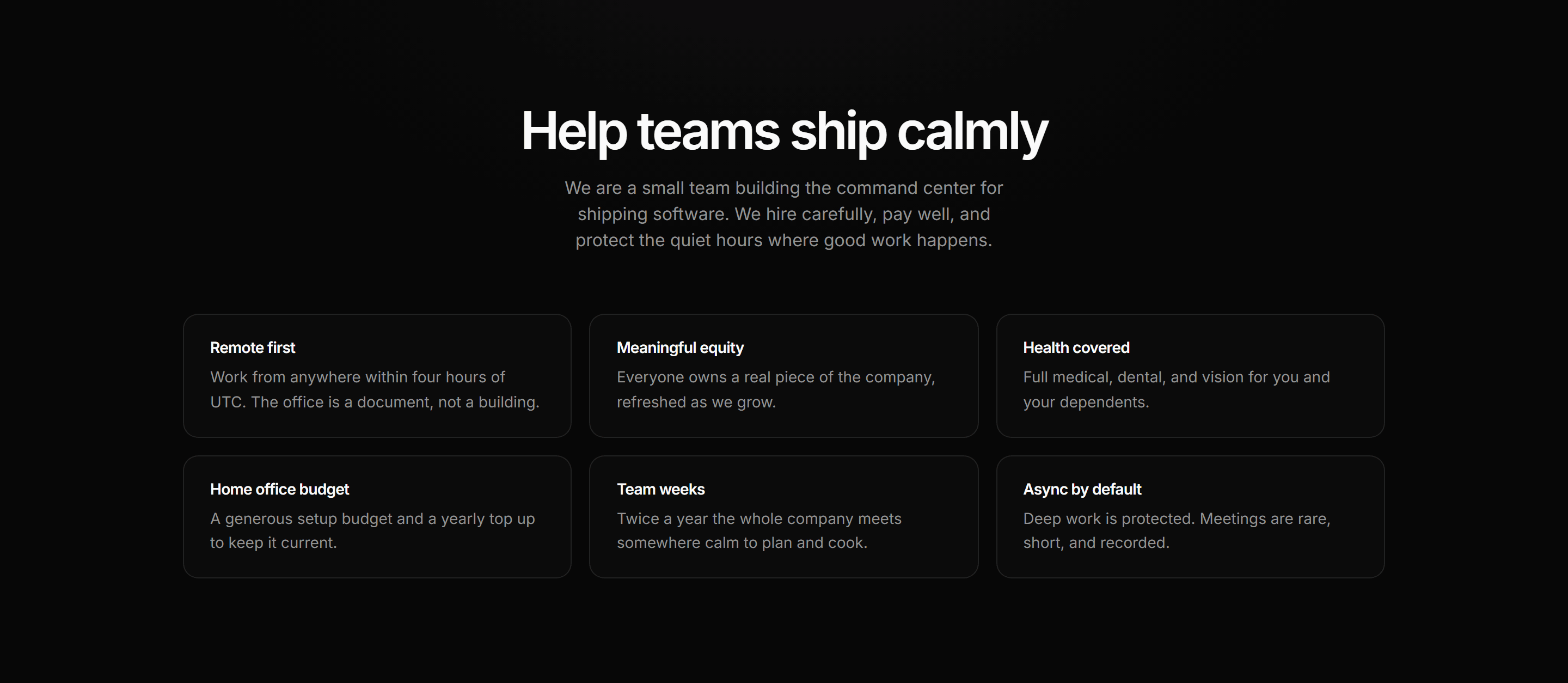
Modern SaaS Career: Hiring Intro Benefits
A careers page opener: kicker, oversized heading, plainspoken pitch, and a three up grid of quiet benefit tiles.
Modern SaaS About: Our Purpose
An editorial about section with no imagery: an uppercase eyebrow and large headline on the left beside a two paragraph purpose statement on the right.


Modern SaaS About: Leadership Avatar Grid
A five up leadership grid of tile cards with large illustrated avatars, names, and roles under an asymmetric header.
Modern SaaS About: Meet the Team
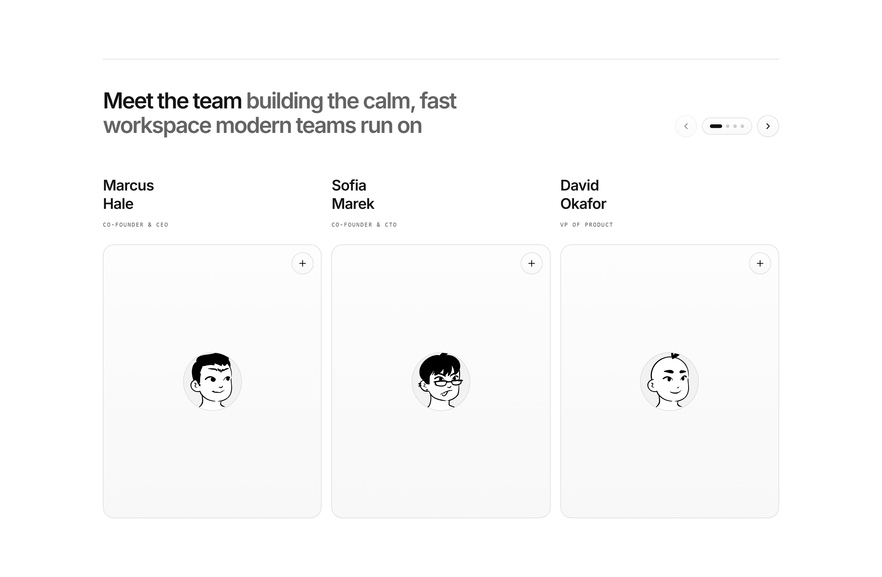
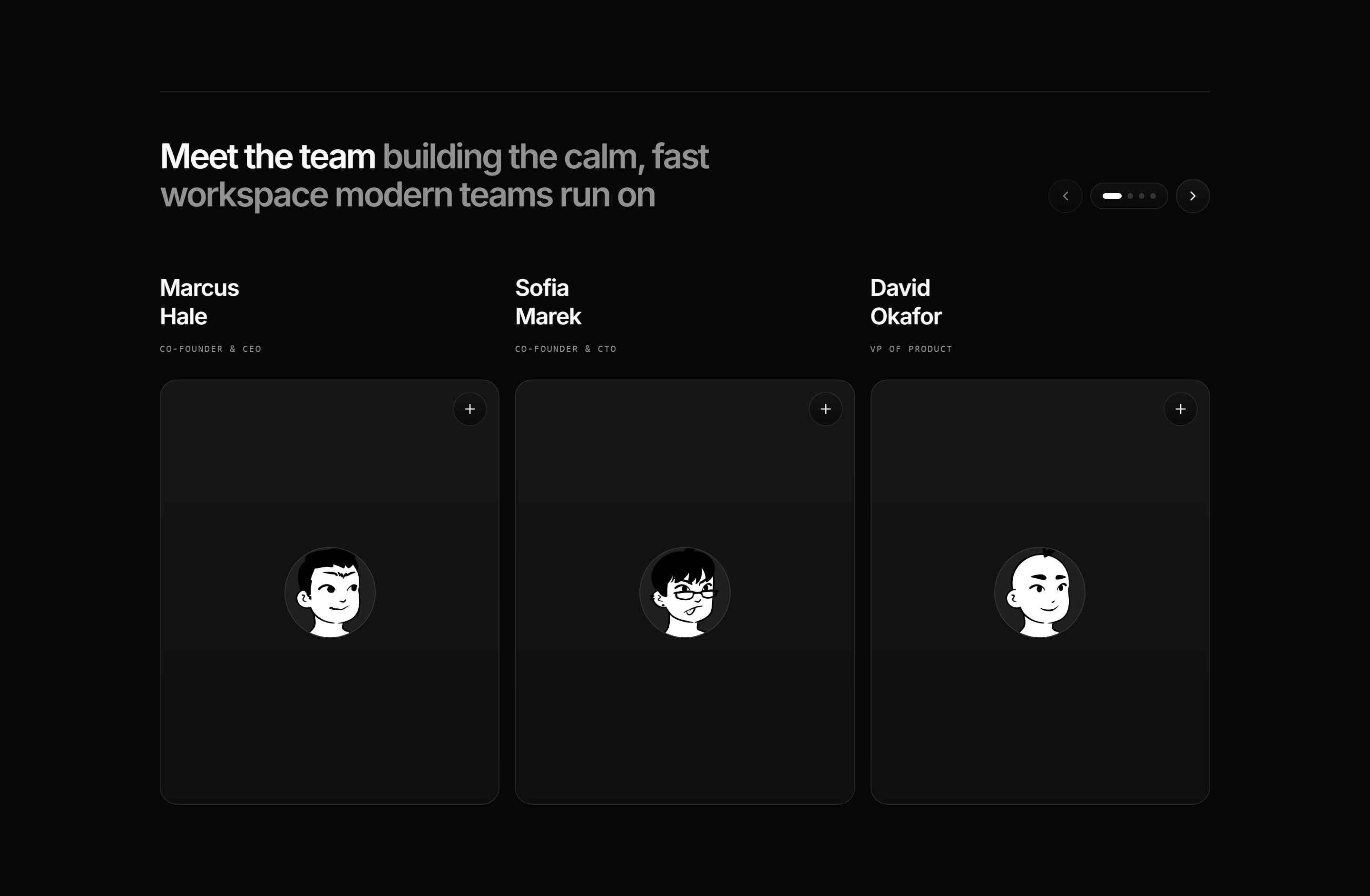
A swipeable carousel of team profile cards with names, roles, and portraits, each opening a short bio in a dialog.
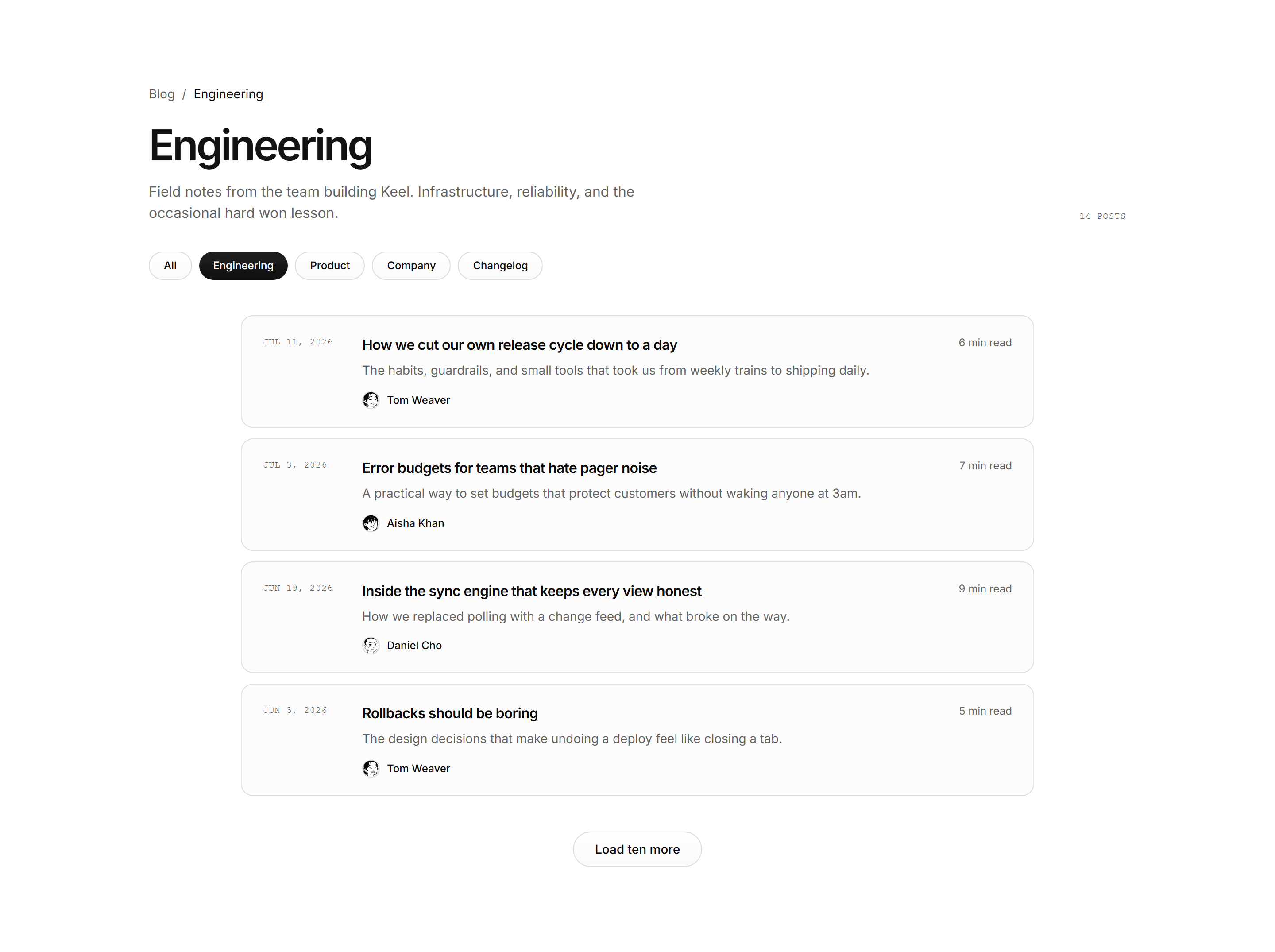
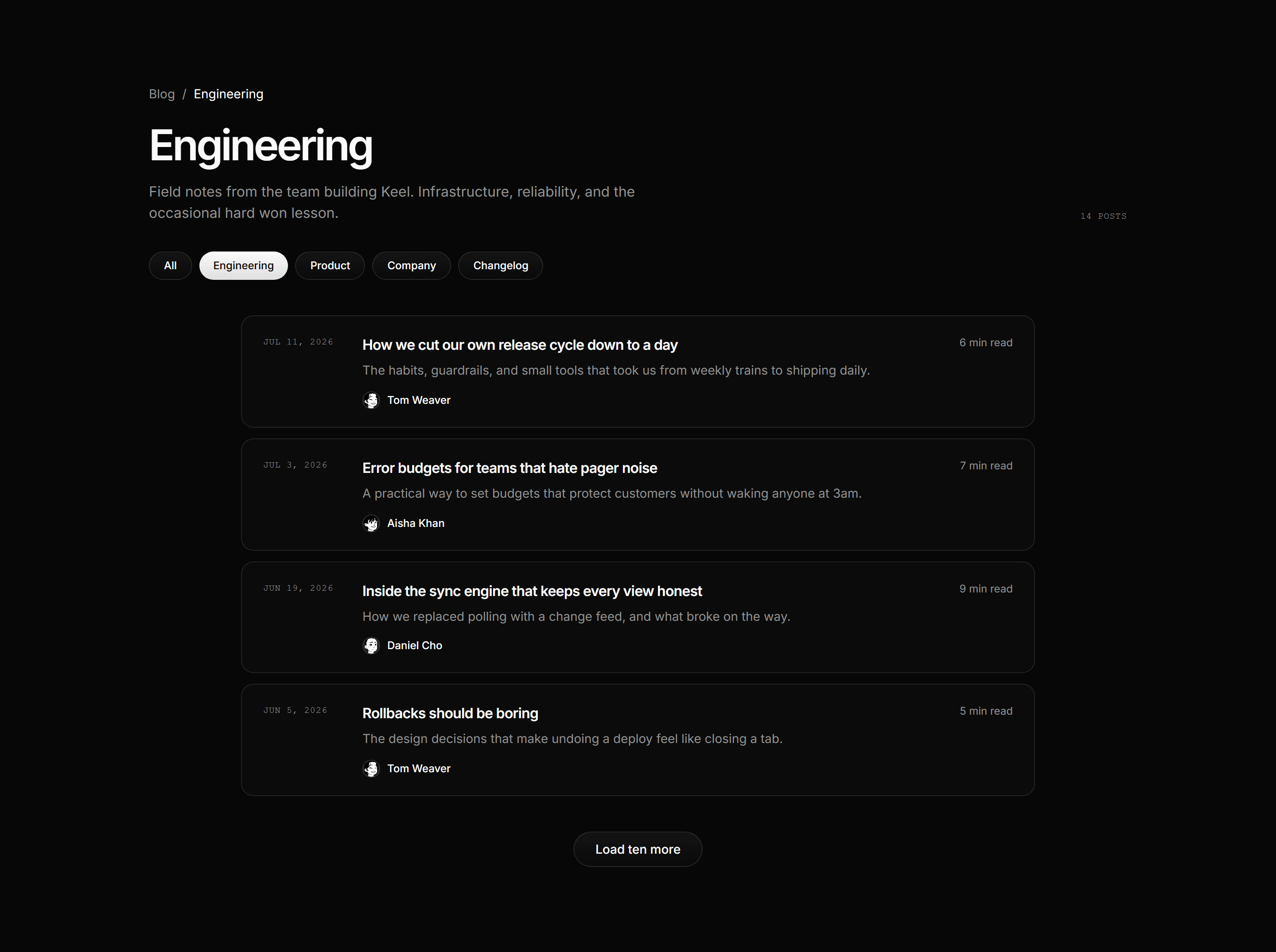
Modern SaaS Blog: Category Post List
A blog category page: breadcrumb, left aligned heading with mono post count, category filter pills, a column of quiet list rows, and an honest load more pill.
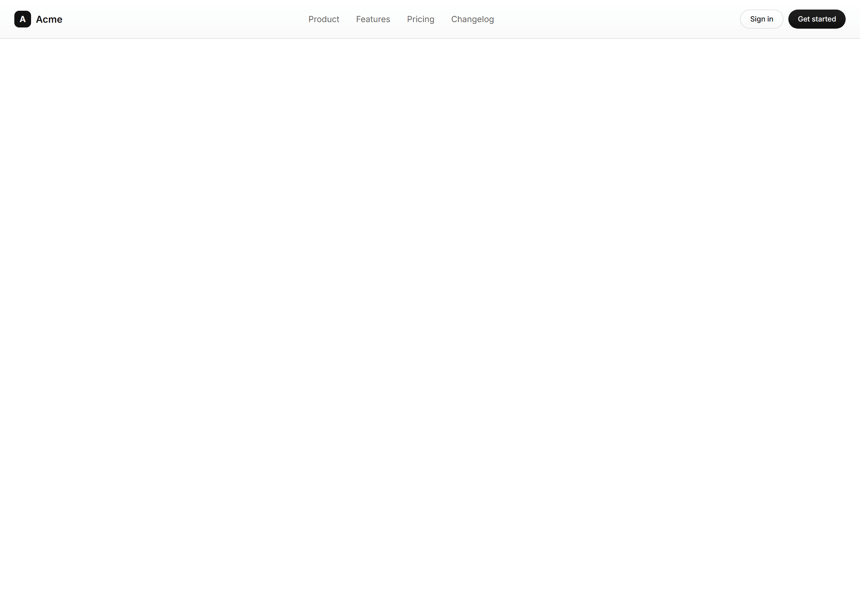

Modern SaaS Navbar: Standard Sticky
A full width sticky header with a bottom border, logo, inline links, and CTAs. Links collapse into a mobile sheet menu. A clean, dependable Modern SaaS header.
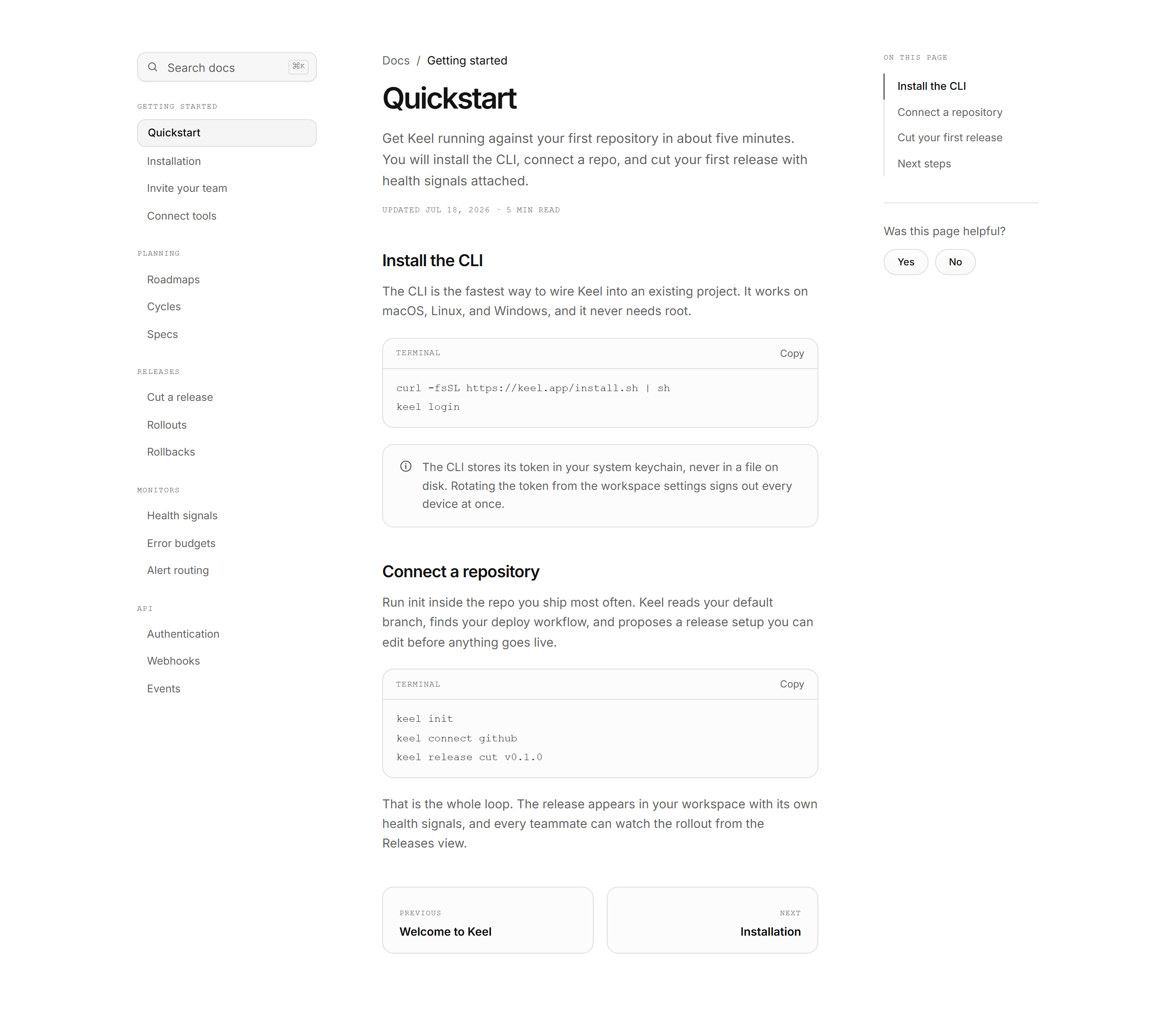
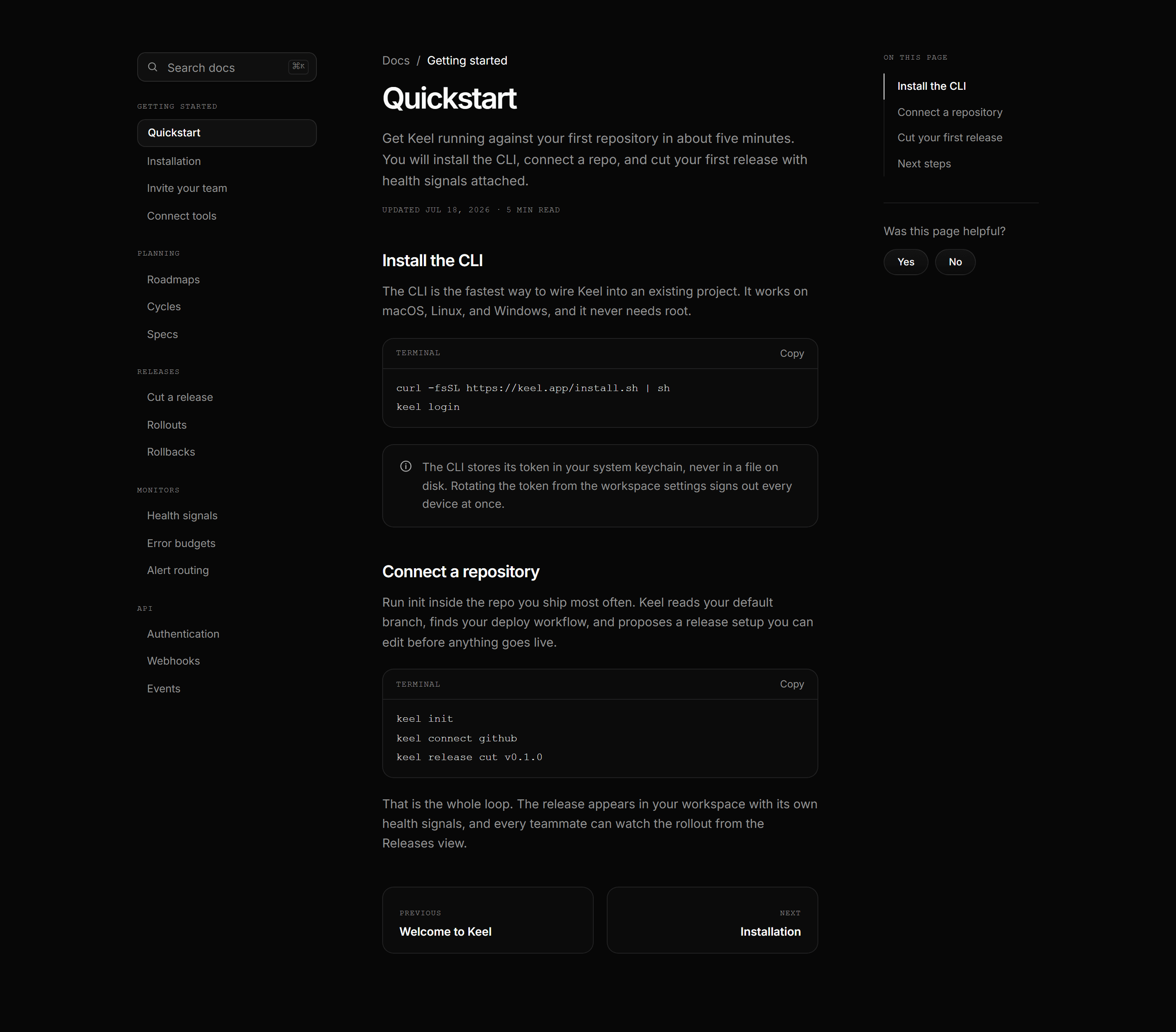
Modern SaaS Docs Page: Sidebar Docs Shell
A complete docs page shell: sidebar with mini search and mono section labels, prose column with terminal blocks and working copy buttons, and an on this page rail.
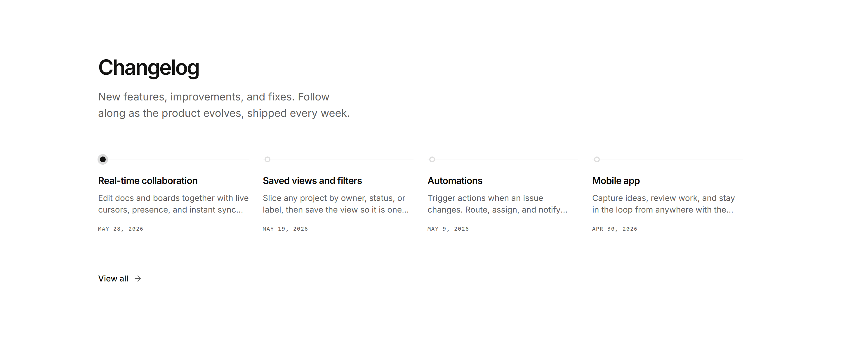

Modern SaaS Changelog: Horizontal Timeline
A Linear style changelog: a bold heading above a horizontal rail of recent releases, each with a dot, title, two line summary, and date. The newest entry is highlighted.
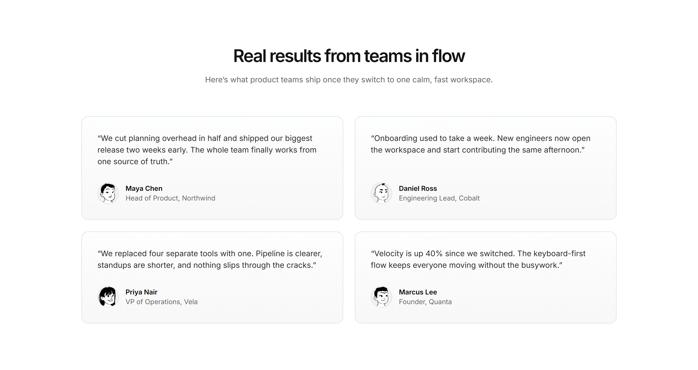
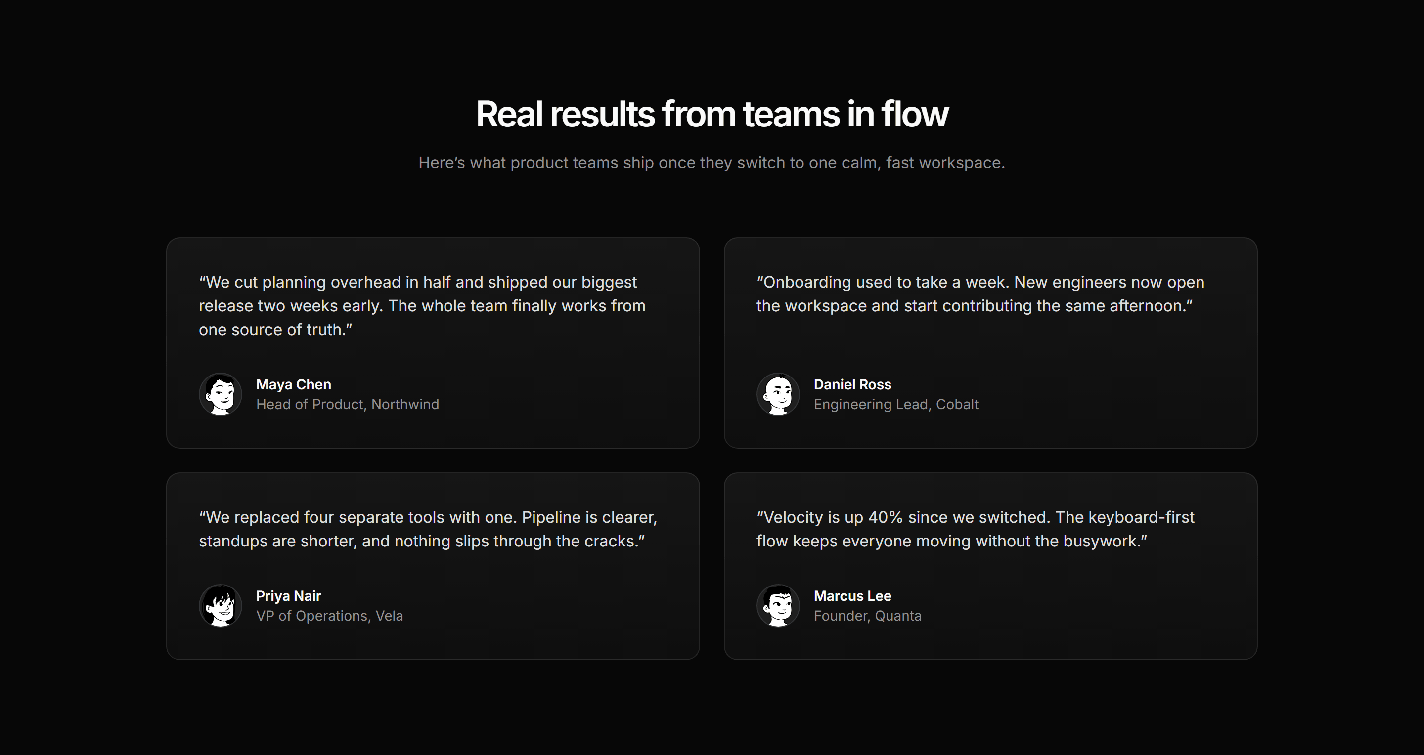
Modern SaaS Testimonial: Quote Card Grid
A two column grid of testimonial cards, each pairing a customer quote with an avatar, name, and role.
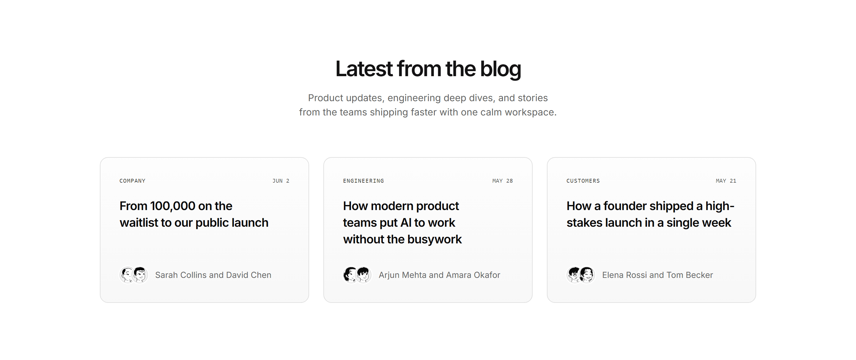

Modern SaaS Blog: Article Card Grid
A three up grid of blog post cards, each pairing a category badge and date with the post title and a stacked author byline.
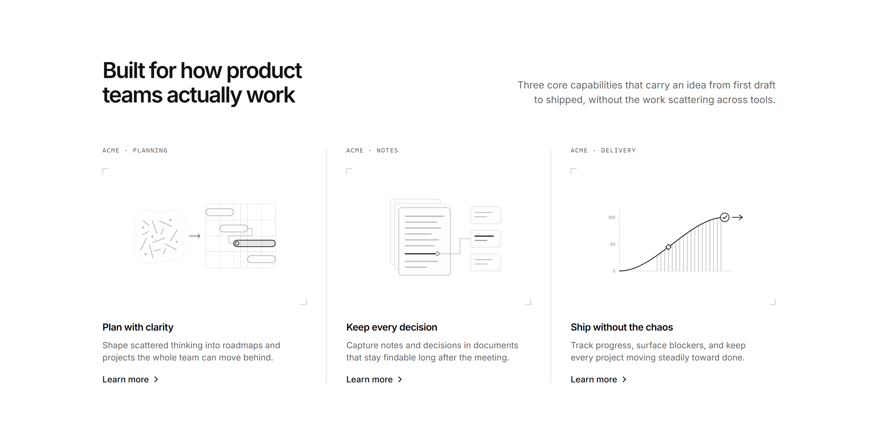
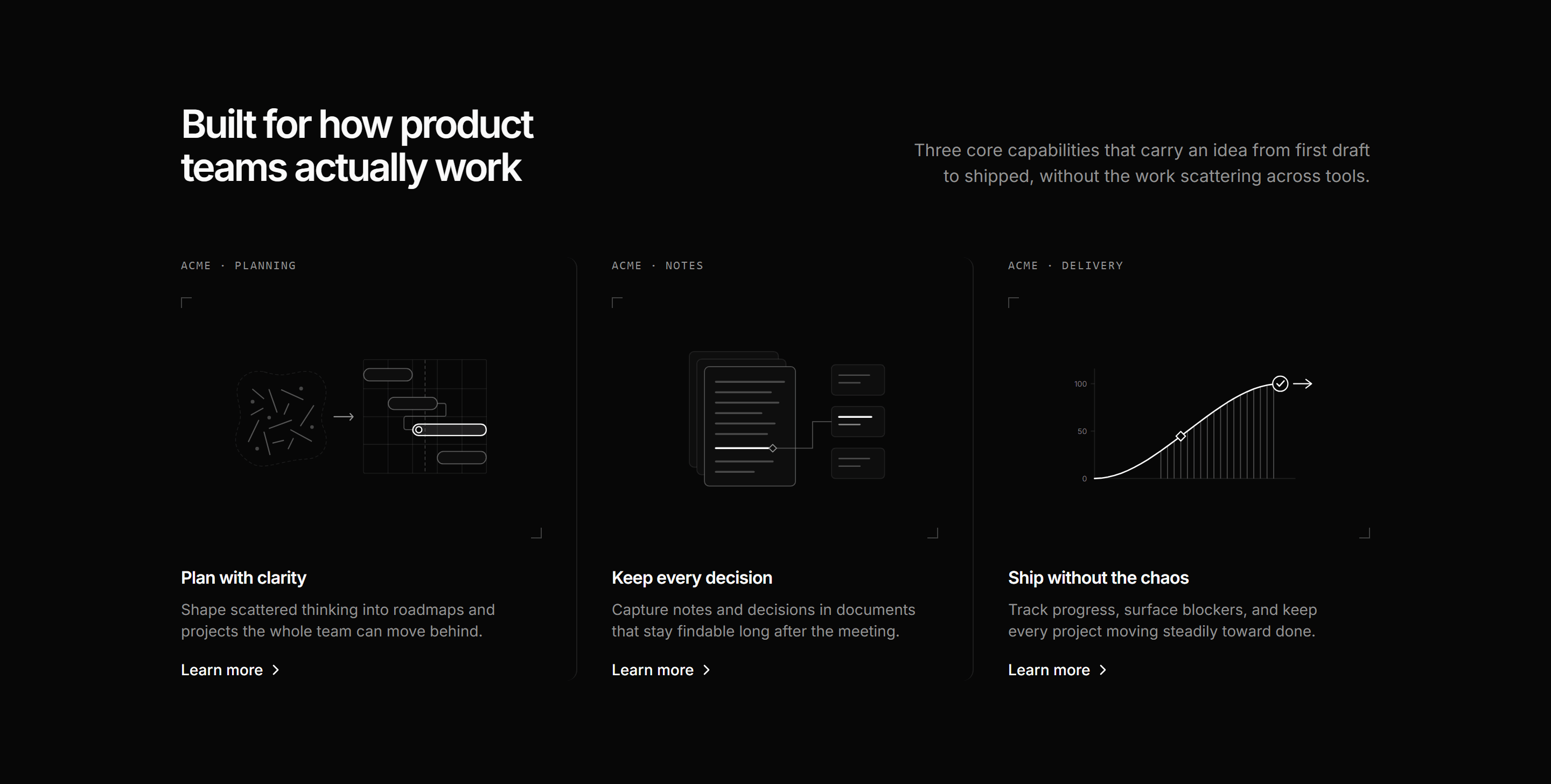
Modern SaaS Feature: Capability Columns
A split lead over three capability columns, each framing a schematic SVG figure with corner crop marks, a caption tag, and a Learn more cue.
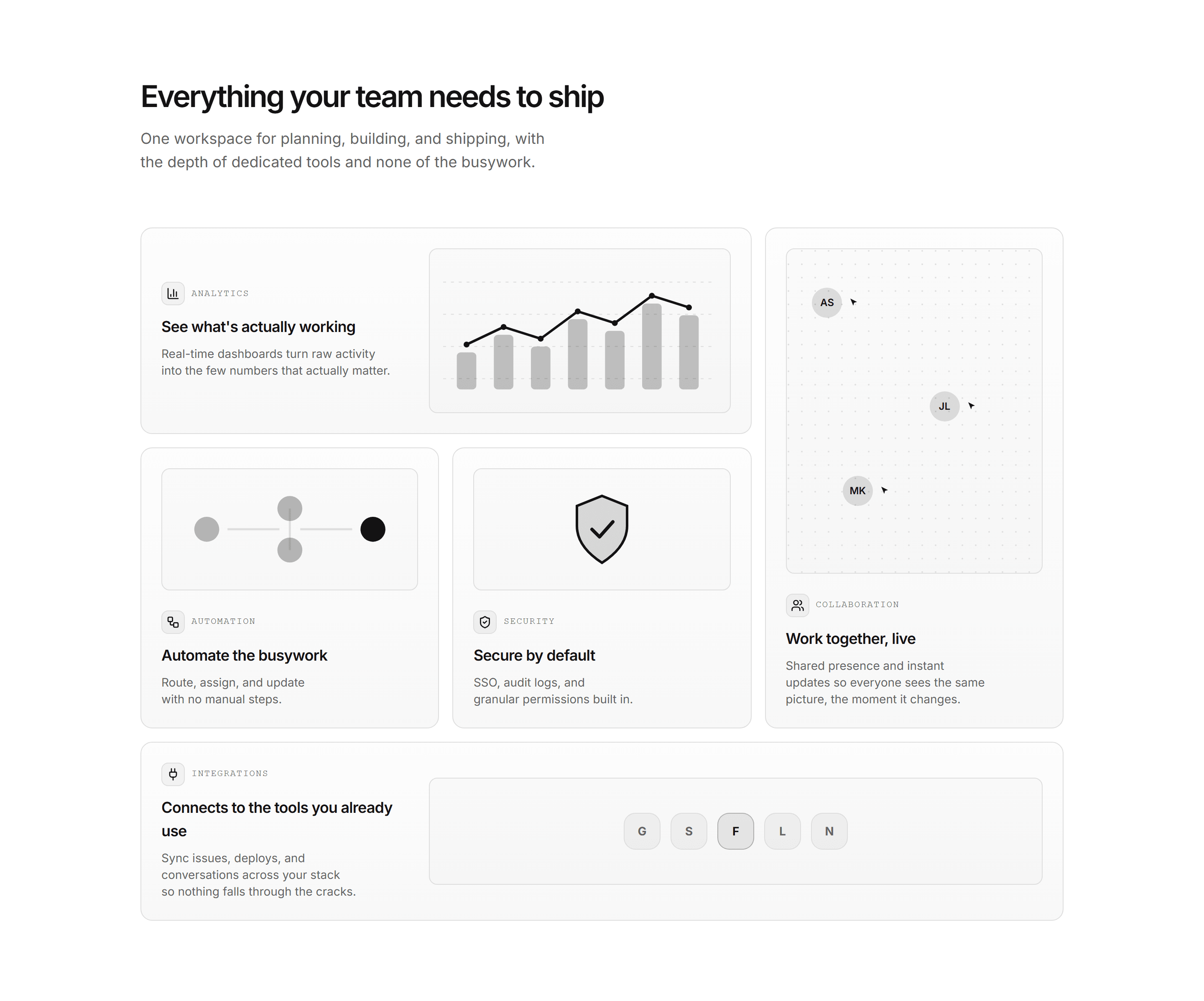
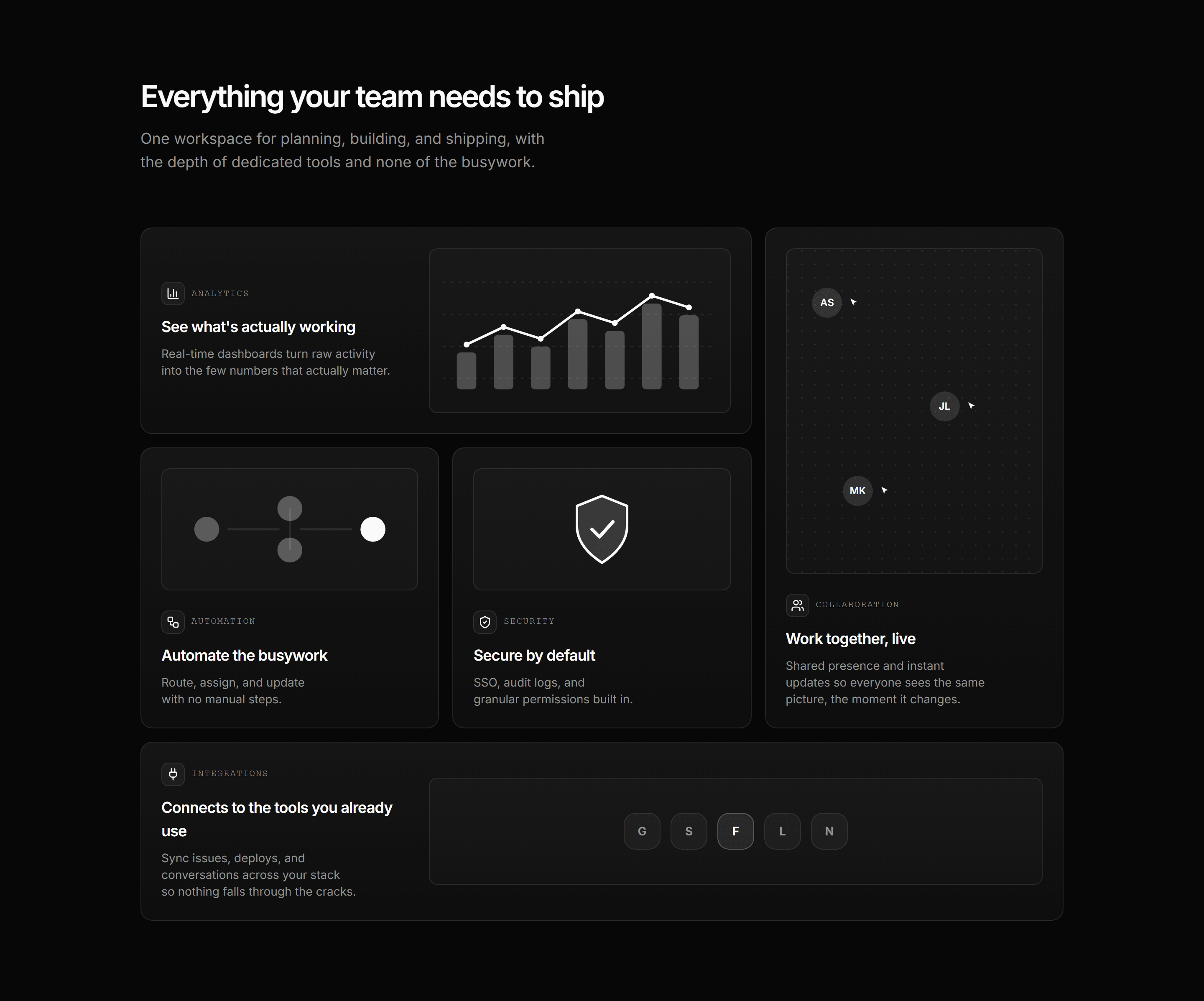
Modern SaaS Feature: Bento Grid
An asymmetric bento feature grid with a custom SVG illustration in every cell: analytics, collaboration, automation, security, and integrations. A clean, minimal overview.
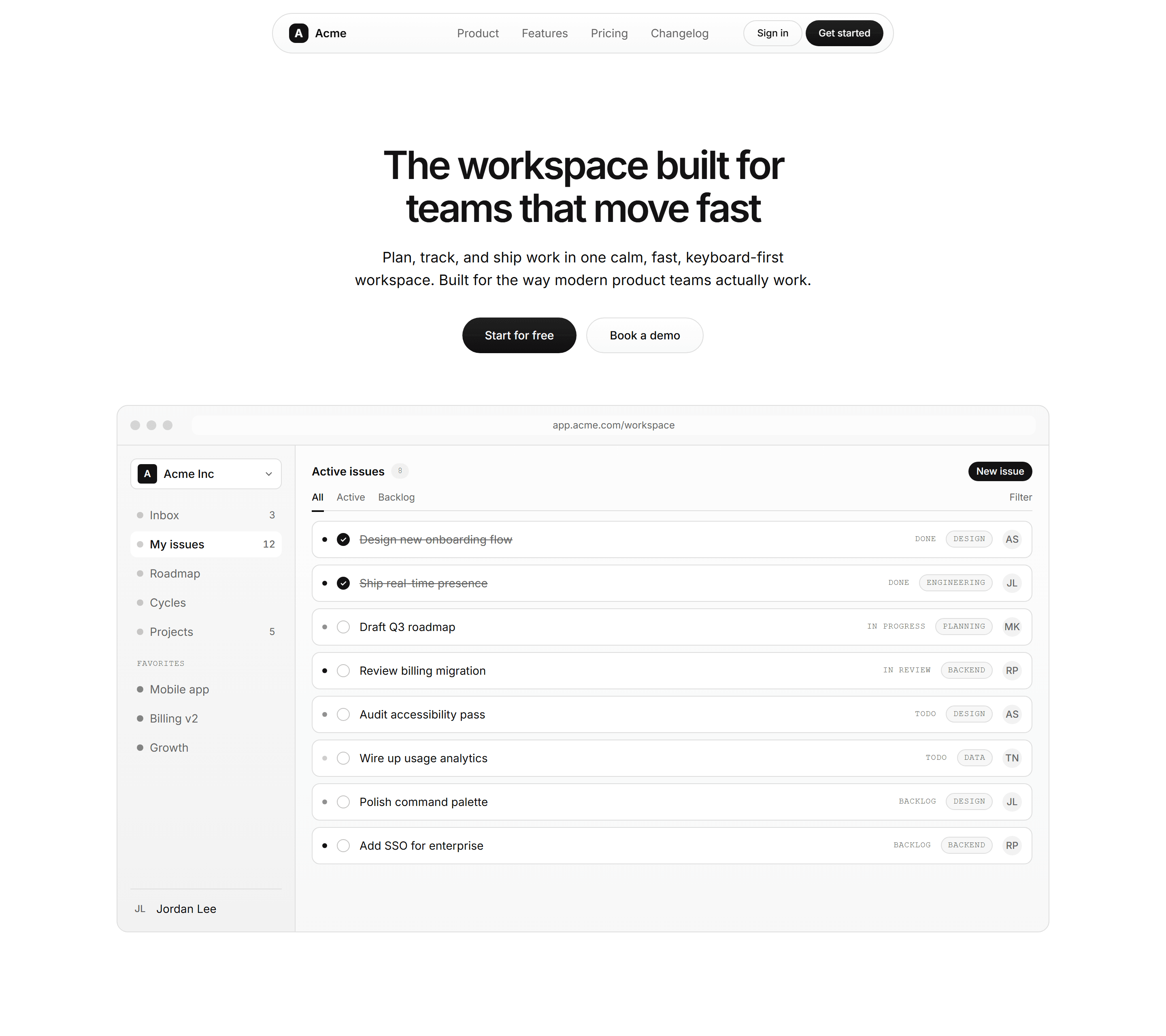
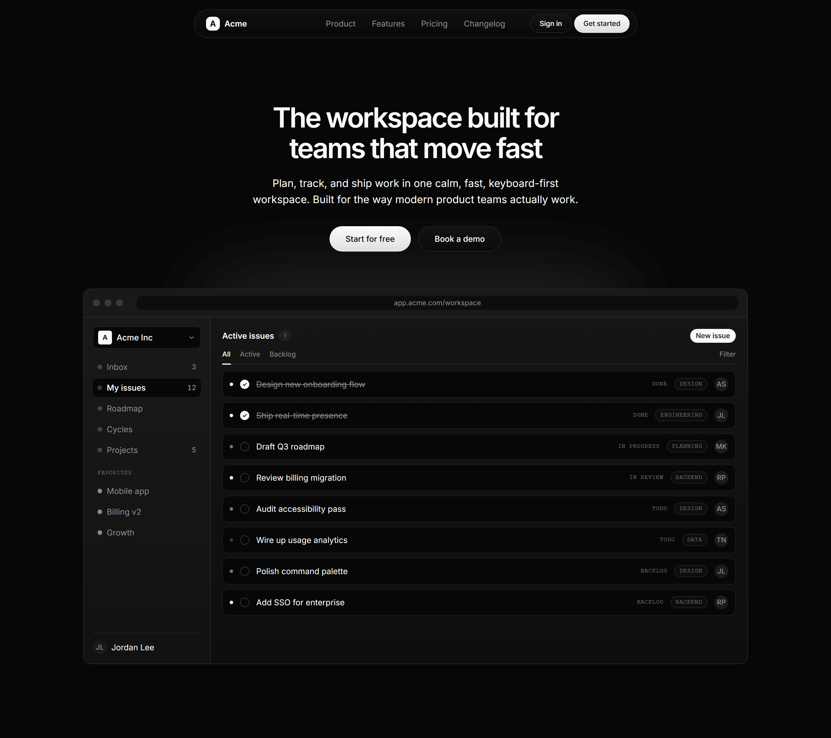
Modern SaaS Hero: Centered With Product Image
A centered hero with a bold headline, lede, and dual CTAs above a sleek app window mockup, topped by a sticky oval navbar. A clean, modern opener for product launches.
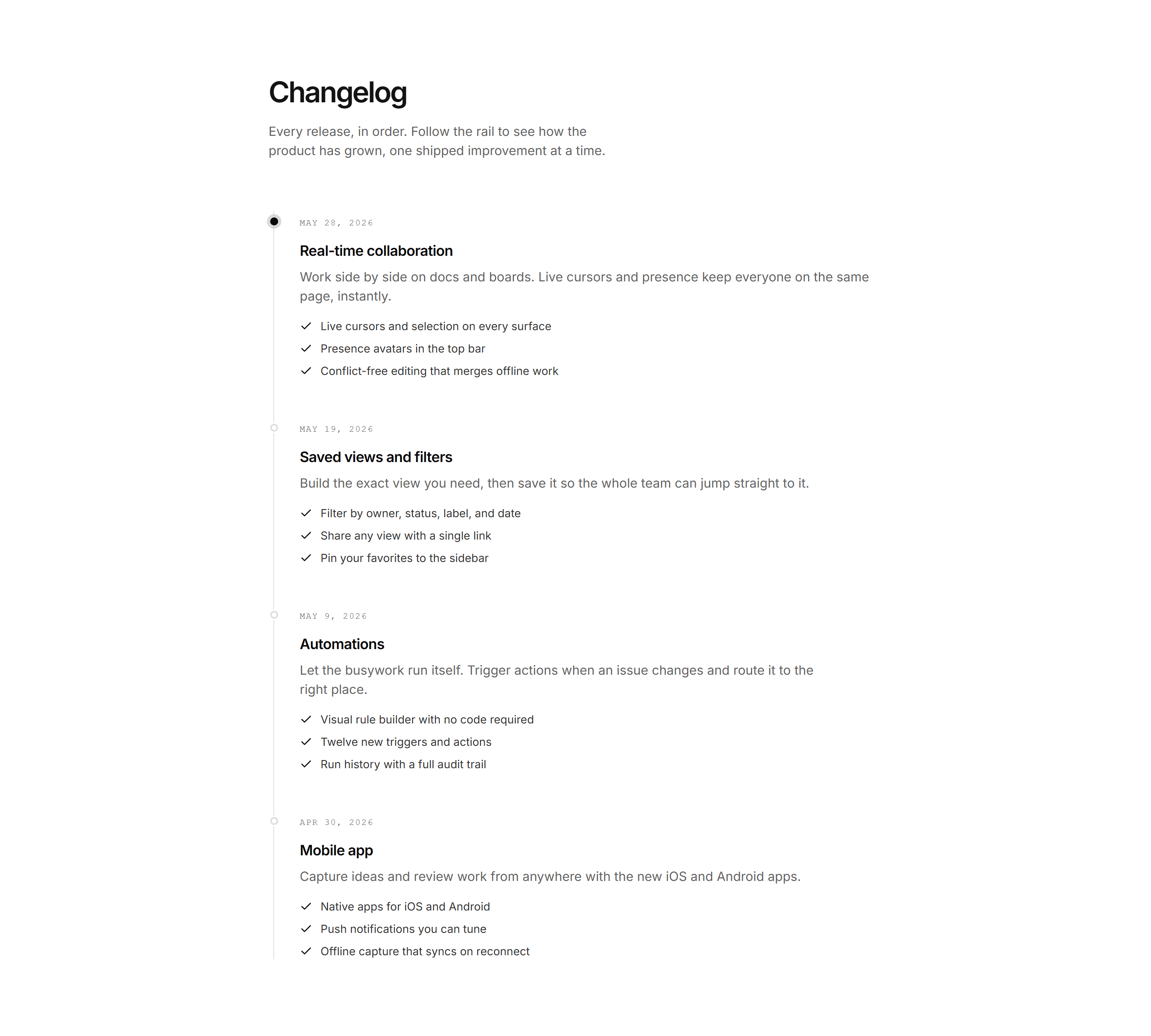
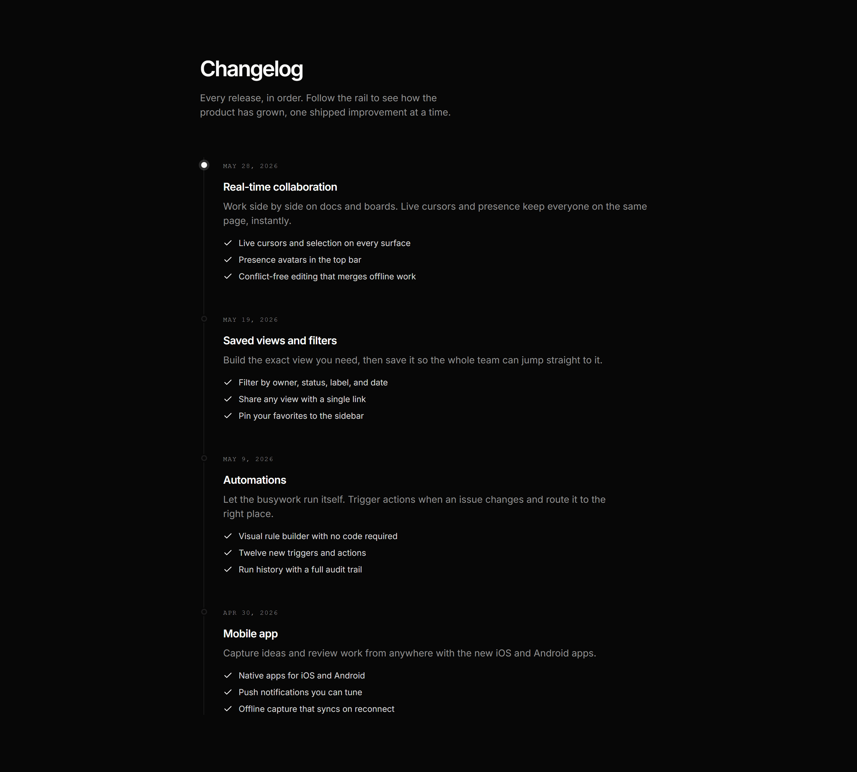
Modern SaaS Changelog: Vertical Timeline
A vertical changelog feed: a single rail of releases, each with a dot, date, title, summary, and a bulleted list of what changed. The newest release is highlighted.
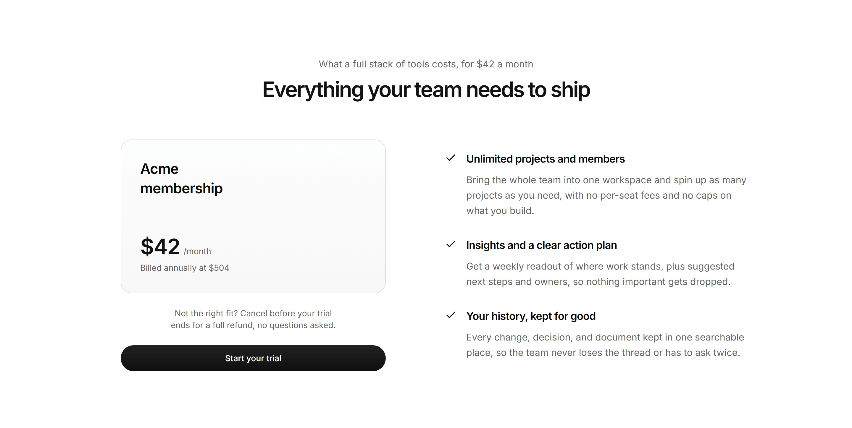
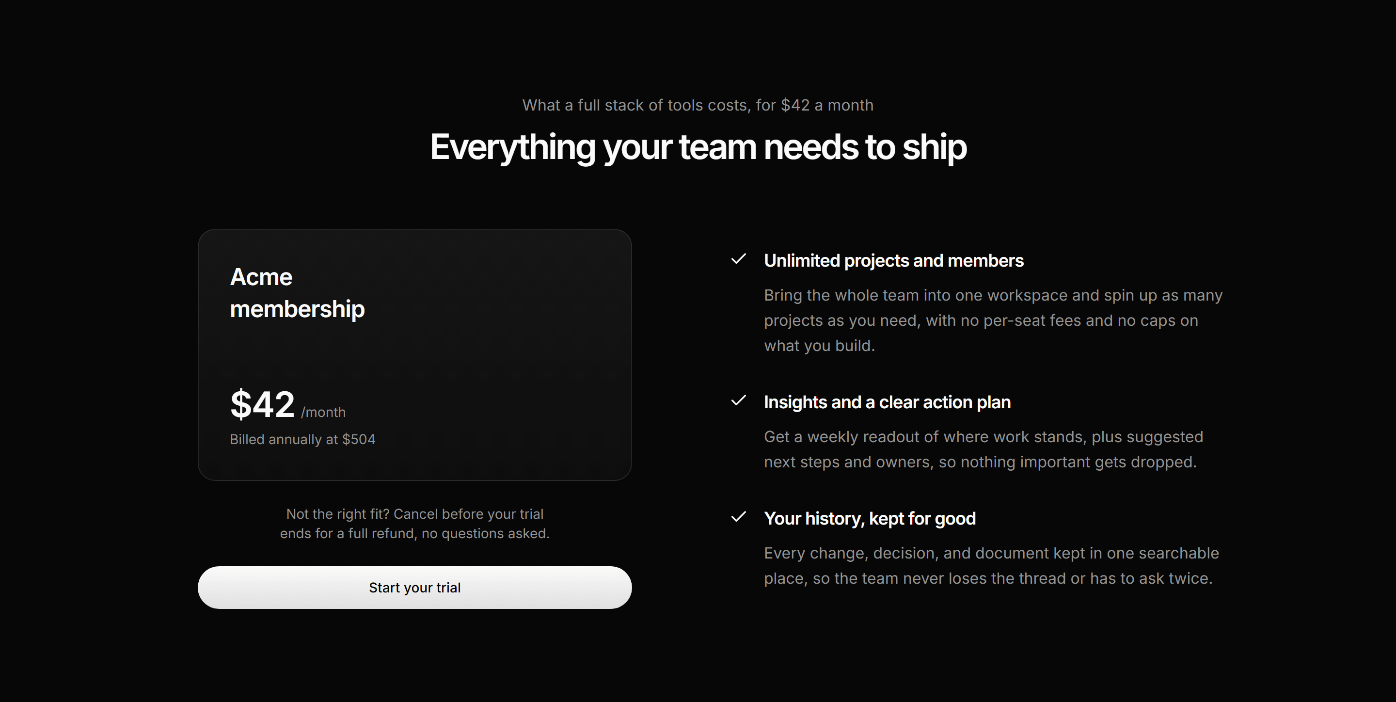
Modern SaaS Pricing: Membership
A single membership plan: a price card with an annual note and refund line beside a checked list of what the plan includes.


Modern SaaS CTA: Selfserve FAQ Strip
A self serve strip: a gentle redirect for contact page visitors whose answer already exists, pointing at the FAQ.


Modern SaaS About: Team Stats Interlude
A quiet company facts interlude: two large proof stats split by a hairline, followed by a single transitional statement line about the team.
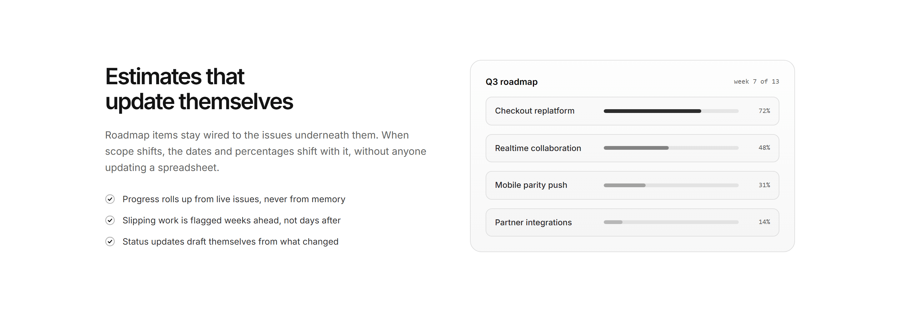
Modern SaaS Feature: Split Checklist Panel
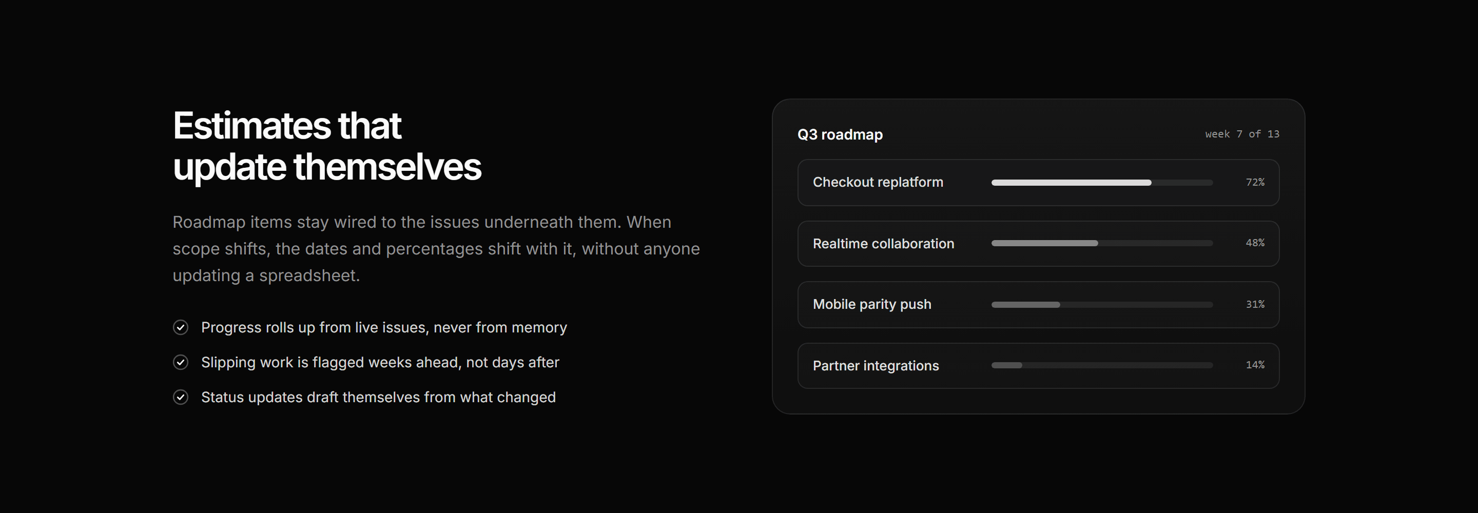
A split highlight: heading, lede, and checklist beside a roadmap panel of initiative rows with stepped progress meters.
Modern SaaS Career: Open Roles List
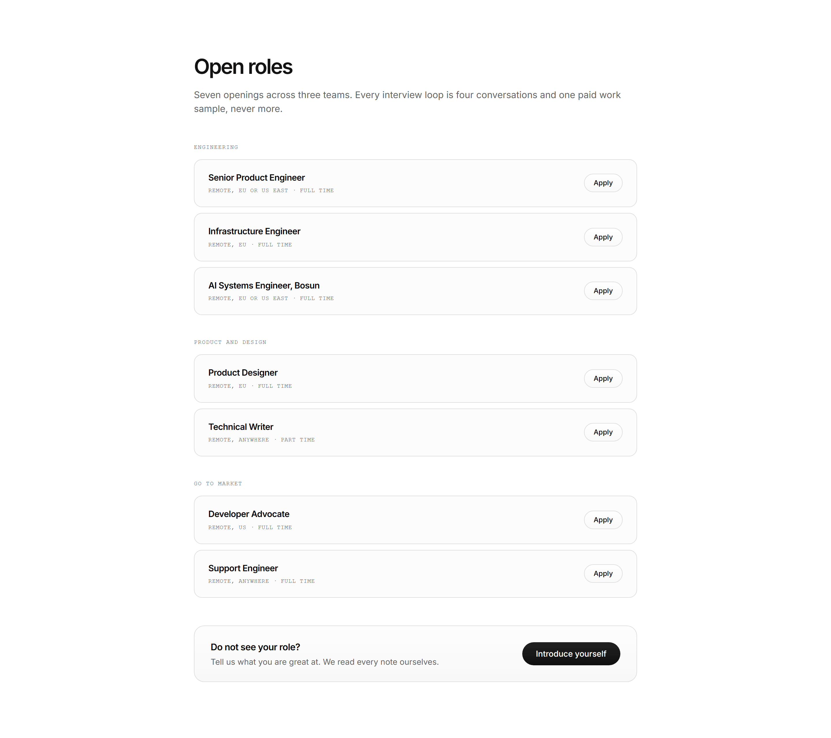
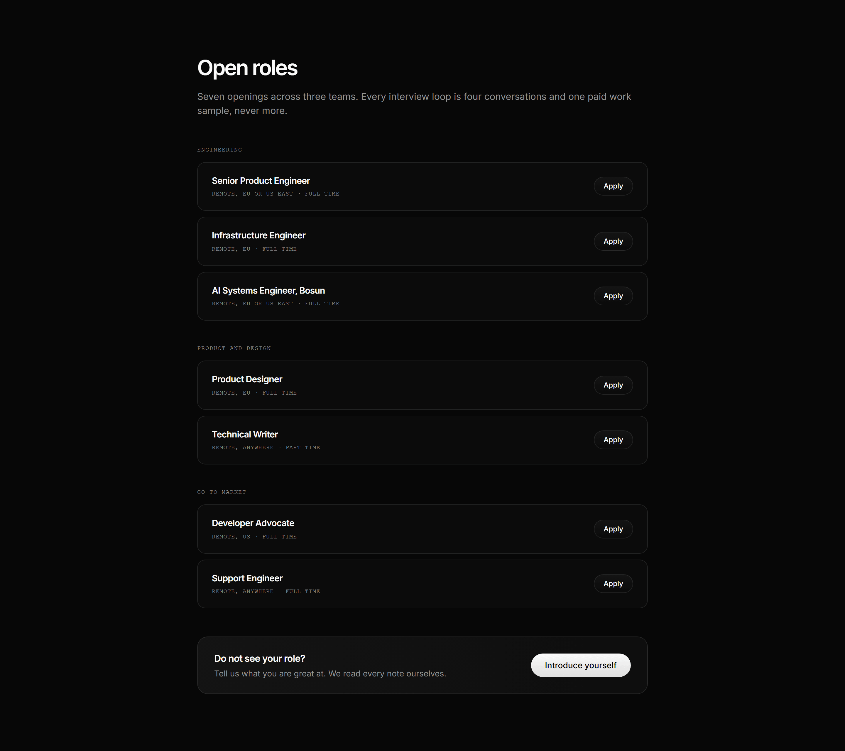
An open roles section: mono team labels over quiet role tiles with location and contract details, ghost apply pills, and a strip for unlisted roles.