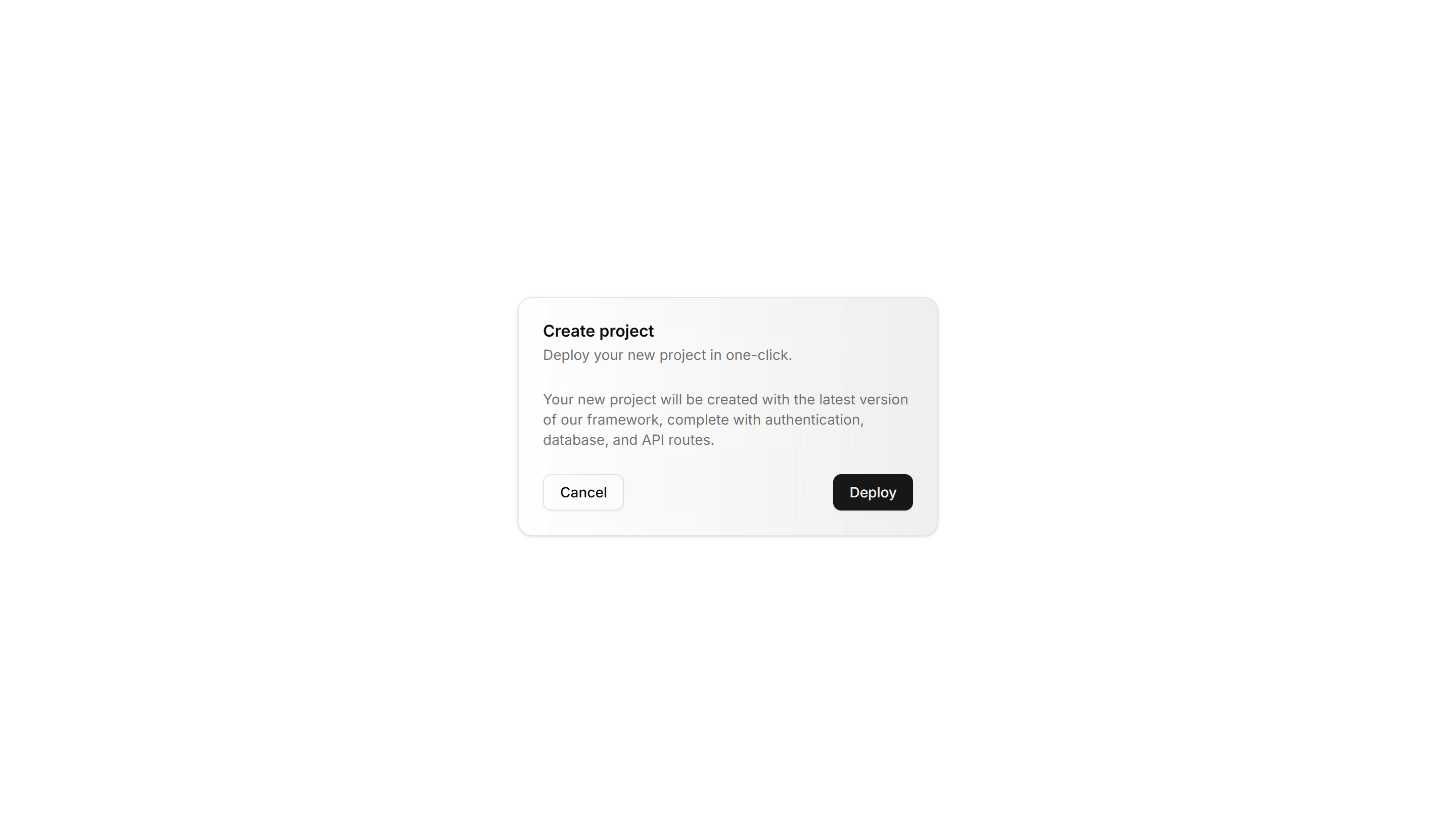
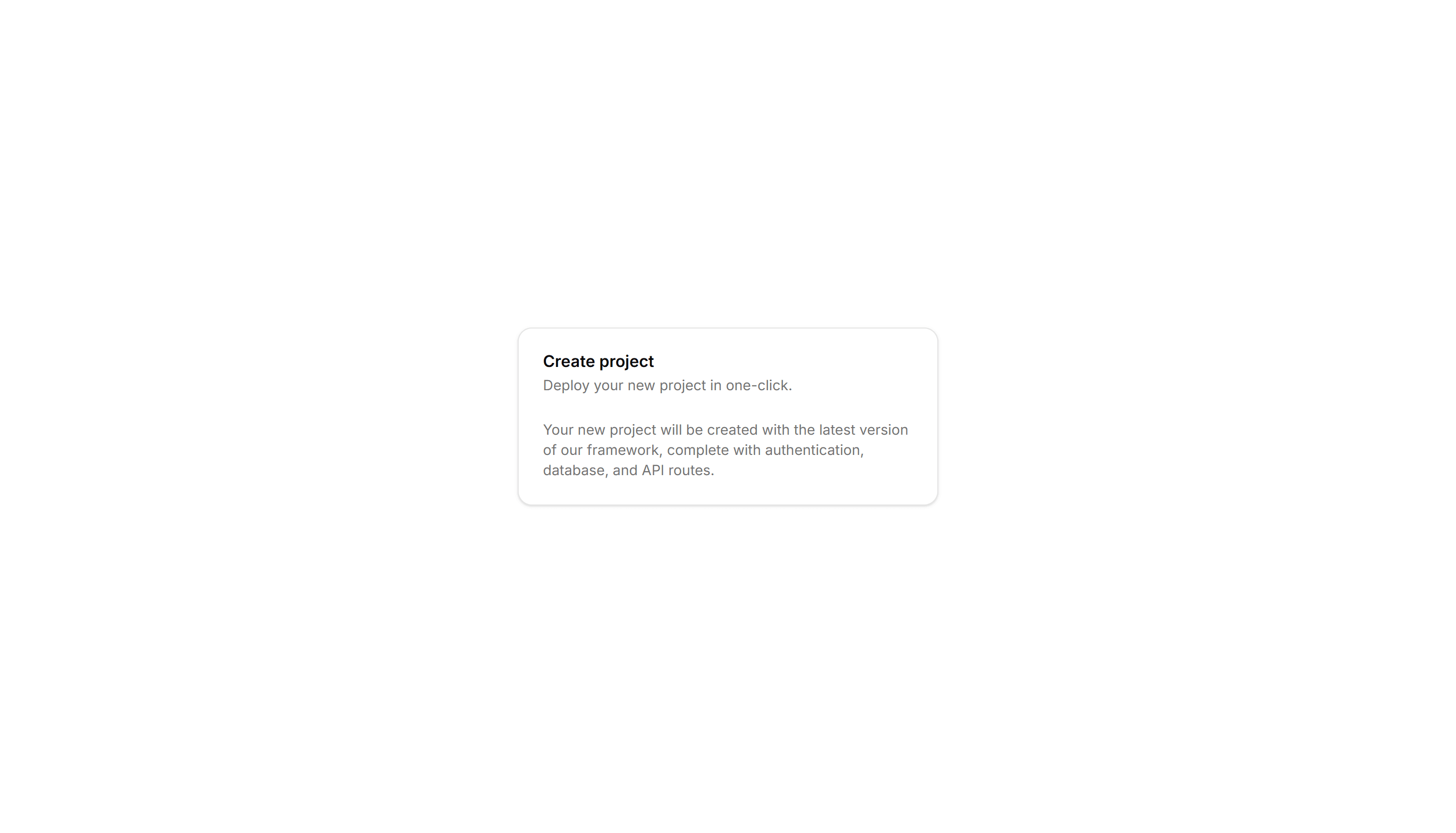
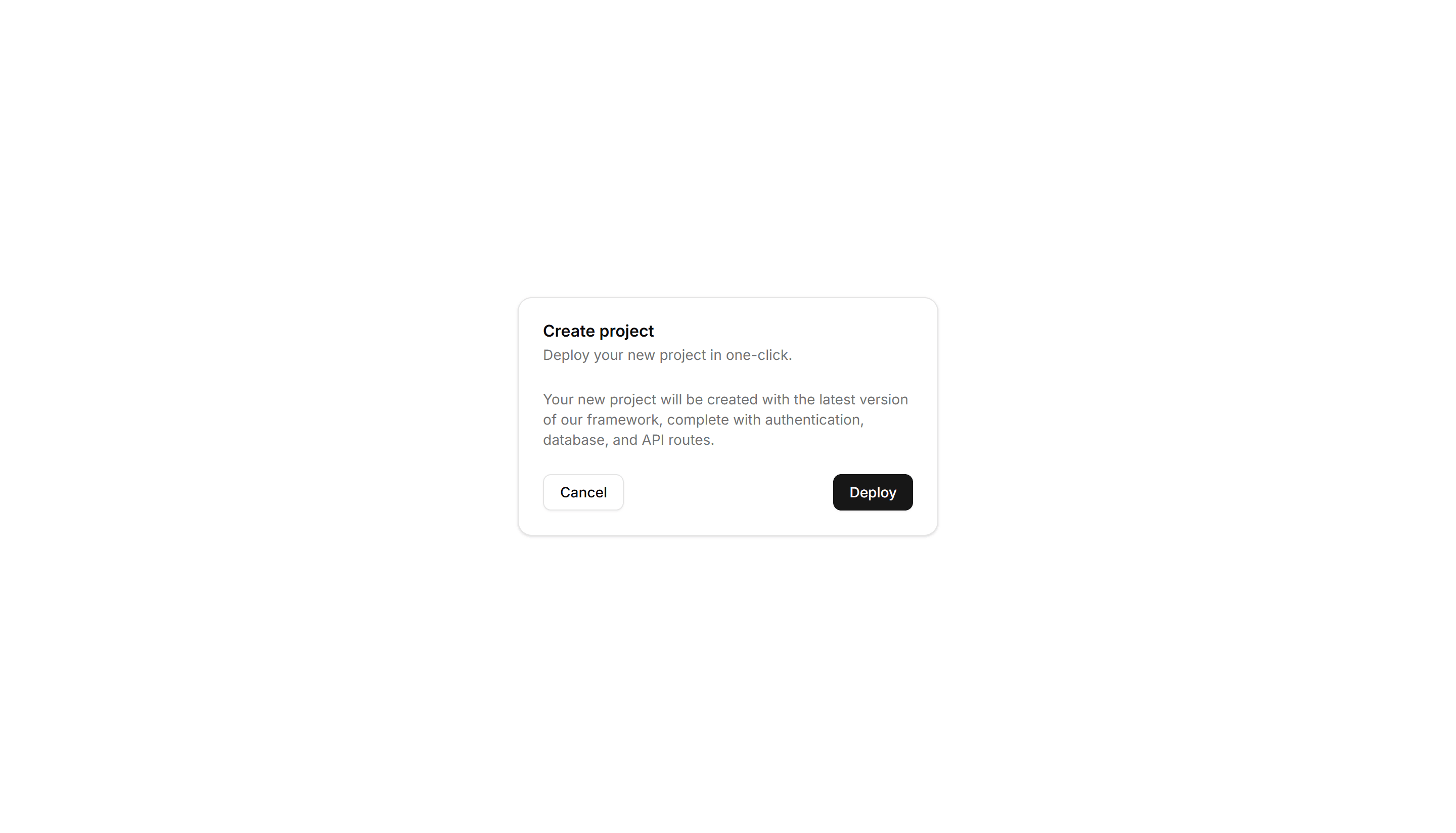
Shadcn Card Blocks
Browse 22 card blocks for shadcn/ui. Bordered, animated, hover, and status variants to frame content, stats, and actions across any page layout.
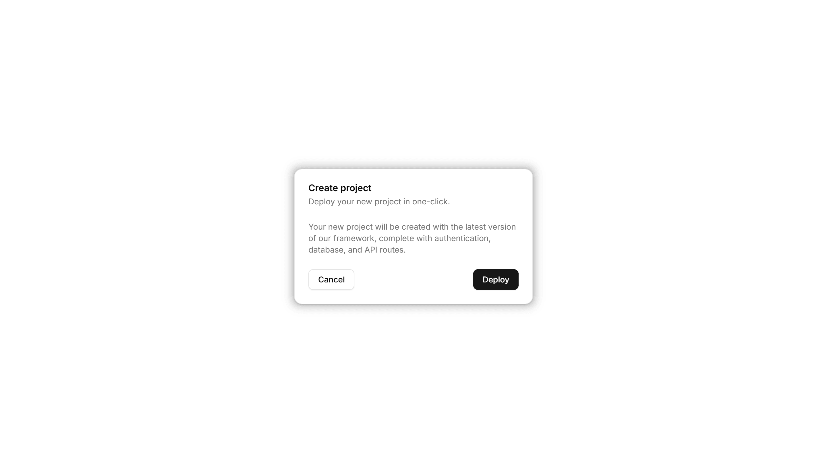
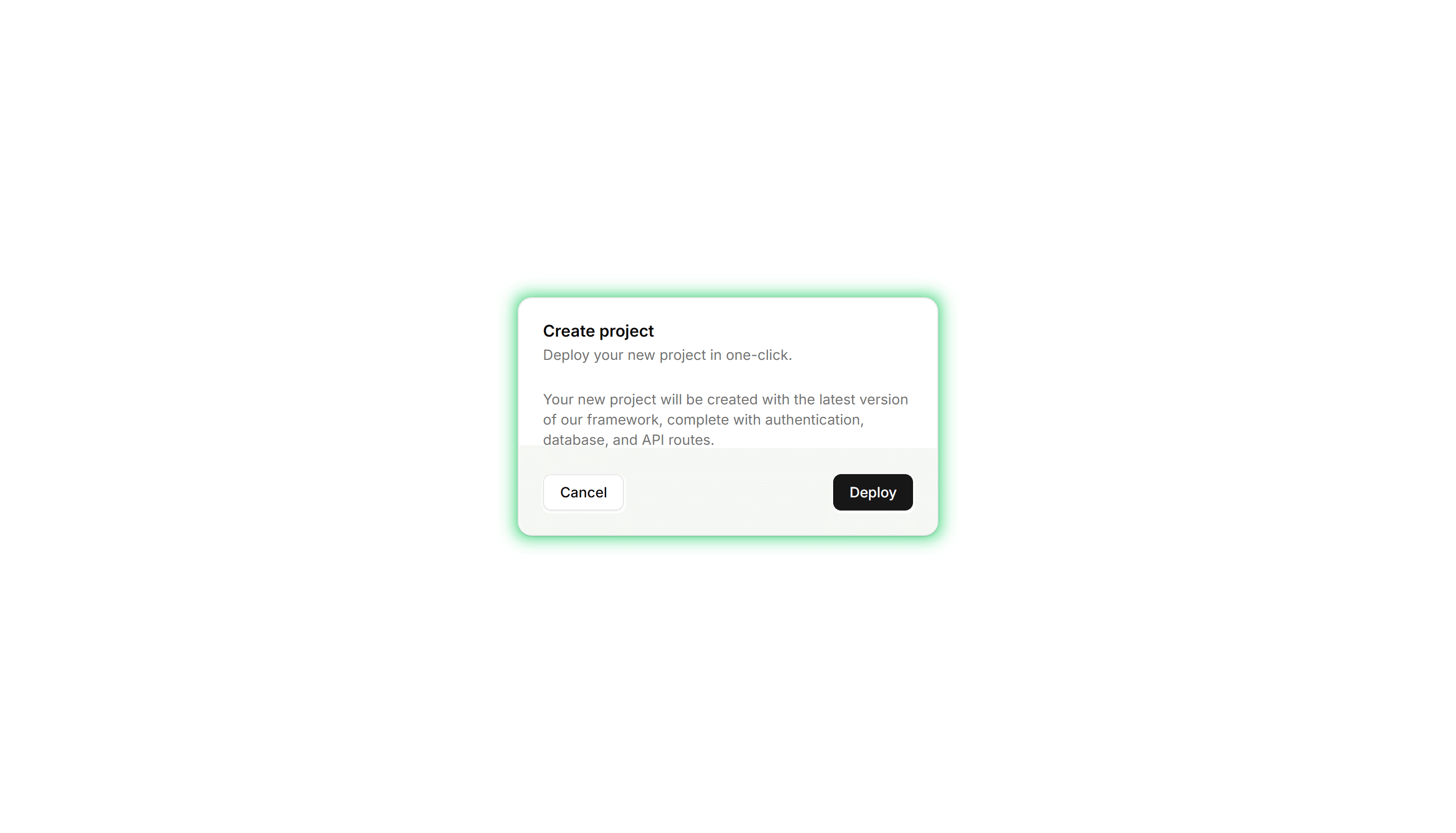
Components Card: Pulse Border Card
A card with a border that pulses softly to draw a glance over. Use it for live alerts, fresh items, or a call to action that should feel active now.
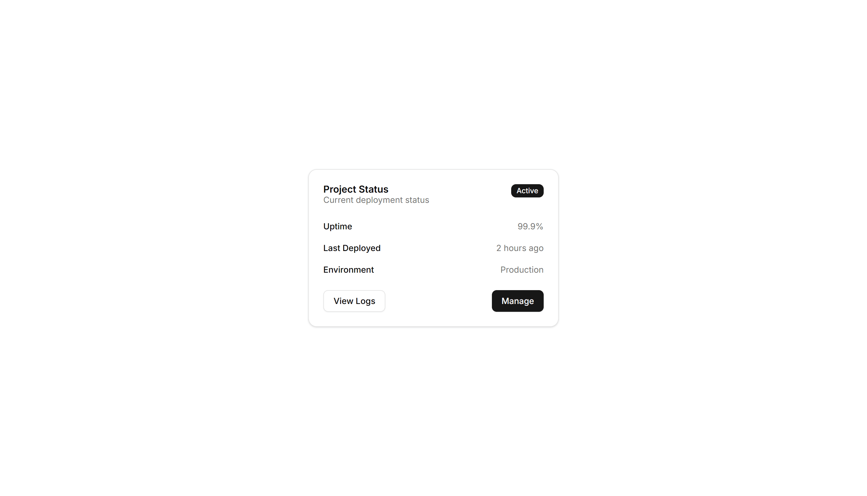
Components Card: Status Card
A card showing a state badge, label, and short note together. Use it on dashboards to surface health, order, or system status at a quick glance.
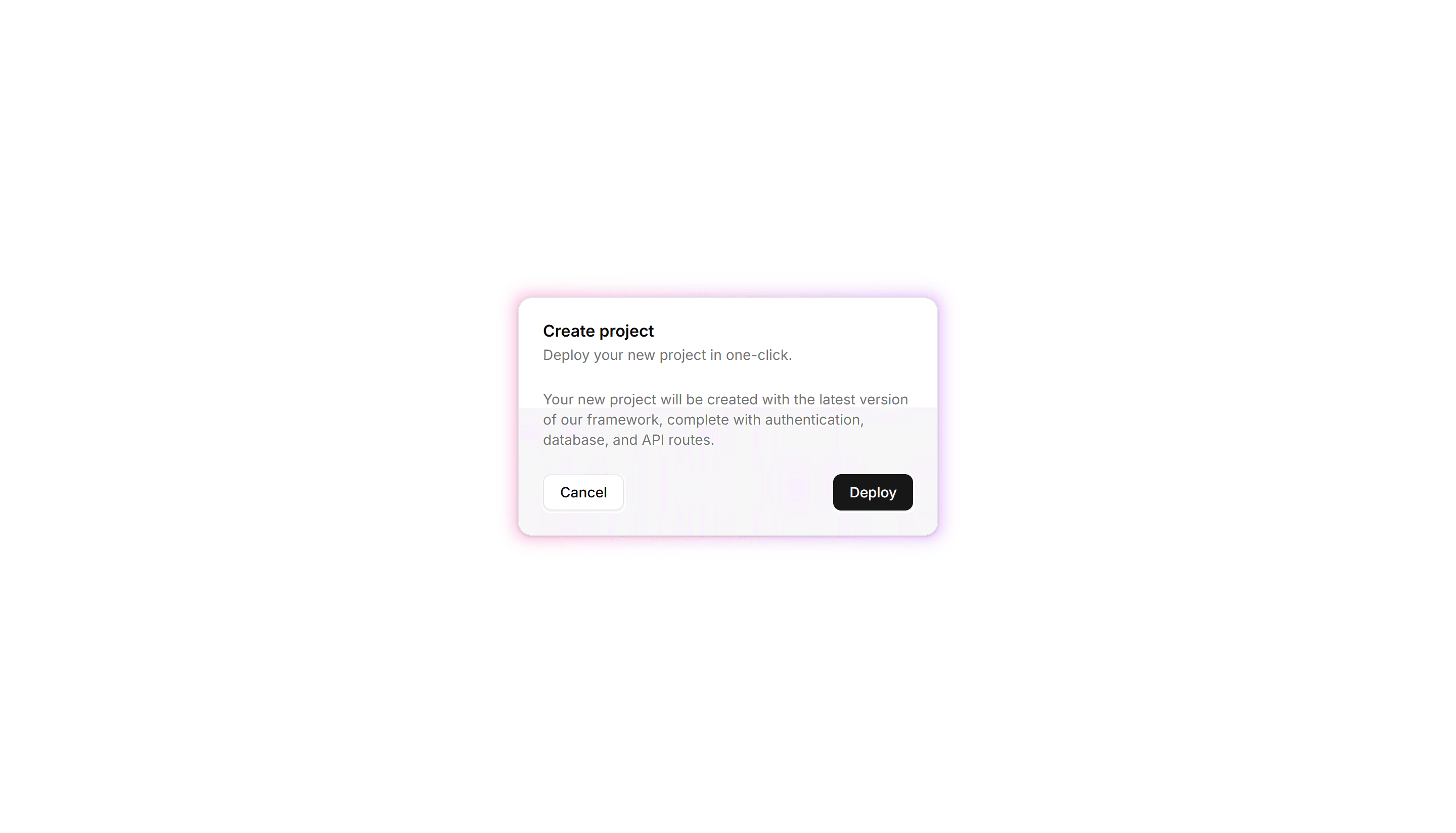
Components Card: Gradient Border Card
A card edged with a static gradient outline that adds color without noise. Use it to set apart a key offer or profile in an otherwise plain grid.

Components Card: Icon Card
A card led by a single icon above a short title and blurb. Use it for feature grids, service lists, or steps where a glyph anchors each point made.
Components Card: Perspective Hover Card
A card that rotates in 3D space as the pointer crosses it for depth. Use it for hero items or showcases where motion makes a tile feel tactile.

Components Card: Border Animation Card
A card whose border traces a moving outline around the edges. Use it to spotlight a featured plan, offer, or item that needs attention on the page.
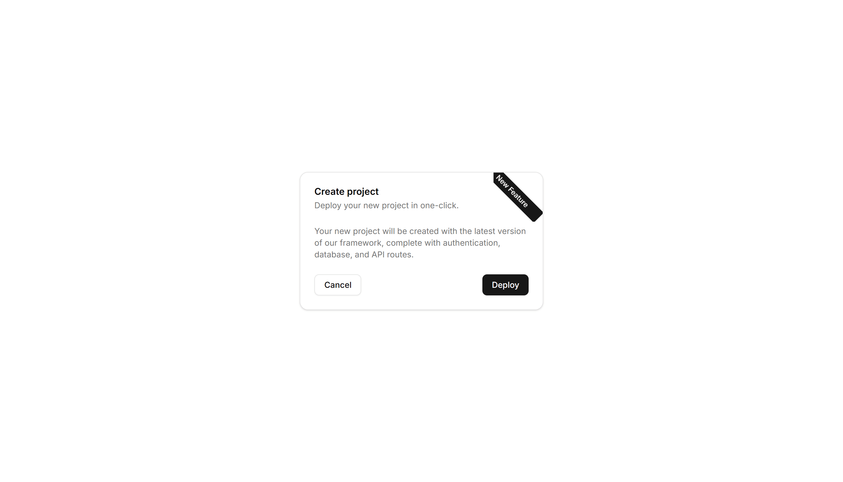
Components Card: Corner Ribbon Card
A card with a diagonal ribbon pinned to one corner for a short label. Use it to flag New, Sale, or Featured items in a product or listing grid.

Components Card: Double Border Card
A card wrapped in two stacked outlines for a framed, formal look. Use it for certificates, awards, or quotes that deserve emphasis on the page.
Components Card: Shimmer Effect Card
A card with a light sweep that glides across its surface. Use it as a loading skeleton or to add gentle motion to a featured tile in a busy grid.

Components Card: Tilt Effect Card
A card that tilts under the cursor to follow its position closely. Use it for interactive feature tiles or showcases where slight motion adds polish.

Components Card: Hover Effect Card
A card that lifts, scales, or shades when the pointer moves over it. Use it for clickable tiles in a gallery, menu, or dashboard to signal they react.

Components Card: Magnetic Card
A card that drifts toward the cursor as it nears, with a subtle pull. Use it for playful landing pages or feature tiles that reward a hovering pointer.
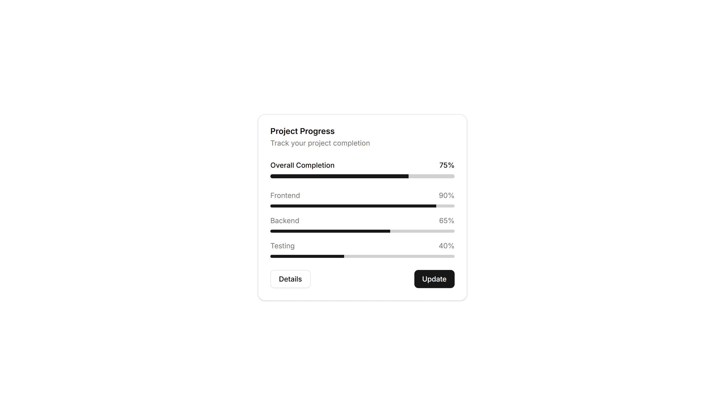
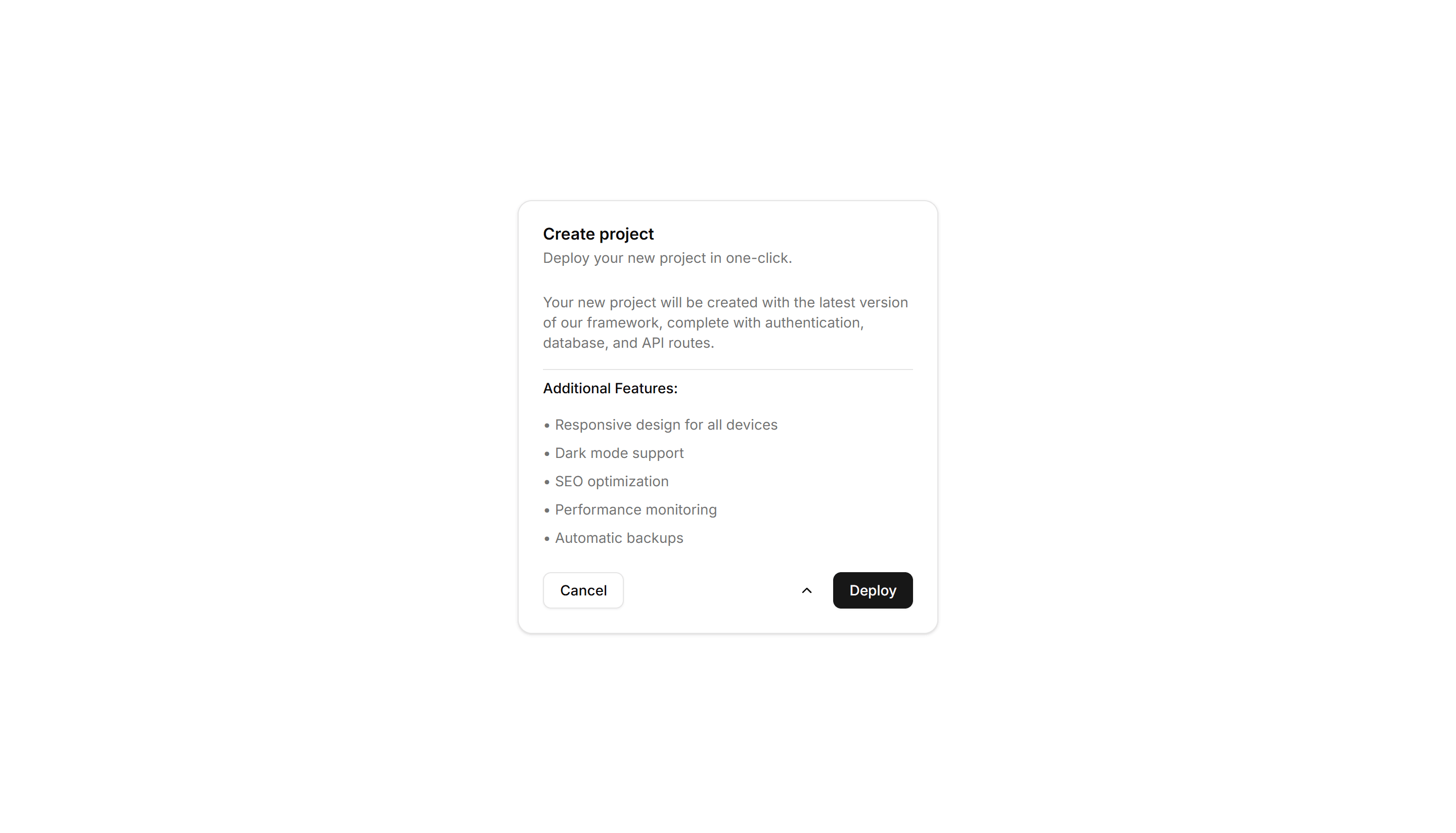
Components Card: Progress Card
A card pairing a progress bar with a label and value reading. Use it to show task completion, goals, or usage limits inside a dashboard or account view.

Components Card: Border Gradient Animation Card
A card framed by a shifting gradient border that flows around the edges. Use it to highlight a premium tier or hero item in a grid of options.

Components Card: Cutout Border Card
A card with a notched border that carves out shape along its edge. Use it for tickets, coupons, or passes where a distinct outline reads as a stub.
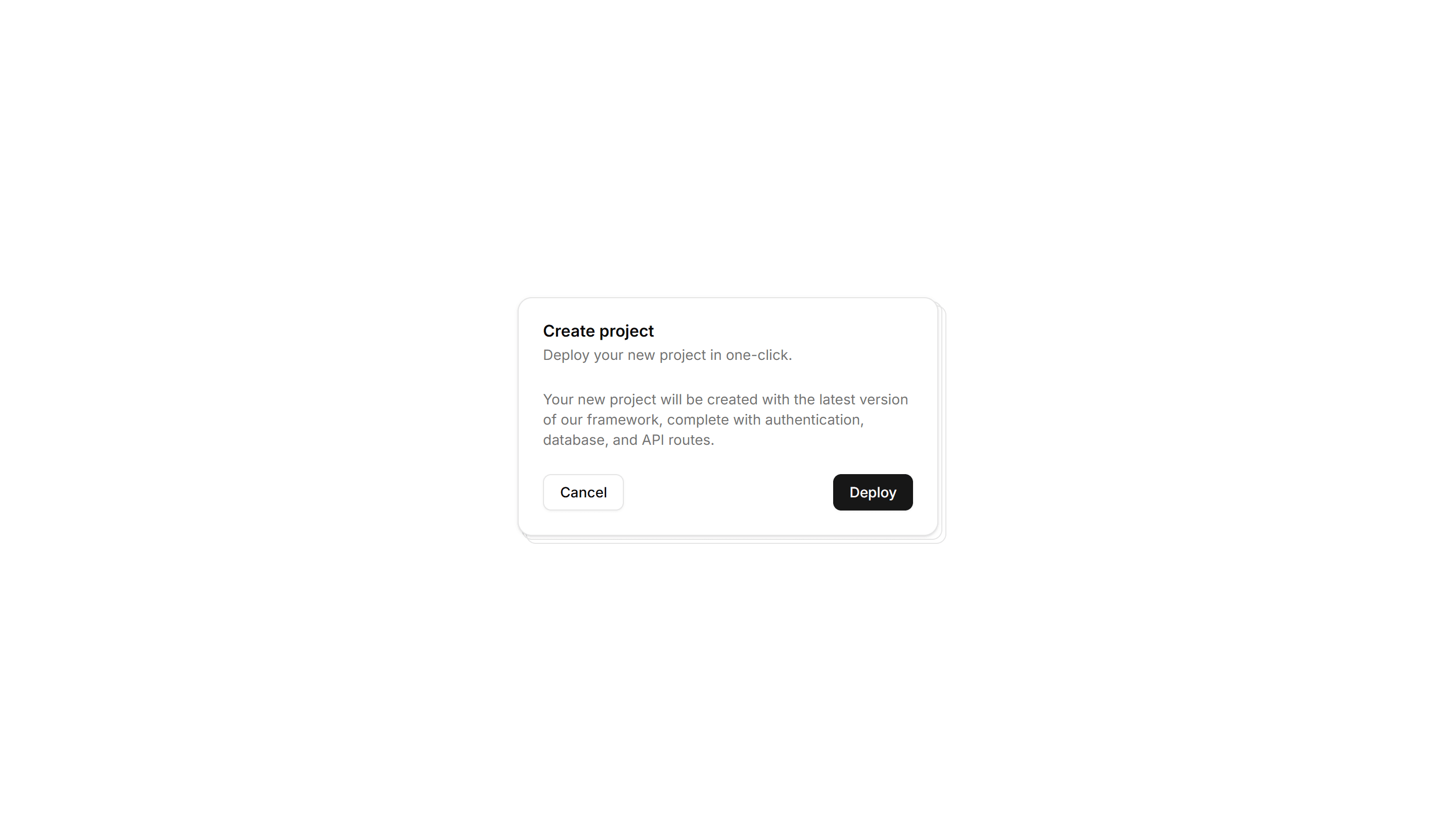
Components Card: Stacked Card
A card layered over offset copies to suggest a deck behind it. Use it for collections, albums, or grouped items where many sit under one cover here.
Components Card: Expandable Card
A card that grows to reveal more text or controls when opened. Use it for FAQs, settings, or summaries that hide detail until the reader wants it.
Components Card: Hover Reveal Card
A card that hides extra text or actions until hover uncovers them. Use it for portfolio tiles or features where the cover stays clean until needed.
Components Card: Neon Border Card
A card ringed by a glowing neon outline that pops on dark backgrounds. Use it for gaming, music, or tech pages where a bright frame fits the mood.
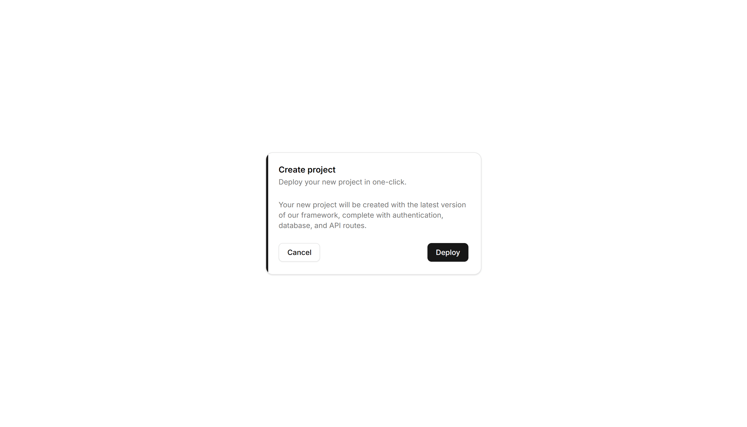
Components Card: Border Accent Card
A card with a colored accent line along one edge that draws the eye. Use it to group related text and labels while signaling category or status.
Components Card: Border Highlight Card
A card that brightens its border when focused or hovered. Use it to mark the recommended choice in a pricing grid or a selected option in a form.

Components Card: Dashed Border Card
A card outlined with a dashed border for a light, sketch feel. Use it for empty states, upload zones, or placeholders that invite the user to add content.