Shadcn Tab Blocks
Browse 8 tab blocks for shadcn/ui. Card, pill, gradient, icon, outline, and vertical styles to split content into panels and switch views fast.
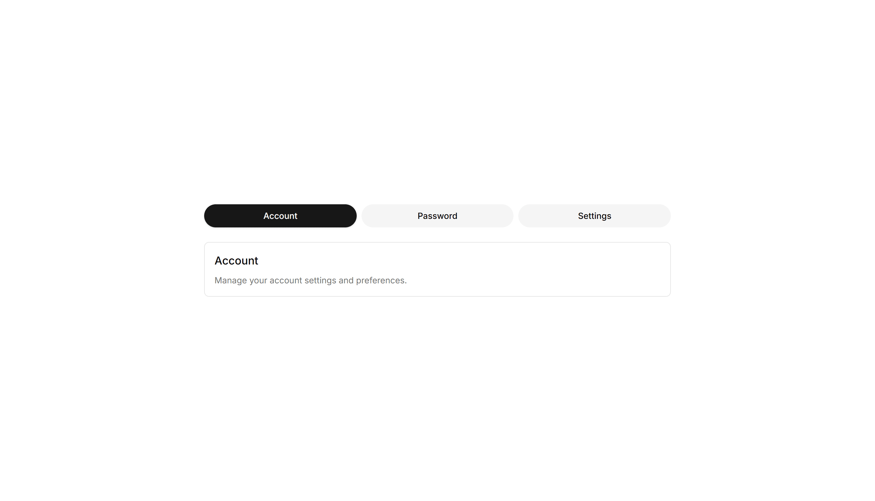
Components Tab: Pill Tabs
Tabs shaped as rounded pills with a filled background on the active one. Ideal for filter bars and segmented controls that toggle between a few short views.
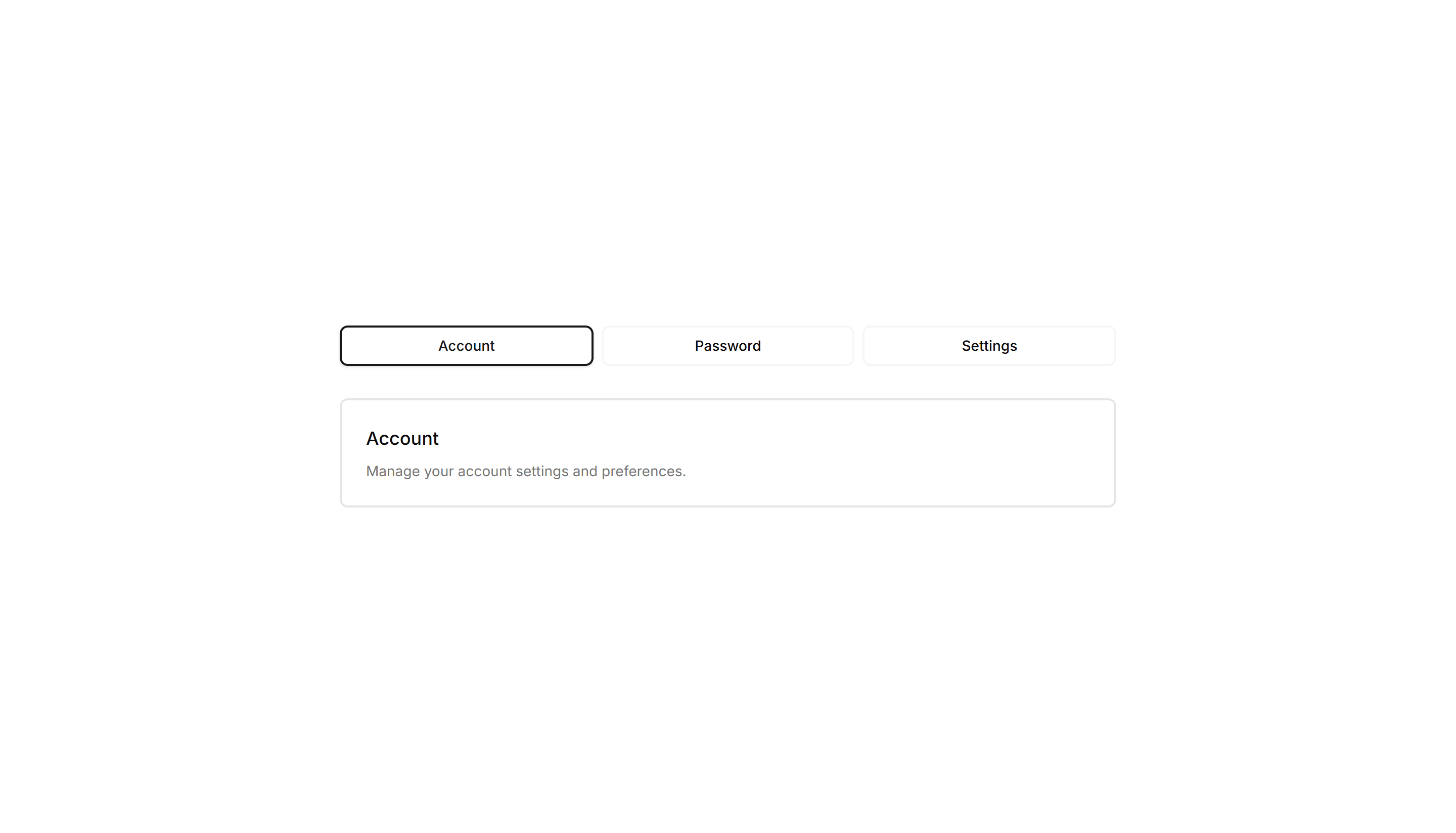
Components Tab: Outline Tabs
Tabs wrapped in a light border that frames each trigger and the active panel. Suits forms or profile screens that need clear structure between grouped fields.

Components Tab: Icon Tabs
Tabs that pair a small icon with each label so options read at a glance. Good for navigation menus and toolbars where space is tight and clarity matters.
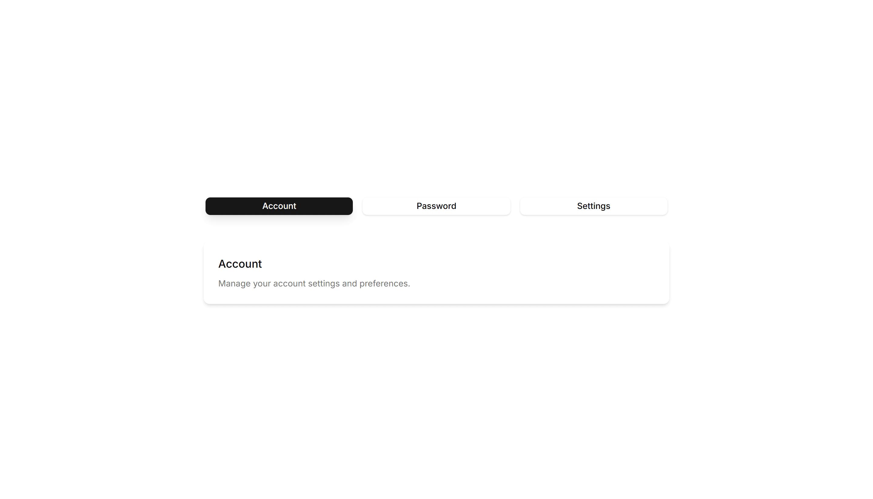
Components Tab: Shadow Tabs
Tabs where the selected trigger gains a subtle drop shadow for depth and focus. Works well on cards and panels that need a tactile, layered feel to the switch.
Components Tab: Card Tabs
Tabs styled as raised cards, where the active panel lifts above the rest. Great for settings pages or dashboards that group related content into sections.
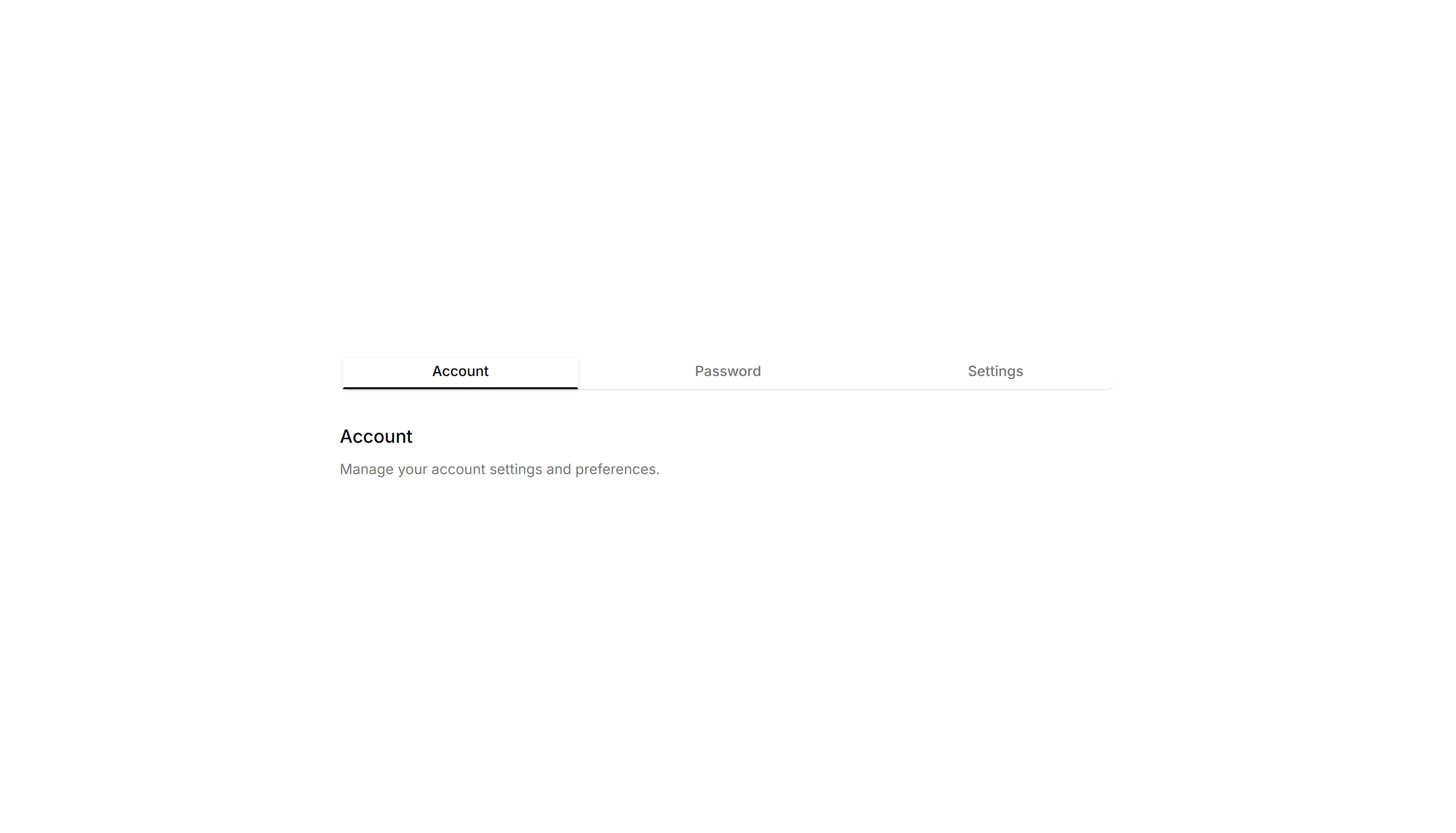
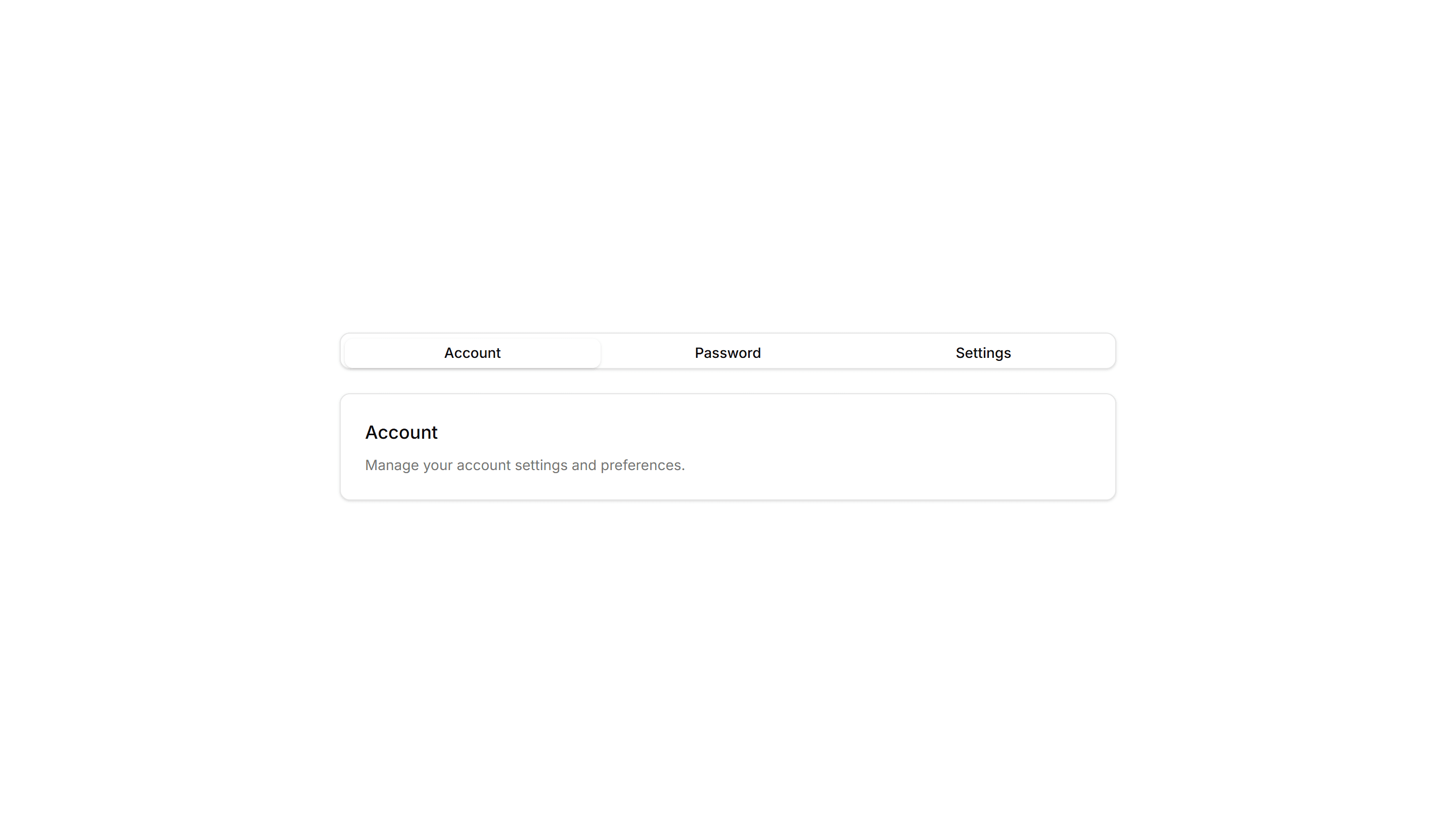
Components Tab: Minimal Tabs
Clean tabs with a thin underline marking the active item and no extra borders. Fits content heavy pages where the switcher should stay quiet and unobtrusive.
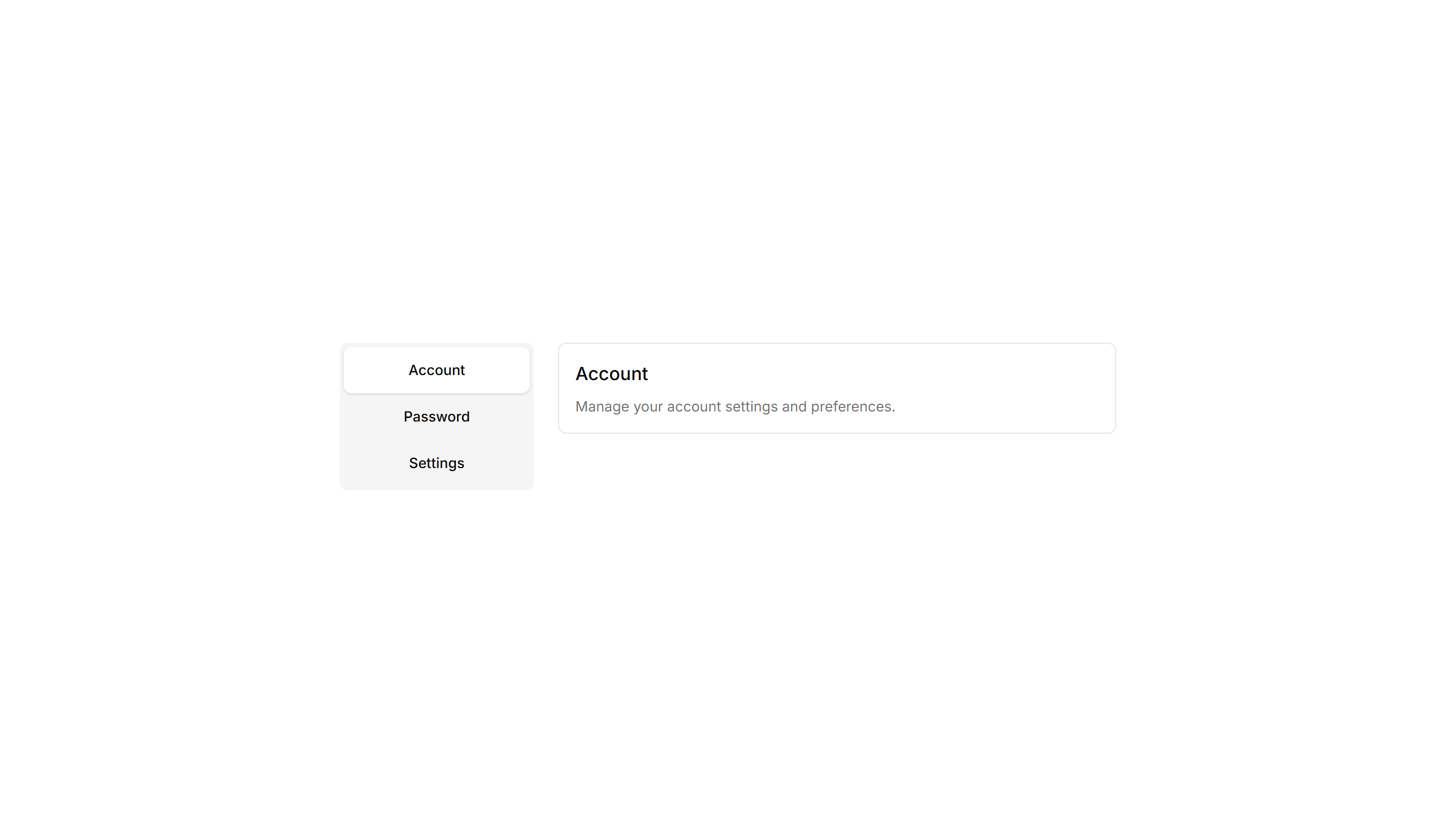
Components Tab: Vertical Tabs
Tabs stacked in a sidebar column with panels rendered to the right. Built for settings, account, and documentation pages with many sections to navigate.
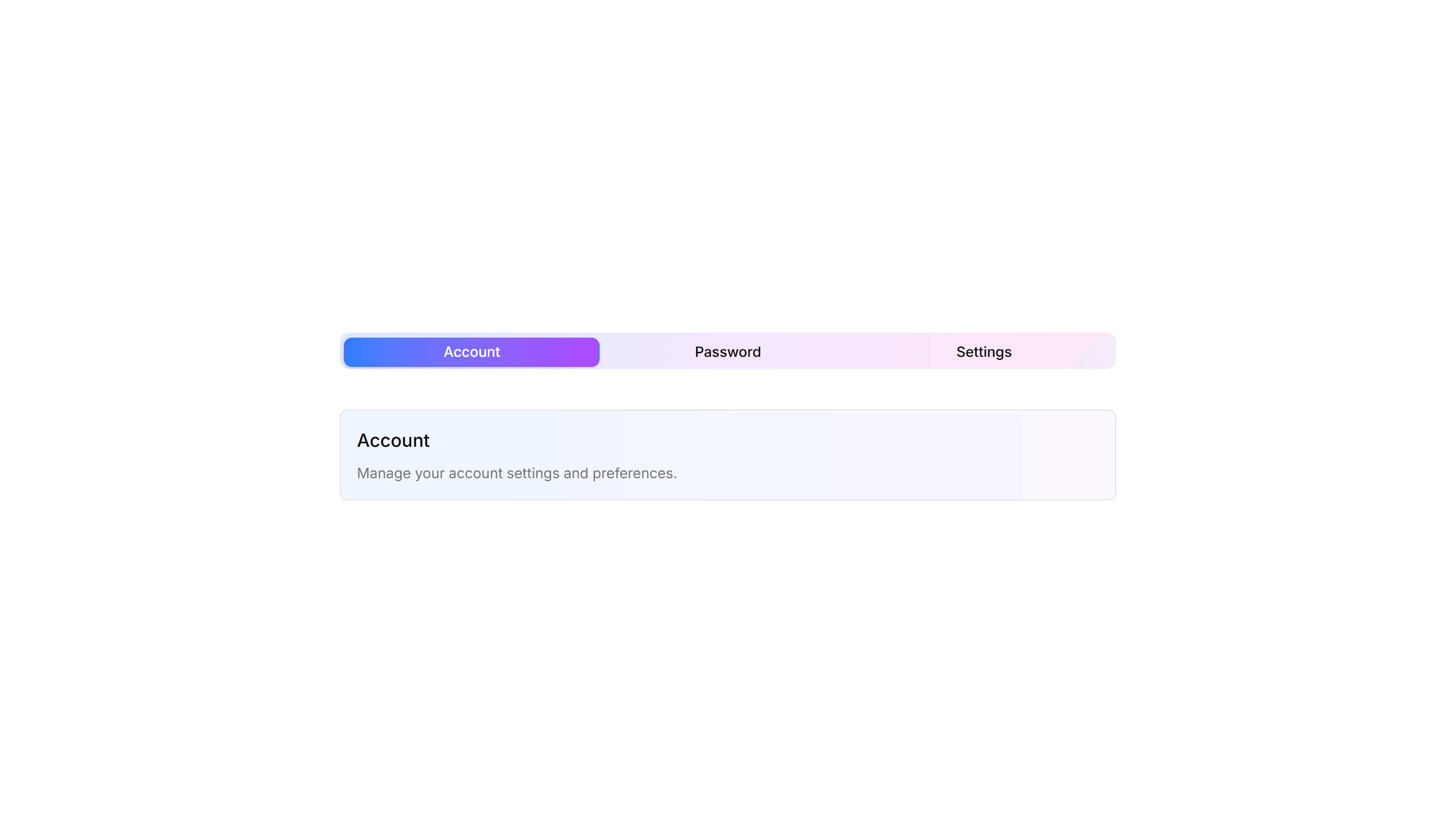
Components Tab: Gradient Tabs
Tabs with a soft color gradient on the active trigger for a vivid accent. Use them on landing pages or feature views where the switcher should draw the eye.