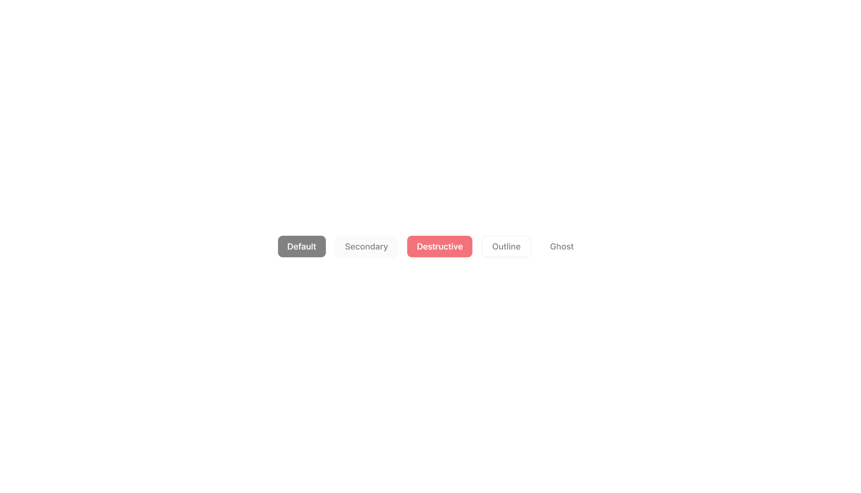
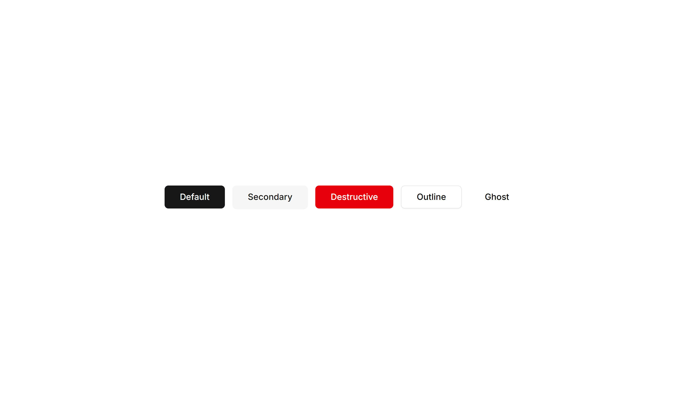
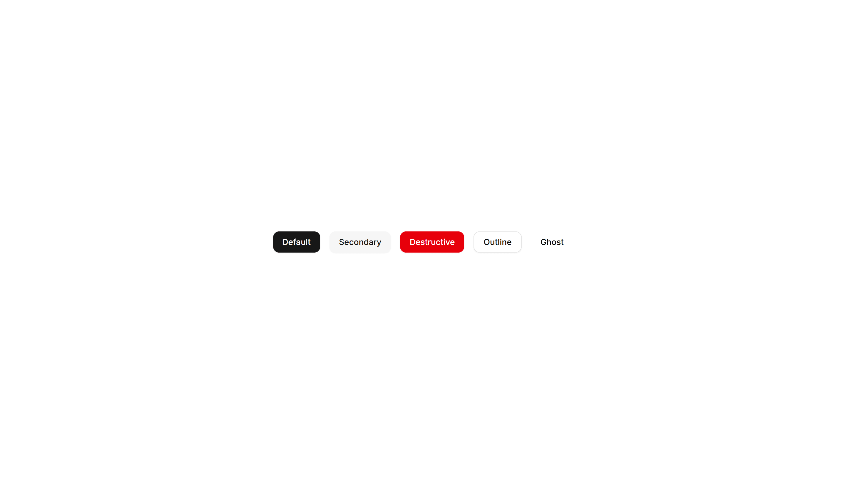
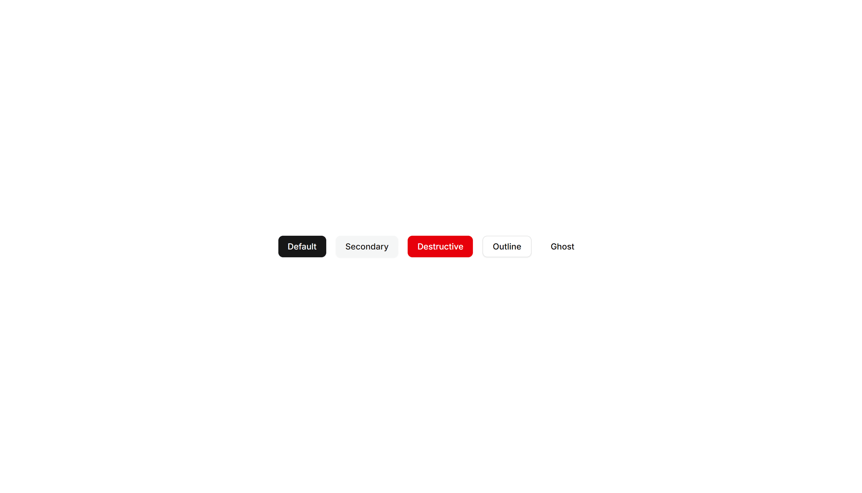
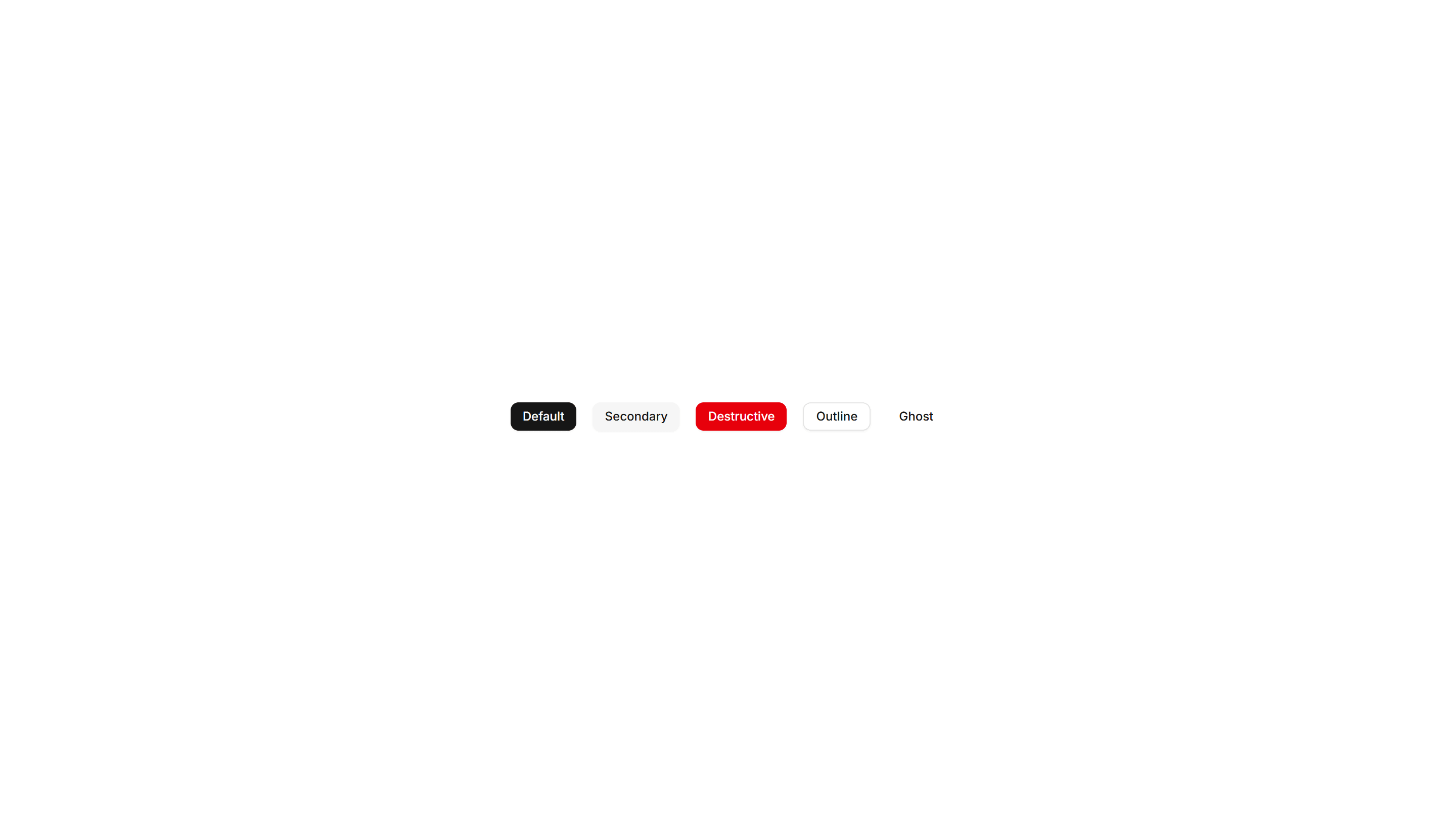
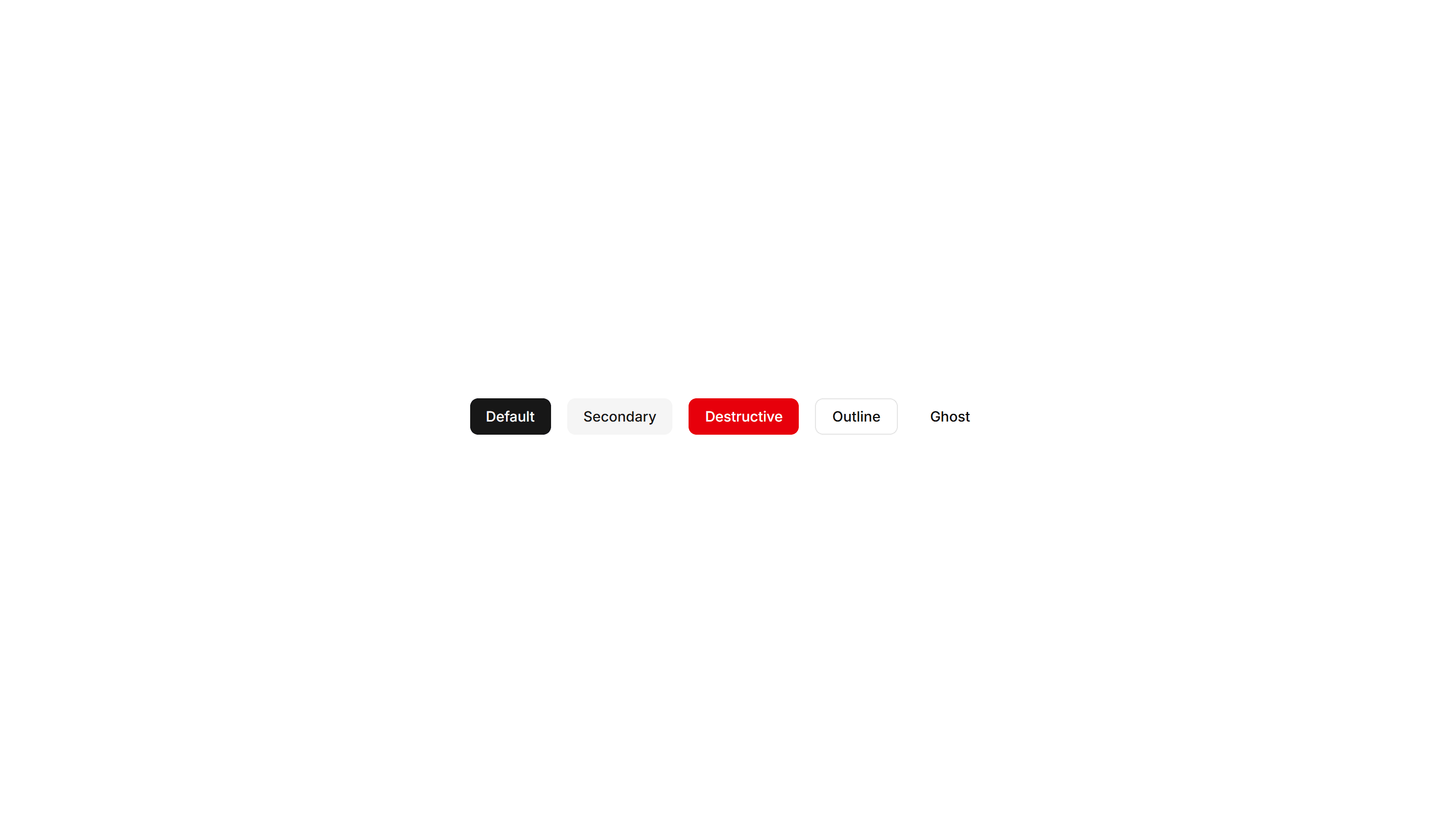
Shadcn Button Blocks
Browse 17 button blocks for shadcn/ui. Animated borders, hover effects, sizes, and social styles you can copy, paste, and wire to any action fast.

Components Button: Underline Buttons
Buttons styled with an animated underline that grows in on hover. A clean, minimal accent for text links and quiet secondary actions in any UI.
Components Button: Pulse Buttons
Buttons with a soft pulsing glow that draws the eye over time. Highlight a single primary action like start trial or buy now on a busy page.

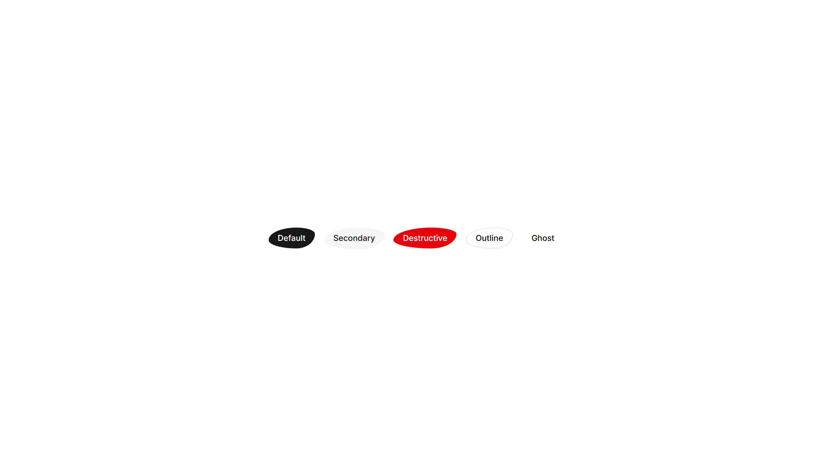
Components Button: Skew Buttons
Buttons with a skewed, slanted shape for a sense of dynamic energy. Suits sports, fitness, and bold marketing pages that want forward momentum.

Components Button: Squeeze Buttons
Buttons that squeeze inward on press for satisfying tactile feedback. Use on mobile flows and forms where every tap should feel confirmed fast.
Components Button: Extra Large Buttons
Oversized buttons with generous padding and large type. Use them as the main hero call to action where one tap should be impossible to miss.
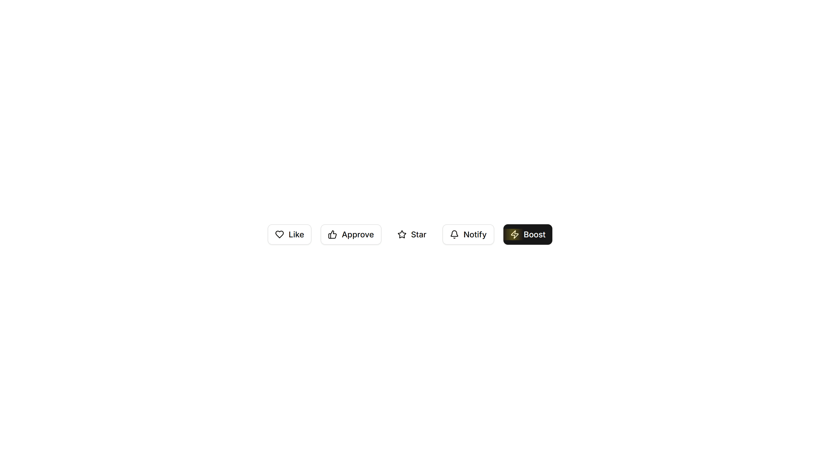
Components Button: Interactive Buttons
Buttons that react to hover and click with motion and state changes. Make signups, downloads, and key actions feel alive and worth clicking.
Components Button: Morphing Buttons
Buttons that morph their shape, size, or label between states. Use for loading, success, and submit flows that confirm progress to the user.

Components Button: Rotate Buttons
Buttons that rotate an icon or the whole label on hover. Add subtle motion to refresh, settings, and other action icons across your app today.
Components Button: Slide Buttons
Buttons with a color or label that slides in on hover. Reveal a second state to guide users toward the next step in a clear and simple flow.

Components Button: Border Animation Buttons
Buttons with borders that animate and trace around the edge on hover. Draw attention to a primary action without changing the button fill at rest.
Components Button: Extra Small Buttons
Compact, low height buttons with tight padding and small type. Ideal for dense toolbars, table rows, and inline controls where space is limited.
Components Button: Liquid Buttons
Buttons with a flowing liquid fill that sweeps across the surface on hover. A playful accent for landing pages and creative product sites today.

Components Button: Pixel Buttons
Buttons with a blocky pixel art finish and retro styling. Perfect for games, indie projects, and brands that lean on a nostalgic visual theme.
Components Button: Shadow Buttons
Buttons with layered shadows that lift or shift on hover. Give actions a tactile, raised feel across cards, forms, and toolbars in any layout.
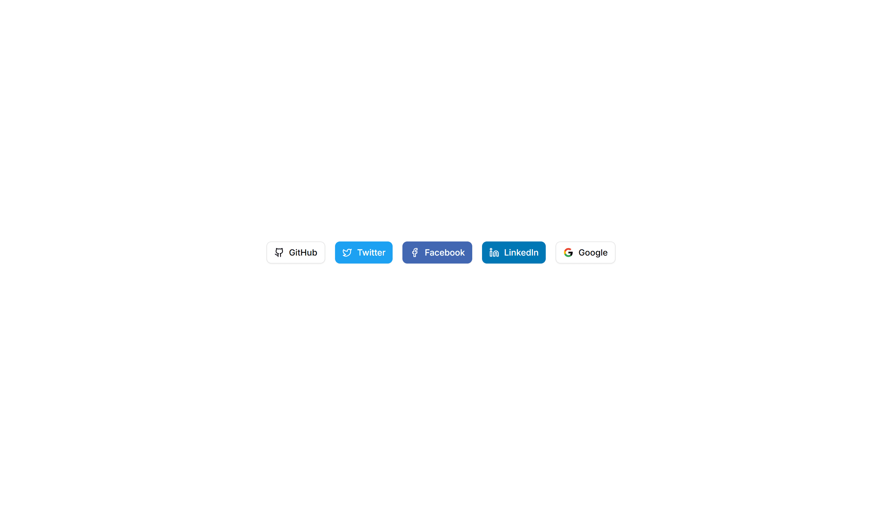
Components Button: Social Buttons
Buttons branded for Google, GitHub, Apple, and more providers. Drop them into sign in and sign up screens for fast one click authentication.
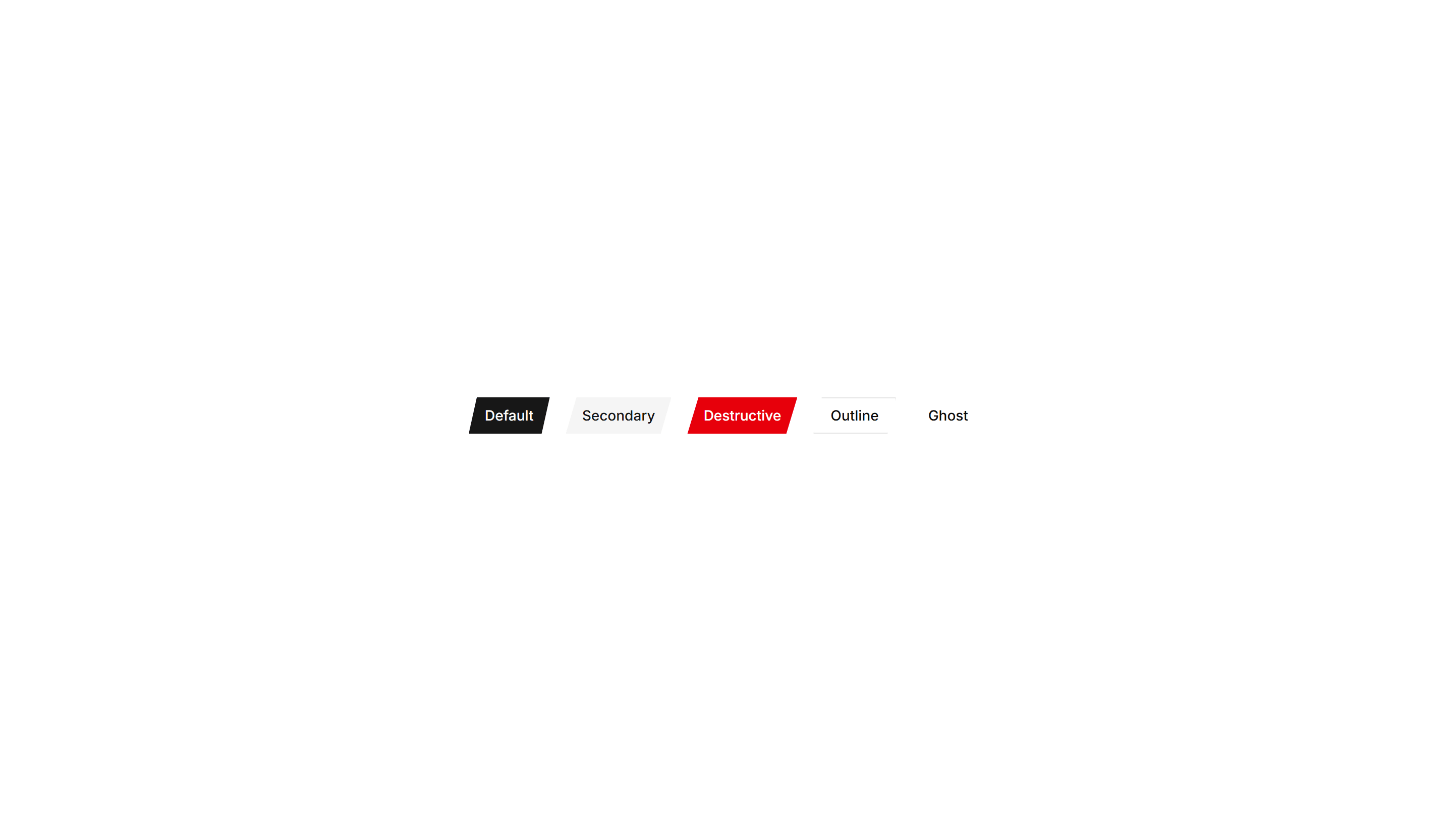
Components Button: Cut Corners Buttons
Buttons with angled, clipped corners for a sharp geometric look. Fits gaming, tech, or editorial interfaces that want an edgy call to action.

Components Button: Grow Buttons
Buttons that scale up smoothly on hover to feel responsive. Add a touch of motion feedback to cards, pricing tiers, and primary form actions.