Shadcn Breadcrumb Blocks
Browse 12 breadcrumb blocks for shadcn/ui. Pill, card, dot, numbered, timeline, and progress trails that show page location and aid navigation.
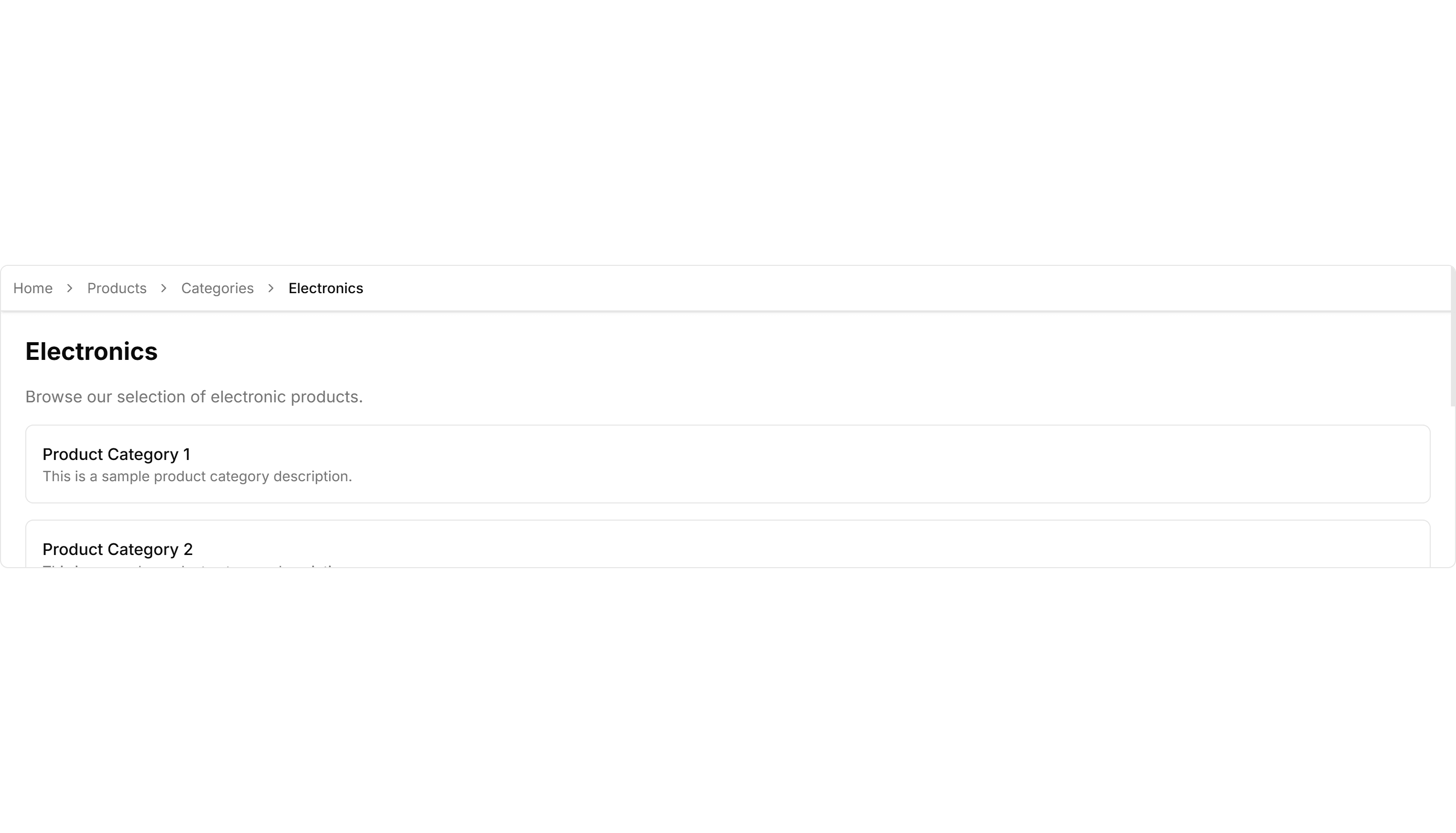
Components Breadcrumb: Sticky Breadcrumb
A breadcrumb that pins to the top of the view as the page scrolls. Keeps the current location visible on long articles and deep settings pages.

Components Breadcrumb: Card Breadcrumb
A breadcrumb housed in a rounded card with a subtle shadow. Lifts the navigation path off the page for detail views and account settings screens.

Components Breadcrumb: Icon Breadcrumb
A breadcrumb pairing each link with a leading icon. Helps users scan the path at a glance across sections like home, docs, billing, and settings.
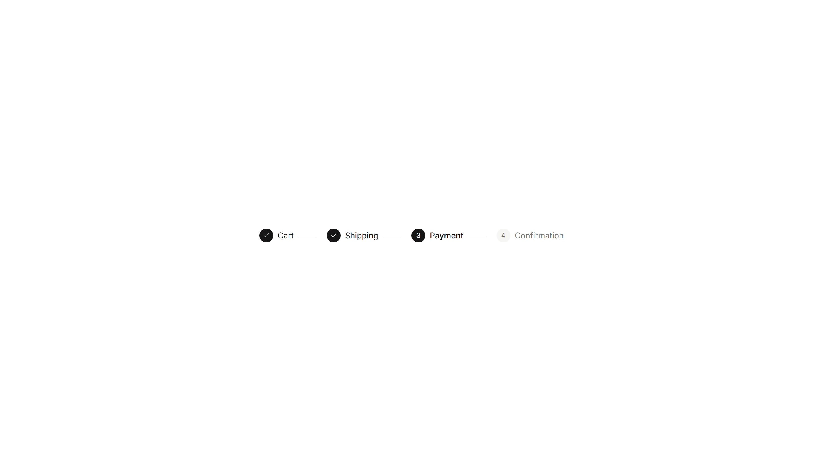
Components Breadcrumb: Progress Breadcrumb
A breadcrumb with a fill that tracks how far a user has moved. Shows completion across multi step forms, checkout, and guided account onboarding.
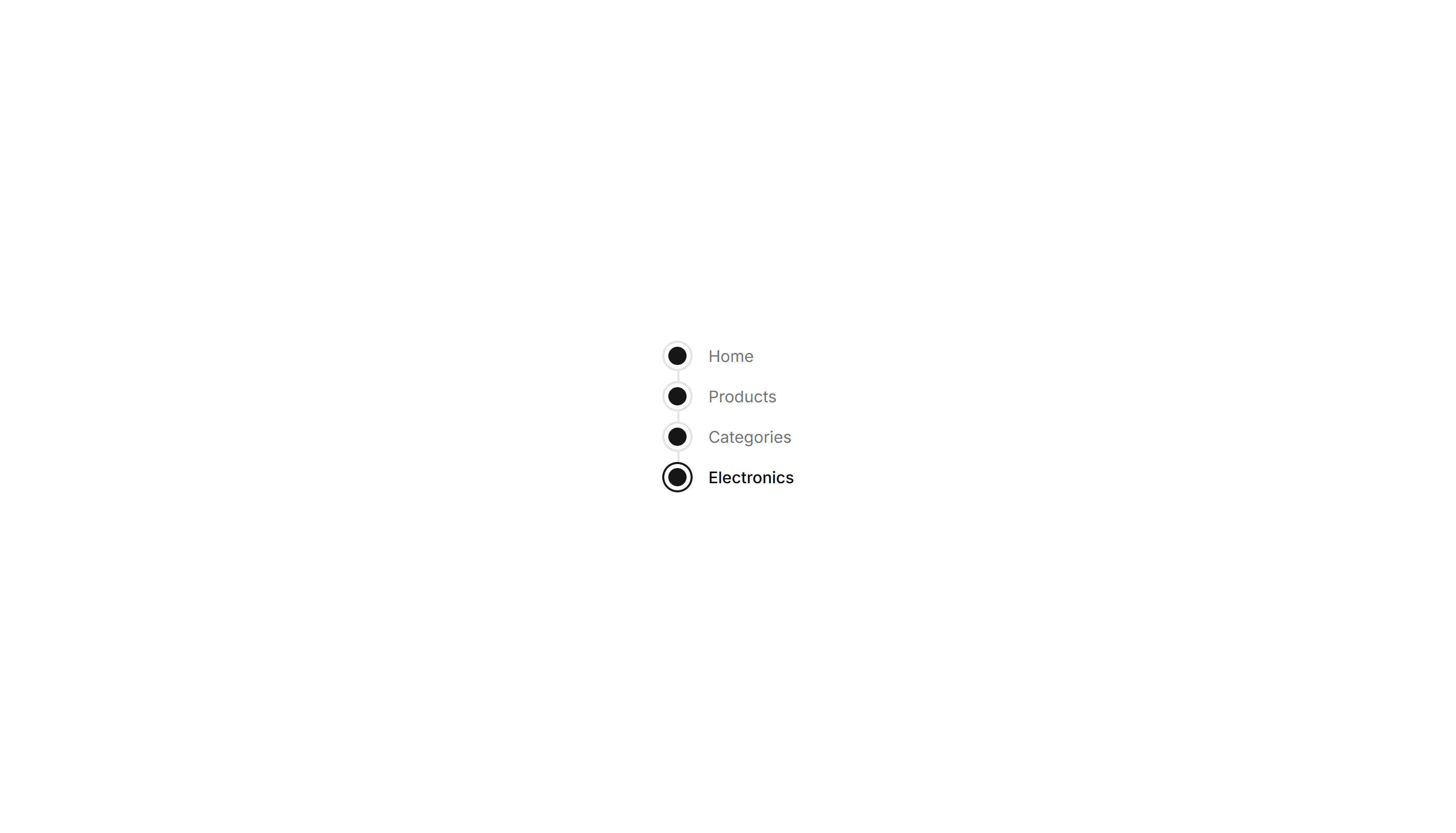
Components Breadcrumb: Timeline Breadcrumb
A breadcrumb laid out as a connected timeline of steps. Maps a journey through stages, ideal for order tracking and live project status views.

Components Breadcrumb: Compact Breadcrumb
A tight breadcrumb with reduced spacing between its links. Fits crowded toolbars and mobile headers where horizontal room is in short supply.

Components Breadcrumb: Numbered Breadcrumb
A breadcrumb that numbers each step in the path. Clarifies order for sequential flows such as checkout, onboarding, or a multi step setup wizard.

Components Breadcrumb: Slash Breadcrumb
A breadcrumb that divides its links with a forward slash. Mirrors a file path style for code tools, documentation, and folder browsing screens.

Components Breadcrumb: Bordered Breadcrumb
A breadcrumb sitting inside a thin outlined container. Frames the navigation path cleanly on a dashboard header or any content section toolbar.

Components Breadcrumb: Dot Breadcrumb
A breadcrumb that separates each link with a small round dot. Offers a quiet, minimal path indicator for clean app layouts and page headers.

Components Breadcrumb: Pill Breadcrumb
A breadcrumb where each link sits inside a rounded pill shape. Adds a friendly, tappable feel to navigation on dashboards and profile pages.
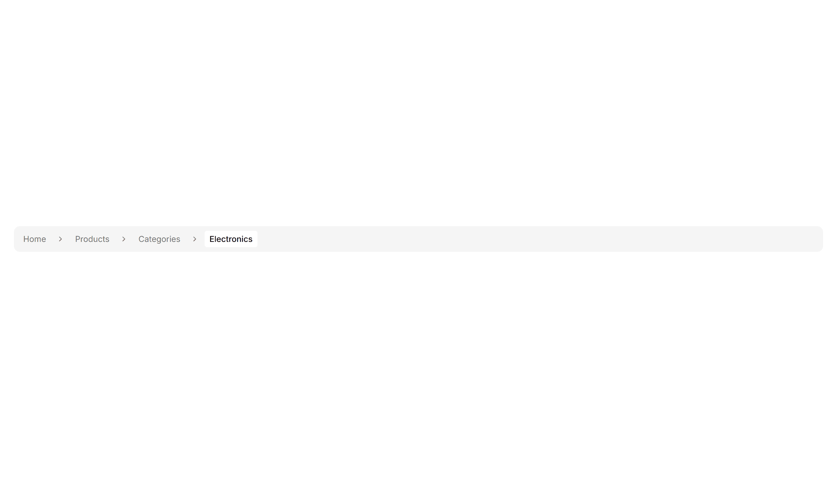
Components Breadcrumb: Background Breadcrumb
A breadcrumb trail wrapped in a soft tinted background bar. Anchors the top of a page and keeps navigation links readable above busy content.