Shadcn Pagination Blocks
Browse 11 pagination blocks for shadcn/ui. Page number rows, prev and next controls, dot indicators, and compact variants to navigate long lists.
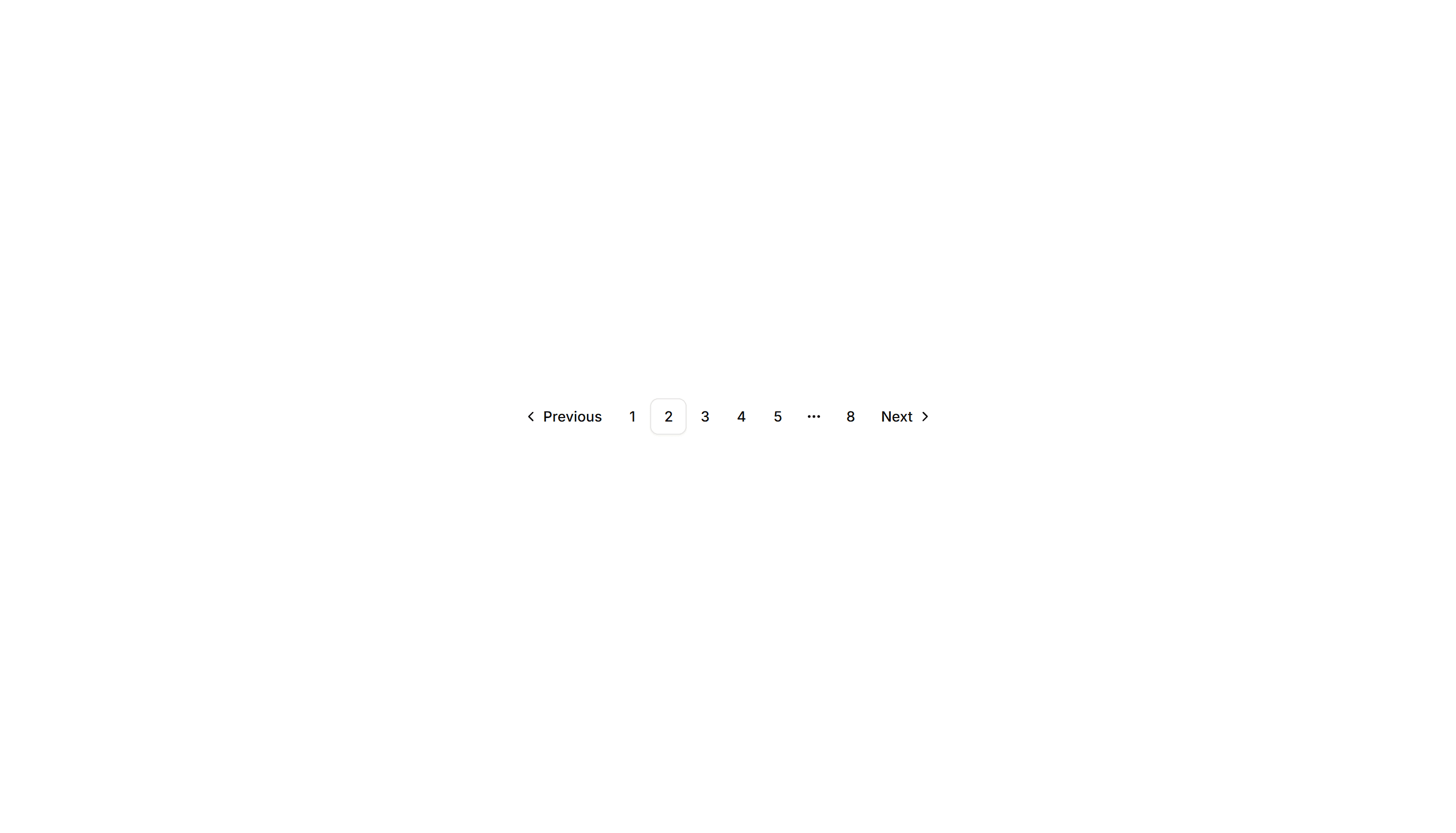
Components Pagination: Responsive Pagination
Pagination that shows full page numbers on desktop and collapses to arrows on mobile. Keeps navigation usable across phones, tablets, and wide screens.
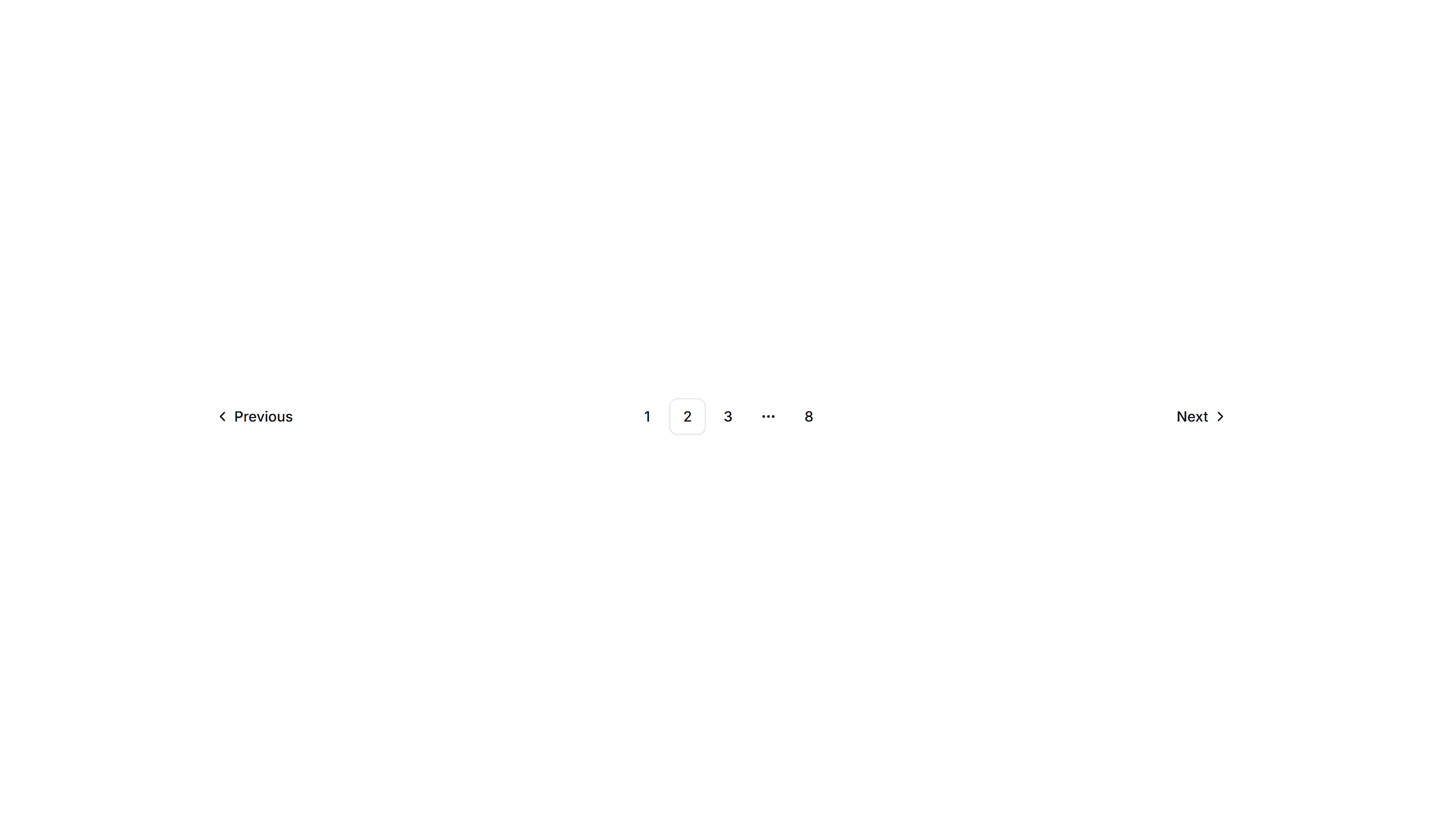
Components Pagination: Split Pagination
Pagination with prev and next pushed to opposite edges and page numbers centered. Spreads controls across wide footers and full width content areas.
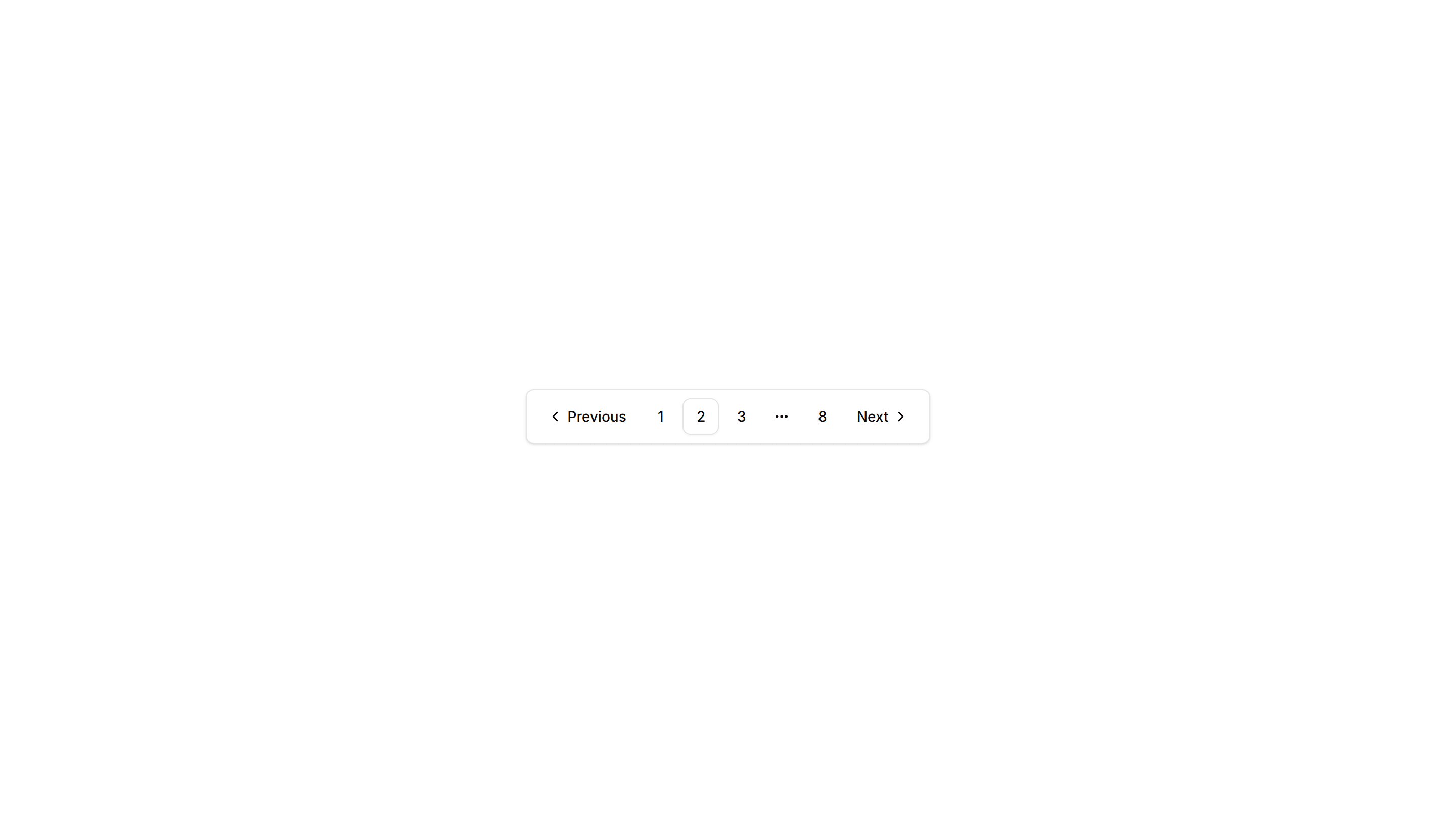
Components Pagination: Card Pagination
Pagination wrapped in a raised card surface with page numbers and prev next controls. Groups navigation neatly below a list or grid of cards.
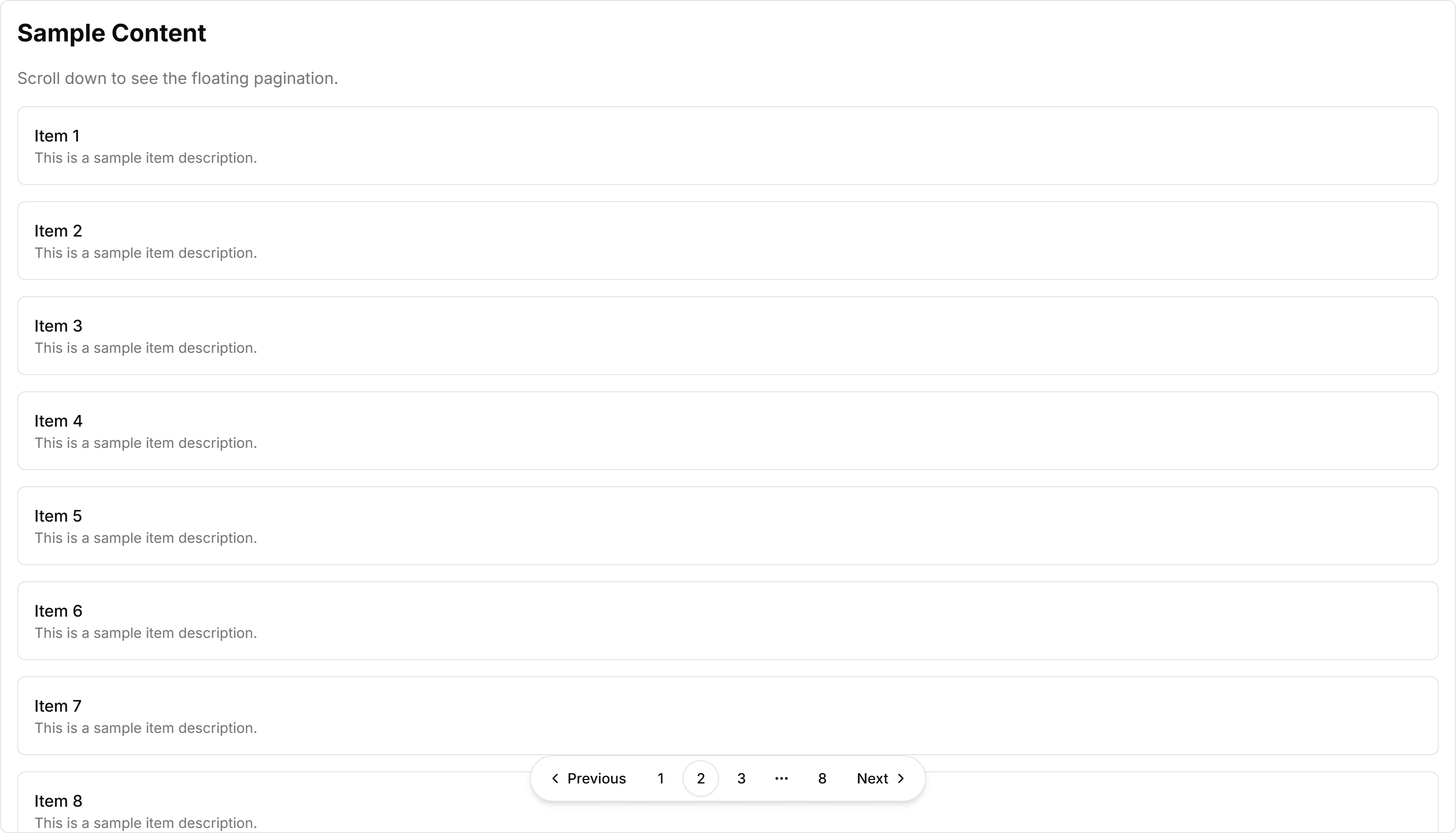
Components Pagination: Floating Pagination
A pagination bar that hovers above the content with soft elevation. Stays visible while readers scroll through long articles, feeds, or paginated galleries.
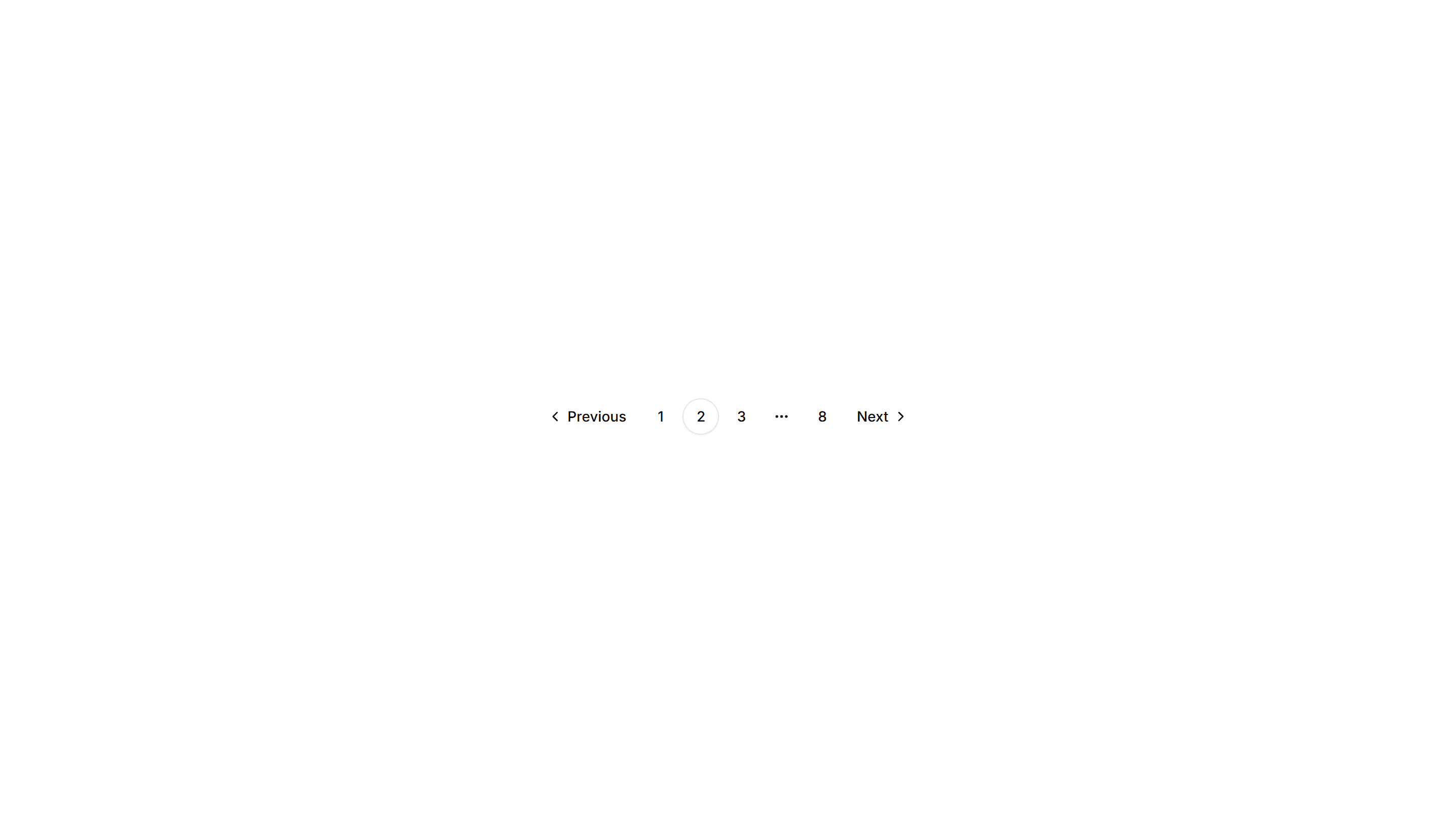
Components Pagination: Rounded Pagination
A pagination row with fully rounded pill buttons for each page. The soft circular shape suits friendly product pages, blogs, and modern marketing layouts.

Components Pagination: Mini Pagination
A very small pagination control showing the current page and arrows to step through results. Fits inline next to filters, counts, or table footers.

Components Pagination: Compact Pagination
A tight pagination row that fits page numbers, prev, and next into a small footprint. Good for sidebars, panels, and dense admin tables with limited space.

Components Pagination: Icon Only Pagination
Pagination built from chevron icons for previous and next, with no page numbers. Keeps mobile toolbars and image viewers clean when only direction matters.
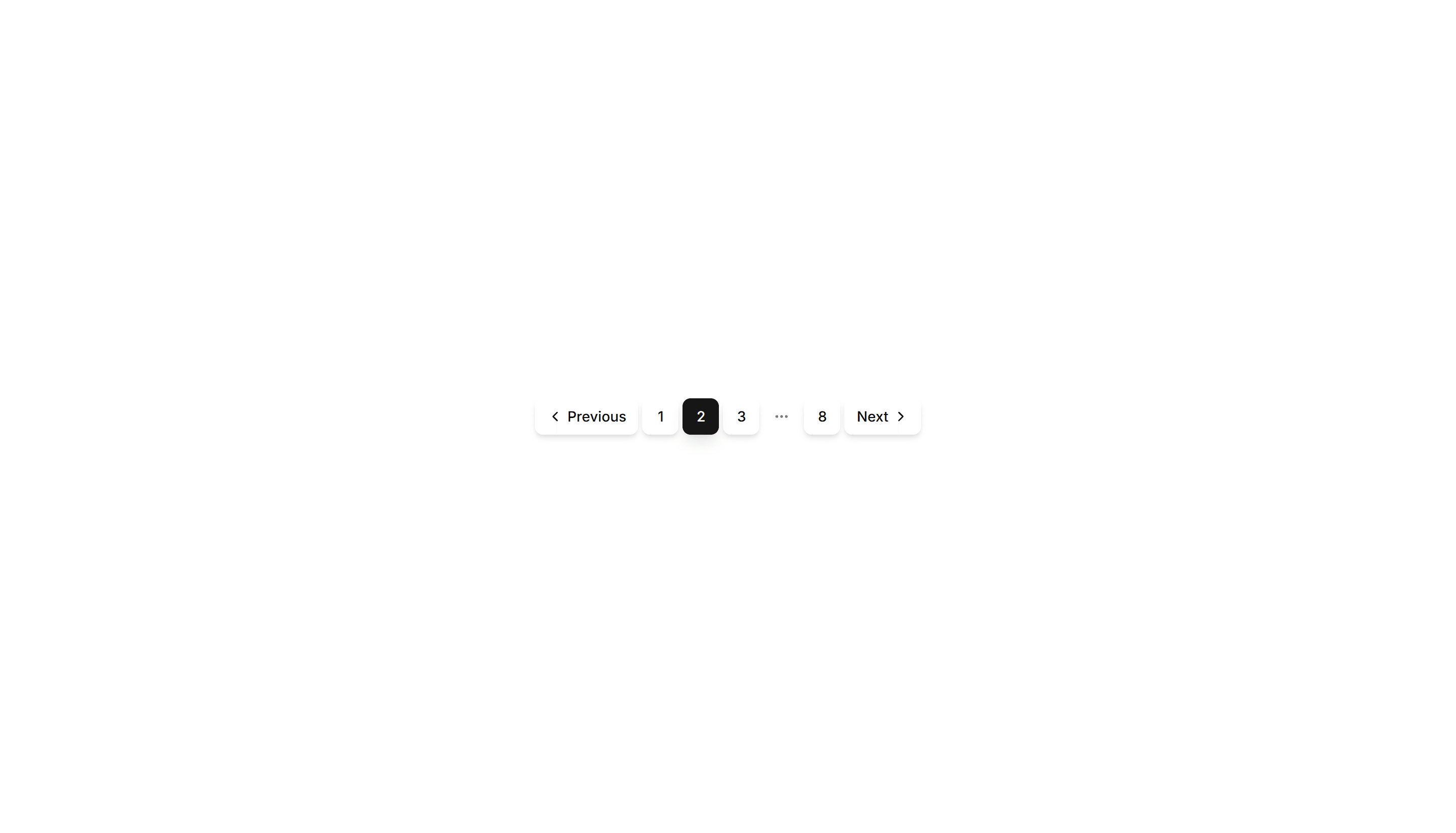
Components Pagination: Shadow Pagination
Pagination with subtle drop shadows on each button for depth. The lifted look helps the controls stand out over busy backgrounds and image grids.
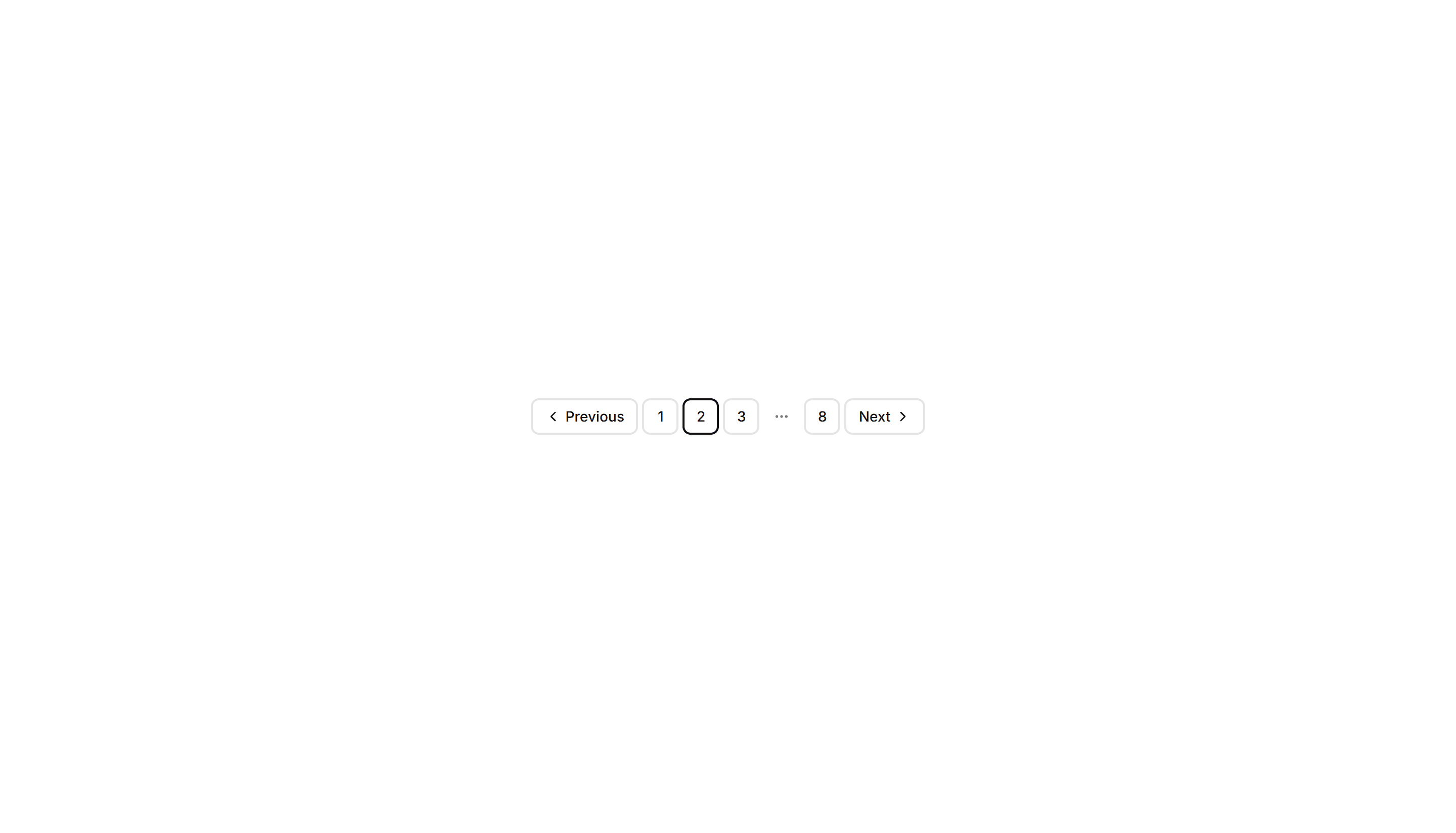
Components Pagination: Bordered Pagination
A pagination row where each page number sits inside its own outlined button. The clear borders separate pages cleanly across data tables and search results.

Components Pagination: Dot Indicator Pagination
Pagination shown as a row of dots, with the active page filled. Ideal for image carousels, onboarding steps, and short sequences where numbers feel heavy.