Shadcn Badge Blocks
Browse 12 badge components for shadcn/ui. Status dots, pulses, gradients, icons, and ribbons to label items, flag counts, and mark live states.
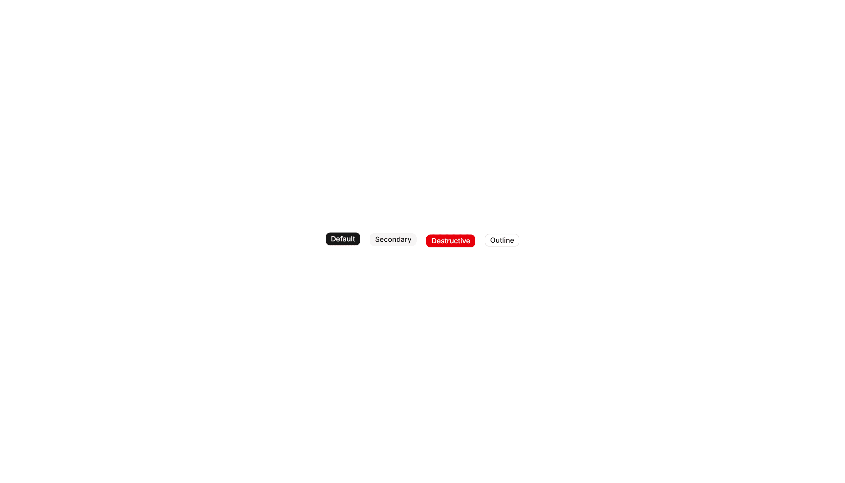
Components Badge: Extra Large Badge
An oversized badge with generous padding and bold text for high visibility. Use it on hero areas or banners where a tag must read from a distance.
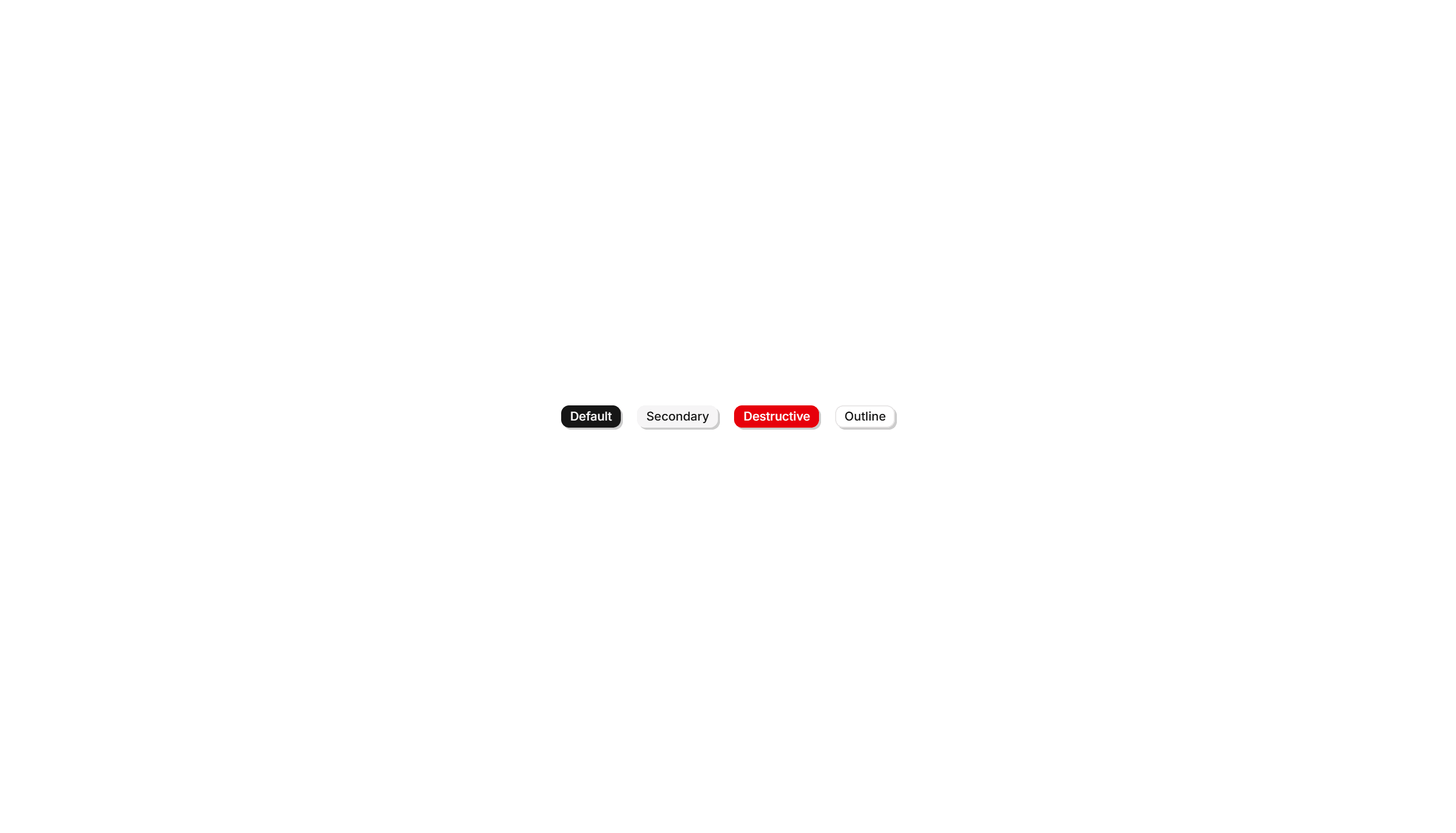
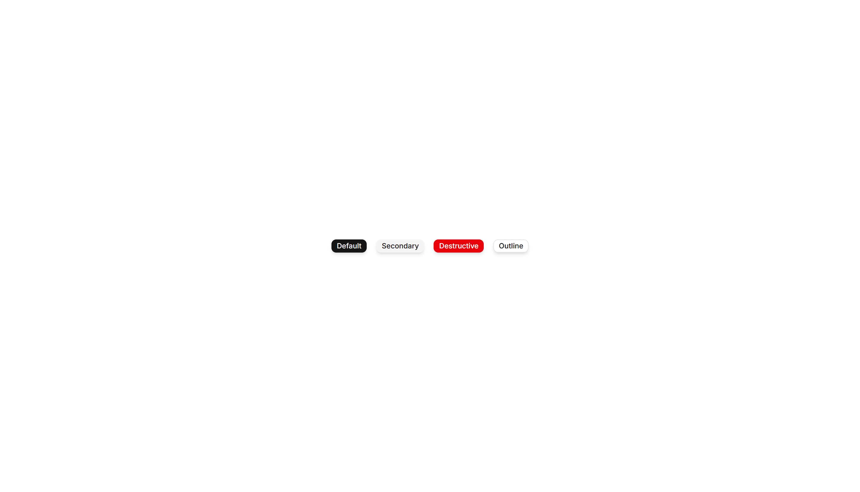
Components Badge: Icon Badge
A badge that pairs a small icon with a label for instant meaning. Use it to tag categories, statuses, or actions where text alone reads slowly.
Components Badge: Ribbon Badge
A badge styled as a corner ribbon that drapes over a card edge. Use it to flag sale, new, or sold out states across product and gallery tiles.
Components Badge: Bounce Badge
A badge with a springy bounce animation that draws the eye on entry. Use it to flag new arrivals or fresh updates that should grab attention.
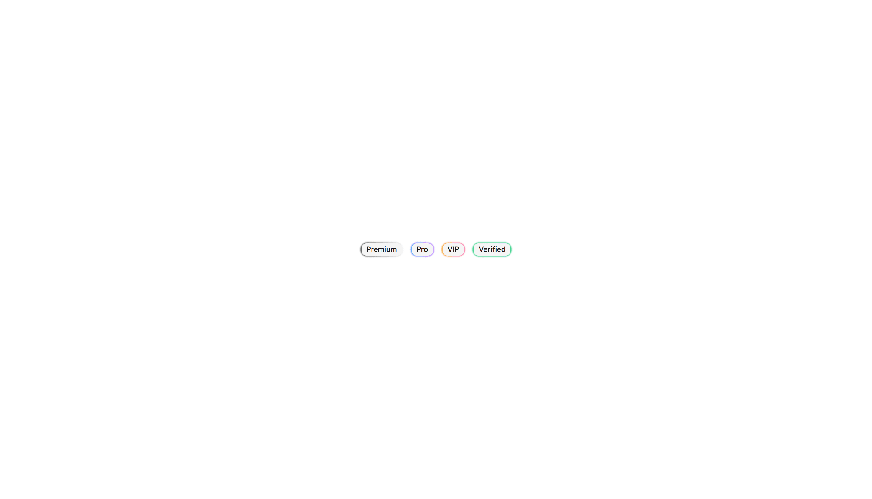
Components Badge: Gradient Border Badge
A badge wrapped in a colorful gradient outline around plain fill. Use it to mark beta, pro, or featured labels that need a vivid accent edge.
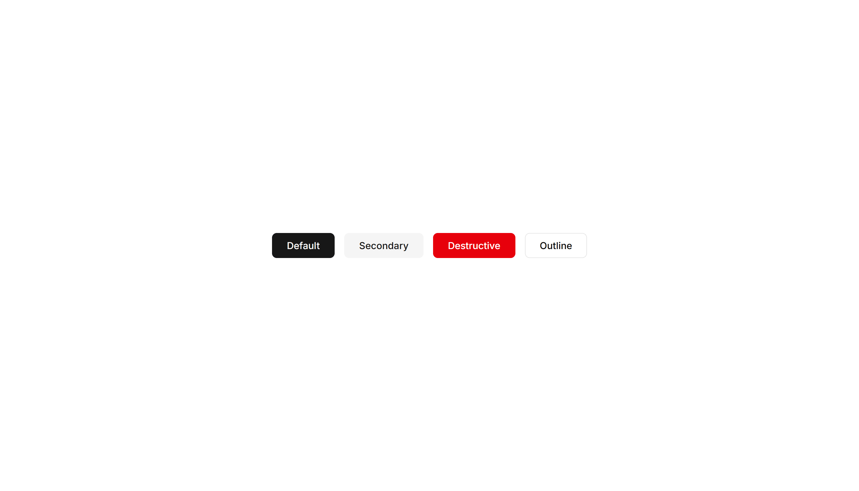
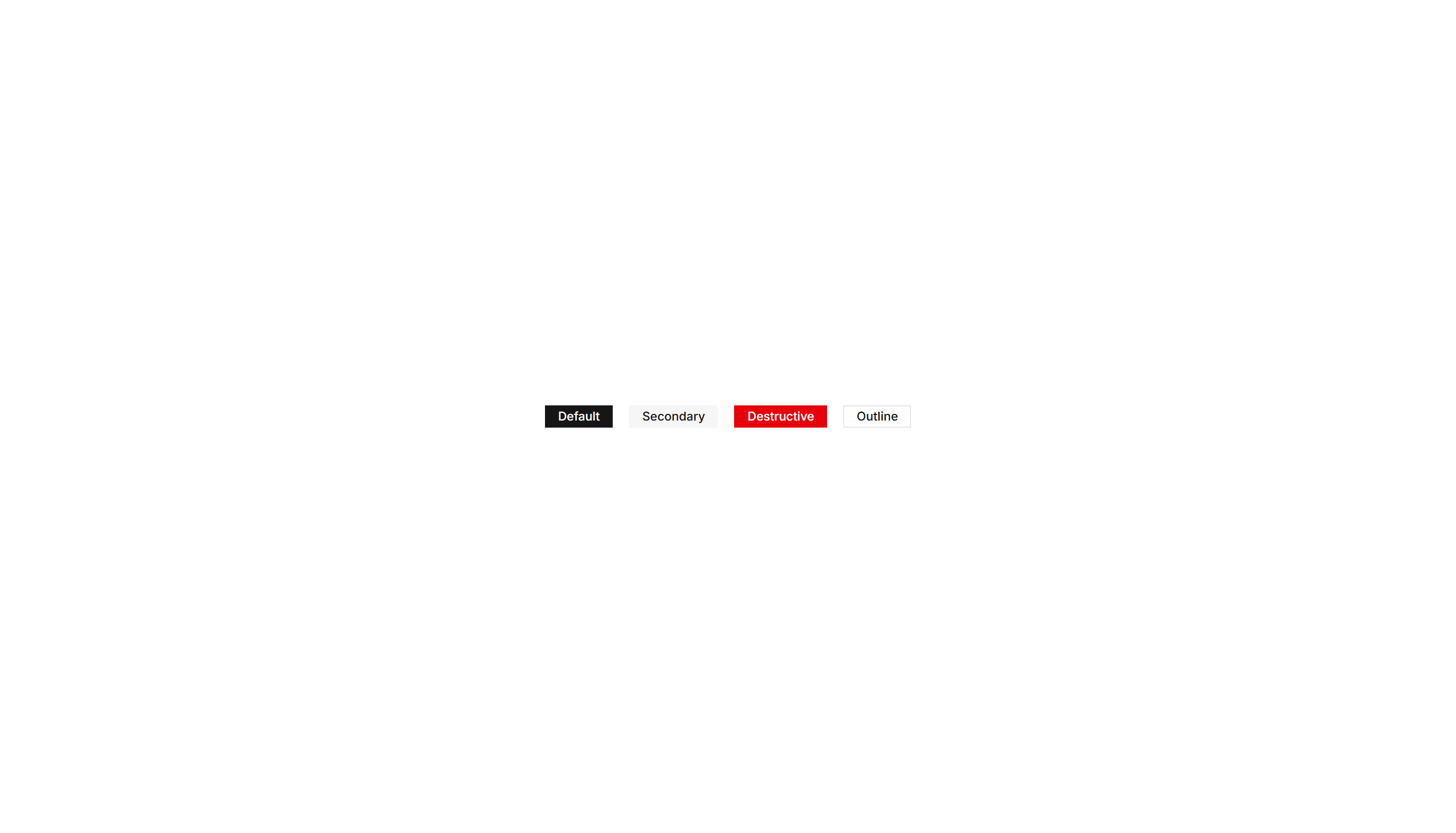
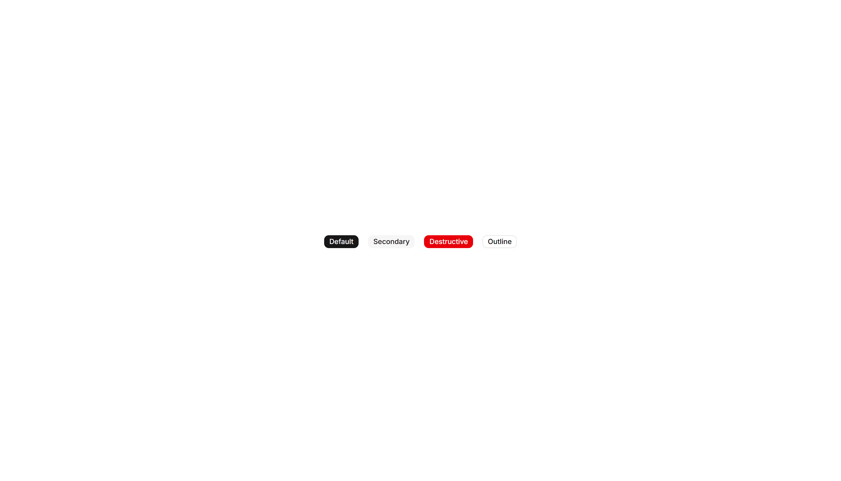
Components Badge: Large Badge
A roomy badge with extra padding and larger text for clear reading. Use it to highlight a plan tier, count, or status across busy interfaces.
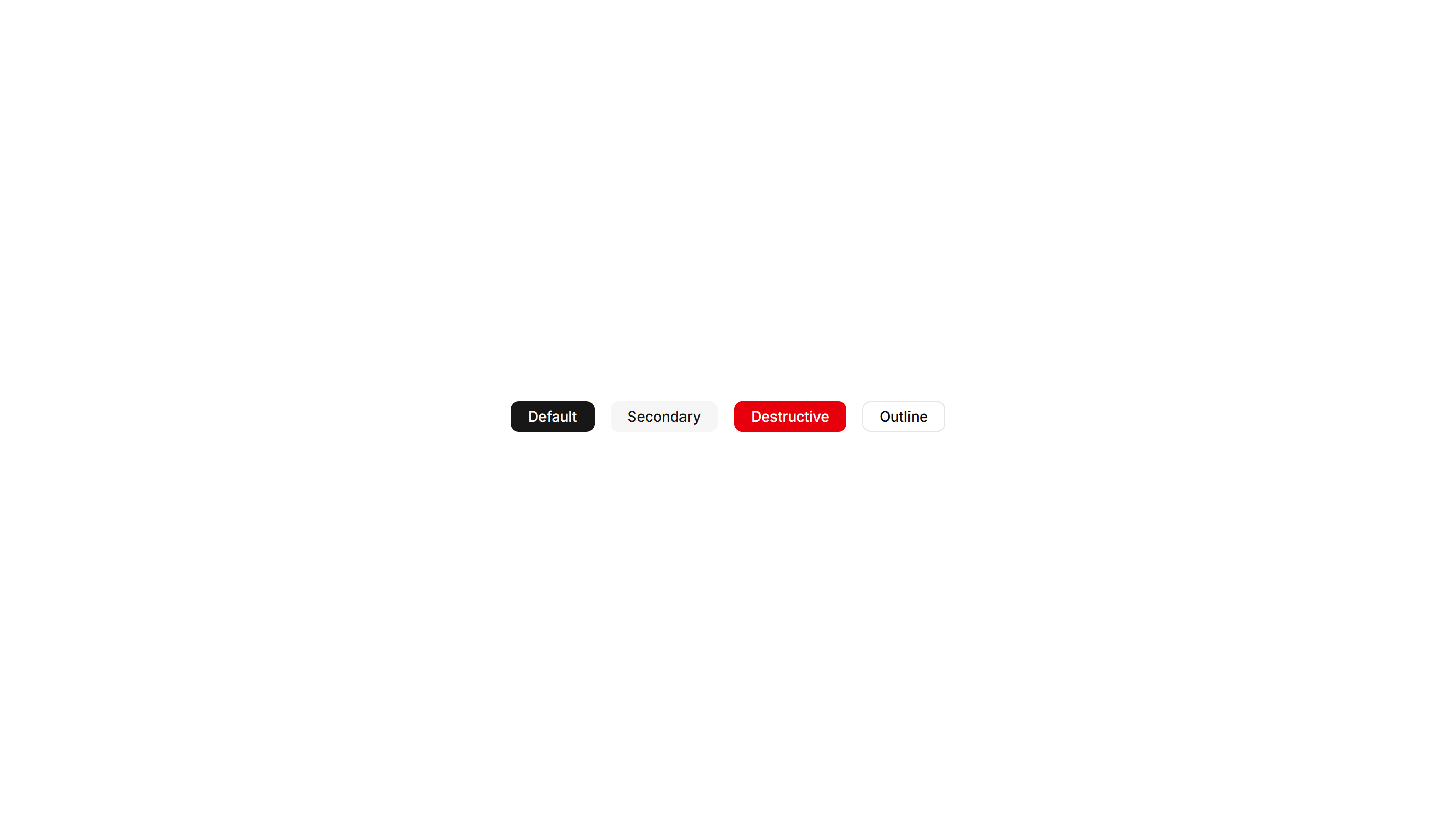
Components Badge: Square Badge
A badge with sharp square corners and a compact footprint. Use it for crisp version tags, counts, or labels that suit a structured grid layout.
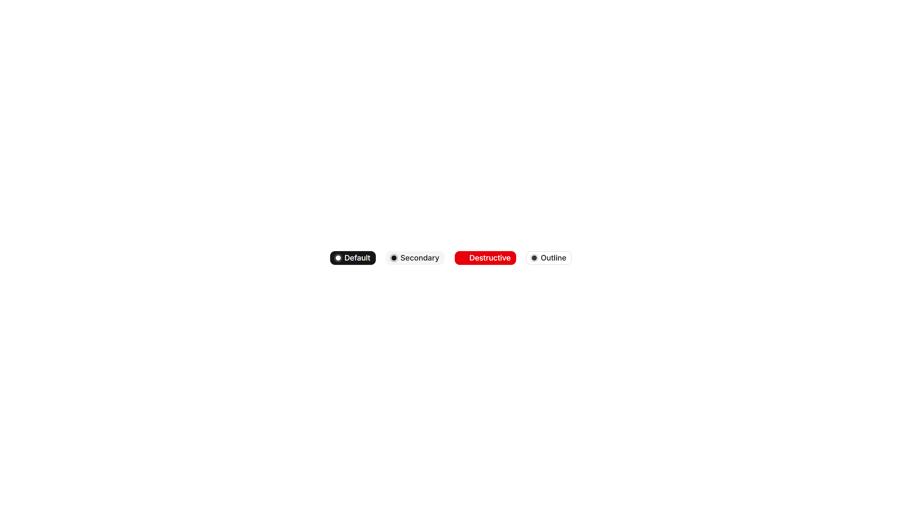
Components Badge: Dot Indicator Badge
A badge paired with a small colored dot that shows status at a glance. Use it to show online, busy, or away states next to a name or avatar.
Components Badge: Hover Scale Badge
A badge that grows slightly when the pointer rests on it. Use it for interactive tags or filters where a touch of feedback invites a quick click.
Components Badge: Pulse Badge
A badge with a soft pulsing ring that radiates outward on a loop. Use it to signal live activity, unread items, or a recording session in progress.
Components Badge: 3D Badge
A badge with layered shadows and depth that lifts off the surface. Use it to spotlight a featured tag or premium label that needs to stand out.
Components Badge: Elevated Badge
A badge raised above the surface with a soft drop shadow. Use it to mark a priority label or count that should read as floating above content.