Shadcn Collapsible Blocks
Browse 6 collapsible blocks for shadcn/ui. Expandable panels, cards, and grouped sections that hide secondary content until a reader needs it.
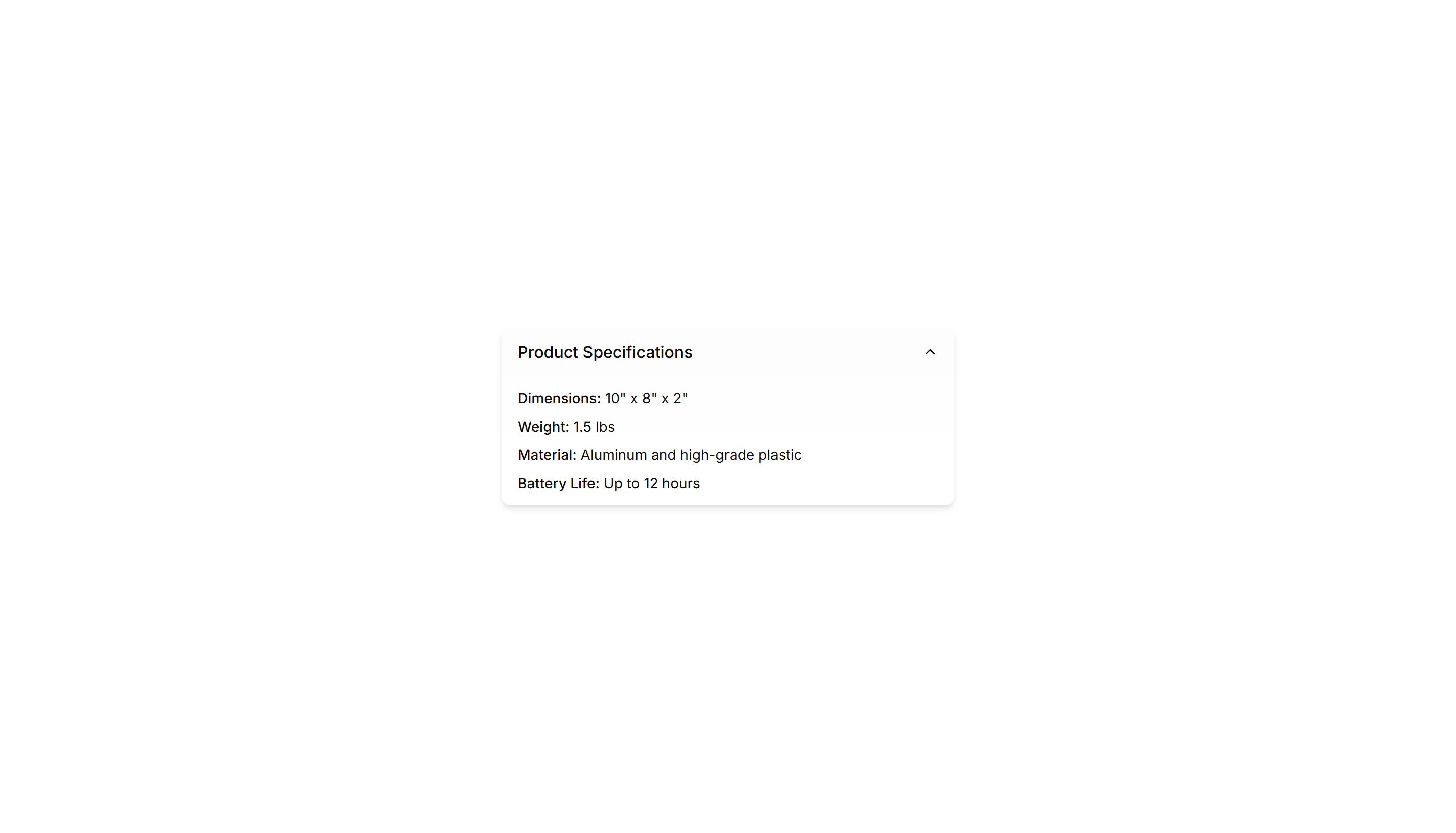
Components Collapsible: Shadowed Collapsible
A collapsible panel with a soft shadow that lifts it off the page. Use it to highlight an expandable block of content inside a busy layout or feed.
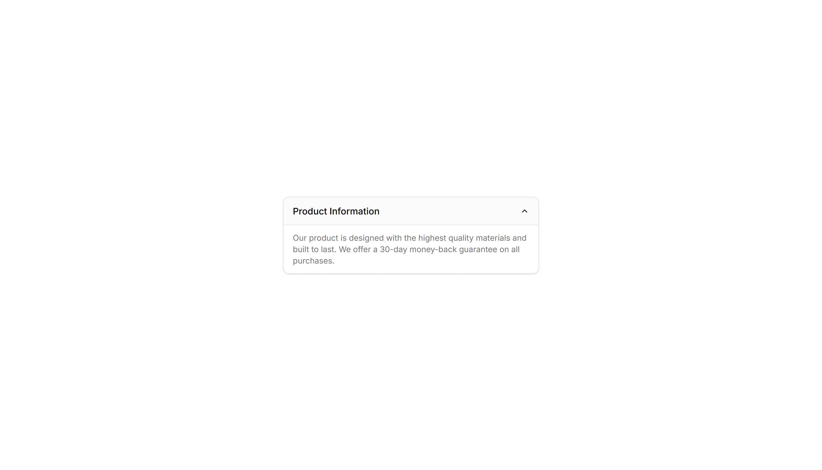
Components Collapsible: Card Collapsible
A card that expands to reveal extra detail when clicked, keeping the summary visible. Use it on dashboards to tuck away long notes inside a tidy tile.
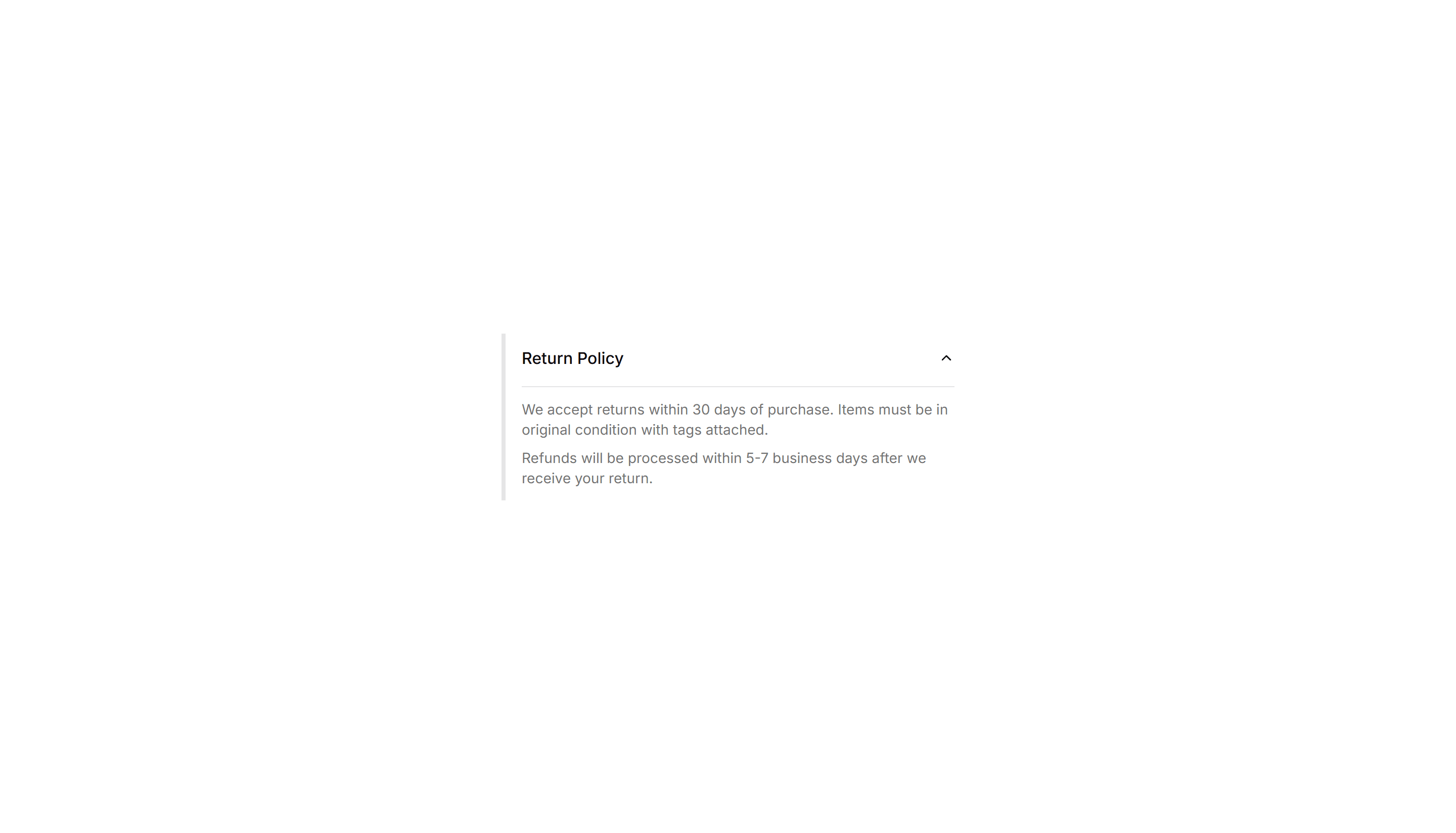
Components Collapsible: Side Bordered Collapsible
A collapsible panel with a colored bar down one side to mark its state. Use it for alerts or notes whose details readers can show or hide on demand.
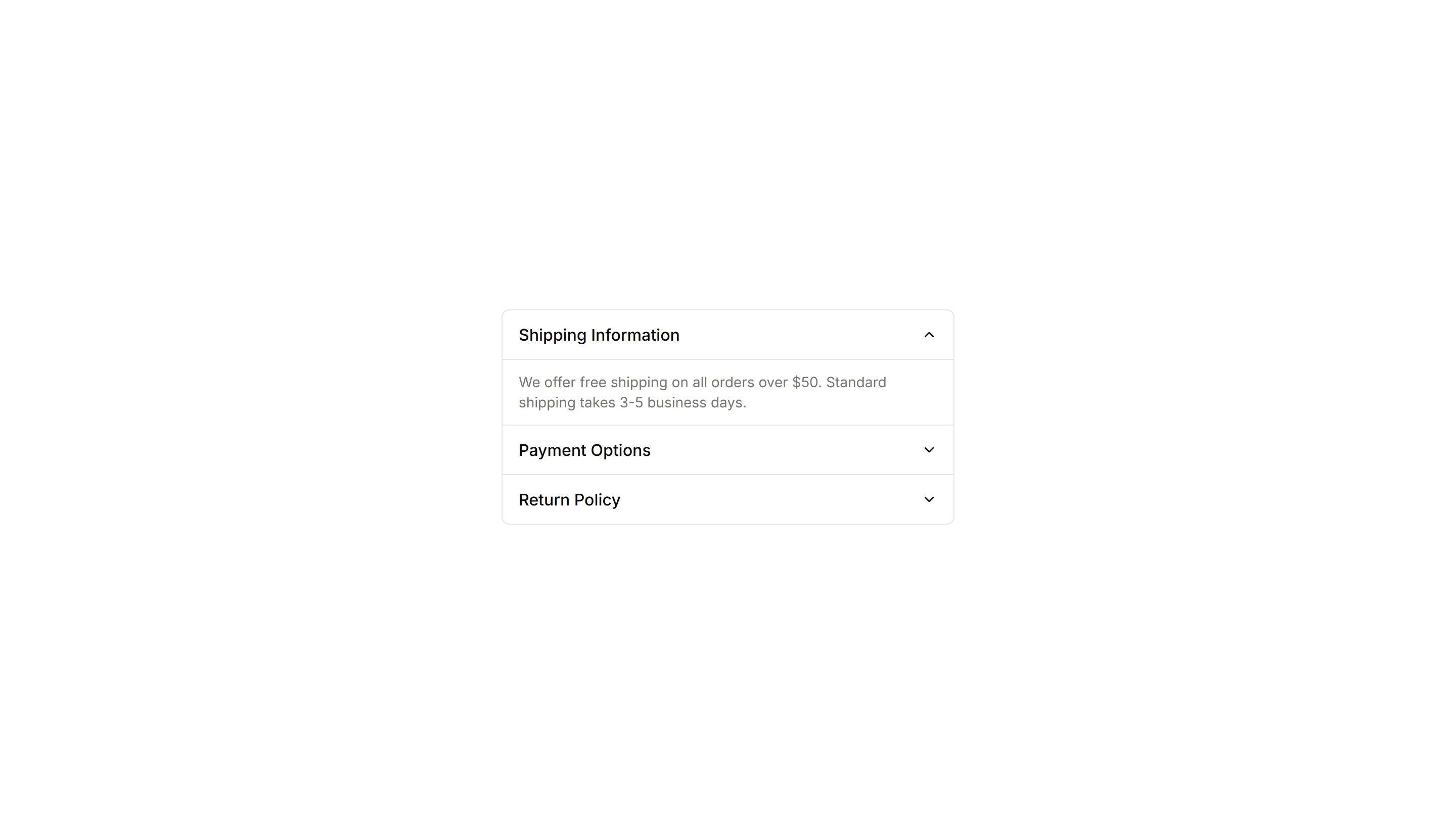
Components Collapsible: Grouped Collapsible
Several collapsible panels stacked together so readers open one section at a time. Good for settings pages where related options sit in separate groups.
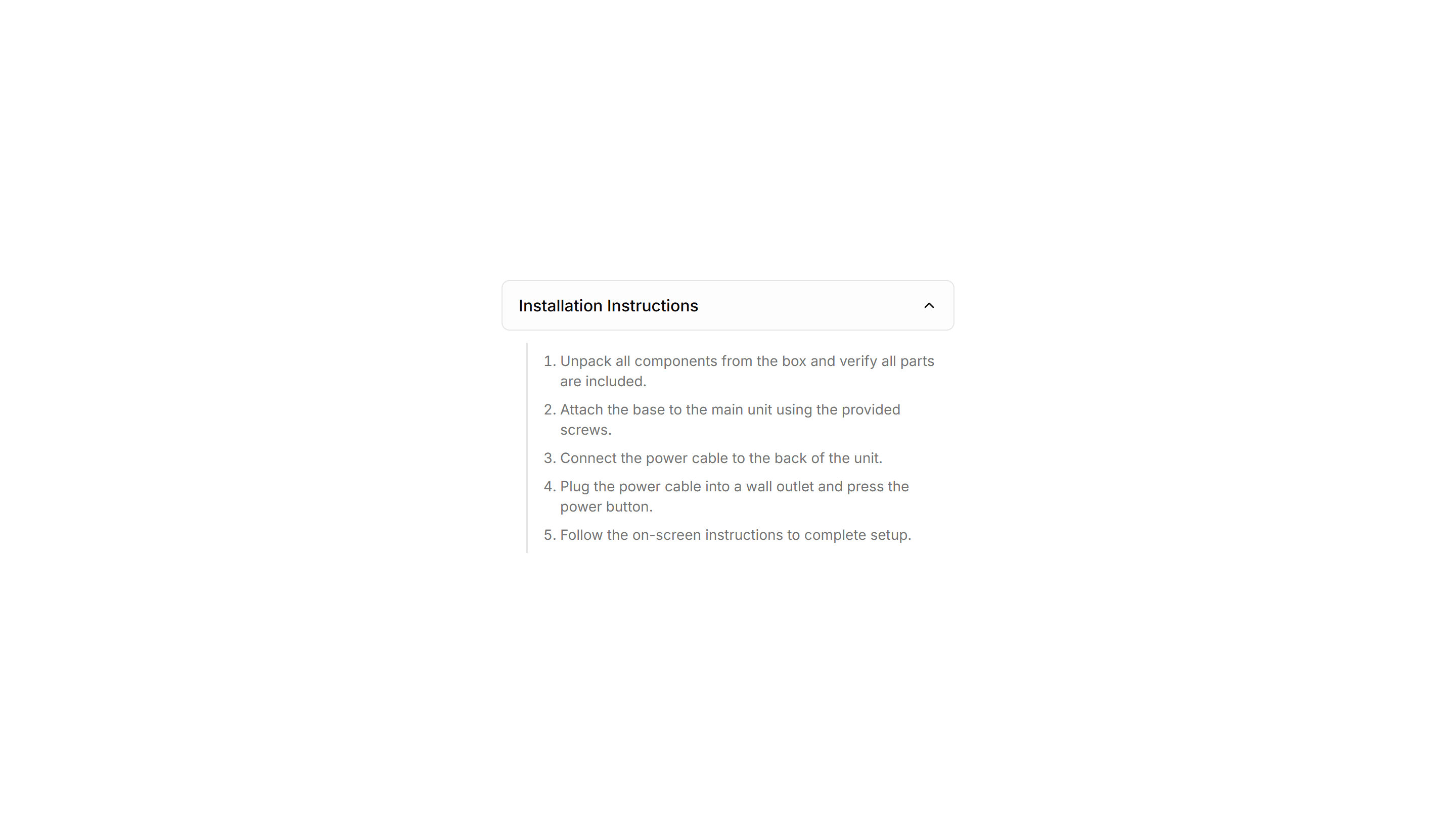
Components Collapsible: Stepped Collapsible
Numbered collapsible steps that reveal instructions one at a time. Use it for onboarding or setup guides where readers work through tasks in order.

Components Collapsible: Icon Collapsible
A collapsible row with a chevron icon that rotates as the panel opens and closes. Use it in menus where a clear visual cue tells readers it expands.