Shadcn Accordion Blocks
Browse 16 accordion blocks for shadcn/ui. Collapsible panels with borders, glows, numbers, and steps to organize FAQs and dense content cleanly.
Components Accordion: Stepped Accordion
An accordion styled as numbered steps with connecting markers. Ideal for setup flows, tutorials, and any process that readers complete in order.

Components Accordion: Fade In Content Accordion
An accordion whose answer text gently fades in as a panel opens. The soft entrance keeps reader focus on the revealed content in FAQs and guides.

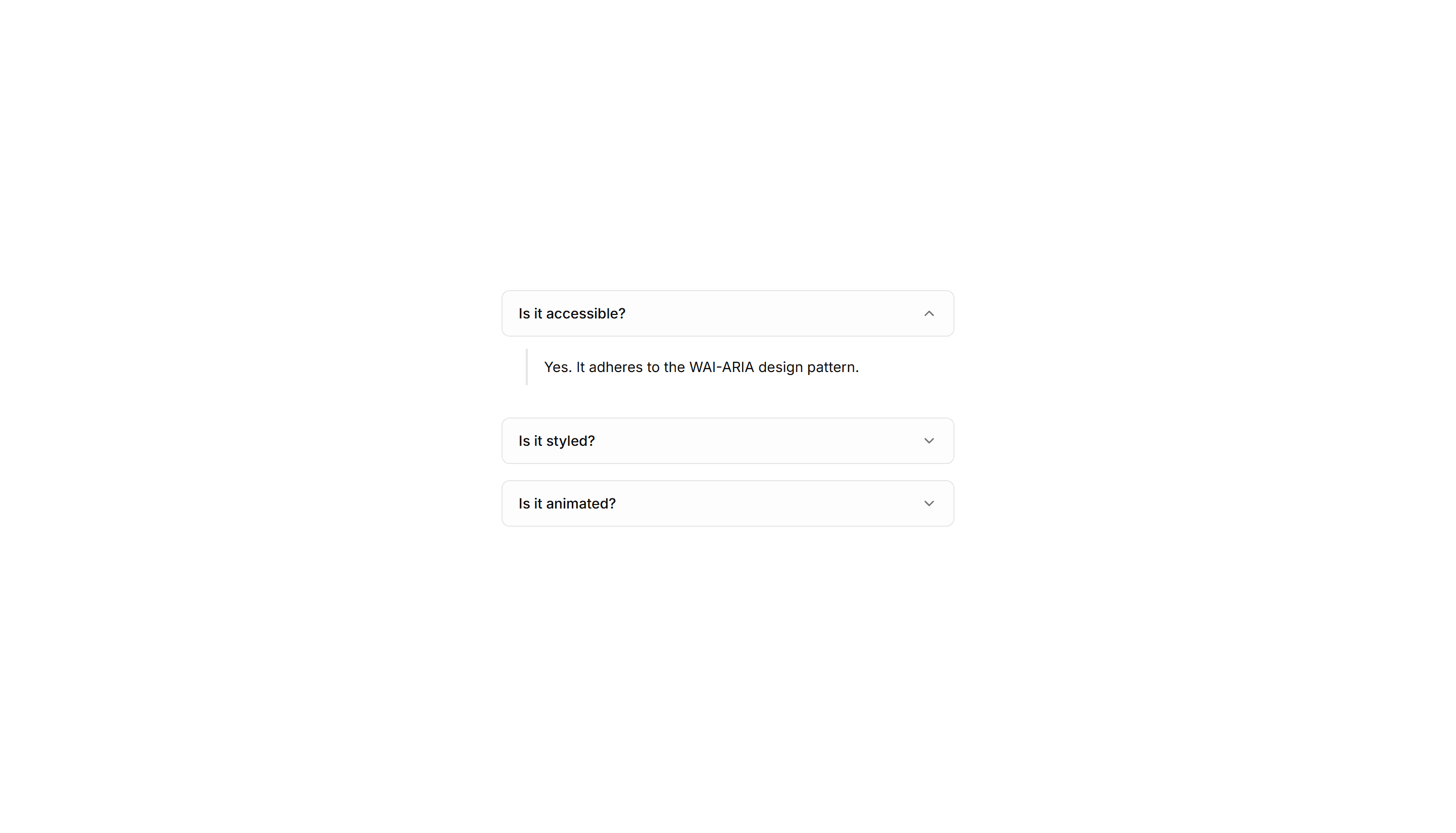
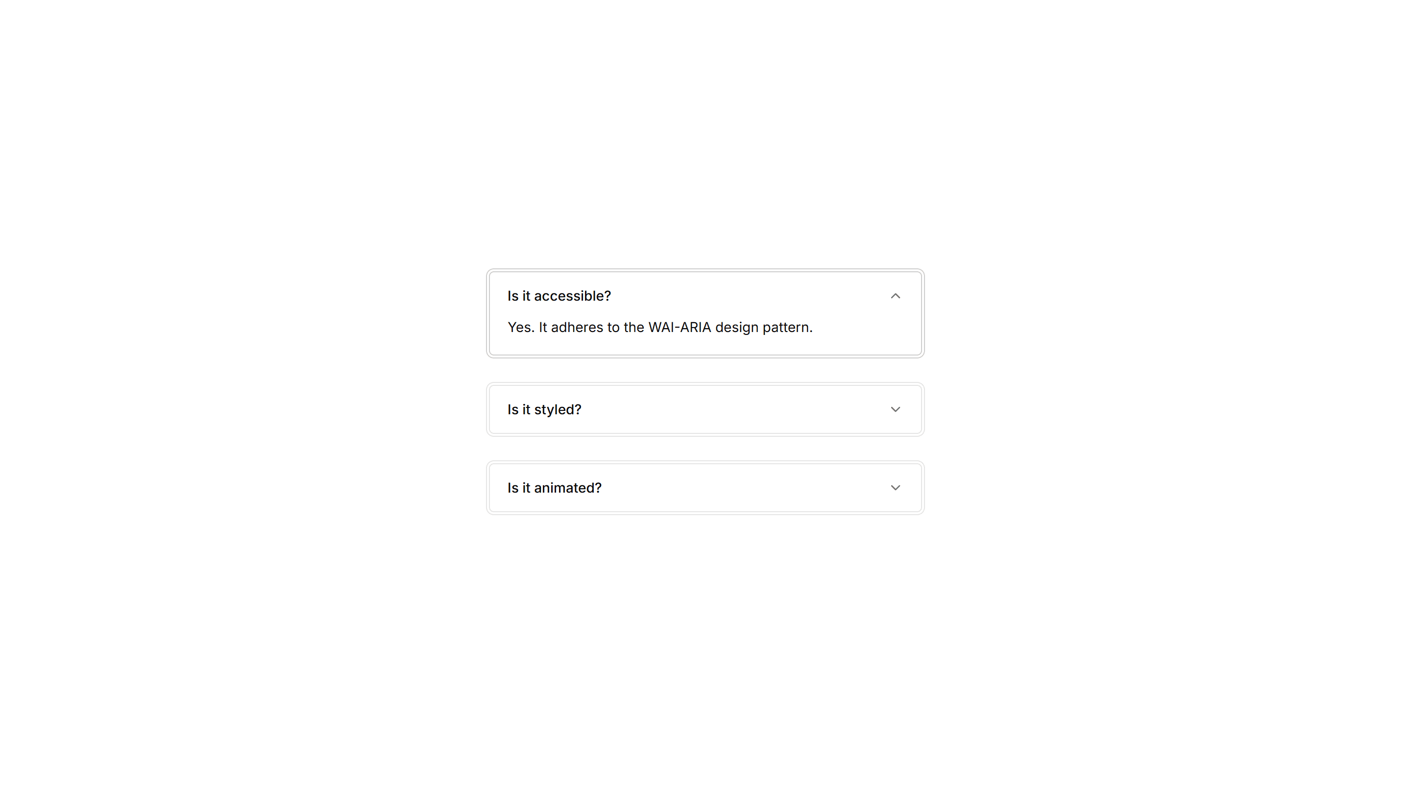
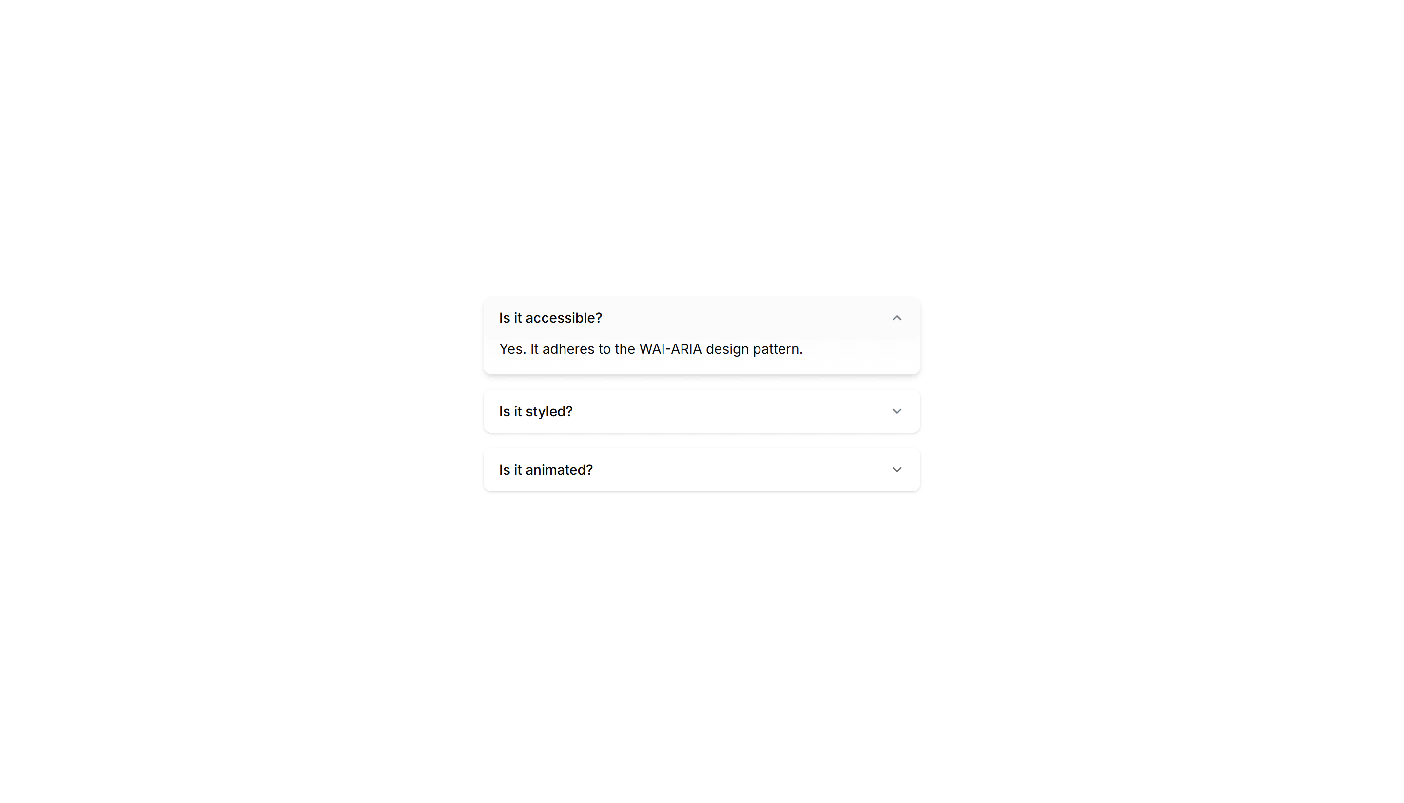
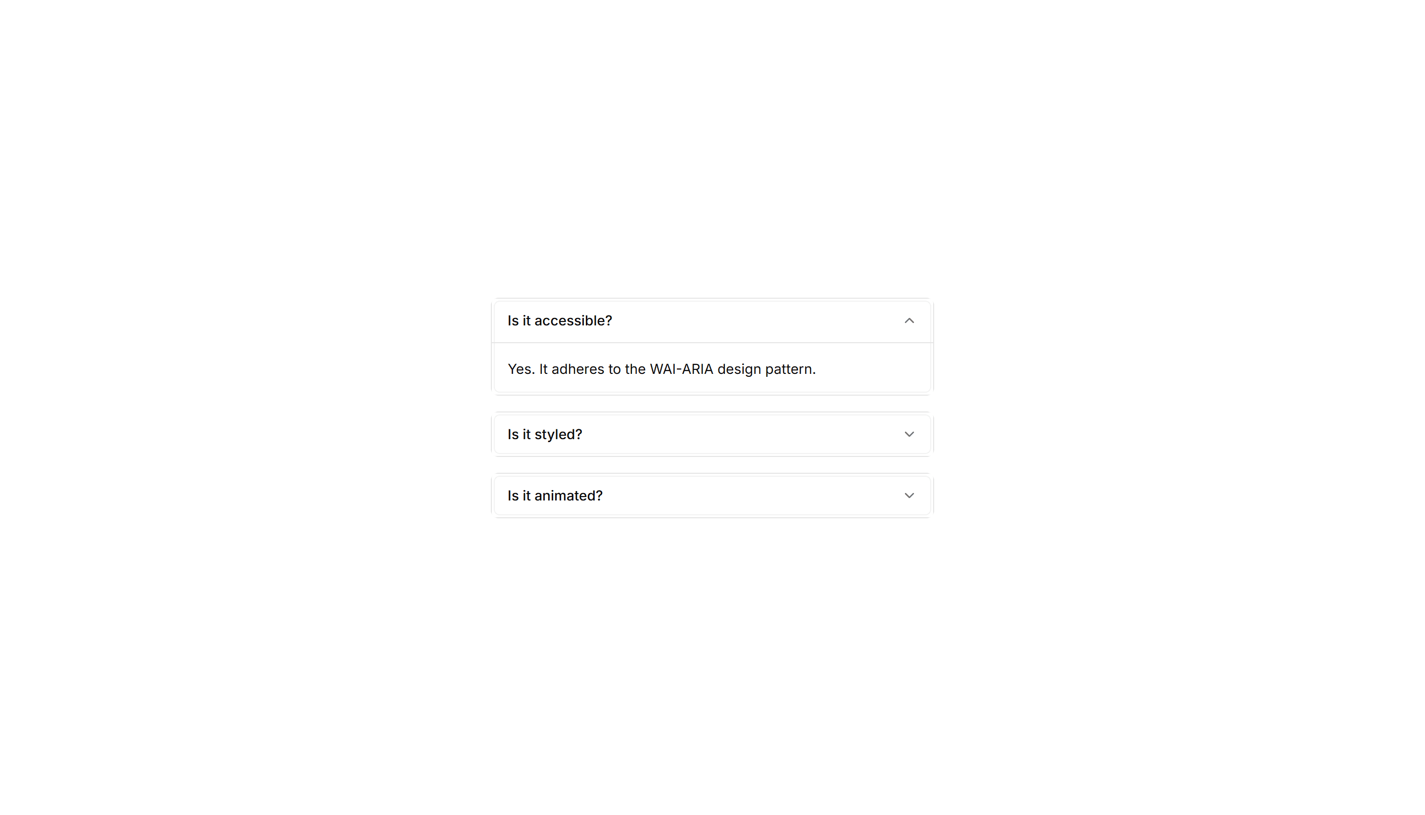
Components Accordion: Highlight Active Accordion
An accordion that tints the background of the open item. The highlighted row keeps your place in long FAQ lists and dense product documentation.
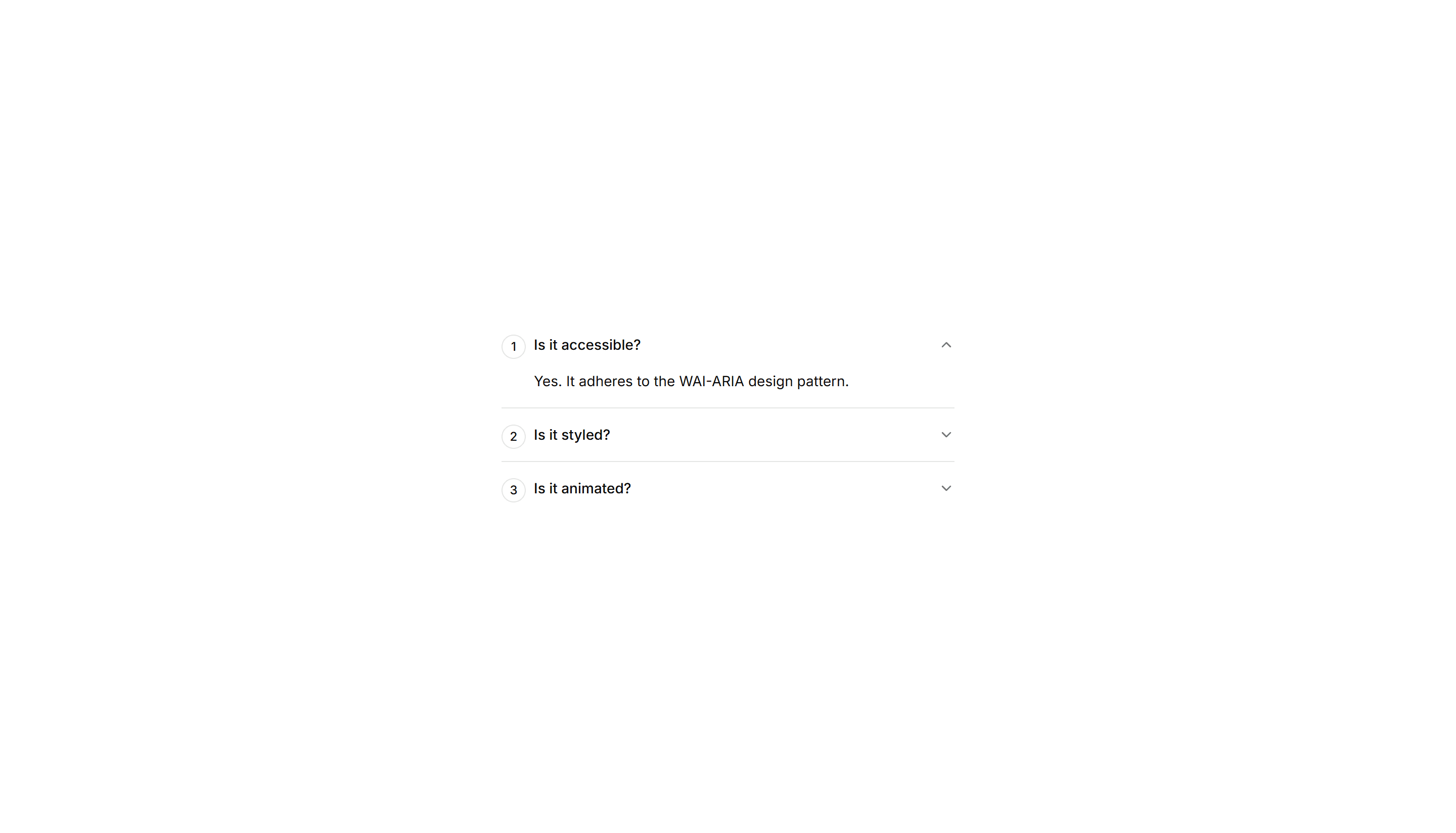
Components Accordion: Numbered Accordion
An accordion with a number beside every question. The counted order suits step guides, ranked FAQs, and any sequence readers follow in turn.
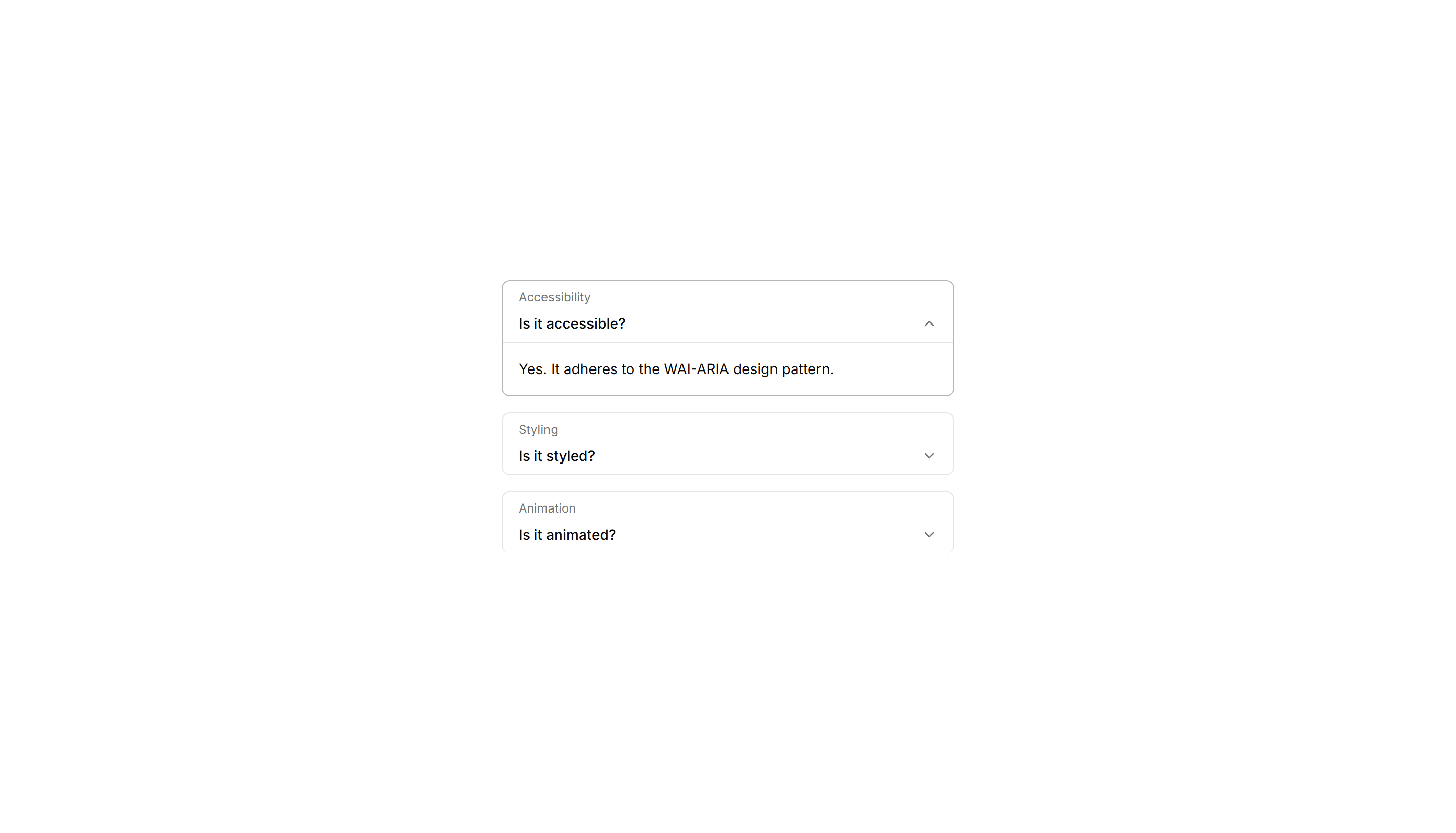
Components Accordion: Card Accordion
An accordion built from separated cards, each panel raised on its own surface. Good for FAQs or feature details that need clear visual separation.
Components Accordion: Double Border Accordion
An accordion with a double line framing every item. The layered borders add clear structure for FAQs and specs where rows need firm definition.

Components Accordion: Thick Side Border Accordion
An accordion with a bold colored bar down the side of each item. The thick accent marks active rows in FAQs and grabs reader attention quickly.
Components Accordion: Floating Label Accordion
An accordion where the question label lifts up as the panel opens. The floating title keeps context visible while reading through long FAQ answers.

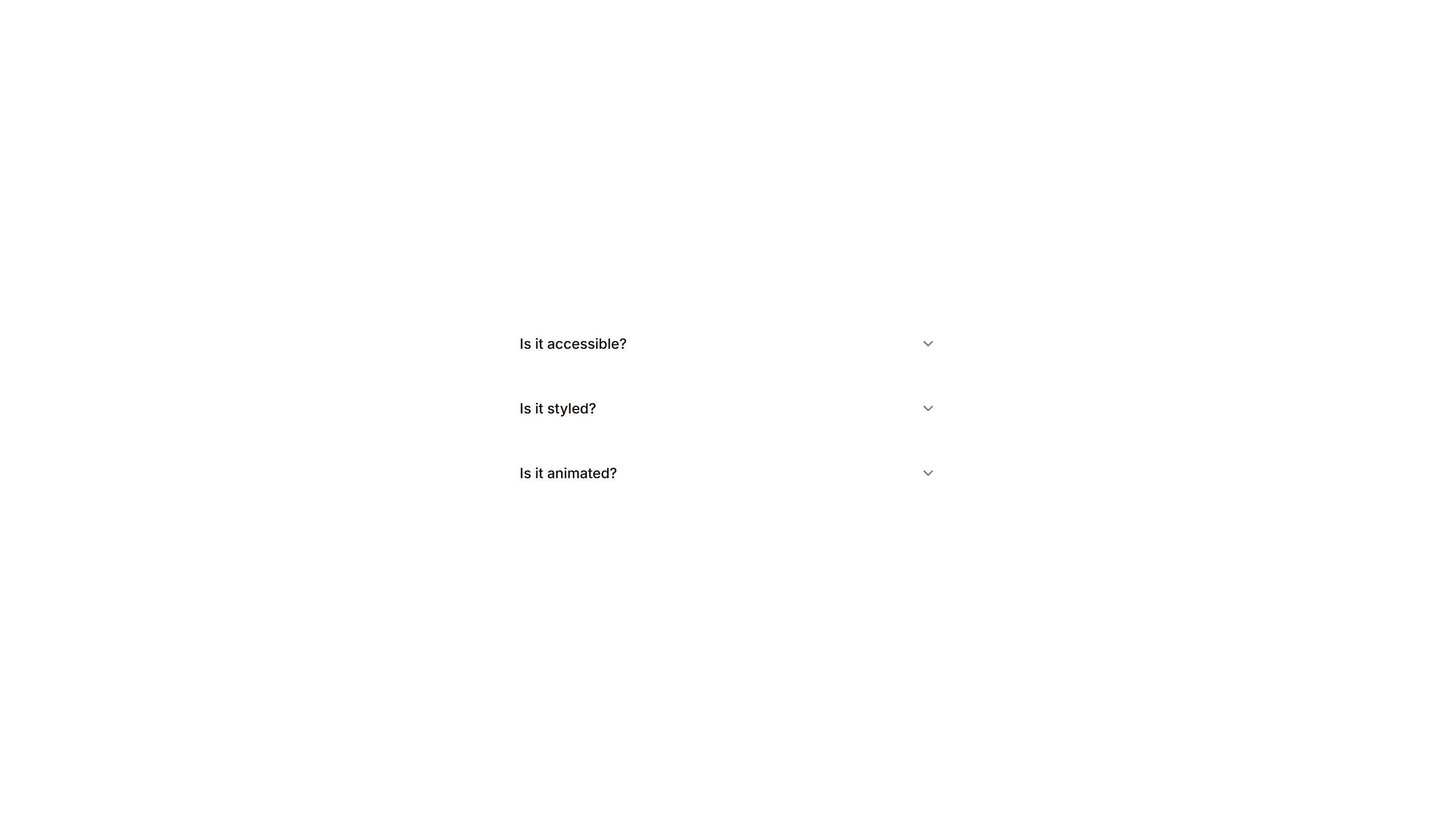
Components Accordion: Minimal Line Accordion
An accordion with thin divider lines and no boxes at all. The stripped back style fits clean FAQs, sidebars, and content heavy marketing pages.
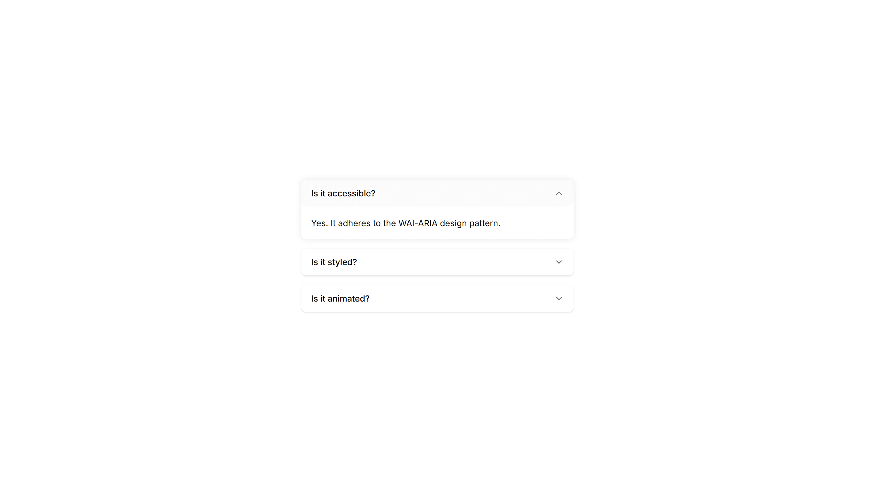
Components Accordion: Shadow Reveal Accordion
An accordion that lifts each item with a soft shadow on open. The raised panel clearly signals the active answer in FAQs and feature breakdowns.
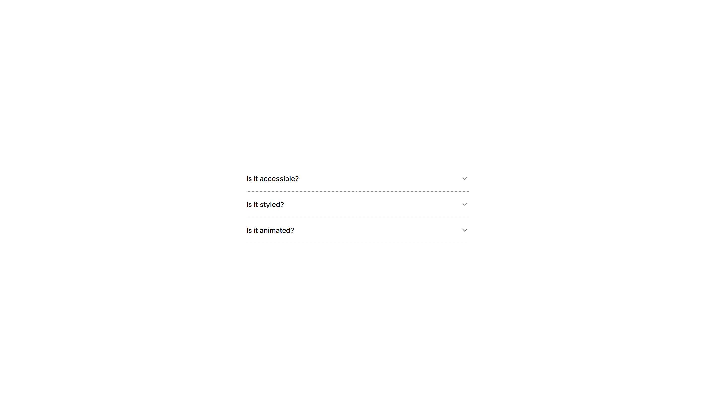
Components Accordion: Dash Line Accordion
An accordion divided by dashed lines between items. The light dashed rhythm keeps long FAQ lists readable while staying subtle and unobtrusive.

Components Accordion: Underline Accordion
An accordion where each question sits above a single underline. The clean text first look fits editorial FAQs and quiet, tidy help sections.
Components Accordion: Glow Border Accordion
An accordion with a glowing border on the open item. The lit edge draws the eye to the active panel, fitting dark themes and modern product FAQs.
Components Accordion: Nested Border Accordion
An accordion supporting nested items inside bordered panels. Use it for layered FAQs, docs, and settings where topics branch into subtopics.
Components Accordion: Border Fade Accordion
An accordion where each item border softly fades on open. Adds a quiet visual cue for active panels in FAQs and settings without loud styling.

Components Accordion: Dotted Border Accordion
An accordion framed by a dotted border around each panel. The playful dotted outline suits informal FAQs, help docs, and friendly onboarding tips.