Shadcn Feature Section Blocks
Browse 18 feature section blocks for shadcn/ui. Cards, tabs, timelines, stats, and carousels to show what your product does and why people care.
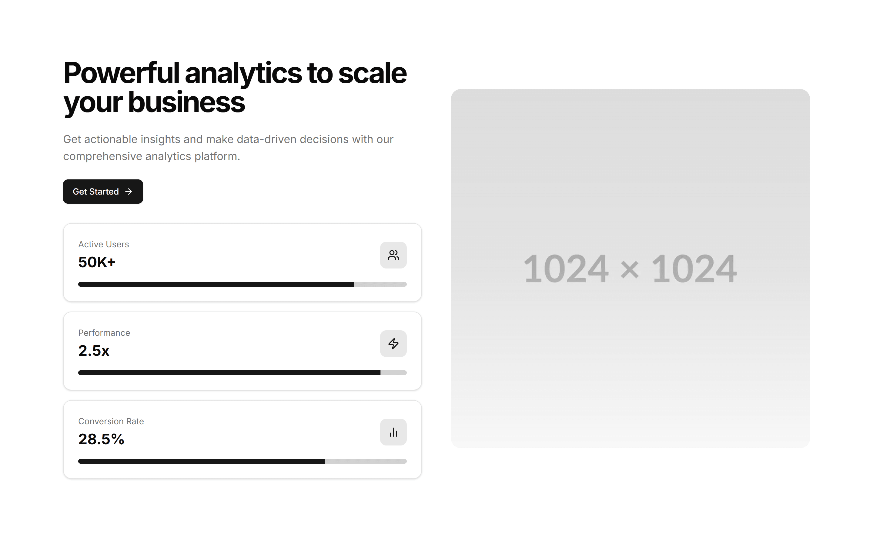
Marketing Feature Section: With Stats
Feature descriptions interleaved with headline numbers and labels. Pairs the what with the proof so visitors trust the results on a product or pricing page.
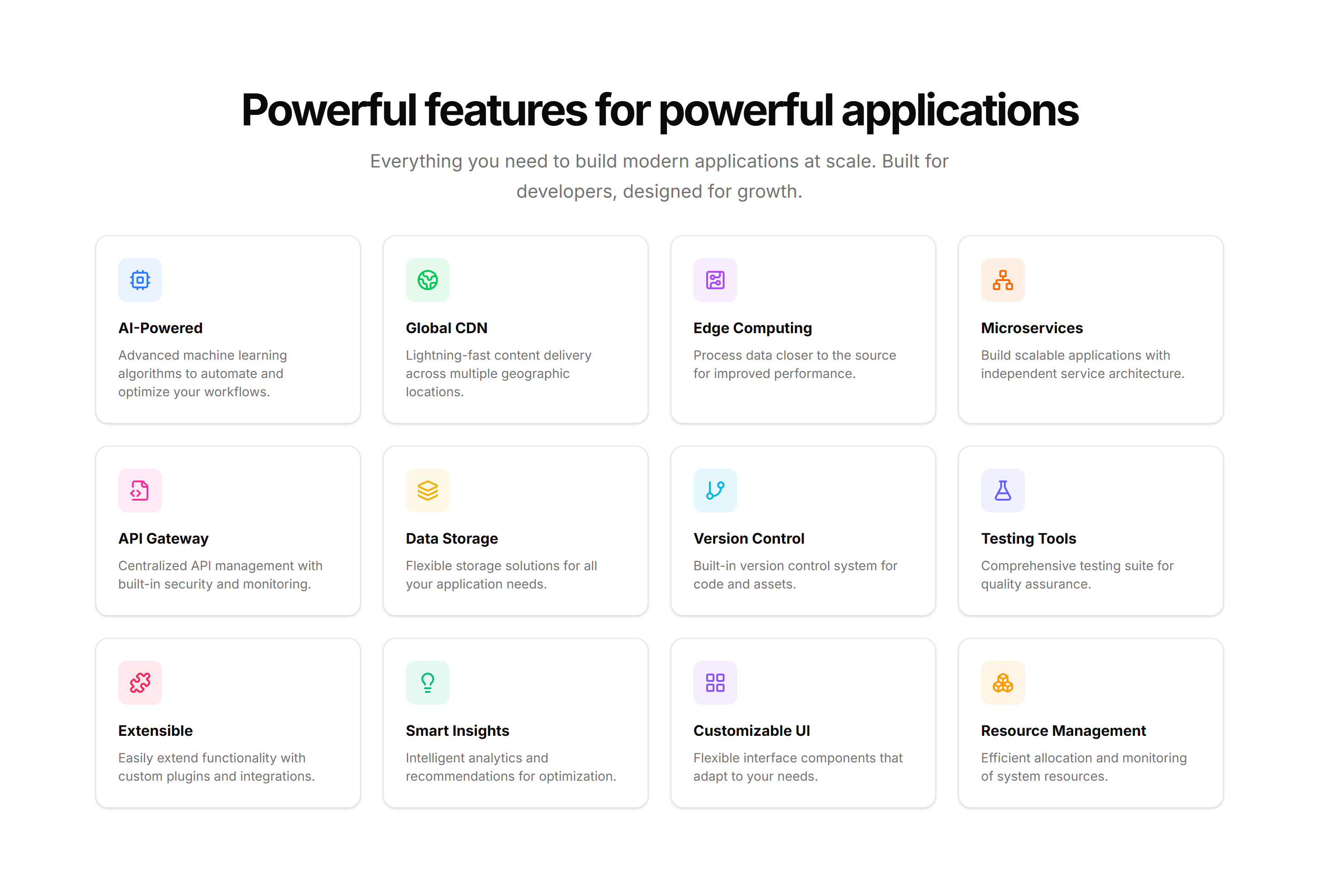
Marketing Feature Section: Grid Hover
A feature grid where each cell reveals more copy and a glow on hover. Keeps the section compact at rest, then rewards visitors who explore each capability.
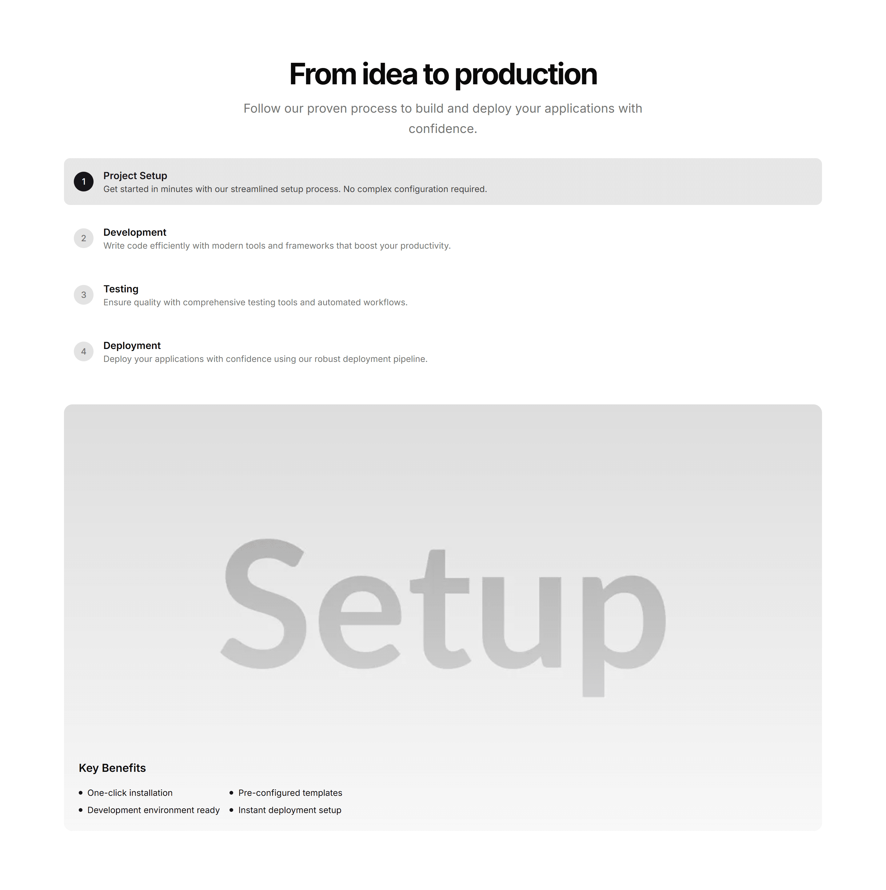
Marketing Feature Section: Steps
Numbered steps that lay out how your product works from start to finish. Drop it on a homepage to turn a process into an easy three or four part story.
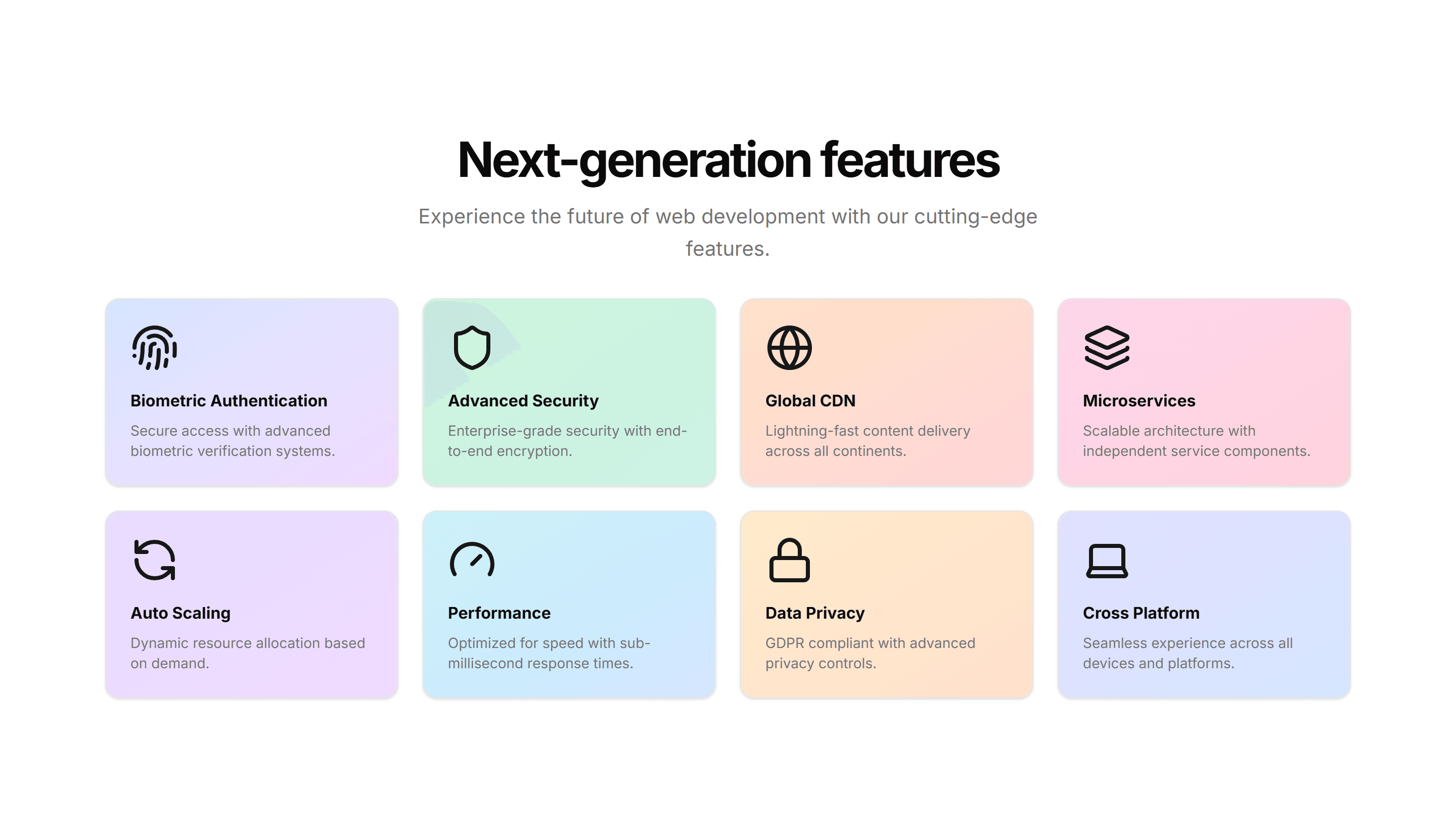
Marketing Feature Section: 3D Cards
Feature cards that tilt in 3D as the cursor moves, each holding an icon, title, and copy. Adds depth to a landing page when you want highlights to feel tactile.
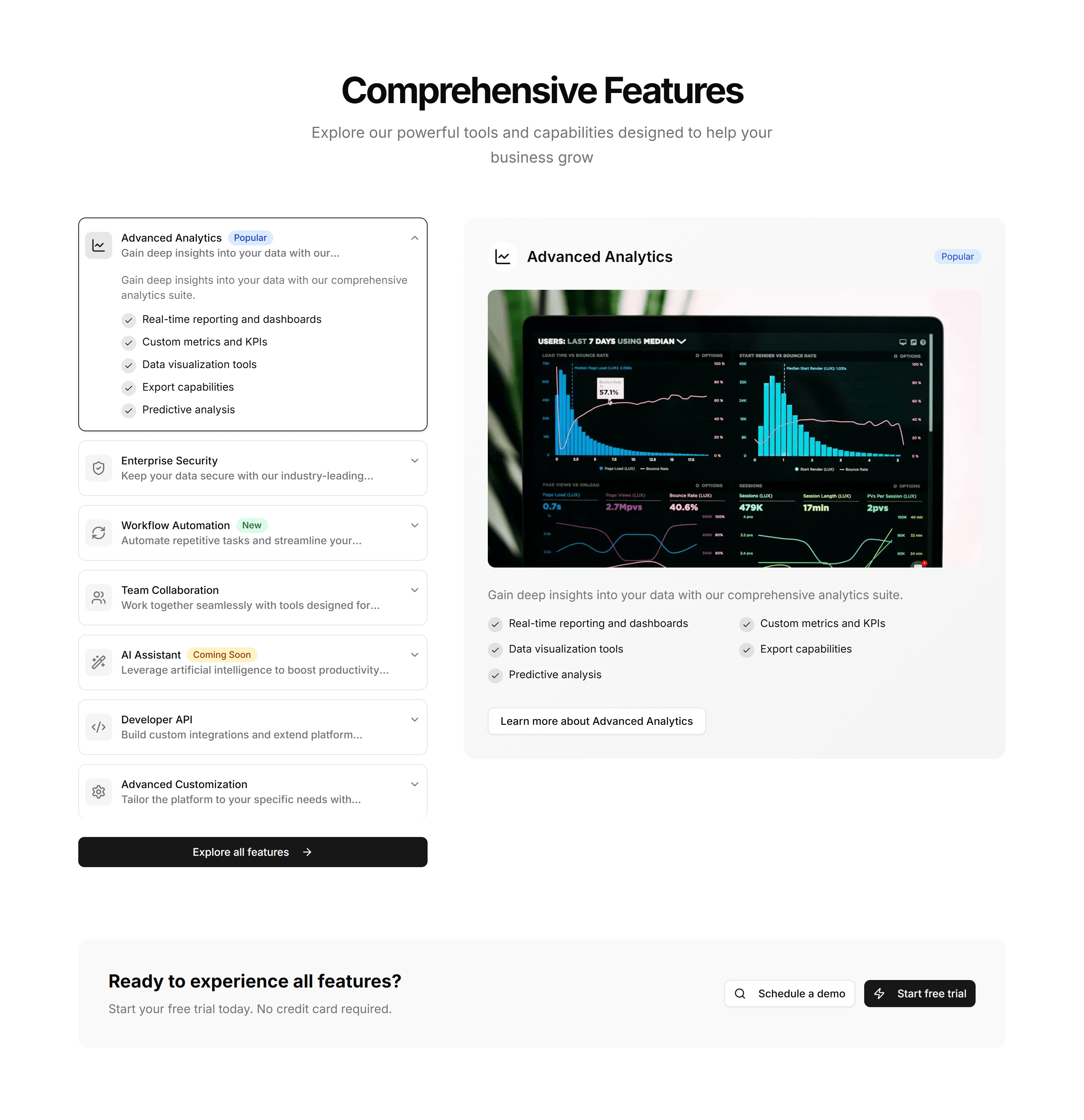
Marketing Feature Section: Feature Accordion
Stacked feature panels that expand on click to reveal detail and a paired visual. Lets visitors drill into one capability at a time without crowding the page.
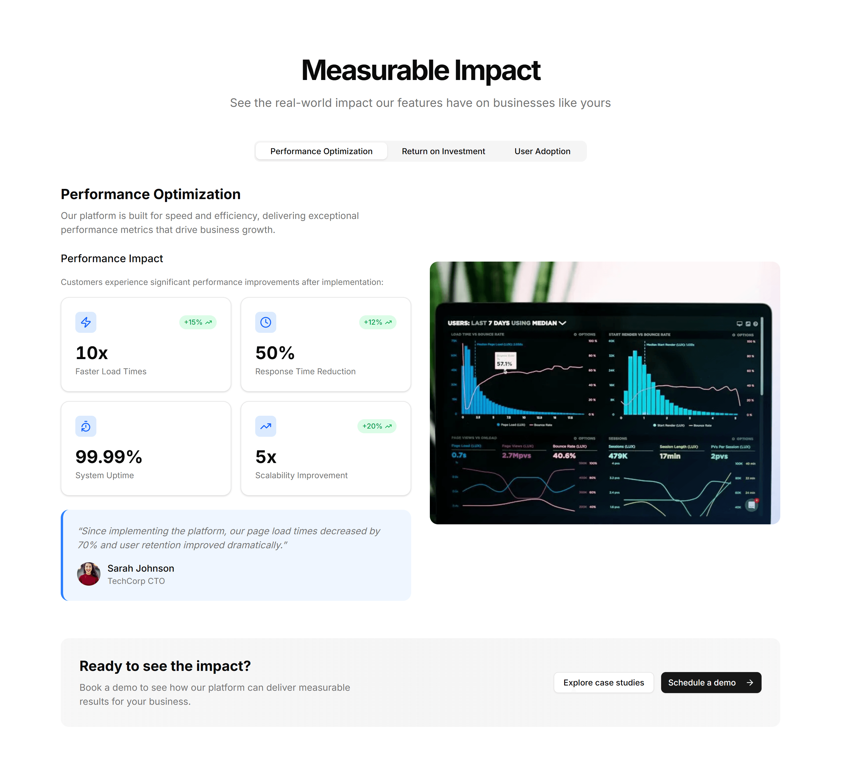
Marketing Feature Section: Feature Stats
Feature copy paired with bold metrics like uptime, users, or speed. Backs your claims with numbers and builds trust on a homepage or product overview.
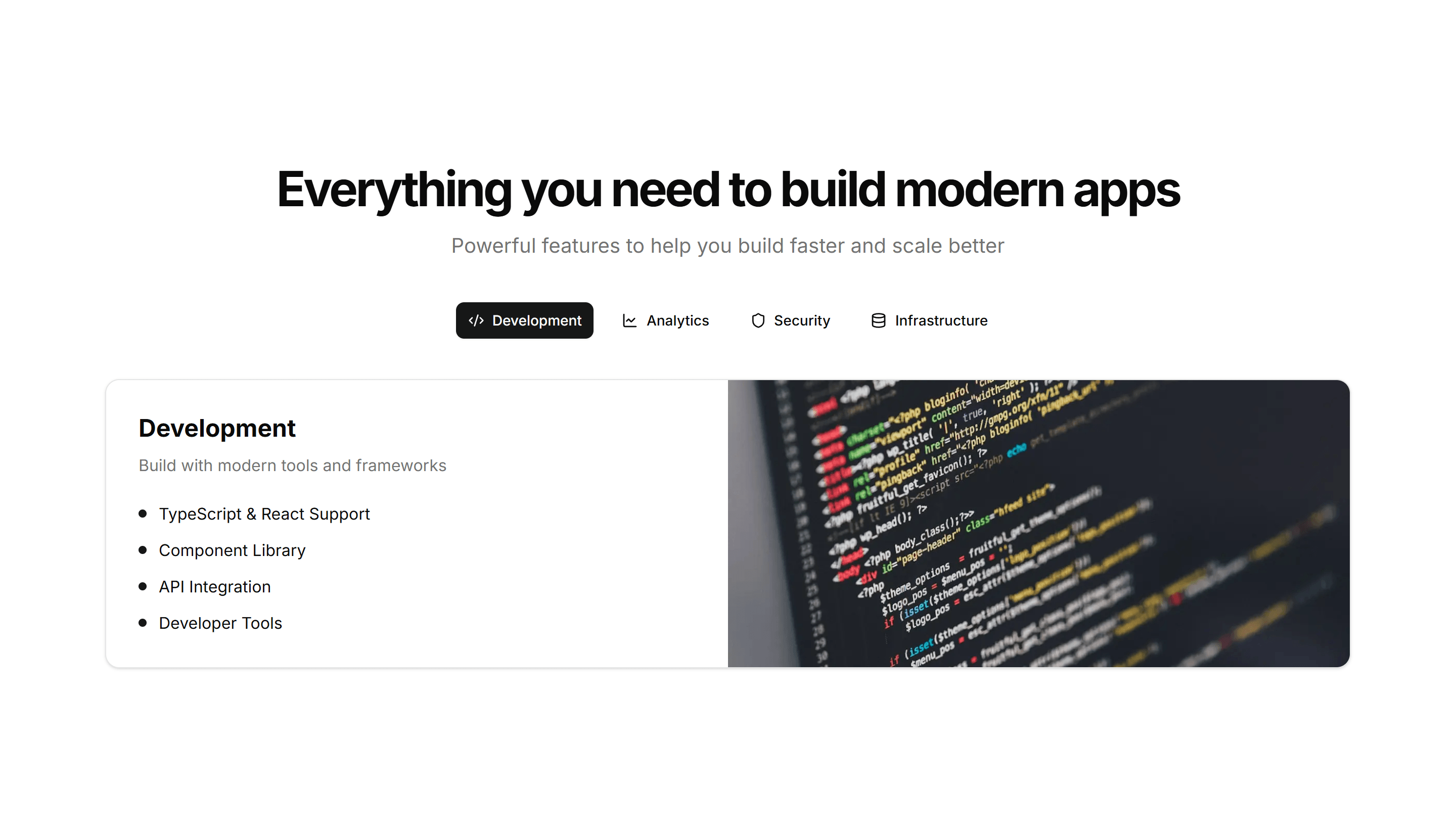
Marketing Feature Section: With Tabs
Tabbed feature panels that swap content and visuals as visitors switch tabs. Organizes many capabilities into one compact, tidy section that stays readable.
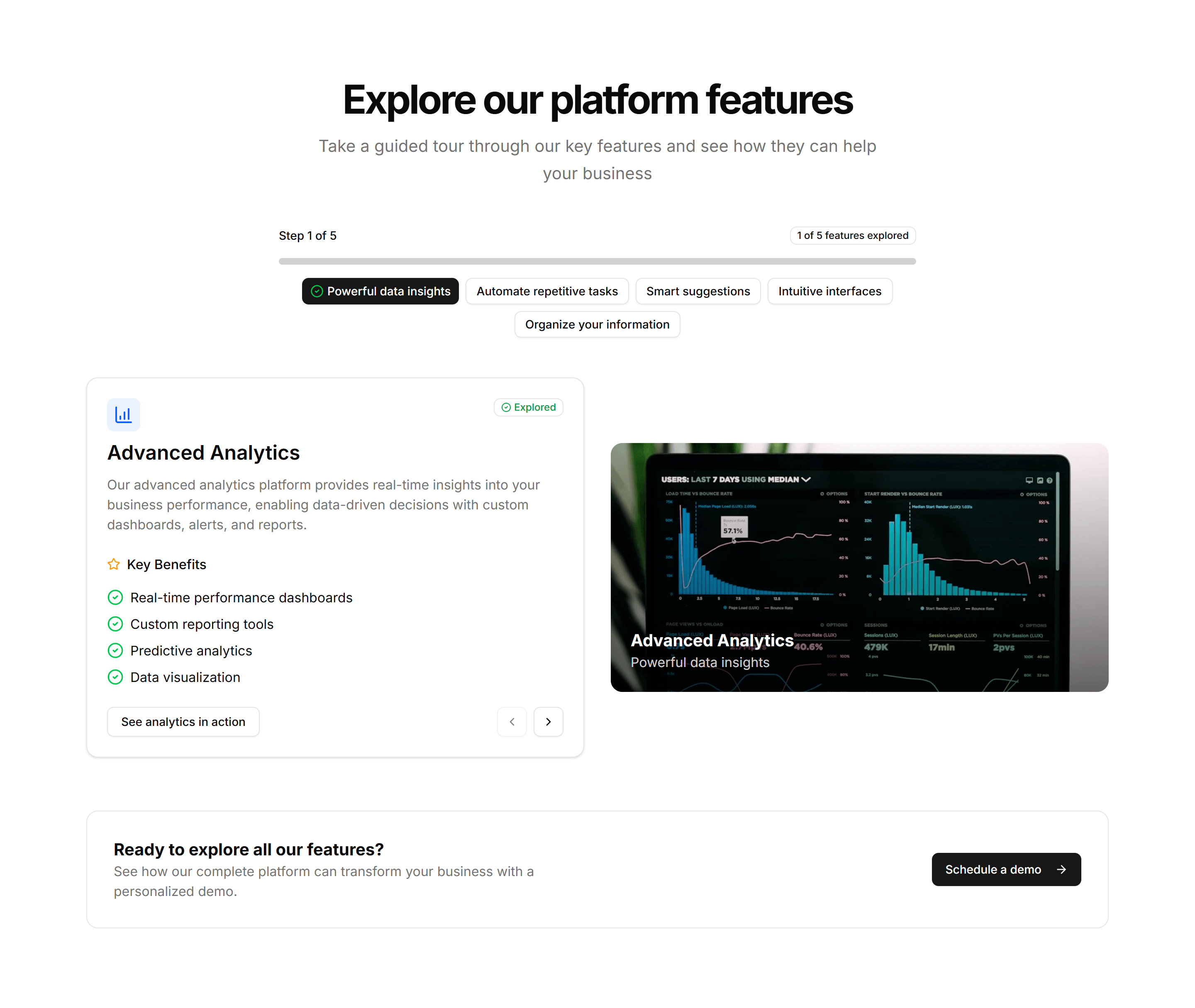
Marketing Feature Section: Feature Wizard
A guided, multi step layout that reveals features as the visitor advances. Useful for onboarding copy or walking through a setup flow one screen at a time.
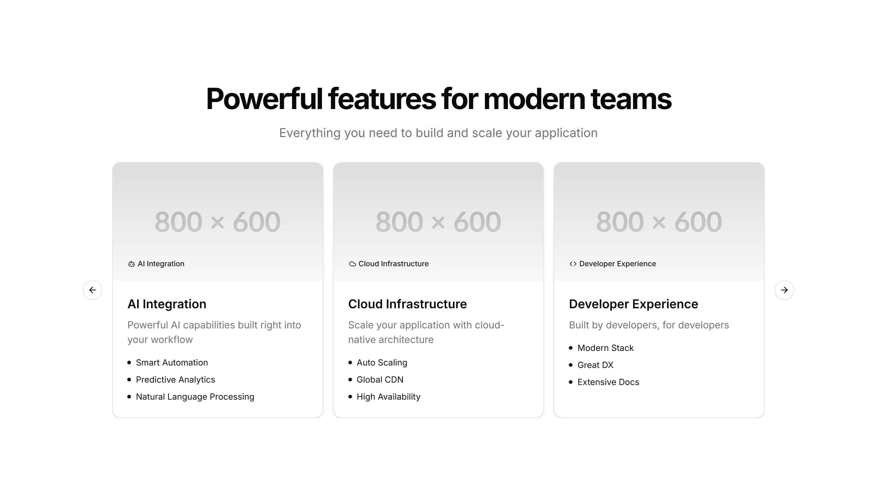
Marketing Feature Section: With Carousel
Feature highlights in a swipeable carousel, one slide per capability with copy and a visual. Fits many features into a small space without a long scroll.
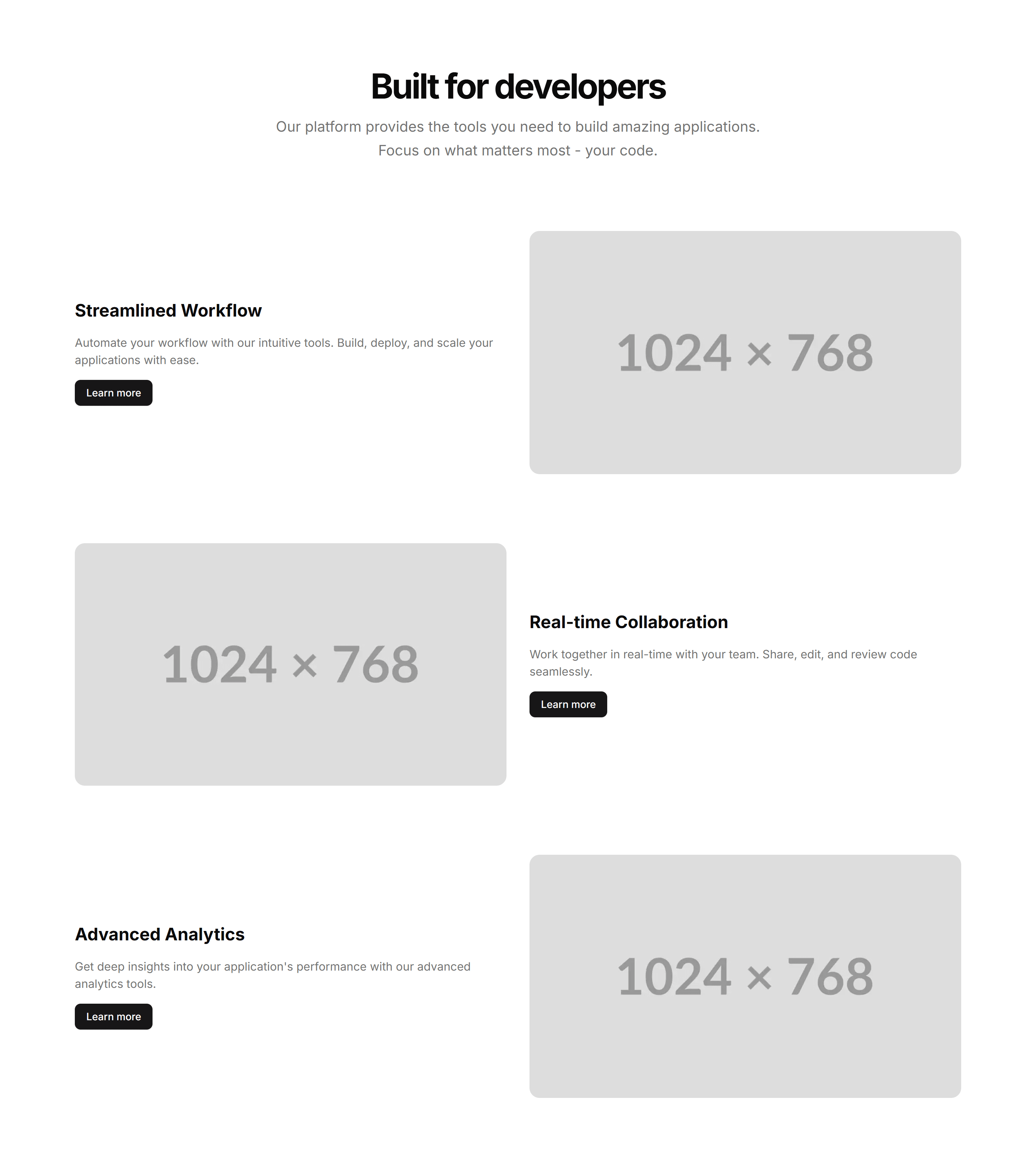
Marketing Feature Section: With Images
Alternating rows of feature copy beside supporting images. A reliable pattern for explaining several capabilities while keeping the page lively and balanced.
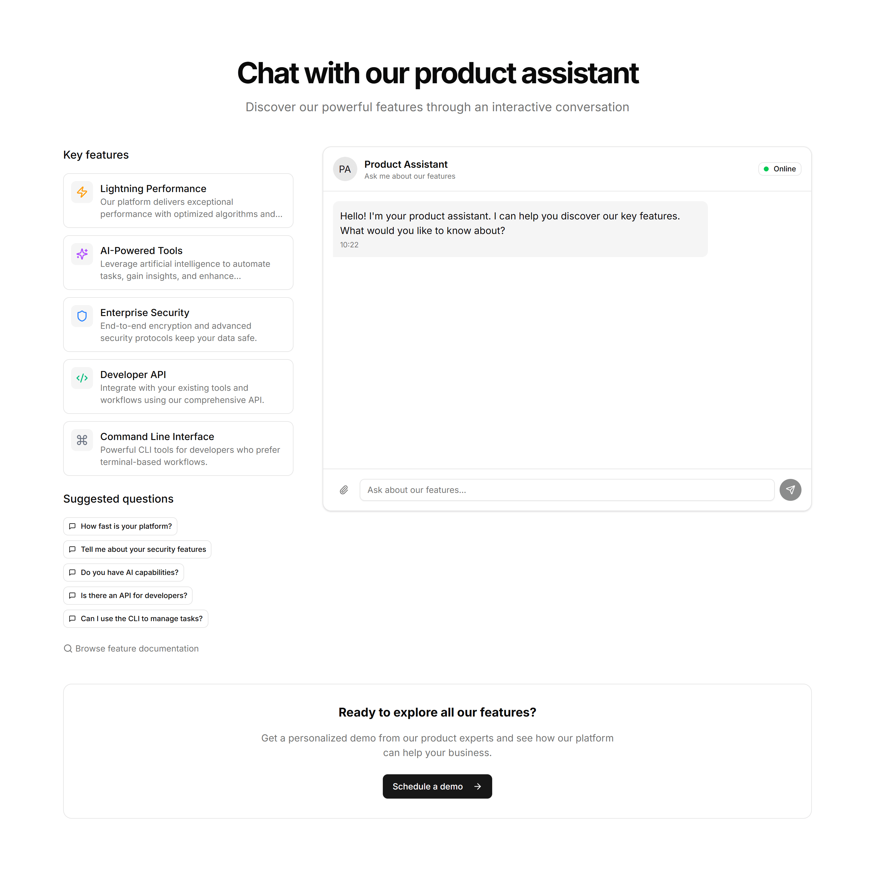
Marketing Feature Section: Feature Chat
A feature section styled as a chat thread, pairing message bubbles with copy. Built to show a messaging or support product talking in real conversation.
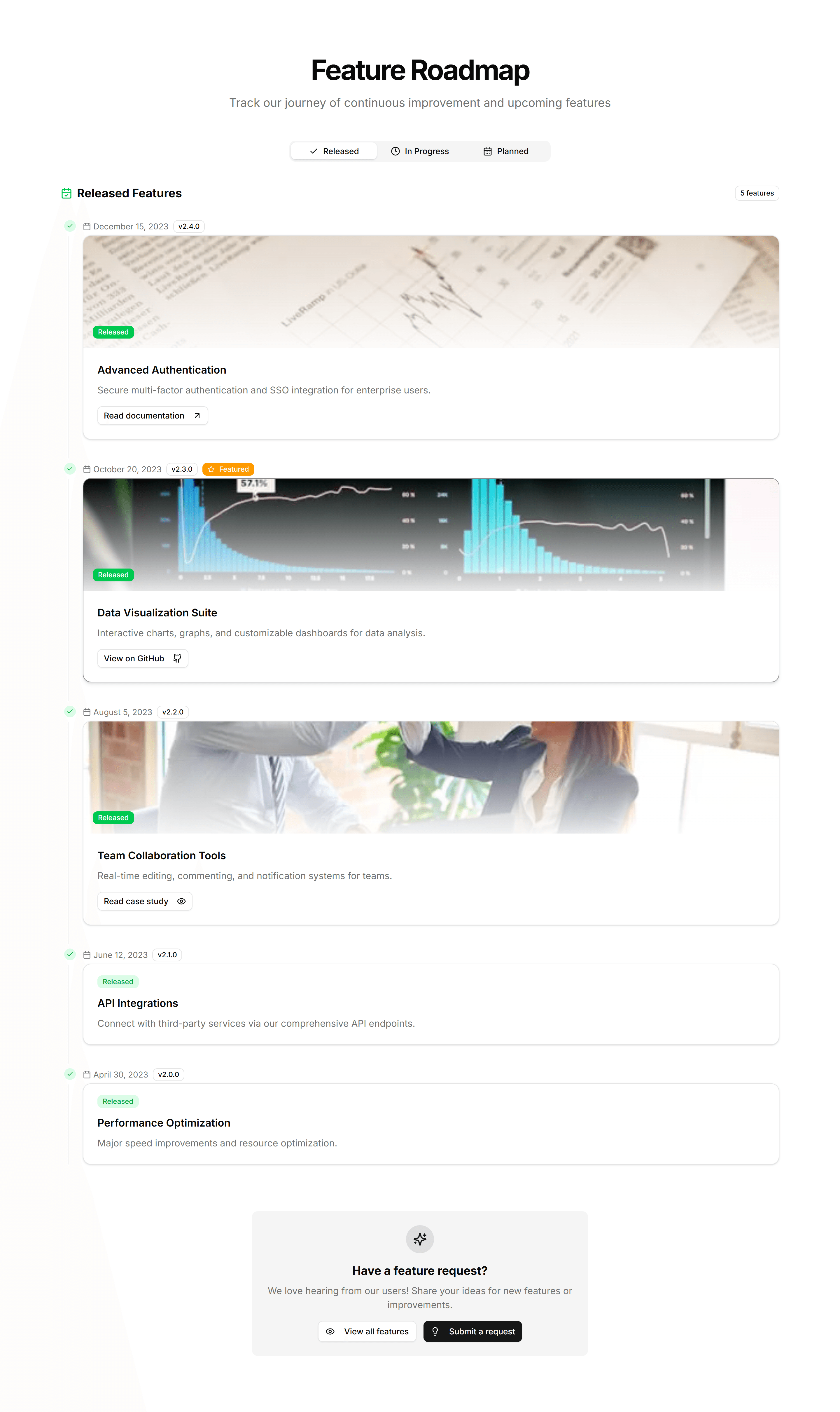
Marketing Feature Section: Feature Timeline
A vertical timeline that walks through features or milestones in sequence. Ideal for telling how a product flow works or how your story unfolded over time.
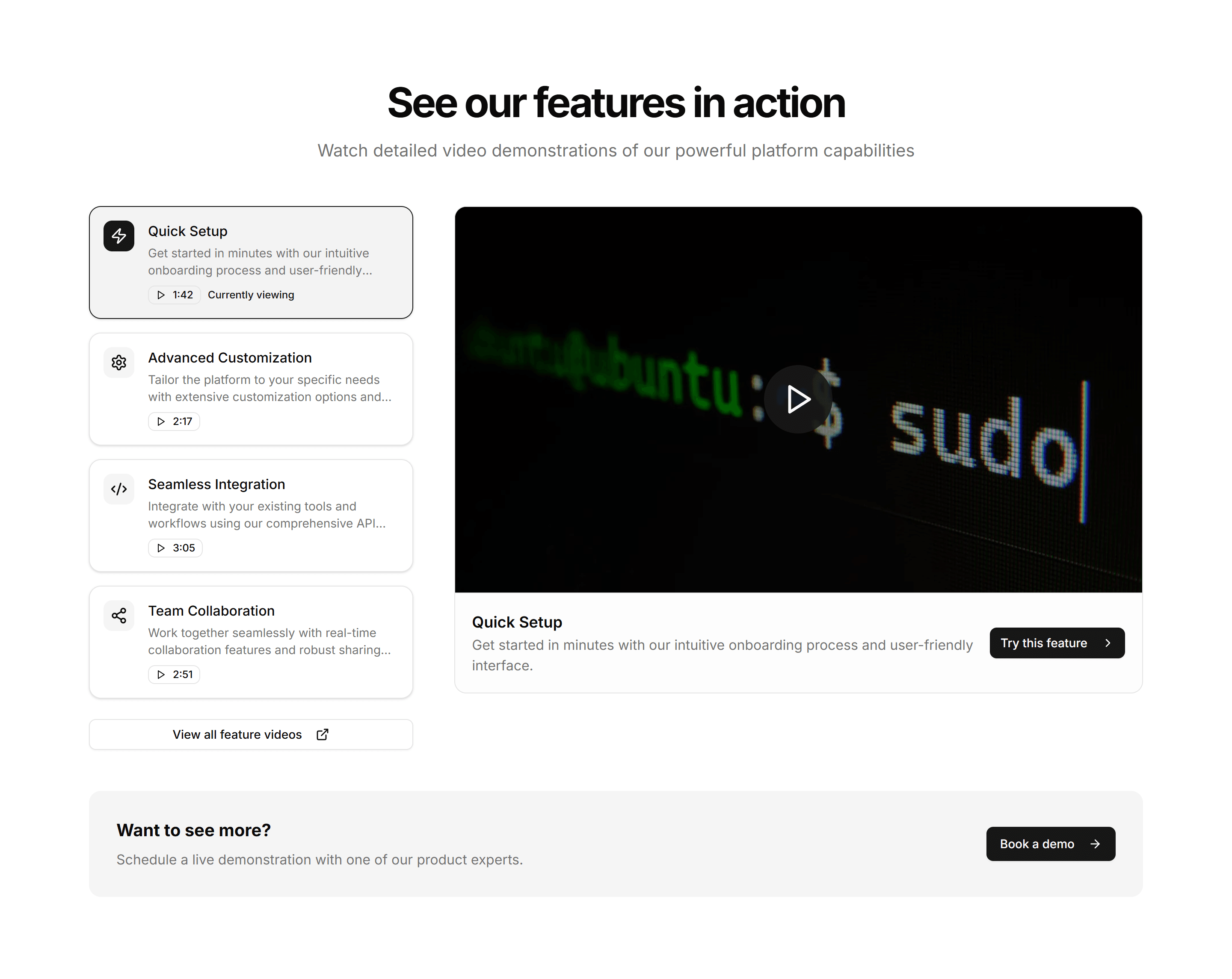
Marketing Feature Section: Feature Videos
A feature layout built around short video clips, each captioned with a benefit. Best when a moving demo explains the value faster than text alone could.
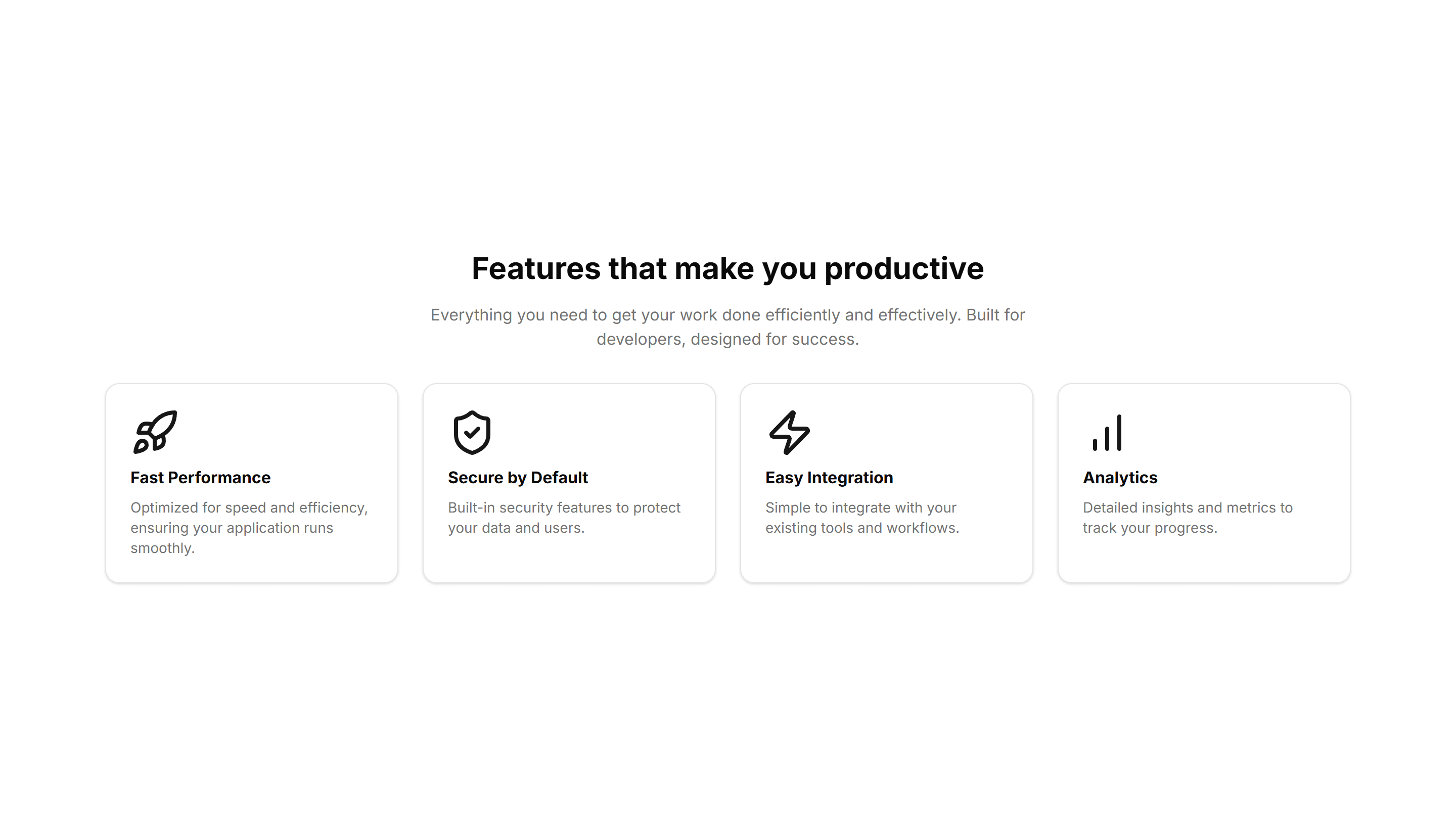
Marketing Feature Section: Simple
A clean feature section with a heading, supporting text, and a short list of points. Reach for it when you want clarity over decoration on a marketing page.
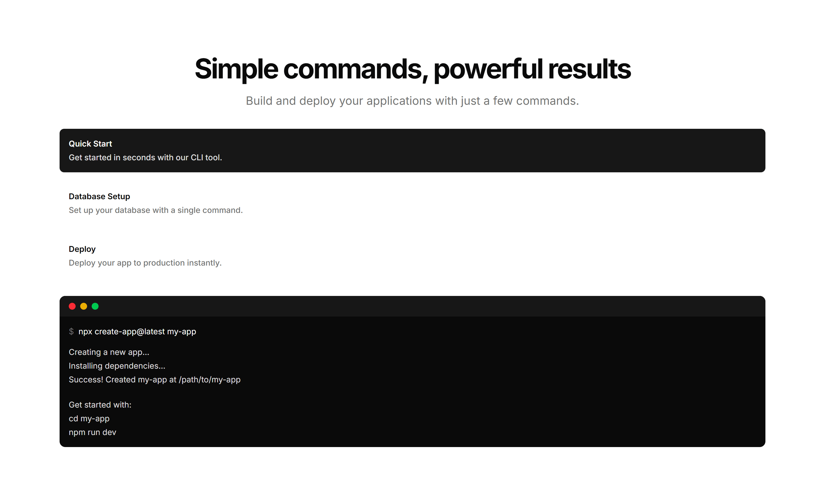
Marketing Feature Section: Terminal
A feature section featuring a mock terminal with typed commands and output. Built for developer tools where showing real CLI usage sells the value fast.
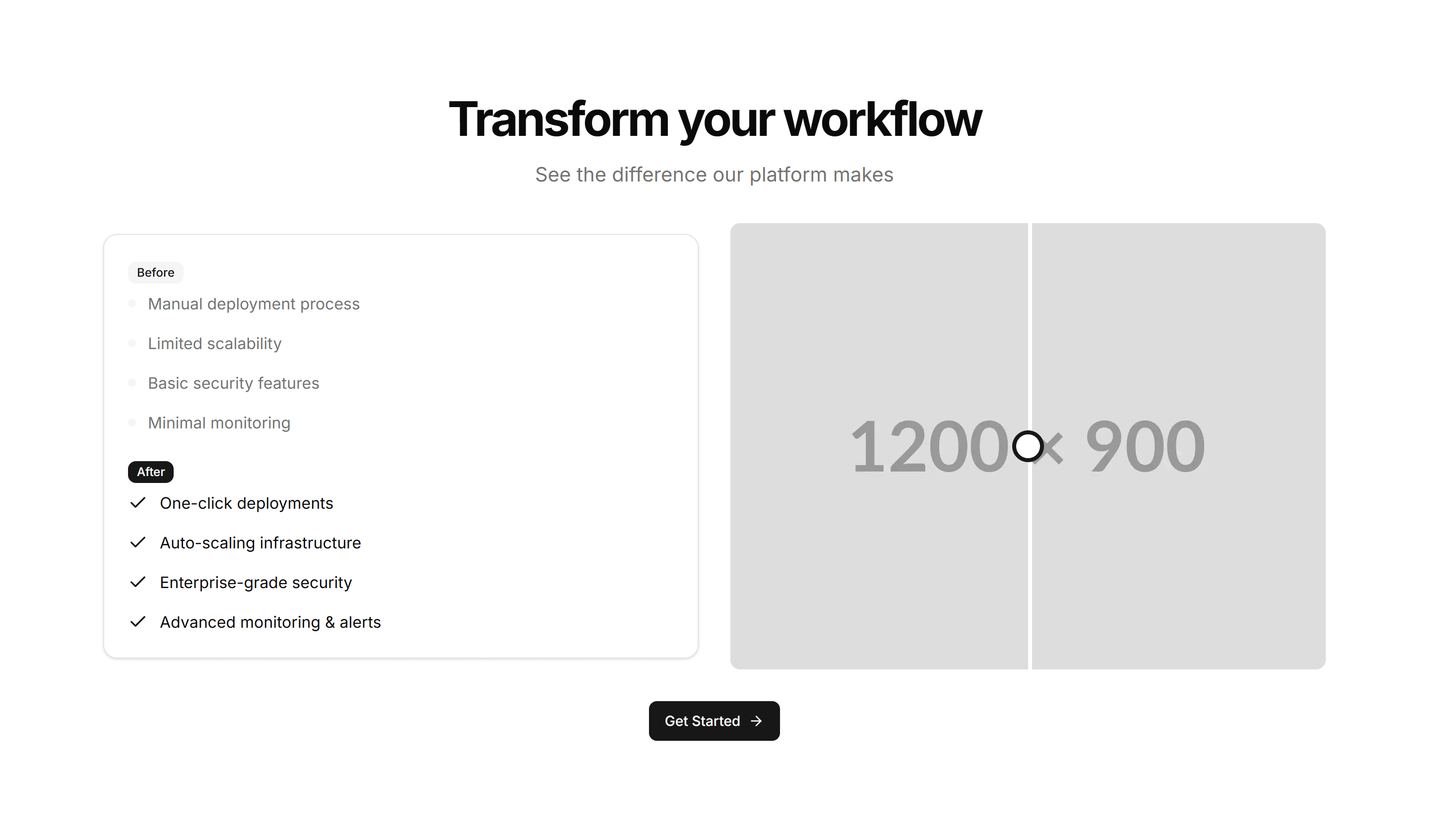
Marketing Feature Section: With Comparison
A feature block that places before and after states next to each other. Use it to show the change your product brings and let the difference speak plainly.
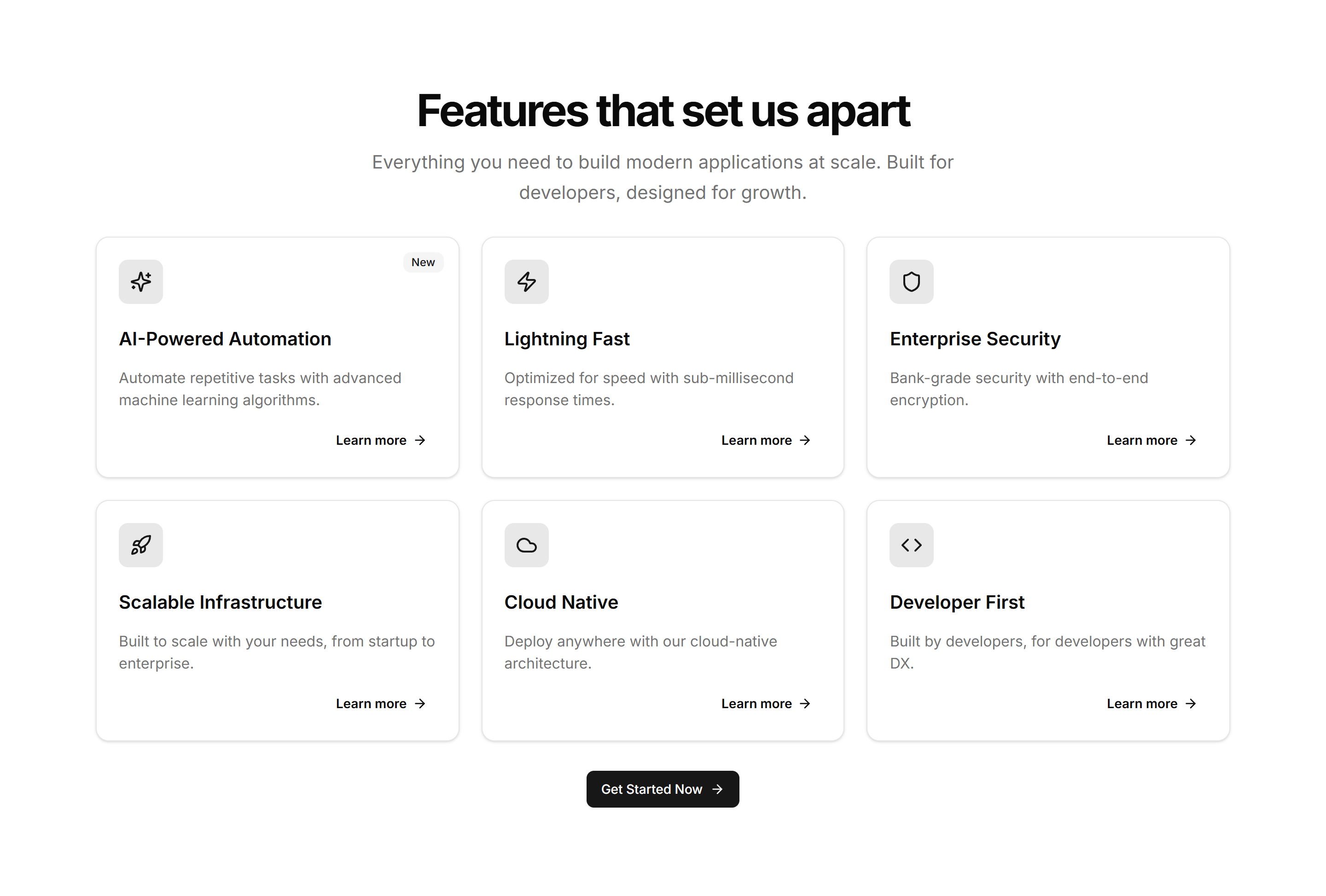
Marketing Feature Section: Card Grid
A tidy grid of feature cards, each with an icon, heading, and short description. Lays out several product capabilities at once for a clean overview section.
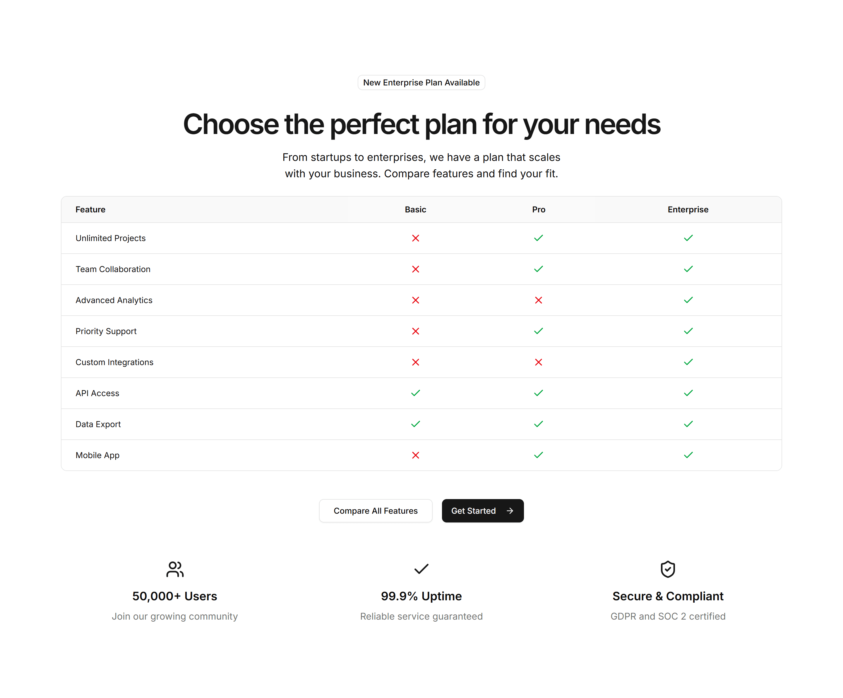
Marketing Feature Section: Feature Comparison
Sets two options side by side with checkmarks and notes per row. Use it to contrast your product against an alternative and make the better choice obvious.