Shadcn App Shell Blocks
Browse 19 Application Pro shell blocks for shadcn/ui. Sidebar layouts, topbar frames, and settings scaffolds ready to hold your pages.
Application App Shell: Centered Content Shell
A slim top bar and a max-w-3xl reading column on a muted background for docs, articles, or single settings detail pages.
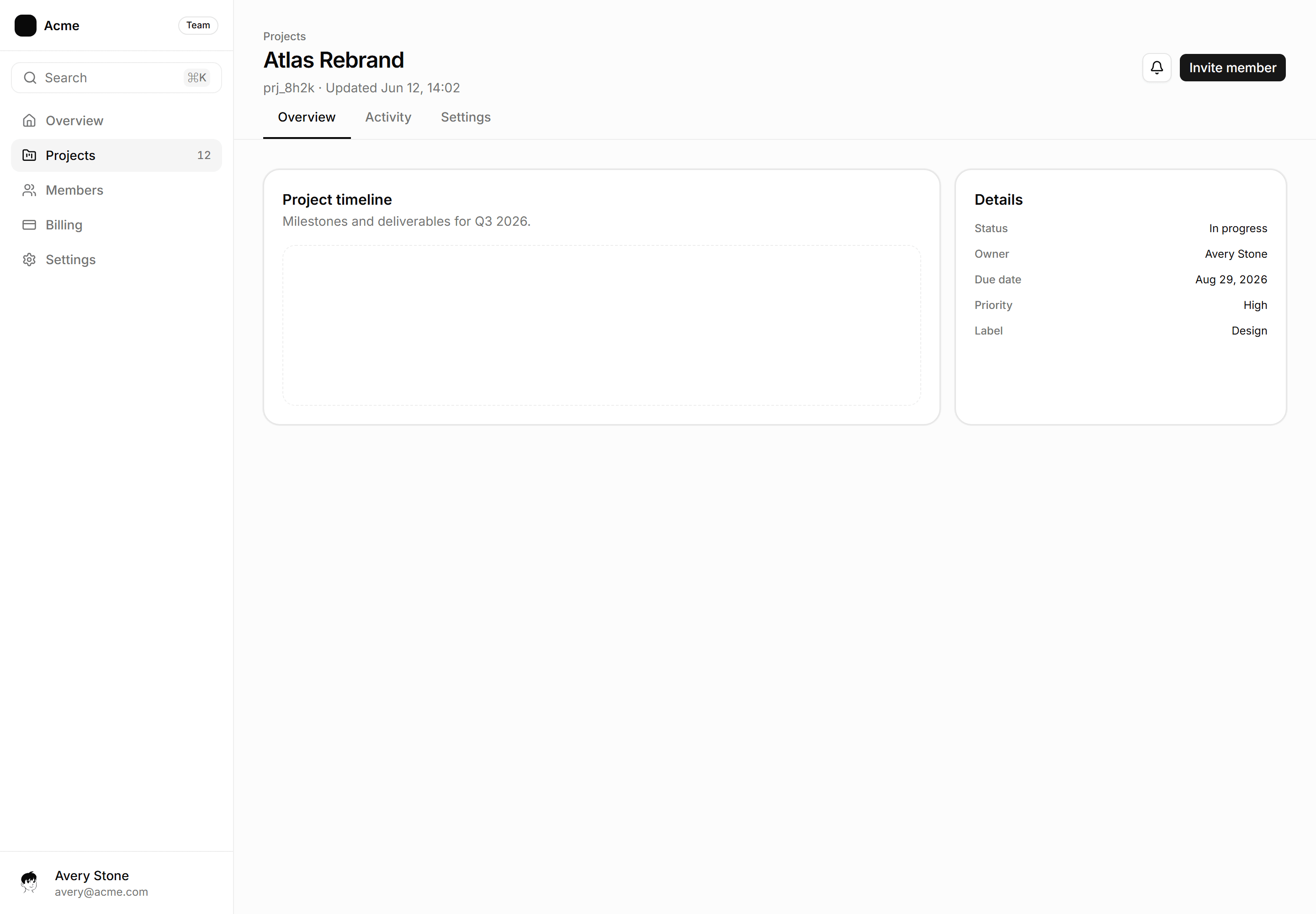
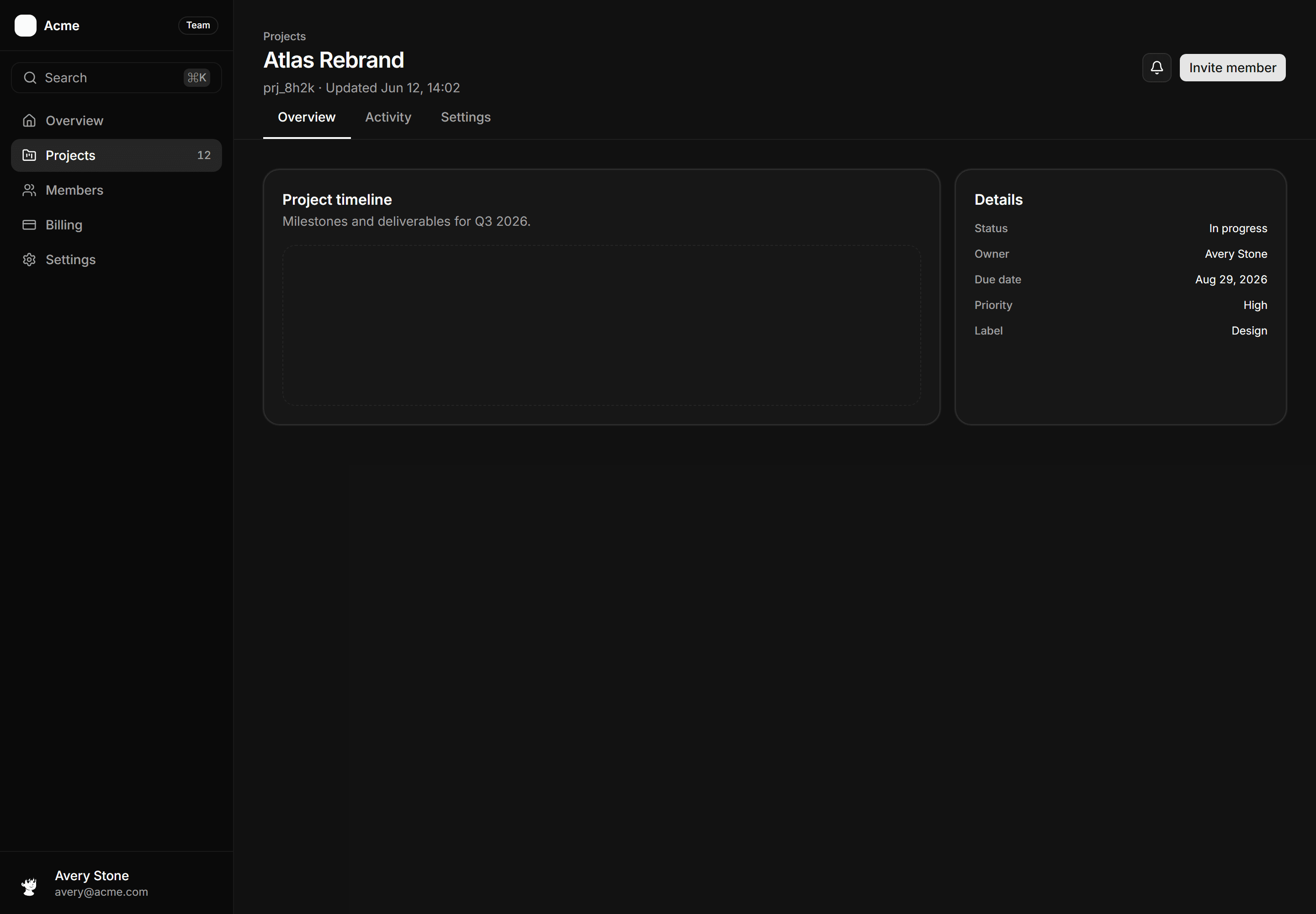
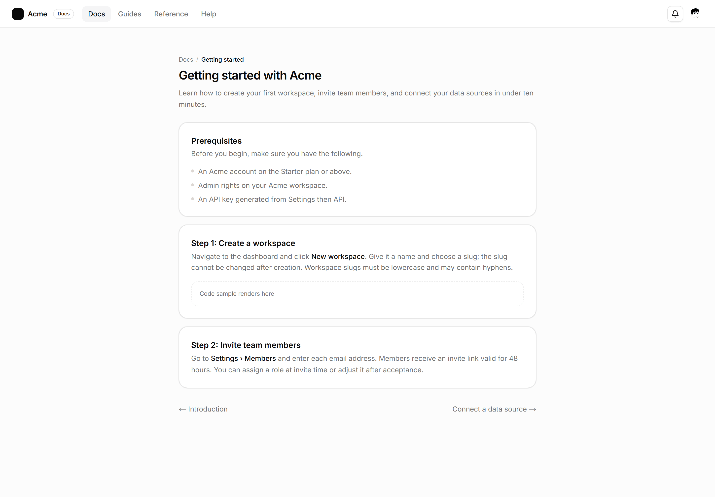
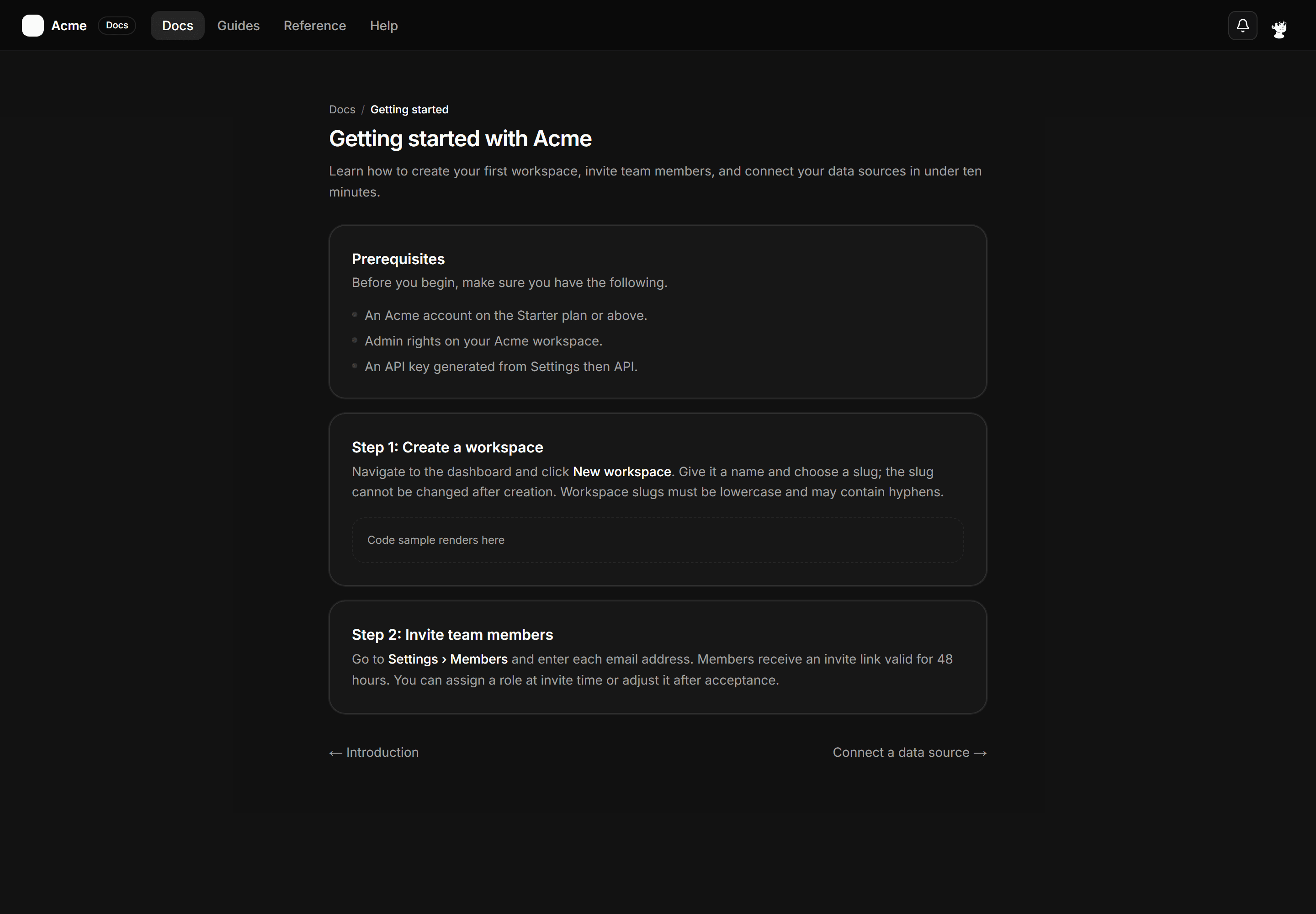
Application App Shell: Tabbed Page Shell
A full-page shell with a sidebar, a named resource header, and a horizontal tab row delivering sub-view content below.
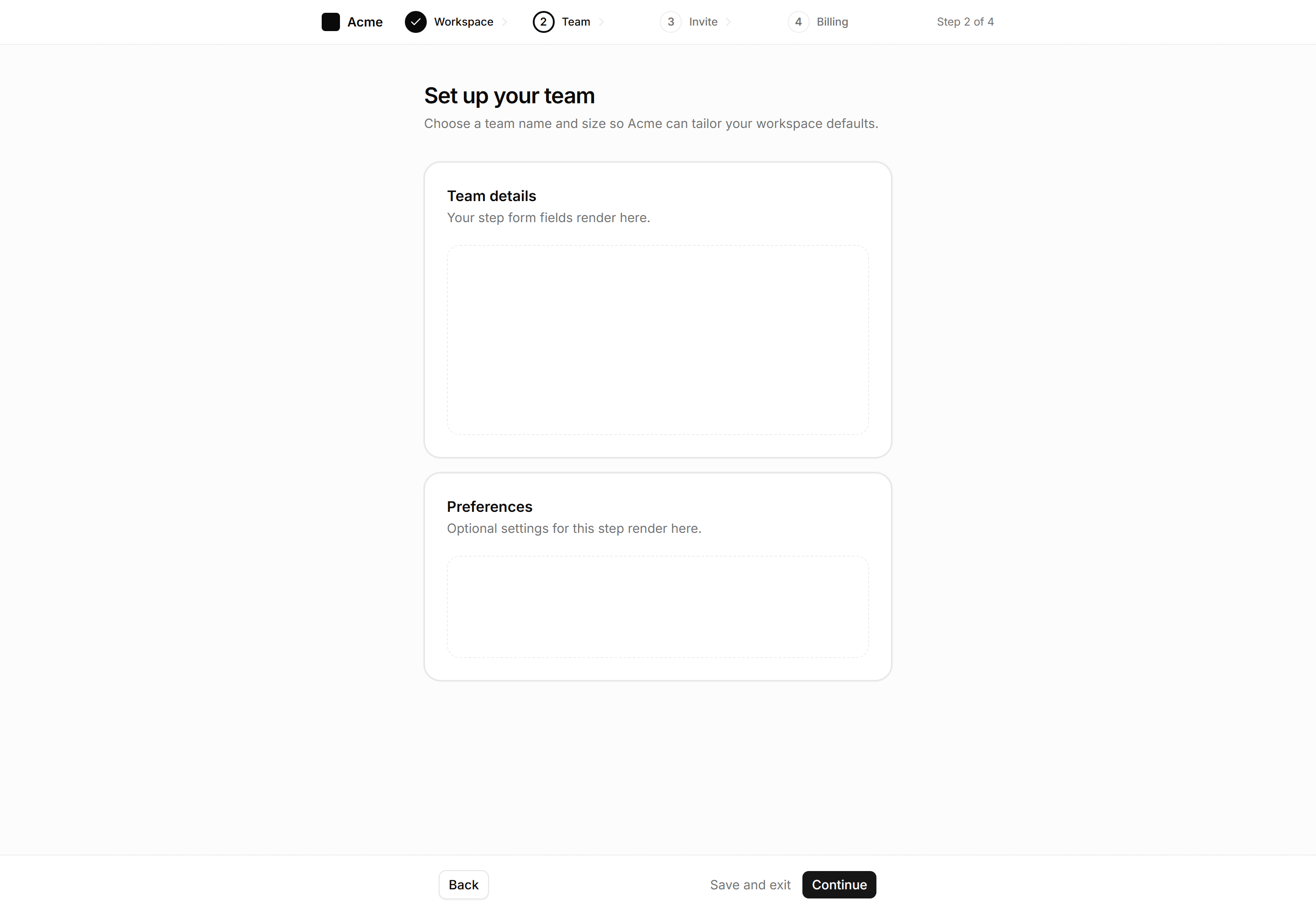
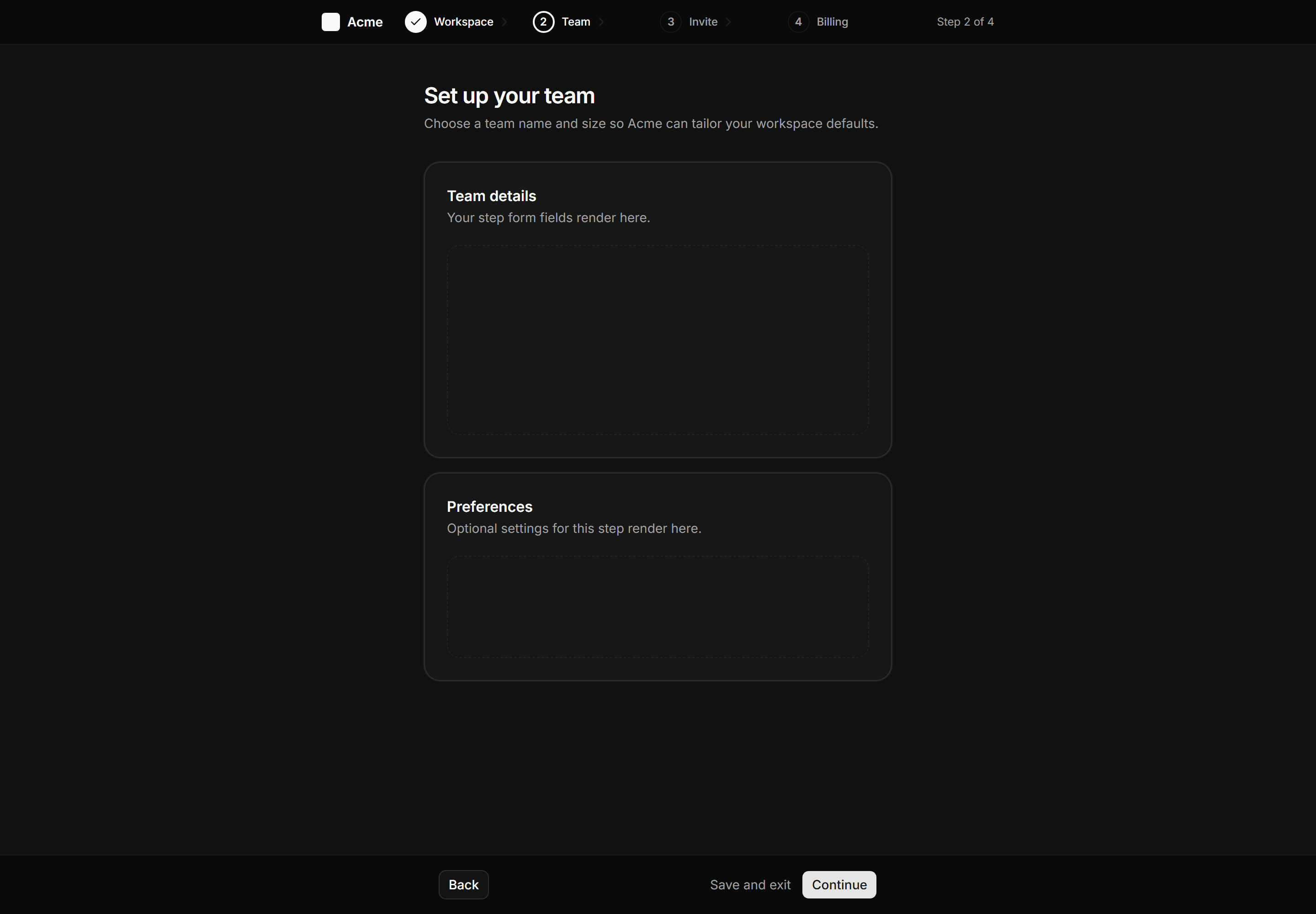
Application App Shell: Wizard Shell
Multi-step flow shell with a slim header step indicator, centered content column, and sticky back and continue footer.
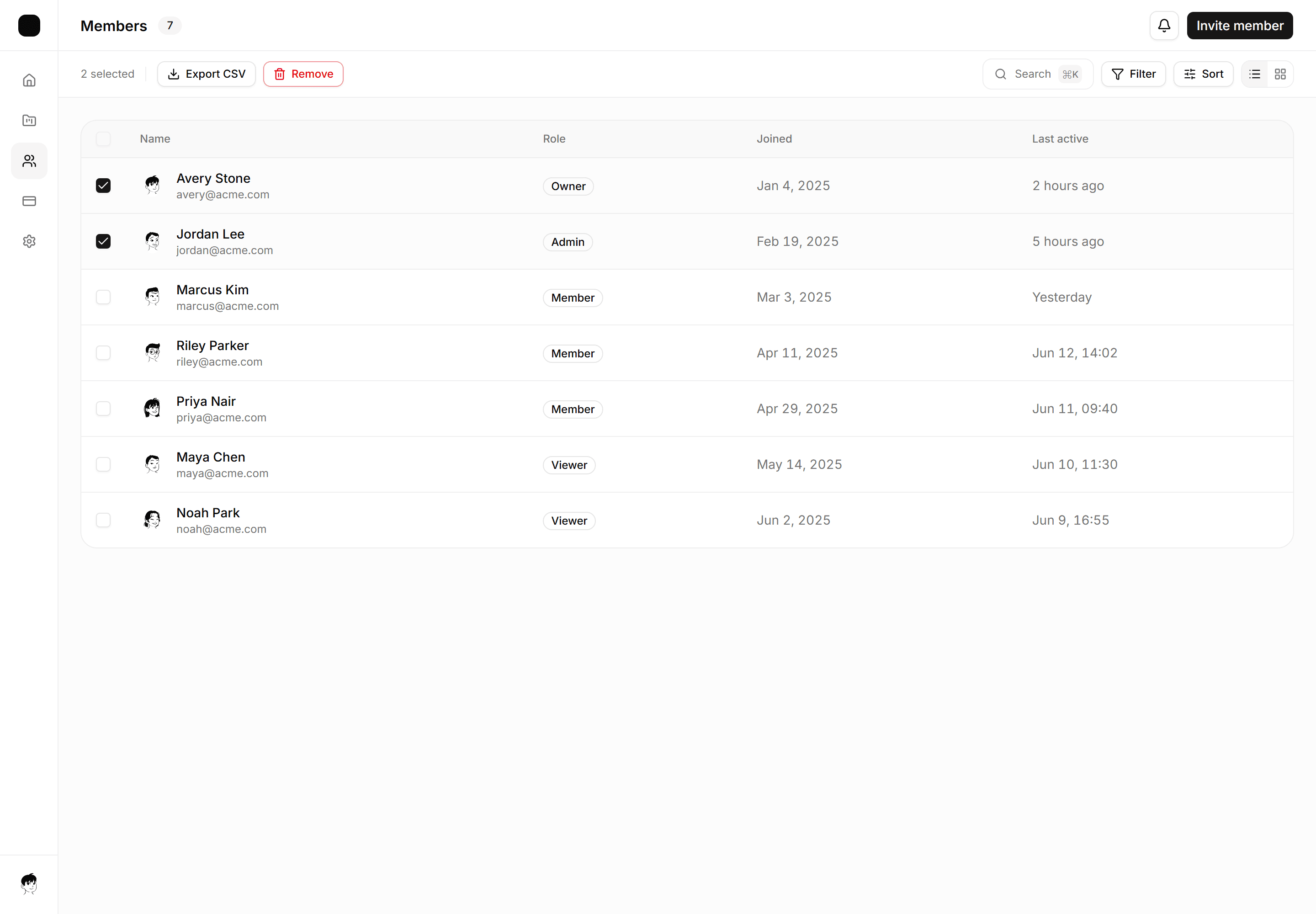
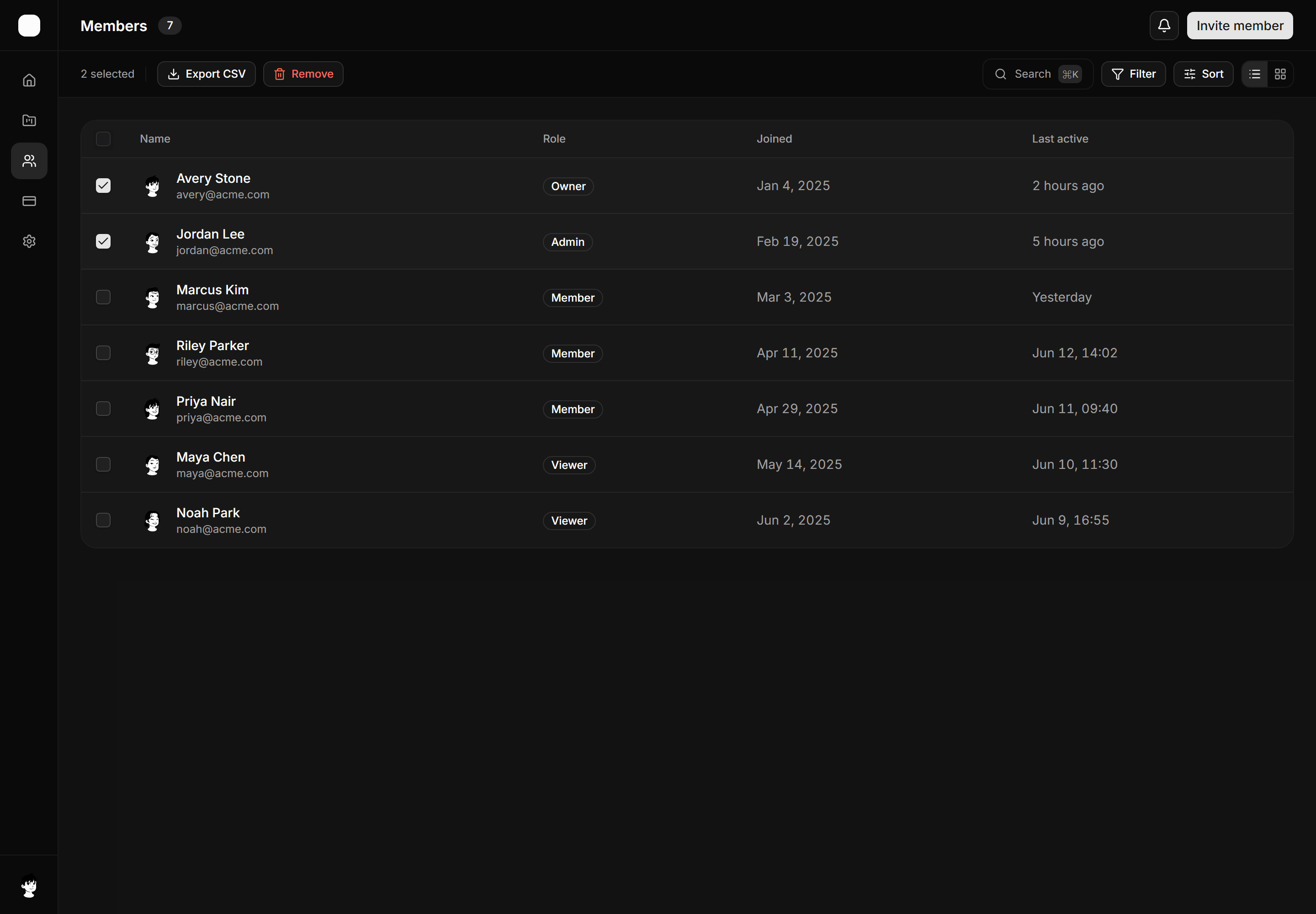
Application App Shell: Sticky Toolbar Shell
App shell with a sticky bulk-actions and filter toolbar that stays pinned above a scrollable data table.
Application App Shell: Dual Sidebar Shell
App shell with a primary icon nav rail and a grouped contextual sub-nav panel for deep two-level navigation.
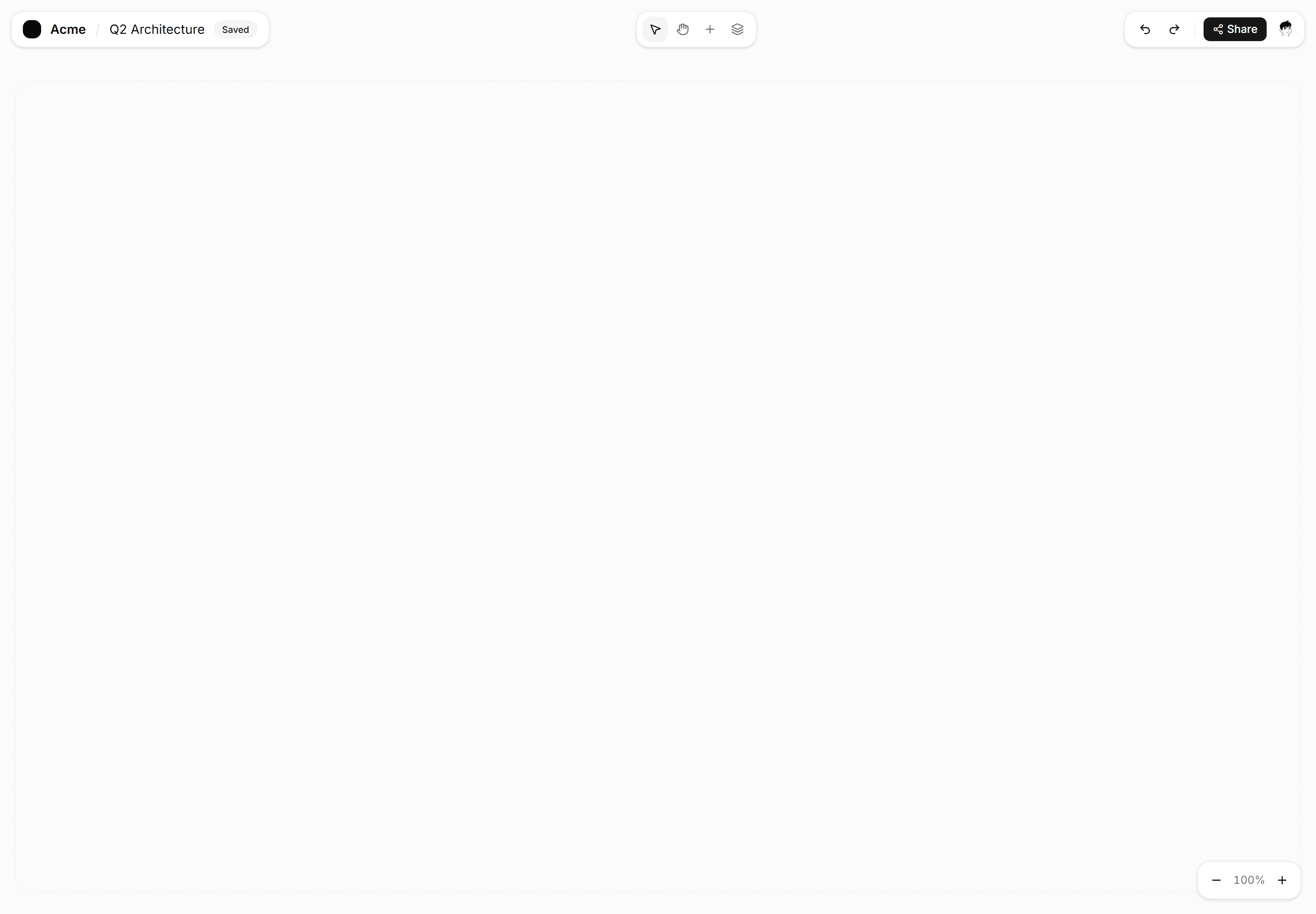
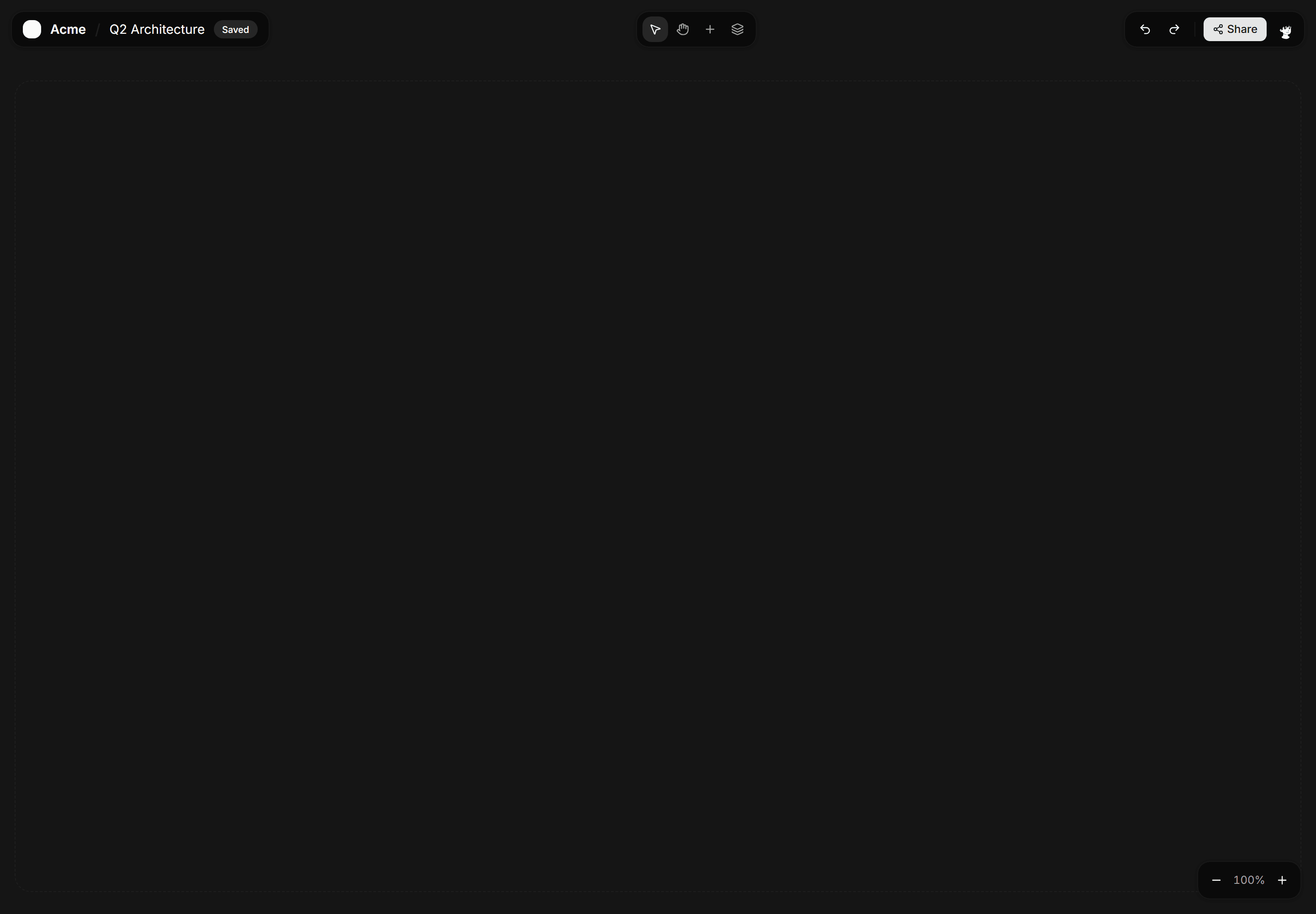
Application App Shell: Full Bleed Shell
Edge-to-edge canvas shell with a floating toolbar for maps, boards, and diagram editors that need every pixel of viewport space.
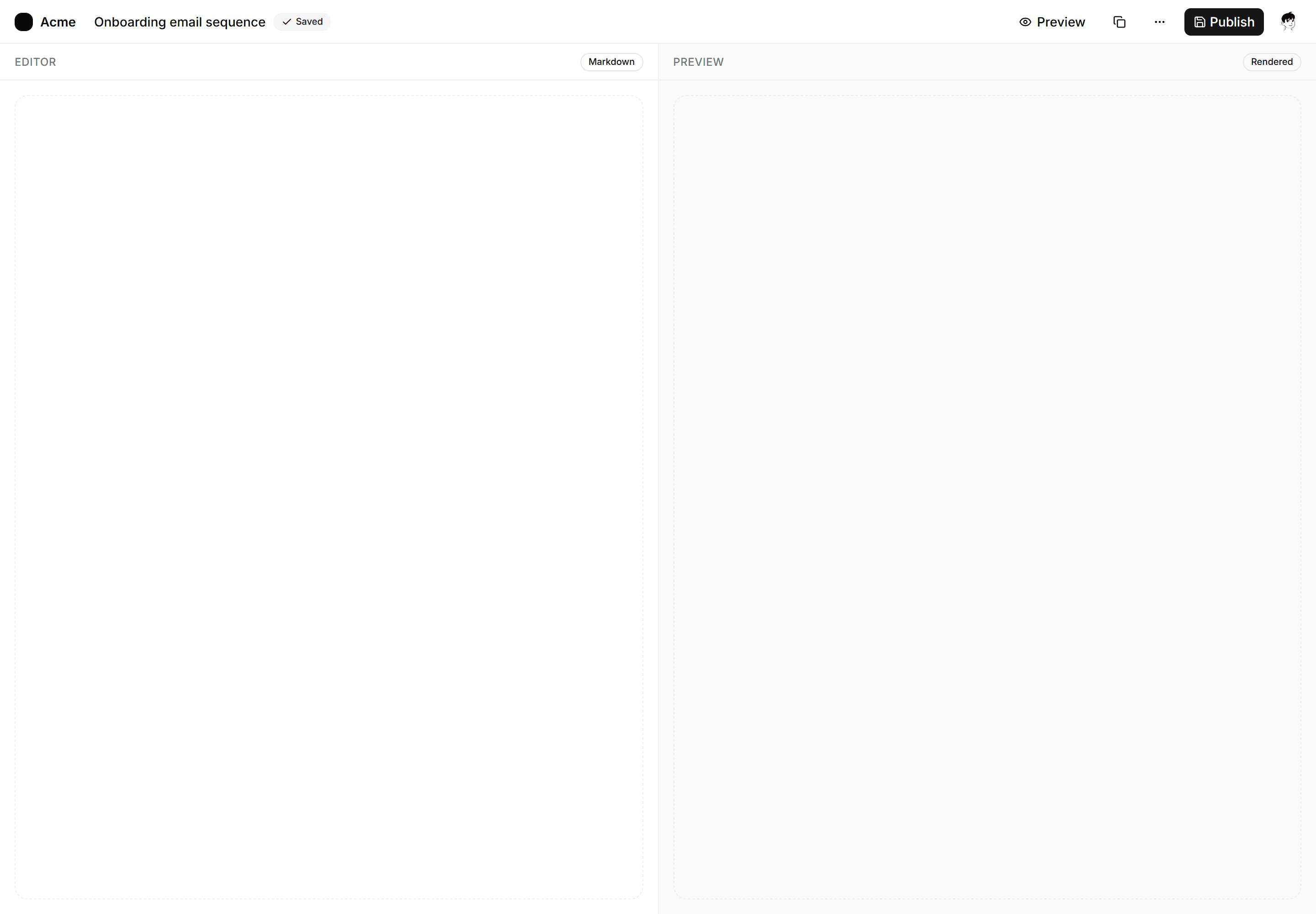
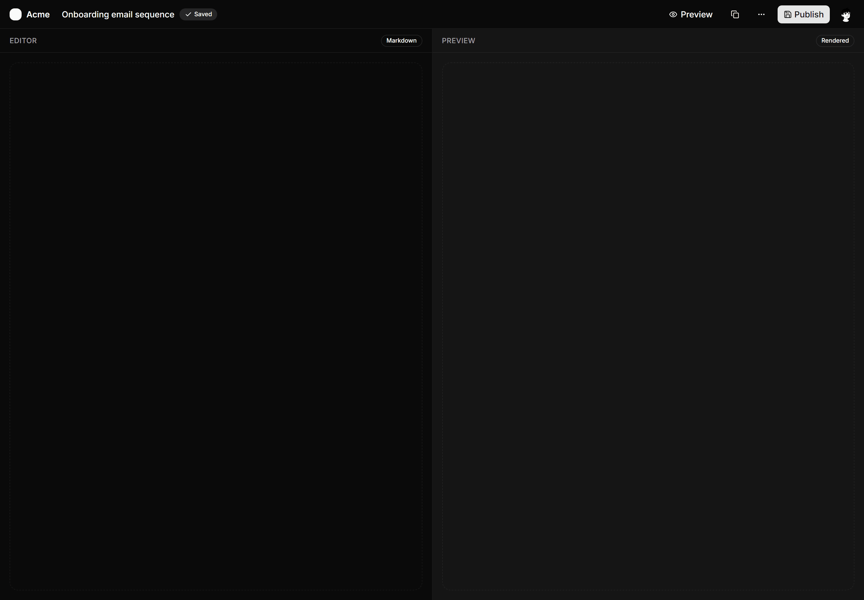
Application App Shell: Split Content Shell
Full-page shell with a slim top bar and a 50/50 editor and preview pane split for authoring and live-preview workflows.
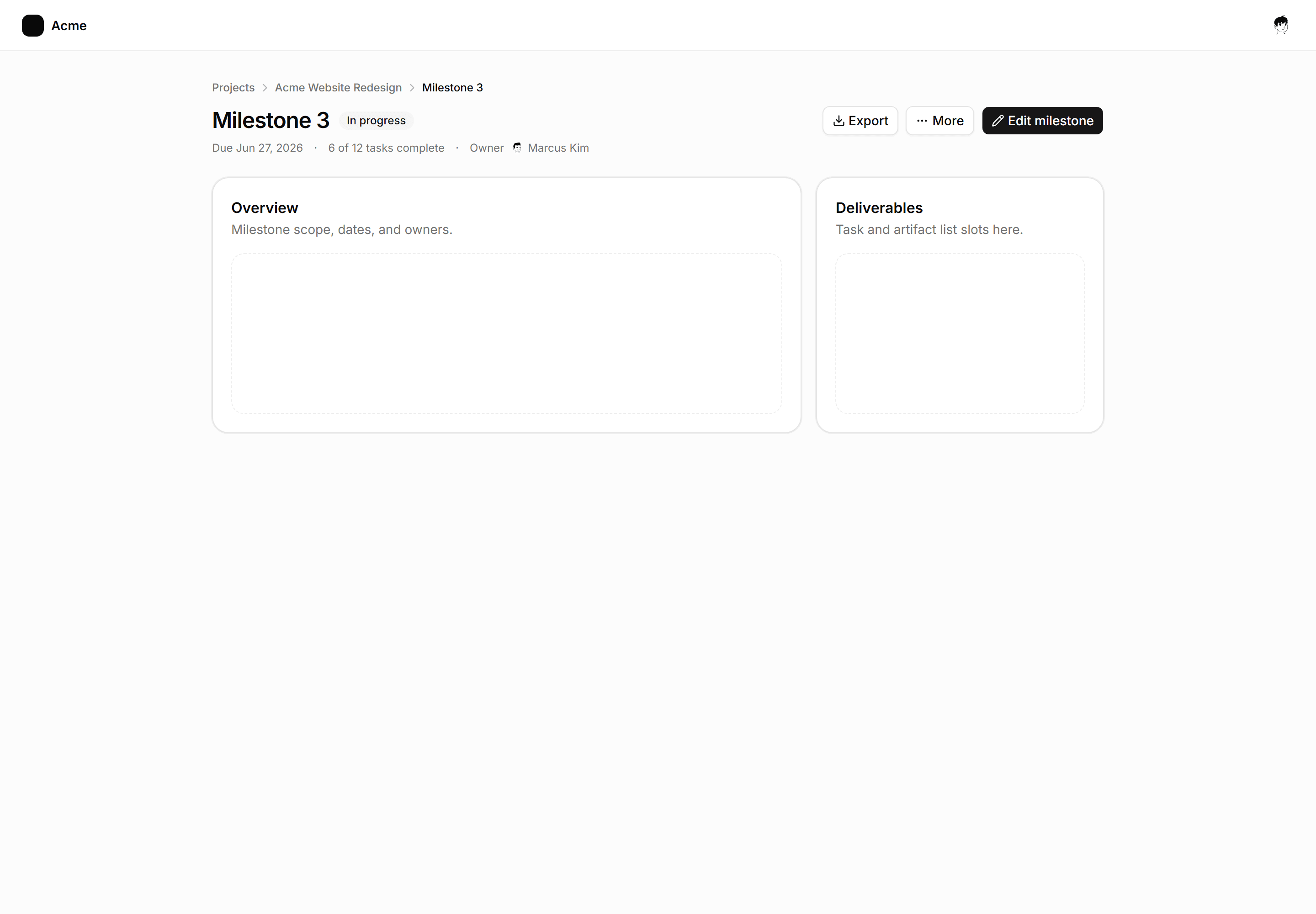
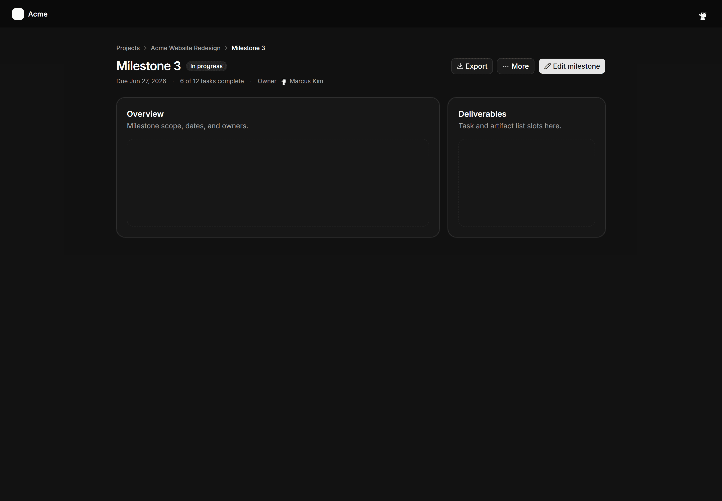
Application App Shell: Breadcrumb Header Shell
Full-page shell for deep detail views with a breadcrumb trail, page title, meta row, and action buttons above two content panels.
Application App Shell: Two Pane Shell
Master-detail layout with a six-row project list pane and a wide detail pane showing the selected item header.
Application App Shell: Right Rail Shell
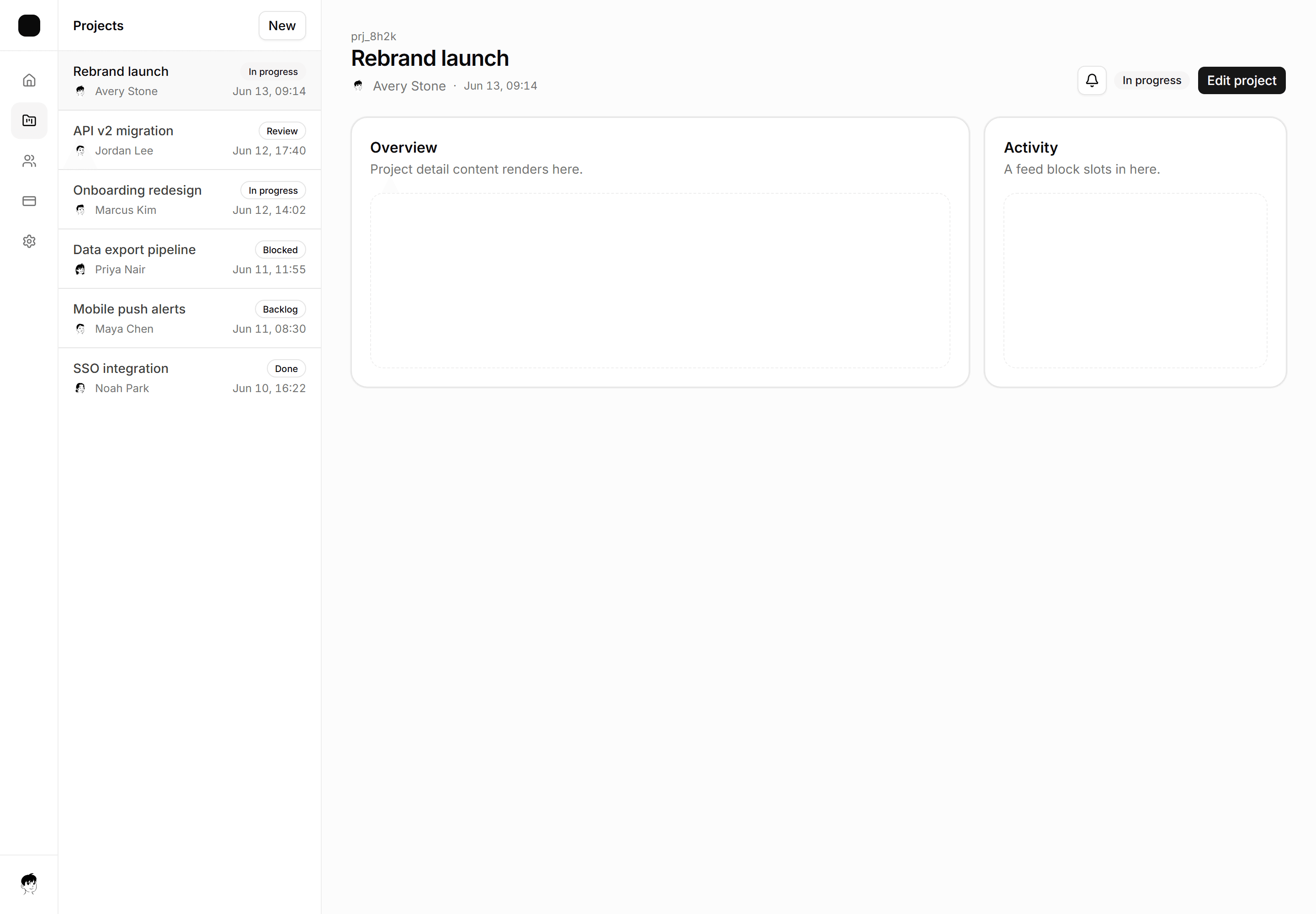
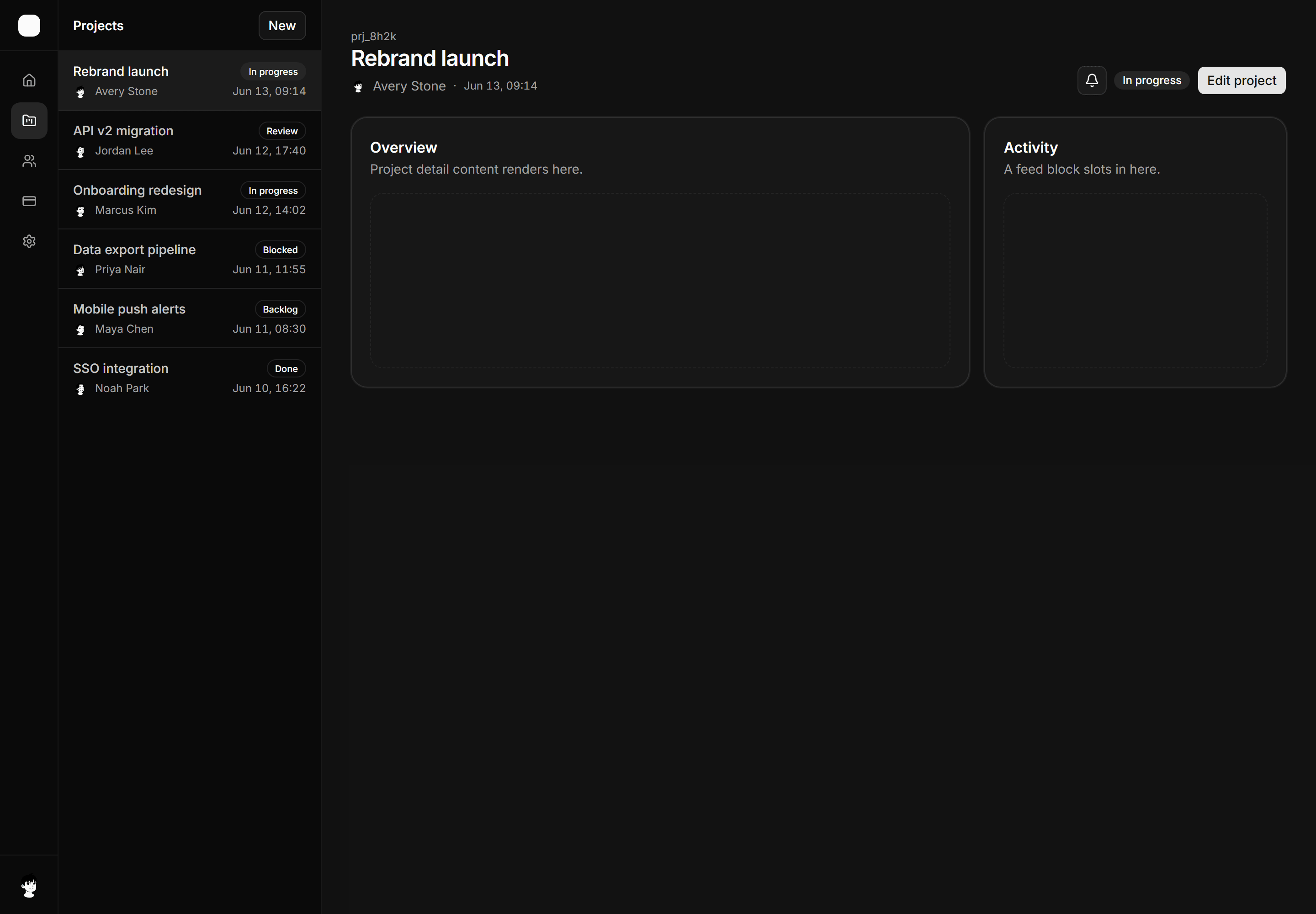
Three-column shell with an icon nav rail, main content area, and a right context rail showing a live activity list.
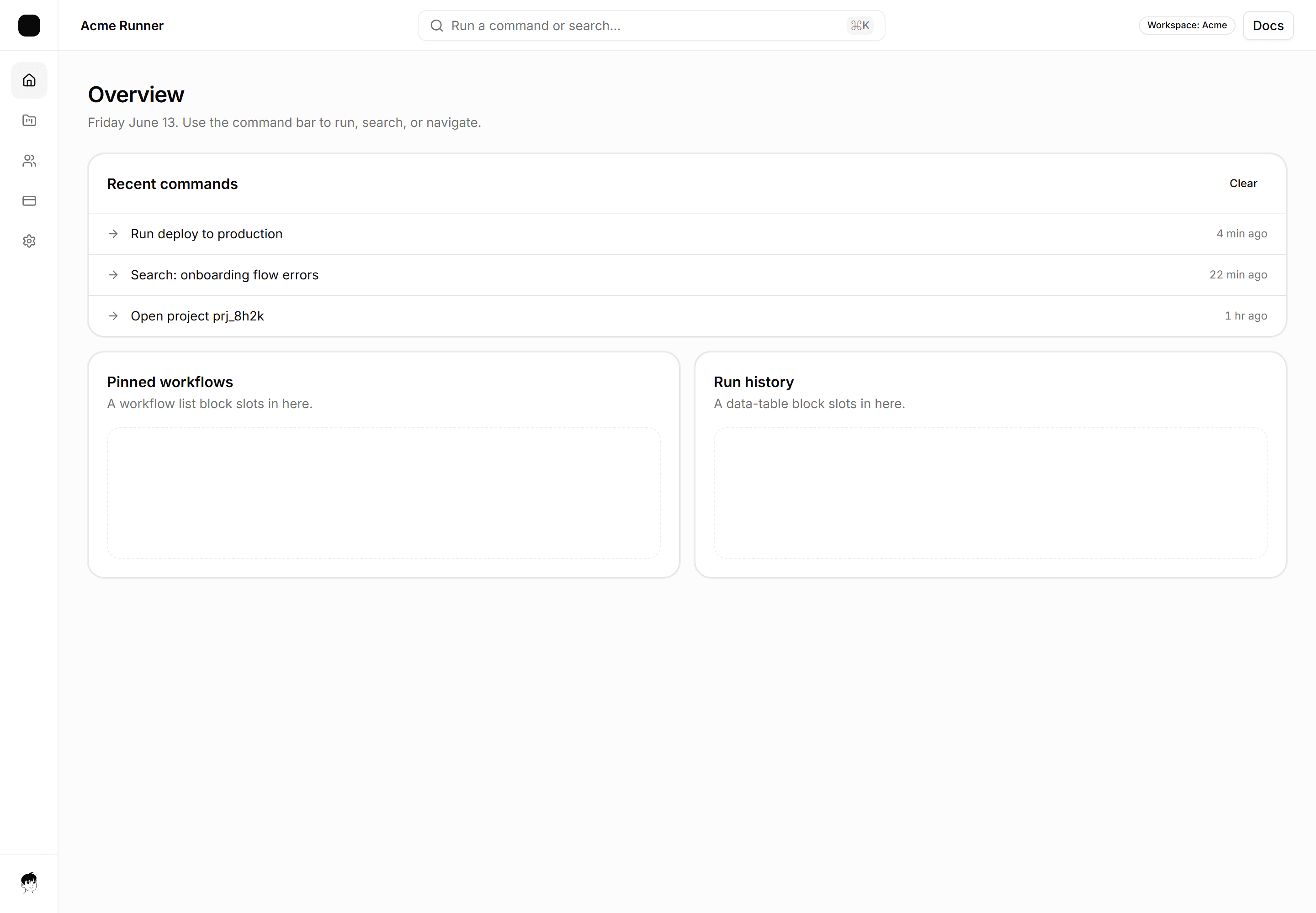
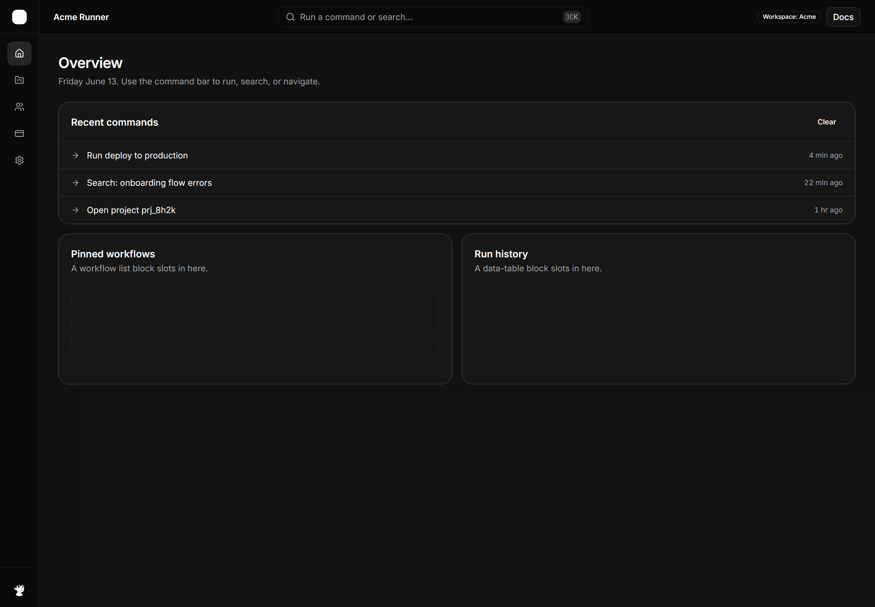
Application App Shell: Command Bar Shell
Shell with a centered command bar in the top header, a keyboard shortcut hint, and a recent commands list below.
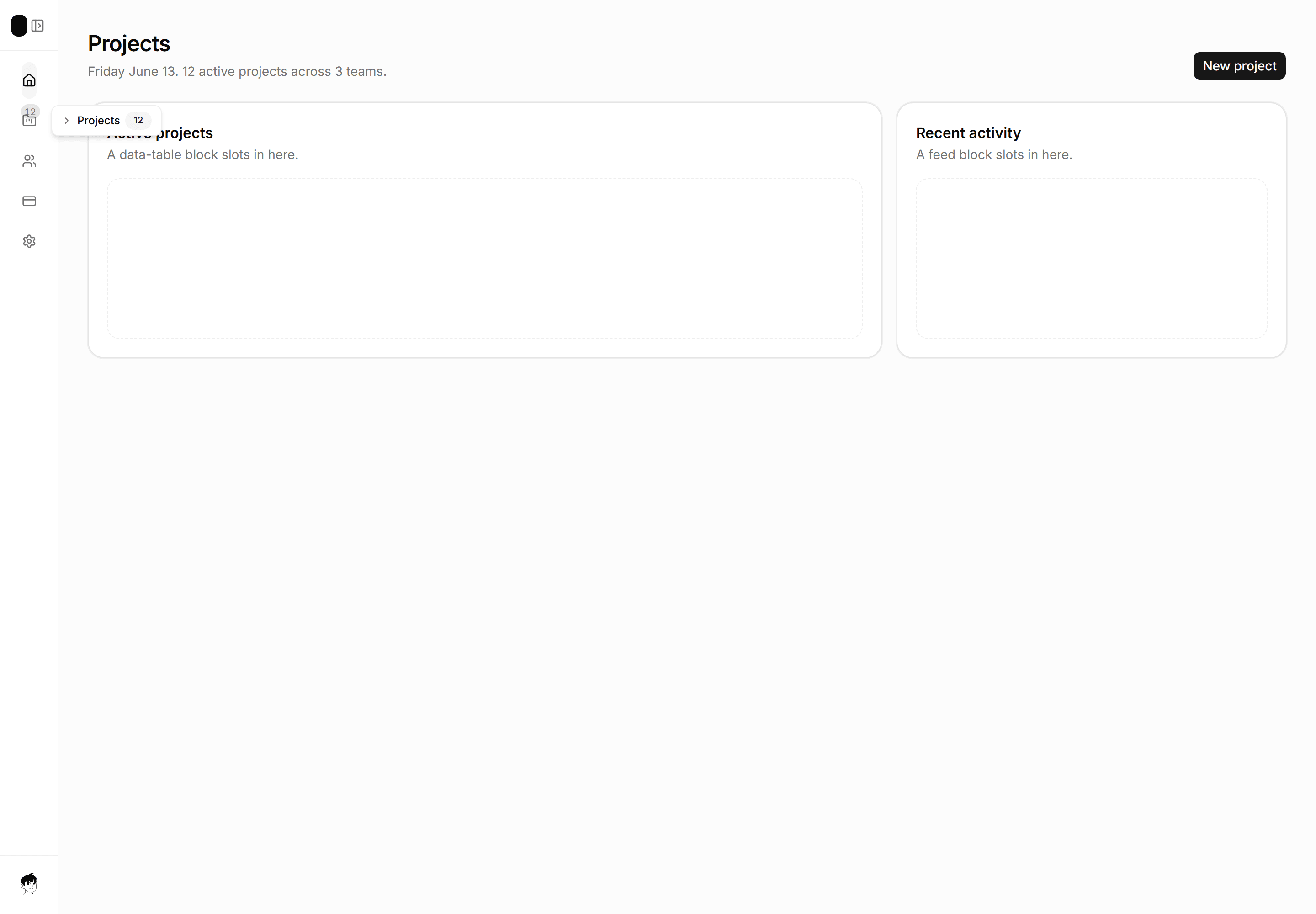
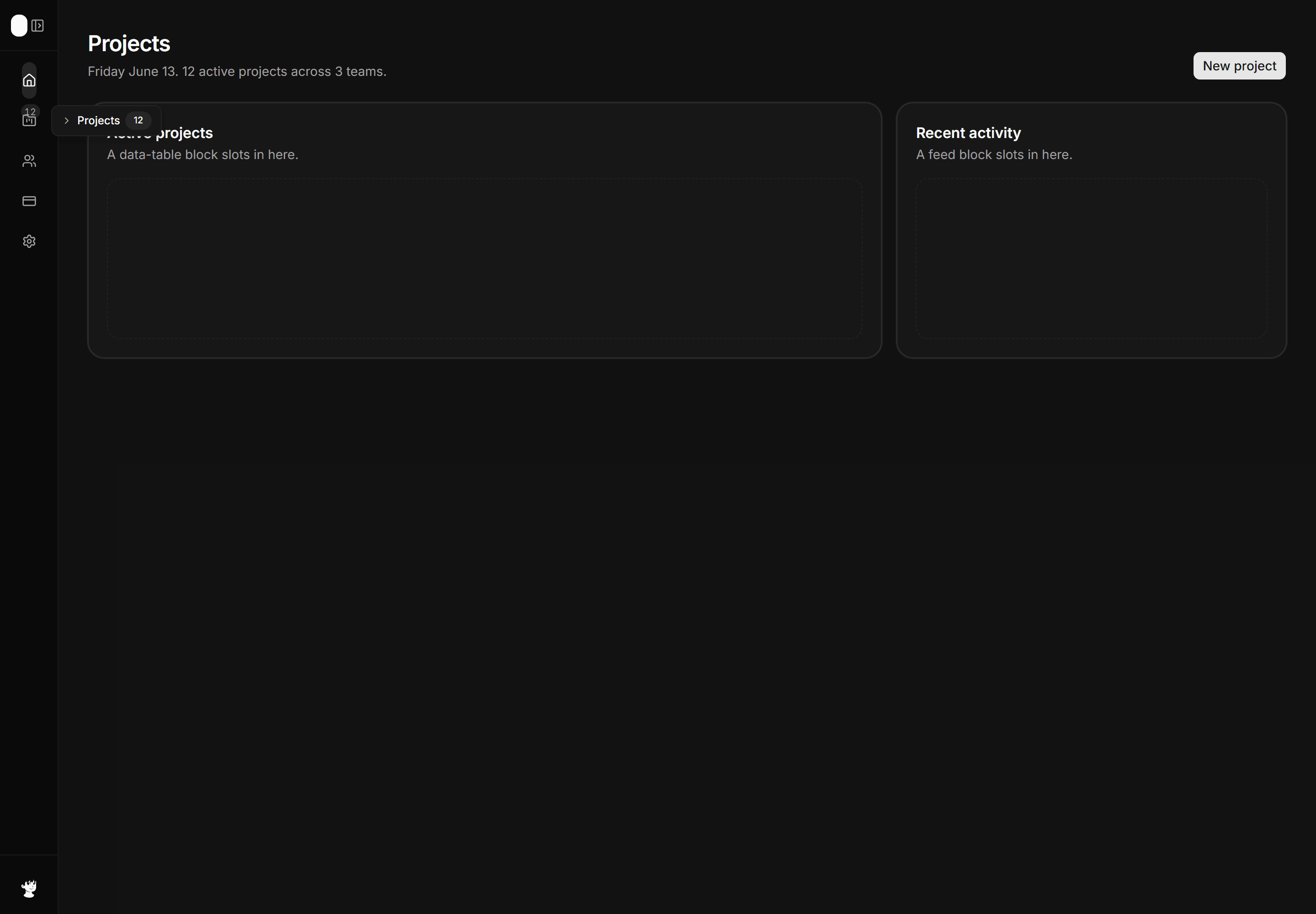
Application App Shell: Collapsible Sidebar Shell
Icon-only nav rail with an expand affordance, badge count on Projects, and an inline tooltip hint on one item.
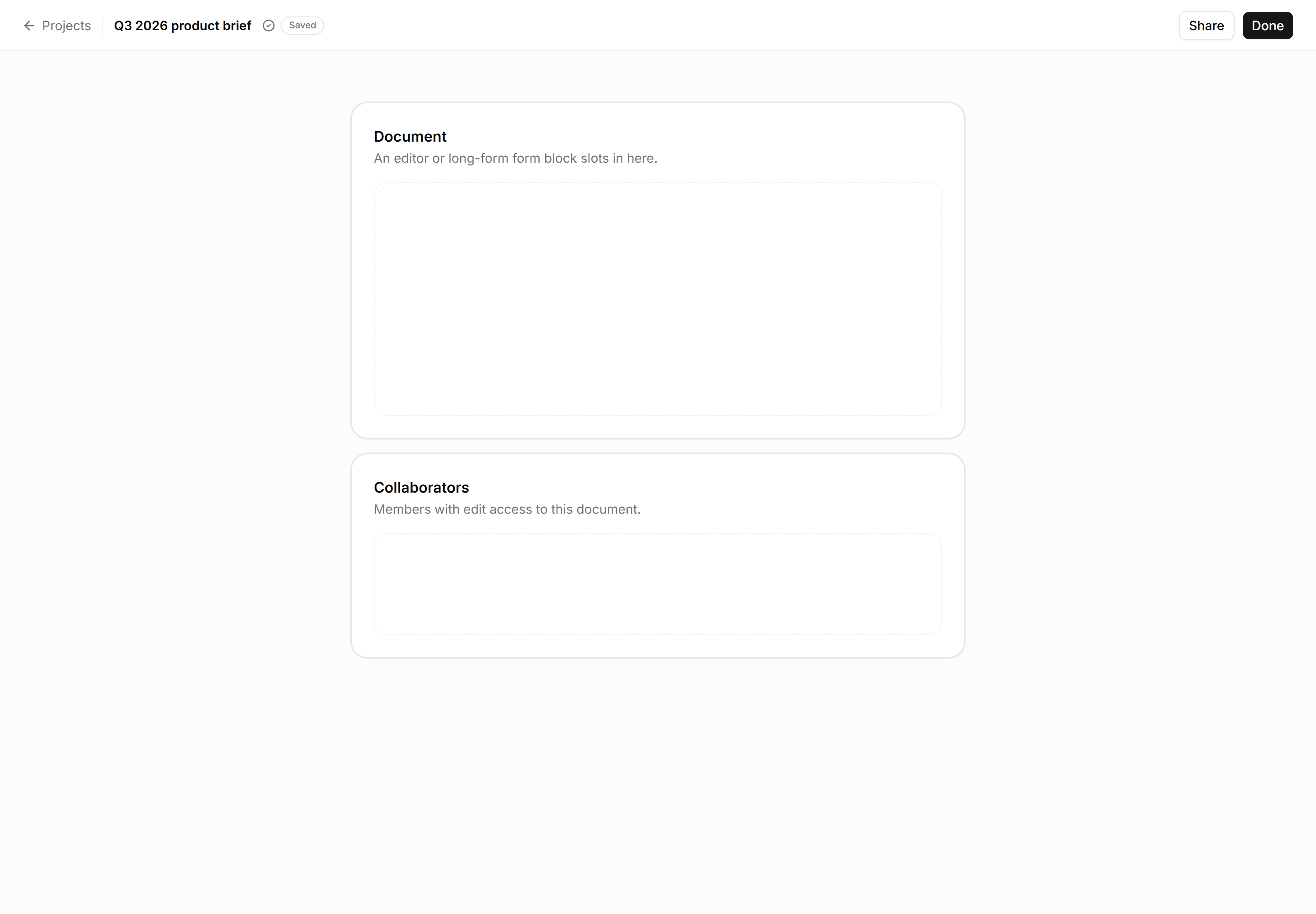
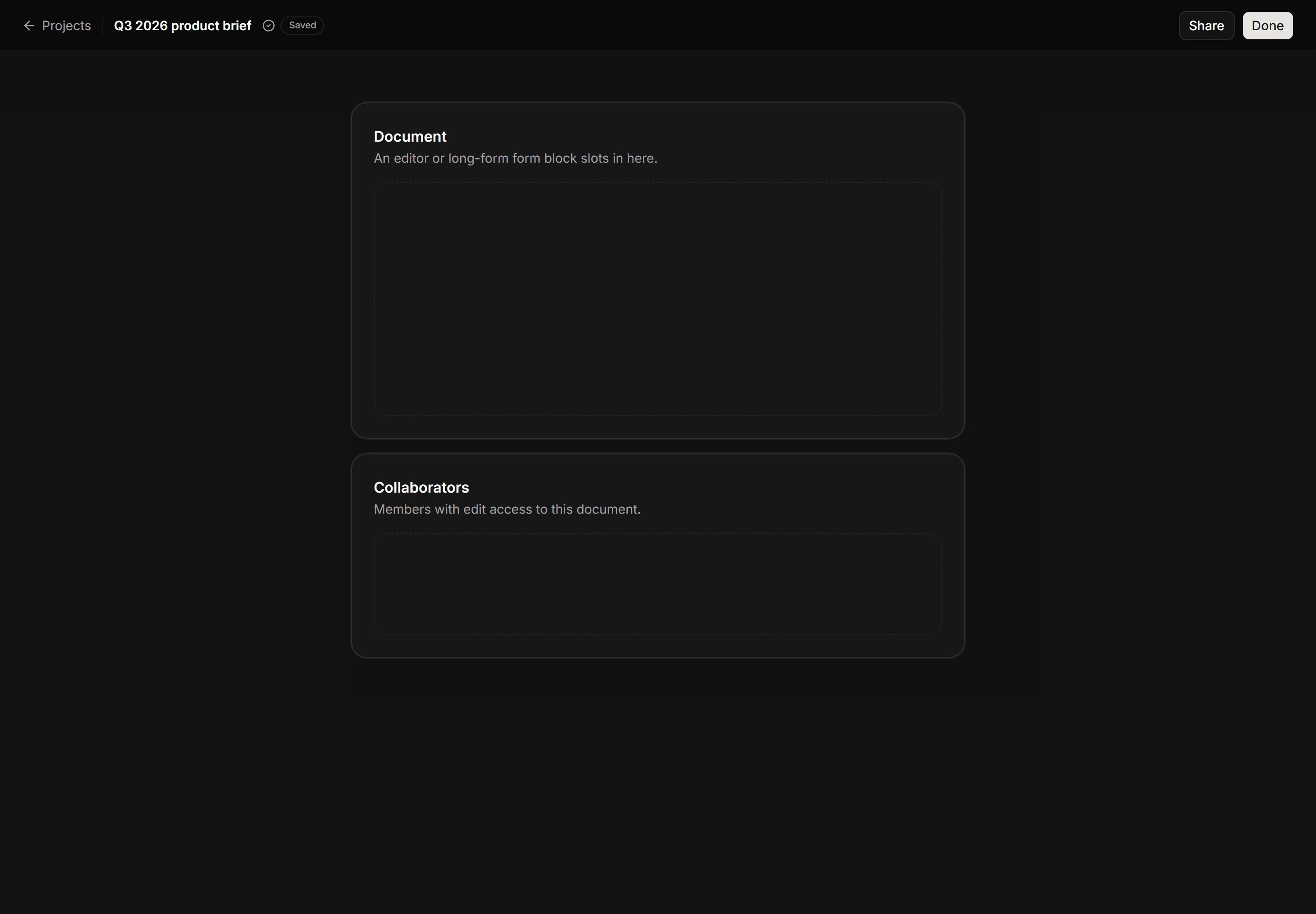
Application App Shell: Focus Mode Shell
Minimal top bar with back link, document title, save state badge, and a centered max-w content column with no sidebar.
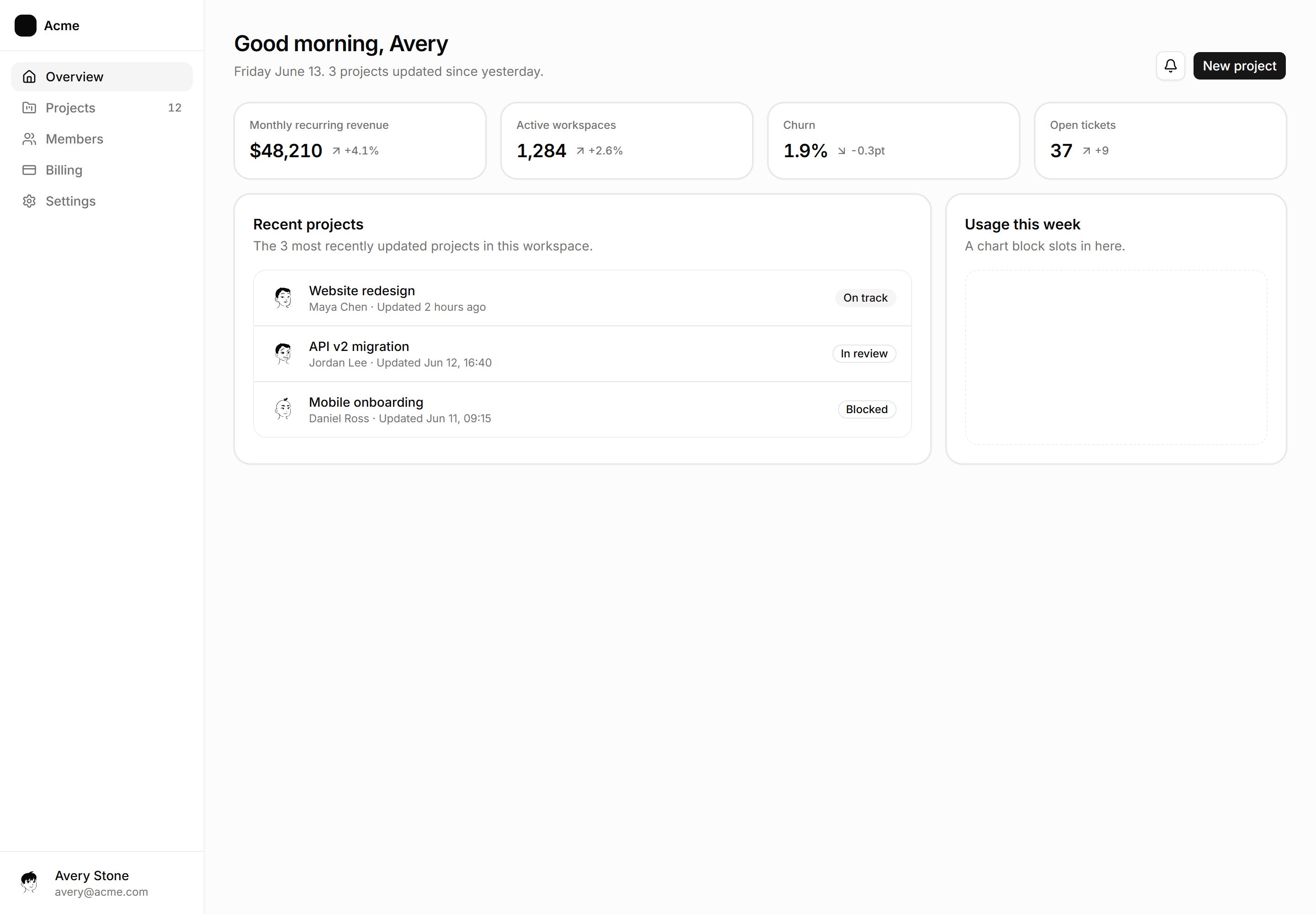
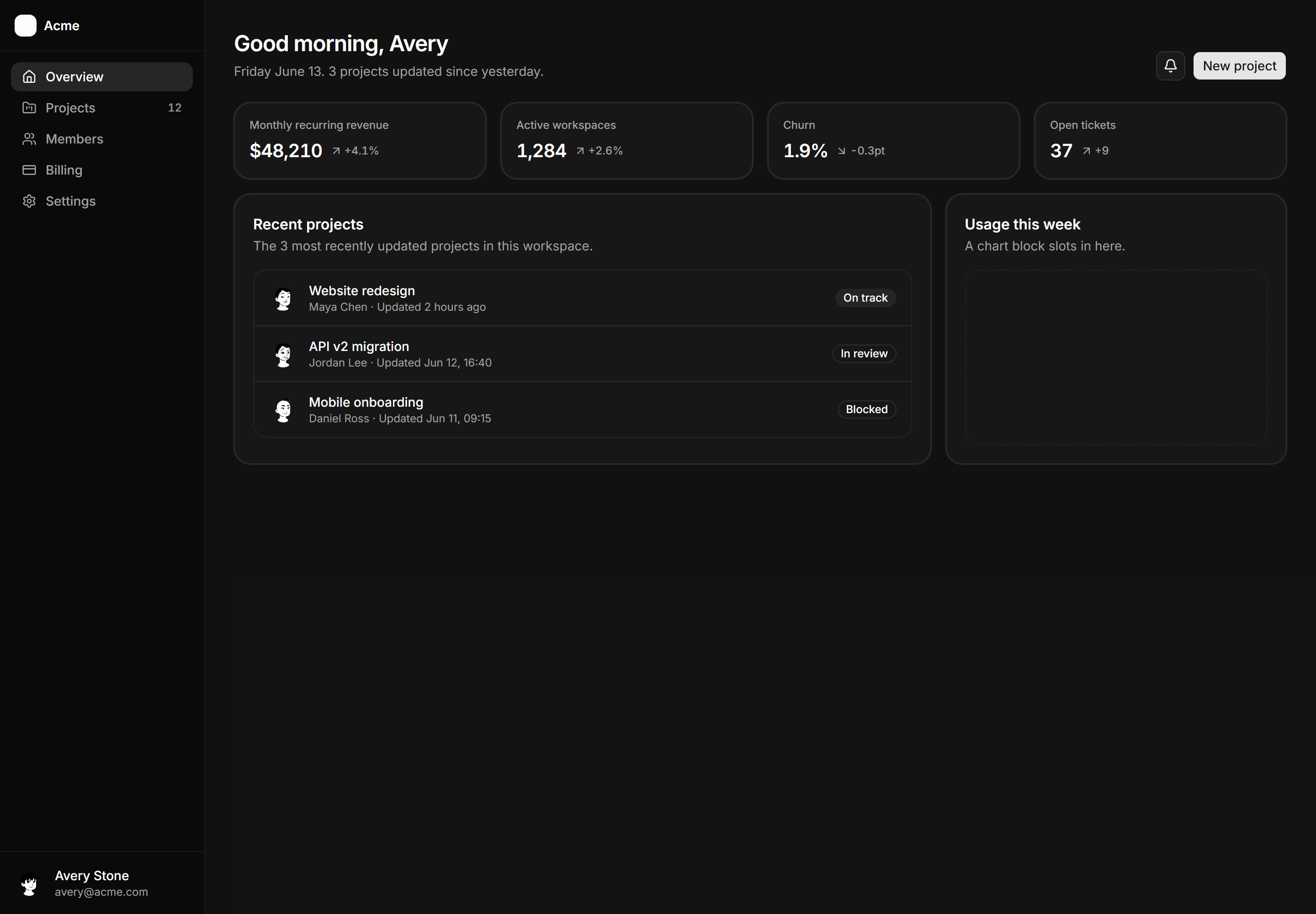
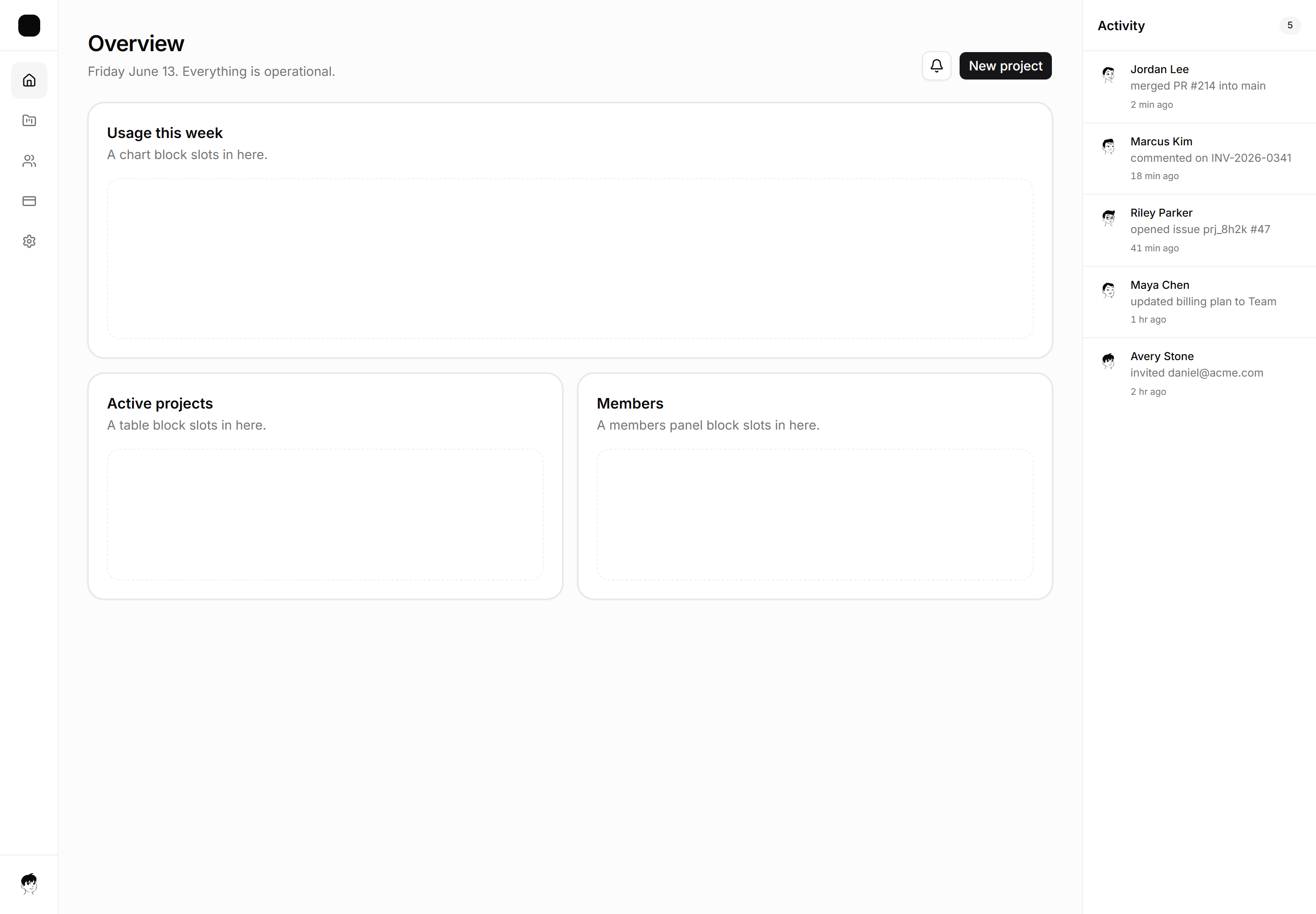
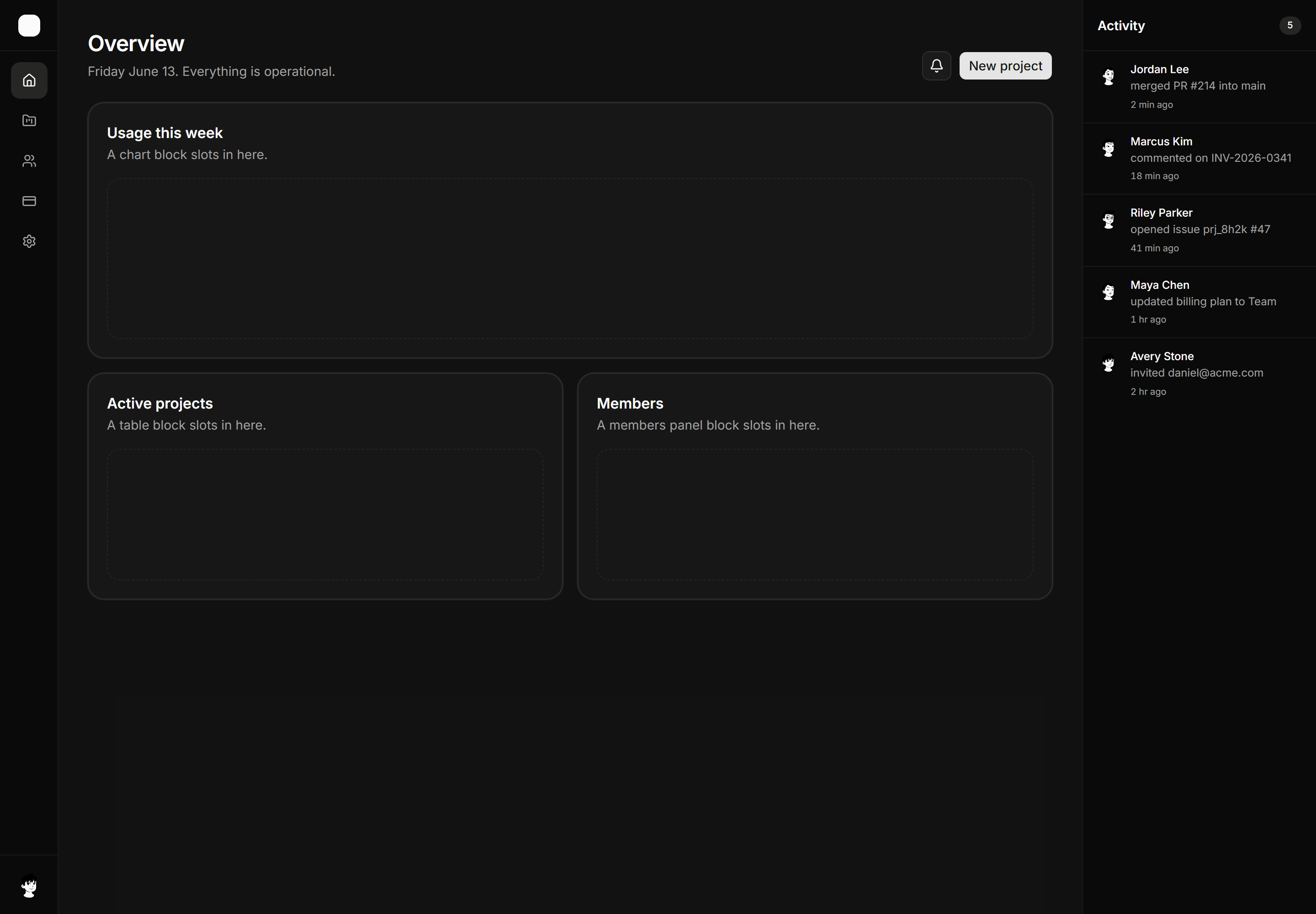
Application App Shell: Dashboard Home Shell
The assembled overview, greeting header, KPI strip, recent list, one open chart slot.
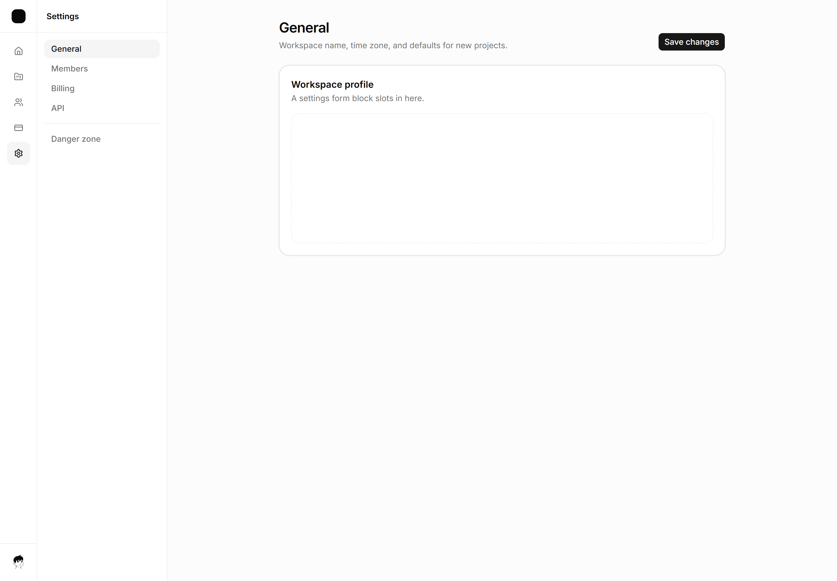
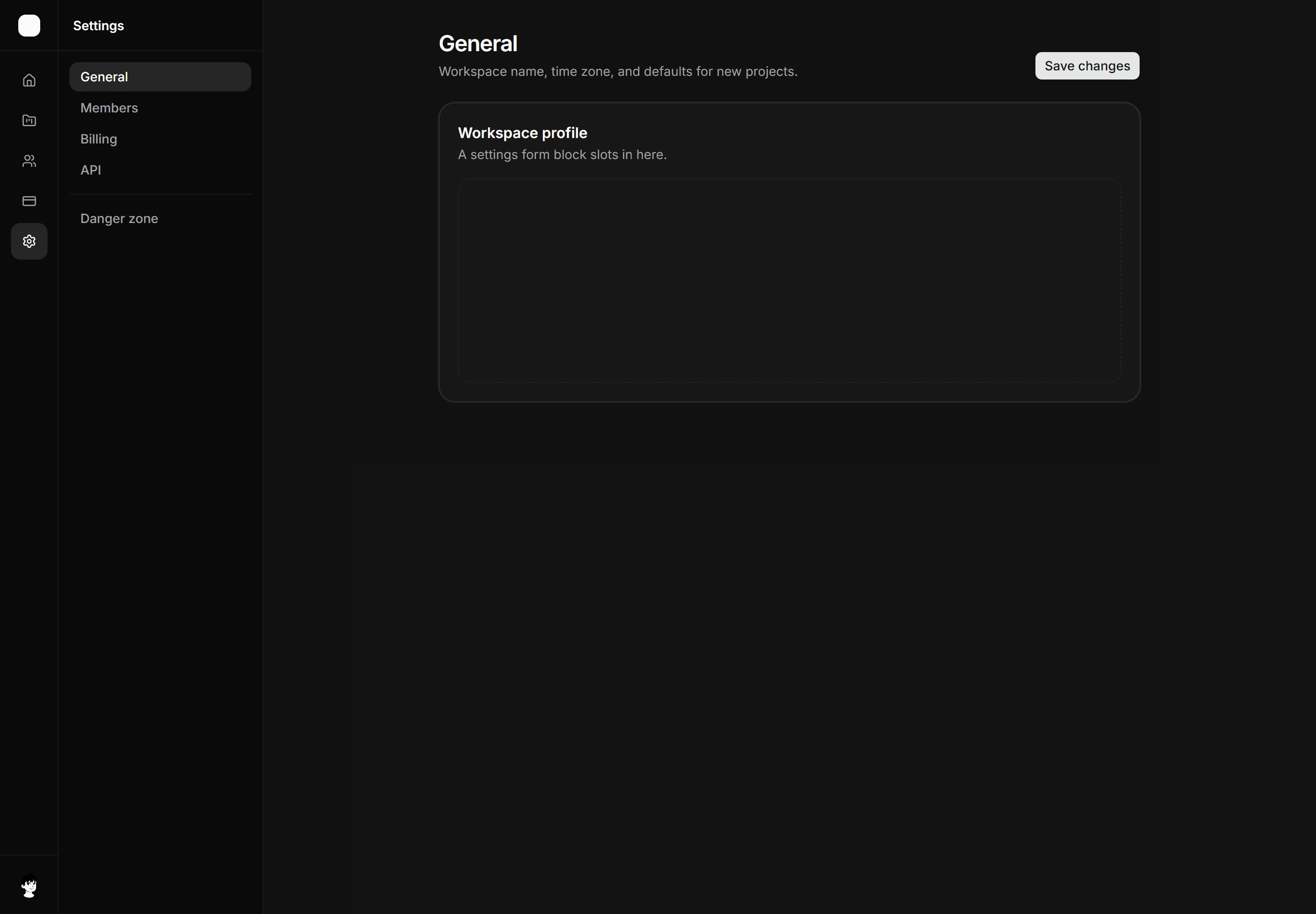
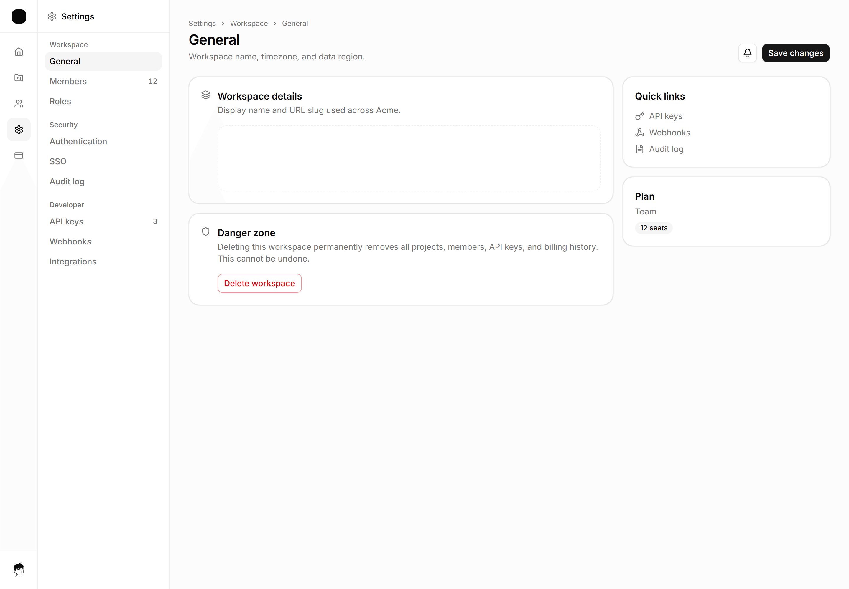
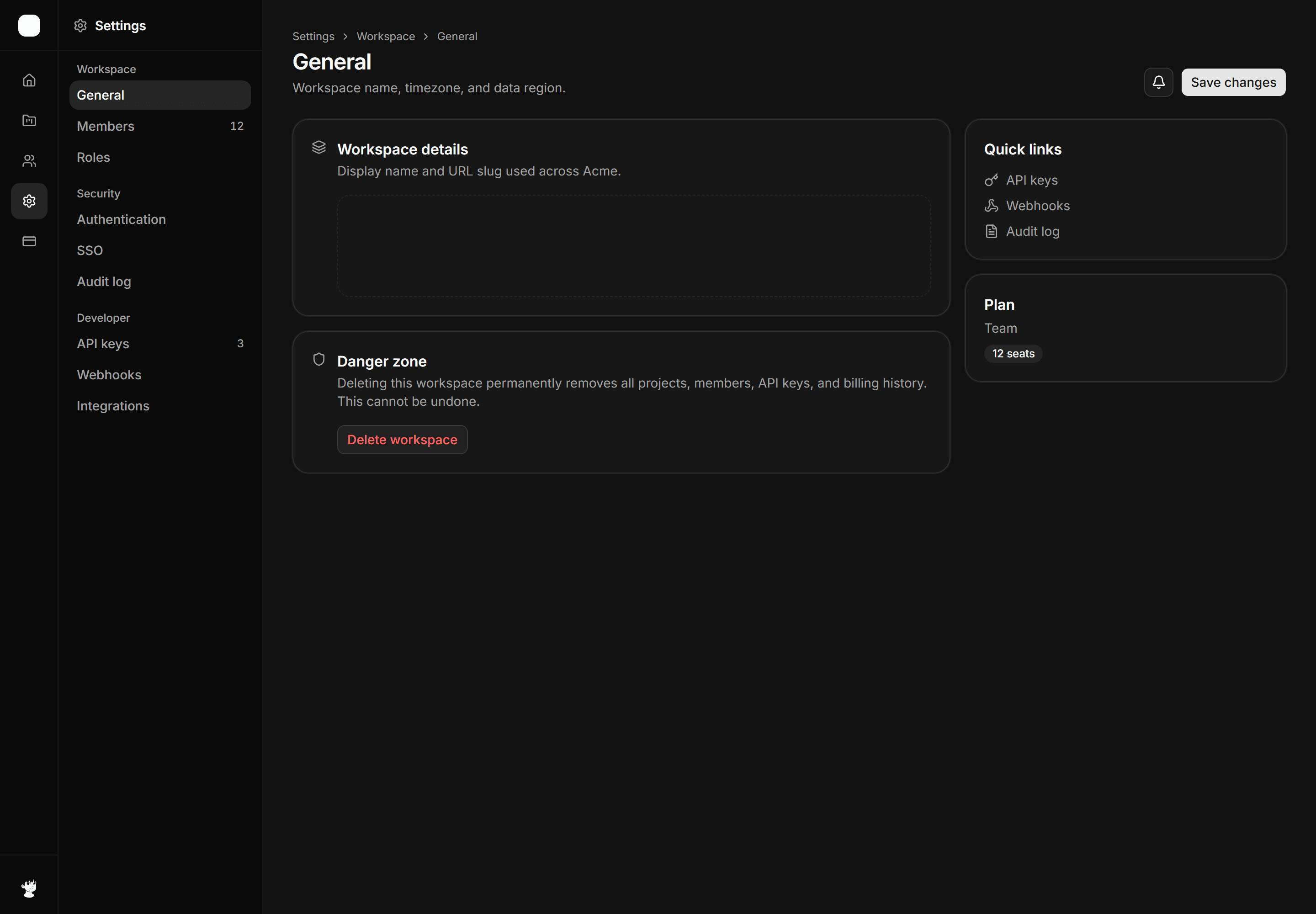
Application App Shell: Settings Shell
Three column settings scaffold, icon rail, secondary nav with Danger zone, content column.
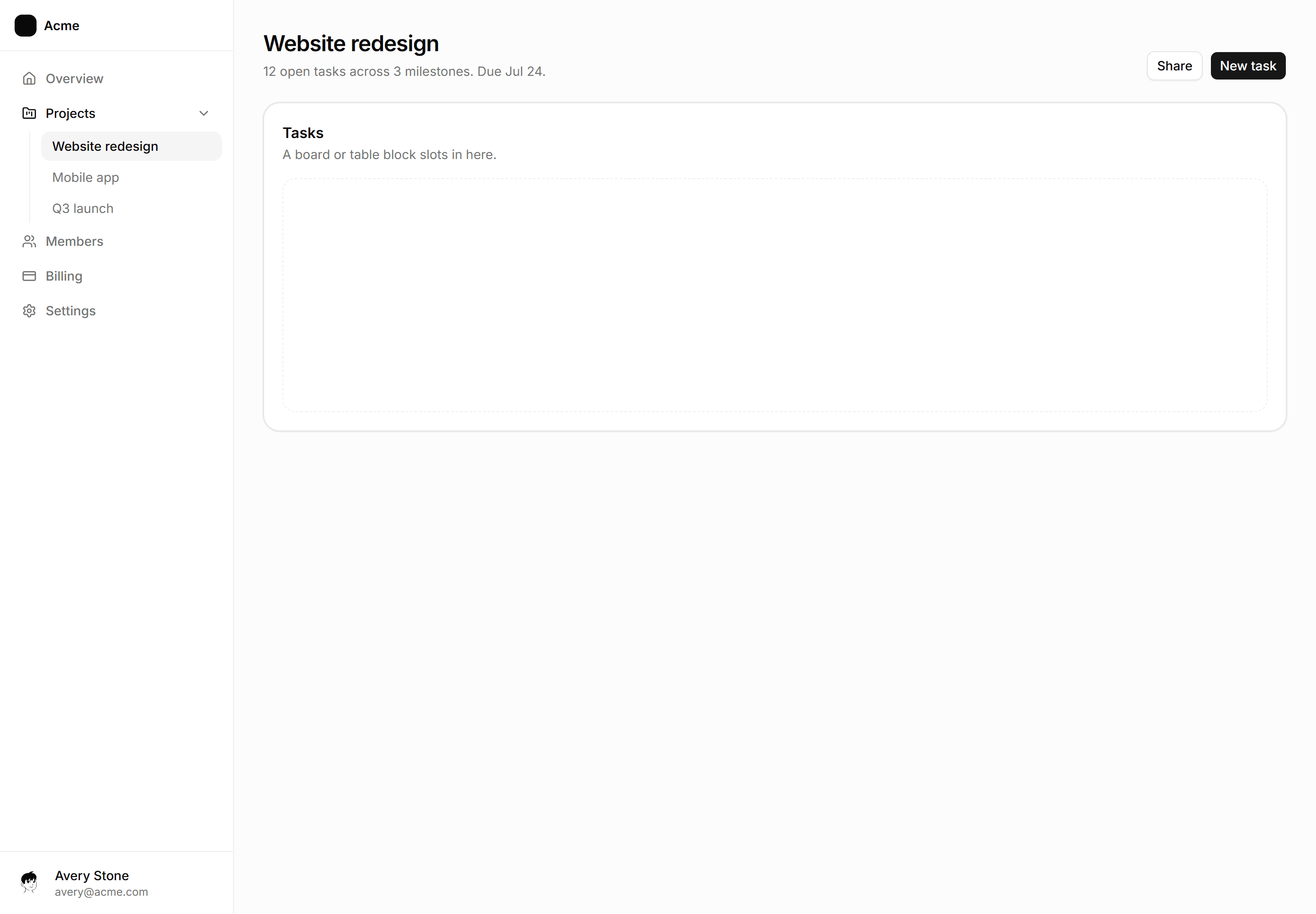
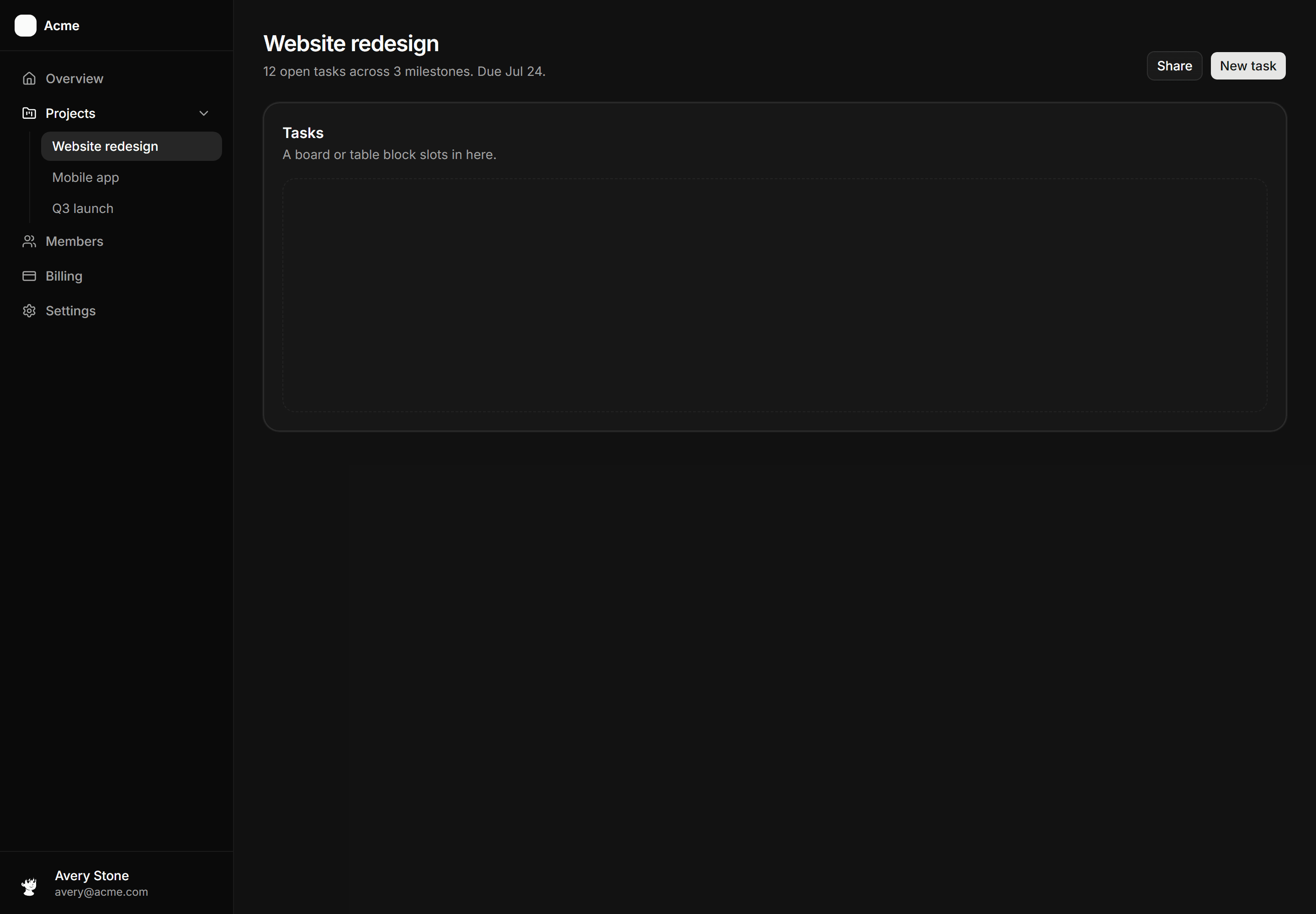
Application App Shell: Nested Nav Sidebar Shell
Sidebar with Projects expanded to three indented children, one active.
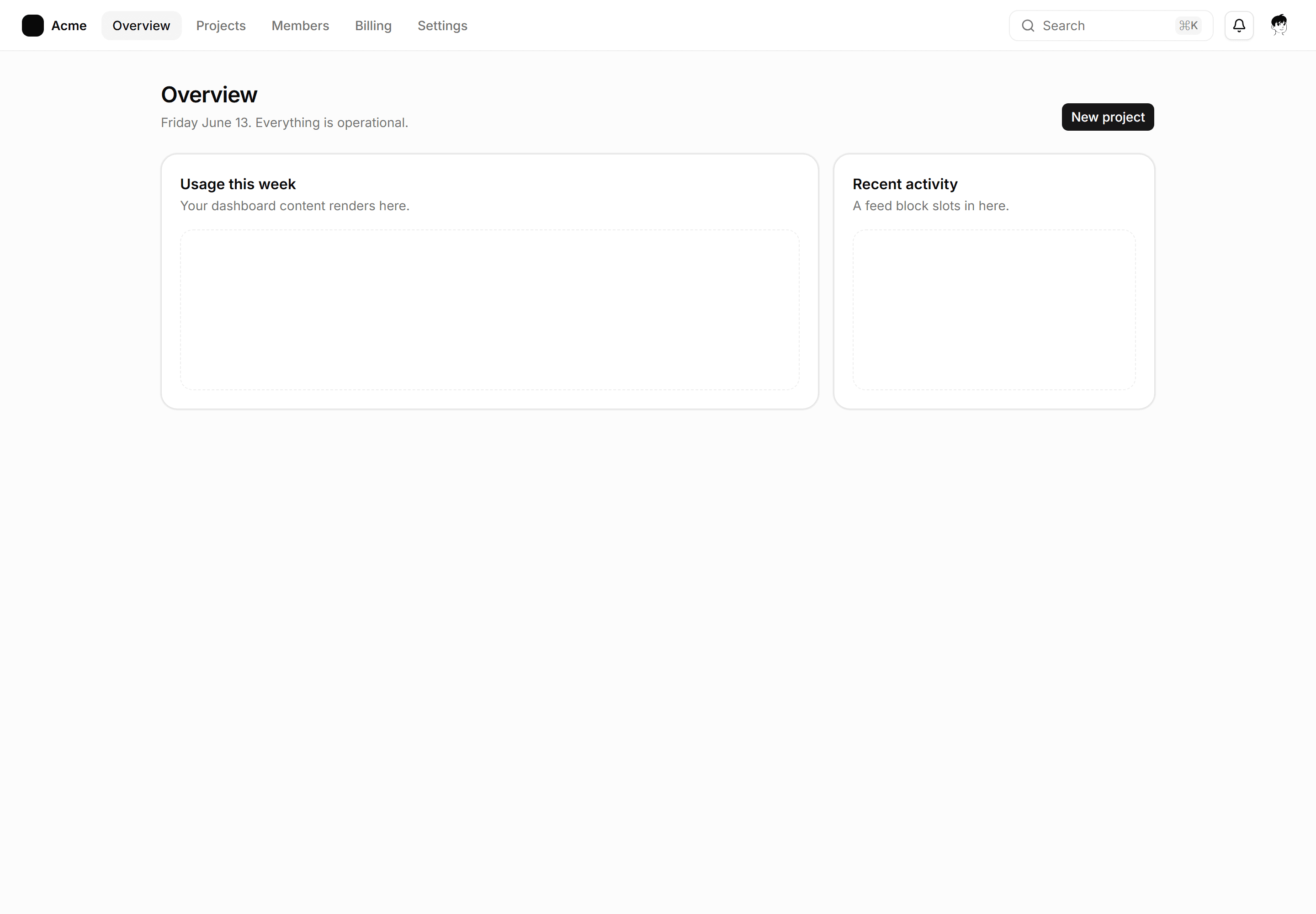
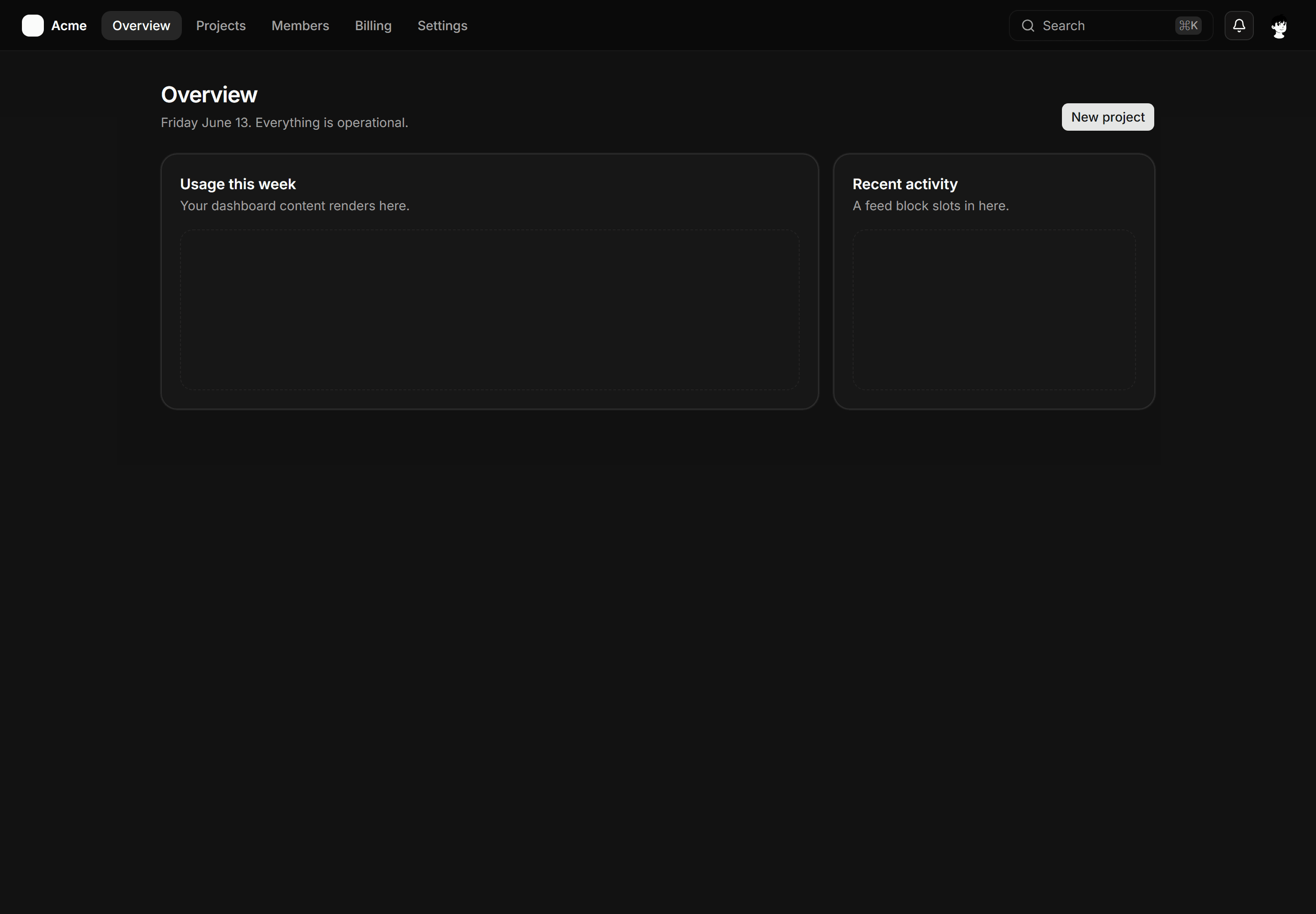
Application App Shell: Topbar Shell
Horizontal nav with the Acme lockup, five links, a command hint, and the page below.


Application App Shell: Icon Sidebar Shell
The icon only rail with aria labels, maximum width left for dense tool content.
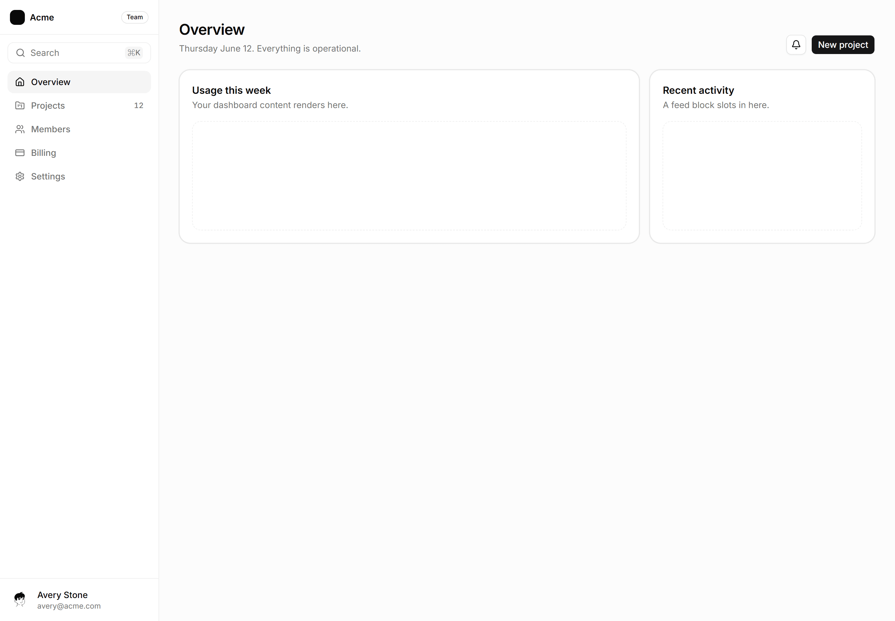
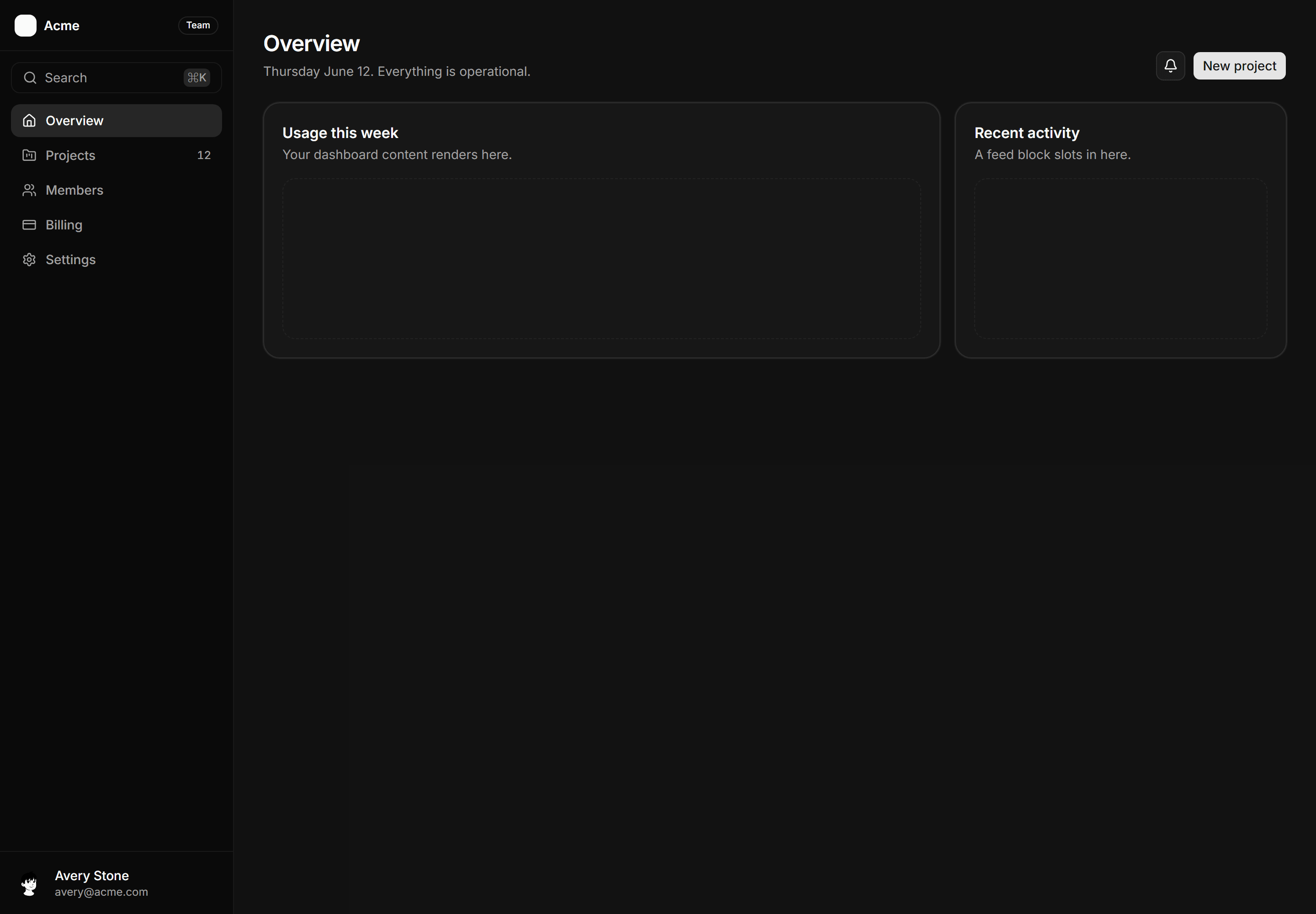
Application App Shell: Sidebar Shell
The navigation rail with active state, command hint, and labeled drop zones for your pages.