previewcode
Copy codeInstall command
Search blocks by description or jump to a page.
Connector Directory opens an integrations page for a release tracking tool. A centered heading, set as the page's H1, sits over a two line lede. Below it twelve connector cards fill a grid of three columns from lg, two from sm and one on phones. A wide strip closes the section with a line for anyone whose tool is missing and a primary pill to the API docs.
Each card is a Surface panel with a real app glyph in a framed box at the top left and a mono uppercase category tag at the top right, then the app's name and one sentence on what the connection does. The glyphs share one softened foreground tone instead of their brand colors, and the cards are not links.
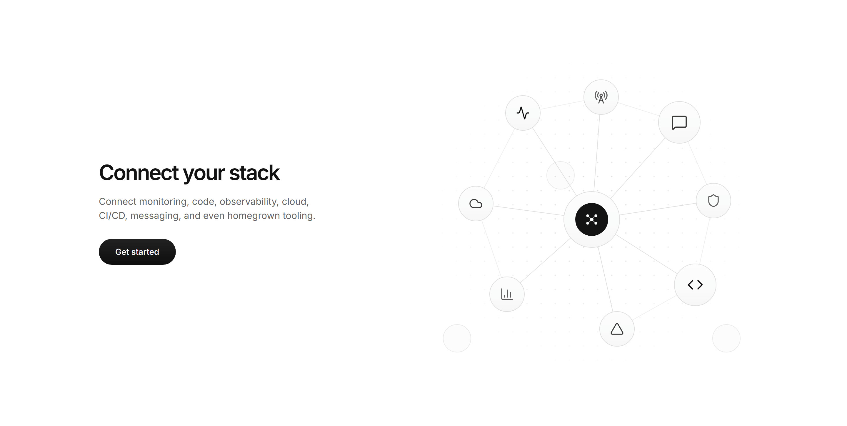
Use it as the top of an integrations page for a product that connects to many developer and team tools. The heading is an H1, so the block opens the page rather than sitting midway down. The category tags let a reader scan for their kind of tool, and the strip catches anyone who does not find theirs.
A natural flow around it on a Modern SaaS page:
After
connectors array: a name, a description, a
category and a glyph. Glyphs come from @icons-pack/react-simple-icons;
Slack is in components/ui/brand-icons.tsx. Keep the count a multiple of
six so the last row fills at both two and three columns.h1 and each card's name an h2. If you
place the block lower on a page, step them down to h2 and h3.href at your API reference.Tip: write each description as what moves between the two products, a verb and its object, rather than what the other app is.





The source for every Modern SaaS block is included with Pro and Team. Start a plan to copy the code.
Every block and every tool, for one person.
Pro for every seat, plus what a team needs.
Already on a plan? Log in