Shadcn Social and Link Blocks
Browse 8 Portfolio Pro link blocks for shadcn/ui. Link-in-bio layouts, social rows, and elsewhere lists.
Portfolio Social and Link: Links Card
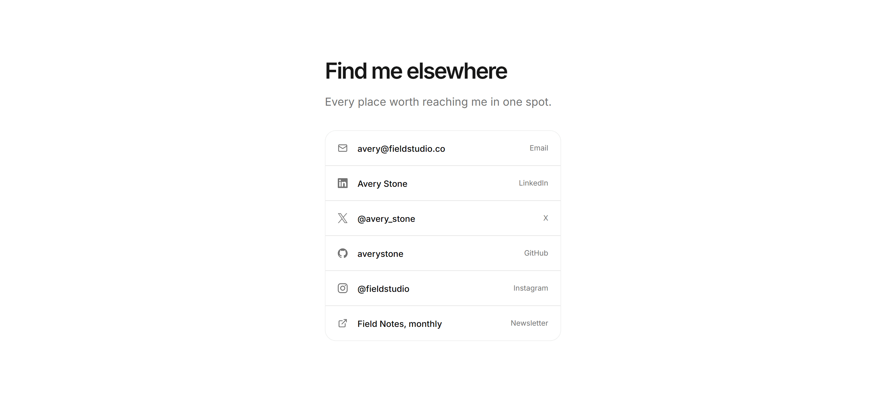
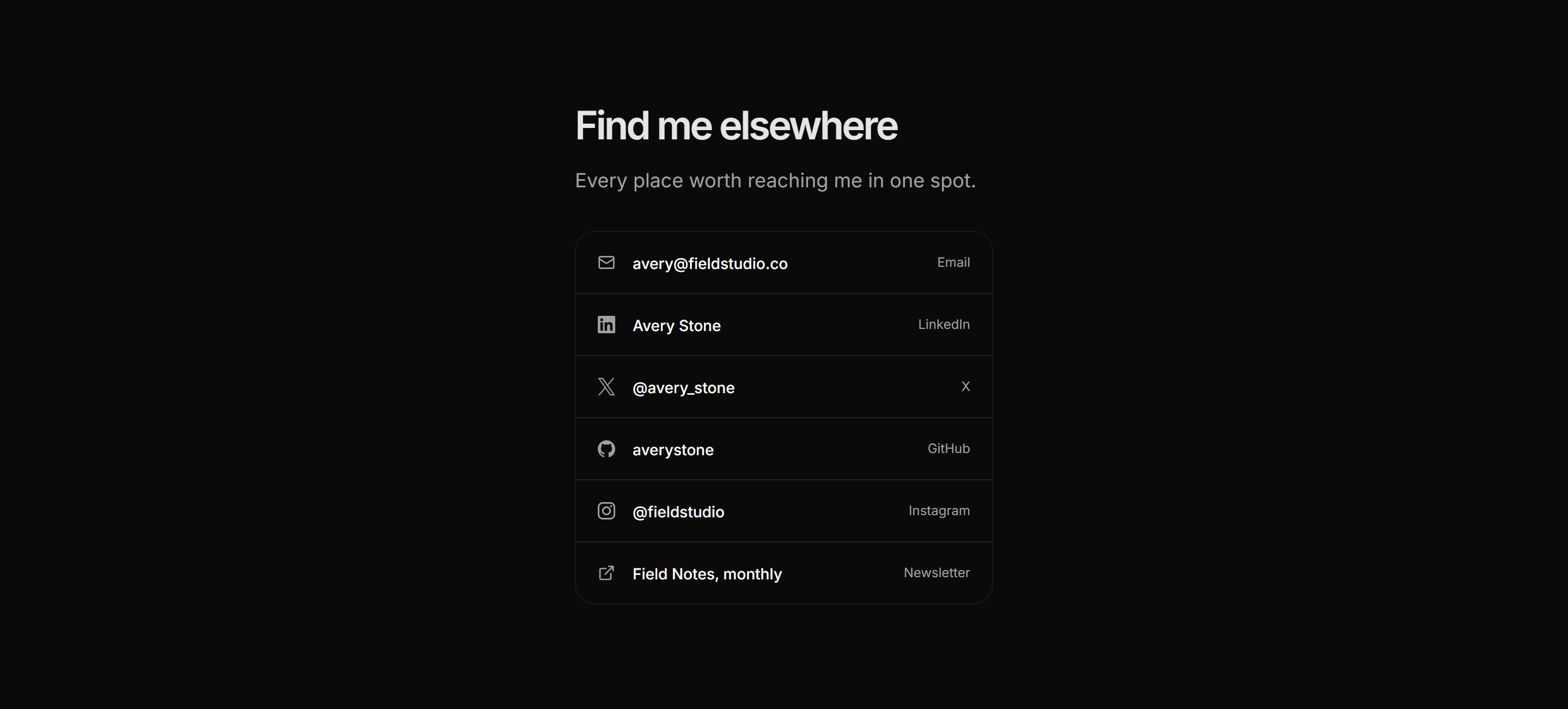
A compact bordered card listing email, social handles, and a newsletter as ruled rows with an icon and platform label per entry.


Portfolio Social and Link: Icon Row
A centered strip of brand-icon links for GitHub, LinkedIn, X, and Instagram with accessible labels and hover transitions.
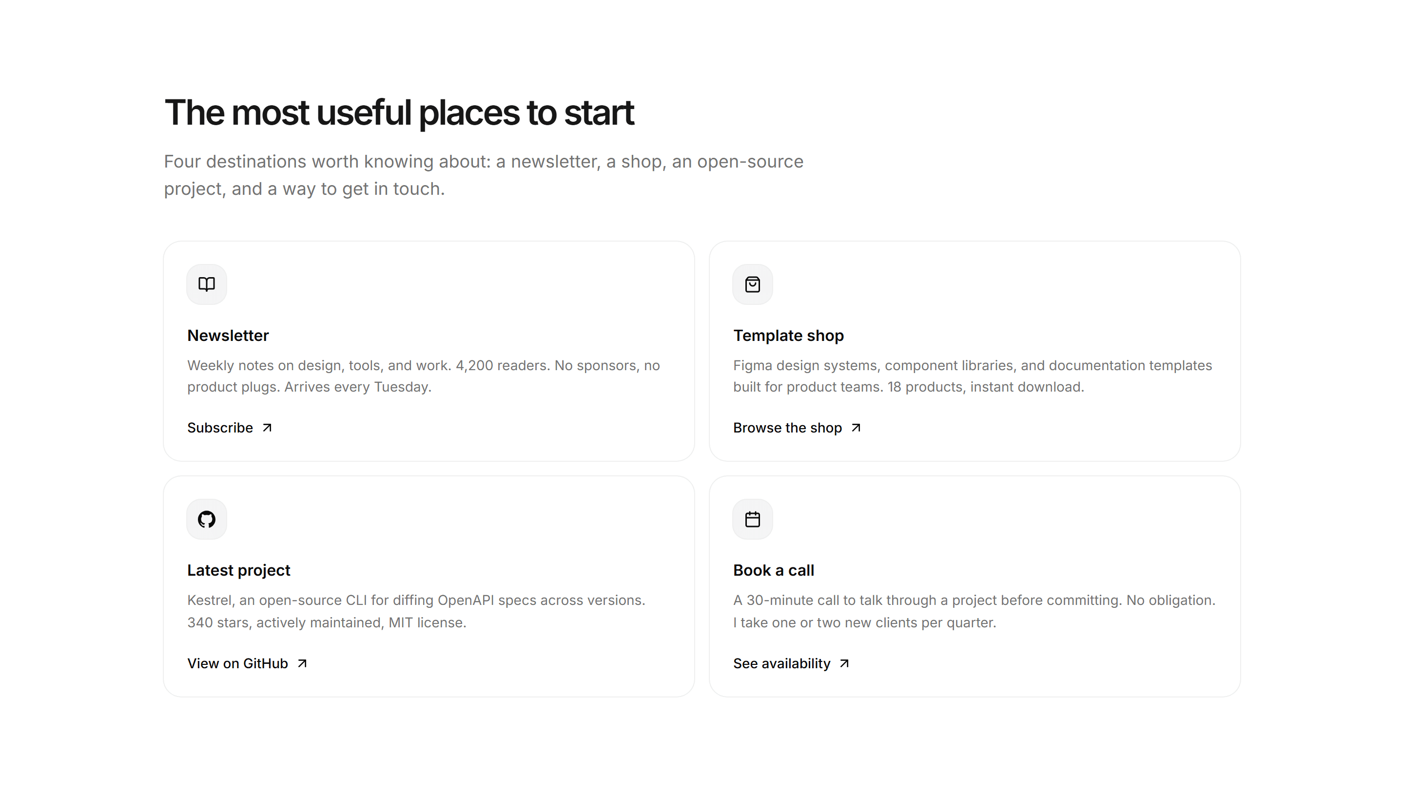
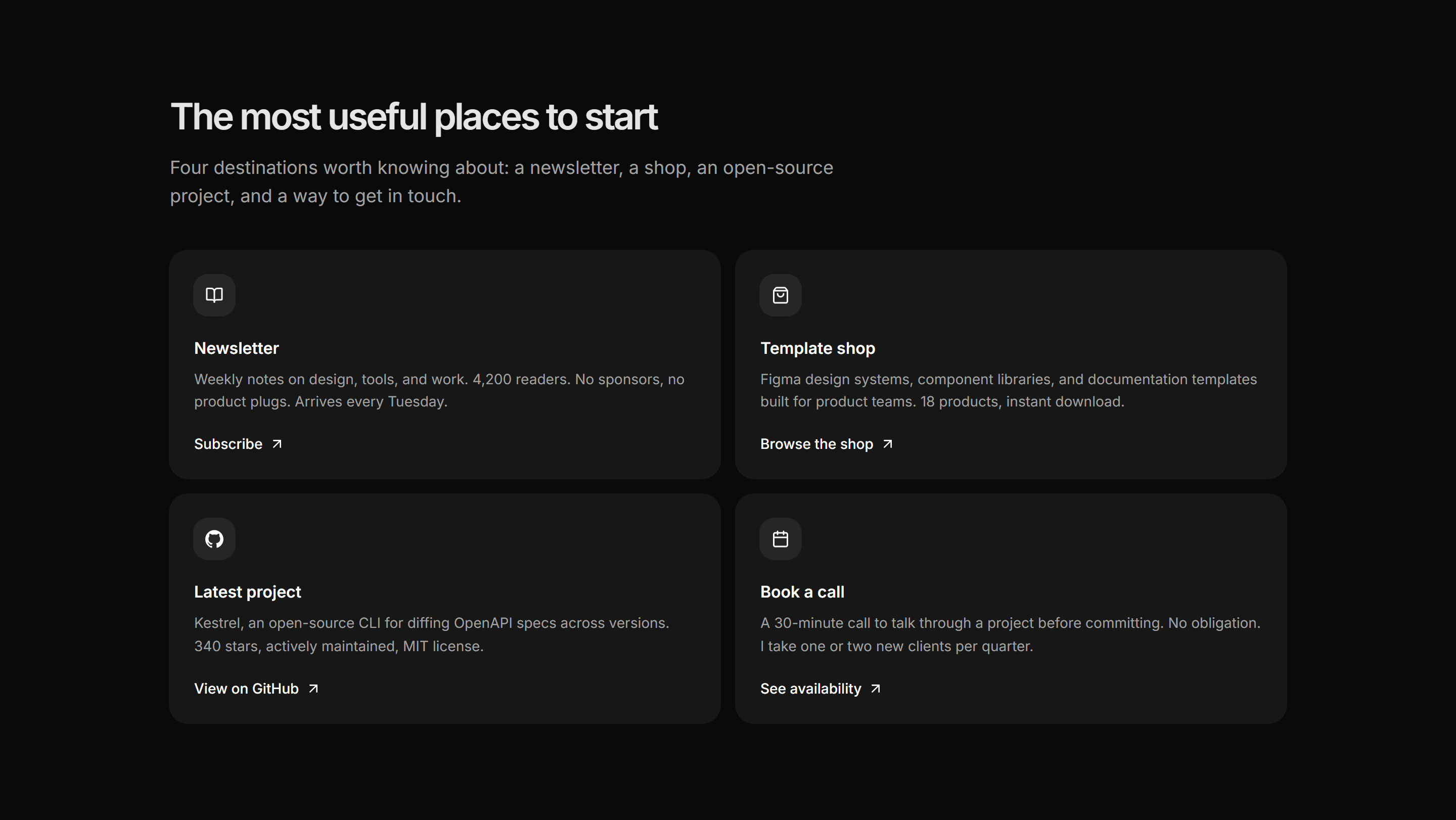
Portfolio Social and Link: Featured Links
Four high-priority destinations given prominence as large icon cards covering newsletter, shop, open-source project, and booking link.


Portfolio Social and Link: Social Row
A centered horizontal strip of social links pairing a brand icon with a display handle for each platform, sized for embedding at the foot of any section.
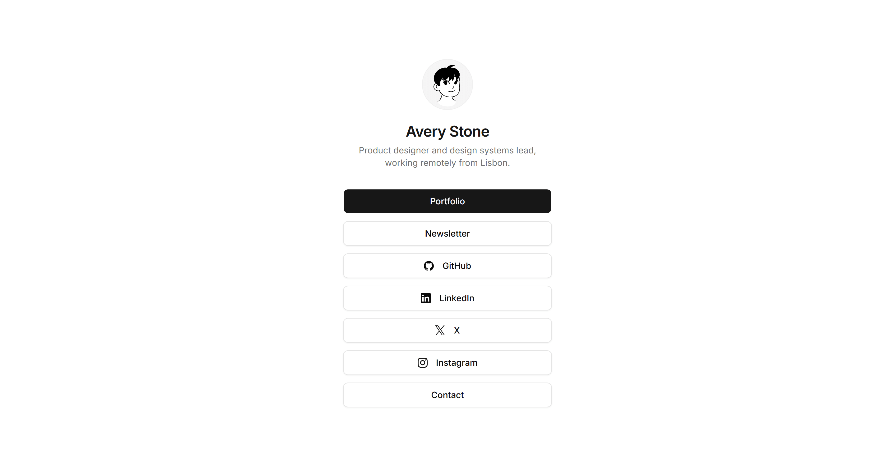
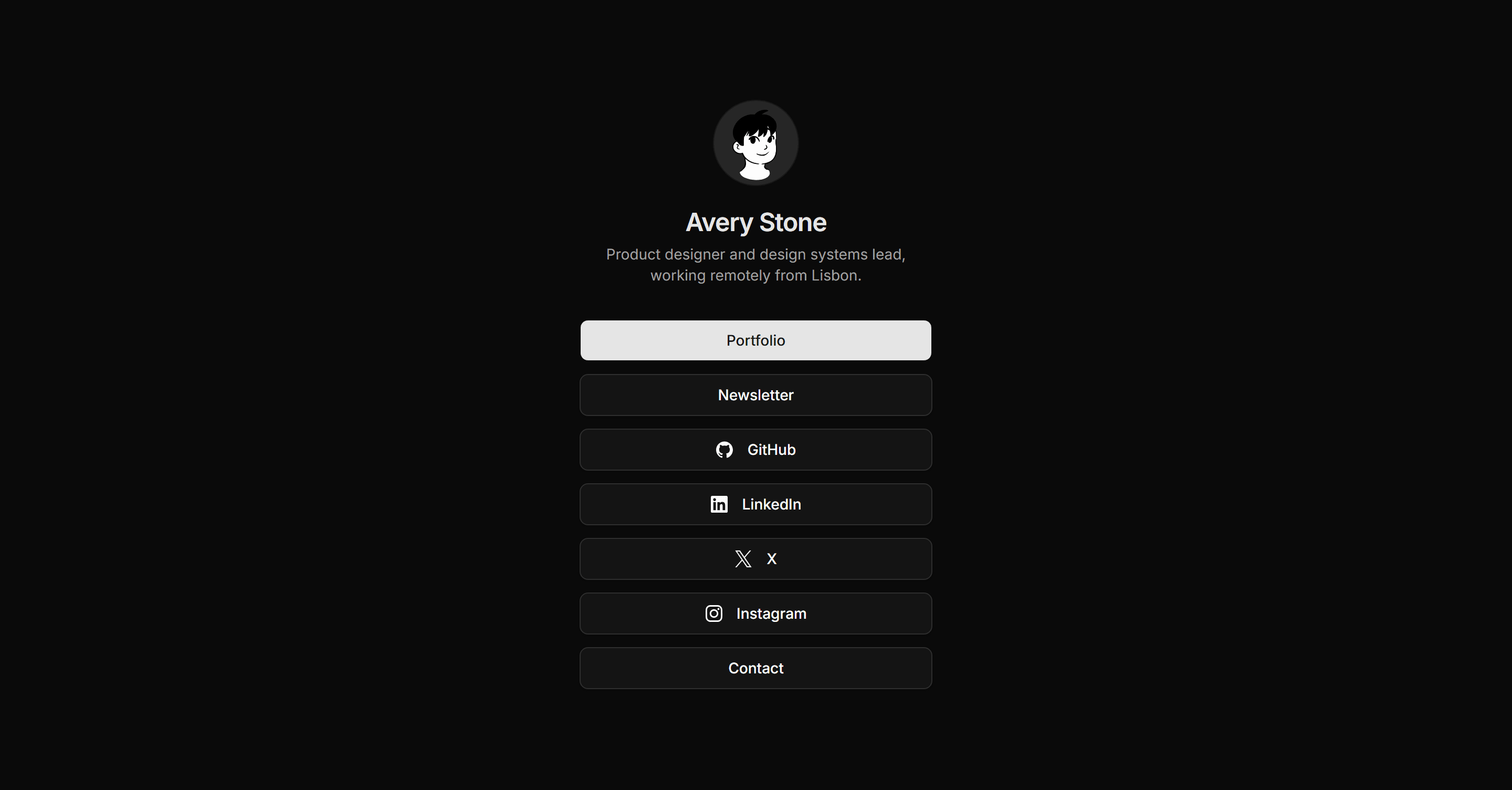
Portfolio Social and Link: Link In Bio
A mobile-first link hub with a centered avatar, name, one-line context, and a vertical stack of full-width buttons covering portfolio, newsletter, socials, and contact.
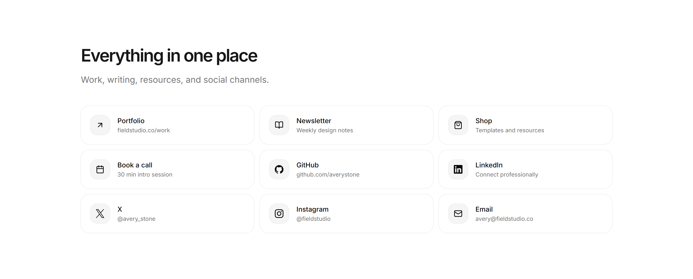
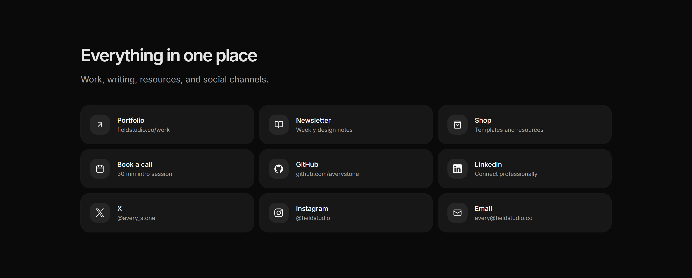
Portfolio Social and Link: Links Grid
A responsive grid of link cards covering portfolio, newsletter, shop, calendar, and social channels, each with an icon, a bold label, and a short destination note.
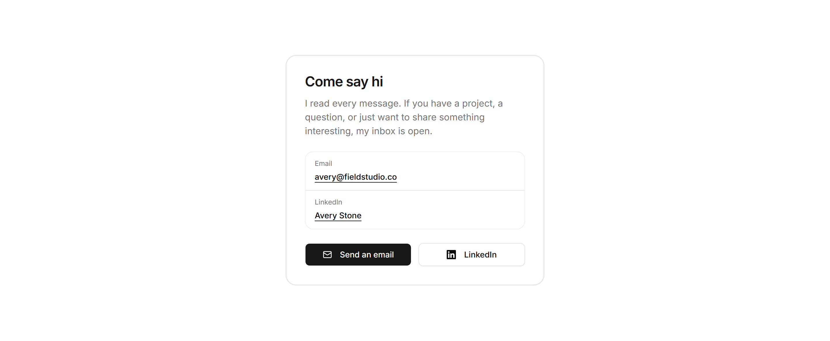
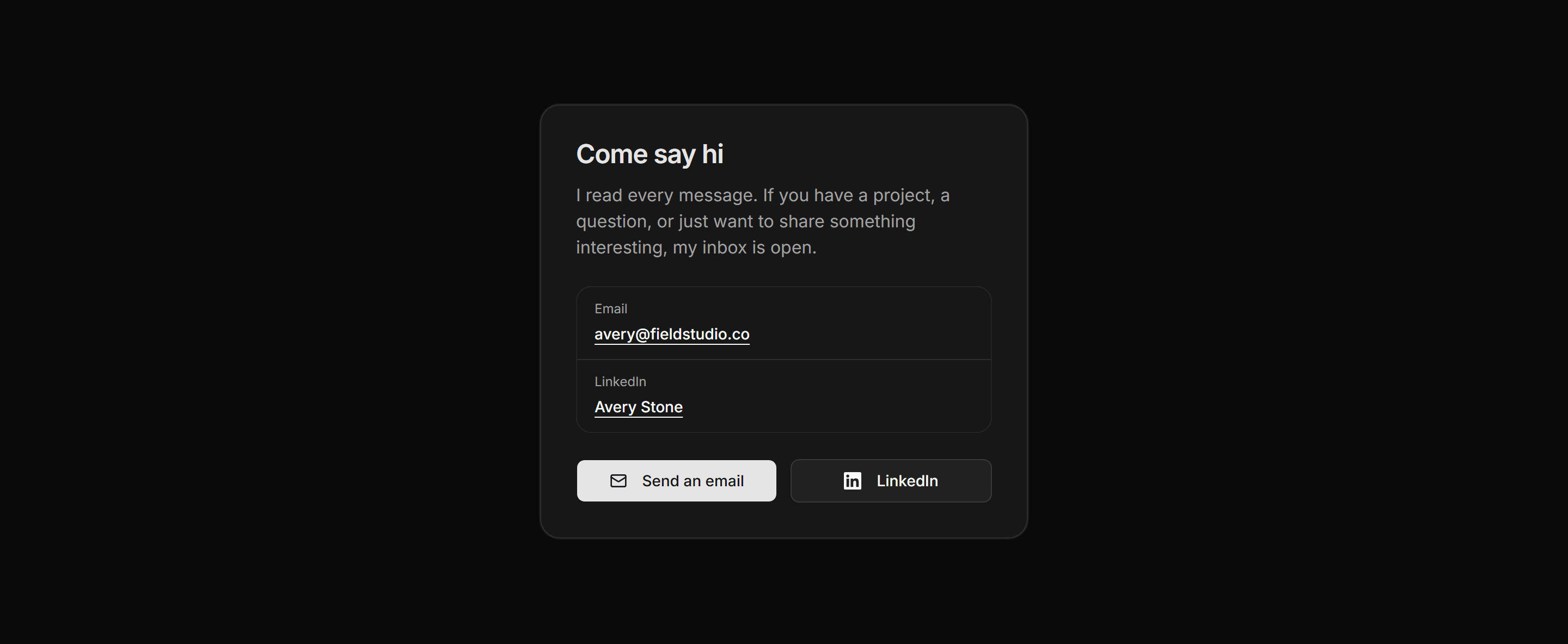
Portfolio Social and Link: Connect Card
A compact centered card with a come-say-hi headline, an email row, a primary social row, and two side-by-side action buttons for a lightweight contact nudge.
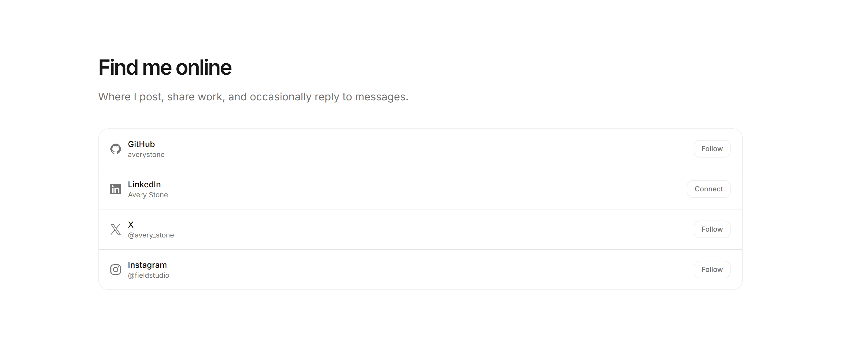
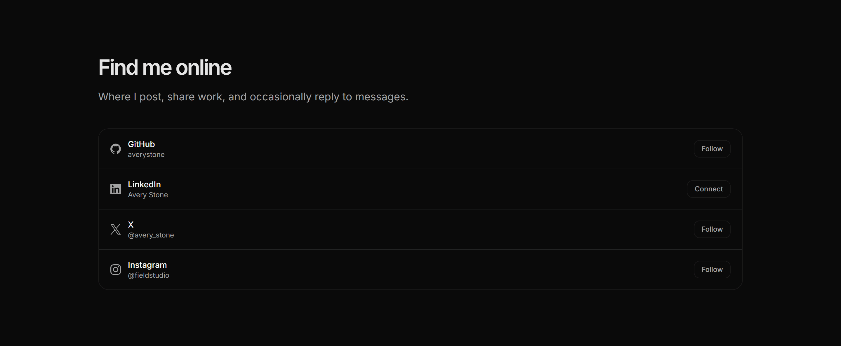
Portfolio Social and Link: Elsewhere List
A ruled list of platforms where this person can be found online, showing the brand icon, handle, and a context-appropriate follow or connect action per row.