Shadcn Feature Blocks
Browse 15 Modern SaaS feature blocks for shadcn/ui. Bento grids and illustrated sections that show what your product does in a clean, minimal layout.
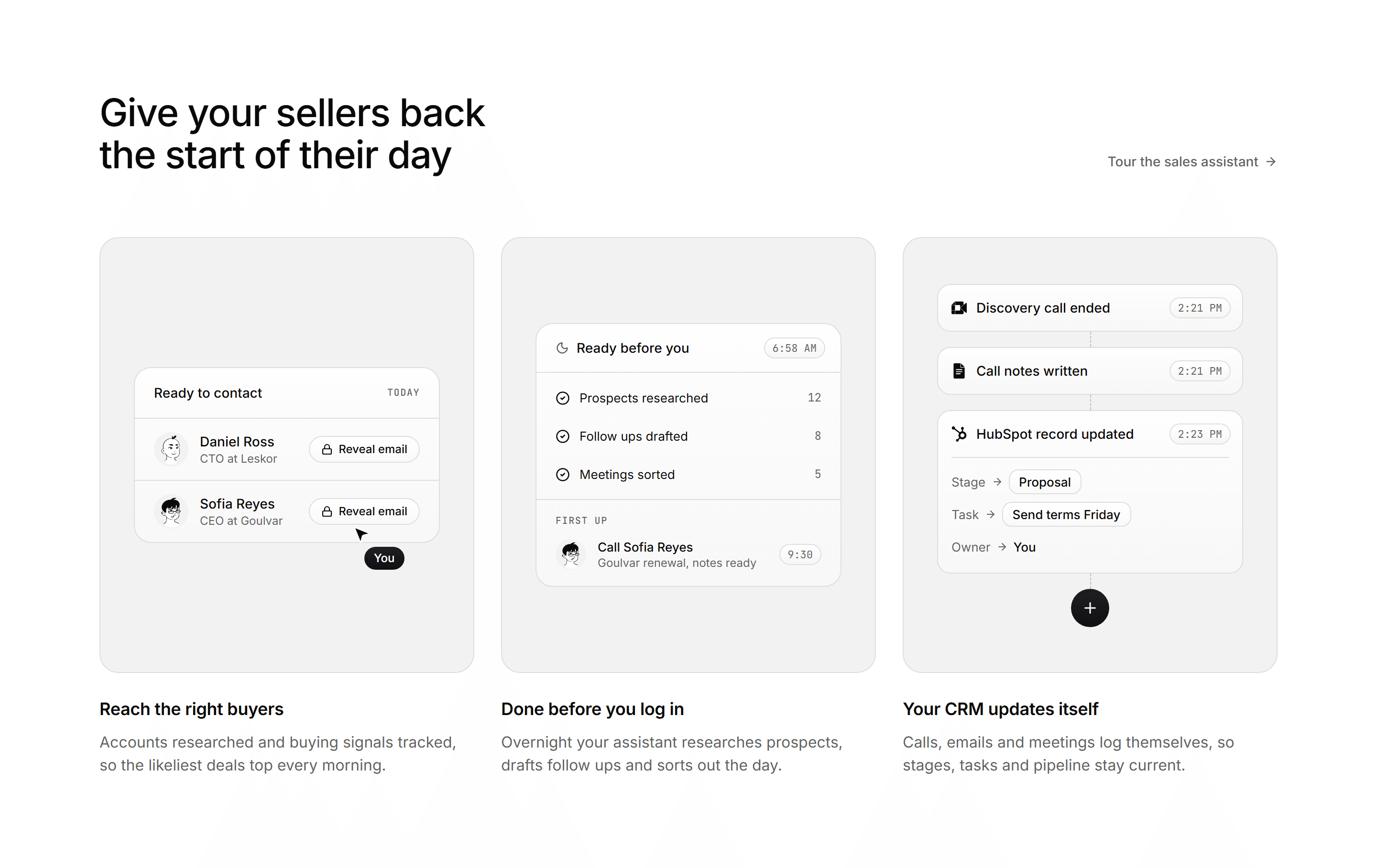
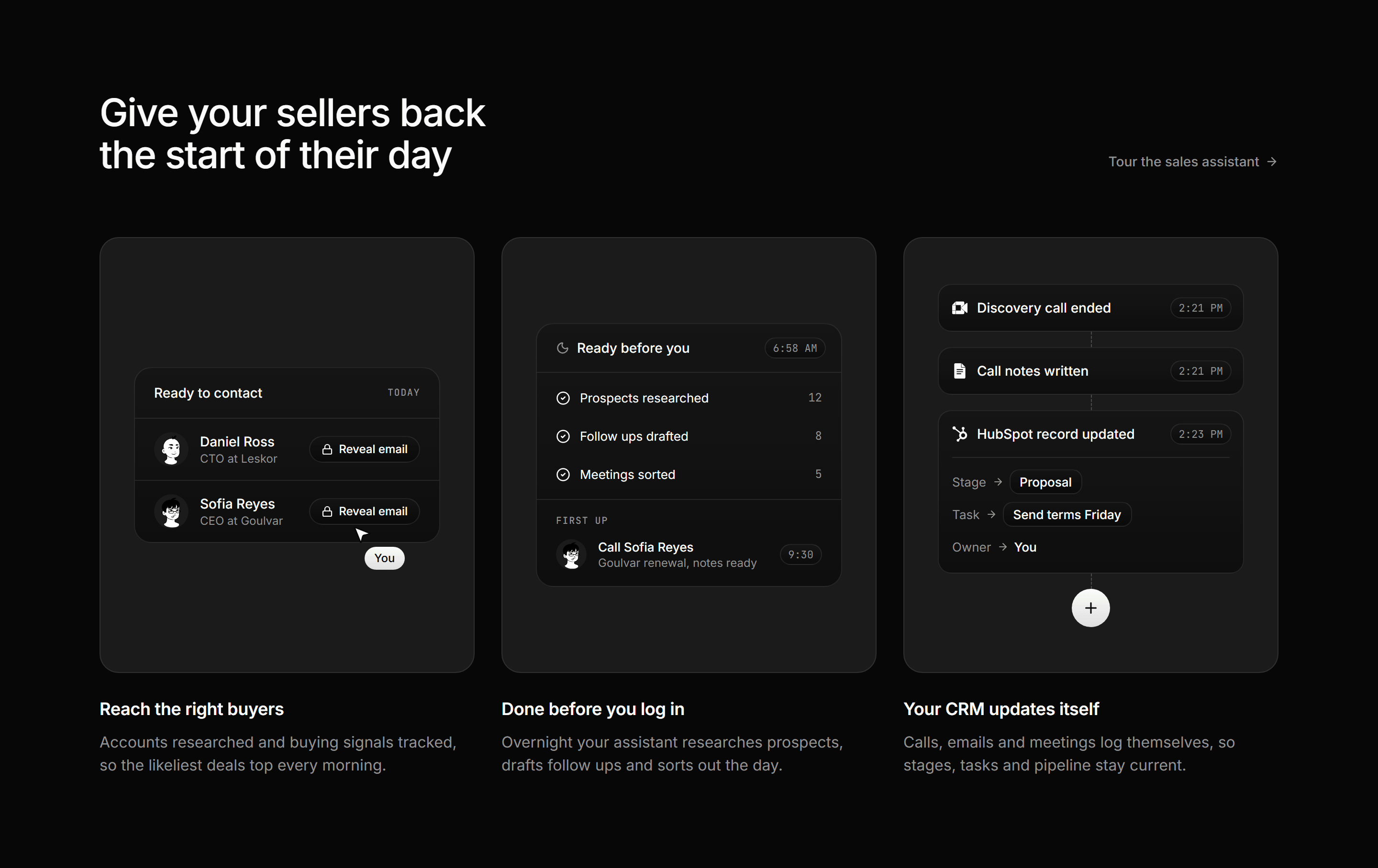
Modern SaaS Feature: Mockup Panel Trio
A heading row with a text link over three muted panels, each holding a small sales assistant mockup above a title and a two line blurb.
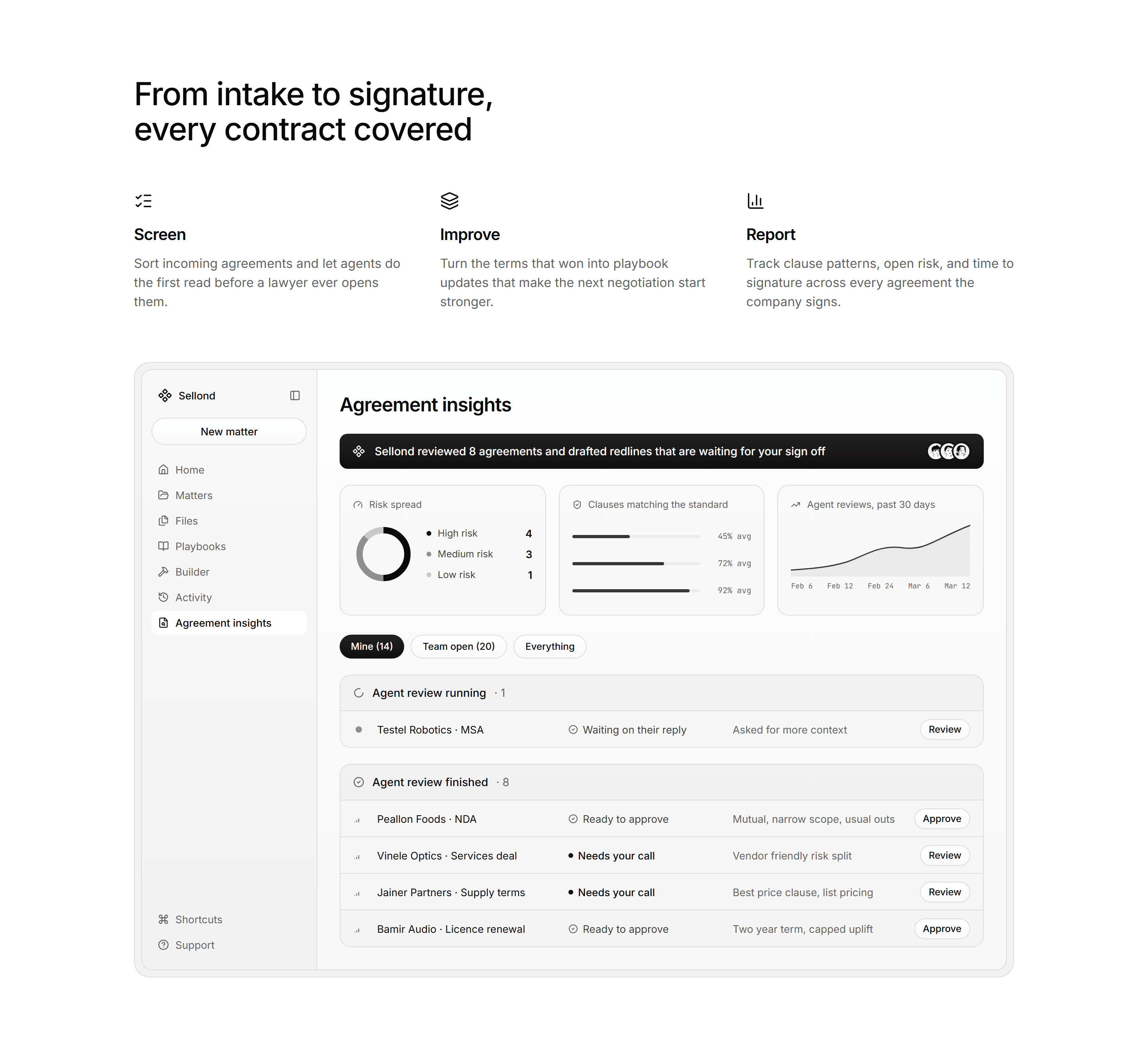
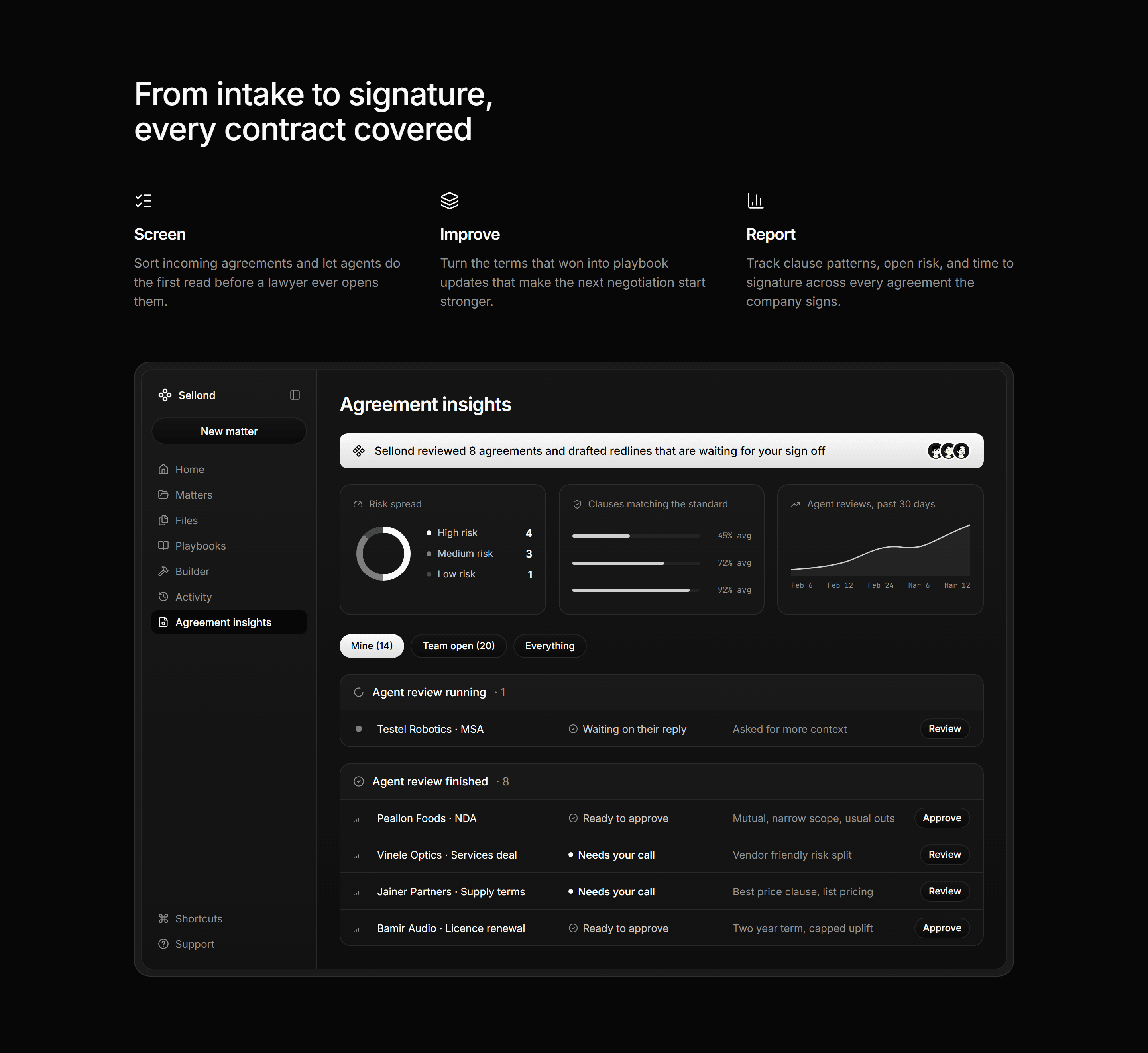
Modern SaaS Feature: Three Columns with App Mockup
A section heading over three icon columns, then a contract review app mockup with charts, filters and grouped lists in an inset tray.
Modern SaaS Feature: Product Showcase
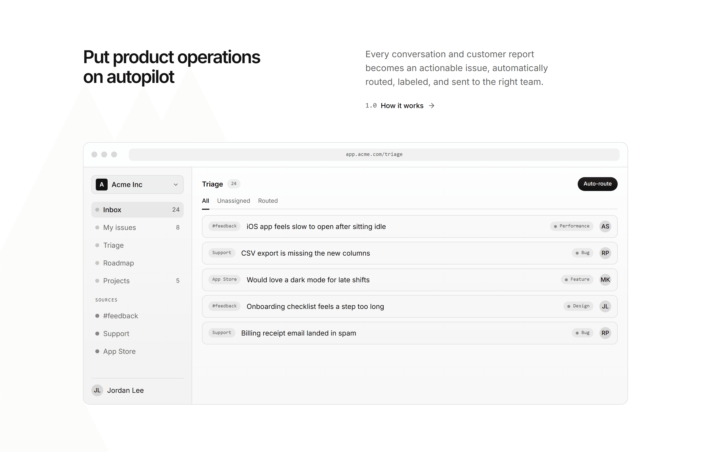
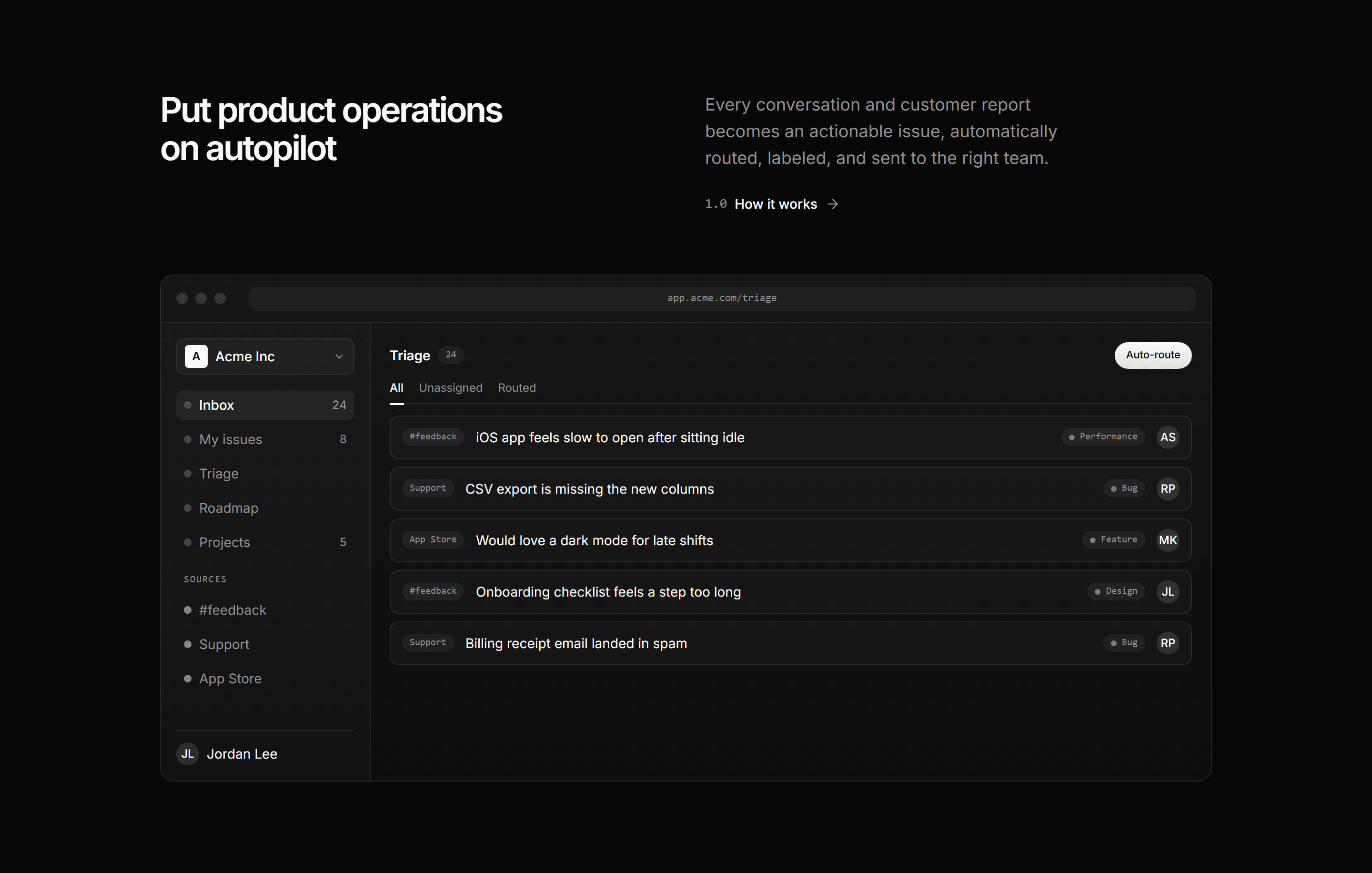
A split header over an app window mockup: a triage inbox where incoming feedback is auto-routed into labeled, assigned issues. Shows the product in action.
Modern SaaS Feature: Benefits Isometric
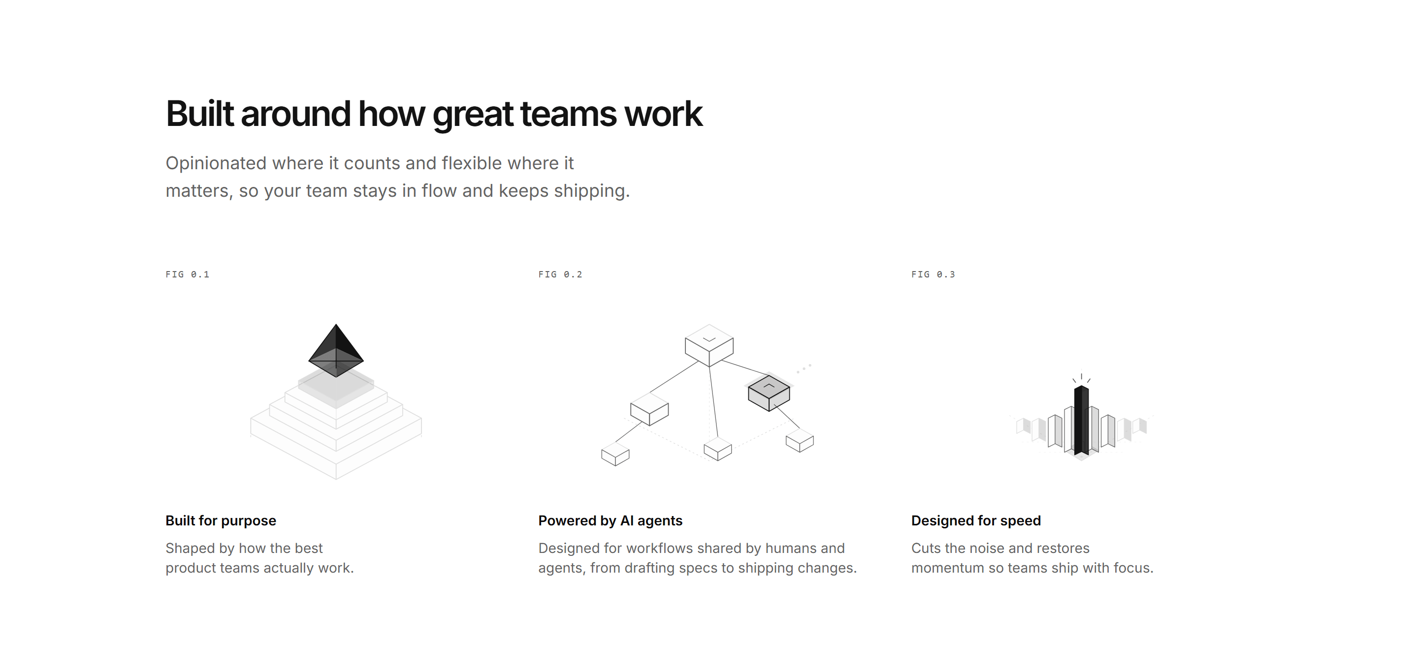
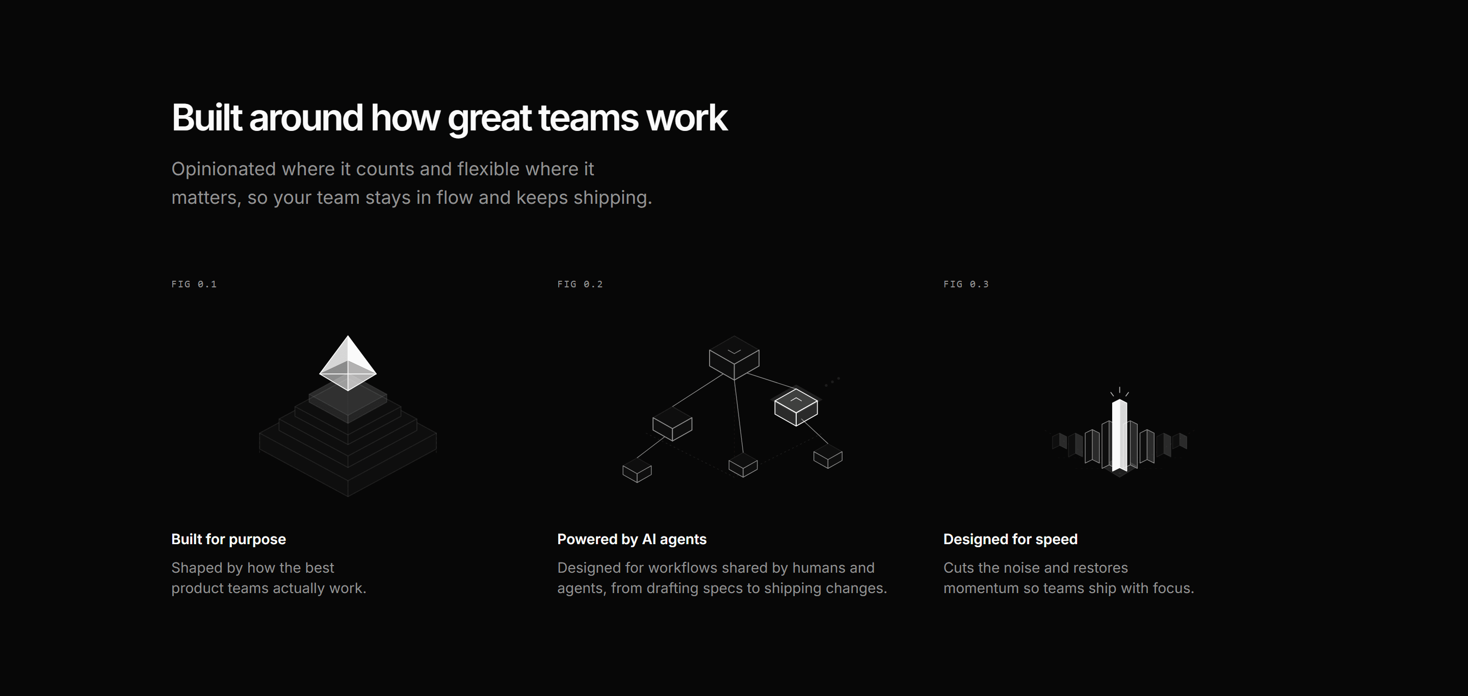
Three benefit columns, each with a centered isometric SVG illustration, a FIG tag, label, and short paragraph. A clean, minimal way to frame product principles.


Modern SaaS Feature: Metric Interlude
A quiet pacing section: two large proof stats split by a hairline, followed by a single transitional statement line.
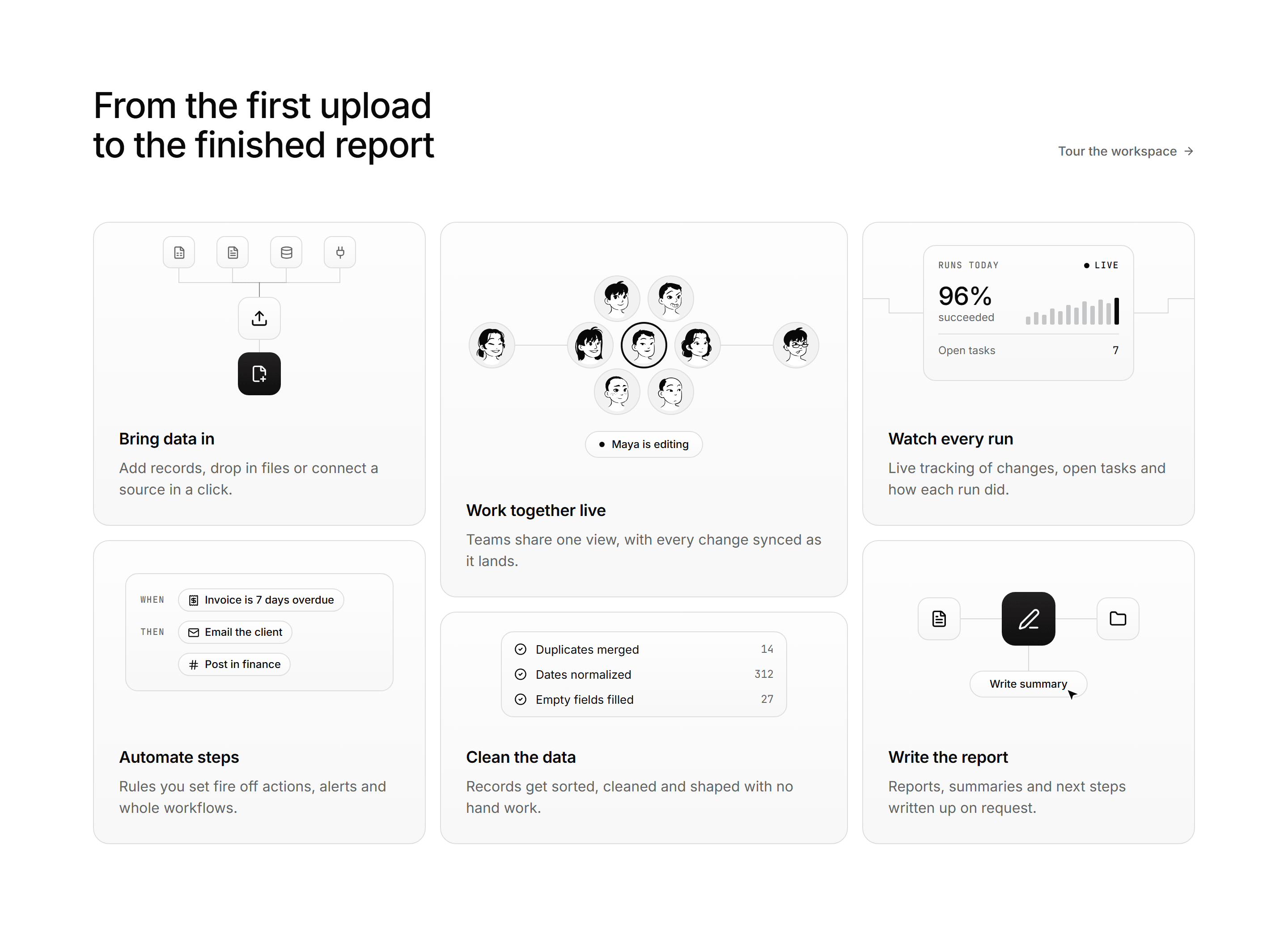
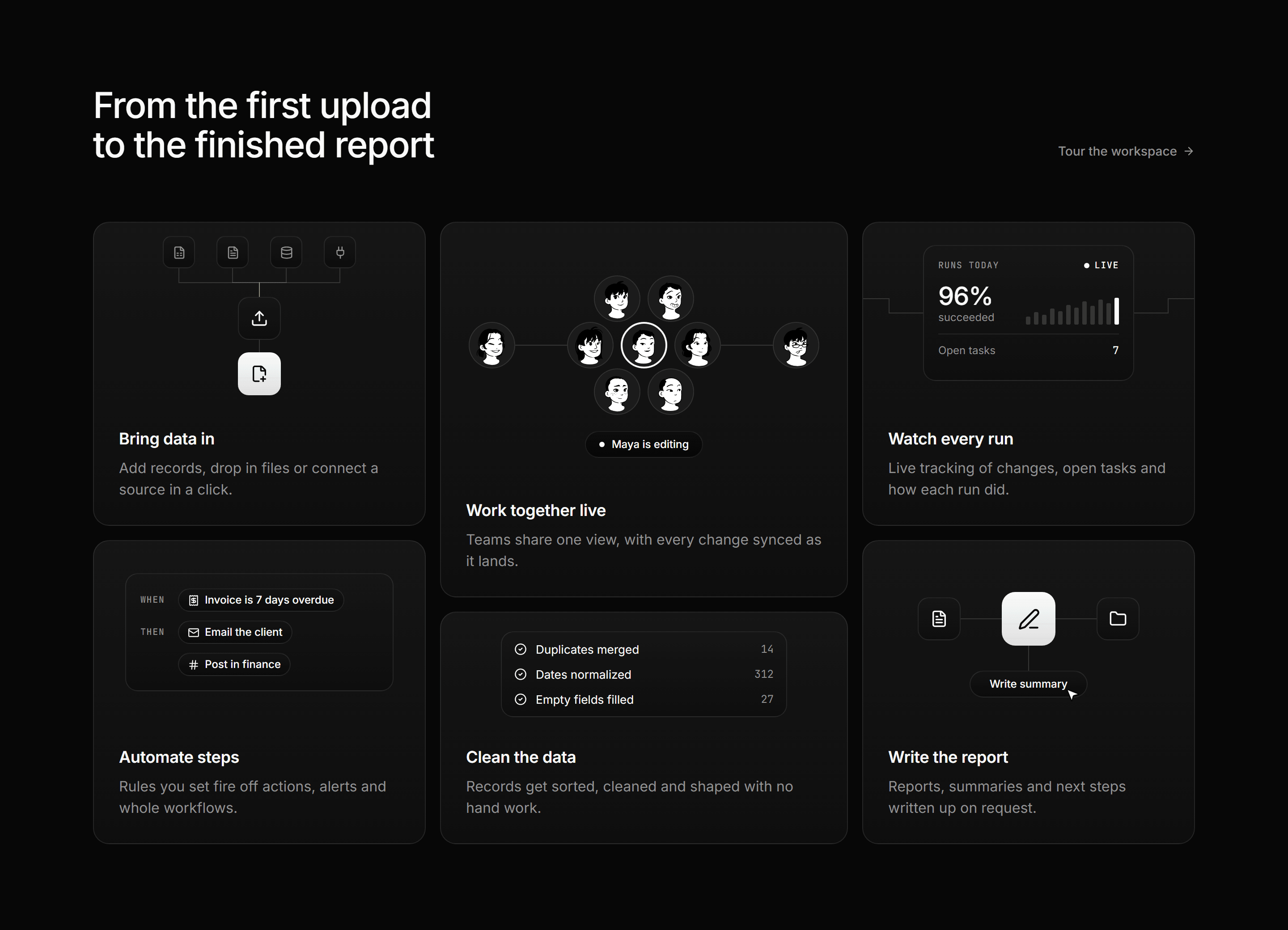
Modern SaaS Feature: Node Bento Grid
A heading row with a text link over a six tile bento, each tile a small product moment for its feature above a title and a two line blurb.
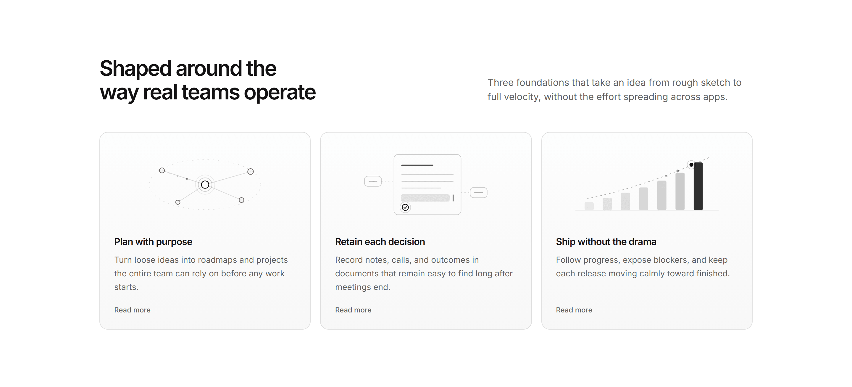
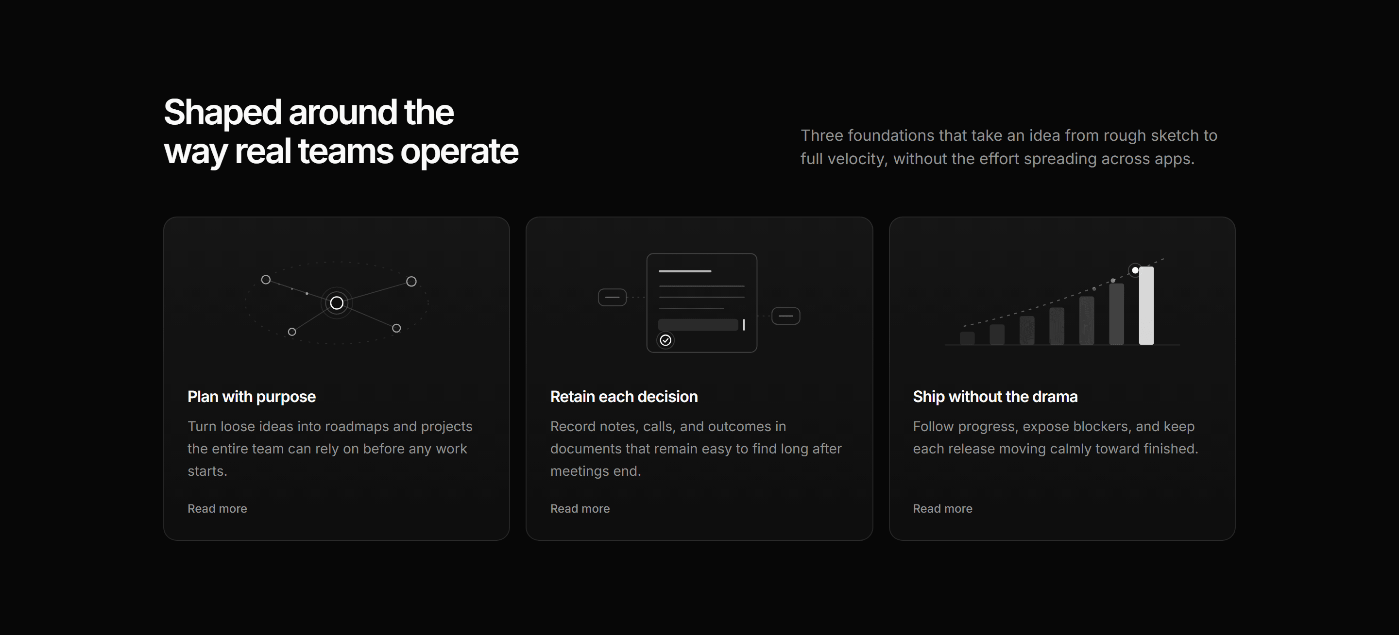
Modern SaaS Feature: Capability Diagram Cards
Three depth cards each led by an illustrative SVG diagram: node constellation, decision doc, and ascending bars.
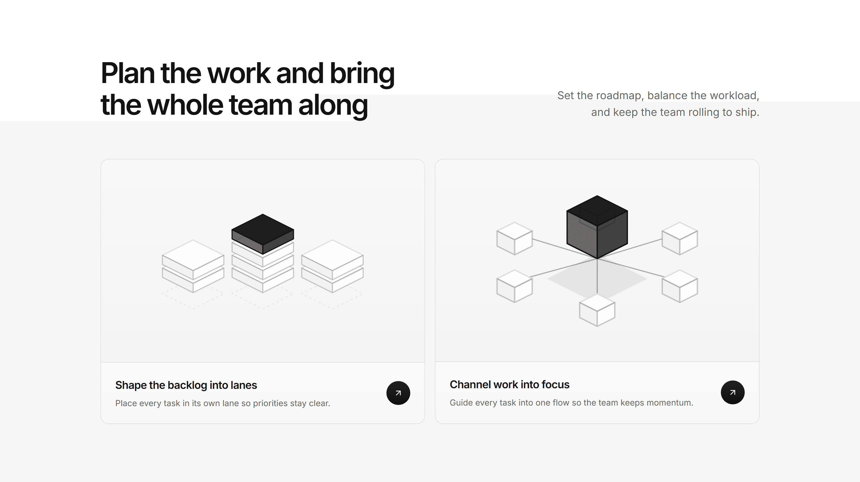
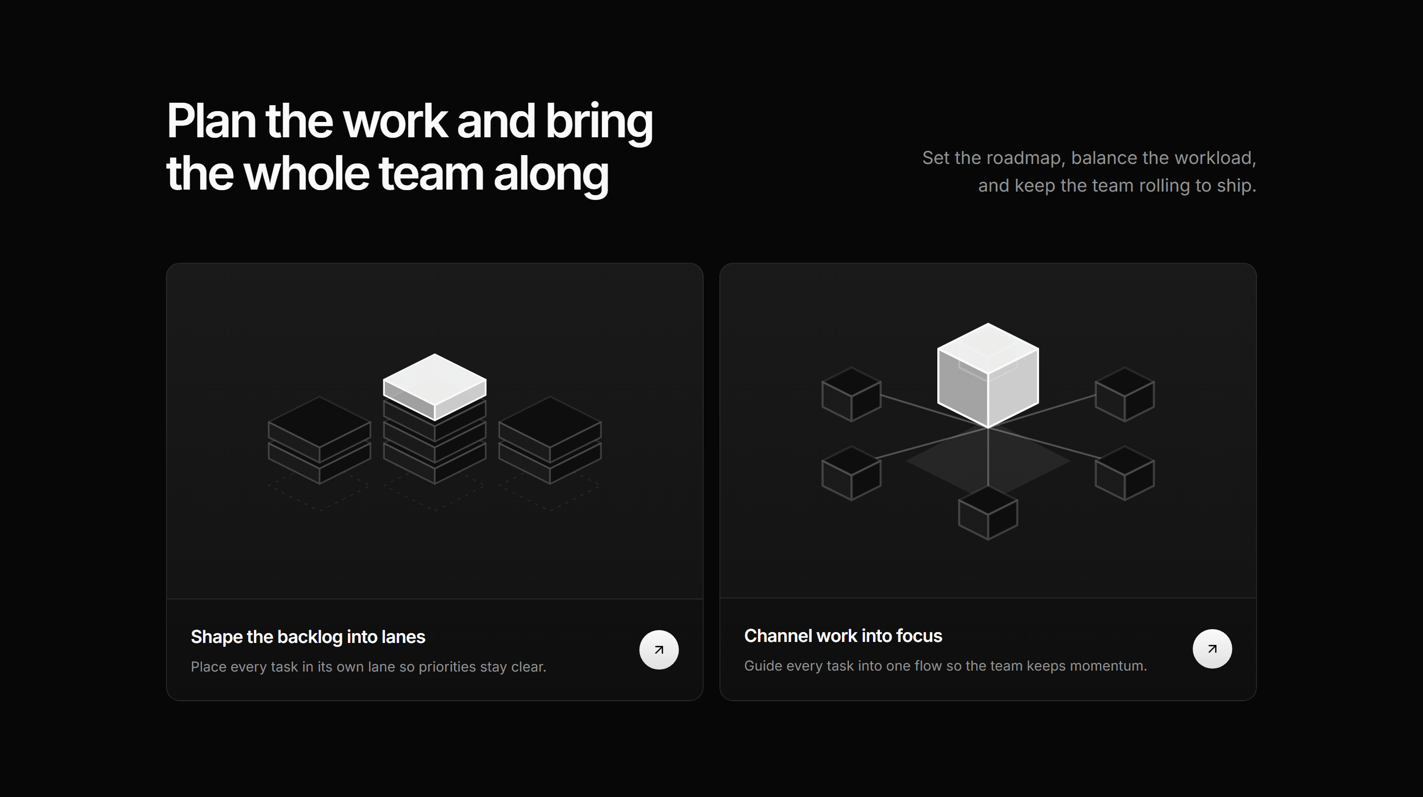
Modern SaaS Feature: Illustrated Cards
A gradient lead headline over two equal isometric cards: a backlog sorted into stacked lanes and cubes converging on one focused point.
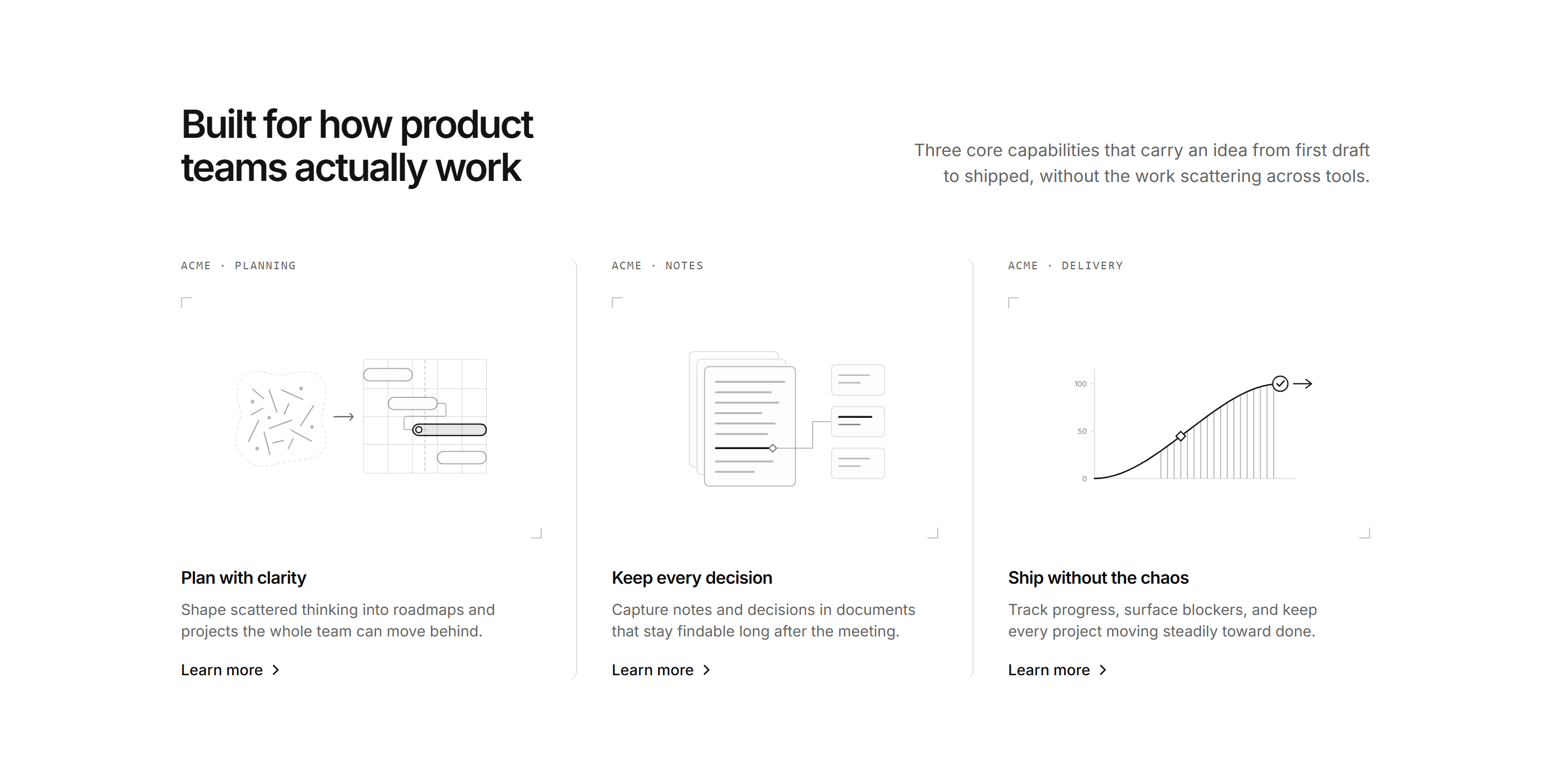
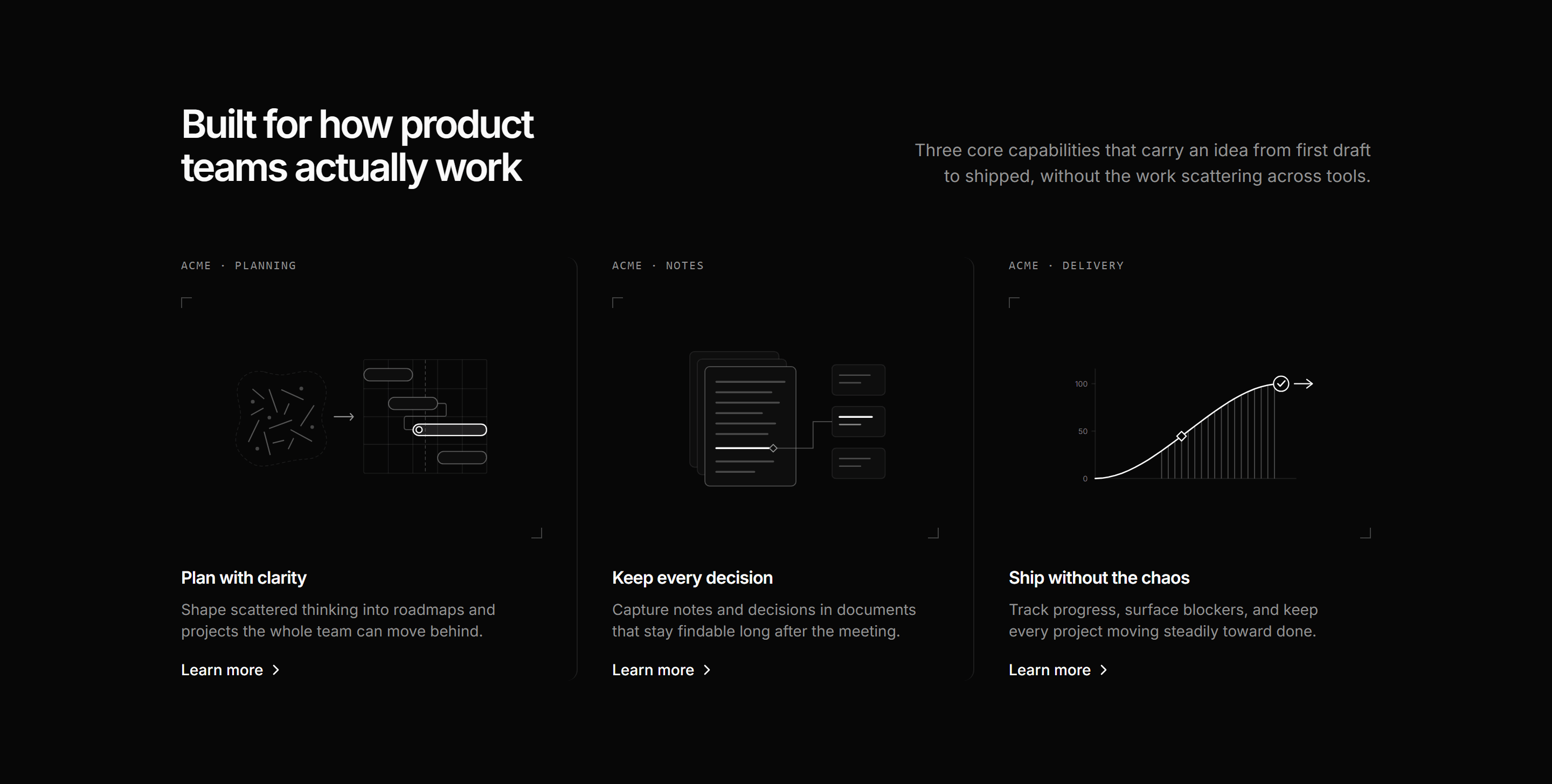
Modern SaaS Feature: Capability Columns
A split lead over three capability columns, each framing a schematic SVG figure with corner crop marks, a caption tag, and a Learn more cue.
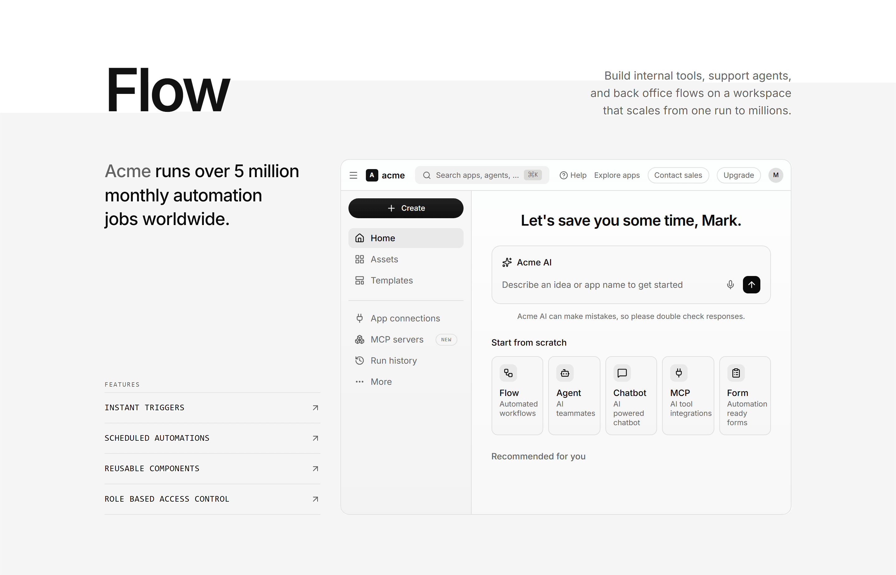
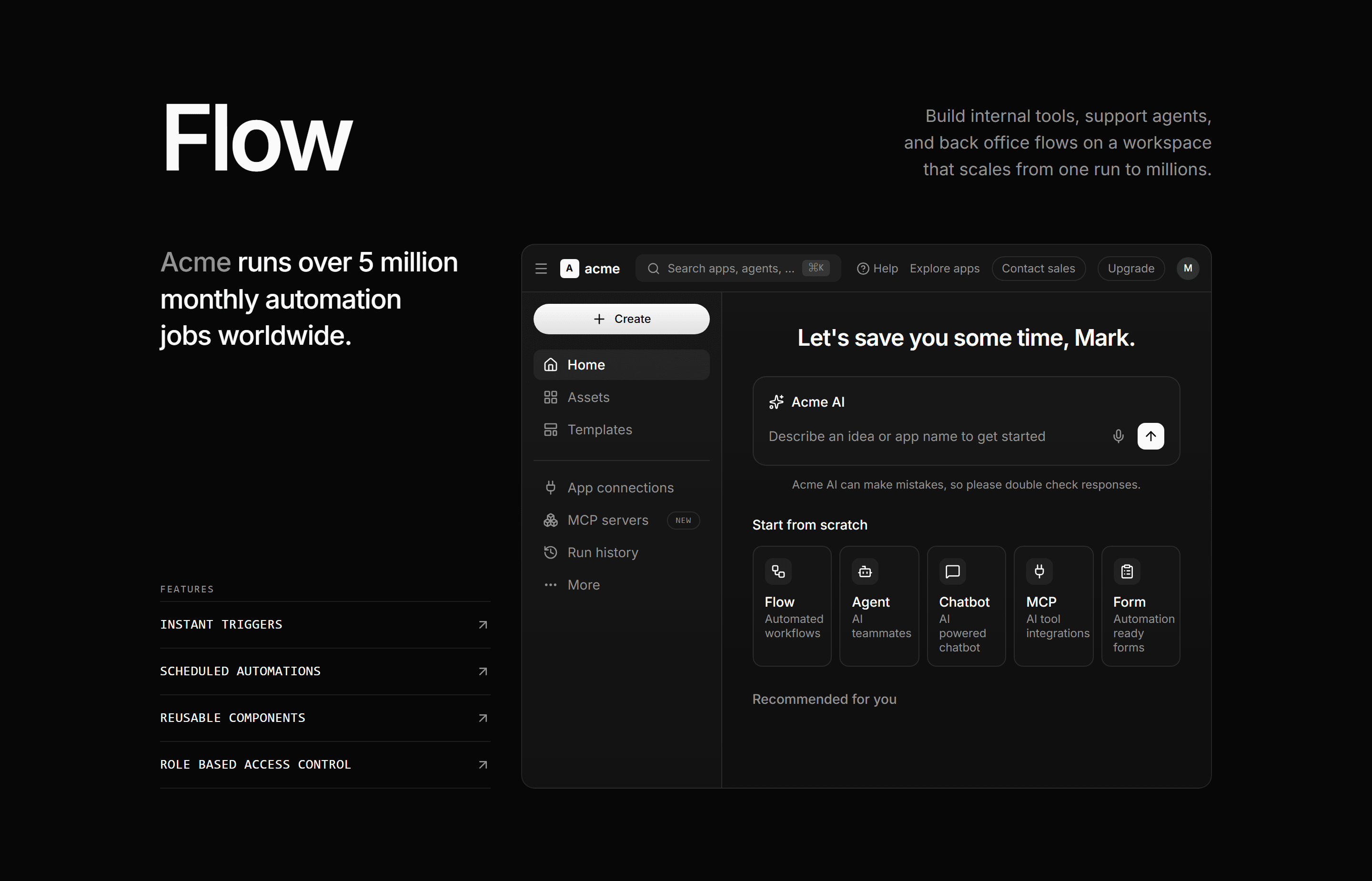
Modern SaaS Feature: App Workspace
An oversized display word over a stat-led feature rail beside a full automation workspace dashboard mockup built from theme tokens.
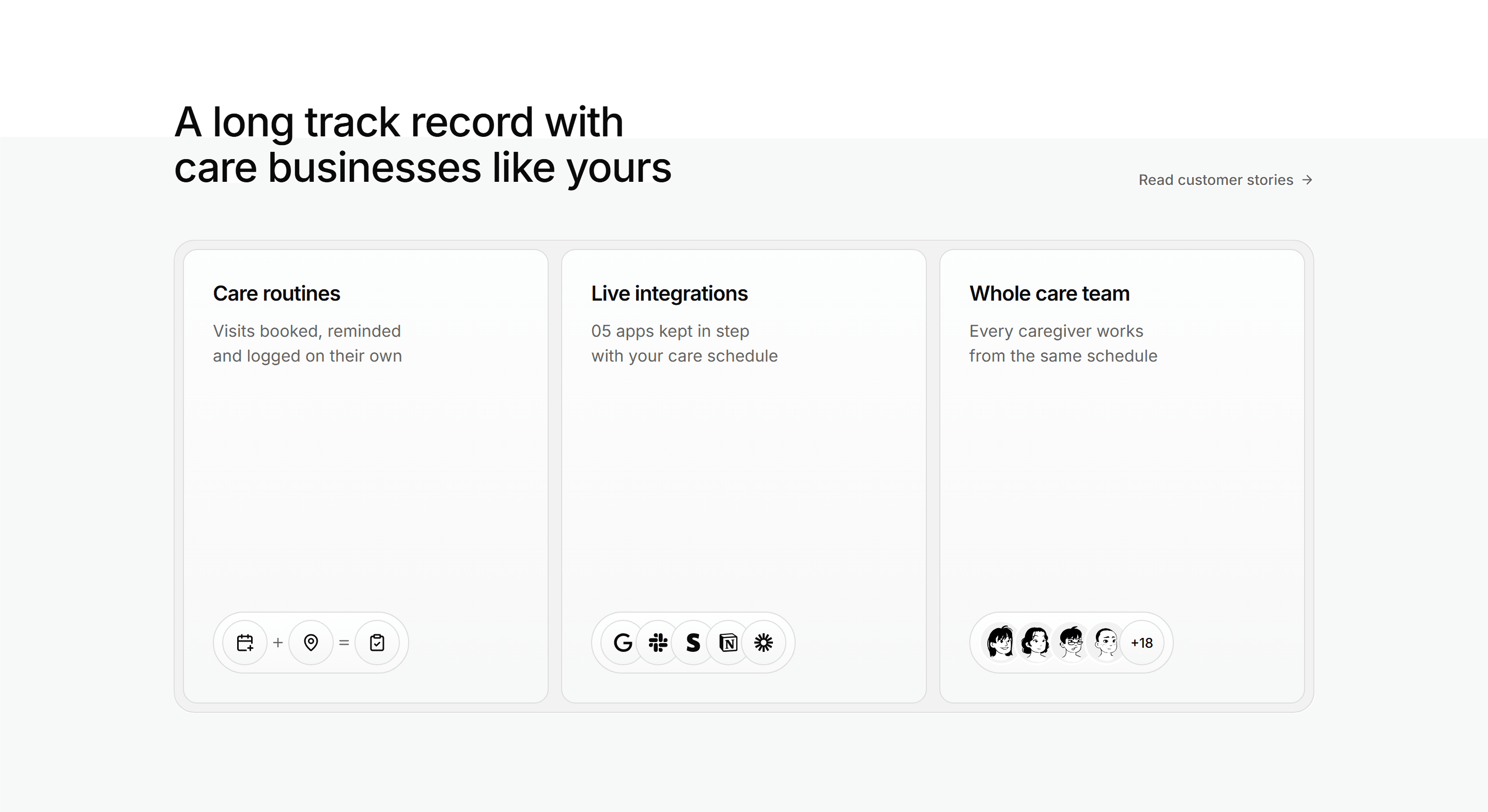
Modern SaaS Feature: Capsule Card Trio
A heading row with a text link over three tall cards in a muted inset tray, each closing on a capsule of icon, brand or avatar chips.


Modern SaaS Feature: Icon Card Grid with CTA
A heading row and a right aligned lede over a grid of five icon feature cards, closed by a call to action card on the primary surface.
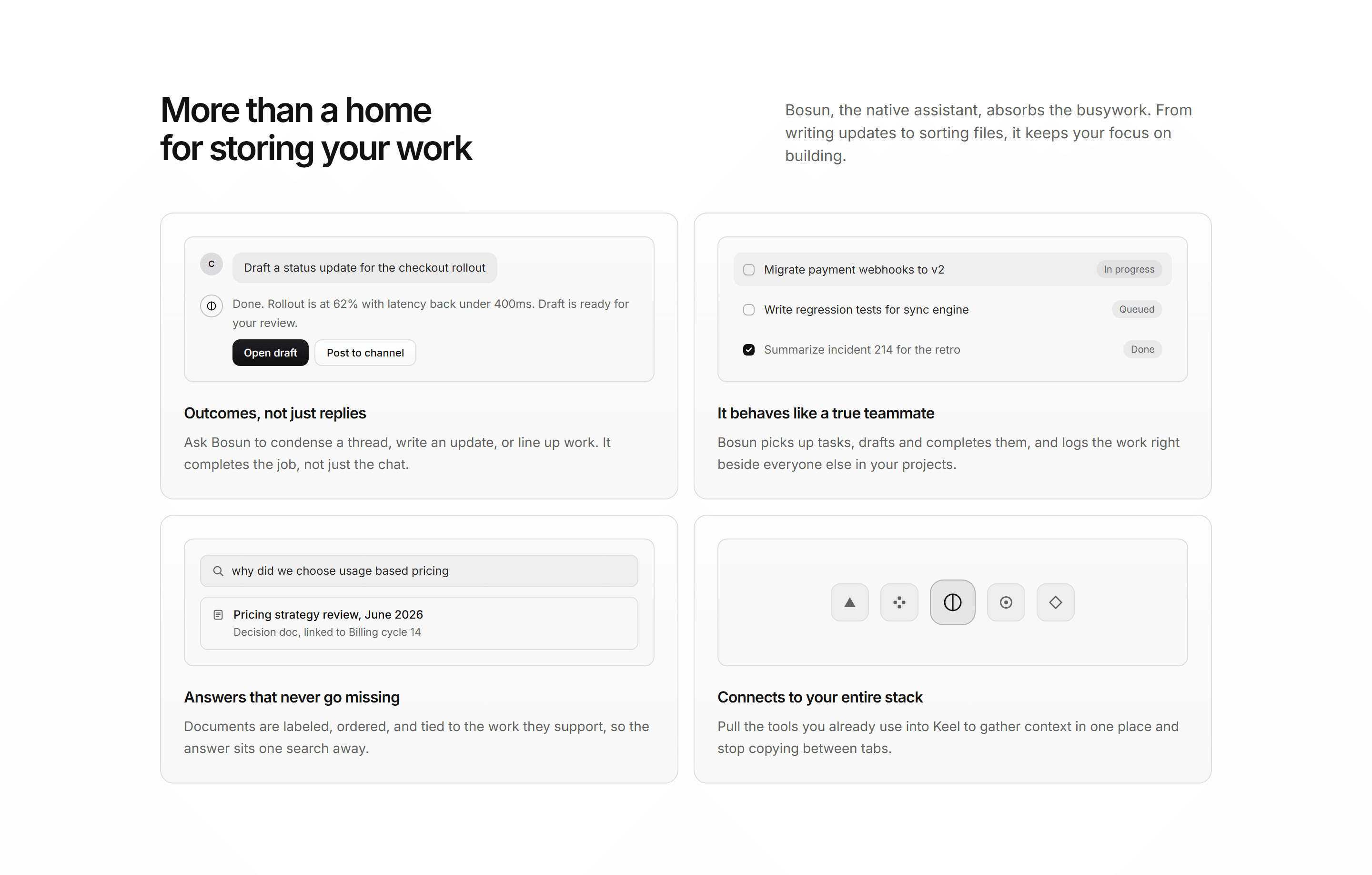
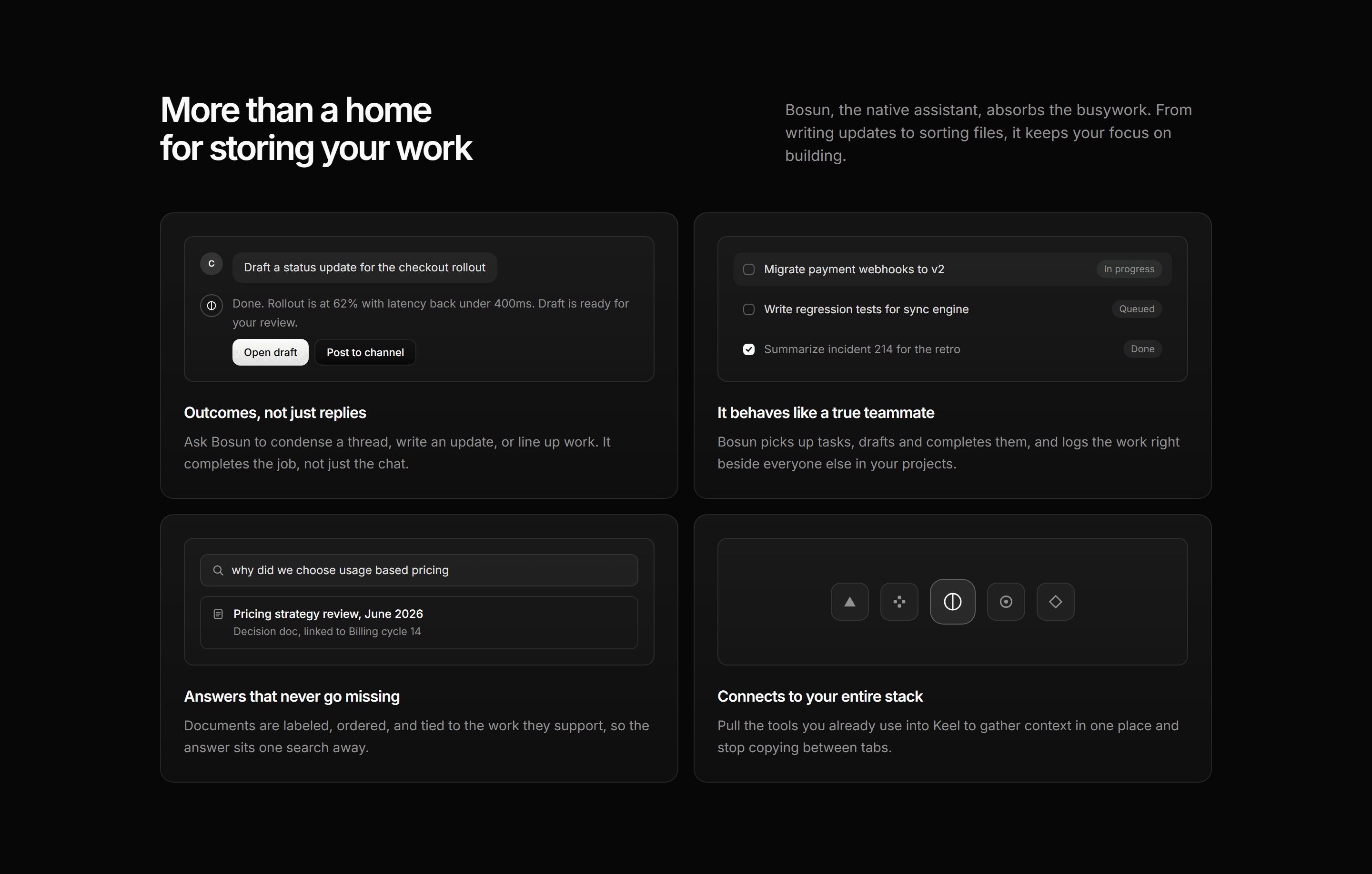
Modern SaaS Feature: Assistant Snippet Grid
A two by two grid of assistant feature cards, each led by a miniature UI snippet inside an inset tile.
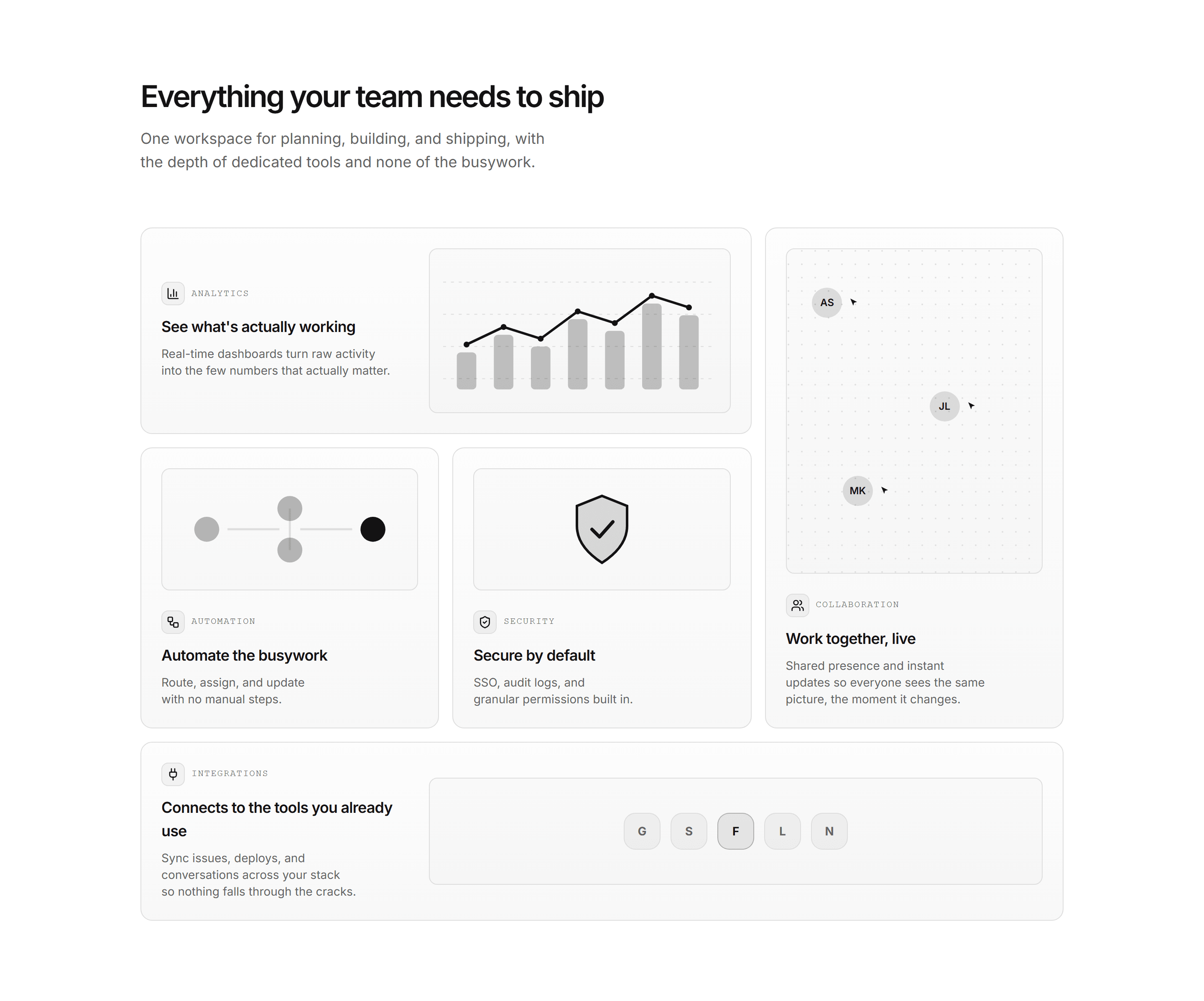
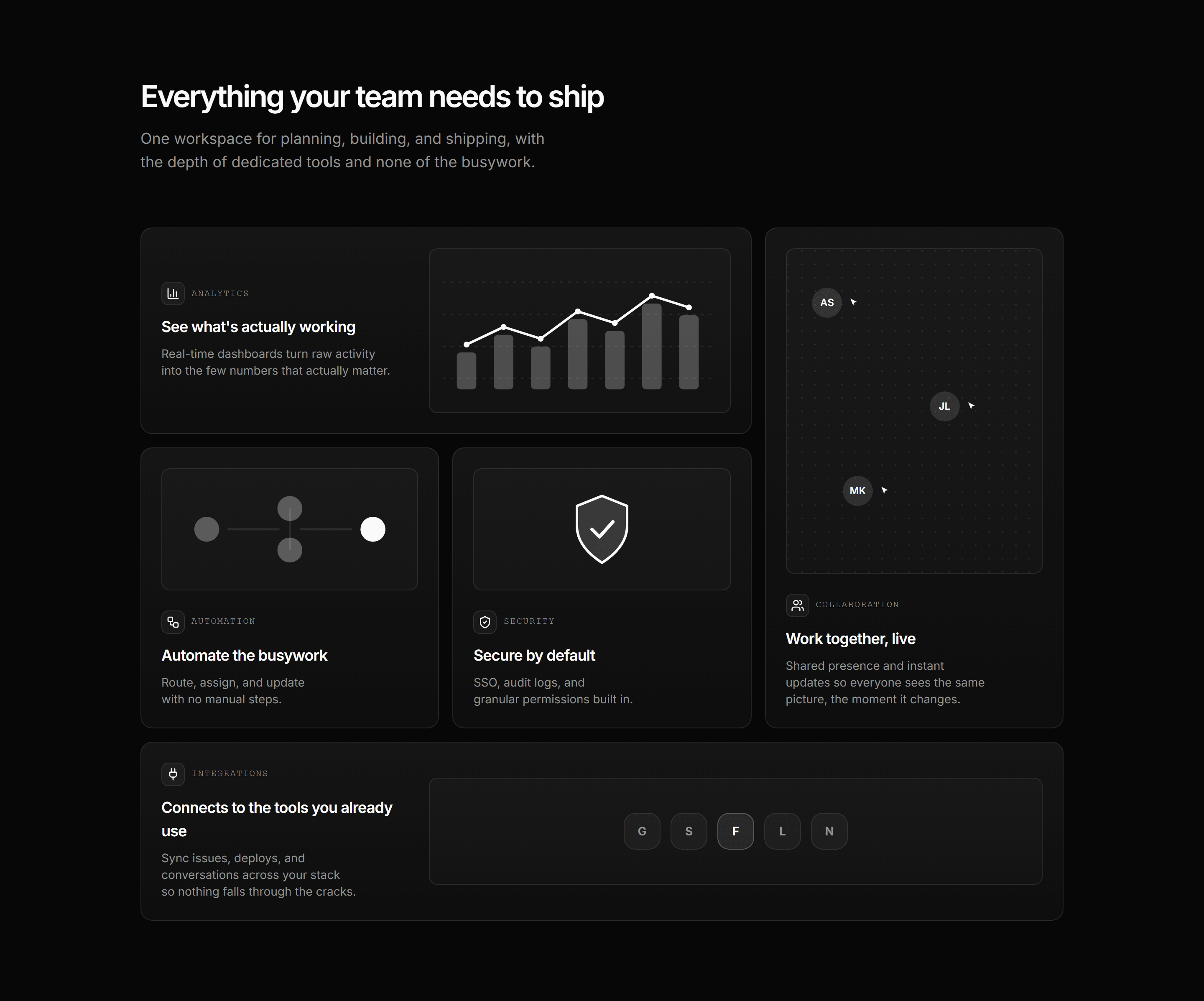
Modern SaaS Feature: Bento Grid
An asymmetric bento feature grid with a custom SVG illustration in every cell: analytics, collaboration, automation, security, and integrations. A clean, minimal overview.
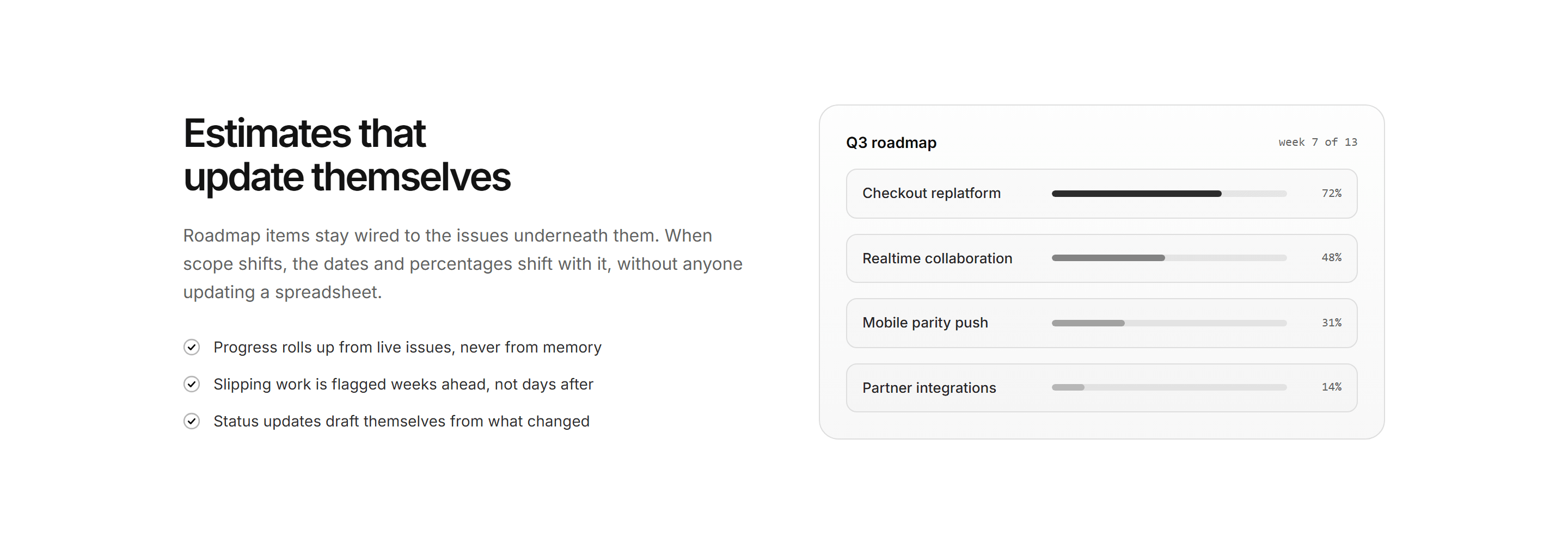
Modern SaaS Feature: Split Checklist Panel
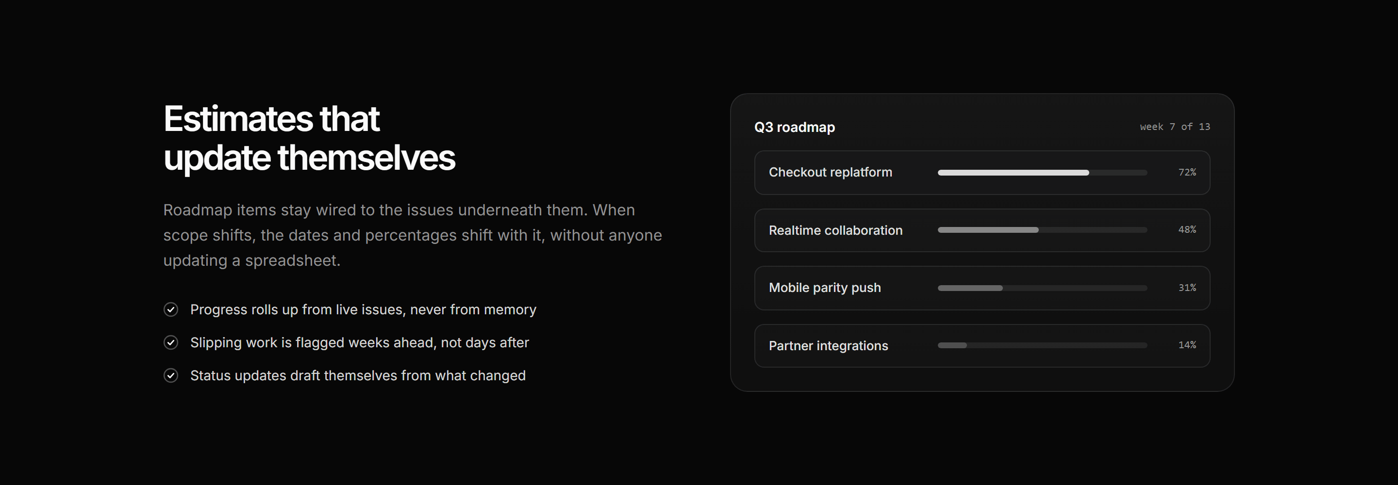
A split highlight: heading, lede, and checklist beside a roadmap panel of initiative rows with stepped progress meters.